
Ad Guides · Fashion & Apparel × Instagram
Instagram ads for clothing brands
The only industry here where the purchase completes in the ad's own session — and the only feed already full of clothes. Both facts change the ad.
Apparel is the one business on this site where an ad can finish the job. A dentist can cause an appointment, an agent can cause a conversation, a software company can cause a trial — a clothing brand can cause a purchase, in the ad's own session, on a phone, in about ninety seconds. That single fact rearranges everything: which objective you buy, what the campaign is even shaped like, what the creative has to do, and which two objections have to be answered before anybody's card comes out.
It also means this is the one page in the cluster where the campaign-type decision is a real product decision rather than a choice between a form and a landing page. So the Advantage+ section below was written against Meta's own documentation rather than from memory: what a shopping campaign actually is, what it removes, what it requires from your catalogue and your pixel, and the one budget control that stops it quietly spending your acquisition money on people who bought last week.
The second thing that makes apparel different is the feed itself. Every other industry in this cluster is a stranger on Instagram — nobody's timeline is full of dental practices. Yours is full of clothes: competitors, creators, resellers, and the reader's actual friends, all shot in the same idiom with the same light. A beautiful photograph of a garment is therefore the single most invisible thing you can put in a paid slot, because it is indistinguishable from the content around it. Every one of the ten ads on the examples page argues something instead — fit, sizing, repairs, cost per wear, what the fibre actually costs — and that is not a stylistic house rule, it is the only way a paid impression here is distinguishable from a free one.
The ads below are real output, not mockups drawn for the argument. Six come from the ten on the fashion Instagram examples page, published exactly as generated, for brands that do not exist. Two of them carry problems worth learning from rather than hiding: one is a review wall filled with invented customers, which is the one ad on that page that must not be run as-is, and one was pinned to an objective its own copy then refused. Both are used below as teaching material.
One thing this page is not: a benchmark report. There is no target ROAS here, because a number from somebody else's margin structure is worthless against yours — and in this industry more than any other, the number that decides whether an ad worked is one the ad platform never sees. Returns land three weeks later, and a campaign that looks profitable in Ads Manager and unprofitable in the warehouse is the normal failure mode, not an edge case.
Generate Instagram ads for your label
Paste your site and best-in-slot reads it the way these invented labels were read — products, customers, positioning — then writes the concepts, renders the images and drafts the copy. Free to start, no card.
The feed is already full of clothes
Every other guide in this cluster has to argue for Instagram. This one does not, and that is the problem. Apparel is native here: the platform's whole visual grammar was built by and for clothing, which means your ad is not competing for attention against other ads, it is competing against content in an identical idiom — a competitor's campaign, a creator's haul, and a photograph a friend posted this morning, all with the same light and the same crop. In that context a beautifully shot garment is not a strong ad, it is camouflage. Indistinguishable from organic means indistinguishable, and a paid impression that reads as organic content is one you bought for nothing.
So the working rule for this platform is that the ad has to make a claim the surrounding content is not making. Look at what the ten ads on the Browse page actually do: one argues that a size chart lied about inseam, one puts six reviews side by side labelled XS to 4XL, one prices a pair of jeans against the four pairs it replaces, one states what organic cotton costs and where the rest of the markup goes. Not one of them is a product photograph doing product-photograph work. That is the platform tax, and it is worth paying because the alternative is invisible.
The shape half is short and mostly familiar from the other Instagram pages: 4:5 for feed, full-screen 9:16 for Stories and Reels — eight of the ten ads are 4:5 and two are 9:16 — and no 1.91:1, because that ratio routes to Facebook's right-hand column and search results and our publisher gives it no Instagram position. (Instagram Feed itself accepts up to 1.91:1 — corrected 7 September 2026; what this app lacks is the surface, not the shape.) For apparel the consequence is specific: the shapes that matter beyond those two are catalogue formats rather than aspect ratios, which is a campaign-type decision and is covered below rather than here.
The last Instagram-specific point is the one most brands get backwards. The organic playbook on this platform — post often, ride the trend, let the garment speak — is a genuinely good playbook, and it is the wrong one for paid. Organic reach is granted to content that fits the feed; paid reach is bought, and what you are buying is a chance to say something the feed will not say for you. Brands whose paid creative is their best-performing organic post, boosted, are the ones who conclude Instagram ads do not work.
Which objective to buy
Sales, and this is the only cluster on this site where that sentence is true. Six of the ten ads on the Browse page were written for it, three for Traffic and one for Leads — against dentist's seven Leads out of ten and real estate's eight. The reason is not that apparel advertisers are more ambitious; it is that a purchase can complete inside the session the ad started, so Sales is the objective describing the thing that can actually happen. Buying Leads for a product with a checkout is asking the delivery system to optimise for a lesser outcome and then being surprised it delivered one.
The three Traffic ads on that page are all doing the same job, and it is worth recognising: they argue something the reader has to read before they could want the product — what 17.5-micron merino actually is, what organic cotton costs, how a shoulder seam should sit. Those are the ads that need a page, not a checkout, and Traffic is honest about it.
The single Leads ad is the most instructive thing on the page, because it went wrong in a way that teaches the rule. The sneaker drop was pinned as a Leads concept — build a list before the drop — and the copy came back saying "no raffle, no waitlist… just a countdown". Objective is recorded metadata here and is never fed to the model, so the model followed the angle to its natural conclusion: first come, first served, live now. The ad is fine. The pairing is not, and you cannot run that copy against a signup form, because it has just told the reader there is no list. Match the objective to the mechanic the offer actually has, not to the stage of the funnel you wish it were at.
- SalesDefault
Six of the ten Browse ads, and the only cluster on this site where this is the answer. The purchase completes in-session, so this is the objective describing the real outcome. It is also the objective an Advantage+ shopping campaign requires.
- TrafficSometimes
For the arguments that need reading before anyone could want the product — a material claim, a pricing teardown, a fit explanation. Three of the ten, all of them ads whose job is to change what the reader believes rather than to sell a specific SKU.
- App promotionSometimes
Real if you have a shopping app that people genuinely reorder from — repeat purchase is where apparel margin actually lives. Not worth it for a brand whose app is a wrapper around the same storefront.
- LeadsRarely
Only when there is a real list mechanic: a waitlist, a restock alert, a made-to-order queue. The Browse page's drop ad is the worked example of getting this wrong — pinned Leads, copy explicitly refused a waitlist, and no form on earth fixes that pairing.
- EngagementRarely
The trap of this industry specifically, because engagement is what the organic account is measured on and the numbers look wonderful. It optimises for the cheapest reaction in a feed where reacting to clothes is free and buying them is not.
- AwarenessRarely
Defensible for a brand with a launch budget and a category to define. For everyone else it buys reach in the one feed already saturated with your category, which is the most expensive place to be forgettable.
What to argue, and the angle that wins it
Apparel has no service menu, so the unit of planning here is not an offer but an argument — which claim about the product, aimed at which body or which habit. What the ten Browse ads have in common is instructive: eight of them are about fit, sizing, durability or cost, and none is about how the garment looks. Looks are what the photograph is for; the copy exists to answer the two questions that stop a purchase completing, which in apparel are always "will it fit me" and "what happens if it doesn't".
Each row pins four decisions: who it is for, the angle family that argues it (each is a page in the angle library), the objective to buy it under, and the finished ad that shows it assembled. The two rows with no example are the families this batch skipped, and one of them — the founder's story — is the single most over-used and worst-executed argument in this industry, which is why it is worth writing carefully rather than not at all.
One recurring shape worth naming before the table: the strongest ads here narrow the audience by body rather than by taste. Tall women. Petite professionals. Big and tall. Lifters who have been let down at 2XL. That is a real, unglamorous segmentation the rest of the category ignores, and it is why those ads can say something a general apparel ad structurally cannot.
The size chart that lied
Sales- Who it is for.
- Somebody whose measurements fall outside the range every brand claims to serve — tall, petite, long-torsoed, broad-shouldered.
- Angle.
- Problem & Pain — The friction is specific, repeated and never acknowledged in advertising, which makes naming it feel like being seen rather than being sold to. Drafted for height rather than hemmed longer is a claim about pattern-making, and it is checkable — which is what separates it from every brand that says it is inclusive.
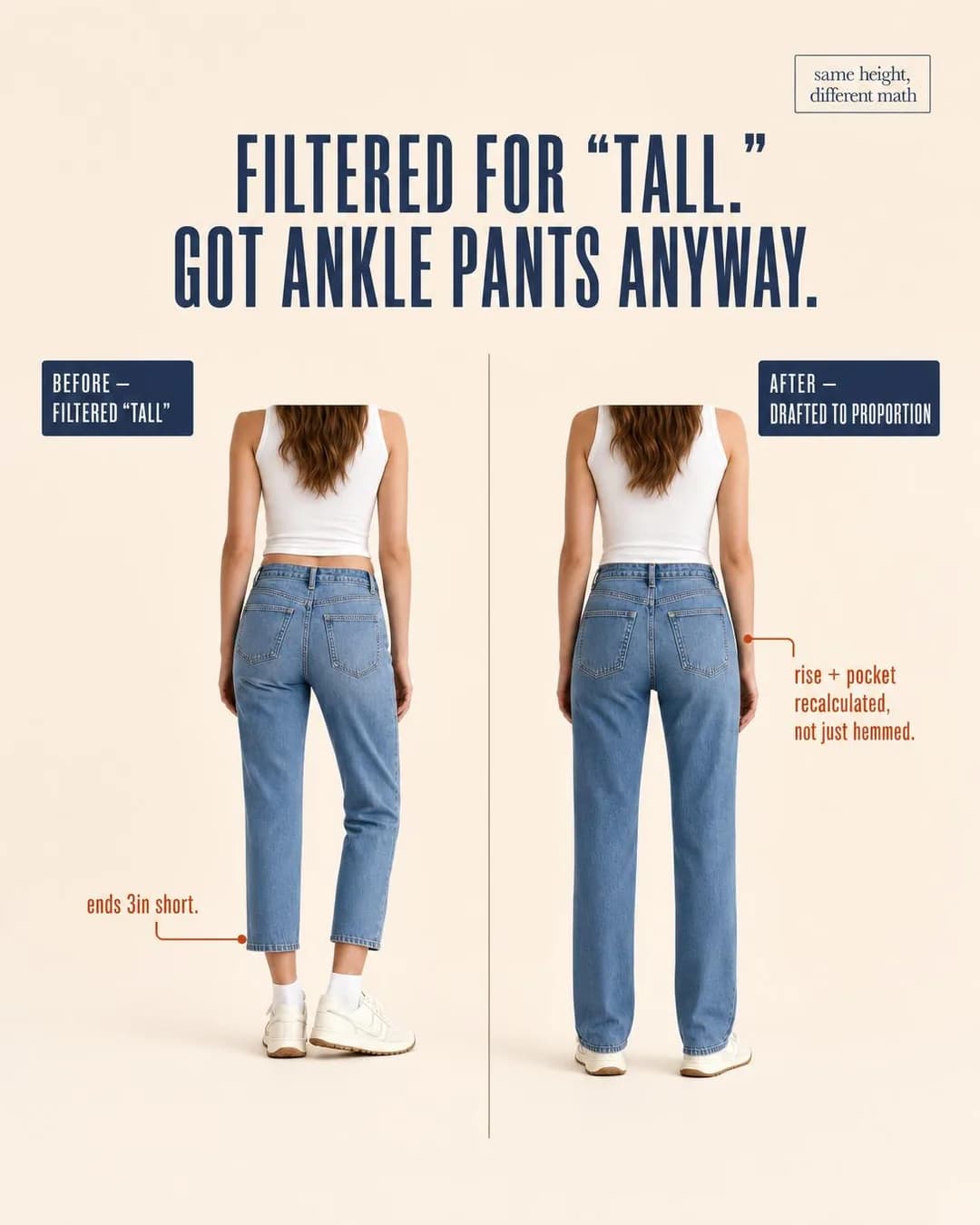 Example adJeans drafted by height, not hemmed longerSee the brief →
The size-labelled review wall
Sales- Who it is for.
- A buyer who has watched a product be reviewed to death by sample-size bodies and has no idea whether any of it applies to them.
- Angle.
- Proof & Trust — The format lesson of this whole page. Ordinary Reviews/Ratings ads assert volume — four stars, thousands of reviews — and volume is wallpaper. Labelling one review per size, XS to 4XL, makes the structure do the arguing: it answers "is it good in my size" rather than "is it good". Build it from customers who exist; see the mistakes section for why that sentence is load-bearing.
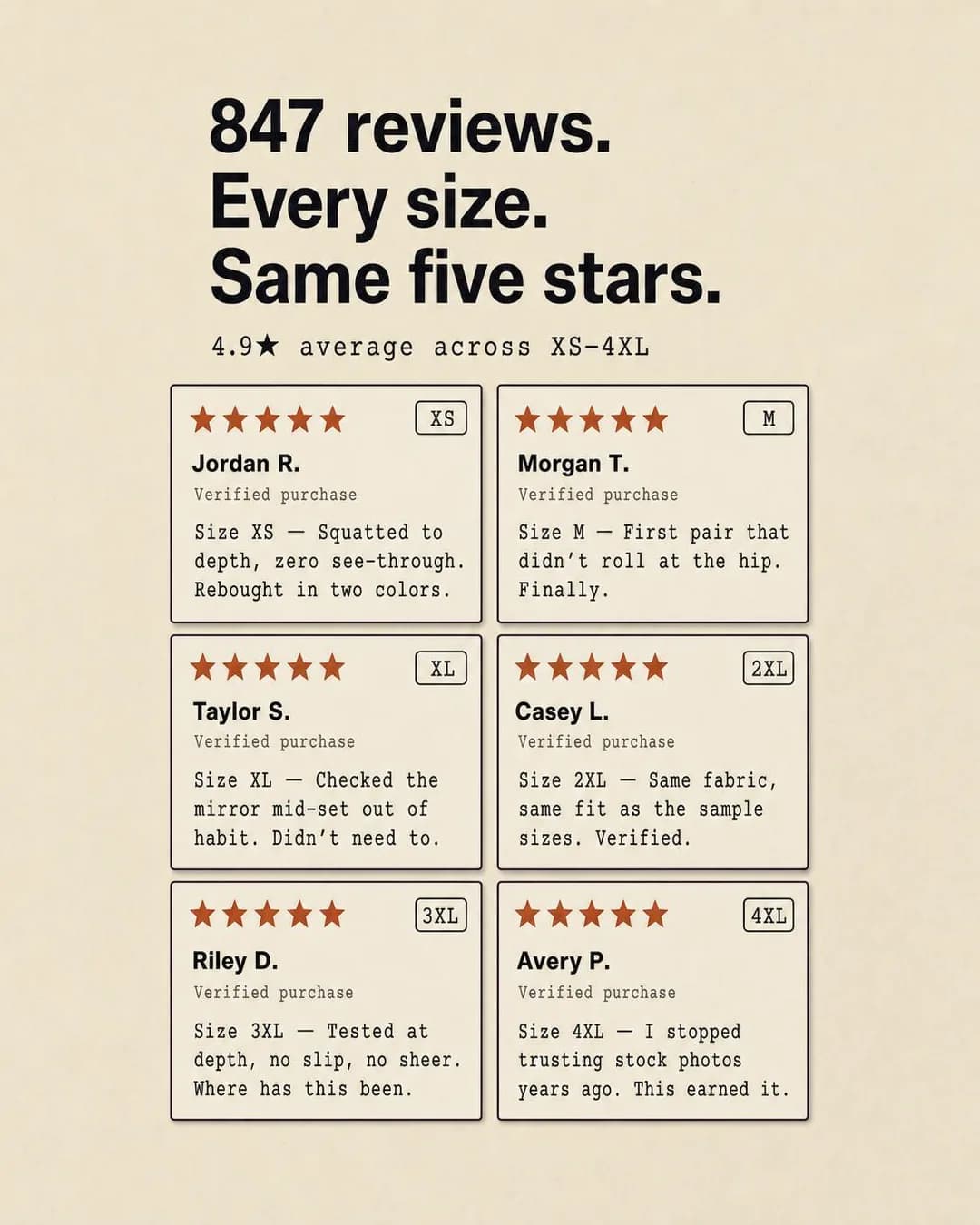 Example ad4.9★ across every size we carrySee the brief →
Cost per wear
Sales- Who it is for.
- Someone consciously buying less and therefore willing to spend more per item, if the arithmetic holds.
- Angle.
- Offer & Economics — The only way a higher price becomes a feature. It reframes the comparison from your price against a cheaper rival to your price against the number of times it gets worn — and it works precisely because the reader can do the division themselves and catch you if it is wrong.
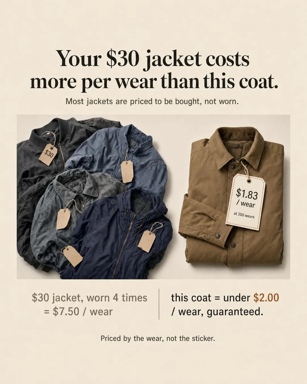 Example adUnder $2/wear, guaranteed in 24 monthsSee the brief →
The size range as an identity claim
Sales- Who it is for.
- Someone who has spent years shopping from whatever was left on the corner rack.
- Angle.
- Identity & Emotion — Sized by chest and height rather than by hope is a joke that only lands for people who have lived it, which is exactly the qualifying you want. Identity works here where it would be mawkish elsewhere, because the exclusion being named is real and specific rather than aspirational.
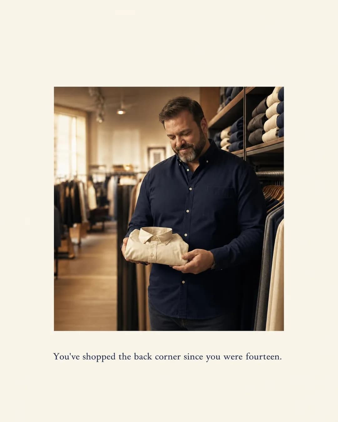 Example adSized by chest and height, not hopeSee the brief →
The garment that removes a chore
Sales- Who it is for.
- People who dress for a shift rather than for an occasion — nurses, teachers, anyone on their feet for ten hours.
- Angle.
- Benefit & Outcome — Convenience is under-argued in fashion because it is unglamorous, and it converts because it is checkable. Wash it Sunday, wear it Monday is a claim about a Tuesday problem, and the pockets sell it better than the silhouette does.
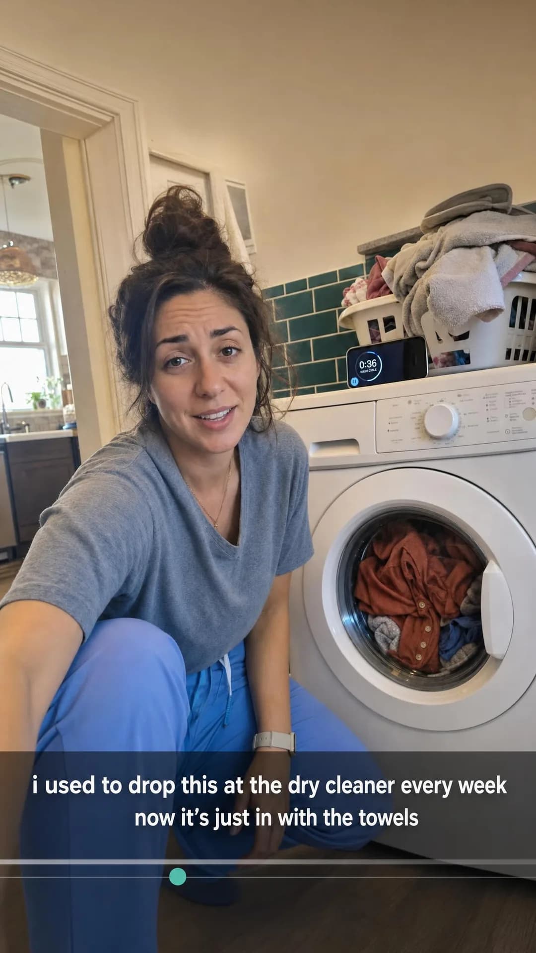 Example adWash it Sunday. Wear it Monday.See the brief →
The material claim, in numbers
Traffic- Who it is for.
- A researcher — the buyer who reads the fabric composition before the price.
- Angle.
- Product & Mechanism — A named specification does work that adjectives cannot: 17.5 microns is a fact somebody can check, and checkability is the entire mechanism of trust in a category built on unverifiable words. Buy it as Traffic — this reader wants a page, not a checkout.
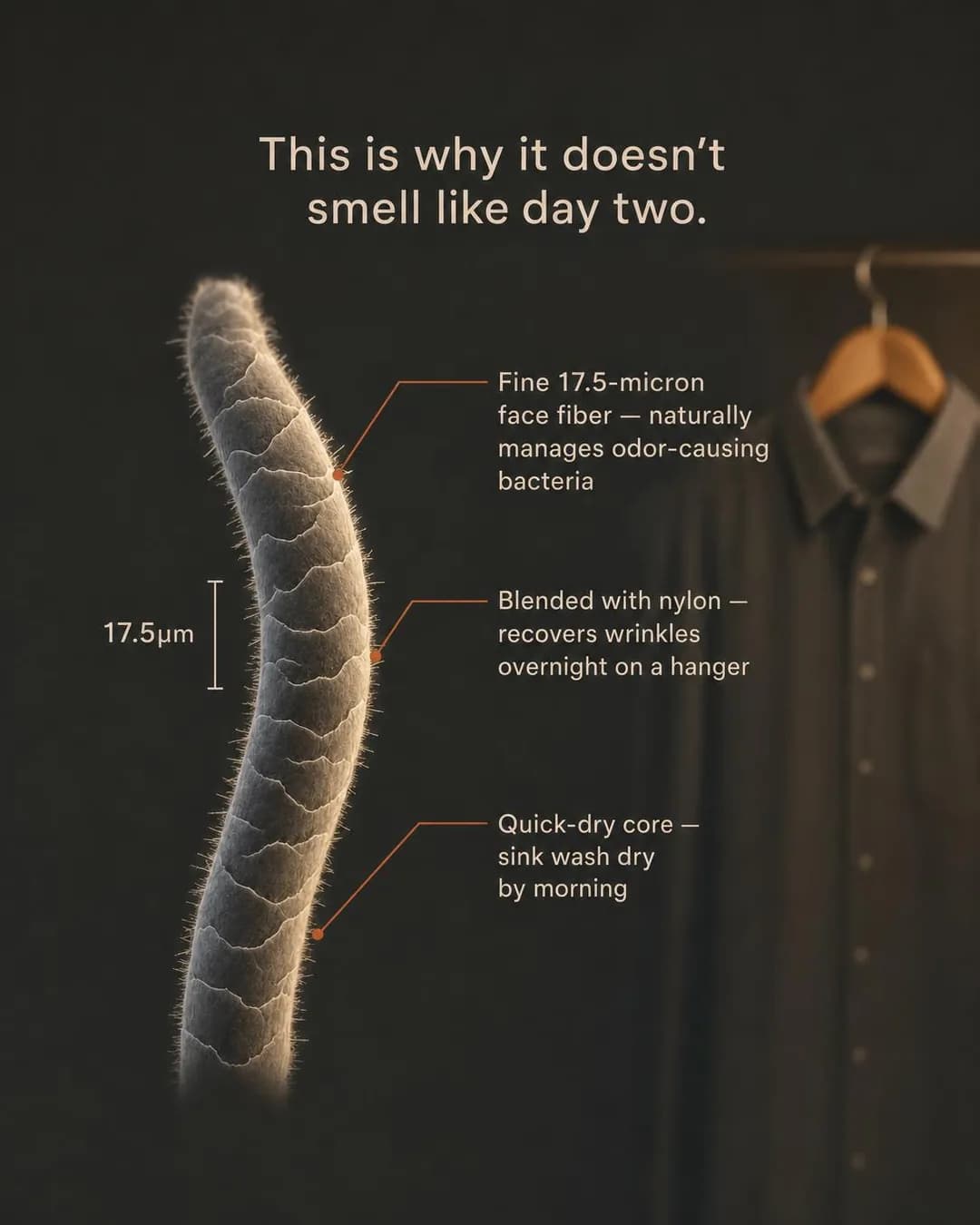 Example ad17.5 microns. 7 days. No laundry.See the brief →
The fit objection, answered physically
Traffic- Who it is for.
- Someone who wants the garment and has been burned enough times to assume it will not fit.
- Angle.
- Objection & Risk Reversal — The one objection that stops apparel purchases completing, and it is answered with a test rather than a promise. Where the shoulder seam sits is something a reader can picture on their own body in a second, which a returns policy cannot do.
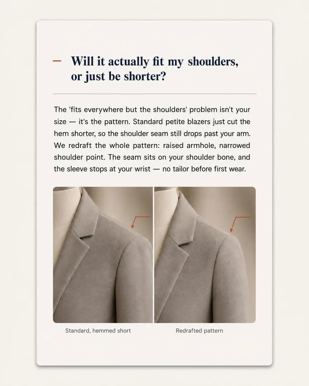 Example adThe seam sits on your shoulder, not your armSee the brief →
The drop
Traffic- Who it is for.
- Buyers who live by a release calendar and can smell manufactured hype from a great distance.
- Angle.
- Scarcity, FOMO & Timing — The one category on this site with real, countable scarcity — a batch has a number of pairs in it. Which means the credible register is anti-hype: state the batch, the count and what is already gone, and disown the raffle. And pick the objective from the mechanic you actually have (see the objectives section for why this ad is the cautionary tale).
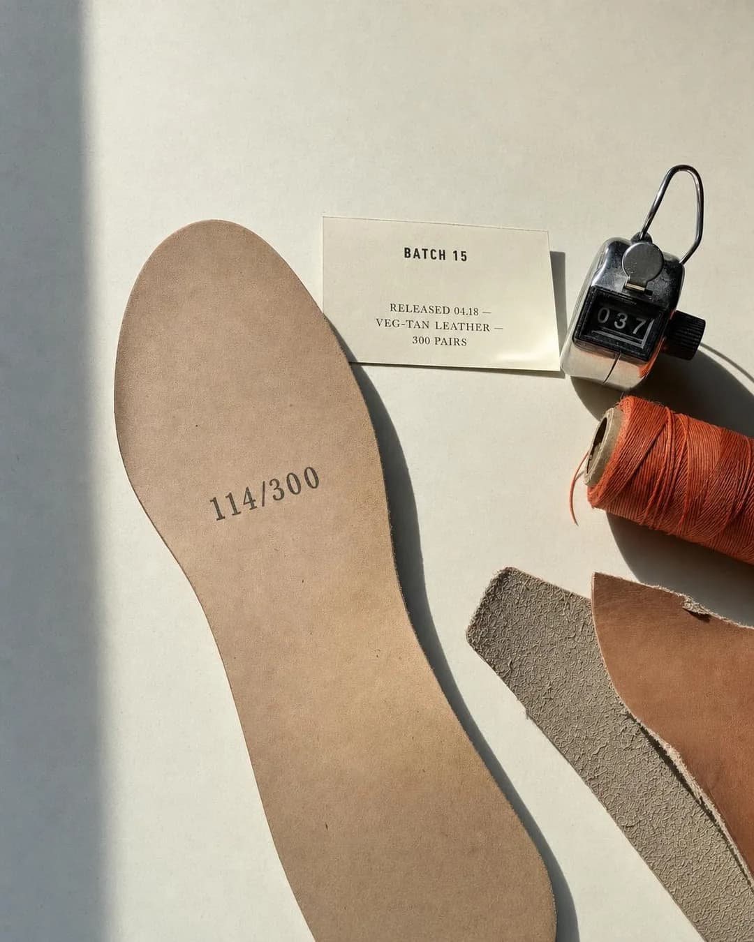 Example adBatch 15. 300 pairs. No raffle.See the brief →
The sustainability teardown
Traffic- Who it is for.
- A shopper who has heard the word sustainable so often it now reads as a warning.
- Angle.
- Comparison & Positioning — Myth-busting beats claim-making in a category where every brand makes the same claim. Naming what a fibre costs and where the rest of the price goes is a risky, specific move — and specificity is the only thing left that separates you from the brands making the claim without it.
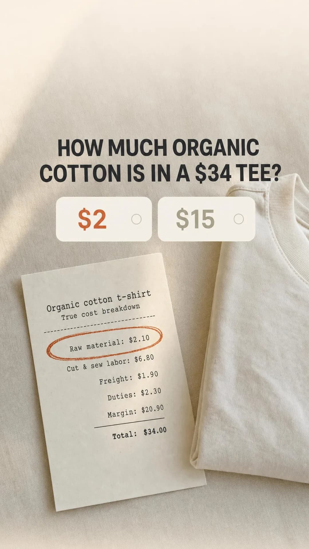 Example adOrganic cotton costs $2. The rest is markup.See the brief →
Why the brand exists
Traffic- Who it is for.
- A buyer choosing between two visually identical products at a similar price.
- Angle.
- Story & Founder POV — The row this batch skipped, and the most over-used argument in apparel. It only works when the origin explains a product decision a competitor did not make — the pattern block, the factory, the size range — rather than describing a feeling somebody had about fashion. If the story does not end in a design choice, it is not an ad.
No example ad for this offer on the examples page yet.
End of season and the real deadline
Sales- Who it is for.
- Someone who wanted the item at full price and has been waiting.
- Angle.
- Scarcity, FOMO & Timing — The second skipped row, and the one where honesty is worth more than urgency. Apparel has genuine seasonal deadlines — sizes sell out in a fixed order and do not come back — so state the actual mechanic rather than inventing a countdown, particularly on a platform whose audience has been trained by a decade of fake ones.
No example ad for this offer on the examples page yet.
Campaign type first, targeting second
This is the one industry in the cluster where the first decision is not who to target but which kind of campaign to run, because Meta offers apparel a trade the other trades are not offered. An Advantage+ shopping campaign hands the targeting to the delivery system in exchange for the catalogue and the purchase signal doing the work instead. The specifics matter, so here they are from Meta's own documentation: an ASC can only be created with the OUTCOME_SALES objective, only geo_locations may be specified in its targeting, and exactly one ad set may be associated with each ASC campaign. That is not a simplification of manual targeting — it is its removal.
Which is worth reading against the housing guide in this cluster. A real estate agent loses age, ZIPs, lookalikes and exclusions by regulation and gets nothing back. An apparel brand gives away the same levers voluntarily and gets a system optimising against actual purchases. The trade is only good if the signal is good, which is the whole of the requirement below — and it is bad if your catalogue is broken, because then you have given away the targeting and received noise.
So: catalogue and pixel before campaign type. Advantage+ catalog ads need a product catalogue and a pixel firing ViewContent, AddToCart and Purchase, and each of those events has to carry either content_ids or contents, with IDs that match the ones in your catalogue. That last clause is where most implementations quietly fail — the events fire, the dashboard fills in, and the product IDs do not line up, so the dynamic half of the system has nothing to be dynamic about. Check that the IDs match before you check anything else.
One control deserves its own paragraph because it is the difference between an ASC that grows a brand and one that flatters it: existing_customer_budget_percentage sets the maximum share of the budget that can be spent on the ad account's existing customers, from 0 to 100. Leave it unset and a well-optimised shopping campaign will happily spend a large part of your acquisition money re-selling to people who bought a fortnight ago, because they are the easiest purchases in the room. Your ROAS will look excellent and your customer count will not move.
For everything outside a shopping campaign — the Traffic ads, the arguments, the top of the funnel — normal targeting applies and apparel is not a special ad category, so all of it is available. The recommendation is the same as the SaaS page's, for a related reason: go broad and let the creative do the narrowing, because the segmentation that actually matters here is by body and habit rather than by interest, and no picker has ever offered "women who are five foot ten".
- Special ad categoryNot required
- Apparel is not one of the four. Everything is available to you — which is what makes handing it to an Advantage+ campaign a choice rather than a rule.
- Advantage+ shopping campaignUse it — with conditions
- OUTCOME_SALES only, geo_locations only in targeting, exactly one ad set per campaign. Worth it once the catalogue and purchase events are clean and the account has real conversion volume. Before that you are giving away targeting in exchange for noise.
- CatalogueRequired for catalog ads
- One catalogue with everything in it — price, image, description, availability. Splitting products across catalogues to mirror your internal structure is the most common way this goes wrong.
- Pixel eventsRequired, and check the IDs
- ViewContent, AddToCart and Purchase, each carrying content_ids or contents whose IDs match the catalogue. Events that fire with mismatched IDs look healthy in Events Manager and give the dynamic system nothing to work with.
- Existing-customer capSet it deliberately
- existing_customer_budget_percentage, 0–100, caps the share of an ASC budget spent on existing customers. Unset, it is the reason a campaign can post a superb return while acquiring almost nobody.
- Broad + creative filterUse it
- For everything outside a shopping campaign. The segmentation that matters in apparel is by body and habit — tall, petite, big and tall, lifting at 2XL — and none of it is selectable. The first line of the ad does it instead.
- ExclusionsUse it
- Exclude recent purchasers from acquisition ad sets, and exclude returners from retargeting. Available to you, unlike in housing, and the manual equivalent of the existing-customer cap above.
- GeographyDecide it
- Ship-to reality rather than reach: duties, returns cost and delivery time decide which markets are profitable, and a cheap impression in a country you cannot economically return a parcel from is a loss dressed as efficiency.
Where the click should land
The product page, and specifically the page for the item in the ad — not the homepage, not a collection, not a filtered grid. This is the least ambiguous destination recommendation in the whole cluster and the most frequently ignored, because collection pages feel generous. They are not: an ad that argued about the inseam on one pair of jeans, landing on forty pairs of jeans, has handed the reader the exact search problem the ad just solved for them.
Catalog ads solve this by construction — the ad is generated from the catalogue entry and the click goes to that item — which is one of the underrated reasons to get the catalogue right. For hand-built ads it is a discipline you have to keep yourself.
There is no lead-form debate to have here, which is unusual for this cluster. A form between a reader and a checkout is a step that costs a sale and gains an email address. The single exception is a real list mechanic — a waitlist for a made-to-order run, a restock alert on a size that is genuinely out — and the test is whether the thing you are collecting an address for actually exists. The Browse page's drop ad is the cautionary version: its copy promises there is no waitlist, so a form behind it would be contradicting the ad that produced the click.
One thing to put on the destination page rather than in the ad: the returns policy and the size guide, both above the fold on mobile. Those are the two questions that stop the purchase, and the ad can only gesture at them.
The recommendation: The product page for the item in the ad — never the homepage or a collection. No lead forms unless a real waitlist or restock list exists behind them.
Creative direction
The rule that matters most here is the one that sounds wrong: do not make the ad beautiful. Or rather, do not let beauty be the only thing it does, because the feed you are buying into is already full of beautifully photographed clothes that cost nothing to post. An ad has to make a claim, and the claim is what buys the second of attention that the photograph then converts. Every one of the ten ads on the Browse page argues something, and it is not a coincidence that eight of the arguments are about fit, sizing, durability or price.
The second thing is a format worth stealing wholesale, and the to-do for this cluster was right to call it out. A Reviews/Ratings ad normally asserts volume — 4.9 stars, twelve thousand reviews — and volume is wallpaper. The version on the Browse page instead shows six review cards, one per size from XS to 4XL, under a headline naming the pattern. The structure does the arguing: it answers "is it good in my size", which is the actual anxiety, rather than "is it good", which nobody was asking. Any brand with a real size range and real reviews can build that ad this week, and almost none of them have.
Which leads directly to the hazard. That same ad is the one on the Browse page that must not be run as generated, because Jordan R., Morgan T. and the rest do not exist and their verified purchases never happened. A review grid works because readers assume real customers are behind it — that assumption is the mechanism — so filling it with invented ones is fabricated social proof, which is a policy violation on Meta and a legal problem in most markets. Take the format. Fill it with people who said it and agreed to appear.
- Make a claim, not a picture. A garment photographed well is indistinguishable from the organic content around it, and indistinguishable is invisible.
- Answer fit and returns, in that order. They are the two objections that stop a purchase completing, and no amount of styling substitutes for either.
- Label reviews by size rather than counting them. Six cards from XS to 4XL argue size consistency; a star average argues nothing.
- Never invent a reviewer or a customer. The format works on the reader's assumption that the person is real, which is exactly what makes a fabricated one a lie rather than a mock-up.
- Put a number in that the reader can check — an inseam, a micron count, a cost per wear, a batch of 300. Checkability is what separates you from a category built on adjectives.
- Show the garment on the body it was cut for. A size claim modelled exclusively on sample sizes contradicts itself in the picture.
- Export 4:5 for feed and 9:16 for Stories and Reels. Skip 1.91:1 — Instagram Feed accepts it as its maximum ratio, but the surfaces built for a wide asset are Facebook's; the formats that matter beyond those two are catalogue formats, which is a campaign decision. Meta's spec is 1440 × 1800, the same as Facebook Feed, so one export serves both — but the aspect-ratio tolerance here is 1% against Facebook's 3%, so a crop that is a few pixels out passes there and not here.
- Write to 40 characters of headline and 125 of primary text — Meta's recommendations for an Instagram Feed image ad. The run on the Browse page does not: three of its ten headlines are over 40, and all ten primary texts are over 125. That is worth watching in this category specifically, because the claim doing the work is usually the fit or sizing one, and truncation puts it behind a “more” nobody taps.
- Do not boost your best organic post. Organic reach is granted to content that fits the feed; paid reach has to buy something the feed will not give you.
Funnel structure
Two structures, and which one you are running depends on whether the catalogue and purchase signal are clean. If they are, the shopping campaign is most of the funnel by design — one ad set, geography only, the system doing the rest — and the manual work sits either side of it: the argument ads that create demand at the top, and the customer programme at the bottom. If they are not clean, run the manual three-stage version below and fix the catalogue in parallel, because handing targeting to a system fed by broken product IDs is worse than keeping it.
Either way the third stage is where apparel margin actually lives. Repeat purchase in this category is the difference between a business and a hobby, and it is the cheapest revenue in the account — which is also why the existing-customer cap in the targeting section matters so much. You want to buy repeat purchases deliberately, in their own stage, rather than have an acquisition campaign quietly buy them for you and report them as growth.
Cold
≈60% of budgetAudience. Broad, geography set to where you can actually ship and accept returns, recent purchasers excluded. Or an Advantage+ shopping campaign with the existing-customer share capped.
Running. The argument ads — fit, sizing, cost per wear, the material claim. Sales where there is a product to buy, Traffic where the reader has to be convinced of something first.
Warm
≈25% of budgetAudience. Product viewers, add-to-cart abandoners, video viewers, engagement — the audiences the pixel earns you.
Running. Catalog ads for the items they looked at, plus the objection answers: the review wall, the returns terms, the fit test.
Customers
≈15% of budgetAudience. Past purchasers, segmented by how long ago and by what they bought.
Running. New drops, the seasonal reorder, the complementary item. Cheapest revenue in the account, and worth buying on purpose rather than by accident.
Budget and testing
Start with the learning-phase arithmetic, which lands somewhere between the two extremes in this cluster. Meta's delivery system needs roughly 50 optimisation events per ad set per week to leave the learning phase. For a dental practice, 50 booked implant consultations a week is fantasy; for a software company, 50 trial starts is routine. For an apparel brand it depends entirely on your average order value: 50 purchases a week is achievable at €40 and hard at €400. Multiply your own cost per purchase by 50 and you have the weekly spend at which one ad set is fully optimised — and if that number is out of reach, the Advantage+ constraint of one ad set per campaign stops being a limitation and starts being the reason it works, because it concentrates every event into a single pile.
Resist the obvious workaround. Optimising for AddToCart because purchases are too thin is the same mistake the SaaS page warns about with trial starts, in a different costume: the system will find you people who add to cart, which is a different population from people who complete a checkout, and the gap between those two groups is exactly where apparel loses money. Use the shallower event only as a temporary measure while volume builds, and know that you are doing it.
Then leave it alone. Pausing an ad set, or changing its optimisation event, audience or creative, is a significant edit that restarts the learning phase; budget and bid changes can be too, depending on size. In a business with a drop calendar the temptation to intervene daily is stronger than in any other industry here, and it is the same self-inflicted cost.
Finally, the number Ads Manager cannot show you. Returns in apparel arrive weeks after the sale, they are concentrated in exactly the categories where fit is uncertain, and they do not appear in reported ROAS. A campaign that looks profitable in the dashboard and unprofitable in the warehouse is the normal case rather than an edge case, so reconcile against net revenue on a lag before you scale anything — and treat a high return rate on a specific ad as a creative problem, because it usually is one: an ad that oversold the fit produced the return.
- Test the argument, not the photograph. Which claim earns the second of attention has a far wider range than which shot you used.
- One change at a time, with seven days to read it — the learning phase is measured over a week, so anything shorter is noise.
- Reconcile on net revenue after returns, on a three-to-four week lag. Reported ROAS in this category is a leading indicator, not a result.
- Watch return rate by ad, not just by product. An ad that overpromised the fit shows up as a returns spike weeks later and nowhere else.
- Check that catalogue IDs still match after any storefront migration. It breaks silently, and the first symptom is a shopping campaign quietly getting worse.
Six of these ads, in full
Every ad below was generated by best-in-slot for a clothing brand that does not exist, with its audience, angle and objective pinned before the run — and published exactly as it came back. They are six of the Instagram examples for a clothing brand; the rest, with the full brief and the alternate headlines behind each one, are on that page.
Problem & Pain · 4:5 · Sales
Jeans drafted by height, not hemmed longer
Written for: Tall women, 5'10" and up.
The full brief and why it works →
Proof & Trust · 4:5 · Sales
4.9★ across every size we carry
Written for: Women lifting in commercial gyms.
The full brief and why it works →
Offer & Economics · 4:5 · Sales
Under $2/wear, guaranteed in 24 months
Written for: Women pruning their wardrobes.
The full brief and why it works →
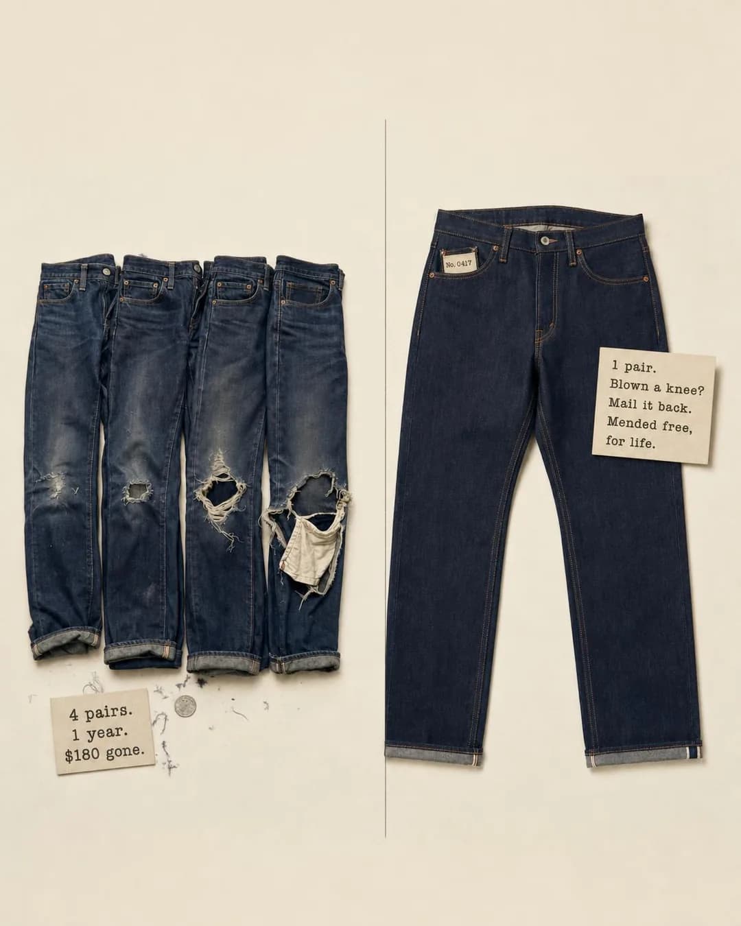
Comparison & Positioning · 4:5 · Sales
One pair. Free repairs. For life.
Written for: Men replacing jeans yearly.
The full brief and why it works →
Benefit & Outcome · 9:16 · Sales
Wash it Sunday. Wear it Monday.
Written for: Teachers and nurses.
The full brief and why it works →
Comparison & Positioning · 9:16 · Traffic
Organic cotton costs $2. The rest is markup.
Written for: Shoppers who distrust the word sustainable.
The full brief and why it works →
Mistakes specific to this trade
The first two are the reason most apparel accounts underperform on this platform specifically, and they are the same mistake: bringing the organic playbook to a paid slot.
Running a beautiful garment photograph and nothing else
It is the most natural ad in the world to make and it is camouflage. The feed already contains that photograph, posted for free, by competitors, creators and the reader's friends. Paid reach has to buy a claim the feed will not make for you — about fit, durability, sizing or price — and the photograph then converts the attention the claim bought.
Boosting your best-performing organic post
Organic reach is granted to content that fits the feed, which is precisely the property that makes it a weak advert. The post performed because it belonged; the ad has to work because it does not.
Fabricating reviews or customers
The Browse page carries the worked example: its review-wall ad is the one that must not be run as generated, because the named reviewers do not exist and their verified purchases never happened. The format works on the reader's assumption that real customers are behind it, which is what makes an invented version fabricated social proof — a Meta policy violation and a legal problem in most markets. Keep the structure, change the people.
Pinning an objective the offer has no mechanic for
The drop ad on the Browse page was written as a Leads concept and its own copy then refused a waitlist — "no raffle, no waitlist, just a countdown". No form fixes that pairing. Pick the objective from the mechanic the offer genuinely has, which for most apparel is a checkout and therefore Sales.
Product IDs that do not match the catalogue
ViewContent, AddToCart and Purchase all have to carry content_ids or contents whose IDs match your catalogue. When they do not, everything looks healthy in Events Manager and the dynamic half of the system has nothing to work with. It breaks silently on storefront migrations and the first symptom is a shopping campaign that slowly stops working.
Handing targeting to a shopping campaign before the signal is clean
An Advantage+ campaign is OUTCOME_SALES only, geography-only targeting and one ad set — that is a removal of targeting, not a simplification of it. It is a good trade when the catalogue and purchase events are right and there is real conversion volume, and a bad one when you are exchanging your levers for noise.
Leaving the existing-customer share uncapped
existing_customer_budget_percentage limits how much of an ASC budget goes to people who have already bought. Unset, a well-optimised campaign will spend heavily on the easiest purchases in the room, post an excellent return, and acquire almost nobody. The dashboard will look like growth.
Sending the click to a collection page
The ad solved a search problem — this pair, this inseam, this size — and a grid of forty items hands it straight back. Send them to the product page for the item in the ad. Catalog ads do this by construction, which is another reason to get the catalogue right.
Scaling on reported ROAS and ignoring returns
Returns arrive weeks later, cluster in exactly the categories where fit is uncertain, and never appear in the number you are optimising against. Reconcile on net revenue on a lag, and read a high return rate on one ad as a creative fault rather than a logistics one — an ad that oversold the fit is what produced it.
Making a size-range claim modelled only on sample sizes
The picture contradicts the copy, and this audience has been trained by a decade of exactly that to notice immediately. If the claim is that the range is real, the range has to be in the frame.
Inventing a countdown
Apparel has genuine scarcity — a batch has a number, sizes sell out in a fixed order — which is precisely why fake urgency is a bad trade here. The audience has seen a thousand ending-soon timers reset. State the real mechanic; the Browse page's drop ad is credible because every number in it agrees with the copy.
Questions
- Which objective should a clothing brand buy?
- Sales, and this is the only industry on this site where that is the default. The purchase can complete inside the ad's own session, so Sales describes the outcome that can actually happen — six of the ten ads on our fashion examples page were written for it. Use Traffic for the ads whose job is to change what a reader believes before they could want the product, and Leads only when a genuine waitlist or restock list exists behind it.
- Should I use an Advantage+ shopping campaign?
- Once your catalogue and purchase events are clean and you have real conversion volume, yes. Be clear about what it is, though: an ASC can only be created with the OUTCOME_SALES objective, only geo_locations may be specified in its targeting, and exactly one ad set is allowed per campaign. That is a removal of targeting in exchange for the system optimising against actual purchases — a good trade on a good signal and a bad one on a broken catalogue.
- What do Advantage+ catalog ads actually require?
- A product catalogue and a pixel firing ViewContent, AddToCart and Purchase, with each event carrying either content_ids or contents whose IDs match the IDs in your catalogue. That last part is where most setups quietly fail: the events fire, Events Manager looks healthy, and the product IDs do not line up, so the dynamic system has nothing to be dynamic about. Check the IDs before anything else.
- Why are my ads getting engagement but not sales?
- Usually because the creative is beautiful and does not claim anything. Instagram's feed is already full of well-photographed clothes posted for free, so a paid impression that looks like organic content is one you bought for nothing. Every ad on our examples page argues something — an inseam drafted for height, six reviews labelled by size, what organic cotton actually costs — and the argument is what earns the attention the photograph then converts.
- How do I make reviews work in an ad?
- Stop asserting volume and start labelling by size. A star average and a review count are wallpaper; six review cards running XS to 4XL, under a headline naming the pattern, answer the question a buyer is actually asking, which is not "is it good" but "is it good in my size". Fill it with customers who exist and agreed to appear — a review grid works because readers assume real people are behind it, and inventing them is fabricated social proof.
- Where should the ad send people?
- The product page for the item in the ad. Not the homepage, and not a collection page — the ad just solved a search problem for the reader and a grid of forty items hands it straight back. Put the size guide and the returns policy above the fold on mobile, because those are the two questions that stop the purchase and the ad can only gesture at them.
- How should I judge whether the ads are working?
- On net revenue after returns, reconciled on a three-to-four week lag — not on the ROAS in Ads Manager. Returns land weeks after the sale, cluster in the categories where fit is uncertain, and never appear in the number you are optimising against. A high return rate on one specific ad is usually a creative fault: an ad that oversold the fit is what produced it.
Sources
Every platform claim on this page was read against these on . Meta’s policies move; if one of these disagrees with this page, it is right and we are stale.
- Meta Marketing API — Advantage+ shopping campaigns (OUTCOME_SALES, geo-only targeting, one ad set, existing_customer_budget_percentage)
- Meta Pixel — required events and parameters for Advantage+ catalog ads
- Meta Business Help Centre — Advantage+ catalog ad requirements
- Meta Business Help Centre — about Advantage+ sales campaigns
- Meta Marketing API — special ad categories (apparel is not one)
- Meta Business Help Centre — choosing Ads Manager advertising objectives
- Meta Business Help Centre — about the learning phase
- Meta Business Help Centre — significant edits and the learning phase
- Meta ads guide — image ad specifications, Instagram feed
That is the playbook. Now make the ads.
Paste your store. It reads your products, your customers and your look, then writes the concepts, renders the images and drafts the copy — for the one feed already full of clothes.
No credit card · 50 free credits (about 5 ads or Instagram posts)
Every angle recommended above is documented in the best-in-slot ad angle library, and the ads are from fashion & apparel instagram ad examples. More industries are at all ad guides.