
Ad Guides · Fashion & Apparel × Facebook
Facebook ads for clothing brands
The one app that reaches the customer the industry stopped cutting for — and the one page where you are not allowed to name them.
Almost everything written about fashion advertising on Meta assumes one customer: someone in their twenties, discovering a brand, on Instagram, at night. That customer is real, the other app is the right place to reach them, and our Instagram guide is about them. This page is about the customer the industry keeps forgetting, and Facebook is the only place they are.
Pew's November 2025 survey puts Facebook at 74% of 50- to 64-year-olds and 57% of over-65s, against Instagram's 40% and 19%. That is a clothing buyer with money, a long memory for brands that fitted, and a shopping mode nothing in the fashion playbook describes. They are not discovering; they are replacing. They know their size and cannot find it. They own one jacket they intend to keep for fifteen years. They buy clothes for other people and guess at the size. Every recommendation below follows from that.
There is a constraint sitting on top of it that nobody else writing about this mentions, and it is the reason this page exists rather than a fifth rewrite of the drop calendar. The vernacular that comes naturally when you sell clothes to this buyer — "at our age", "since the menopause", "if your waist has changed", "for wide feet" — asserts age, a medical condition or a disability about the person reading the ad. Meta's personal attributes policy covers all three. So the one app that reaches this customer is the one where you are not allowed to name them, and most of what follows is the working answer to that.
The answer, in a sentence: qualify on the garment, not the body. A width fitting, a finished waist in inches, a 34-inch unhemmed inseam, a machine-washable wool — each of these selects exactly the people a demographic sentence would select, and asserts nothing about any of them. It is the same move the real estate guide makes when it says to qualify on a property event rather than a person, and it works for the same reason: a fact about the thing you sell is not a claim about the person you are selling to.
The ads on this page are real output, not mockups drawn for the argument. Seven come from the ten on the fashion Facebook examples page, published exactly as generated, for brands that do not exist. All ten of those briefs were written to the rule above and all ten held it — not one names an age or a body. Five of them nevertheless invented evidence, which is a different failure and a more expensive one, and they are used below as teaching material rather than hidden.
One thing this page is not: a benchmark report. There is no target ROAS here, and no cost-per-purchase figure, because a number from somebody else's margin structure and somebody else's return rate is worth nothing against yours.
Generate Facebook ads for your label
Paste your site and best-in-slot reads it the way these invented labels were read — products, customers, positioning — then writes the concepts, renders the images and drafts the copy. Free to start, no card.
The one app that reaches this buyer, and the one where you may not name them
Start with the reach, because it is the whole reason to be here. Pew's November 2025 numbers put Facebook thirty-four points ahead of Instagram among 50- to 64-year-olds (74% against 40%) and thirty-eight points ahead among over-65s (57% against 19%). No other industry in this cluster gets that much from the platform axis, because for most trades an older customer is simply an older version of the same customer. In apparel they are a different customer with different problems: a body that has changed shape, a size range the high street has narrowed, a favourite garment that has been discontinued, and thirty years of learning which brands lie about fit.
That is a strong position and it comes with a specific tax. Meta's Advertising Standards prohibit ads that assert or imply personal attributes about the person seeing them, and the list includes age, disability, and physical or mental health. Every sentence that names why this customer needs you lands on it. "Trousers for women over 50" asserts age. "Since your hip replacement" asserts a medical condition. "Struggling with wide feet?" asserts a physical characteristic and does not stop being an assertion because it is phrased as a question — the question form is not an exemption anywhere in this policy, which is exactly the trap the dental vernacular falls into on our dentist pages. Meta does permit passing reference to an attribute, including age ranges, but the line is whether the ad is telling the reader something about themselves, and retail copy written to this audience almost always is.
Which produces the inversion with our Instagram guide, and it runs in the direction most people would guess wrong. That page says to go broad in the ad set and let the creative narrow the audience, because no picker has ever offered "women who are five foot ten". Here the narrowing you want is age, apparel is not a special ad category, and age is fully available in the picker — so the qualifying moves out of the creative and back into the ad set. Facebook is the app where you may select the customer and may not describe them. That single sentence organises the rest of this page.
The mechanical differences are smaller but they compound. Meta's ads guide recommends a 27-character headline for a Facebook Feed image ad against Instagram Feed's 40, and 50–150 characters of primary text against 125; both re-read from the spec pages on 7 September 2026. Facebook Feed shows no description line at all while Marketplace shows 30 characters. And Advantage+ placements will fill nine image surfaces from one export, so the 4:5 you designed for the feed will appear as a square on Marketplace and small in the right-hand column whether you planned for it or not.
The 27-character limit is worth a paragraph of its own, because our own batch measured it and the result is the sharpest in this cluster. Ten ads produced fifty headlines. Two of them fit 27. Forty-eight fit Instagram's 40. All ten lead headlines overran Facebook's recommendation, which is worse than the four Facebook batches before it — those ran eight or nine of ten over. Every specification headline overran too: "E to 6E. Cut once. Still available." is 35 characters and "0.4% shrinkage after 40 washes." is 31. The two that fit were "The tag names the frame" and "Knit where we spin the yarn". Twenty-seven characters is not room for a claim. It is room for a noun.
Which objective to buy
Sales, same as the Instagram twin, and the fact that the answer does not move is itself the finding. Our Facebook batch is five Sales, three Traffic, one Leads and one Awareness, against Instagram's six, three, one and none. The SaaS cluster is the only one on this site whose objective mix flips across the platform axis, and it flips because the label "SaaS" covers two business models with two different buyers. Apparel is one business model. The buyer changes; the mechanic does not. A purchase still completes in the ad's own session, so Sales still describes the thing that can actually happen.
What does change is how much convincing happens before the checkout. This reader has been burned — by fit, by sizing charts, by a parcel that took six weeks from an address nobody would print — so a larger share of the work is arguing rather than selling, and Traffic is the honest objective for the ads doing it. The three Traffic ads on our Browse page are all of that kind: one explains that vanity sizing drifts and the labels are the variable, one publishes a wash test, and one makes the case that a return address is a diagnostic you can apply to every other ad in the feed.
Leads is more real here than on Instagram, and for a reason worth knowing: this buyer will still give you a postal address. A swatch card, a fabric sample, a printed lookbook — these are lead mechanics that the Instagram audience would find quaint and that work on this app, because they suit a considered purchase and a reader who is not going to choose a £395 cloth from a phone screen. That is the one Leads ad on our examples page, and it is the only offer in this cluster where the deliverable arrives in the post.
- SalesDefault
Five of the ten Browse ads. The purchase completes in the ad's own session here exactly as it does on Instagram — apparel is one business model and the platform does not change the mechanic. Buy the outcome that can actually happen.
- TrafficSometimes
Three of the ten, and a larger share of the work than on the twin, because this reader needs the claim established before the product matters. Use it for the ads that change a belief: the size chart argument, the wash test, the case that a real return address is a test you can run on any advert.
- LeadsSometimes
More real on this app than on Instagram. A posted swatch card, a fabric sample or a printed lookbook is a genuine mechanic for a considered purchase, and this audience will give you a postal address. Only buy it where something actually arrives in the post.
- AwarenessRarely
Defensible for the argument that has to land before anybody could want the product — the mill, the factory, the reason the range exists. One of our ten. Not defensible as a way to avoid measuring anything.
- App promotionRarely
Weaker here than on the twin. Repeat purchase is where apparel margin lives, but this customer's repeat purchase is an email, a phone call or a reorder link — not a shopping app they were going to install.
- EngagementNo
The specific trap of an older Facebook audience: engagement on clothes is free, plentiful and completely uncorrelated with a card coming out. It will produce the best-looking numbers in the account and the worst revenue.
What to argue, and the angle that wins it
Apparel has no service menu, so the unit of planning is an argument rather than an offer — and on this app every one of them has to be an argument about a garment. That is not a stylistic preference, it is the policy rule from the platform section applied to the planning table: the moment a row is about the reader's body, age or health rather than about what you make, it stops being an ad you can run. Read the "who" column below as a targeting note and the row itself as the thing the ad is allowed to say.
Each row pins four decisions: who it is for, the angle family that argues it (each is a page in the angle library), the objective to buy it under, and the finished ad on the Browse page that shows it assembled. Ten of the twelve have an example, because the batch ran all ten angle families once each — including the Founder POV row the Instagram twin left empty. Two rows have no example on purpose and both are named below.
One recurring shape worth naming before the table: nearly every row is about getting the same thing again. Reorder, restock, resole, re-cut, the block that has not moved since 1998, the last cut in 2004. On Instagram the strongest ads narrow by body — tall, petite, big and tall — because that reader is discovering. Here the strongest ads narrow by continuity, which is a property of your product rather than of your customer, and that is the same distinction the policy is drawing.
Sold by measurement, not by size
Traffic- Who it is for.
- Somebody who owns three sizes of the same trouser because no two brands agree, and has concluded the problem is them.
- Angle.
- Problem & Pain — The most-felt and least-advertised problem in womenswear, and the reframe is what makes it publishable: the blame goes onto grading that drifts every season, which is a claim about the industry rather than about the reader. Written the other way round — "if your waist has changed" — it is the same insight and an assertion about a body. Sell it with a finished measurement in inches, which is checkable against a garment they already own.
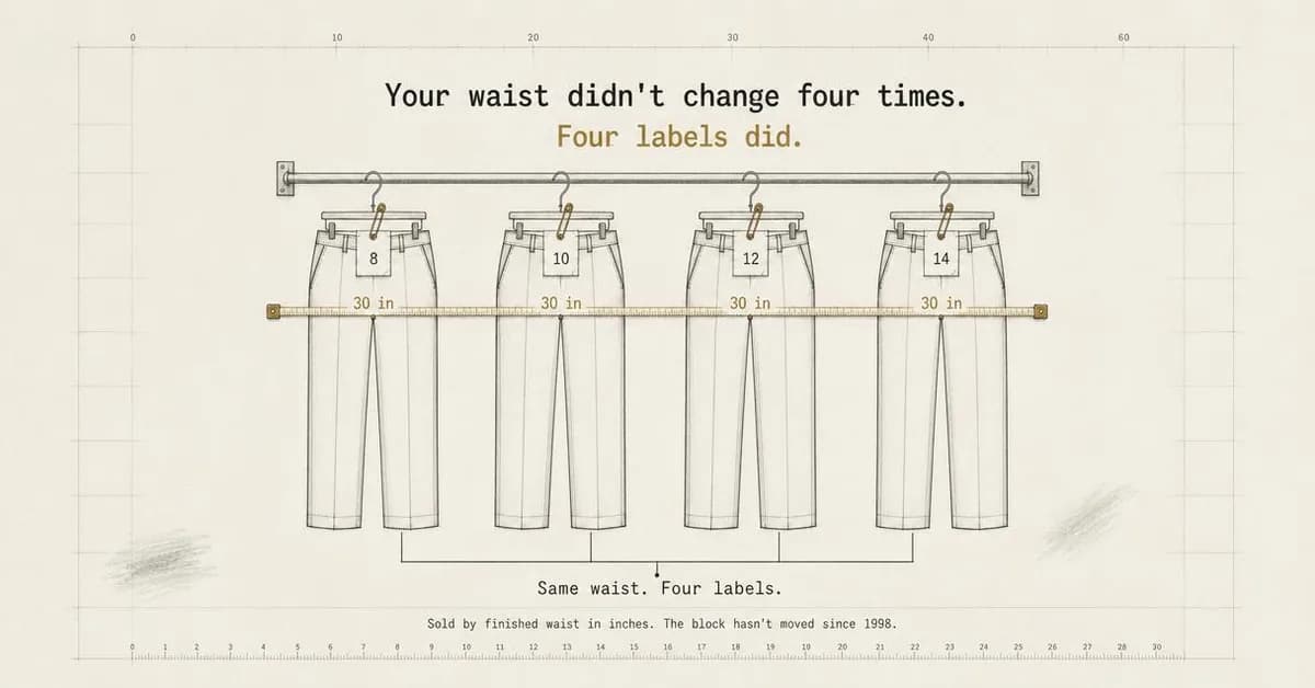 Example adSold by waist in inches, not labelsSee the brief →
The fit that outlives the product
Sales- Who it is for.
- Somebody who found one shirt nine years ago and dreads the day it is discontinued.
- Angle.
- Benefit & Outcome — The single most Facebook-shaped argument in apparel, and one Instagram has no use for at all: this reader is not looking for the next thing, they are trying to keep the current one. Storing measurements against a profile rather than a label turns a discontinuation into a non-event, and Ease is the family because the promise is the absence of a search rather than a better product.
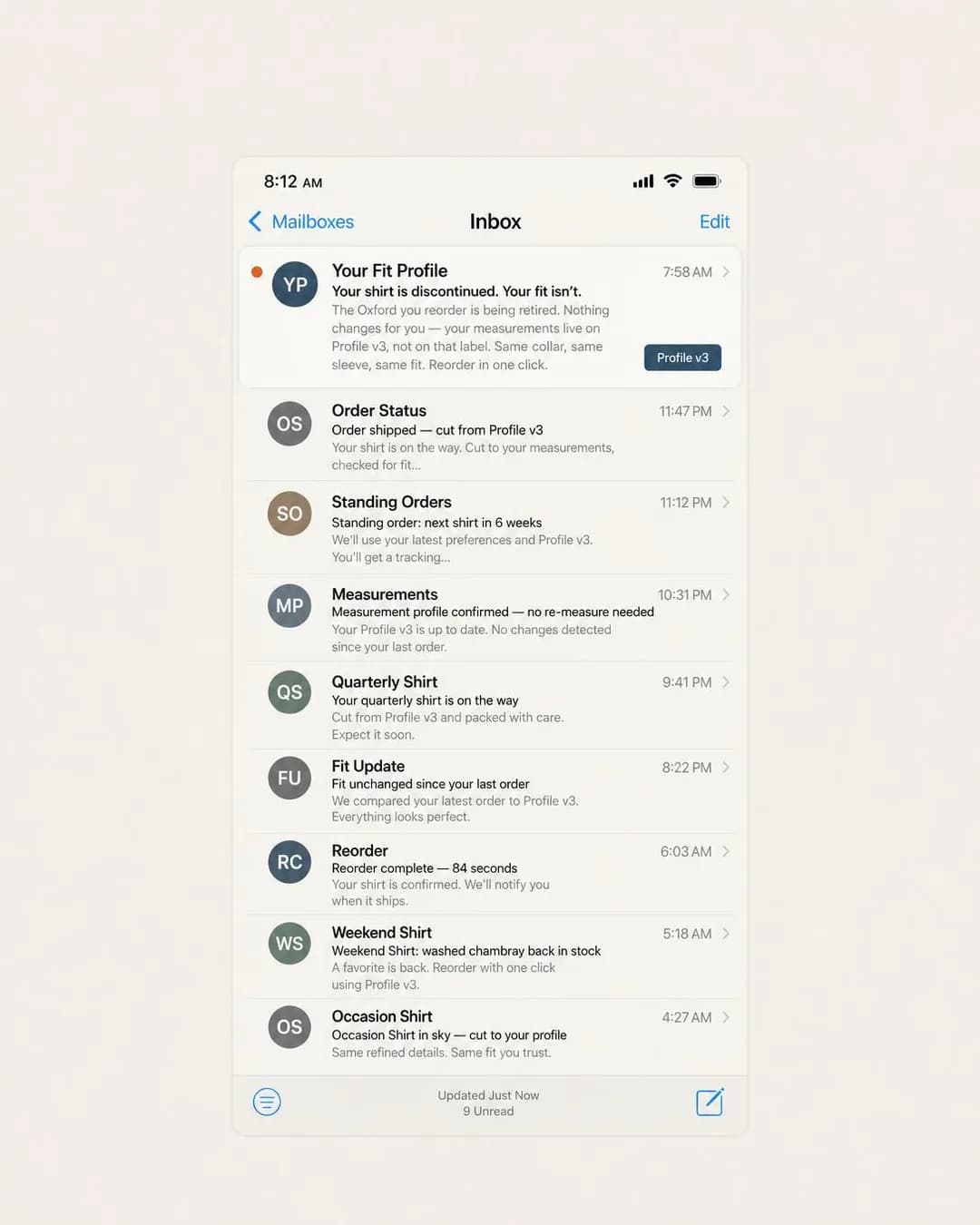 Example adYour fit doesn't get discontinuedSee the brief →
The care label as the product
Traffic- Who it is for.
- Anyone with good wool in the wardrobe that comes out twice a year because everything about it means a trip to the dry cleaner.
- Angle.
- Product & Mechanism — A specification that does the qualifying a lifestyle sentence would otherwise do. "Machine wash cold, tumble dry low" reaches every person too busy or too unwilling to visit a dry cleaner, and says nothing about them. It is also checkable, repeatable and printed on a label, which makes it the cheapest kind of trust to earn.
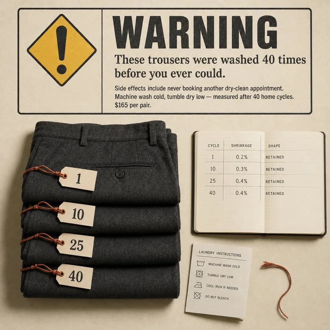 Example adTested 40 times. Still looks pressed.See the brief →
The size that will still exist next year
Sales- Who it is for.
- Somebody outside the range the high street stocks, who has given up on shops entirely.
- Angle.
- Proof & Trust — The batch's model sentence lives here: "E to 6E" reaches everyone who has worn the sides out of every shoe they own and asserts nothing about their feet. The proof is continuity rather than volume — a last that has not been re-cut in twenty years means a reorder is three numbers on a card, which matters more to a repeat buyer than any star rating.
 Example adSame last since 2004. Reorder by number.See the brief →
Proof the shop is real
Traffic- Who it is for.
- Somebody who ordered from a photograph once, waited six weeks, and now assumes every clothing advert in the feed is the same operation with a different font.
- Angle.
- Comparison & Positioning — On this app the competitor is not another brand, it is the genre of advertisement you are sitting inside. A decade of dropshipped apparel has trained this reader to look for the tell, so the differentiated claim is logistics: the return address, the delivery window, the actual parcel photographed beside the actual garment. It also arms the reader with a test they will apply to your competitors.
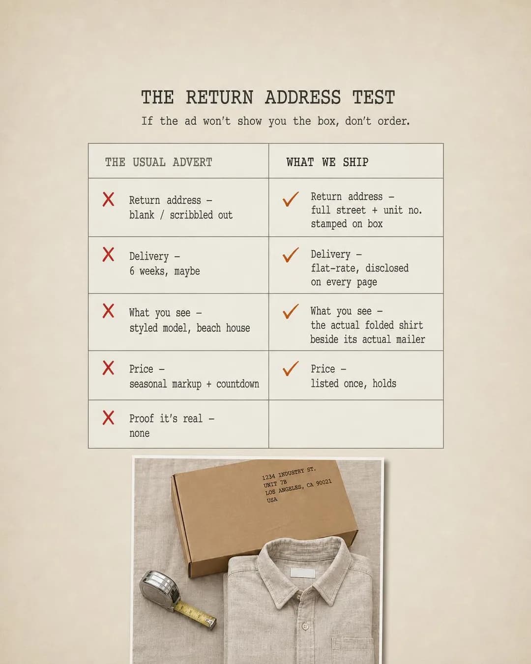 Example adIf they hide the box, don't orderSee the brief →
Send something before you sell something
Leads- Who it is for.
- Somebody buying one good jacket for a wedding, a funeral or a promotion, who will own it for fifteen years.
- Angle.
- Objection & Risk Reversal — The one offer in this cluster whose deliverable arrives in the post, and the reason Leads is a real objective on this app. A cloth cannot be judged on a screen, so a free swatch card removes the objection physically rather than promising to. Name the price in the ad: it filters the list down to addresses worth posting a card to.
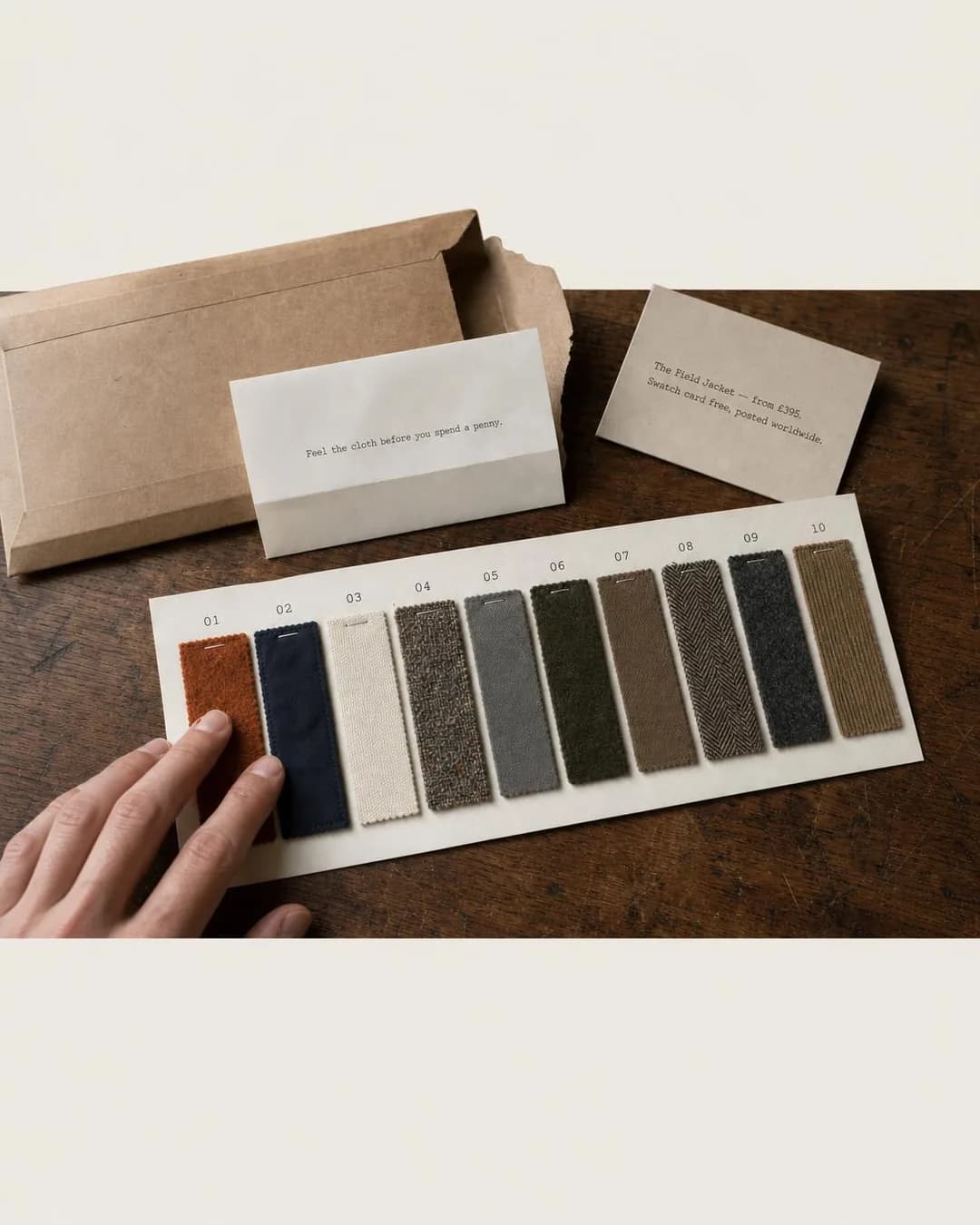 Example adFeel the cloth before you paySee the brief →
The decision made once
Sales- Who it is for.
- Somebody who would rather do almost anything than spend a Saturday in a changing room.
- Angle.
- Offer & Economics — A bundle sold as relief rather than as a discount. The saving is the least interesting thing in the offer — what converts is that the sizing decision happens one time and then stops. Put the arithmetic in the frame and make sure it adds up, because an anchor price is a factual claim about your own pricing.
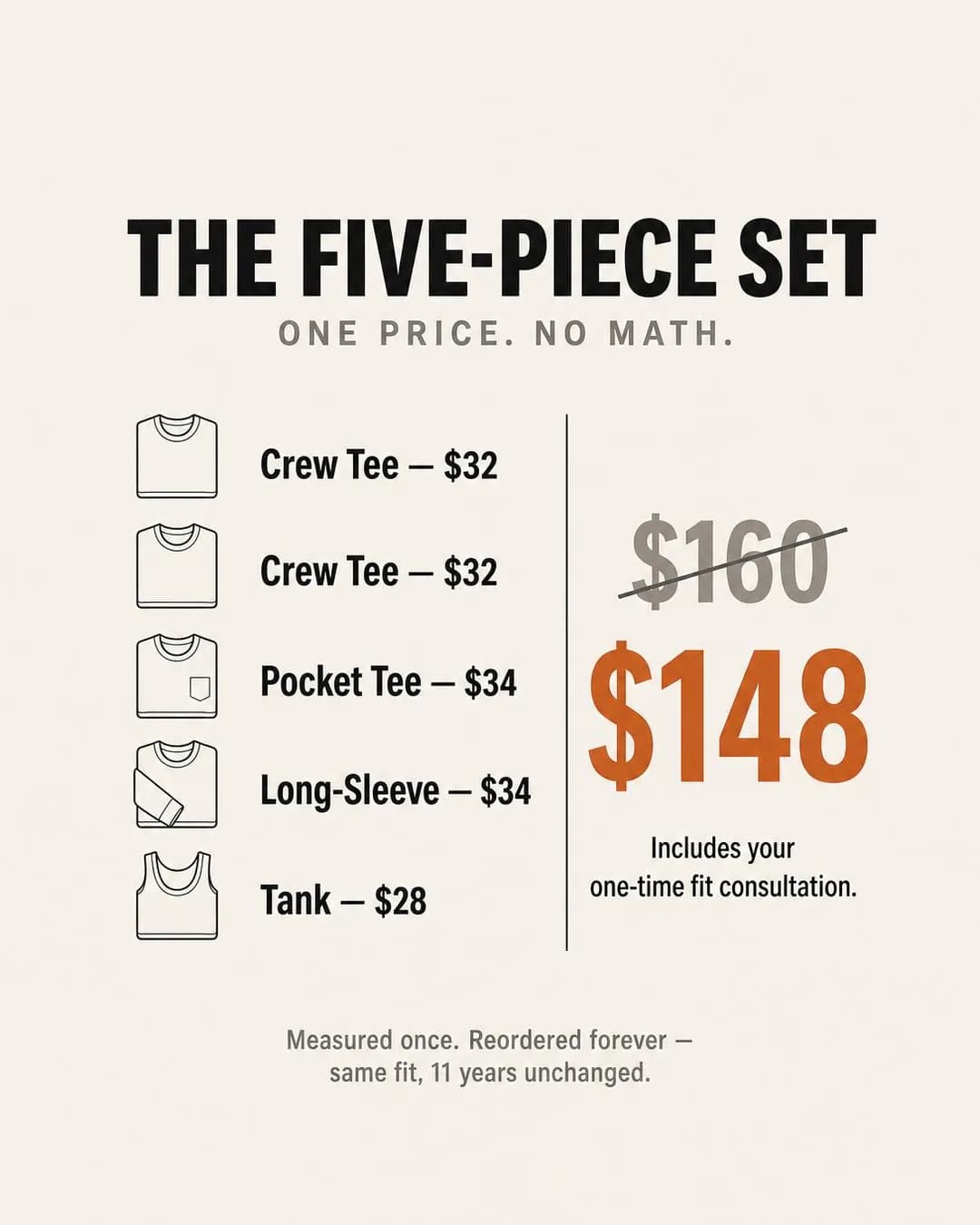 Example adFive pieces. One price. No math.See the brief →
It is back, in your size
Sales- Who it is for.
- Somebody who went to buy the thing they had been thinking about for a month and found their size gone.
- Angle.
- Scarcity, FOMO & Timing — The exact inverse of the drop, which is the scarcity argument on the Instagram twin. A drop sells something that has never existed to a reader who wants to be first; a restock sells something that already existed to a reader who missed it, and the scarcity is genuine because a knitting run has a number in it. Alert per size rather than per mailing list — the general version disappoints most of the people it reaches.
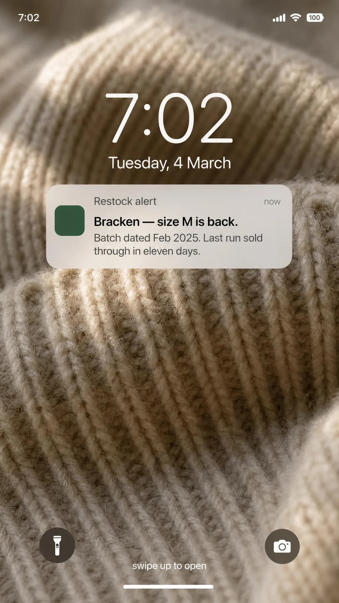 Example adBracken restocked. Eleven days last time.See the brief →
The gift that can be exchanged without a conversation
Sales- Who it is for.
- Somebody buying for a partner or a grown-up child, who knows the person and not the size.
- Angle.
- Identity & Emotion — Gifting is a mode this app has and the other does not, and the insight is that the failure is social rather than financial — the present was wrong and nobody could say so. A prepaid exchange card removes an emotional risk. It is also the safest place on this page to talk about a person, because the person is the recipient rather than the reader.
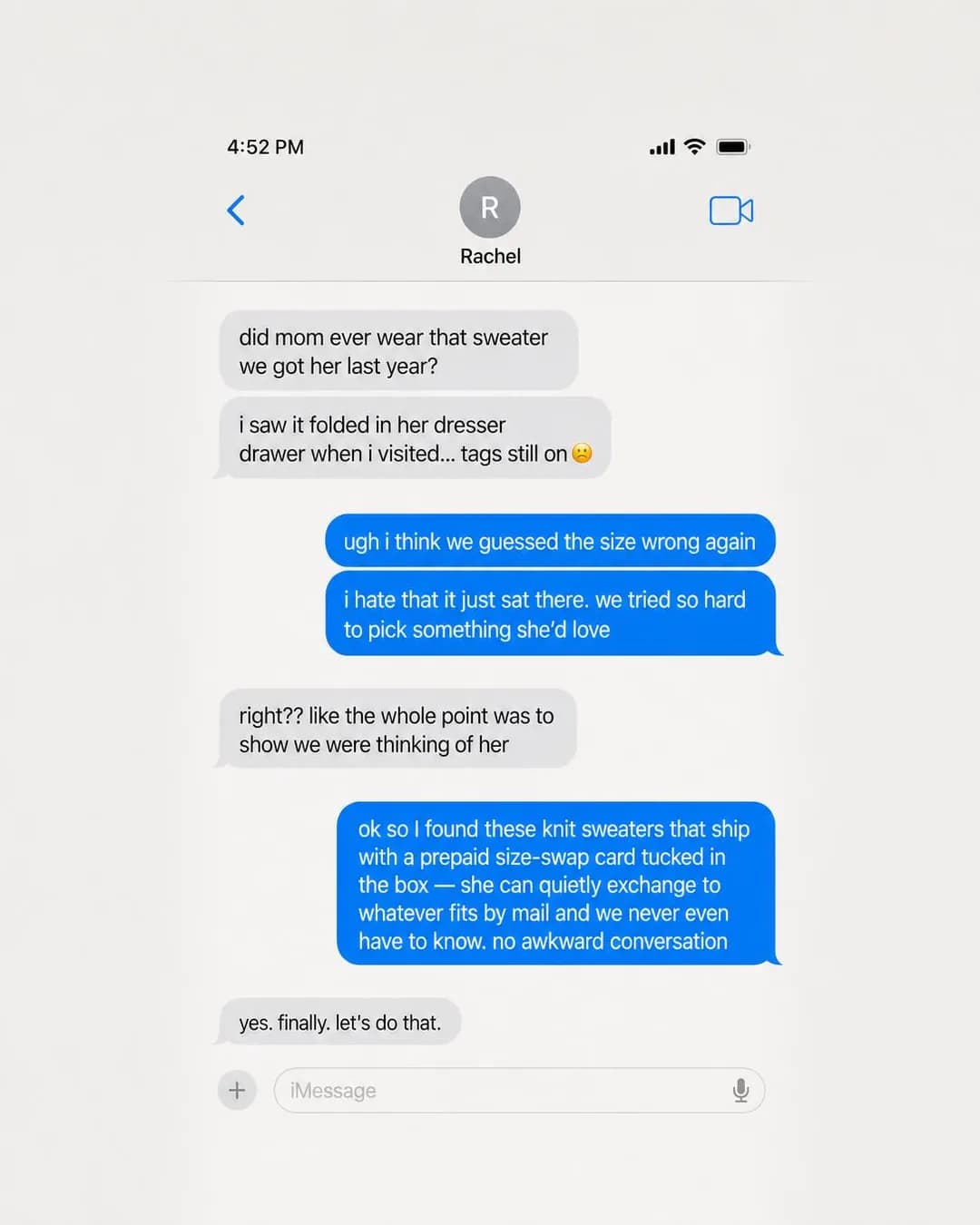 Example adKnitwear gifts that actually get wornSee the brief →
Where it is actually made
Awareness- Who it is for.
- Somebody with two near-identical jumpers open in two tabs at nearly the same price.
- Angle.
- Story & Founder POV — The row the Instagram twin left empty, and it answers that page's own condition: a founder or heritage story only works when it ends in a design choice a competitor did not make. Ending it in an object — a tag naming the machine and the week — turns a feeling about fashion into a tiebreaker. Buy it as Awareness; the reader has not decided to buy anything yet.
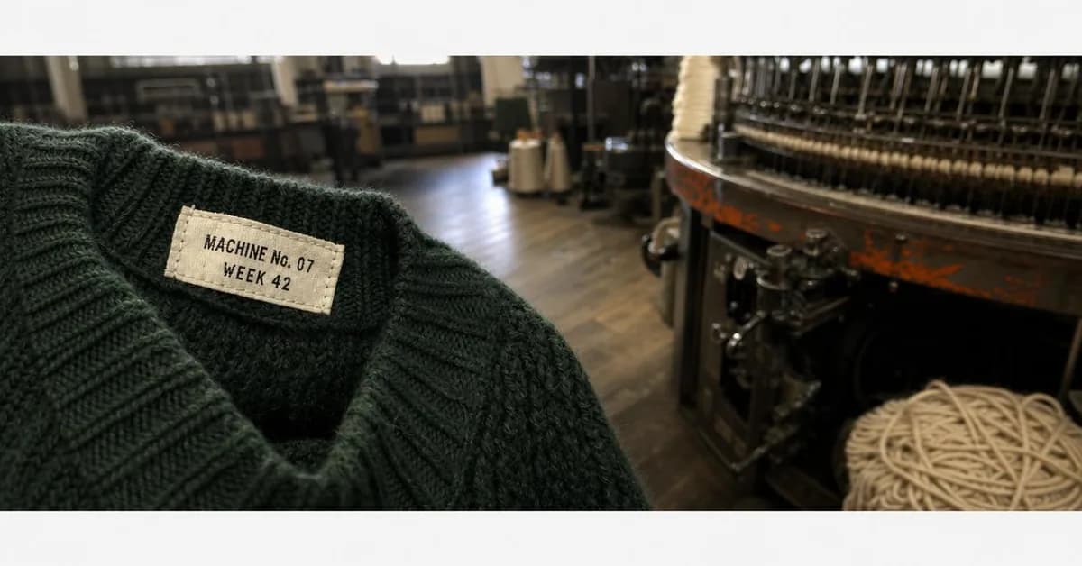 Example adMachine No. 07 made this oneSee the brief →
The printed catalogue
Leads- Who it is for.
- A customer who reads a paper catalogue over a weekend and orders on Monday, which is a real customer on this app and almost nowhere else.
- Angle.
- Offer & Economics — The second lead mechanic this audience still answers, and the batch skipped it because a catalogue that does not exist cannot be photographed honestly. Treat it as a genuine offer rather than nostalgia: it collects a postal address, it survives without a screen, and it reaches the part of this demographic that is on Facebook and not on your email list. Only run it if you will actually print and post one.
No example ad for this offer on the examples page yet.
Adaptive and easy-dressing garments
Sales- Who it is for.
- Somebody dressing with one hand, from a seated position, or around a device — or the person who helps them.
- Angle.
- Objection & Risk Reversal — The hardest case for this page's own rule, and the reason it is here without an example: the batch deliberately did not run it. The entire audience is defined by a disability or a medical condition, which is squarely on Meta's personal attributes list, so the copy cannot describe the customer at all. It has to describe the garment — magnetic closures, side-opening seams, a one-handed fastening — and let the specification do the finding. Where you can, address the ad to the carer rather than the wearer, which is the same move the gifting row makes.
No example ad for this offer on the examples page yet.
Select the customer you may not describe
Apparel is not one of Meta's special ad categories, so every lever survives — and on this app that matters more than it does on the twin, because the lever you most want is the one Instagram cannot deliver an audience for. Age is selectable. The 50–64 and 65+ bands are where this buyer is, and reaching them is an ad set decision rather than a creative one. Note the asymmetry that produces: you may target by age and you may not write about it, so the ad set and the copy are doing two different jobs, and only one of them is allowed to know who it is talking to.
Since 31 March 2020 every campaign created through the Marketing API has had to declare a special_ad_category even when the answer is NONE, so declare it and move on. The one thing to watch is that the category attaches to what an ad offers rather than to what a company sells: a creative promoting instalments, a store card or financing is a financial-products ad regardless of the fact that you sell jumpers, and that category carries housing's restrictions — fixed 18–65+ age, no lookalikes, no saved audiences, a forced radius. If you run a finance offer, that ad set loses the age lever this whole page is built on.
Everything else is ordinary and the ordinary answer is right. Go broad within the age band and let the garment do the rest — the segmentation that matters here is by body and by habit, and no picker has ever offered "wears a 4E" or "has three sizes of the same trouser". Exclusions are available to you, unlike in housing, and the two worth setting are recent purchasers on acquisition ad sets and serial returners on everything.
Two things this page will not tell you, because both are the sort of claim that gets repeated across marketing blogs until nobody remembers where it came from. First, which specific detailed-targeting interests currently exist for clothing or shopping behaviour: Meta has narrowed detailed targeting repeatedly and the honest instruction is to open the picker in your own account. Second, whether a given interest "still works" — the recommendation is to go broad regardless, so the answer changes nothing.
The last lever is the one everybody forgets on this app: placement. Advantage+ will put your 4:5 feed export into Marketplace as a square and into the right-hand column at a size where a paragraph of body copy is a smear. Either accept that and design a composition that survives it, or turn placements off for the ads where the frame carries the argument — which for apparel is most of the good ones.
- Special ad categoryDeclare NONE
- Apparel is not one of the four. Every lever survives — but the declaration is still mandatory on every campaign created through the Marketing API since 31 March 2020, and the category attaches to what the ad offers, not to what you sell.
- AgeUse it — and never write it
- The lever the whole page turns on. 50–64 and 65+ are where this buyer is and Facebook is the only app that delivers them at scale. Selecting an age band is fine; telling the reader you selected it is a personal attributes violation.
- Broad + garment filterUse it
- Within the age band, go broad and let the specification qualify. A width fitting, a finished inseam or a care instruction selects the people no picker offers, and does it inside the copy without asserting anything.
- Detailed targetingCheck your own account
- Meta has narrowed this repeatedly and the options move. Open the picker rather than trusting a list from a blog post — and because the recommendation is to go broad anyway, the answer rarely changes the plan.
- ExclusionsUse it
- Available here, unlike in housing. Exclude recent purchasers from acquisition ad sets, and exclude serial returners from everything — in apparel a returner is a negative-margin customer, not a warm one.
- Finance offersCareful
- An ad promoting instalments, a store card or financing is a financial-products ad even though you sell clothes. That ad set inherits fixed 18–65+ age, no lookalikes and no saved audiences — which removes the age lever this page depends on. Run finance creative in its own campaign.
- PlacementsDecide it
- Nine image surfaces filled from one export. Marketplace wants a square, the right-hand column renders small, and Advantage+ will send your portrait to both. Turn it off for the ads whose argument is inside the frame.
- GeographyDecide it
- Ship-to reality rather than reach. Duties, return shipping cost and delivery time decide which markets are profitable, and a cheap impression somewhere you cannot economically accept a parcel back from is a loss dressed as efficiency.
Where the click should land
The product page for the item in the ad, same as the Instagram twin, and for the same reason: an ad that argued about one inseam landing on a grid of forty trousers has handed the reader back the search problem it just solved. What changes here is what has to be on that page. On Instagram the two things to put above the fold are the size guide and the returns policy. Here it is those two plus the things that prove you exist — a street address, a phone number, a returns address in the same country, a company registration. This reader is checking.
Do not put the size guide behind a modal or ship it as an image. This is the buyer most likely to be reading on a large screen with text scaled up, and a size chart rendered as a JPEG is unreadable at 150% and invisible to a screen reader. It is also the single most-visited page on an apparel site for this audience, and treating it as a footnote is the most common own goal in the category.
Lead forms are worth more here than on the twin and only for something that physically arrives: a swatch card, a fabric sample, a printed catalogue. Use an Instant Form on Higher intent so there is a review step, ask for a postal address because that is the whole point, and do not run it if you are not actually going to post anything. A lead form standing between this reader and a checkout is a step that costs a sale and buys an email address.
One placement-specific note. If Advantage+ is on, some of your traffic will arrive from Marketplace, which is a shopping surface with its own expectations — people there are browsing listings, not reading brand pages. A click from Marketplace landing on a lookbook converts worse than the same click landing on a priced product page with a delivery date on it.
The recommendation: The product page for the item in the ad, with the size guide as real text and the company's real address above the fold. Lead forms only where something is genuinely posted out — a swatch, a sample, a printed catalogue.
Creative direction
The first rule is the policy rule and it is a creative rule, not a legal footnote: the ad talks about the garment and never about the reader. Every argument you want to make has a version pointing at the product and a version pointing at the person, they select exactly the same audience, and only one of them can run. "E to 6E, resoleable" instead of "for wide feet". "Finished waist in inches" instead of "if your size keeps changing". "Machine wash cold, tumble dry low" instead of "nobody has time for the dry cleaner". Write the product version first and you will rarely have to catch the other one.
Our own batch is the evidence that this works at the brief rather than at the review. Ten ads were written to that rule and not one came back naming an age, a body or a condition — which is worth contrasting with the gym batch on this site, where ten briefs written to avoid body transformation still produced "SAME BODY" rendered into an image, because there the offer itself was about the body. If the thing you are selling is a garment specification, the copy has nowhere else to go. If it is a transformation, no amount of steering keeps it away.
The second rule is the one the same batch failed, five times out of ten, and it is the expensive one: where a direction offers a place to put proof, the model fills it. A wash-test logbook came back with four rows of shrinkage percentages nobody measured. Two ads spoke in the first person as customers who do not exist. A gift ad rendered a private text conversation between two named siblings about their mother. A linen ad — whose entire argument is that its return address is real — stamped a specific Los Angeles garment-district address on the parcel. None of that was asked for and all of it is the same failure: an evidence slot in the composition and no evidence to put in it. If you cannot substantiate a number or a person this week, choose a direction with nowhere to put one.
Then the frame, which on this app is not the frame you designed. Advantage+ placements fill nine image surfaces from one export, so compose 4:5 for the feed with a square crop out of the middle that still works. Check the re-framed file rather than the square draft: two of the nine non-square exports in our batch arrived with the original picture inset inside the new canvas and white bars top and bottom, and on 1.91:1 — which routes to the smallest surfaces on the app — that costs a sixth of an already small asset.
- Write about the garment, never about the reader. Age, disability and physical or mental health are on Meta's personal attributes list, and a question mark is not an exemption — "Struggling with wide feet?" is the same assertion as "For wide feet".
- Put the qualifying in a specification. A width fitting, a finished waist in inches, an unhemmed inseam or a care instruction selects the same people a demographic sentence would, and asserts nothing about any of them.
- Twenty-seven characters is room for a noun, not a claim. Two of the fifty headlines our batch produced fit Facebook Feed's recommendation, and both named a single object rather than making an argument.
- Lead with continuity, not novelty. Reorder, restock, resole, the block that has not moved since 1998 — this reader is trying to keep something, not find something.
- Prove the shop exists. A decade of dropshipped apparel advertising has trained this audience to look for the tell, so a real return address, a delivery window and a photograph of the actual parcel do work that styling cannot.
- Never invent a reviewer, a customer, a conversation or a test result. Half our batch did one of the four unprompted, and each one is the kind of claim that gets an account restricted rather than an ad rejected.
- Check the rendered numbers three ways: the sum, the quantity, and the derived figure. And check rendered interfaces too — an inbox mock-up in our batch had timestamps in no order and a nine-unread badge over one unread row.
- Check any rendered address, URL or product name against the real world. A street address in a fake ad is somewhere a real business trades, exactly as a rendered domain is one somebody can register.
- Compose for a square crop and open the re-framed export before you upload it. Two of nine non-square exports in our batch were the square picture padded rather than re-composed.
- Set the size guide in real text on the landing page, not as an image. This is the audience most likely to be reading at 150% zoom, and it is the page they visit most.
Funnel structure
Three stages, and the differences from the Instagram twin are all at the ends. At the top, more of the budget goes to establishing that you are real and that the sizing is honest, because this reader will not buy from a brand they have not verified — which is why our batch is Traffic-heavier at the front than a pure Sales structure would be. At the bottom, the customer stage is worth more than it is on the other app: a buyer who has found a garment that fits will reorder it for years, and that is the cheapest revenue in the account.
The middle stage is where the apparel-specific work sits, and it is objection handling rather than reminding. Somebody who looked at a product page and left almost always left for one of two reasons — they were not sure it would fit, or they were not sure about you. Retarget with the answer to each rather than with the same product photograph and a discount, which reads as a brand that was overcharging the first time.
Cold
≈55% of budgetAudience. Broad within the age bands you actually sell to, geography set to where you can ship and accept a return, recent purchasers and serial returners excluded.
Running. The four things this reader checks before anything else: that the sizing is measured, that the care is realistic, that the range still exists, and that the shop does. Traffic for the first three, Sales for the priced item they came for.
Warm
≈25% of budgetAudience. Anyone who reached a product page and left, split by which of the two doubts sent them away — size-guide readers in one bucket, everyone who bounced off the brand itself in the other.
Running. The two objections, answered separately: will it fit (the size chart, the fitting card, the swatch) and are you real (the address, the returns terms, the mill). Not the same photo with money off.
Customers
≈20% of budgetAudience. Past purchasers, segmented by what they bought and how long ago — and by size, if you can.
Running. The restock in their size, the reorder, the second colour, the gift with the exchange card in it. The cheapest revenue you have, and worth buying deliberately rather than letting an acquisition campaign buy it and call it growth.
Budget and testing
The learning-phase arithmetic is the same everywhere and lands differently for every business: roughly 50 optimisation events per ad set per week to leave the learning phase, so multiply your own cost per purchase by 50 and that is the weekly spend at which one ad set is fully optimised. For apparel it turns entirely on average order value — 50 purchases a week is routine at €40 and a serious budget at €400. If the number is out of reach, consolidate ad sets rather than splitting the audience further, and accept that you are reading a fortnight rather than a week.
The specific temptation on this app is to keep adjusting the age band, and that is a significant edit: it restarts the learning phase in the same way a new optimisation event or a new creative does. Narrowing 45–65+ to 50–64 because the reports look better in one row costs you a fortnight of delivery to buy a distinction the creative was never allowed to make anyway.
The calendar itself is different on this app and it is the part most apparel media plans get wrong. Instagram's fashion calendar is drops and seasons. This one is gifting: Christmas, Mother's Day, Father's Day, and the long tail of birthdays that a gift-with-exchange-card offer serves all year. Auction prices in the six weeks to Christmas are the highest you will pay, and the honest move is the same one the gym guide makes about January — buy the month before the peak, when the same customer is deciding and nobody is bidding against you.
Finally the number Ads Manager cannot show you, and it is worse here than on the twin. Returns in apparel arrive weeks after the sale and never appear in reported ROAS, and this audience returns more than a younger one does, for the specific reason that fit is less predictable on a body the industry does not cut for. So reconcile on net revenue after returns on a three-to-four week lag before scaling anything, and read a high return rate on one ad as a creative fault: an ad that oversold the fit is what produced it.
- Test which specification does the qualifying. Inseam against waist, width against last, care label against cloth — the range between them is far wider than the range between two photographs of the same garment.
- Test the product version of a sentence against the reader version — where the reader version is even runnable. It is usually the weaker ad as well as the riskier one.
- Give every test a full week before reading it, and two if your order value puts fifty purchases out of reach — the learning phase is measured over seven days, so a Wednesday verdict on a Monday change is noise.
- Keep two numbers per ad: the one Ads Manager reports today and the one the warehouse reports a month later. The gap between them is the only apparel metric that decides anything.
- Sort returns by which ad bought the sale, not by SKU. On this app the culprit is usually a fit claim written for a body rather than for a garment, and it is invisible everywhere else in the account.
- Spend the month before each gifting peak rather than the peak itself. The same customer is deciding and the auction is cheaper.
Seven of these ads, in full
Every ad below was generated by best-in-slot for a clothing brand that does not exist, with its audience, angle and objective pinned before the run — and published exactly as it came back. They are seven of the Facebook examples for a clothing brand; the rest, with the full brief and the alternate headlines behind each one, are on that page.
Problem & Pain · 1.91:1 · Traffic
Sold by waist in inches, not labels
Written for: Women who own four sizes of the same trouser.
The full brief and why it works →
Proof & Trust · 1:1 · Sales
Same last since 2004. Reorder by number.
Written for: People with wide feet.
The full brief and why it works →
Comparison & Positioning · 4:5 · Traffic
If they hide the box, don't order
Written for: People burned by a linen dress advert.
The full brief and why it works →
Product & Mechanism · 1:1 · Traffic
Tested 40 times. Still looks pressed.
Written for: Owners of wool they never wear.
The full brief and why it works →
Scarcity, FOMO & Timing · 9:16 · Sales
Bracken restocked. Eleven days last time.
Written for: People who missed it last time.
The full brief and why it works →
Identity & Emotion · 4:5 · Sales
Knitwear gifts that actually get worn
Written for: People buying clothes for someone else.
The full brief and why it works →
Story & Founder POV · 1.91:1 · Awareness
Machine No. 07 made this one
Written for: Someone choosing between two identical jumpers.
The full brief and why it works →
Mistakes specific to this trade
The first two are the ones that get accounts restricted rather than ads rejected, and they are both consequences of writing the sentence that comes naturally.
Naming the reader's age, body or condition
"Trousers for women over 50." "Since the menopause." "Struggling with wide feet?" All three assert a personal attribute about the person seeing the ad — age, a medical condition, a physical characteristic — and Meta's standards cover them. The question form is not an exemption. Every one of these has a product-side version that selects the identical audience: a finished waist in inches, a width fitting, a care instruction. Write that one.
Running a finance offer in the same campaign as everything else
The special ad category attaches to what an ad offers rather than to what you sell, so a creative promoting instalments or a store card is a financial-products ad even from a knitwear brand. That declaration brings housing's restrictions with it: fixed 18–65+ age, no lookalikes, no saved audiences. It removes the age lever this whole page depends on, so keep finance creative in its own campaign rather than letting it constrain the rest.
Running your Instagram creative on Facebook
It is the same brand and it is not the same customer. The other app's audience is discovering: a new label, a drop, a look. This one is replacing something they already own and cannot find. A drop announcement to somebody trying to rebuy the cardigan they wore out is an advert for a shop that has nothing they want.
Letting the picture invent the evidence
Five of the ten ads on our Browse page did this without being asked: a wash-test log with shrinkage percentages, two first-person customers who do not exist, a fabricated private text conversation, and a real street address stamped on a parcel. Every one is the same failure — a composition with an evidence slot and no evidence. If you cannot substantiate it this week, pick a direction with nowhere to put it.
Shipping a rendered address, URL or product name unchecked
The linen ad on our Browse page stamps a specific Los Angeles garment-district address on its box, in the one ad whose argument is that the address is genuine. Somebody occupies that unit. The same class of fault has produced a real top-level domain and a real discontinued product name in earlier batches on this site. Read every word inside the frame against the real world before it runs.
Shipping the size guide as a JPEG
It is the most-visited page on your site for this customer and the one most likely to be read at 150% zoom on a large screen. As an image it is unreadable when scaled, invisible to a screen reader, and impossible to search. Set it as text, put it above the fold, and give the ad somewhere to send the reader who is checking.
Not proving the shop is real
This audience has been trained by a decade of dropshipped apparel advertising to look for the tell before they look at the garment. A street address, a phone number, a returns address in their own country and a delivery date do more for conversion than another photograph. It is also the cheapest differentiation available, because most of the ads next to yours cannot make the claim.
Sending the click to a collection page
Whatever the ad narrowed to — a width fitting, a finished waist, one discontinued cardigan in one colour — a collection page widens it again, and the reader has to redo the work the ad just did for them. Land on the item itself, with the measurement table and the returns address readable without a tap.
Retargeting with the same photograph and money off
Somebody who left a product page left because they were unsure about the fit or unsure about you. A discount answers neither, and to this customer it mainly says the first price was wrong. Retarget with the size chart, the swatch, the return address or the resole service.
Spending only in the six weeks before Christmas
It is the most expensive auction of the year and the same customer was deciding a month earlier at a fraction of the price. Gifting is this app's apparel calendar rather than the drop calendar, and it runs all year — a gift with a prepaid exchange card in it is a birthday offer as much as a December one.
Scaling on reported ROAS and ignoring returns
Returns land weeks after the sale, never appear in the number you are optimising against, and run higher for this customer than a younger one because fit is less predictable on a body the industry does not cut for. Reconcile on net revenue on a lag, and treat a returns spike on one ad as a creative fault rather than a logistics one.
Uploading a re-framed export you have not opened
Two of the nine non-square exports in our batch came back as the square picture inset in the new canvas with white bars top and bottom, and both read as deliberate white space until they were measured. On 1.91:1 that is a sixth of an asset that already renders small. Open the file you are actually uploading.
Questions
- Do Facebook ads work for clothing brands?
- They work for a customer Instagram does not reach. Pew's November 2025 survey puts Facebook at 74% of 50- to 64-year-olds and 57% of over-65s, against Instagram's 40% and 19% — a clothing buyer with money whose size the high street has narrowed. What does not work is running your Instagram creative here: that audience is discovering a brand and this one is trying to replace something they already own. Eight of the ten ads on our Facebook examples page are about getting the same thing again.
- Can I say my clothes are for women over 50?
- Not in the ad. Meta's Advertising Standards prohibit ads that assert or imply personal attributes about the person seeing them, and age, disability and physical or mental health are all on the list — and a question mark does not help, so "Struggling with wide feet?" is the same assertion as "For wide feet". You can select the age band in the ad set, which is where the qualifying belongs on this app. In the copy, put it in a garment specification instead: a width fitting, a finished waist in inches, an unhemmed 34-inch inseam. It reaches the same people and asserts nothing about any of them.
- Which objective should an apparel brand buy on Facebook?
- Sales, exactly as on Instagram — apparel is one business model and a purchase still completes in the ad's own session. Our Facebook batch is five Sales, three Traffic, one Leads and one Awareness against Instagram's six, three, one and none, which is the point: unlike software, the industry does not change buyer when you change app. What does change is that more of the work is arguing before the checkout, so Traffic carries more weight, and Leads is genuinely real here because this audience will still give you a postal address for a swatch card or a printed catalogue.
- How long should a Facebook headline be for an apparel ad?
- Twenty-seven characters, which is shorter than Instagram's 40 and shorter than almost anyone expects. We measured it: the ten ads on our examples page produced fifty headlines and two of them fit. Every specification headline overran — "E to 6E. Cut once. Still available." is 35 — and the two that fit both named a single object rather than making an argument. Nothing is rejected for being longer, Meta truncates, but truncation lands first on the smallest surfaces, so put the noun first.
- What should the ad send people to?
- The product page for the item in the ad, with the size guide as real text and the company's actual address above the fold. Not a collection page — the ad just solved a search problem and a grid of forty items hands it straight back. Use a lead form only for something that physically arrives: a swatch card, a fabric sample, a printed catalogue. A form between this reader and a checkout costs a sale and buys an email address.
- Why do my apparel ads get engagement but no sales?
- On this app it is usually because the ad has not established that you are real. This audience has spent a decade being shown beautifully photographed clothes that arrive in six weeks from an address nobody will print, so they look for the tell before they look at the garment. A return address, a delivery date, a phone number, a photograph of the actual parcel — those do more for conversion here than styling does, and most of the ads next to yours cannot make the claim.
- How should I judge whether the ads are working?
- On net revenue after returns, reconciled on a three-to-four week lag, rather than on the ROAS in Ads Manager. Returns arrive weeks after the sale and never appear in the number you are optimising against, and they run higher for this customer because fit is less predictable on a body the industry does not cut for. A returns spike on one specific ad is nearly always a creative fault: an ad that oversold the fit is what produced it.
Sources
Every platform claim on this page was read against these on . Meta’s policies move; if one of these disagrees with this page, it is right and we are stale.
- Meta ads guide — image ad specifications, Facebook Feed (4:5 at 1440 × 1800; primary text 50–150, headline 27; aspect-ratio tolerance 3%)
- Meta ads guide — image ad specifications, Instagram Feed (headline 40, primary text 125; aspect-ratio tolerance 1%)
- Meta Advertising Standards — privacy violations and personal attributes (age, disability, physical or mental health)
- Meta Marketing API — special ad categories (apparel is not one; NONE must still be declared since 31 March 2020)
- Meta Business Help Centre — about the learning phase
- Meta Business Help Centre — significant edits and the learning phase
- Meta Business Help Centre — choosing Ads Manager advertising objectives
- Pew Research Center — Americans' social media use, November 2025
That is the playbook. Now make the ads.
Paste your store. It reads your products, your customers and your look, then writes the concepts, renders the images and drafts the copy — for the one feed already full of clothes.
No credit card · 50 free credits (about 5 ads or Instagram posts)
Every angle recommended above is documented in the best-in-slot ad angle library, and the ads are from fashion facebook ad examples. More industries are at all ad guides.