
Ad Angle Library #1 · 10 angles
Problem & Pain ad angles
Make the current state feel relevant, painful, or costly.
Every angle in this family makes the same bet: that the fastest way to earn a stranger’s attention is to describe their own life back to them, accurately. Not the product. Not the offer. The thing that was already annoying them before your ad turned up.
That is why these ten carry cold traffic better than almost anything else in the library. A benefit claim asks someone to imagine a future they have no reason yet to believe in. A problem statement asks them to recognise a present they are already living in — and recognition is involuntary. They have identified themselves before they have decided to be interested.
The failure mode is just as consistent. Pain is easy to write and hard to write well, and the distance between an ad that feels seen and an ad that feels accused is about four words. Every angle below has a version that works and a version that gets you muted, so each one here comes with the line that separates them.
The ten are not ten ways to say “this is bad”. They differ on where the pain sits. Callout names it. Agitation makes you feel it. Symptom Stack widens the net so more people find themselves in it. Hidden Problem argues it exists at all. Misdiagnosis moves the blame. Mistake and Bad Habit put the cause in the reader’s own hands — once, and repeatedly. Friction shrinks the whole thing down to one irritating moment. And the last two put a number on it, which is the only thing in this family that answers “why now”.
Which one, when
- ColdProblem Callout · Symptom Stack · Hidden Problem · Mistake
- They don’t know you and may not have named the problem yet. Recognition first: the job is to make someone think “that’s me”, not to explain anything.
- Cold–MidProblem Agitation · Misdiagnosis / Reframe · Bad Habit · Friction / Annoyance
- The problem is accepted; the cause isn’t. These deepen the feeling, move the blame, or shrink the problem to one concrete moment the reader can’t argue with.
- Mid–HotCost of the Problem · Cost of Inaction
- They know. They’ve been meaning to fix it. Only these two answer “why now”, and only these two make your price look small by comparison.
About the examples. Every ad below was generated by best-in-slot for best-in-slot — one product, one underlying problem, 10 different arguments about it. That repetition is the point: hold the product and the pain still, and the angle is the only thing left changing. Each is shown exactly as it came out.
Problem Callout
Cold–MidNames the core problem directly. Example: “Still wasting hours on X?”
The simplest ad in the library, and the one most teams skip because it looks too obvious to bother testing. It does exactly one job: state the problem in the audience’s own words, early enough that somebody scrolling decides in well under a second whether this is about them. No agitation, no mechanism, no proof.
Its power is self-selection, not persuasion. A callout is a filter — deliberately losing everyone the problem doesn’t apply to and holding everyone it does. That is also why the plain version usually beats the clever one in cold testing: cleverness spends the half-second in which recognition was supposed to happen.
The whole thing lives or dies on specificity. “Struggling with your marketing?” is not a callout, it’s a category. “Four campaigns live and no idea which one made the sale” is a callout. Write it the way a customer complains about it — steal the sentence from a support ticket, a review, or a sales call, and resist the urge to tidy up the grammar.
- Works because
- Immediate relevance and strong self-selection.
- Fails when
- Can feel generic if the problem is obvious or overused.
Write one like this
- Still building every ad from a blank Canva page?
- Four campaigns live. No idea which one made the sale.
- You have 200 product photos and not one of them is an ad.
- Your best ad is three months old and you know it.
Don’t write the category. A callout that could run unchanged for ten competitors isn’t a callout, it’s a headline.
Still filling out a 40-field form before your first ad? Every ad tool starts with the same exhausting questionnaire — forcing you to explain your own business back to a machine. It's the exact moment most founders quit. best-in-slot skips it entirely. Paste your website link, get a finished Meta ad in ~1 minute. No forms, no guesswork, no wasted afternoon.
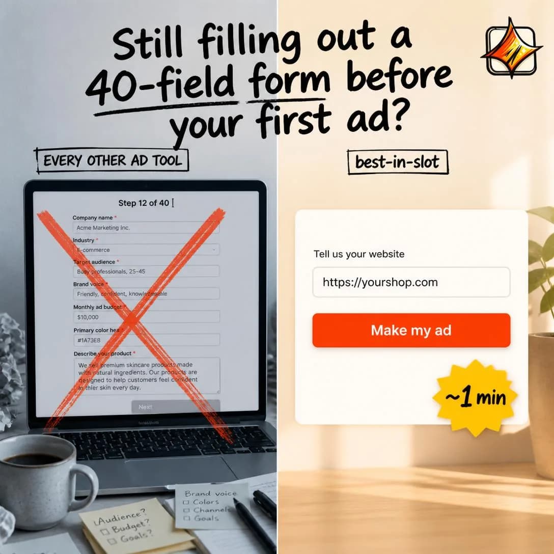
No 40-field form. Just your link.
From website to Meta ad in ~1 min
Problem Agitation
Cold–MidExpands the pain, frustration, or consequences of the problem before presenting relief.
Callout names the problem; agitation holds the reader in it a beat longer than is comfortable. It’s the difference between “ads take too long to make” and eleven o’clock on a Sunday, the fourth resize, the export that came out blurry, the client email still sitting unanswered.
The mechanic is concreteness, not volume. Agitating doesn’t mean more adjectives, it means more specific nouns. Pain generalises terribly — “frustrating and time-consuming” describes nothing anyone has ever actually experienced — and particularises brilliantly. One true detail the reader has personally lived beats a paragraph of sympathy.
It also buys you the right to sell. Relief only lands in proportion to the tension set up in front of it, which is why agitation is almost always the first act of a longer ad rather than an ad by itself. The moment the reader thinks “yes, exactly, and it’s worse than that” is the moment your product becomes interesting. Get there in three to five seconds, then turn.
- Works because
- Creates emotional urgency and makes the status quo feel costly.
- Fails when
- Can feel manipulative or overly negative if pushed too far.
Write one like this
- It’s 11pm on Sunday. You’re resizing the same image for the fourth time.
- Three hours an ad. Four ads a week. Now do that for a year.
- The brief said “something fun”. It is now day six.
- You didn’t start a business to spend Sundays in Canva.
Don’t agitate past the turn. An ad that ends while the reader is still in the pain has spent their attention making them feel bad — and handed the relief to whoever advertises next.
You've abandoned more ad tools than you've launched ads. That half-finished setup form still haunts your browser tabs — the one asking for your 'brand personality adjectives' on question 14. Every day it sits there, your competitors keep showing up in the feed while your ad budget collects dust. The friction isn't in running ads. It's in the 22-question gauntlet you have to survive first. We deleted the form. Paste your website, get a finished ad in ~60 seconds. No questionnaire. No uploads. No excuses left.
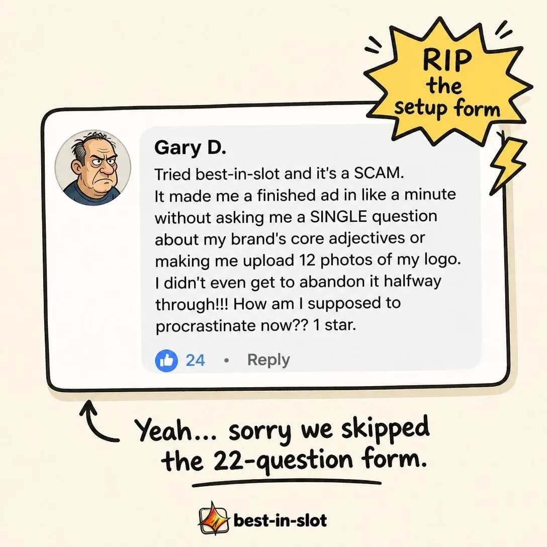
RIP the 22-question setup form
Website → finished ad in ~1 min
Symptom Stack
ColdLists several manifestations of one underlying problem so prospects recognize themselves.
One underlying problem, listed as the three or four different ways it actually shows up. The reader doesn’t need to match all of them; matching one is enough to be pulled in, which is precisely why this angle reaches wider than a single callout ever can.
It earns its place when your buyers describe the same root problem in incompatible language. A bookkeeping tool’s customers don’t say “my bookkeeping is disorganised” — they say the VAT deadline snuck up, the receipts are in three places, the accountant keeps asking for the same file. Stack those and all three recognise themselves, even though none of them would ever have searched for the root cause.
The format does structural work in the creative, too: a natural list layout for statics, a card per symptom for carousels, a rhythm of quick cuts for video. Keep it to three or four. The fifth symptom is where the ad stops being a mirror and starts being a survey.
- Works because
- Broadens recognition and gives the viewer multiple reasons to identify with the ad.
- Fails when
- Too many symptoms can dilute the core message.
Write one like this
- Receipts in the glovebox. Invoices in your inbox. VAT due Friday.
- Pick the one that’s you: no time, no designer, or no idea what to post.
- A logo, a font, and 40 product photos — and still nothing to run.
- Three tabs, two freelancers, one deadline.
Don’t stack symptoms of different problems. A list that wanders from cost to time to quality reads as a feature checklist, and the reader stops looking for themselves in it.
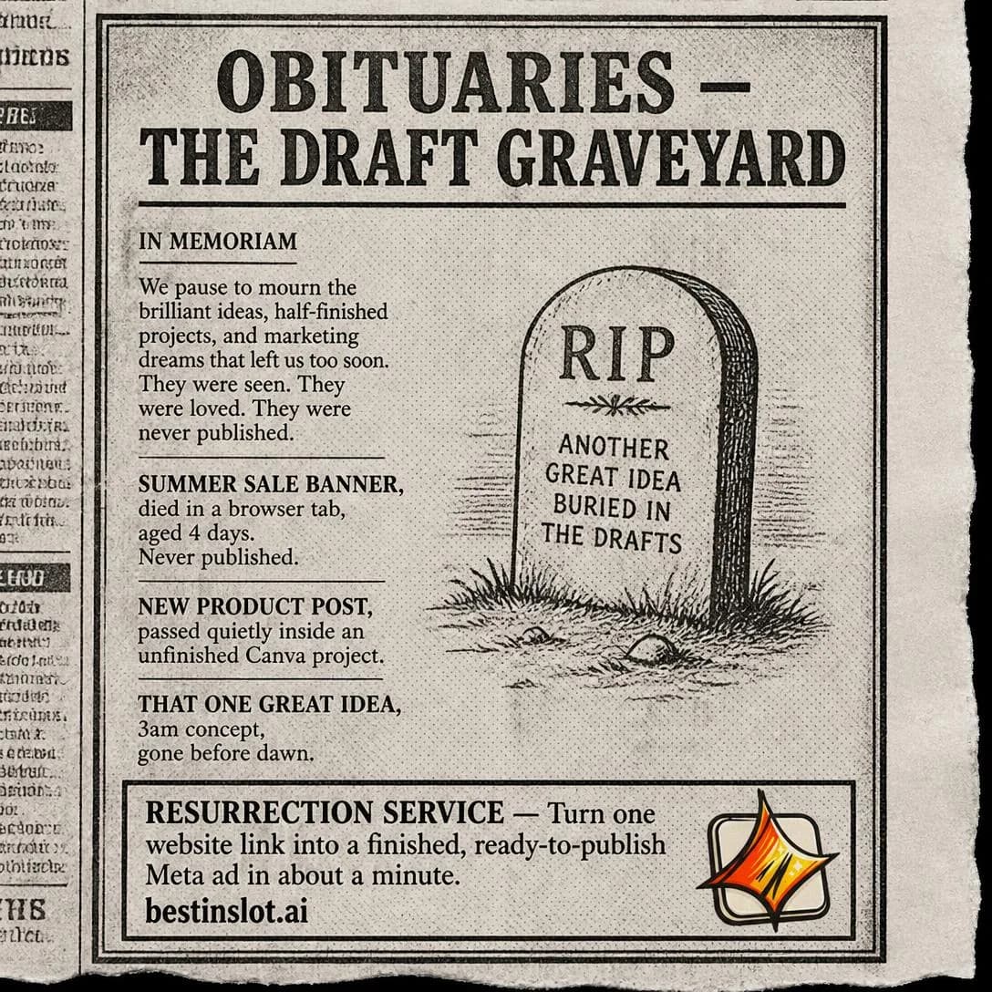
Empty Canva tab ✅ Brief you never filled out ✅ Stock photo that screams 'I gave up' ✅ Freelancer who ghosted ✅ 47 browser tabs open ✅ If this is your Tuesday afternoon, you don't have a creativity problem. You have an ad-maker problem. best-in-slot turns your website into a finished Meta ad in 60 seconds. No brief. No forms. No begging ChatGPT for the fifth headline variation. Just paste your link and publish.

Ad-making shouldn't feel like this
Paste your site. Publish your ad.
Misdiagnosis / Reframe
Cold–MidReframes the cause of the problem: “It isn’t X causing this. It’s Y.”
The reader already knows they have a problem and already has a theory about what’s causing it. This angle tells them the theory is wrong. “It isn’t your budget, it’s your creative.” “It isn’t the landing page, it’s what the ad promised before they got there.”
It is the most strategically valuable angle in the family, because it changes what the buyer thinks they are shopping for. Someone convinced their problem is targeting will spend a year buying audience tools. Move the diagnosis to creative and every one of those tools stops being a competitor — you haven’t won the comparison, you’ve excused yourself from it. This is how categories get built, one ad at a time.
It also costs more to write than anything else here, because the reframe has to be true and it has to be argued. A single line of assertion is a slogan, not a reframe. Give the reader the observation that led to it — the account you audited, the test you ran, the pattern across forty clients — and let the conclusion arrive as theirs.
- Works because
- Excellent for changing buying beliefs and creating a new category frame.
- Fails when
- Weak if the reframe is contrived or unsupported.
Write one like this
- It’s not your targeting. Meta solved targeting years ago.
- You don’t have a traffic problem. You have a nobody-remembers-the-ad problem.
- Cheap clicks aren’t a bidding win. They’re a promise you’ll have to keep.
- Your conversion rate isn’t the page. It’s what the ad made them expect.
Don’t reframe toward whatever you happen to sell. If the new diagnosis is always, conveniently, the exact thing on your pricing page, readers clock the move — and this angle’s entire value is that it doesn’t feel like selling.
Your ads aren't failing because your budget is too small. They're failing because you never finish making one. That 45-minute setup form? It's the real killer. Most people abandon the idea before a single dollar moves. best-in-slot turns your website link into a finished Meta ad in about a minute — concept, image, copy, all four sizes. No form. No friction. Just paste your URL and you're done.
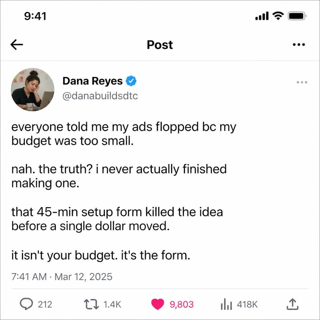
It's not your budget. It's the form.
Website → finished ad in 60s
Mistake
ColdShows something the audience is doing incorrectly.
Shows the reader something they are doing wrong. It is the most clickable angle in the library: a mistake is a curiosity gap with a personal stake attached, and unusually, it survives being stated plainly in the first three words.
What makes it convert rather than merely collect clicks is that a mistake implies a fix, and the fix implies you. But the ad has to actually deliver that fix, inside the ad. Naming a mistake and then sending people to a landing page to find out what to do instead spends all your credibility on the click and leaves none for the destination.
Tone is the entire risk. The line between “here’s a thing most people get wrong” and “here’s a thing you, personally, were too careless to notice” is narrow, and the word that usually crosses it is “you”. Aim the mistake at the industry, at a past version of yourself, or at “most accounts I audit” — you keep the information and drop the accusation.
- Works because
- Highly clickable, educational, and easy to turn into hooks.
- Fails when
- Can sound accusatory or patronizing.
Write one like this
- Most accounts I audit make the same mistake in week one.
- I did this for two years. It cost me about $40k in wasted spend.
- Nine out of ten product ads get the first frame wrong.
- If your ad opens with your logo, stop.
Don’t pick a mistake only an idiot would make. The reader has to be able to admit to it — if recognising themselves means calling themselves stupid, they’ll scroll instead.
You open the ad tool. You see the form. 12 fields. 'Target audience?' 'Brand voice?' 'Tone of voice?' You just wanted to advertise your store. Twenty minutes later, you're still on field 3, filling boxes with guesses. This is where most people close the tab. best-in-slot skips the form entirely — paste your website link, get a finished ad in about a minute. No questionnaire. No guesswork. Just done.
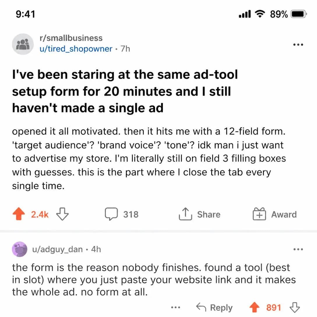
Paste a link. Get a finished ad.
One link → full Meta ad in 60s
Bad Habit
Cold–MidFrames repeated behavior as the source of poor results.
A mistake is something you did. A habit is something you keep doing, which is a harder argument to win: the reader has to accept not one bad decision but a pattern of them. The payoff is that habits explain results in a way single mistakes never can. “This is why nothing has changed in six months” is a far bigger claim than “that ad was bad”.
It works best when the habit is comfortable and looks rational. Boosting the post that did well organically. Refreshing the same creative instead of testing a different argument. Checking the dashboard every morning and moving budgets on noise. Nobody defends an obviously stupid habit; they defend a sensible-looking one — and defending it is exactly what keeps them reading.
Give the habit a name if you can. Named behaviours are quotable, repeatable, and turn one ad into a series; a reader who adopts your name for their own behaviour has already adopted your frame for what’s wrong with it.
- Works because
- Creates recognition and motivation to change.
- Fails when
- Can make the audience defensive.
Write one like this
- Every Monday you nudge budgets 20%. Every Thursday you undo it.
- Boosting the post that did well organically is a habit, not a strategy.
- You’re not testing creative. You’re rotating it.
- Same ad, new colour, every three weeks. That isn’t iteration.
Don’t take away a ritual without offering somewhere to put the effort. Attack the habit and leave nothing in its place and the ad reads as criticism rather than help.
You've said 'I'll make the ad tomorrow' for 47 days straight. That's not a busy season — that's a habit that's quietly bleeding sales while your competitors' ads run. The real problem isn't lack of ideas. It's that starting an ad feels like losing an entire afternoon. best-in-slot turns your website into a finished Meta ad in about a minute. One click. Done. Break the loop today.
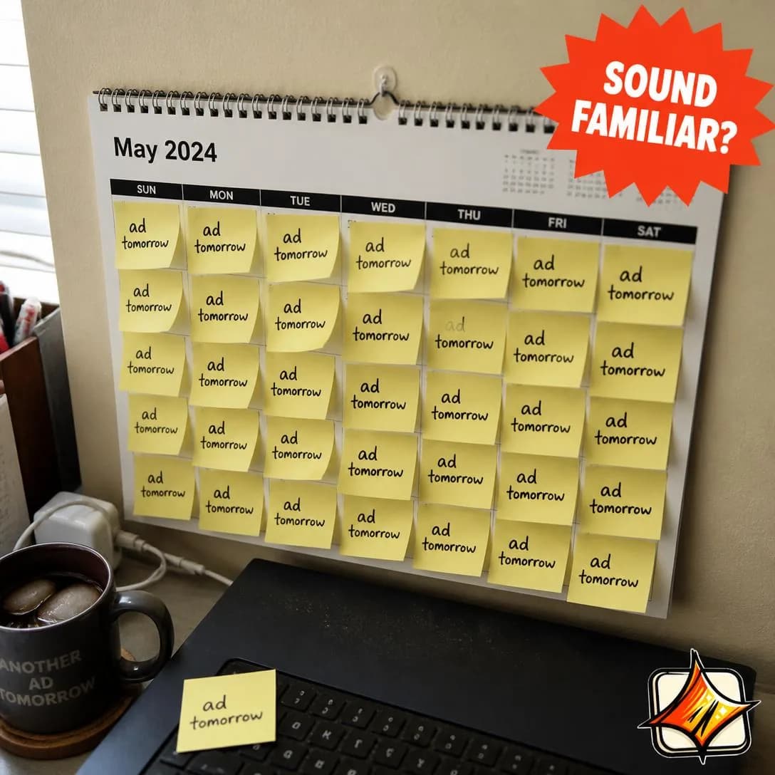
Stop saying 'ad tomorrow'
No forms. Just paste & publish.
Friction / Annoyance
Cold–MidFocuses on an irritating part of an existing workflow, routine, or product experience.
Zooms all the way in. Not the big strategic problem — one small, irritating moment inside a workflow the reader already has. The export that has to be resized four times. The password reset before every invoice. The fifteen minutes of “can you send that in a different format”.
It is badly under-used for software and apps, and the reason is a false instinct: teams assume an ad has to justify the whole product, so they lead with the platform and bury the paper cut. But small, precise, universally hated moments out-engage big claims, because they’re checkable instantly and everyone who has lived one reacts before they think.
The ceiling is real, though. Annoyance motivates a click far more reliably than a purchase, so friction ads work best as an entry point with something larger behind them — or in categories where the annoyance recurs often enough that removing it obviously pays for itself. Once a day is a business case. Once a quarter is a joke, and it can be a good one, but expect it to sell like a joke.
- Works because
- Strong for convenience products, apps, and SaaS.
- Fails when
- The annoyance may not be important enough to justify a purchase.
Write one like this
- Resize. Export. Wrong size. Resize.
- Nine formats for one ad. Meta needs four of them.
- “Can you send it as a PNG?” — the six words that end every Friday.
- You’ve typed your brand’s hex codes into Canva 200 times.
Don’t build a whole campaign on an annoyance nobody would pay to remove. Test it as a hook into a bigger argument before you test it as the argument.
You know that onboarding form every ad tool makes you fill out? The one that asks for your audience, brand voice, tone, goals, budget, audience again, and 41 other things before you see anything useful? We deleted it. best-in-slot reads your website instead and builds finished Meta ads in about a minute. No forms. No questionnaires. Just paste your link and go.
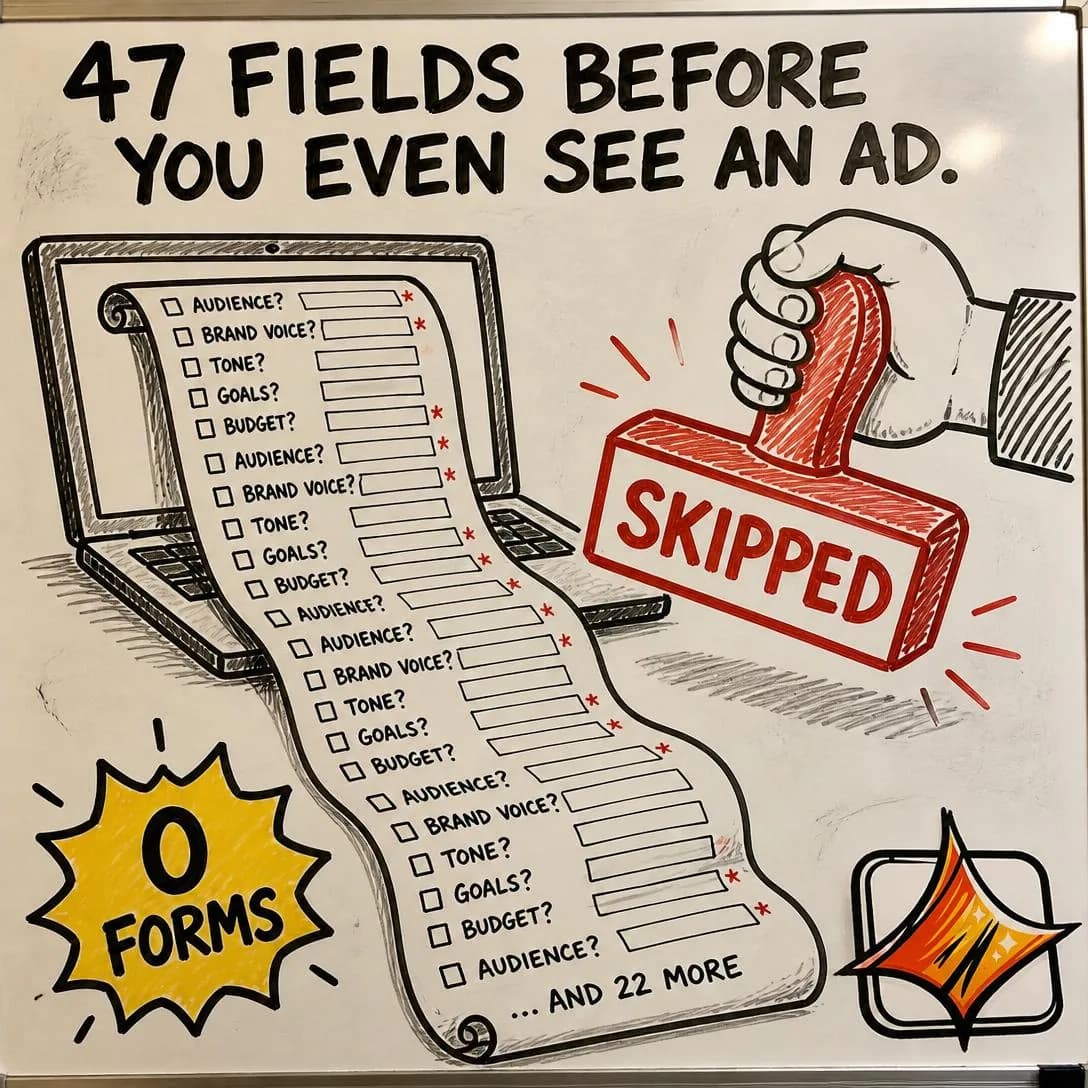
Zero forms. Just finished ads.
Paste link. Get ad. Done.
Cost of the Problem
MidQuantifies the money, time, effort, missed revenue, or lost results caused by the problem.
Puts a number on it. Hours, money, missed revenue, wasted spend — the job is converting a vague ongoing irritation into a figure the reader can hold up against your price.
The arithmetic has to be theirs, not yours. A number you assert — “businesses lose $12,000 a year to this” — is a statistic, and gets discounted like one. A number they compute — three hours an ad, four ads a week, at whatever they think an hour of their time is worth — is a conclusion, and people don’t argue with their own conclusions. Hand over the inputs and let the multiplication happen in their head.
It sits mid-funnel for a reason: it assumes the problem is already accepted. Run it cold and you’re asking a stranger to do sums about a pain they haven’t agreed they have. Run it at people who already engaged with a callout or an agitation ad and it does the thing those ads can’t — it makes your price look small.
- Works because
- Converts vague pain into concrete stakes.
- Fails when
- Requires believable, defensible numbers.
Write one like this
- Three hours an ad, four ads a week. That’s a part-time job you don’t get paid for.
- Count the hours you spent on ads last month. Now put your rate on them.
- A designer is $2,400 a month. You’ve briefed them twice this quarter.
- Your last freelancer invoice cleared. The ads still aren’t live.
Don’t inflate the figure. A number that’s obviously the top of the range invites the reader to audit the rest of the ad, and they’ll find that wanting too. A defensible small number beats an impressive one.
You just paid someone $600 to make one ad. Concept: $150. Stock photo: $80. Copywriter: $200. Three days of Slack messages asking which headline they like better. And you still don't have the ad. best-in-slot turns your website into a finished Meta ad in 60 seconds. Concept, image, copy, all four sizes. 15 credits. One click. No freelancer invoice.
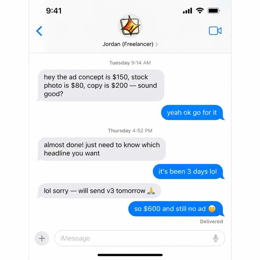
One ad shouldn't cost $600
Finished ads in 60 seconds
Cost of Inaction
Mid–HotShows what happens if the buyer does nothing and the current situation continues.
Not what the problem costs today — what it costs to keep doing nothing about it. This is the only angle in the family that answers “why now”, which is why it belongs late in the funnel and why it’s the natural closer for retargeting.
The mechanic is loss aversion, and its honesty depends entirely on the clock being real. Compounding is the good version: every week without new creative, frequency climbs and CPMs follow; every month a competitor tests four angles and you test one, and the gap doesn’t stay the same size. Deadlines you invented are the bad version, and they are indistinguishable from a fake countdown timer.
It also pairs unusually well with risk reversal, which is the other reason it sits where it does. Once the reader accepts that waiting has a price, the only objection left is the risk of moving — so a guarantee, a trial, or a cancel-anytime line placed immediately after the cost of inaction closes both halves in a single ad.
- Works because
- Creates urgency without requiring a discount.
- Fails when
- Overstatement can quickly destroy trust.
Write one like this
- Every week that ad stays live, it reaches fewer people for more money.
- Q4 isn’t moving. Your creative pipeline has to.
- In three months you’ll wish you had a year of test data. Start it or don’t have it.
- Doing nothing isn’t free. It just bills you later.
Don’t invent the deadline. Urgency the reader can verify is the strongest thing in this family; urgency they can’t is the fastest way to lose the ones who were nearly convinced.
Every week you don't run an ad, someone else is running one for your customers. They're building the brand, getting the clicks, making the sales — while 'launch ads' sits on your to-do list gathering dust. The setup forms. The designer hunt. The endless back-and-forth. It's not your fault it's hard. But your competitors aren't waiting for you to figure it out. Paste your link, get a finished Meta ad in about a minute. No forms. No guesswork. Nothing goes live until you say so.
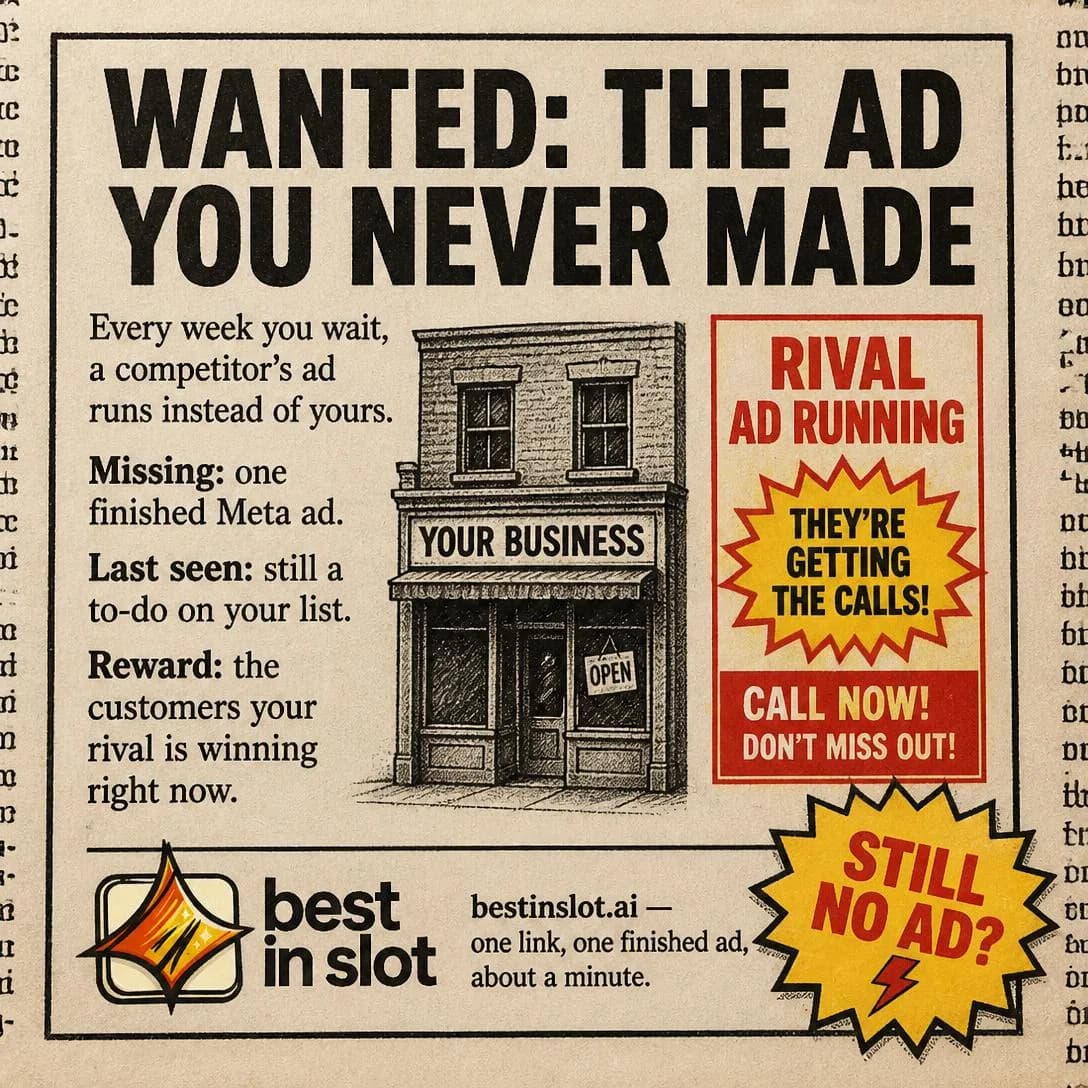
Your competitor's ad is running now
About a minute. Nothing live til you say.
Testing them against each other
Test these against each other before you test hooks inside any one of them. The ten angles here are ten different arguments, and which argument works is a fact about your market that no amount of rewriting a headline will discover for you. Pick three that are genuinely far apart — a Callout, a Misdiagnosis, and a Cost of Inaction, say — run them at the same audience with the same offer, and let the spread tell you which territory your buyers actually live in.
Only then is it worth writing five hooks for the winner. That order is the whole point of a library: angles decide whether anyone cares, and hooks and formats only decide how well the argument lands once they do.
Pick an angle. Get the ad.
No credit card · 50 free credits (about 5 ads or Instagram posts)