
Ad Angle Library #2 · 10 angles
Benefit & Outcome ad angles
Make the desired result vivid and valuable.
This family sells the after. Where Problem & Pain describes a reader’s present back to them, every angle here asks them to picture a future they are not in yet — and then to believe you can get them there. Recognition is involuntary. Belief is a decision. That gap is the whole difficulty.
It also makes this the most written and the worst written family in advertising. Benefit claims are free — anyone can promise anything — and the market has priced them accordingly. The reader’s default posture in front of a benefit ad isn’t hostility, it’s a shrug: sure you do. Every angle below is a different technique for getting past the shrug.
The technique is almost never a bigger claim. Bigger claims are cheaper to make, which is exactly why they are worth less — a promise nobody could check is a promise nobody has to take seriously. Benefit ads win on the opposite quality: specificity that could be wrong. “Saves you time” is a category. “Your Sunday back” is a benefit. “Faster” is a word. “Brief at 9, live by 9:20” is a claim you can be held to, and being holdable is what makes it worth anything.
The ten differ on what kind of after they promise. Three are structural: Core Benefit picks one outcome, Benefits List stacks several, Transformation sells the distance between before and after. The other seven each trade in a currency. Speed and Save Time both deal in time — one as arrival, the other as hours not spent. Ease and Convenience both deal in effort — one as skill you don’t need, the other as steps that fit around your life. Save Money and Make / Earn More are the two directions money moves. And Simplification deals in the thing nobody budgets for: the number of things you have to keep track of.
Which one, when
- All stagesCore Benefit · Transformation · Ease
- The three that don’t need the reader to know you first. Core Benefit is the control every account should be running. Transformation smuggles the problem in alongside the promise, so it self-selects the way a cold ad has to. Ease answers “will it work for me”, which is a colder question than “does it work”.
- Cold–MidConvenience · Simplification
- Low-belief arguments: nobody needs persuading that fewer steps and fewer tools are better. Cheap to get agreement on, which is why they open well and close badly — treat them as a way in, not as the close.
- MidBenefits List · Save Time · Make / Earn More
- For readers who have accepted the problem and are now sizing the value. All three ask for arithmetic or sustained attention, and a stranger gives you neither.
- Mid–HotSpeed · Save Money
- The two that turn interest into a decision. Both are instantly checkable, both are promises you will be held to after purchase, and both belong where the reader is already deciding rather than still browsing.
About the examples. Every ad below was generated by best-in-slot for best-in-slot — one product, one underlying problem, 10 different arguments about it. That repetition is the point: hold the product and the pain still, and the angle is the only thing left changing. Each is shown exactly as it came out.
Core Benefit
AllLeads with the single most important outcome the buyer receives.
The simplest promise in advertising: here is the one thing you get. No stack of reasons, no mechanism, no story — a single outcome, stated early enough that a stranger decides in well under a second whether they want it. It is also the control every account should be running, because it is the only ad whose result tells you something about your offer rather than about your writing.
The difficulty isn’t writing it, it’s choosing. Picking one benefit means giving up four others, and most teams can’t, so what ships is a Benefits List in a Core Benefit’s clothes with the real promise buried third. If you can’t decide, stop looking at the roadmap and read what customers say back to you unprompted — in reviews, in renewal calls, in the sentence they use when they explain you to a colleague. The benefit you are proudest of is a fact about what you built. The one they repeat is a fact about your market, and only one of those has earned the first line of an ad.
Its known weakness is that a competitor could run the same line, and the honest answer is: let them. A core benefit is not where differentiation happens — that is Mechanism and Positioning, two and three issues from here. This is where you find out whether the promise itself has a market at all. Write it in the customer’s vocabulary, keep it plain enough to be boring, and treat the number it puts up as the bar every other angle in this library has to clear.
- Works because
- Very clear and easy to understand.
- Fails when
- Easy for competitors to copy; may lack distinctiveness.
Write one like this
- One product photo in. A finished ad out.
- Ads for Meta, in the time it takes to choose a photo.
- The 200 photos on your phone are 200 ads you haven’t made.
- Everything you need to run an ad, from a photo and one sentence.
Don’t lead with the benefit you’re proudest of. Lead with the one customers say back to you unprompted — they are almost never the same sentence.
Paste a link. Get a finished ad in 60 seconds. That's the entire process. No forms. No waiting. No wondering if you're doing it right. Just a URL and one minute later, you've got concept, image, copy, and all four Meta ad sizes sitting in your Ads Manager, paused and ready to review. This is what happens when you throw out everything that makes ad tools annoying.
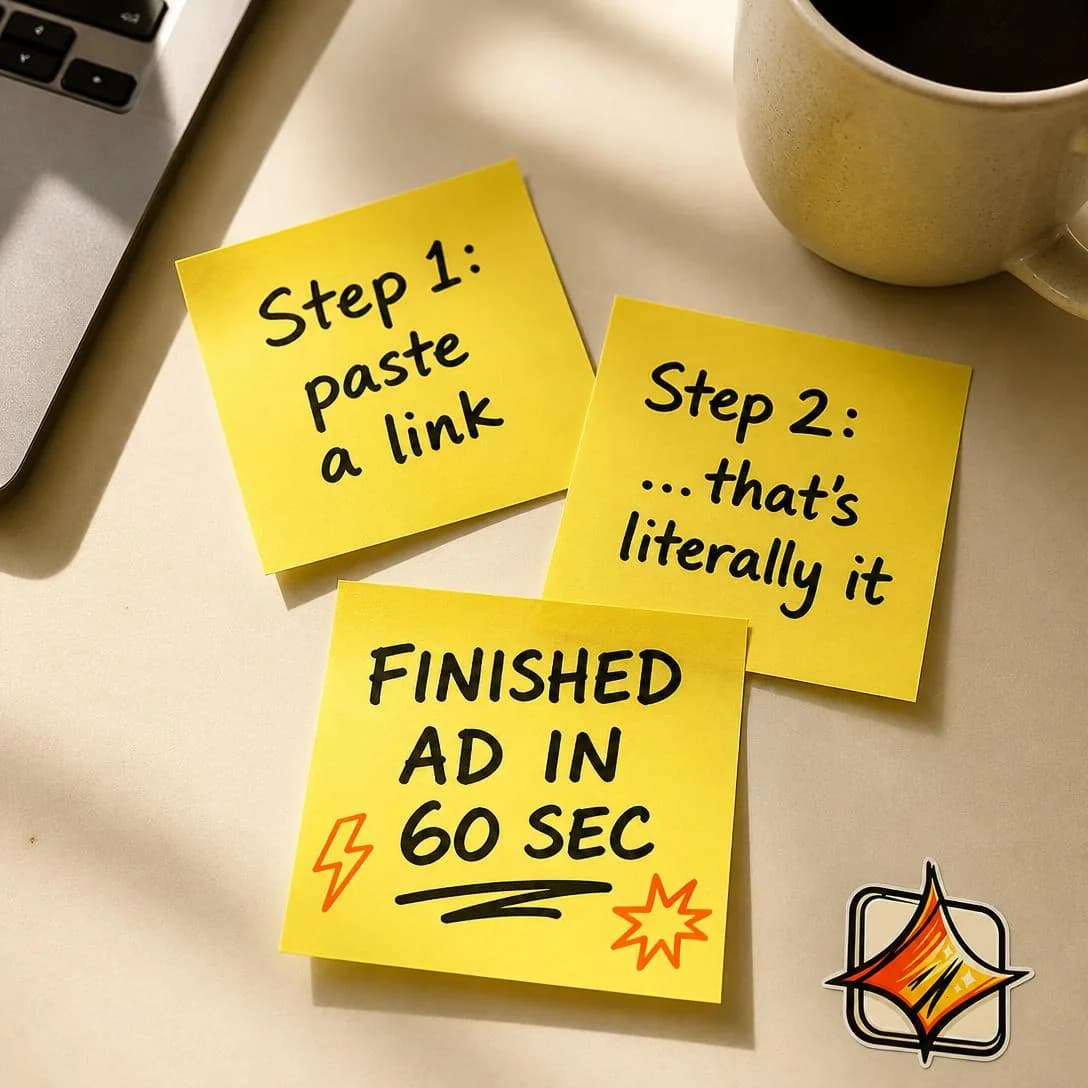
From URL to finished ad in 60 seconds
No forms. Just finished ads.
Benefits List
MidStacks multiple benefits or reasons to buy, usually 3–7.
Three to seven reasons, stacked. The argument is breadth: no single line is decisive, but together they outweigh the price. It is the workhorse of mid-funnel and retargeting, where the reader has already accepted the problem and is now quietly doing the sum.
A list only persuades if it is ordered. The first item does most of the work and the rest corroborate it; seven benefits of equal weight read as seven small ones, and the reader starts averaging instead of adding. Mixed currencies beat matched ones, too — faster, cheaper, and on-brand gives three separate reasons to buy, while four flavours of fast gives one. And every item has to survive the benefit test: would the reader want this if your product didn’t exist? “Brand kit sync” fails. “Your fonts and your colours, every time, without being asked” passes.
Feature soup is the failure mode named in every list ad’s post-mortem, and it comes from writing the list product-outward. Build it objection-inward instead: each line answers one specific reason a real person gave for not buying. That also caps the length honestly — you have as many items as you have genuine objections, which is usually four, not seven, and a four-item list that lands beats a seven-item list that scrolls.
- Works because
- Communicates breadth and value quickly.
- Fails when
- Can become feature soup if benefits are not prioritized.
Write one like this
- Faster than a designer. Cheaper than an agency. On-brand either way.
- Every size Meta asks for. Your fonts, not ours. Live today.
- Four things this replaces before lunch.
- No brief, no revisions, no “can you send it as a PNG”.
Don’t give the items equal weight. A list where everything is the same size reads as a spec sheet — lead with the biggest promise and let the rest corroborate it.
One link in. Six reasons to never write an ad brief again. Write the brief? REMOVED. Hire a designer? REMOVED. Wait 3 days? REMOVED. Guess what works? REMOVED. Paste your website. Get a finished Meta ad in 60 seconds — concept, image, copy, all four sizes, ready to publish. No forms. No waiting. No creative bottleneck. That's best-in-slot. Start free at bestinslot.ai

One link. One minute. One finished ad.
Start free at bestinslot.ai
Transformation
AllSells the change from the customer’s current state to the desired state.
Sells the distance travelled: who the reader is now, who they are after. It is the only angle in the family that contains its own before, which is why it carries cold traffic when the rest of these can’t — the opening does the self-selection a Problem angle would have done, and the close does the promising.
The gap is the product. Too narrow and there is nothing to buy; too wide and the reader files it under someone else’s life and watches it like a film. The safest structure is a specific, unglamorous before and a modest, dated after: six months ago, one ad a month, done at midnight. Now, four a week, done before lunch, by the same person with the same budget. Nobody has become a different human being — that is what makes it credible, and credibility is the scarce thing here, not aspiration.
It rewards showing over telling more than anything else in the family, which is why it is the natural home of before/after statics, day-in-the-life video, and the two-panel carousel. One warning about the person in the middle: the transformation has to be attributable to something you actually did. A reader who watches a stranger get better at their job and can’t see where your product entered the story has watched an inspiring ad for nothing.
- Works because
- Emotionally powerful and easy to visualize.
- Fails when
- The outcome must feel believable and attainable.
Write one like this
- Six months ago: one ad a month. Now: four a week. Same person, same budget.
- You had a folder of product photos. Now you have a campaign.
- From “we’ll do ads properly when we hire someone” to shipping them yourself.
- The account that used to post twice a month now tests twelve angles.
Don’t make the after unrecognisable. A version of the reader they can’t picture themselves reaching reads as someone else’s story, and they’ll enjoy it exactly that much.
You know that blank Meta Ads Manager tab you've been staring at for three days? The one you close every time because "you'll figure it out later"? Paste your website link into best-in-slot. 60 seconds later, you've got a finished ad — image, copy, all four sizes — sitting paused in your account, ready to go live. No form. No guessing. No creative paralysis. Just a done ad.
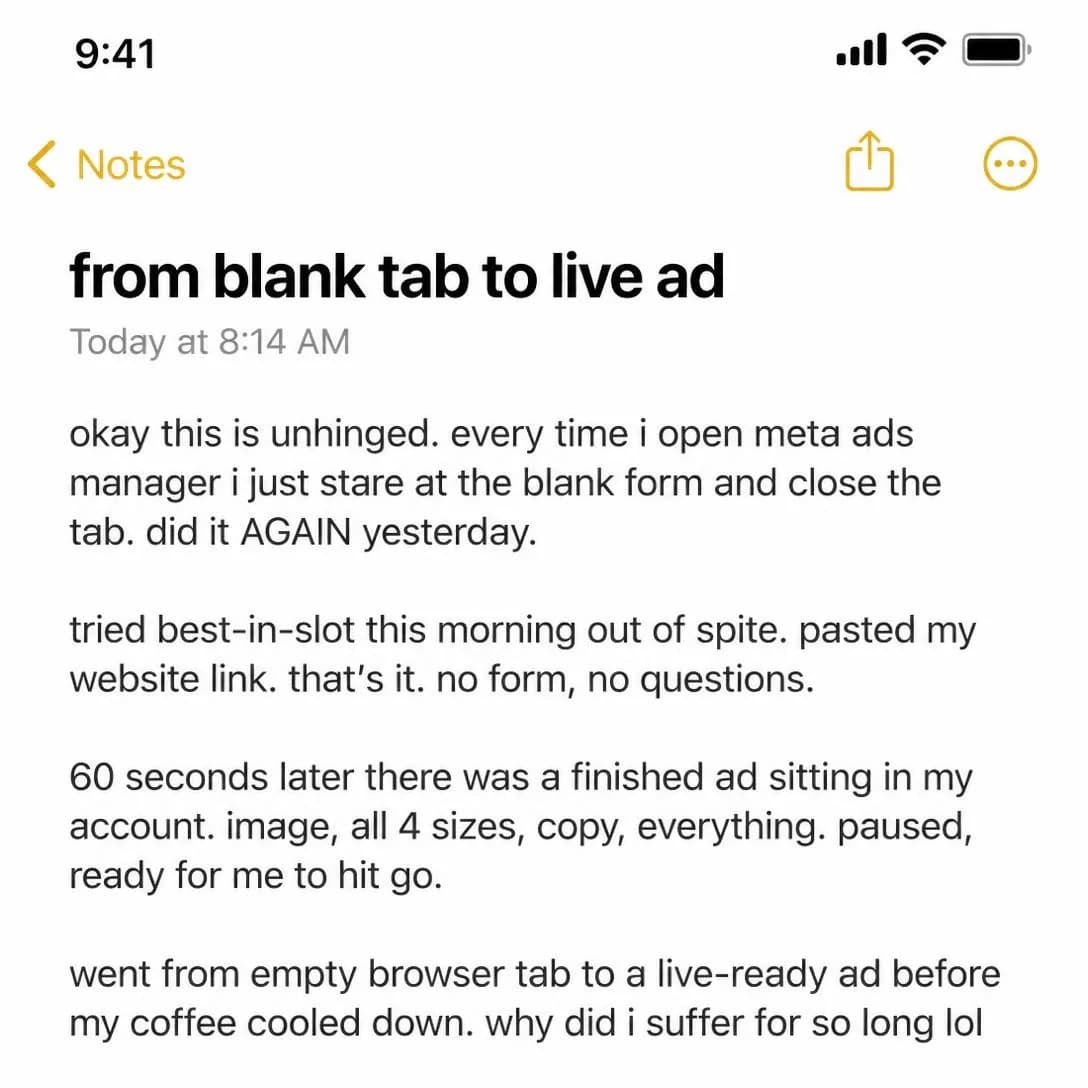
Blank tab to finished ad in 60 seconds
Paste link. Get ad. That's it.
Speed
Mid–HotEmphasizes achieving the desired result faster.
The result, sooner. Not less work — that is Ease — but less waiting. Speed is the most checkable benefit in the family and the most immediately felt, which is why it converts hard at the bottom of the funnel and why it is the one most likely to be held against you afterwards.
It only sells if the reader is currently blocked. Speed against a wait people resent is a purchase argument; speed against a wait nobody noticed is a spec. So name the wait you are replacing, not just your own number: “ten minutes” means nothing, “ten minutes instead of a four-day freelancer round trip” is an argument, because the comparison supplies the baseline the reader would otherwise have to invent. Round numbers with a unit and a competitor process attached are what make this angle land.
Then honour it. Every fast claim is a stopwatch you handed a customer, and they start it at signup — promise twenty minutes and deliver an afternoon and you have converted someone into a refund. Two other cautions: in health, finance, and anything body-adjacent, speed claims attract both scepticism and policy review, so keep them about your process rather than about their results. And if speed is your only benefit, expect it to sell like a feature, because the reader who has waited four days before can wait four days again.
- Works because
- Strong when time-to-result matters.
- Fails when
- Speed claims can trigger skepticism or compliance risk.
Write one like this
- Brief at 9. Live by 9:20.
- The freelancer’s first draft takes four days. This takes four minutes.
- Sale starts tomorrow. That is still enough time.
- Ten minutes from photo to campaign — including the part where you change your mind.
Don’t promise a speed your onboarding can’t hit. The claim is a stopwatch the customer starts on day one, and the fastest way to churn someone is to be slower than your own ad.
You don't have time to build ads. We get it. That's why we timed ourselves: paste your website link, wait 63 seconds, and your ad lands paused in Meta Ads Manager. All four sizes. Full copy. Hero image. Zero forms, zero downloads, zero guesswork. Nothing spends until you say so. bestinslot.ai — the one-minute ad tool.
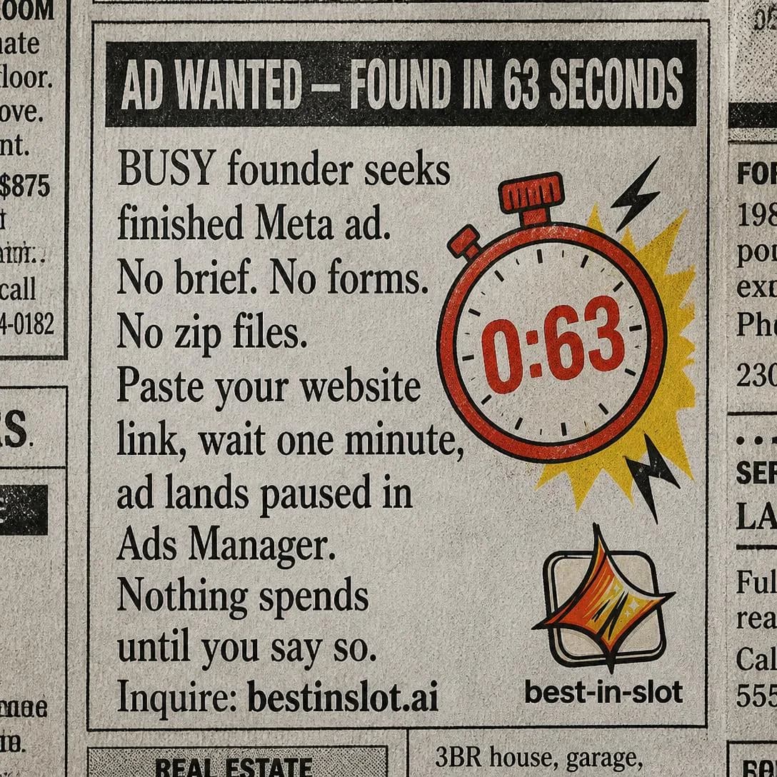
Your ad in 63 seconds. Really.
Paste link → Get Meta ad. Fast.
Ease
AllEmphasizes getting the result with less effort, complexity, or skill.
Same result, less effort or skill required. It reads like a close relative of Speed and isn’t: Speed removes waiting, Ease removes competence. That makes it the angle that speaks to self-doubt, and for a great many categories self-doubt is a bigger barrier than price. The question in the reader’s head is not “does this work” but “will it work when I’m the one doing it”.
Which means the whole angle is a tone problem. “So simple anyone can do it” insults the reader who has already failed at this once. “You don’t need to be a designer” excuses them. The words carry nearly the same information and land in opposite places, because one locates the difficulty in the person and the other in the task. Always put it in the task. Better still, be concrete about what has been removed — no layers, no export settings, no brief — since a specific absence is checkable in a way that “easy” never is.
Its risk is the one you inherit at first use. Ease sets an expectation that the product has to meet in the first five minutes, and an onboarding with a settings screen in it will contradict the ad before the customer has finished reading it. Test this angle against Core Benefit early: if Ease wins, you have learned that your market’s real objection is about themselves, and that finding should reshape your onboarding, not just your ads.
- Works because
- Reduces perceived friction.
- Fails when
- Can imply unrealistic simplicity if overstated.
Write one like this
- You don’t need to be a designer. You need a photo and ten minutes.
- No layers. No templates. No export settings.
- If you can describe the ad, you can make the ad.
- There is nothing to learn. That’s the entire pitch.
Don’t sell ease by implying the task was trivial all along. The reader has struggled with this before — an ad that says it’s easy is telling them they were the problem.
You know what stops most people from running ads? The setup. The forms. The guessing. The part where you stare at a blank screen wondering what to write. Paste your website link into best-in-slot. About 60 seconds later, you get a finished ad — concept, image, copy, all four Meta sizes — sitting in your Ads Manager, paused and ready to review. No forms. No brief. No creative paralysis. One link in. One ad out. That's the whole thing.
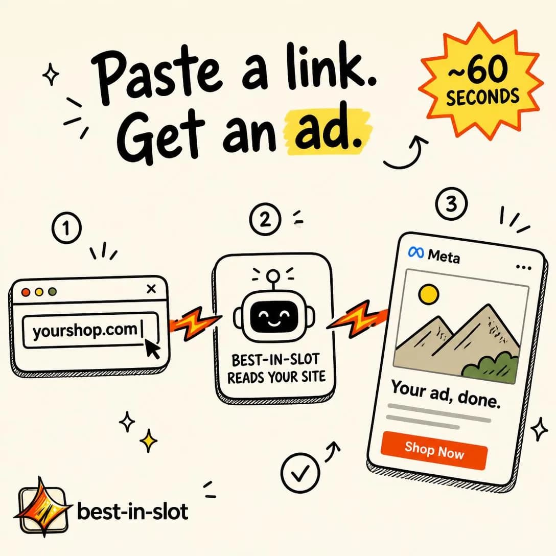
One link in. One finished ad out.
Start free. No card required.
Convenience
Cold–MidMakes an existing task, routine, or purchase easier to complete.
Ease is about the skill a task demands. Convenience is about where and when it can happen. It comes to you, it works on your phone, there is nothing to install, no appointment, no one else who has to be awake. The task itself is unchanged; what changes is how well it fits into a life that was already full.
It runs cold better than most of this family because it asks for no belief at all. Nobody has to be persuaded that fewer steps beat more steps, so the reader agrees instantly — and agreement that cheap is also that shallow. Convenience gets the click and rarely closes the sale on its own, which is why it belongs early in a sequence with something heavier behind it. It is at its strongest when the task recurs: something you do daily makes convenience an economic argument, something you do twice a year makes it a nicety.
The other structural weakness is that it is the easiest benefit in the world for a competitor to copy — an app, a delivery option, a mobile view, and they have matched you by Tuesday. So use it to widen the top of the funnel and to unblock a specific moment the reader can picture, but don’t build premium pricing on it and don’t let it become the sentence the brand is known for.
- Works because
- Universally understandable value proposition.
- Fails when
- Convenience alone may not justify premium pricing.
Write one like this
- Make the ad on your phone, in the queue at the post office.
- It’s Sunday. Your designer is asleep. The sale starts tomorrow.
- No install, no seats, nobody to ask.
- Ads made where your photos already are.
Don’t charge a premium on convenience alone. It’s the benefit competitors match fastest and the one buyers are least willing to pay extra for twice.
Paste a link. Get a finished ad. Go make coffee. ☕ That's it. No forms, no creative briefs, no waiting on designers. best-in-slot reads your website, generates the concept, writes the copy, and builds the ad — in about a minute. All four Meta sizes. Ready to publish. Nothing goes live until you say so.
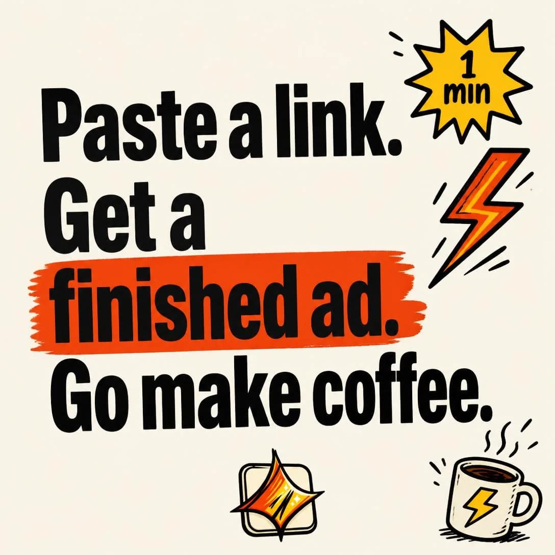
Paste a link. Get a finished ad.
Start free. No card required.
Save Time
MidQuantifies hours, minutes, or steps saved.
The hours you don’t spend. It is the mirror image of Cost of the Problem from issue #1, and it works the same way: the number has to be theirs, not yours. A figure you assert — “our customers save 12 hours a month” — is a statistic and gets discounted like one. A figure they compute from inputs you handed over is a conclusion, and nobody argues with their own conclusion.
So give the inputs and let the multiplication happen in their head. Three hours an ad, four ads a week, at whatever they privately think an hour of their time is worth. Keep the baseline defensible and small; an obviously top-of-range number invites the reader to audit the rest of the ad, and the audit never stops at the number. This is also why the angle sits mid-funnel: it assumes the reader has already agreed the task is costing them, which a stranger has not.
The mistake that flattens it is leaving the saved hours abstract. Time returned to nothing is not a benefit — it is an accounting entry. Say what the hours become: Sunday off, the two campaigns you never got round to, the part of the business only you can do. Naming the destination converts a number into a want, and it costs you one clause.
- Works because
- Concrete and easy to compare against the status quo.
- Fails when
- Needs a believable baseline.
Write one like this
- Three hours an ad becomes twenty minutes. Four ads a week. Do the maths.
- You get Sunday back. That’s the offer.
- Count the hours ads cost you last month, then look at the price.
- Nine exports, nine resizes, one click.
Don’t leave the saved hours abstract. Name what they’re for — time handed back to nothing in particular doesn’t motivate anybody to change tools.
68 minutes. That's how long most people spend filling out ad briefs, uploading assets, writing copy, and waiting for revisions before they even see a draft. best-in-slot does all of it — concept, hero image, four Meta sizes, full copy — in about a minute. Paste your website link, click once, and the ad lands in your Ads Manager paused and ready. Nothing goes live until you say so. You just got your afternoon back.

68 minutes saved per ad. Actually.
No forms. Just finished ads.
Save Money
Mid–HotFocuses on direct financial savings.
The same outcome for less money. It is the most rational argument in the family and the hardest to disagree with, which is why it closes well at the bottom of the funnel — and why it should be handled with more care than any other angle here.
Compare against the spend you replace, not against a competitor’s price. “Less than one designer month” is a savings argument: it measures you against a bill the reader already pays and leaves your positioning intact. “Cheaper than [competitor]” is a positioning argument, it belongs in family five, and it starts a race whoever is best funded wins. Make the replaced cost something specific and recurring — an invoice, a retainer, a per-asset licence — because a saving against a real line item is felt, and a saving against a vague market average is arithmetic.
The deeper risk is who this angle recruits. A customer who arrives for the cheapest option leaves for the next cheapest, and a brand that wins on price has taken a position it then has to defend forever against anyone willing to lose money longer. Use Save Money to close people who were already convinced by another argument, and be wary the moment it starts outperforming everything else — that is usually the market telling you it can’t tell you apart from the alternatives yet.
- Works because
- Strong rational purchase argument.
- Fails when
- Can attract highly price-sensitive customers.
Write one like this
- A designer month is $2,400. This isn’t.
- Cancel one freelancer invoice. That’s the year covered.
- The stock photo licence costs more than the ad does.
- You’re paying per asset. There’s no reason to.
Don’t win on a price you can’t hold. Customers recruited by cheapness leave for the next cheapest, and the position you took to get them is the one you’re stuck defending.
That $1,500 invoice from your freelancer? You just ripped it up. This tool reads your website, generates a finished Meta ad — concept, image, copy, all four sizes — and publishes it straight into your Ads Manager. One click. About a minute. From $0.30 per ad. No design fees. No revision rounds. No retainer. Just ads that work, made while you finish your coffee.

Ads for $0.30, not $1,500
From your site to Ads Manager
Make / Earn More
MidConnects the product to revenue, productivity, or economic upside.
Upside rather than savings. It is the only angle in the family that changes what category your price is in: a cost gets compared against a budget, an investment gets compared against a return, and the second comparison is the one you want. That is why it is the default for B2B, agency, creator, and anything sold to someone with a P&L.
Make the mechanism the claim, not the number. “Test ten angles a month instead of one and you find winners you would never have written” is defensible, repeatable, and true of the customer’s own behaviour. A monthly income figure is neither, and Meta’s policies treat unrealistic economic outcomes as prohibited content rather than a grey area, so the practical effect of putting a revenue promise in a headline is usually a rejected ad and a slower review queue afterwards. The restraint is also better persuasion: readers discount numbers from strangers and follow logic from anyone.
Attribute the upside to the reader’s work, not to your magic. Ads that say “we made this customer $40k” invite the question of what was special about that customer; ads that say “more shots on goal is the whole strategy, and this is what makes more shots cheap” hand the reader a model they can run themselves. If you do have a real result, put it in a case study — that is family four, and proof is what that family is for.
- Works because
- Powerful for B2B, creator, and business audiences.
- Fails when
- Requires proof and careful claims.
Write one like this
- You can’t find a winning ad you never made.
- Ten angles tested this month instead of one. One of them is the winner.
- The account that tests more wins more. That is the entire strategy.
- Your best ad is still unwritten. That’s the good news.
Don’t put an income figure in the ad. Meta treats unrealistic economic outcomes as prohibited content, and a mechanism the reader can follow persuades better than a number they don’t believe.
Every day you wait to launch that ad is a day of revenue you're leaving behind. You have the idea. You have the product. What you don't have is three hours to fumble through Canva, write copy, and wrestle with Meta's interface. Paste your website link. Get a finished ad in your Ads Manager in about a minute — paused, ready for you to review and launch. Speed to publish is speed to revenue. Stop letting good ideas collect dust.
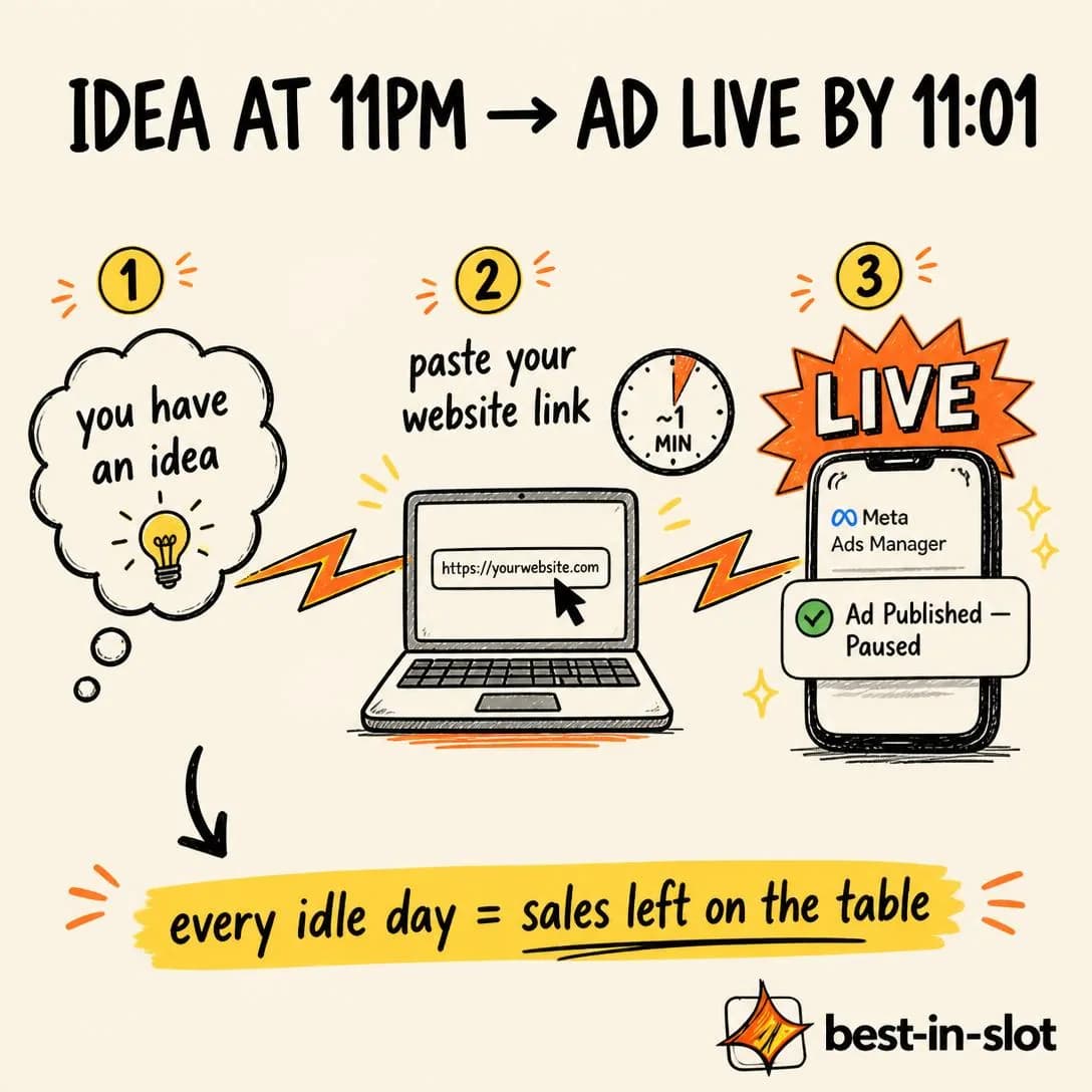
Idea to live ad in 60 seconds
Paste link. Publish ad. Sell.
Simplification
Cold–MidReplaces several tools, products, steps, or workflows with one simpler solution.
Fewer things. One tool where there were four, one step where there were nine, one subscription instead of the three nobody has cancelled. The promise isn’t that any individual piece was bad — it’s that keeping the pieces in sync is a job, and nobody was hired to do it.
It runs colder than the rest of this family because naming the stack is itself a callout. A reader who hears their own four tabs listed back to them recognises the situation before any promise arrives, which is the Problem & Pain mechanic doing the opening while a benefit does the closing. So name the actual tools and the actual steps. “All-in-one” is the weakest phrase in software marketing: the reader is counting logos, and a category noun counts as zero of them.
Its limit is stated in the taxonomy and worth taking seriously — it only works if the current process is perceived as complicated. Plenty of people have four tools and are fine. The tell that this angle is live for your market is a complaint about the seams rather than about any one product: the exporting, the re-uploading, the file that has to be renamed before it will go anywhere. Aim at the seams. And expect a specific objection in return, because consolidation asks someone to give up tools they chose — answer it with what stays the same, not only with what disappears.
- Works because
- Powerful when the category is fragmented or complex.
- Fails when
- Weak if the customer does not perceive the current process as complicated.
Write one like this
- Canva, Drive, a spreadsheet, and a freelancer. Or this.
- Your ad process has nine steps. Six of them are file management.
- Four tabs became one.
- One subscription instead of the three you forgot you were paying for.
Don’t say “all-in-one”. Name the tools and steps you replace — the reader is counting, and a category noun counts as nothing.
I just canceled Canva, my freelance designer, a stock photo sub, AND a copywriter. One link into best-in-slot and I get a finished Meta ad in about a minute. Why did I have a whole ad stack for this lol
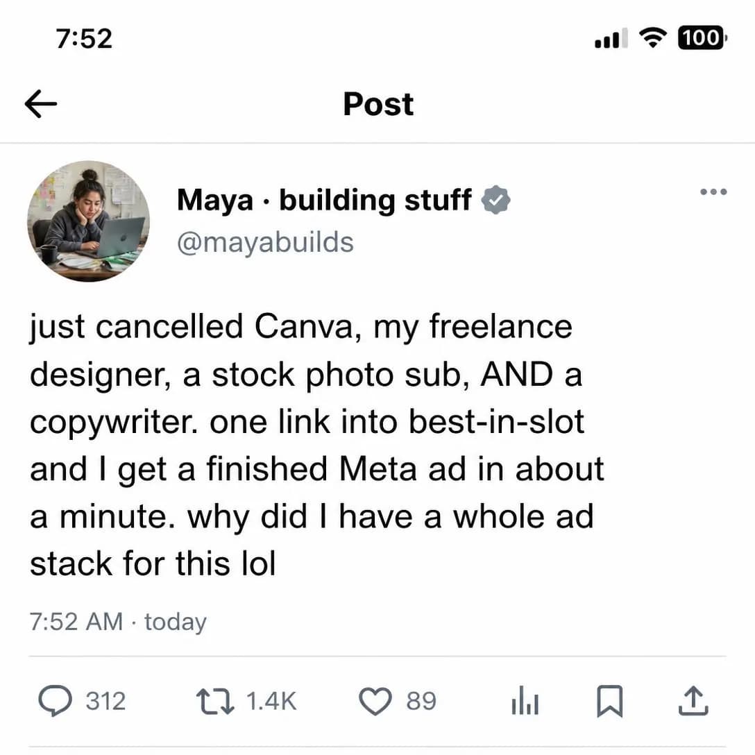
One tool. Zero coordination tax.
Link in, ad out. Try free.
Testing them against each other
Every ad in this family looks like every other one from a distance — a promise, a product, a button — so the instinct is to test the wording. Resist it and test the currency instead. Whether your market buys on time, money, effort, or upside is a fact about them, and no amount of rewriting a headline will discover it for you. Run a Save Time against a Save Money against an Ease, same audience, same offer, and read the spread as market research rather than as a copy result.
Then put the winner up against Problem & Pain. Benefit versus pain at one audience is the most informative single test in this library: it tells you whether your buyers are running away from something or towards something, and the answer should propagate into the landing page, the first email, and the opening seconds of every video you make afterwards. One discipline while you do it — hold the size of the claim constant across variants. If one version promises more than the others, you haven’t learned which currency your market buys on. You’ve learned how much they’re willing to believe.
Pick an angle. Get the ad.
No credit card · 50 free credits (about 5 ads or Instagram posts)