
Ad Angle Library #3 · 10 angles
Product & Mechanism ad angles
Explain what the product does and why it works.
This family answers the question the first two provoke. Problem & Pain gets a stranger to admit something is wrong. Benefit & Outcome tells them what life looks like once it isn’t. Both leave the same objection standing, unanswered and usually unspoken: fine, but why would that work? Everything below is a different way of opening the lid.
It is the only family in the library whose arguments are constrained by what you actually built. Anyone can write a problem ad. Anyone can write a benefit ad — the claim costs nothing to make and, as issue #2 argued, is priced accordingly. You cannot write a Mechanism Reveal about a product with no mechanism, and the reader can tell. That constraint is also the reason these ads are the hardest in the library to copy: a competitor who wants your problem ad rewrites a headline, and a competitor who wants your mechanism ad has to build your product first.
The failure mode is explanation for its own sake. Nobody wants to understand your product; they want to stop worrying that it won’t work for them. Explanation is the currency you spend to buy that belief, and the moment you start spending it on completeness instead, the ad turns into documentation — accurate, thorough, and scrolled past. The working discipline is mechanical: every sentence about how it works gets a sentence about what that means for the reader, immediately, in the same breath. If you can’t write the second sentence, cut the first.
The ten differ on where they point. Product Demo shows the thing working and argues nothing. How It Works walks the path the customer will walk; Mechanism Reveal argues that path is different from everyone else’s. Feature → Benefit takes one specification and translates it. Ingredient and Craftsmanship both look inward — one at what is in it, the other at how it was made. Technology claims the advantage is new. Durability claims it holds up after the novelty is gone, Versatility claims it does more than you assumed, and Hidden Feature holds one capability back so the product itself can deliver the surprise.
Which one, when
- All stagesProduct Demo
- The only one that asks nothing of the reader first. Showing needs no prior belief, no context and no patience, which is why a demo is the rare mechanism ad that survives cold traffic — and why it belongs in the rotation even when the account is mostly running problem and benefit ads.
- Cold–MidTechnology / Innovation · Hidden Feature / Aha
- The two that earn attention rather than spend it. Novelty and surprise do the work a cold ad needs done in the first second, and both pay the curiosity off with the product rather than with a promise. Both also decay, so treat them as a rotation rather than a position.
- MidHow It Works · Mechanism Reveal · Feature → Benefit · Ingredient / Material · Craftsmanship · Versatility
- The middle of this family is large because the middle of the funnel is where explanation is welcome. The reader has accepted the problem and is now auditing the fix. The first three explain the product — the process, the difference, the spec that matters. The last three make it worth more: what it’s made of, what it took to make, and how much it turns out to do.
- Mid–HotDurability / Reliability
- The last objection before real money moves is not “does this work” but “will it still work in six months”. It only lands with someone already close enough to be imagining ownership, and it is the one claim here your customer will re-audit every day after they buy.
About the examples. Every ad below was generated by best-in-slot for best-in-slot — one product, one underlying problem, 10 different arguments about it. That repetition is the point: hold the product and the pain still, and the angle is the only thing left changing. Each is shown exactly as it came out.
Product Demo
AllShows the product actively solving the problem.
The ad that stops arguing and shows. No mechanism, no explanation, no adjectives — the product doing the thing, in a frame the reader can check. It is the only angle in the library where the evidence and the explanation are the same shot, which is why the taxonomy lists it as strong at every stage and why it is the most under-tested ad most accounts have.
What you show matters far more than how well you shoot it. Show the moment of change: the input going in, the result coming out, ideally without a cut. Continuity is the whole proof — every edit is a place where the reader assumes something was fixed off-camera, and a demo assembled from seven flattering fragments persuades less than one unglamorous continuous take. Resist the interface tour, too. A tour is a list of features arranged as a video, and it answers a question nobody asked.
Its known weakness is real: if the result isn’t visually interesting, a demo is boring. The fix is usually to change what you’re demonstrating rather than to abandon the angle. When the outcome is invisible — software, services, anything financial — demo the input instead, because how little the customer has to do is itself a visible result. Two fields and a button is a demonstration. So is the speed at which a screen fills in.
- Works because
- Combines explanation and proof in one creative.
- Fails when
- Can be boring if the result is not visually interesting.
Write one like this
- One photo in. This is what came out.
- Unedited, in real time: a link, a product photo, a finished ad.
- This is the whole workflow. There is nothing after this screen.
- Nothing here is a mockup. It’s the ad it made, at the size Meta serves it.
Don’t tour the interface. A demo is one outcome happening in front of the reader, not a walk through your navigation with a voiceover.
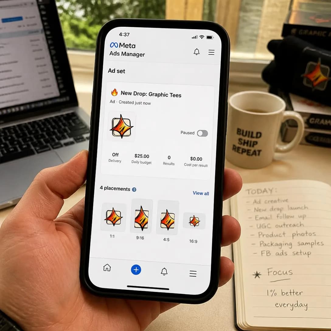
Paste your website link. Walk away for 60 seconds. Come back to a finished Meta ad — image, headline, copy, all four sizes — sitting in your account, paused and ready to publish. No brief. No form. No back-and-forth. Just your URL and best-in-slot's AI reading your site, learning your business, and building the ad while you grab coffee. This is how ad creation should've worked from the start.
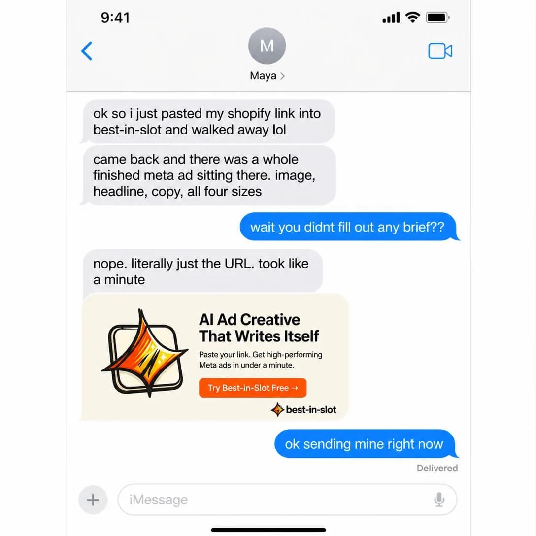
Paste a link. Get a finished Meta ad.
Start free. No card required.
How It Works
MidExplains the process from input to mechanism to result.
Input, mechanism, result — the path the customer will walk, laid out end to end. Where a demo shows one instance, this describes the shape of every instance, which is what someone needs before they can picture themselves doing it. Its job is uncertainty reduction, and uncertainty is the quiet reason most people who liked your benefit ad still didn’t buy.
The reader is not trying to learn your system. They are trying to price the effort, and every step you name is a step they mentally add to their week. So name three. Three is enough to feel like a real process and few enough to feel survivable; five reads as a project, and a project gets postponed. The other rule follows from the same place: every step must be something the customer does or something that visibly happens to them. Internal stages of your pipeline are not steps, they are your problem, and putting them in the ad makes your product sound like work.
It becomes too technical exactly when the writer starts enjoying it. The test is to read the ad as someone deciding whether to spend a Saturday on this. If a step needs a term the reader doesn’t already own, either teach the term in four words or cut the step — and if the honest process really is nine steps, the ad’s job is to tell them which two they’re responsible for.
- Works because
- Reduces uncertainty and builds understanding.
- Fails when
- Can become too technical or slow.
Write one like this
- Paste a link. Pick a photo. Publish. There is no step four.
- Step one is a URL. Step two is you saying yes.
- Where the brief normally goes, there’s a link box.
- Three steps, and you only do two of them.
Don’t describe your pipeline. Steps the customer doesn’t personally perform make the product sound longer, not more impressive.
Paste your website link. Get a finished Meta ad in ~1 minute. No forms, no briefs, no back-and-forth. best-in-slot reads your site, generates the concept, creates the image, writes the copy, and drops it straight into your Ads Manager — paused and ready for you to review. It's the entire ad workflow, automated. Link in, ad out.

Paste your link. Get a finished ad.
Start free at bestinslot.ai
Mechanism Reveal
MidExplains why the product works differently from alternatives.
Not what it does — why it can do it when the obvious alternative can’t. This is the reason-to-believe angle proper, and the one that does double duty: a mechanism is simultaneously an explanation and a differentiator, which is why it is worth more test budget than its position in the library suggests.
It requires a difference you can name, and the tell that you have a real one is that it also explains a limitation. A mechanism that produces nothing but upsides is a slogan wearing a lab coat. “It reads your website instead of asking you to fill in a brief” is a mechanism — and it explains why the setup is quicker and why a business with a thin website gets a thinner first draft. Saying the second half is not a concession; it is the thing that makes the first half believable, because a reader who has been sold to before knows every real design decision cost somebody something.
Sequence matters more here than anywhere else in the family. Name the mechanism in the first line and it is jargon; name it after the reader wants the outcome and it is a brand. So lead with the consequence they can feel, reveal the machinery second, and only then attach a capitalised name to it if you intend to keep using that name for years. And be honest with yourself about whether you have one: if the mechanism ad underperforms a plain benefit ad at the same audience, the market has just told you your difference is invisible from outside, which is a positioning problem no headline will solve.
- Works because
- Creates differentiation and a reason to believe.
- Fails when
- Requires a genuinely interesting or defensible mechanism.
Write one like this
- Most ad tools start from a template. This one starts from your website.
- Your logo isn’t redrawn from a description. The file is handed to the model as a reference.
- It doesn’t guess your brand colours. It reads them off your own pages.
- The reason the product in the ad looks like yours: it was built from your photo, not from a sentence about it.
Don’t reveal a mechanism with no cost attached. A difference that apparently sacrifices nothing reads as marketing, and the reader discounts it for free.
It didn't ask you a single question. It just read your site. Every ad tool starts with a form because it doesn't know your business. best-in-slot skips the interrogation — it scans your actual website, pulls your real logo, your brand colors, your product details — and builds an ad that already sounds like you. No guessing. No questionnaire fatigue. Just paste your link and watch it work.
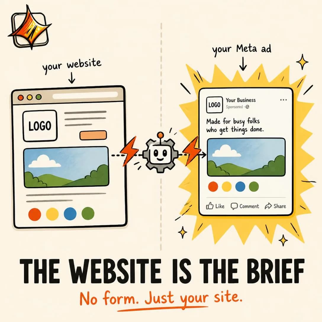
No form. Just your website.
From website to Meta ad in 60sec
Feature → Benefit
MidLeads with a feature and immediately translates it into a customer outcome.
One specification, immediately translated. The feature supplies credibility because it is concrete and checkable; the benefit supplies motivation because it happens in the reader’s life rather than in your product. Neither works alone — a feature by itself is trivia, a benefit by itself is the unbacked promise issue #2 spent ten angles trying to rescue — and the translation between them is the entire ad.
Write it as one sentence with a hinge in the middle. Four sizes in one ad, which means Stories stops cropping your product out of frame. Every ad lands paused, which means you can generate at midnight and decide in the morning. The hinge is where most of these fail: the writer states the feature, feels the relief of having been specific, and stops. If the ad ends before “which means”, you have published a spec sheet with a logo on it.
The taxonomy’s warning — that it still becomes a catalogue if overused — is really a warning about quantity. One feature per ad. The moment there are three, the reader stops translating and starts skimming, and you have written a Benefits List with worse pacing. There’s a strategic side effect worth using deliberately: the benefit you attach declares who the ad is for. The same export feature translated as “hand it to your client by Friday” and as “stop paying for a designer to resize things” is two different ads aimed at two different buyers, and running both is a cheap way to find out which one you actually have.
- Works because
- Makes specifications meaningful.
- Fails when
- Can still feel like a product catalog if overused.
Write one like this
- Four shapes in one ad — which means Stories stops cropping your product’s head off.
- Every ad is created paused, so you can generate at midnight and decide over coffee.
- It inherits the page, the link and the CTA from the ads already in your set. You fill in nothing.
- Five headlines per ad, because Meta optimises better when you give it something to choose between.
Don’t stop at the feature. The spec earns attention and the translation earns the click — an ad that ends before “which means” is a product catalogue.
Paste your website link. Wait 60 seconds. Get a finished Meta ad — image, copy, all four sizes, ready to publish. No forms. No briefs. No back-and-forth. Just your URL in, and a scroll-stopping ad out before your coffee gets cold. best-in-slot reads your site, learns your business, and builds the entire ad for you. Nothing goes live until you say so. Start free — no card required.
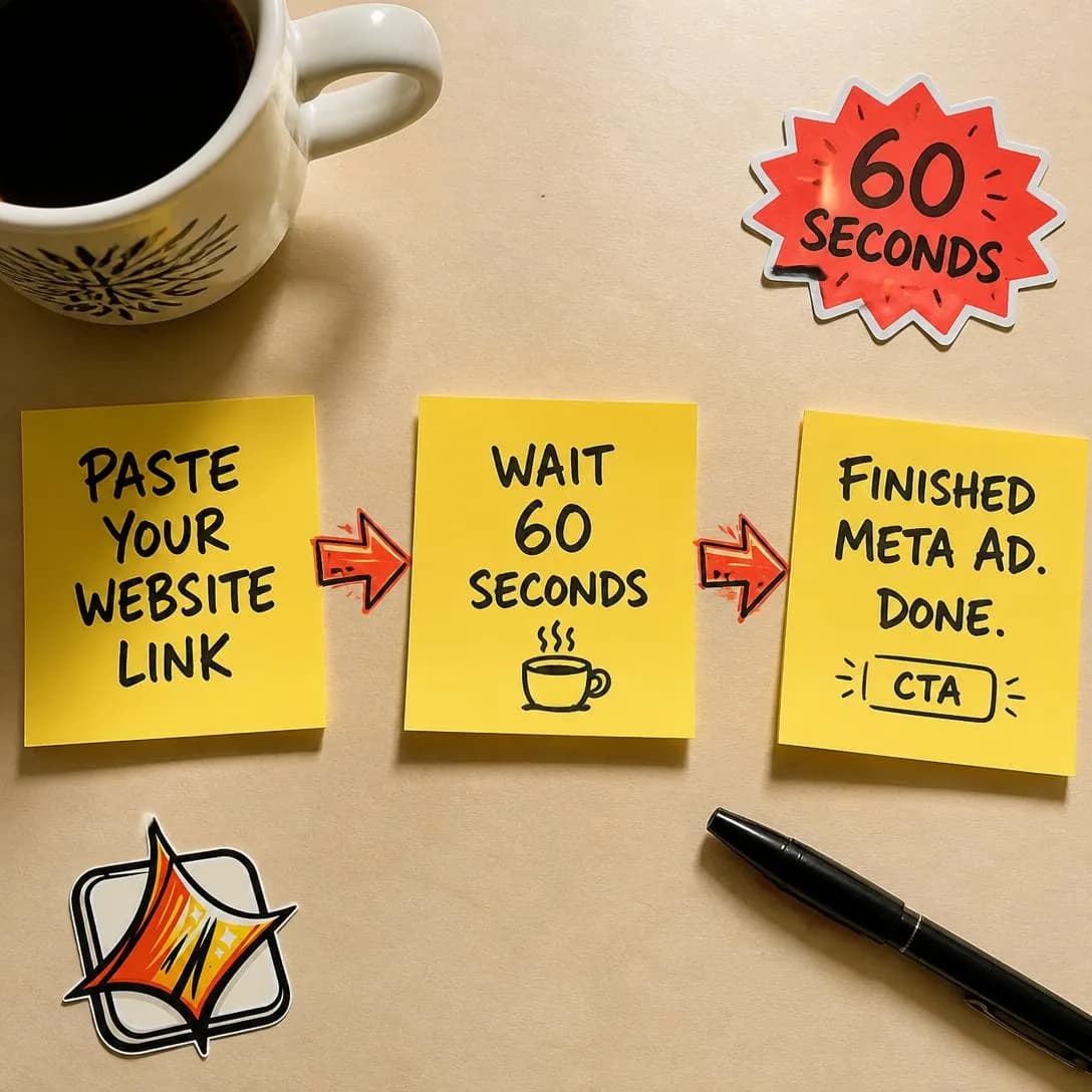
Website link → finished ad in 60 sec
No setup. Just finished ads.
Ingredient / Material
MidSpotlights a specific ingredient, component, material, or input.
One input carries the whole argument. The fabric, the compound, the chip, the source of the data. It is the premium-positioning workhorse in physical categories because an ingredient is a quality claim you can point at, and pointing is worth more than describing.
The taxonomy’s weakness — the ingredient may mean nothing without education — is not a caveat, it is the job. Budget two sentences: what it is, and what it does that the ordinary alternative doesn’t. A quantity beats an adjective every time, because a number implies someone chose it and a choice implies a trade-off. “Merino” is a word the reader may or may not have opinions about; “230gsm merino, so it doesn’t hold smell for a week of wear” is an argument with a reason attached.
There is a second effect worth naming, because it is why brands pay for ingredients they could have made themselves: a known input transfers credibility you didn’t have to build. That is also its risk. Lean on someone else’s ingredient hard enough and you have taught your market to shop for the ingredient, which is available to your competitors at the same price it was available to you. The safest version is an input that is genuinely yours, or a combination that is — and the fastest way to find out whether the education landed is whether customers start repeating the ingredient back to you unprompted.
- Works because
- Strong for quality, efficacy, and premium positioning.
- Fails when
- The ingredient may mean nothing without education.
Write one like this
- The photo in the ad is the photo you uploaded. Not a lookalike generated from a description of it.
- Your fonts. Your hexes. Read off your own site, not picked for you from a palette.
- Two things go in: a link and a photograph. Everything else is derived from them.
- Built from your product page — the copy, the pricing, the way you write. Nothing was invented.
Don’t name the ingredient without explaining it. An unexplained input is a word the reader skips, and a skipped word can’t justify a higher price.
Your website link is the only ingredient we need. Every other ad tool makes you fill out a 20-field brief before it does anything. best-in-slot just reads your URL — pulls your offer, your audience, your brand voice — and spits out a finished Meta ad in about a minute. Concept, image, copy, all four sizes. The setup form is gone.
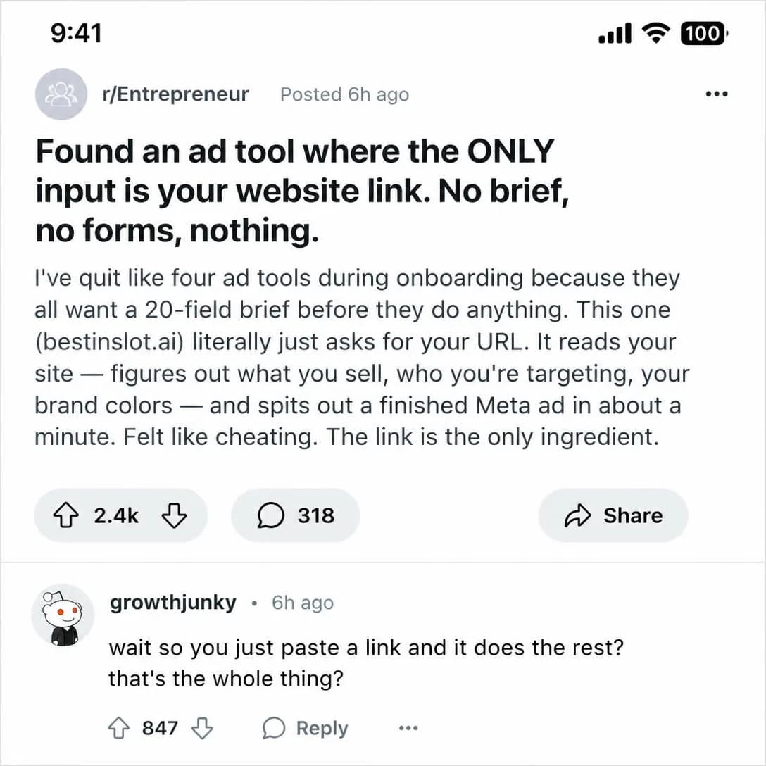
Paste your link. Get a finished ad.
Ready-to-publish Meta ads
Technology / Innovation
Cold–MidPositions proprietary or newer technology as the advantage.
The advantage is that it’s new. This runs colder than most of the family because novelty needs no prior belief — new is interesting on arrival, and interest is the thing a cold ad is short of. It is also the angle that has degraded fastest in the last three years, for a reason worth being blunt about.
“AI-powered” is not a differentiator any more; it is a table stake, and an ad whose entire technological claim is that it uses AI is an ad about the year rather than about the product. The same was true of “cloud” and “app” before it. The fix is ordering: lead with the capability that didn’t exist before, name the technology second, and only if naming it adds something the capability didn’t already prove. Jargon is not a vocabulary problem, it is a sequencing problem — the identical term reads as substance after a consequence and as noise before one.
Novelty also has a shelf life, and the ad expires when the category catches up. So treat a technology ad as a claim with a clock on it: run it while the difference is real, watch for the month the mechanism becomes ordinary, and have the durable version — a mechanism, a benefit, a proof — already tested and waiting. Anything you plan to still be selling in two years should not depend on a word that will sound dated by then.
- Works because
- Establishes novelty and perceived superiority.
- Fails when
- “Technology” can become empty jargon without evidence.
Write one like this
- Ten years ago this was a photoshoot, a designer and a fortnight. Now it’s a link and a photo.
- The interesting part isn’t that it’s AI. It’s that it read your website before it wrote anything.
- It’s not a template with your colours dropped in. None of this existed before you asked for it.
- Your logo goes to the model as a file, not as a paragraph describing your logo.
Don’t sell the technology, sell what it made possible. “AI-powered” differentiates nothing and dates the ad the month the category catches up.
Your website already has everything an ad needs. We just read it. 🧠 No setup form. No questionnaire. Our AI crawls your site, extracts your business summary, audience, and brand identity in seconds — then builds a finished Meta ad in about a minute. Paste your link. Get an ad. That's it.
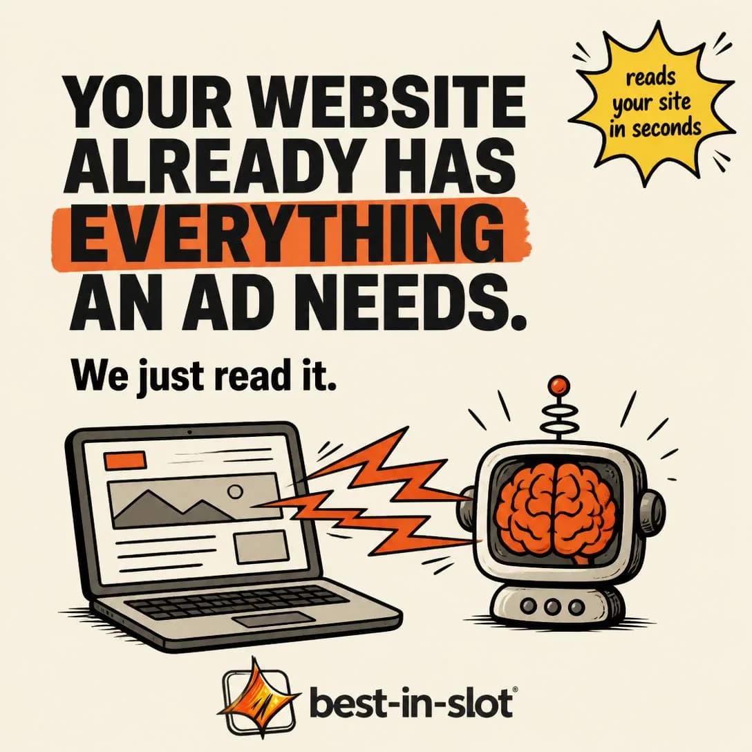
AI reads your site. Builds your ad.
Paste link → Get finished ad
Craftsmanship
MidShows how the product is designed, built, sourced, or made.
How it was made, offered as proof of what it is. The reader can’t evaluate the product from an ad — they have never held it, never used it — so they evaluate the process instead and generalise from that. Care visible in the making is taken as evidence of care in the result, and that inference is what lets a craftsmanship ad support a price a spec sheet couldn’t.
Specific and unglamorous beats beautiful. The slow-motion beauty shot is what everyone shoots; the detail that actually moves people is the one with a cost in it — the batch that gets rejected, the fourth pass nobody would notice was missing, the supplier you kept when a cheaper one appeared. Anyone can claim to care. Only someone who does can name the thing that caring cost them, which is why a trade-off is evidence and a sentence about passion is decoration.
The taxonomy is right that this is production-intensive and weak for commodities, and it looks at first like it doesn’t apply to software at all. It does — it just isn’t “our engineers are passionate”. The software version of craftsmanship is the decisions you made against your own short-term interest: the default that protects the user, the feature you refused to ship, the thing that is slower because the fast version was worse. Those are checkable, they are the reasons your product feels different in use, and they are almost never in anyone’s advertising.
- Works because
- Excellent for premium pricing and quality perception.
- Fails when
- Production-intensive and less useful for commodities.
Write one like this
- Every ad we create arrives paused. That decision costs us signups. We kept it.
- It will never create a campaign, or touch an ad you already have. That restraint took longer to build than the feature did.
- Forty-three ad styles in the picker, and the one that wins is rarely the one you’d have guessed.
- We deleted the setup form. That was a year of work, so you could skip ten minutes.
Don’t say you care about quality. Name the decision that cost you something — care is a claim anyone can make, a trade-off is evidence only you can show.
We don't ask you to fill out a form. We just read your website — and pull your real logo, real colors, and real tone straight from it. Then we build your ad from those exact materials, not generic templates. That's why the finished ad already looks like it came from your brand. Because it did.
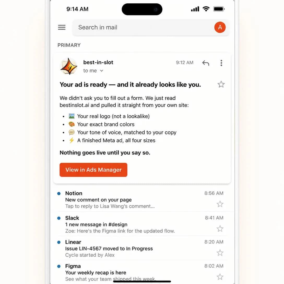
Your site is the blueprint
Paste link → finished ad
Durability / Reliability
Mid–HotDemonstrates robustness, consistency, lifespan, or dependability.
Not “does it work” but “will it keep working”. That question only arrives once someone is close enough to imagine owning the thing, which is why this sits Mid–Hot and why it converts: it is often the last live objection between a decided buyer and a payment.
It has to be demonstrated, not asserted. Every category has its version of the torture test — the bag dragged behind a car, the ten-year warranty, the machine on its four hundredth cycle. For anything digital the equivalent is consistency: the hundredth run looking like the first is the claim, because software rarely breaks, it drifts. What makes any of these persuasive is that they are falsifiable. A number with a unit and a duration attached invites the reader to check it, and inviting the check is most of the persuasion.
Then live with it, because this is the only angle in the family your customer re-audits daily. A durability claim doesn’t end at purchase; it becomes the standard your product is measured against every time it is used, and the gap between the ad and the third bad week is where refunds and one-star reviews come from. Which is the useful discipline: only make the reliability claim you would still be comfortable with printed on the box a year in.
- Works because
- Strong for high-AOV physical goods and tools.
- Fails when
- Needs convincing evidence or demonstration.
Write one like this
- The tenth ad looks like the first. That’s the hard part.
- If a generation fails, the credits come straight back. Nothing else would be honest.
- Same brand, same fonts, same product, ad after ad. Consistency is the feature.
- Run it fifty times this month. It won’t drift.
Don’t claim a reliability you haven’t measured. It’s the one promise in this family the customer re-tests every single day, and the gap shows up as refunds, not as complaints.
One button. Every time. No jams, no crashes, no do-overs. 🔥 Most ad tools break when you feed them anything weird — a cluttered site, an oddball product, a slow Tuesday. best-in-slot is built like a factory press: link goes in, finished Meta ad comes out, same battle-tested pipeline every single run. Concept. Image. Four sizes. Copy. Done. The reliability is the actual product.
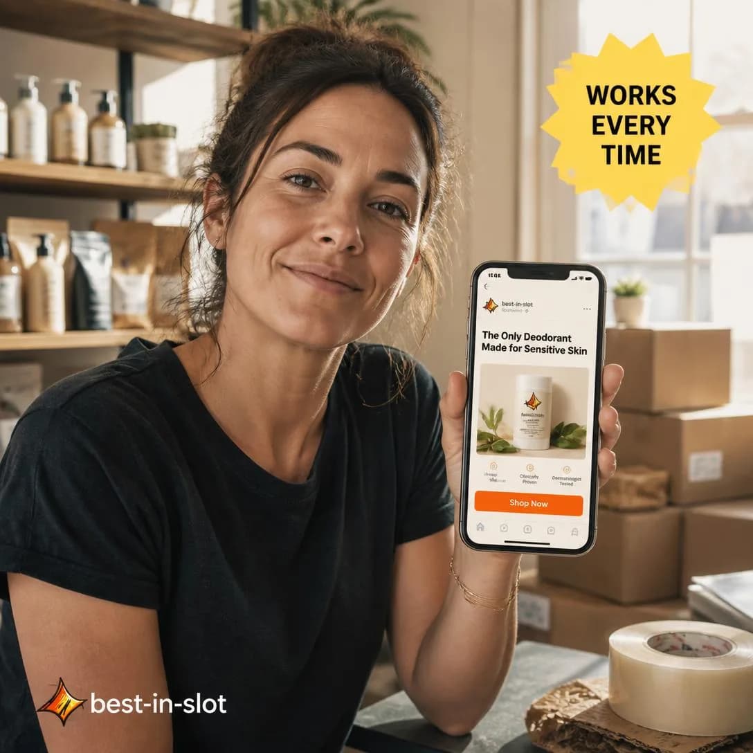
One button. Finished ad. Every time.
Try it free — no card needed
Versatility
MidDemonstrates multiple uses, configurations, or outcomes.
It does more than you assumed. The argument is arithmetic on perceived value — one price, several jobs — and it is at its best when the second use is one the reader was already paying somebody else for.
Its weakness is the most predictable in the family and the most ignored: say everything and you stand for nothing. The reader files products under one heading, and an ad offering eight uses gets filed under none. So take the structure seriously — one primary use, one surprising second, and stop. The second should be adjacent enough to be believed and far enough to be news, which is a narrower target than it sounds. A blender that also crushes ice is not news. A blender that grinds coffee is.
There is a better place for this angle than cold traffic, and it’s the one most accounts skip: existing customers. Someone who already owns the product and doesn’t know about its second use is the cheapest expansion audience you have, and the ad is doing a retention job while it runs. Cold, be more careful — a stranger who hasn’t agreed you’re good at the first thing has no reason to be impressed that you also do a second.
- Works because
- Expands perceived value.
- Fails when
- Can weaken the primary positioning if the ad tries to say too much.
Write one like this
- One photo becomes four shapes — feed, portrait, story, wide. You upload once.
- It isn’t only for the ad you’re about to run. It’s for finding out which angle works before you spend on it.
- One product photo is a month of tests.
- Three brands in one account, without either of them bleeding into the other.
Don’t list every use. Two is a discovery; eight is an ad that couldn’t decide who it was for, and the reader won’t decide for you.
Same website. Three completely different ads. ⚡ Paste your link once, and best-in-slot spins it into a polished product shot, a native feed screenshot, or even a wildcard meme-style ad. No forms. No guesswork. The AI reads your site, learns your business, and generates concepts that flex into whatever creative style works. One click = finished ad in all four Meta sizes, ready to publish. Nothing goes live until you say so.
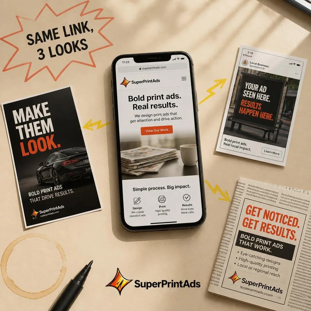
Same link. Infinite ad styles.
Concept to publish in 1 minute
Testing them against each other
Test this family against itself only after you have tested it against the two before it. The question it answers for you isn’t which explanation is best — it’s how much explanation your market needs at all. Some categories buy on recognition and never open the lid; some can’t commit until they can picture the machinery. Run a Product Demo against a Mechanism Reveal against a Feature → Benefit at one audience with one offer, and read the spread as a fact about your buyers rather than about your writing.
Then read the results more slowly than you would elsewhere. Explanation ads usually take a lower click-through rate and hand back better traffic — fewer people, further along — so judging them on CTR is the standard way a good mechanism ad gets killed in week one. Look at cost per purchase and at what happens after the click. And whatever wins, propagate it: the mechanism that earned the click should be the first thing on the landing page and visible in the first five minutes of the product. A mechanism the ad promised and the product never demonstrates is a refund with extra steps.
Pick an angle. Get the ad.
No credit card · 50 free credits (about 5 ads or Instagram posts)