
Ad Angle Library #5 · 10 angles
Comparison & Positioning ad angles
Clarify why this solution is different or better.
Every family before this one has two characters in it: you and the reader. This is the first with a third. A rival, a habit, an era, a belief — something else is in the frame, and the reader grades your description of it before they grade anything you say about yourself. That is the whole craft problem of this family. You are asking somebody to trust a comparison written by one of the two parties being compared, and they know it.
The job is also narrower than it looks. Comparison does not create wanting; it resolves choosing. It needs a reader who already accepts the outcome is worth having and is now deciding where to get it, which is why four of these ten sit at Mid–Hot and none of them will rescue an audience that hasn’t got a problem yet. Run a competitor comparison cold and you have shown a stranger a grid about two things they have never heard of.
But half the family runs cold anyway, and the reason is the split that actually organises these ten. Some of them compare products. Some of them compare beliefs. Us vs. Them, Direct Competitor Comparison, Price vs. Value and Hidden Cost of Cheap all need a reader who is shopping. Old Way vs. New Way, Category Enemy, Myth Busting and Contrarian need only a reader who holds an opinion about the category, which is nearly everybody. A belief comparison requires no product knowledge to understand, so it survives the top of the funnel that a feature grid cannot.
The failure mode is one thing and it is not aggression. It is winning every row. A comparison in which you are better on all eight dimensions is not information, it is a claim wearing a table, and readers discount the whole artifact rather than any single line of it. The credibility in this family is bought with concessions — one dimension where the other option is genuinely the right answer, stated plainly. That single row is what makes the other seven readable as findings rather than as marketing.
The ten differ on who the opponent is. Us vs. Them fights a composite; Direct Competitor Comparison names a real one. Old Way vs. New Way replaces the rival with a date, and Alternative / Substitute replaces it with a different route to the same place. Price vs. Value and Hidden Cost of Cheap both argue about money from opposite ends — one says your number is being measured wrong, the other says theirs is. Category Enemy, Myth Busting and Contrarian pick a fight with a practice, a fact and an opinion respectively. And Why We’re Different removes the opponent altogether, which makes it either the cleanest ad in the family or the emptiest.
Which one, when
- ColdMyth Busting · Contrarian
- No product knowledge required, because the thing being compared is a belief the reader already has. Both work by disagreement — one with something they think is true, one with something they think is sensible — and disagreement is the only form of attention a stranger gives away involuntarily.
- Cold–MidOld Way vs. New Way · Category Enemy
- The opponent is a practice rather than a company, so nobody has to be wrong — only early, or on the wrong side of something they already resent. This is where you go when your category has a dominant habit but no dominant brand, which is most categories.
- MidAlternative / Substitute · Why We’re Different
- For a reader who has accepted the problem and is now assembling a shortlist. One of these widens the shortlist to include the thing they are actually doing instead; the other drops the comparison entirely and just states the position. Both assume enough interest to read a second sentence.
- Mid–HotUs vs. Them · Direct Competitor Comparison · Price vs. Value · Hidden Cost of Cheap
- The reader is choosing, and comparison is what choosing feels like. All four put a second option in the frame — unnamed, named, or priced — and all four carry a cost the belief angles don’t: they make the alternative salient, and half of them make price salient. Worth it at the bottom, expensive at the top.
About the examples. Every ad below was generated by best-in-slot for best-in-slot — one product, one underlying problem, 10 different arguments about it. That repetition is the point: hold the product and the pain still, and the angle is the only thing left changing. Each is shown exactly as it came out.
Us vs. Them
Mid–HotContrasts your brand with the typical competitor or category solution.
A two-column argument where the second column is a composite. “Them” is the typical way this gets done — the category’s default provider, the standard process, the thing most people in the audience are currently putting up with. You get the clarity of a head-to-head without naming anyone, which means no legal exposure, no free advertising for a rival, and no obligation to keep a specific competitor’s facts current.
It also outperforms the named version more often than people expect, because the reader casts the villain themselves. Every person who sees it fills “them” with whichever option actually burned them, and their version is more specific and more annoying than any composite you could have written. You supply the shape of the complaint; they supply the details. That is a better division of labour than it sounds.
The craft is in the axis, not the columns. Pick the single dimension you genuinely win on and stay on it for the whole ad — speed, or control, or what you don’t have to know beforehand. A list that wins on eight dimensions reads as a brochure and persuades on none of them; one axis, stated twice, reads as a position. And watch the tone the taxonomy warns about: “them” must never quietly include the reader. Most of your audience is currently using them, and an ad that mocks the alternative is mocking the choice they made last year.
- Works because
- Extremely clear differentiation.
- Fails when
- Can appear petty or create legal/compliance issues if careless.
Write one like this
- Everyone else starts you at a blank canvas. We start at your product photo.
- Them: brief, designer, four days, one ad. Us: one photo, eleven angles, this afternoon.
- Most tools hand you a template and call it creative direction.
- The usual way to get twelve ads is to ask twelve times. There is a shorter way.
Don’t let “them” include the reader. Contrast the approach, never the people currently using it — most of your audience is one of them, and they hear it.
Other ad tools hand you a form. We ask for a link. Paste your website. Get a finished Meta ad in ~60 seconds — concept, image, copy, all four sizes. No questionnaire. No guessing your brand voice. No 'tell us about your audience.' The setup form is the part of every ad tool that makes people quit before they begin. We threw it out. Start free at bestinslot.ai
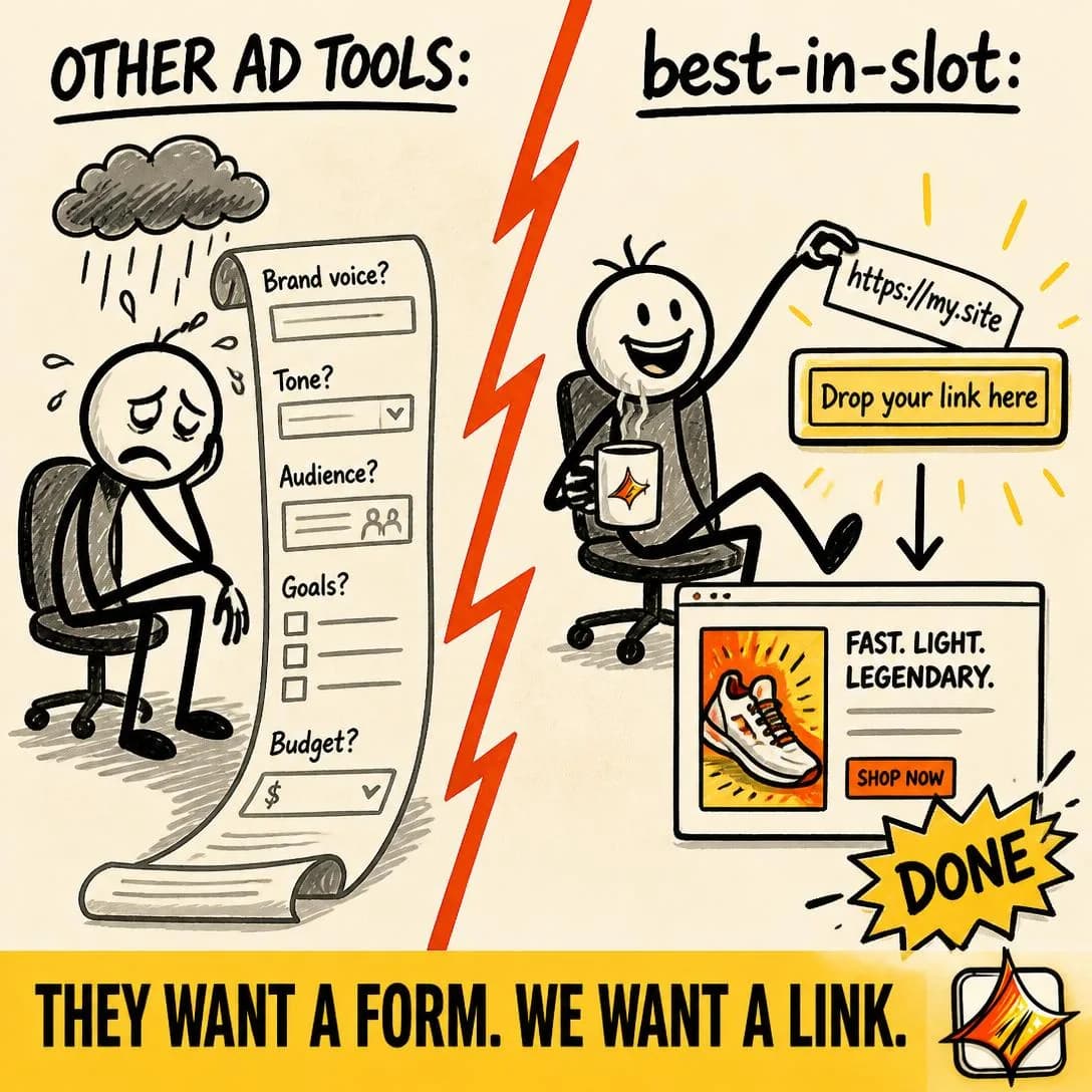
They want a form. We want a link.
Paste link → get Meta ad. Done.
Direct Competitor Comparison
Mid–HotCompares your product against a named competing product or service.
You name them. This is the highest-intent ad in the family and it works for a plain reason: the reader was going to run this comparison anyway, in six tabs, over an evening, badly. Doing it for them intercepts the research rather than interrupting it, which is why product-aware audiences reward it so heavily. You are not asking for attention here, you are answering a question already open in their browser.
Three rules keep it from backfiring. Concede a row — the honest thing the other product does better — because a comparison you win entirely is one the reader knows you wrote. Date it, because the taxonomy’s weakness column is really a maintenance problem: their pricing page changes without telling you, and a stale comparison is a false claim you are paying to distribute. And only name upward. Comparison lends salience in both directions, so naming a rival bigger than you borrows their recognition, while naming a smaller one buys them an introduction to your audience at your expense.
Remember the comparison is public. Meta’s Ad Library carries active ads for anyone who looks, so assume the named competitor reads it the same afternoon, and write the version you would be comfortable defending line by line. In practice that discipline improves the ad. Claims you can support tend to be specific, and specific claims are the ones that convert; the rows you would have to argue about are usually the vague ones that were doing no work anyway.
- Works because
- Powerful for product-aware shoppers.
- Fails when
- Claims must be accurate, current, and supportable.
Write one like this
- Canva gives you a canvas. This gives you eleven arguments and the image for each.
- We wrote the comparison so you don’t have to open six tabs. Row four is the one we lose.
- Cheaper than an agency, more opinionated than a template. Both on purpose.
- What we cost, what they cost, and the one job they still do better than us.
Don’t publish a table you win every row of. One honest concession is what makes the rest of the grid readable as information rather than as advertising.
Spent 3 hours in Canva last week trying to build one Facebook ad. Never again. Canva handed me 400 blank templates. I ended up being the designer, the copywriter, AND resizing everything for Stories. bestinslot.ai learned my business from my website link and gave me a finished ad — image, all four Meta sizes, copy — in under a minute. It landed in my Ads Manager paused, so nothing went live until I said so. Turns out one tool is a blank canvas. The other is the finished product.
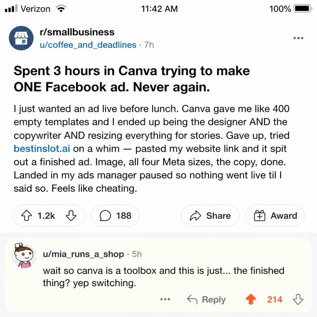
Canva gives you templates. We give you ads.
Finished ads in ~1 minute
Old Way vs. New Way
Cold–MidContrasts the traditional method with your newer approach.
The same two-column structure with the rival swapped for a date. The opponent is not a company, it is a method — the sequence of steps the reader currently performs, presented as the thing everybody sensibly did until recently. That is why it carries cold traffic when the rest of the comparison angles can’t: understanding it requires no knowledge of any brand, only recognition of a process.
Its real trick is converting a purchase into an upgrade. People switch reluctantly and upgrade easily, and the difference is entirely in the framing — switching implies the earlier choice was a mistake, upgrading implies it was correct and has been superseded. Nobody has to be wrong in this ad, only early, and that removes the defensiveness every other comparison angle has to work around.
It needs a recognisable old way, which is the constraint the taxonomy names and the one people underestimate. If the audience does not already perform the ritual, there is no contrast to feel — you have written a description. So show the old way in their own hands, in steps and hours rather than adjectives, and describe it fairly. A caricature is the standard failure here: the reader is still living in the old way this week, and an unfair version of it insults them at the exact moment you wanted recognition.
- Works because
- Turns innovation into an obvious upgrade.
- Fails when
- Requires a recognizable “old way.”
Write one like this
- The old way: brief, designer, revisions, four days, one ad. The new way is a Tuesday afternoon.
- Design tools were built to make one thing beautifully. You need twelve by Thursday.
- You are not bad at this. You’re using the process from before the tools changed.
- Ten years ago this needed a studio. It now needs a product photo and a sentence.
Don’t caricature the old way. Your reader is still doing it, and a straw-man version of their week reads as contempt rather than contrast.
You know that 40-field setup form every ad tool makes you fill out before you can even see a draft? We deleted it. Paste your website link. best-in-slot reads it, learns your business, and generates a finished Meta ad in about a minute. No questionnaire. No brief. No soul-crushing onboarding. The form was the part that made people quit. So we threw it out.
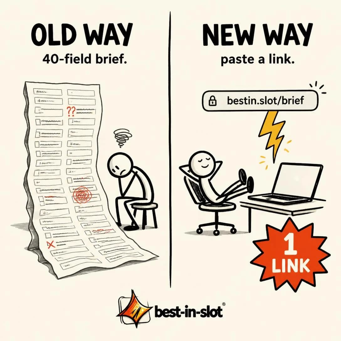
No setup form. Just paste your link.
Start free — no card required
Alternative / Substitute
MidCompares your solution with a completely different way of achieving the same goal.
Compare against a completely different route to the same destination — not the rival product, but the thing the money is currently doing. For most businesses that is not another tool at all: it is a freelancer, an agency retainer, an internal hire, or the decision to keep doing nothing. Your real competitive set is a list of line items, and it rarely matches the list a review site put you on.
Widening the frame is what makes this angle worth its Mid placement. Category comparison fights over a budget that already exists; substitution goes and finds one somewhere else, which is where genuinely new demand comes from. It also reframes the price question before it is asked — measured against a category rival you are expensive, measured against three months of a freelancer you are a rounding error, and the comparison you choose decides which of those the reader does in their head.
The failure the taxonomy names is distance. The comparison only holds while the reader agrees both routes reach the same place, so keep the goal fixed and vary only the method; the moment the substitute solves a slightly different problem, the ad stops being a comparison and becomes a non sequitur. Find yours by listening to what customers say they stopped doing rather than what they say they switched from — the first answer names the substitute, the second names a competitor.
- Works because
- Expands the competitive frame and can unlock new demand.
- Fails when
- Can confuse positioning if the comparison is too distant.
Write one like this
- Your alternative isn’t another tool. It’s the freelancer you message on Sundays.
- Boosting a post isn’t advertising. It’s paying to reach the audience you already had.
- The budget for this already exists. It is currently filed under “design”.
- Hire someone for three months, or test eleven angles before Friday.
Don’t reach for a substitute that solves a slightly different problem. Hold the goal fixed and vary only the route, or the comparison stops parsing as one.
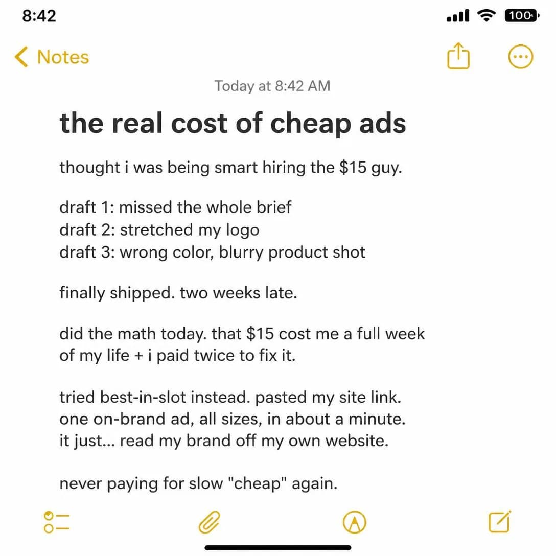
You know the drill: write a brief, wait three days, get a draft that's 'close but not quite,' then spend another week on revisions. Or… paste your URL and get a finished Meta ad in 60 seconds. Best-in-slot reads your website, generates the concept, creates the image in all four Meta sizes, writes the copy, and publishes it straight into your Ads Manager — paused and ready for you to review. No briefs. No back-and-forth. No freelancer needed.
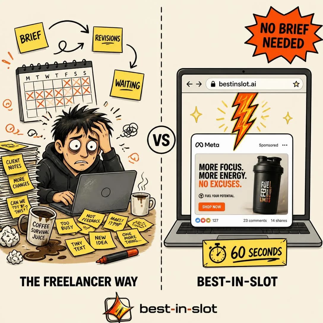
Freelancer or 60 seconds. You pick.
Start free. No card required.
Price vs. Value
Mid–HotExplains why sticker price does not equal true value.
This one does not argue that you are cheap. It argues that the reader is dividing by the wrong number. Price is a figure; value is that figure over a unit — per ad, per month, per campaign, per hour not spent. Supply the denominator and the comparison turns into arithmetic the reader performs themselves, and a conclusion somebody reached on their own does not need defending.
Choose the unit carefully, because the wrong denominator is the tell. It has to be something the reader already counts in their own head, and the comparison has to be against what they currently spend on the same job — not against a coffee, not against a gym membership, not against anything that trivialises a decision they consider serious. Trivialising comparisons read as a dodge, and a reader who catches you dodging price starts wondering what the honest number was.
The taxonomy’s warning is the important part: this makes price salient. That is a real cost, and it decides the stage. Run it where price is already in the room — retargeting, people who reached the pricing page and left, anyone deep enough to have started doing the maths — and keep it away from cold audiences, where you would be introducing an objection nobody had raised yet. Used correctly it is not a discount argument at all, it is permission to charge more.
- Works because
- Useful for premium positioning or disruptive economics.
- Fails when
- Can make price more salient.
Write one like this
- £29 looks like a lot until you divide it by twelve finished ads.
- One agency ad costs more than a year of this. Same brief, same week.
- The real number isn’t what this costs. It’s what another dead week of spend costs.
- Per ad, this is cheaper than the stock photo you were about to license.
Don’t compare your price to a coffee. Compare it to what the reader currently spends doing the same job, or the ad reads as an attempt to make a serious decision sound small.
You just paid a freelancer $350 for one ad and a five-day wait. For $19/mo, best-in-slot gives you 26 ads — concept, image, copy, all four Meta sizes — in about a minute each. No briefs. No back-and-forth. Just paste your website and start building. The math isn't close.
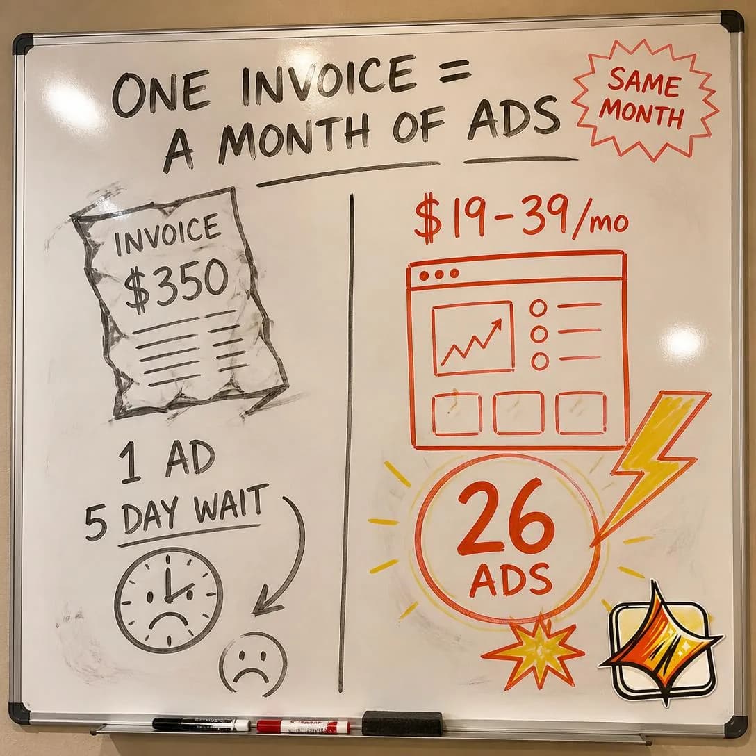
One invoice = a month of ads
From $19/mo. No per-ad fees.
Category Enemy
Cold–MidDefines a common enemy, outdated industry practice, or conventional behavior the brand opposes.
Name a shared adversary and stand on the reader’s side of it. Not a competitor — a practice: the industry habit, the accepted waste, the convention everybody complies with and nobody defends. The reader agrees before they evaluate anything, and agreement is a much cheaper first transaction than belief.
It recruits rather than persuades, which is why it survives cold traffic and why it outlasts the campaign. A well-chosen enemy is the most memorable thing a brand can own, because positions are easier to remember than features and a reader who has adopted your enemy carries your positioning around for you. The requirement is that the enemy already annoys them and they have not yet put words to it. Articulating a resentment somebody is already carrying feels like being understood; announcing one they have never felt feels like a stranger shouting.
Two constraints. It must be a practice rather than a group of people, because the instant the enemy is a category of person your reader might belong to, half the audience is defending themselves instead of agreeing with you. And you have to be clean. This angle is a promise the product is then obliged to keep, so an ad attacking templates from a company whose output looks templated does more damage than no ad at all. Polarisation is only worth its cost when the people it excludes were never going to buy.
- Works because
- Creates memorable positioning and belief alignment.
- Fails when
- Can become unnecessarily aggressive or polarizing.
Write one like this
- Nobody should need a design degree to run a Tuesday ad.
- The industry sells you templates and calls it creative direction.
- Four days of turnaround for one image is not a standard. It’s a habit.
- Agencies bill for the deck. You only ever needed the ad.
Don’t pick an enemy you’re guilty of. This angle turns into a claim about your own product, and the first customer who sees you commit the sin you named is gone for good.
The setup form is dead. 🪦 You know the one — dropdowns, brand guideline uploads, 47 required fields before you see anything. We killed it. Paste your website link, get a finished Meta ad in about a minute. No questionnaire. No torture. Just ads.
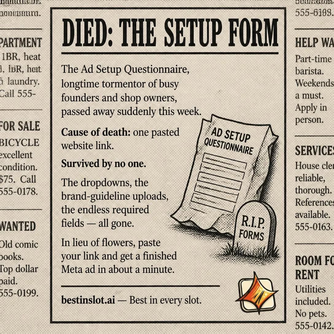
No setup form. Just paste your link.
Finished ads in ~60 seconds
Myth Busting
ColdChallenges and disproves a common belief in the category.
Take something the audience believes, show that it is false, and let the correction land on your territory. It runs cold because it needs no product knowledge and because correction is the most naturally shaped piece of writing there is — claim, contradiction, resolution — so the reader is three beats in before deciding whether to be interested.
It also trades on status, gently. Being told you are wrong about your own field is uncomfortable enough to hold attention and useful enough to forgive, and a reader who finishes the ad has learned something at your expense rather than bought something at theirs. That is a good exchange to open a relationship with, provided the correction is real.
Which is the whole risk the taxonomy names: the myth may not be widely believed. Straw myths are the standard failure of this angle — “people think ads don’t work” is not a belief anybody holds, it is a sentence written to be knocked down, and readers detect the setup instantly. The test is whether a customer could have said it out loud last week, which means the good ones come from sales calls and support tickets rather than from brainstorming. Then actually bust it. A myth stated and answered with “and that’s why we built this” is a pivot, not a correction, and the reader came for the correction.
- Works because
- Educational, differentiating, and hook-friendly.
- Fails when
- The “myth” may not actually be widely believed.
Write one like this
- You don’t need new photos. You need a different argument about the ones you have.
- More creative isn’t the fix. Most accounts are running twelve versions of one idea.
- “Good ads need a good designer” is a true statement about 2015.
- Doubling budget on a losing ad doesn’t find a winner. It buys the same answer twice.
Don’t invent the myth. If a real customer couldn’t have said it out loud last week, you have written a straw man and the reader can see the setup coming.
Myth: good ads need a 40-field brief first. We read your website instead. One link in, finished Meta ad out — concept, image, copy, all four sizes — in about a minute. The brief is dead. Nobody misses it.
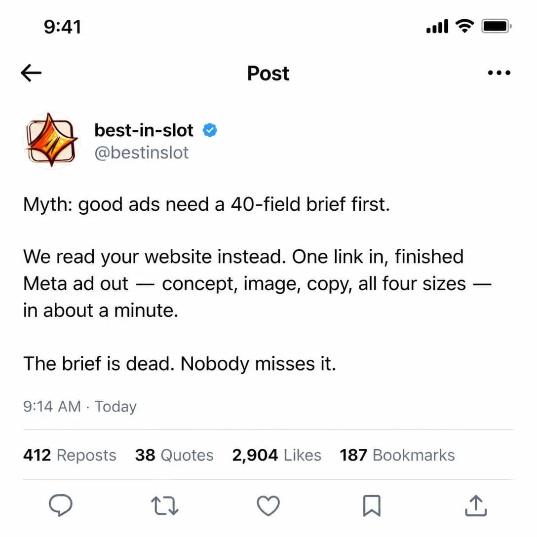
No brief needed. Just your link.
Ads in ~1 min, zero forms
Contrarian
ColdMakes a position that runs against conventional wisdom.
Take a position the reader’s own industry would dispute. It is the sharpest scroll-stopper in the family, because disagreement is involuntary — you cannot decide not to react to a sentence you think is wrong — and it builds authority as a side effect, since arguing credibly against the consensus requires knowing it well.
It is worth being precise about how this differs from Myth Busting, because they get written as the same ad. Myth Busting corrects a factual error: the audience believes something untrue, and you supply the evidence. Contrarian disputes a judgment: the thing everybody believes is broadly true, and you argue it is still the wrong thing to do. One ends in a fact and the other ends in a position, and a position is the harder, more valuable thing to own.
The reason the taxonomy calls out clickbait is a structural mismatch rather than a tonal one. A contrarian opening that resolves into a conventional pitch has taught the reader that your headline is decorative, and that lesson survives longer than the ad. So pay it off: the position has to cost you something visible — a customer segment you send away, a limitation you accept, a popular feature you refuse to build. If the argument costs you nothing, it was a costume, and the audience most attracted to this angle is the one best at spotting them.
- Works because
- Strong scroll-stopper and authority-builder.
- Fails when
- Contrarian-for-contrarian’s-sake becomes clickbait.
Write one like this
- Most brands should be running fewer ads, not more.
- Your creative isn’t the problem. You’ve been running one angle for a year.
- Stop testing headlines. You are A/B testing two versions of the same idea.
- Scale is where bad ads get expensive. It is not where good ones get found.
Don’t take a position you wouldn’t defend in a room. A contrarian hook that resolves into a conventional pitch teaches the reader that your headlines are decoration.
Every ad tool starts with the same broken ritual: a 47-field form asking you to describe your own business like you're filling out a loan application. Most people quit halfway through. The rest rush it and get generic ads built on vague answers. We threw the whole thing out. Paste your website link, and best-in-slot reads it — your actual messaging, your real products, your pricing — then builds a finished Meta ad in about a minute. No interrogation. No guesswork. Just ads.
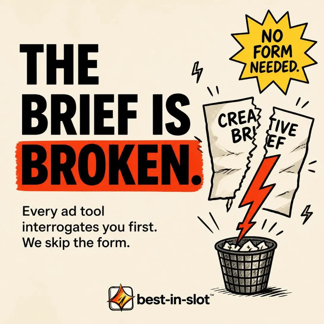
No setup form. Just paste your link.
Paste link → get Meta ad
Why We’re Different
MidStraightforwardly explains the brand’s unique advantages.
The plain statement, with no opponent in the frame at all: here is what is true of this and not of the alternatives. It is the safe one and the flexible one — nothing to keep current, nobody to be fair to — which is exactly why it is the one most likely to be dull. The taxonomy says it is often boring without proof or a point of view, and the reason is more specific than that. Most “why we’re different” copy lists things that are not differences.
Run the so-does-everyone test on every line. Read each claim and ask whether the obvious rival would happily print the same sentence on their own page; if they would, it is a category requirement rather than a difference, and it comes out. Easy to use, powerful, built for teams like yours — those aren’t claims, they are the entry fee, and stacking four of them produces a paragraph the reader has already read on three other sites this week.
What survives that test is usually a trade-off, which is the real find. You built one thing instead of another, refused a feature everyone has, optimised for a use case that costs you a different one. A difference that was free to have is a feature and a rival can copy it by Thursday; a difference you paid for is a position, and stating what you gave up is what makes the claim land as true rather than as asserted. Pair each one with its cost, and use this as the landing-page counterpart to whichever comparison ad won — the page the click arrives on is the right place for the version with no opponent in it.
- Works because
- Clear, flexible, and relatively safe.
- Fails when
- Often boring without proof or a sharp point of view.
Write one like this
- We do one thing: turn a product photo into ads that actually argue something.
- No templates. That isn’t a feature we skipped, it’s the thing we’re arguing against.
- Eleven angles instead of eleven filters. That trade is the entire product.
- We don’t design your ad. We decide what it should say, then draw that.
Don’t list things everyone in the category has. If your obvious rival would print the same sentence without blinking, it isn’t a difference — it’s the entry fee.
You know that setup form every ad tool makes you fill out? The one with 20 questions you don't have answers to? We deleted it. Paste your website link. best-in-slot reads it, learns your business, and builds a finished Meta ad in about a minute — concept, image, copy, all four sizes. No forms. No friction. Just ads.
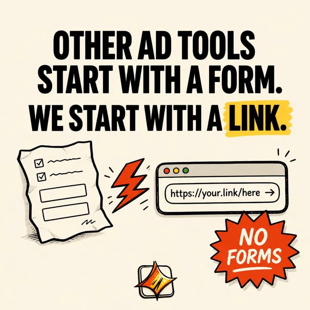
We killed the setup form
Paste link → Get Meta ad
Testing them against each other
Test this family the usual way — one audience, one offer, one product — but read the spread as a question about your buyer rather than about your writing. What varies across these ten is who the opponent is, so the winner tells you who your market thinks it is choosing between, which is information no keyword tool will give you. If Alternative / Substitute beats Direct Competitor Comparison, your competitive set is not the one your category believes in and your budget is being fought over by a freelancer, not a rival. If a belief angle beats every product angle, the audience is earlier than your funnel assumes. Both findings change more than the ads.
Then hold two things after the click. The comparison has to survive the landing page — if a concession won you the click, the full version with the conceded row belongs on the page, and a reader who arrives to find the honest table replaced by a triumphant one has learned exactly one thing about you. And diary a re-check, because this is the only family where somebody else gets a vote in whether your ad is still true. Competitors reprice, the old way quietly becomes the new one, and the myth you built a winning ad on eventually stops being believed. A comparison ad is not finished when it wins; it is finished when the facts in it stop being facts, and nobody sends you a notification on that day.
Pick an angle. Get the ad.
No credit card · 50 free credits (about 5 ads or Instagram posts)