
Ad Angle Library #10 · 17 angles
Story & Founder POV ad angles
Use narrative, human perspective, and founder/operator credibility to persuade.
The source document this library is built from breaks its own pattern here, and says so out loud: this family is “intentionally separated because founder- and story-led ads are strategic angles, not merely creative formats.” It is the only family that needed the disclaimer, because it is the only one people routinely mistake for a way of shooting rather than a thing to argue. A founder talking head is a format. Founder POV is a position somebody is willing to be wrong about in public, and you can run it as forty words on a static image with no face anywhere near it.
What the seventeen share is a mechanism rather than a subject: they persuade by telling you that something happened. Every other family in the library front-loads its claim — the problem is real, the benefit arrives, the price is fair, the deadline is Friday — and the reader can accept or reject it inside the first second. A story defers the claim. It asks for time before it pays, which means every angle on this page is buying attention on credit, and most of the craft in the family is keeping the debt small and settling it early.
That mechanism is also why this is the only family that covers the entire funnel. Nine of the ten cluster: Identity & Emotion (issue #9) has nothing above Mid, Offer & Economics (issue #7) has nothing below it. Here two rows are Cold outright, nine more are Cold–Mid, and then it keeps going — Mid, Cold–Warm, two Warm–Hot, two Mid–Hot. Narrative is not a stage of persuasion. It is a container, and it will carry a callout to a stranger and a price defence to somebody with your checkout already open, which is a range nothing else in the library has.
The failure mode is unique too, and it is worth being frightened of. In the other nine families a bad ad is ignored — wrong claim, wrong person, scroll. Here a bad ad is disbelieved, and disbelief is retroactive: it reaches backwards and discounts the true things you already said. Read the weakness column down the seventeen rows and it is one word in seventeen costumes — self-indulgent, manufactured, performative, overly dramatic, fake vulnerability, gimmicky, tactical. Every one of them describes being caught, and being caught in this family costs a great deal more than the media did.
There is one more thing that makes this issue different from the nine before it, and it is a supply problem rather than a writing problem. You can write a Benefit & Outcome ad from the product page. You can write a Scarcity ad from the calendar. Nothing here can be written from the product: it needs facts about people — what somebody believed, what it cost them, what they did on a particular Tuesday — and no framework can hand you those. So the useful order of work is backwards. Go and collect seventeen true things first, then come back and find which shapes they fit.
Which is what the grouping below is for. Seventeen angles that all narrate sit closer together than eleven angles about deadlines do, so the rows are grouped by what the story is offered as evidence for: where the thing came from, why the person talking has earned an opinion, what you are being allowed to see, whose life it is, what somebody wants to say to you directly, and — at the end, where the storytelling turns commercial — what the number is doing.
Which one, when
- Where it came fromFounder Origin · Why We Built This · Mission / Cause
- Three origin stories that differ on what the origin is meant to prove. Founder Origin proves there is a person behind this, Why We Built This proves the product is shaped by a real problem, and Mission / Cause proves the company is pointed somewhere. Choose by what your reader currently doubts: that you exist, that you understood them, or that you will still be worth trusting after the sale. All three run cold, and all three go wrong in the same way — the reader has to appear in the story before it ends.
- Why this person gets to talkFounder POV · Why We Almost Quit · Founder Failure / Lesson · Founder Confession
- Four ways to establish that the voice is worth listening to, in ascending order of what it costs to say. Founder POV states a position; Why We Almost Quit survives something; Founder Failure / Lesson admits being wrong and shows the correction; Founder Confession admits something still true. The currency is identical in all four — credibility is bought with something that was expensive to disclose — so the real question is what you are actually willing to put in an ad, and the answer is almost always more than the first draft offers.
- Show the workBehind the Brand · Making Of · Build in Public
- Three angles that persuade by letting the reader look inside rather than by arguing anything. Behind the Brand shows who, Making Of shows how, Build in Public shows what is happening right now and implies there will be more. They are the family’s weakest direct-response performers and its strongest second impressions, so schedule them rather than benchmarking them — run them behind something colder or against a warm audience, and read them on assisted conversions rather than on last click.
- Somebody else’s storyCustomer Story · Employee / Operator POV · Day in the Life
- Three angles that take the microphone off the founder, which is the fastest way to keep a story-led account from fatiguing. Customer Story hands it to a buyer and is the only Mid row here — a journey needs a reader who already accepts the problem. Employee / Operator POV hands it to a practitioner and trades ownership for craft. Day in the Life hands it to a routine and is Cold outright, because a day needs no setup at all. Reach for these when founder ads start declining, not after they have.
- Straight to themLetter From Founder · Apology / “We Messed Up”
- The family’s two Warm–Hot rows, and the only two written to somebody rather than about something. Letter From Founder is for the message that would sound wrong compressed into ad copy — a price change, a decision, a thank-you. Apology is for the case where something went wrong and the story has already outrun your own email list. Both are wasted on strangers, both are rationed by their own form, and both need one person’s name at the bottom.
- Explain the numberWhy We’re More Expensive · Why We’re Cheaper
- The two rows where the storytelling turns commercial, and the only place in the library where a price argument is delivered in a person’s voice instead of as a policy. Both are Mid–Hot because both are for a buyer already choosing inside the category, and both live or die on one word: structural. A price with a mechanism behind it is an explanation; a price with an adjective behind it is a discount. Take whichever one your business actually is, and never test them against each other.
About the examples. Every ad below was generated by best-in-slot for best-in-slot — one product, one underlying problem, 17 different arguments about it. That repetition is the point: hold the product and the pain still, and the angle is the only thing left changing. Each is shown exactly as it came out.
Founder POV
Cold–MidThe founder states a strong opinion, belief, lesson, or interpretation of the category.
Barely a story, despite the family it opens: it is a position. One named person says something about the category that another competent person could disagree with, and that is the whole structure. What makes it belong here is the byline. The same sentence from a brand account is a slogan and from a person with a face is an opinion — the reader knows somebody can be held to the second one, and that accountability is the entire mechanism.
There is one test for whether you have a real POV and it is cheap to run: could a competent competitor put their name on this sentence and be perfectly comfortable? If yes, you have written a platitude. A position has a cost — it forfeits some part of the market on purpose. “Most brands should run eleven mediocre ads instead of one good one” loses everybody who sells craft, and losing them is exactly what makes the people who stay actually agree with you rather than merely read past.
Falls flat if the founder has nothing interesting or credible to say, says the taxonomy, and credible is the load-bearing half. An opinion is worth reading in proportion to what it cost the person holding it: they ran the campaigns, they lost the money, they shipped the thing and watched it fail. So attach the position to the experience that produced it in the same breath — one clause is enough. That is also why it works cold. A stranger can evaluate an opinion without knowing anything about your product, which almost nothing else in this library can claim.
- Works because
- Builds trust, distinctiveness, and point of view; excellent for founder-led brands.
- Fails when
- Falls flat if the founder has nothing interesting or credible to say.
Write one like this
- Your creative isn’t underperforming. You’ve only ever made one of them.
- Nobody on Meta has ever been outspent. They’ve been out-tested.
- Most brands don’t need a better ad. They need eleven worse ones.
- The best ad you run this quarter is one you would currently reject in a review.
Don’t write something nobody could disagree with. “Great creative matters” is a position no one holds against you — if a competitor could sign the same sentence without flinching, you have made a slogan and put a face beside it.
I think every 'quick setup' form is a broken promise. You click 'Create Ad,' then get hit with 20 fields asking things your website already says. By question 14, you're wondering if the tool even works or if the form *is* the product. We built best-in-slot on a different belief: your site contains everything an ad needs. So we read it, learn it, and skip straight to showing you a finished ad. One link in, one ad out. No forms, no friction, no pretending busywork is sophistication.
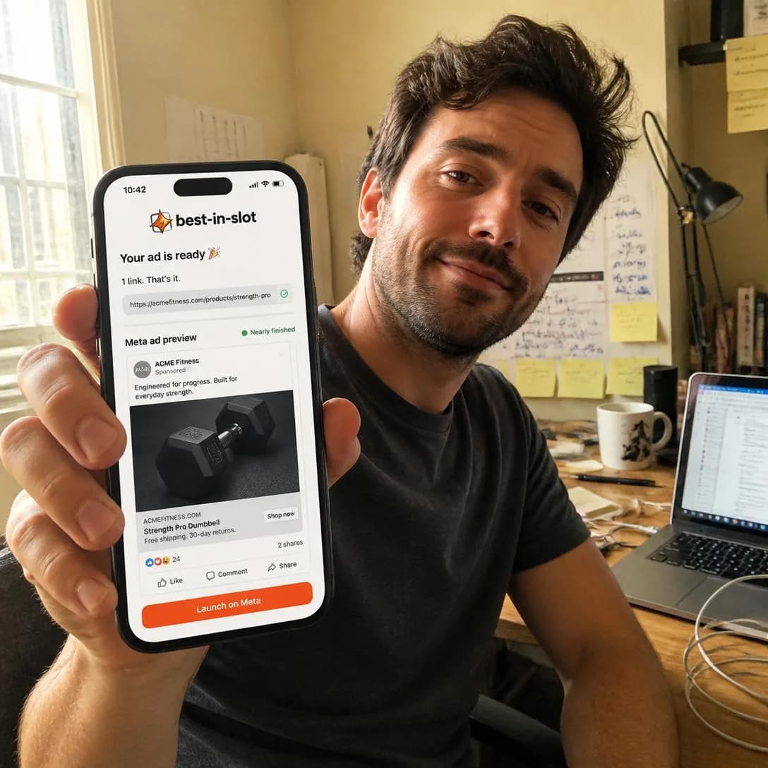
We deleted the setup form
Start free. No card required.
Founder Origin
Cold–MidTells how the company, product, or idea began.
The story of the beginning: who, when, and what they were doing instead. It works for the same reason a face works — attribution. A product from a company is a thing that appeared on the internet; a product from a person on a specific afternoon has a cause, and a cause is far easier to trust than an assertion. It is also the most memorable shape in the family, because people retain narratives at rates that plain claims never approach.
Keep it separate from Why We Built This, which sits directly below it and gets merged with it constantly — and merged is where both stop working. Origin is about the founding, and its job is warmth: this came from somewhere and somebody cared. Why We Built This is about the problem, and its job is product-market fit. The test is the last line. If the story ends “and that is how we started”, it is this angle; if it ends “which is why it works the way it does”, it is the next one, and it should have been written differently from the first sentence.
Self-indulgent if the customer is not central, says the taxonomy, and this is the most-hit weakness in the family for a structural reason: the origin is the story you most enjoy telling and the one the reader has the least stake in. The fix is a ratio you can count. Two sentences of before, one of turn, and then the reader appears — and every sentence in the first half that is not load-bearing comes out. Nobody has ever bought anything because of where a company started. Plenty of people have bought because of what starting there made it good at.
- Works because
- Humanizes the brand and creates emotional connection.
- Fails when
- Can become self-indulgent if the customer is not central to the story.
Write one like this
- I built this because I had 200 product photos, a launch on Friday, and no designer.
- It started as a script I ran for one client. Then four other people asked for it.
- The first version was a spreadsheet and a folder of screenshots, and it still beat the agency.
- Nobody set out to build an ad tool. We set out to stop rewriting the same headline.
Don’t tell the whole beginning. The reader’s interest in your first office is zero and their interest in what it means for them is everything — get to the part where they appear, and cut every sentence before it that isn’t carrying weight.
I watched a friend rage-quit THREE ad tools in one night. Every single one opened with a 20-question setup form. So I sketched the solution on a napkin: paste a link, get a finished ad, skip the form entirely. That napkin sketch became best-in-slot. One click. One ad. No forms, no friction, no quitting before you even start.

Started on a napkin. Still works.
No forms. Just finished ads.
Why We Built This
Cold–MidExplains the customer problem or frustration that motivated the product’s creation.
The origin story with the customer installed as the reason. It is the most useful shape in the family for a cold audience that already has the problem, because it does two jobs in one sentence: it names the pain, in the manner of Problem & Pain (issue #1), and it explains the product’s existence as the response to it. A feature list says what the thing does. This says why it does that and not something else, which is the question a sceptical reader is actually asking.
The mechanism is that it converts a design decision into evidence. Any claim about a product can be doubted; “we built it this way because that kept happening” is much harder to argue with, because the reader can check the second half against their own week. This is the angle where every strange thing about your product becomes an asset — the odd default, the step you removed, the option you refuse to offer. Those are the parts a competitor cannot copy without the story, and the story is what makes them read as judgement rather than as gaps.
Weak if the origin problem feels manufactured, says the taxonomy, and retrofitting is both easy and extremely visible. The tell is a problem stated at exactly the width of your feature set — a frustration nobody has ever complained about in those words. So source the sentence rather than writing it: the support ticket, the sales call, the thing somebody said on a demo before they caught themselves. Keep it in the customer’s vocabulary and not the roadmap’s. And if you cannot find a real one, that is information — the honest response is to run a different angle.
- Works because
- Connects founder story directly to product-market fit.
- Fails when
- Weak if the origin problem feels manufactured.
Write one like this
- We built it because “just make a few variants” is four hours of somebody’s Thursday.
- Every ad tool wanted a brief. We had never once had a brief.
- It publishes straight to Meta because the export-and-reupload step is where good ads went to die.
- Resizing is not a creative decision, and it was eating a day a week. That is the entire origin.
Don’t invent the frustration to fit the feature. A problem described in your product’s vocabulary instead of the customer’s is a spec sheet in a story’s clothes, and the people who actually have the problem can tell that you never did.
We built best-in-slot at 2am after rage-quitting our own ad setup form. 40 fields. Dropdown hell. We closed the tab and decided: if *we* can't finish this, no small business owner stands a chance. So we made an ad tool with zero forms — just paste your website link and get a finished Meta ad in 60 seconds. Concept, image, copy, all four sizes. Published straight into your Ads Manager, paused until you're ready. Nothing goes live without your say-so. The setup form is what kills most ad attempts before they begin. We threw it out.
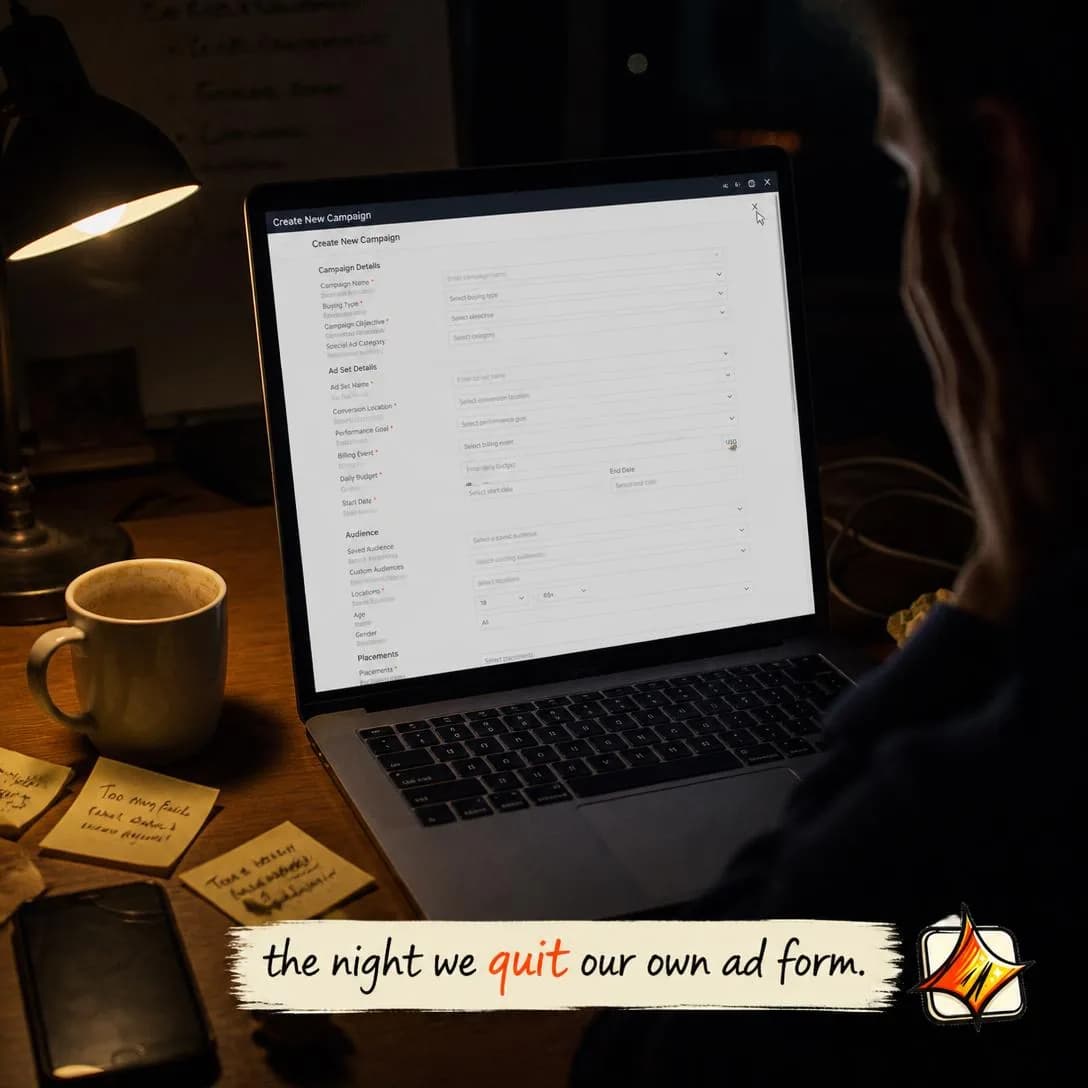
We quit our own ad form at 2am
No forms. Just paste & publish.
Mission / Cause
ColdFrames the brand around a broader purpose, belief, or societal mission.
Frames the brand around something larger than the transaction. It is one of only two rows in the family marked Cold outright, and for a precise reason: a mission requires no product comprehension whatsoever. A reader can agree with what you are for several seconds before they have any idea what you sell, and the agreeing is what makes them read on.
What separates a mission from a value statement is a cost. A belief you have paid nothing for is free to hold, which is why every company has one and why none of them persuades anybody. The version that works names something you gave up: a customer segment you turn down, a feature you will not ship, a pricing model you refused because it would have made you behave differently. It is the Founder POV test applied to the company rather than to a person — if it forfeits nothing, it argues nothing.
Performative is the listed weakness, and the taxonomy is unusually specific about the trigger: “if product actions do not support the mission.” So write the mission out of the actions rather than the actions out of the mission. Look at what the product already refuses to do and what the price already implies, and say that. Readers are thoroughly inoculated against this angle — a mission ad that reads as marketing does not merely fail, it spends credibility you were going to need for the other sixteen rows on this page. If it came out of a positioning workshop rather than out of the way you already behave, do not run it at all.
- Works because
- Strong for values-led brands and community building.
- Fails when
- Can feel performative if product actions do not support the mission.
Write one like this
- Good advertising shouldn’t need a retainer, a deck, and somebody else’s calendar.
- One person with a product should be able to out-ship a department.
- Most small brands advertise badly because the tools were built for teams of nine.
- Nobody should have to spend four thousand dollars to find out an angle doesn’t work.
Don’t state a belief you haven’t paid for. If nothing about the product, the price or the roadmap would look different under the opposite mission, the reader is looking at a value statement — and a thousand of those have already trained them to scroll.
We built best-in-slot because we were tired of quitting ad tools at the setup form. You know the one — twelve fields asking you to describe your business before you even see a headline. Your website already says everything an AI needs to know. So we made a tool that reads it, learns it, and builds your ad in one click. No forms. No questionnaires. Just paste your link and watch a finished Meta ad appear in about a minute. That's not a feature update. That's the entire reason this company exists.
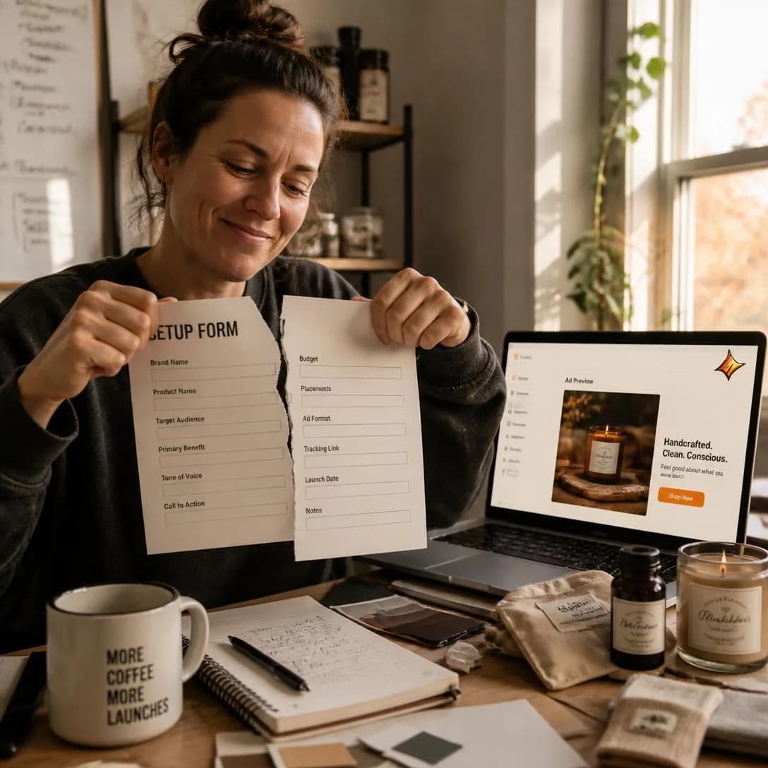
We killed the setup form forever
One link → finished Meta ad
Why We Almost Quit
Cold–MidUses a near-failure, crisis, or difficult period as the narrative tension.
Uses the low point as the engine. Structurally it is the only angle in the family with genuine narrative tension — a beginning that goes wrong before it goes right — and tension is what buys the second and third second of attention. Everything else on this page is told from a stable present, which is comfortable to write and much easier to scroll past.
It persuades rather than merely entertains because survival is evidence. A company that nearly died has been tested against something, which is a kind of proof no feature supplies and no competitor can claim on your behalf. It also inverts the reader’s default assumption: they know that anything in a paid placement is the polished version, so an ad that volunteers the worst part reads as standing outside the convention. That is a one-time credibility purchase per audience, which is why this is a rotation angle rather than an evergreen one.
Can feel overly dramatic, says the taxonomy, and there is a specific mistake underneath the drama — staging the crisis and never showing what changed. A near-death with no consequence is a story about you having a hard time, and the reader owes you nothing for it. Spend one beat on the low point and the rest on the decision that came out of it, and make sure that decision is visible in the product today. Keep the scale honest, too: “we almost quit” about a soft quarter is the kind of inflation a reader punishes retroactively, across everything else you have ever told them.
- Works because
- Vulnerability creates attention and relatability.
- Fails when
- Can feel overly dramatic or distract from the product.
Write one like this
- Six months in, the product could make one ad a day and I was still making all of them by hand.
- I shut it down for three weeks. What came back is the version that works.
- The first build was good and nobody used it. That is a worse problem than nobody liking it.
- We nearly killed it over one question we couldn’t answer: why would anyone trust this with their brand?
Don’t stage a crisis that resolved off-screen. A low point with no visible consequence in the product today is drama, and a reader who is moved and then learns nothing changed will discount the next true thing you tell them.
I wrote our shutdown note on a napkin. We never sent it. It was 1am in a diner. We'd just watched another founder spend 40 minutes on a setup form they'd never finish. Building a 'simpler ad tool' felt like a lie if we still made people fill out the same soul-crushing questionnaire. Then someone asked: what if there's no form at all? Just paste your link. Let the AI read your site. One click, one finished ad. That napkin is framed in our office now. And best-in-slot starts with a link, not a form — because the night we almost quit is the night we finally got it right.
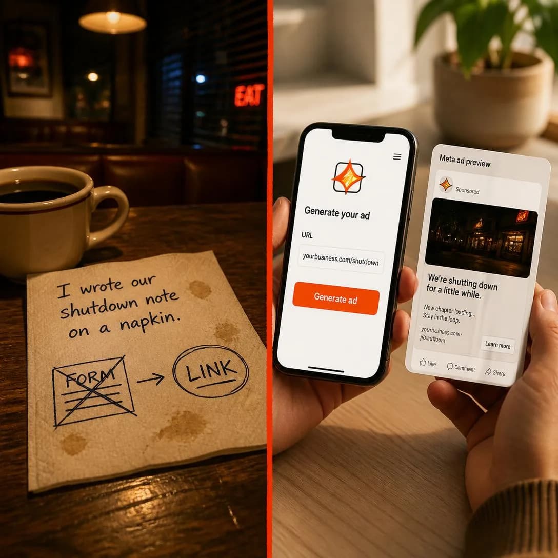
We almost quit. This napkin saved us.
Link in. Ad out. 60 seconds.
Founder Failure / Lesson
Cold–MidThe founder shares a mistake, failure, or painful lesson that led to a better approach.
The mistake is the credential. It is worth separating carefully from the row above it, because they look adjacent and do different jobs: Why We Almost Quit is about the company nearly dying and trades on survival, while this one is about the founder being wrong and trades on the correction. The taxonomy’s phrase is exact — authority through lived experience rather than polished claims — and for a company with no logos to show, it is the cheapest authority on the market.
The structure is fixed and worth following literally: what I believed, what it cost, what I do now. The middle term is the one every draft skips and the only one doing real work. A lesson with no price attached is an opinion, which is angle 101 with extra words; an opinion with a receipt is a lesson. The cost does not have to be money — six weeks, a client, a launch that went out with the wrong thing on it — but it has to be specific, because specificity is the only available evidence that the experience happened at all.
Requires genuine insight; fake vulnerability is easy to detect. The standard tell is a failure that flatters — “I cared too much about quality”, “I over-delivered” — and readers decode a humblebrag faster than they decode almost anything else in advertising. Pick a mistake you would still rather not mention. The second tell is a lesson too general to have come from any particular experience: if it fits unchanged in a LinkedIn caption, it did not come from anywhere. And being caught here is not one wasted impression, it is a tax on the whole family, every row of which runs on the reader believing you.
- Works because
- Builds authority through lived experience rather than polished claims.
- Fails when
- Requires genuine insight; fake vulnerability is easy to detect.
Write one like this
- I spent three thousand dollars perfecting one ad. The one I made in nine minutes beat it.
- For a year I tested headlines. The headline was never the thing that was wrong.
- I used to rewrite copy until it was right. You find out what’s right by publishing four of them.
- My best-performing ad ever is one I argued against running.
Don’t choose a failure that makes you look good. “I cared too much” is a compliment wearing a confession’s clothes, and a reader who spots it stops believing the rest of the page — which, in this family, is everything you have.
I paid a designer $4,000 for one ad that flopped. Two weeks of back-and-forth. One static image. Zero conversions before I pulled the plug. That mistake taught me something: if you can't afford to gamble weeks and thousands on a single ad, the tool should make dozens in a minute. So I built best-in-slot — paste your website, get a finished Meta ad (concept, image, copy, all four sizes) in about 60 seconds. No forms. No freelancer invoices. Just ads. bestinslot.ai
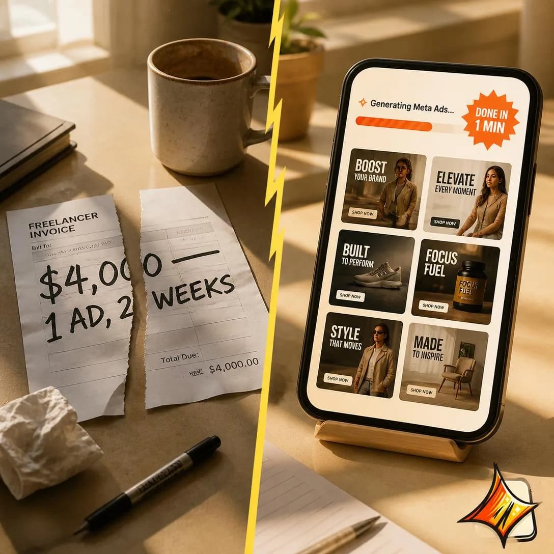
I spent $4K on one ad. It flopped.
Make Meta ads in 1 minute
Founder Confession
Cold–MidOpens with an honest admission, uncomfortable truth, or counterintuitive realization.
Opens with something you would normally keep quiet. What separates it from the lesson above is tense and object: a lesson is about the past and safely resolved, while a confession is about now, and is often about your own product or category. “Most of what we sell is unnecessary for half the people who buy it” is a confession. It is the strongest pure hook mechanic in the family, because an admission opens an information gap the reader has to close.
The strongest version admits something against your own commercial interest, because that is the only kind a reader cannot explain away. Anything convenient gets reclassified as marketing inside a second, and the reclassification is automatic rather than considered. So the confession worth running is the one your own marketing would have edited out: a limitation of the product, a customer you are not right for, a fact about the category that makes your pricing look strange. Say it plainly, then let the rest of the ad be the reason to buy anyway.
Can become gimmicky if every ad is a confession, and the taxonomy has named the exact cause. The form is a rotation, not a voice. Three in a row and the audience has learned that “honestly” is a hook, at which point the mechanism is dead for you specifically and cannot be revived by writing a better one. The other failure is the bait: an admission that opens hard and then resolves into an ordinary product pitch. Readers remember being baited considerably longer than they remember what was being sold, so whatever you admit has to still be true by the end of the ad.
- Works because
- Strong hook potential and high perceived authenticity.
- Fails when
- Can become gimmicky if every ad is a “confession.”
Write one like this
- Honestly: if you run two ads a month, you don’t need this.
- Some of what it generates isn’t good. Nobody selling one of these says that out loud.
- The quiet part: nobody can tell you which angle will win. That is the entire reason to run eleven.
- We are not the cheapest way to get an ad. We are the cheapest way to get eleven of them.
Don’t confess something convenient. An admission that leaves you looking better than you did before it is a pitch with a confessional opening — and once a reader has caught one, every “honestly” you write afterwards reads as technique.
I used to charge $2,000 for ads I hated making. Three-hour briefs. Revision rounds that never ended. Client calls where nobody could agree on anything. The truth? Most 'professional' ad work is just expensive busywork. So I built best-in-slot — paste your website, get a finished Meta ad in 60 seconds. No forms. No calls. No pretending complexity equals quality. It's the tool I wish existed when I was drowning in that invoice.
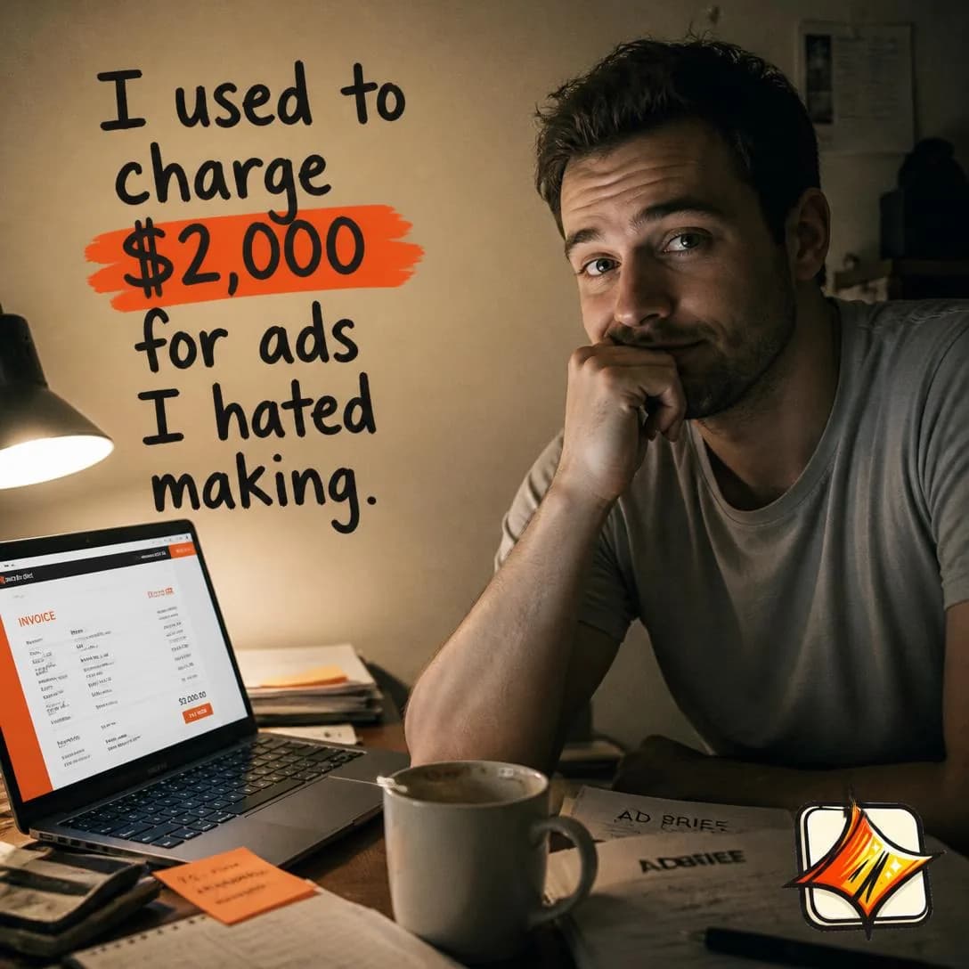
I charged $2k for ads I hated
Website → Meta ad in 60 seconds
Customer Story
MidMakes the customer, not the founder, the protagonist of the narrative.
The customer is the protagonist and the founder is off-screen entirely. It is the only Mid row in this family, and the stage is a statement about what it needs rather than about what it does: a story about somebody who fixed the reader’s problem only works once the reader accepts that the problem is theirs and that fixing it is possible. On genuinely cold traffic it is a stranger’s anecdote, and it will lose to a callout every time.
Keep it distinct from Testimonial over in Proof & Trust (issue #4), because the two use the same raw material for opposite purposes. A testimonial is a verdict — it worked, here is what I got — and it is aimed at doubt. This is a journey, and the part that makes it one is the hesitation in the middle. That is the whole difference and the reason this converts where a testimonial stalls: the reader’s own objection gets spoken out loud by somebody who then went ahead anyway, which is an argument no first-person claim from you can make.
Requires a compelling, representative customer story — and representative is the harder of those two words. Your most spectacular result is usually your least useful one, because a reader who cannot see themselves in the protagonist is reading a lottery ticket. Choose the customer whose starting conditions look most like the audience’s, not the one whose numbers look best. And keep it recognisably one person’s account, in their own words and their own grammar. The moment it is tidied into brand voice it becomes a case study, and nobody in the history of the feed has read one of those.
- Works because
- Combines storytelling with proof and relatability.
- Fails when
- Requires a compelling, representative customer story.
Write one like this
- She had 200 product photos and nine days until the launch. Here’s what she did with them.
- Two years of paying per ad. Then one Tuesday he tried something else.
- He didn’t believe the first three. He ran them anyway, and the third one is still running.
- The agency quoted six weeks. She was live on the Thursday.
Don’t lead with your best result. A number the reader can’t imagine reaching turns the story into somebody else’s — the customer who converts is the one whose starting point looks like theirs, hesitation included.
It was 11pm. My ad was due. I had nothing. I've been there. Staring at a blank screen, knowing I needed to launch tomorrow, no designer on speed dial, no clue where to even start. Then someone told me about best-in-slot. I pasted my website link. One minute later, I had a finished Meta ad — image, copy, all four sizes, ready to publish. I actually laughed out loud. If you've ever felt that midnight panic, this is for you.
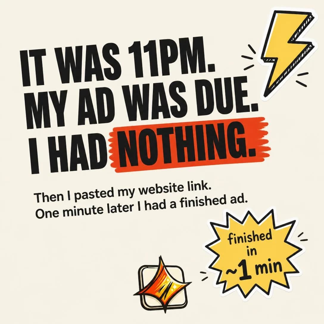
I had 1 hour. I pasted my link.
Paste site → get finished ad
Behind the Brand
Cold–MidShows the people, processes, culture, or operations behind the company.
Shows the company as a place with people and habits in it. There is no argument and no offer; the persuasion is familiarity, which is a real and well-documented effect rather than a soft one, and a face is processed by a reader on a different track from a logo. What it produces is not a decision but a slightly different starting position for every ad you run afterwards.
Its honest limitation is written into the taxonomy: may not be persuasive enough for direct response on its own. That makes it a supporting angle, and the mistake teams make is judging it as a closer and then killing it. It belongs in a sequence — the second impression on somebody a colder angle already caught — and its real return shows up in what a later, harder-selling ad achieves, because the same claim from a known entity is not the same claim. Read it on assisted conversions and frequency, and schedule it rather than benchmarking it.
For software there is a specific trap: “behind the brand” is a room with laptops in it, and nobody wants to see that. The material that works is the specific and slightly odd — what actually gets decided here, how, and by whom. A very small company has an advantage rather than a shortage. “The person who answers support wrote the thing you are emailing about” is a fact about operations that a competitor with two hundred employees literally cannot say. Show the process at the point where it is unusual, and skip the group photo entirely.
- Works because
- Builds trust and brand familiarity.
- Fails when
- May not be persuasive enough for direct-response audiences on its own.
Write one like this
- The person who answers your support email is the person who wrote the code.
- Every ad this thing makes is looked at by a human before it can go live. That human is you.
- We keep a folder of the worst ads it has ever produced. That folder is how the prompts get better.
- There is no creative team here. There is a model, a brand kit, and a stubborn opinion about testing.
Don’t show the office. A desk, a laptop and a plant tell the reader nothing they hadn’t already assumed — what earns the impression is one specific habit or decision, ideally one a competitor couldn’t honestly claim.
Confession: our entire 'creative department' is two guys and one laptop. No glossy agency floor. Just a cramped home office, too much coffee, and a whiteboard that says KILL THE SETUP FORM. We built best-in-slot because we were the people quitting ad tools halfway through the setup form. So we threw it out. Paste your website link → one finished Meta ad in about a minute. Hero image, all four sizes, full copy, dropped straight into Ads Manager. Paused, so nothing spends until you say so. Built by two scrappy operators for the rest of us doing everything ourselves.
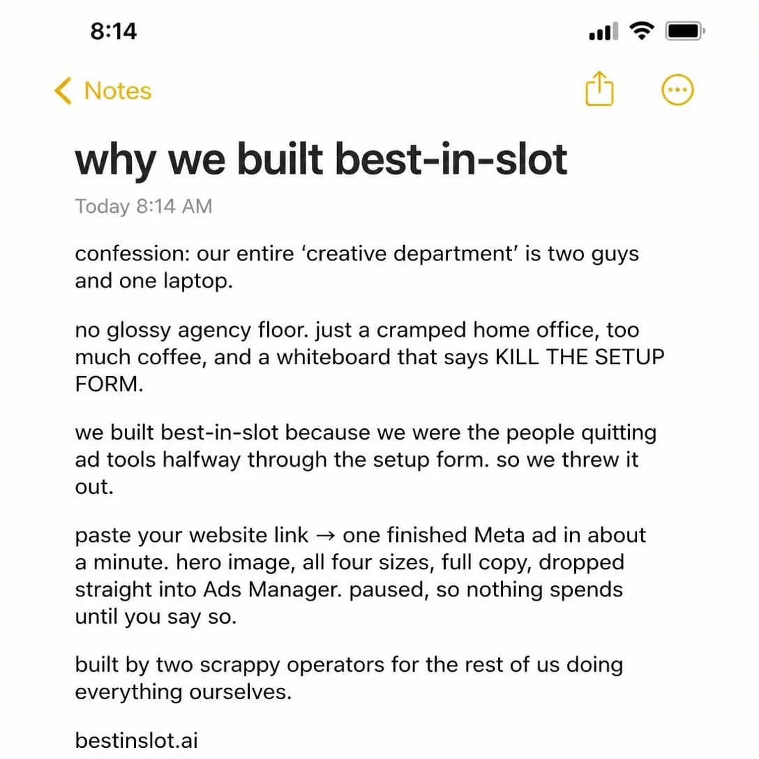
Built by two founders in a home office
Paste link → finished ad in 1 min
Making Of
Cold–MidShows product development, manufacturing, design, sourcing, or craftsmanship as a story.
Turns how the thing is made into the argument. Visible effort is a quality signal and a price signal at once — watching something be built raises what people will pay for it — which is why the taxonomy files it under premium positioning rather than under education.
It also says “less relevant for invisible/digital products”, and that is the sentence that matters if you sell software, because there is nothing to film. The translation that works is to change the subject from the product to its output: not how the software was built, but how one ad got made — the concept, the style picked out of the gallery, the take that got kept and the ones that did not. That version has something to look at, and it doubles as a demonstration, which is the rare case of two angles reinforcing each other instead of blurring into one.
The other digital version is the decision rather than the craft: why the brand kit is a constraint on the model instead of a suggestion to it, why nothing can publish before a person has looked at it. Both versions share one failure, and the taxonomy calls it production-heavy. A making-of more polished than the thing being made reads as an ad about an ad, and the reader notices the extra layer. Keep it plain and let the roughness stay in — the persuasion is that the work is visible, and gloss is precisely the thing that hides it.
- Works because
- Strong for premium positioning and perceived quality.
- Fails when
- Production-heavy and less relevant for invisible/digital products.
Write one like this
- Four styles tried, one picked. Here are the three that didn’t make it, and why.
- This is what happens in the ninety seconds between pasting a link and having an ad.
- One product photo, eleven ads, nothing retouched. Watch the whole thing.
- The brand kit isn’t advice to the model. Here’s the exact point where it stops it.
Don’t polish the making-of. The entire persuasion is that the reader is seeing the work rather than the result — colour-grade the process and you’ve made an ad about an ad, one more layer away from the thing they wanted to look at.
I built this because I was tired of filling out forms just to get a bad ad back three days later. Every ad tool starts with the same twenty-question onboarding—business name, audience, goals, tone—and then you still get generic output that needs a rewrite. So I sketched a different path: paste your website link, let the AI read it, and go straight to finished ads. No forms. No briefs. One click, one ad, published into Meta. This desk is where that sketch became real. bestinslot.ai
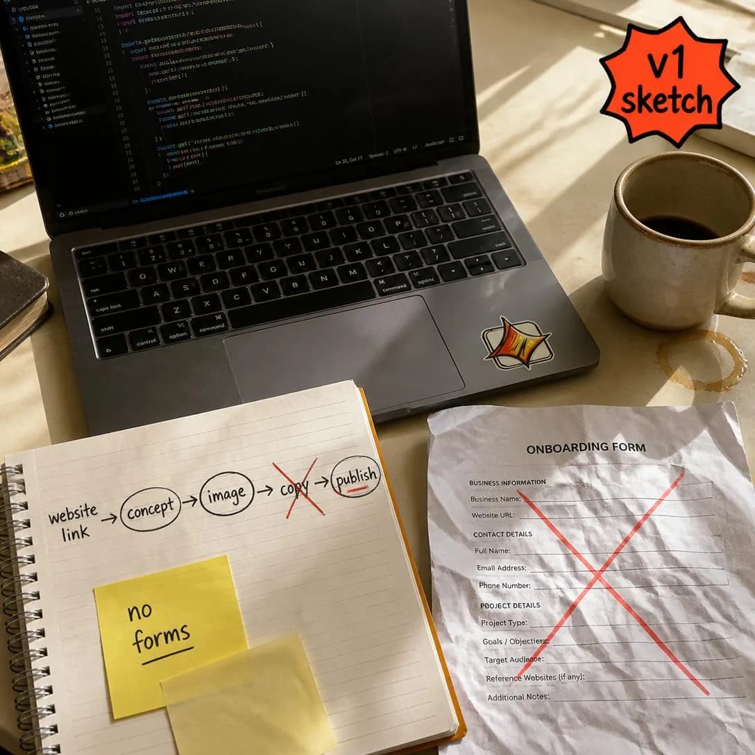
We killed the setup form
bestinslot.ai—try it free
Employee / Operator POV
Cold–MidA team member, specialist, operator, or insider explains how the company thinks or works.
Moves the microphone from the founder to somebody who does the work. It buys two distinct things. The first is a fresh voice, which is the standard remedy when founder-led ads have fatigued an audience. The second is a different species of authority: the founder has an obvious stake in you believing them and an operator has a craft, and a reader discounts those two claims at very different rates.
“The speaker needs a clear reason to be trusted” is the entire angle compressed into a line. That reason is the work, and it has to be legible in the first three seconds — what this person does all day is the credential, not what their title says. A media buyer explaining how they judge a test is credible; “our Head of Growth” saying the product is great is a testimonial with a lanyard on it. The content has to match the framing, too: the operator ad is at its best teaching something slightly technical that a founder would never bother to mention.
Small companies read this row and skip it, and they should not. The operator does not have to be on your payroll. A customer who runs a hundred campaigns a month, a freelancer, an agency lead who opens the thing daily — the angle needs a practitioner, not an employment contract. And if the founder is also the operator, that is a framing choice rather than a disqualification: speak from the work instead of from the ownership, drop the word “we”, and the same person delivers this angle rather than Founder POV.
- Works because
- Adds credibility and creates fresh voices beyond the founder.
- Fails when
- The speaker needs a clear reason to be trusted.
Write one like this
- I run ads for eleven brands. Here’s the one thing I check before I look at any creative.
- Media buyer, six years. This is the part of the job I stopped doing by hand.
- Nobody who buys media judges an ad by whether they like it. Here’s what we actually look at.
- I’m the person who used to resize your ads. Ask me how I felt about that.
Don’t lead with a job title. “Our Head of Growth” is a lanyard, and a reader has no reason to trust one — say what the person does all day and let the credential arrive as a fact instead of a claim.
I'm the engineer at best-in-slot. I deleted our own sign-up form. Best decision I ever made. We were about to build the usual 40-field onboarding intake. Business name, category, colors, audience, brand voice, upload your logo, blah blah. I hated it. Every ad tool I'd ever used made me quit halfway through setup. So instead I trained the AI to just read the customer's website and pull all of it automatically. Paste a link, it learns the business, and about a minute later there's a finished Meta ad. No form. Half the team thought I was insane. Now it's the whole product.
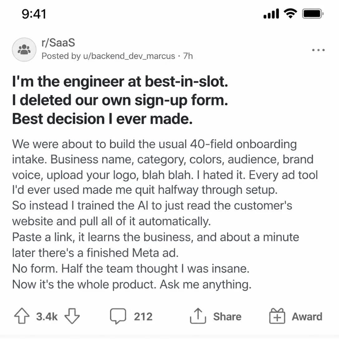
I deleted our sign-up form
Paste link → finished ad in 60s
Day in the Life
ColdEmbeds the product naturally into a founder, creator, employee, or customer’s routine.
One day, in order, with the product appearing exactly where it actually appears. It is Cold outright — one of two in the family — because a routine needs no setup at all: the reader recognises the shape of a day before they have registered that they are being sold anything, which is about as low-friction an entry as advertising gets.
What it does that a demo cannot is show the product’s size. A demo shows what a tool is capable of; a day shows how much of a life it takes up, and for a great many purchases the unasked question is “how much of my week is this going to want” rather than “does it work”. Two minutes between the coffee and the first meeting is an answer no feature list can give. It is also the natural home for the small true details — the tab already open, the thing done one-handed on a phone — that make everything around them believable.
Can become lifestyle filler if the product role is weak, and there is a blunt test for that: would the day be different without it? If the product could be cut from the edit and the day would run the same, you have made a mood film. Two guards. Anchor it to one specific moment rather than a montage of pleasant ones, and let the day keep the parts that are still annoying — a day in which everything is easy is an advertisement for a life the reader does not have, while a day in which one thing got shorter is one they can picture having by Thursday.
- Works because
- Native to social and good for showing real-world use.
- Fails when
- Can become lifestyle filler if the product role is weak.
Write one like this
- 9:10am, coffee. 9:14am, four ads live. 9:15am, the rest of the day.
- This is the twenty minutes a week that used to be Thursday afternoon.
- A launch day with no designer on it, start to finish, in order.
- Between two meetings, on a phone, in a car park: three variants for the weekend.
Don’t film a nice day. If the routine would look identical with your product cut out of it, the reader has watched a lifestyle clip — anchor the whole thing to the one moment that used to be long and is now short.
I built today's ad before my coffee finished brewing. Not because I'm some productivity guru — because best-in-slot actually works that fast. Paste your link, pick an audience, done. The ad's in Meta before I've even grabbed my keys. If you're still blocking out 'creative time' on your calendar, you're doing it wrong.
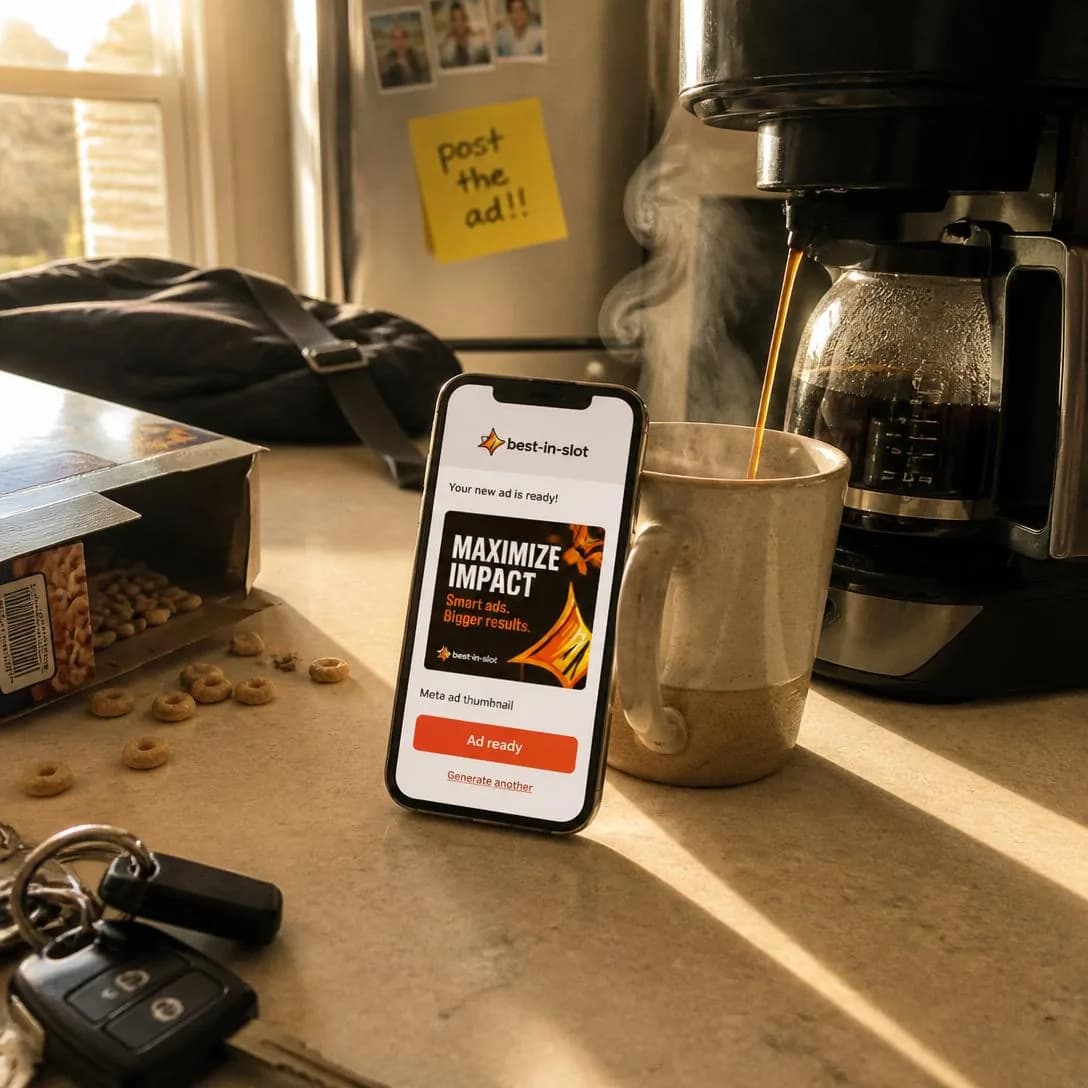
Built an ad before my coffee cooled
Paste link. Get ad. Move on.
Build in Public
Cold–WarmShares iteration, decisions, prototypes, wins, losses, or progress openly.
Publishes the process while it is still running. It is the only angle here in a different tense: the rest tell a finished story, this one tells an unfinished one, and the unfinished part is what creates the investment. A reader who has watched you decide something has a small stake in what you decide next, and a stake is what brings somebody back to a second impression voluntarily.
That is what the Cold–Warm stage is describing — the only such row in the library. It works on strangers, and its actual payoff arrives on the third and fifth exposure, which makes it the family’s best answer to the frequency problem: the same account can run it repeatedly without the audience learning the shape, because the content is genuinely new each time. It is also the cheapest angle here to supply, since the material is whatever you were doing anyway. A decision, a number, a thing that broke.
Two failure modes, and the taxonomy names the first: it exposes unfinished work. Once a roadmap has appeared in an ad it is a promise with a date attached, and the reader who remembers it is the one you least want to disappoint — share decisions and outcomes, never intentions. The second is more common and less discussed: build-in-public is fascinating to other builders and frequently irrelevant to customers. If your buyer is not a founder, filter hard for the parts that touch what they receive. Nobody’s purchase has ever been decided by your refactor. And the form itself promises a next one, so a single build-in-public ad from a company that then goes quiet is worse than none at all.
- Works because
- Creates audience investment and a sense of participation.
- Fails when
- Requires ongoing transparency and can expose unfinished work.
Write one like this
- We shipped the wrong thing in June. Here’s what replaced it and why.
- Version 3 went live yesterday. Version 2 was worse, and here’s exactly how we know.
- Sign-up to first finished ad is currently four minutes. We want it under two.
- We’re rebuilding the part everybody complains about. You can watch it happen.
Don’t publish the roadmap. A date in an ad is a promise with a deadline attached and an audience that remembers it — share what you decided and what happened instead of what you intend to do next quarter.
We shipped 46 terrible ads before this one worked. Most AI ad tools show you the polished demo. We're showing you the graveyard. Draft #1 had a frowning stock photo and generic copy. Draft #23 invented features we don't have. Draft #47? Finally something we'd actually run. best-in-slot turns your website into finished Meta ads in one click — but it took us 47 tries to get the tool right. Now it's your turn to skip the learning curve.
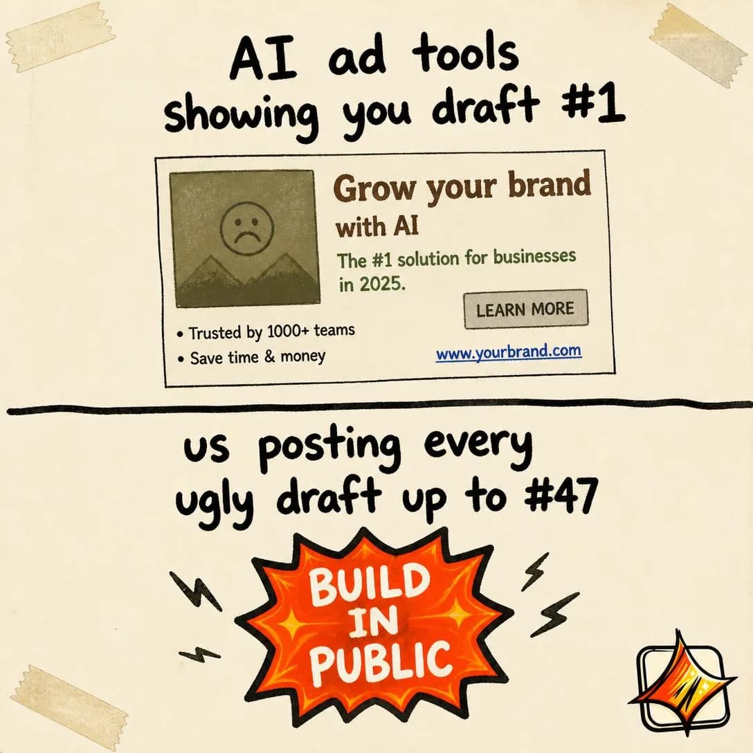
We posted all 47 failed drafts
Start free. No setup form.
Letter From Founder
Warm–HotUses a direct, personal founder message to customers or prospects.
A letter: second person, one signature, and none of the compression that makes an ad look like an ad. The form is itself the signal. Nobody writes a letter to a stranger, so being sent one implies a relationship already exists — which is exactly why it is Warm–Hot, and exactly why it is reliably wasted on cold traffic, where the reader has no relationship to be reminded of.
What it is uniquely good at is the message that would sound wrong compressed into ad copy: explaining a price change, asking somebody who drifted away to come back, saying thank you at a milestone, or making the case for a decision that cannot survive being a headline. Length is permitted here in a way it is nowhere else in the library, because the form sets the expectation before the first line does. There is one mechanical rule and it is absolute: from one person, to one person. A letter with a “we” in every sentence is a press release with a signature at the bottom.
Less scalable if the brand is not founder-led, says the taxonomy, and there is a second scaling limit worth knowing: an audience can only be sent this form a few times before it becomes a template, at which point it stops implying anything at all. Reserve it for moments that genuinely warrant it. On Meta specifically, mind the mechanics — a long letter needs a first line that survives truncation and a reader warm enough to tap “see more”, so run it to customers or a retargeting audience and let that opening sentence carry the entire thing.
- Works because
- Intimate, credible, and effective for warm audiences.
- Fails when
- Less scalable if the brand is not founder-led.
Write one like this
- A note about the price change, from the person who set it.
- You signed up in March and never came back. I’d like to know what stopped you.
- To everyone who bought this in the first month: here’s what your money actually built.
- I want to explain a decision we made this week that some of you are going to dislike.
Don’t write a letter in the plural. “We’re excited to share” is a press release, and readers spot the difference instantly — a letter has one person’s name at the bottom and one person’s opinion in the middle of it.
I quit my competitors' tools halfway through signup. Every single time. The forms broke me. So I built best-in-slot without one. You paste your website link. You get a finished Meta ad in ~60 seconds. Nothing goes live until you say so. Wanted you to hear it from me, not from an ad trying to sound like me. — Ravi, founder
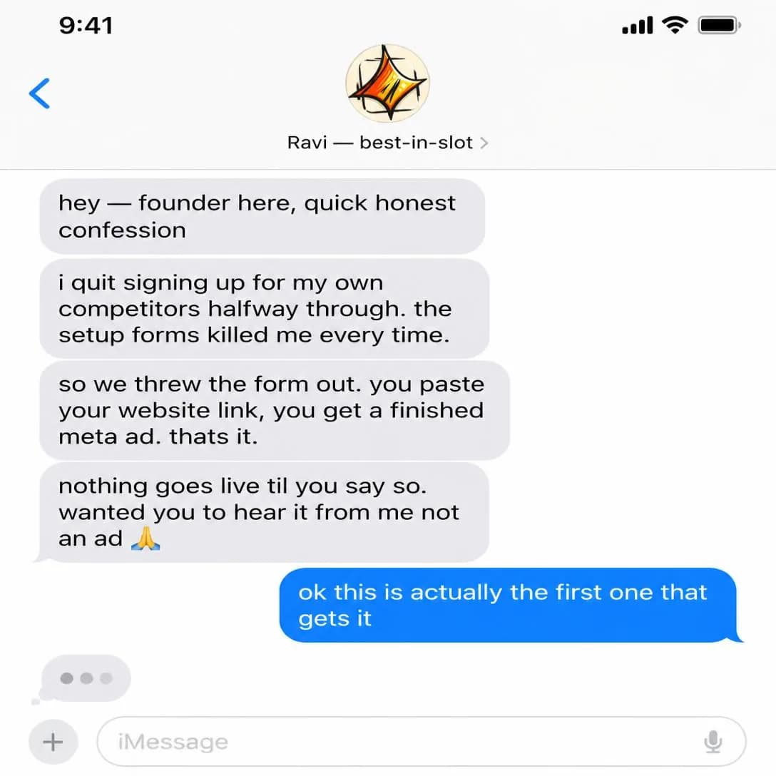
I quit my own competitors mid-signup
Paste link → finished ad
Apology / “We Messed Up”
Warm–HotAcknowledges a mistake or failure and explains what changed.
The rarest angle in the library, and the only one whose subject is a live injury. Attention is enormous precisely because it violates what a reader believes paid placement is for — nobody buys distribution to say they were wrong — and that violation is the mechanism. It is also the only angle here that can make things materially worse, which is why it deserves more caution than anything else on this page.
It works when three things are true and fails if any one is missing: the audience already knows or is about to, the fix is finished rather than planned, and the apology is unconditional. “We’re sorry if” and “we’re sorry you felt” are the two constructions that convert an apology into an aggravation, and both survive into more drafts than anybody would like. The order that works is what happened, what it cost the customer, what has changed, and what you are doing for the people affected — and that last part is what makes it an apology rather than a statement.
Risky if the issue is serious or the apology feels tactical, and both halves need reading. Genuinely serious problems belong in email and support, where the affected people actually are; paid distribution is for the case where the story has already outrun your owned channels. Tactical is the subtler failure — an apology with an offer stapled to the bottom is a promotion, and readers price it as one instantly. The honest version is close to commercially worthless in the short term, and that is exactly why it buys what it buys. If you are reaching for it because the numbers were soft this week, don’t.
- Works because
- Can rebuild trust and generate strong attention.
- Fails when
- Risky if the issue is serious or the apology feels tactical.
Write one like this
- The generator produced broken text for two days. Here is what happened.
- We charged forty people twice on Tuesday. Everyone has been refunded — here’s what changed.
- We shipped something that made the product worse. It’s gone.
- The onboarding you saw last month wasn’t good enough, and I’m not going to defend it.
Don’t attach an offer. A discount at the bottom of an apology tells the reader what the apology was for, and they’ll price the whole thing as a promotion — say what changed, say what you’re doing about it, and stop.
We made you fill out a form. We're sorry. Every ad tool — including our first version — asked 20 questions before showing you anything. Most people quit halfway through. So we deleted the entire setup form. Now you paste your website link, and best-in-slot reads it, learns your business, and builds a finished Meta ad in about a minute. No questionnaire. No fields. Just one link → one ad. We fixed the thing that made you leave.
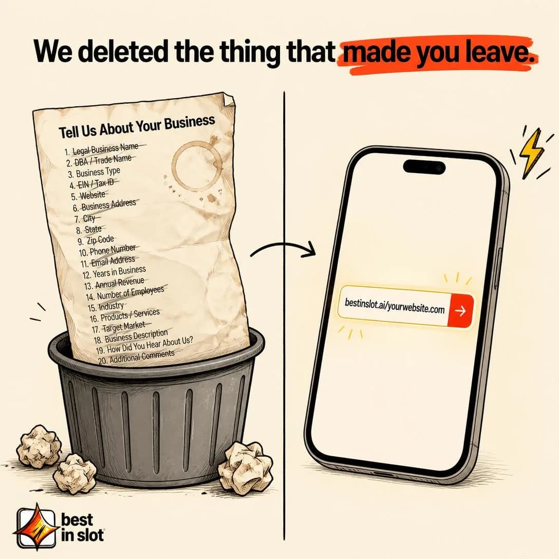
We deleted the setup form
Start free. No card needed.
Why We’re More Expensive
Mid–HotFounder explains the quality, sourcing, labor, service, or economics behind a premium price.
Takes the price objection head-on and answers it with the reason rather than the justification. It is the only place in the library where a founder’s voice is the mechanism of a price argument, and that is not decoration: the same defence from a company is a policy, and from a person it is an explanation. A policy can only be accepted or refused; an explanation can be evaluated, which is the difference between a reader arguing with you and a reader doing arithmetic.
It works because the buyer’s real question is never “why is this more” but “what is the money doing”, and most premium pricing has a perfectly legible answer that nobody bothers to say out loud. The Mid–Hot stage is exactly right and worth respecting: this ad is for somebody who has already decided they want the category and is now choosing inside it. Run it cold and you have introduced price before value, which is the oldest way to lose a sale in Offer & Economics (issue #7) and works no better here for being told in a nicer voice.
Must be backed by real differences, says the taxonomy, and the constraint is sharper than it looks: the difference has to be one the buyer would pay for, not one you happen to be proud of. A cost you incur that they do not value is a confession of inefficiency dressed as a virtue. There is also a comparison choice specific to this category that decides whether the ad works at all — the honest reference point is usually not the cheapest tool on the shelf but the freelancer or the agency, where the real price includes the four-week wait and the round of resizes. Compare with what the reader is doing now, not with the lowest number in the market.
- Works because
- Excellent for price objections and premium brands.
- Fails when
- Makes price highly salient and must be backed by real differences.
Write one like this
- One agency ad costs more than a year of this. Here’s what the agency does with the difference.
- We could halve the price by making the images smaller. We’d rather explain why we won’t.
- Cheaper tools give you more ads per dollar. This one gives you ads you’d actually publish.
- Here is exactly where your money goes when you generate a single ad.
Don’t defend a cost the buyer doesn’t value. Explaining that your process is expensive only persuades if the expense is visible in what they receive — otherwise you’ve told a price-sensitive reader they’re subsidising your inefficiency.
People ask why one ad costs 15 credits when other tools charge you basically nothing. Here's the honest answer: making a good ad has never been free. Every one-click run does 3 concepts → 3 image drafts → 4 resized formats → 5 headline options before it ever reaches you. That's not padding. That's the pipeline. Cheap tools give you one flat image and call it a day. We'd rather charge for the work.
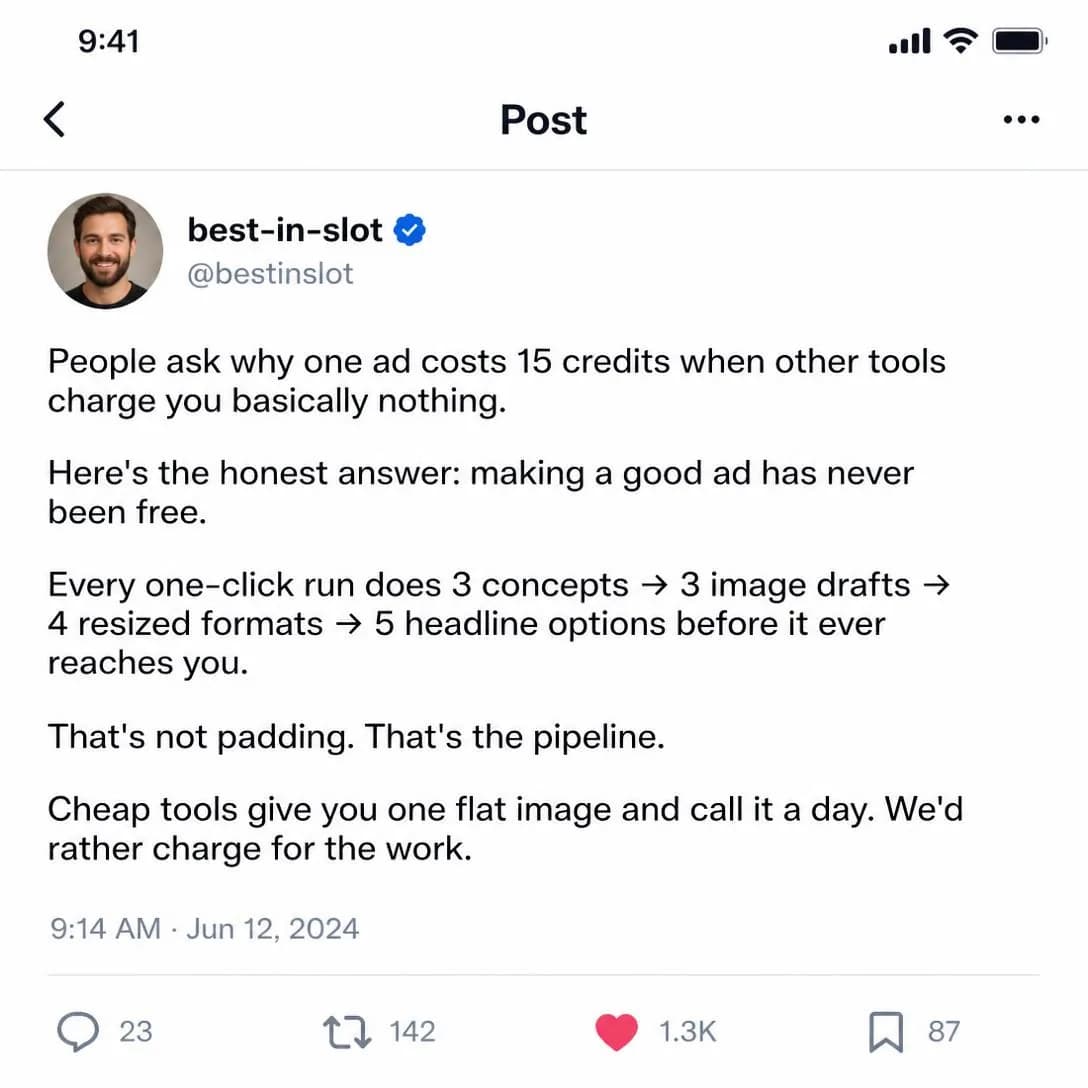
Why one ad costs 15 credits
Not padding. Just the pipeline.
Why We’re Cheaper
Mid–HotFounder explains the structural reason the brand can charge less than alternatives.
The mirror of the row above, and the harder of the two to run well. The reader arrives with a default explanation for a low price already loaded — it must be worse — and unless the ad replaces that explanation with a better one, your own price becomes the strongest piece of evidence against you. This is the one angle in the library where saying nothing would have been safer than saying it badly.
The word carrying the whole thing is structural. Cheaper because we are generous is a discount, and a discount implies the price was wrong before and might be wrong again. Cheaper because of how the business is built is a fact the reader can check against what they already know about the alternative: no account managers, no per-project pricing, no billable hours between having the idea and having the ad. The more mechanical you make it the stronger it gets, and the more it flatters you the weaker — name the cost your competitor carries and you don’t, then let the reader finish the arithmetic.
Can accidentally lower quality perception, and there are two guards. Never use the word cheap: the sentence is about a structure, and the price is its consequence rather than its subject. And pair the claim with a quality proof inside the same ad, because the reader is running one silent question the entire time and leaving it unanswered is how a good price argument still loses. Then decide whether this is your angle at all before committing to it — a brand that argues on price gets chosen on price, and there is always somebody prepared to go lower next quarter.
- Works because
- Strong for disruptors and value-led brands.
- Fails when
- Can accidentally lower quality perception.
Write one like this
- There’s no account manager on this. That’s most of the difference.
- An agency bills the hours between your idea and the ad. There aren’t any here.
- Same output, a fraction of the price, because nobody is sitting in a kickoff call about it.
- We’re cheaper for a boring reason: the expensive part of making an ad was never the making.
Don’t say cheap. Price is the consequence of the story and never the subject of it — name the cost your competitor carries and you don’t, and let the reader do the arithmetic they were already doing.
I did the math on a napkin this morning. Agency retainer: $2,500/mo. Strategist: 6 hours. Designer: 8 hours. Three revision rounds. That's one ad concept. Or: best-in-slot at $39/mo — 66 finished ads, concept to copy to four Meta sizes, in about a minute each. Same coffee shop, wildly different economics. The AI does the strategist's job, the designer's job, and the revision rounds. You just pick what ships. We're not cheaper because we cut corners. We're cheaper because we rebuilt the entire workflow.
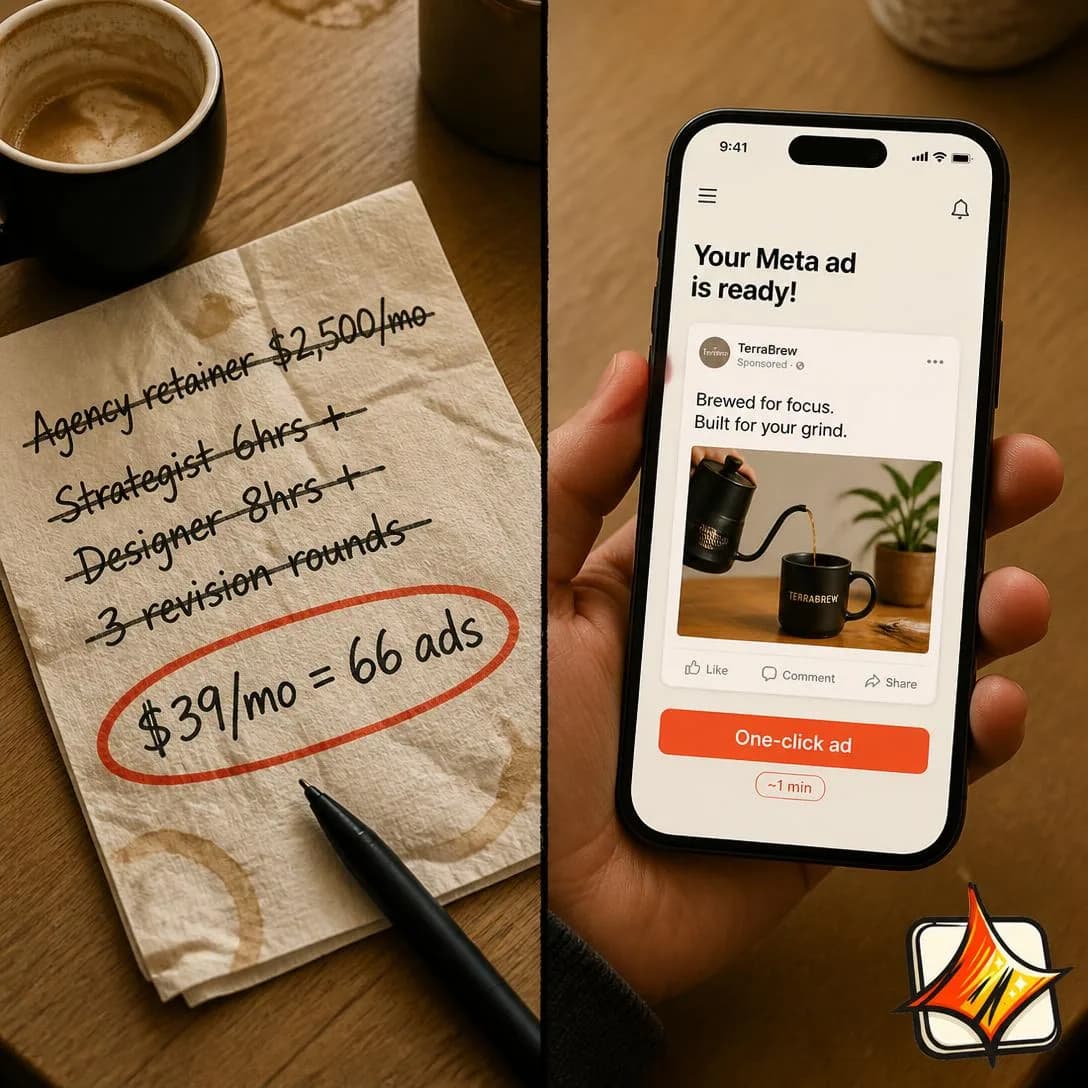
Why we're 98% cheaper than agencies
66 ads/mo for the price of coffee
Testing them against each other
Testing inside this family goes wrong in a way the other nine mostly avoid: seventeen angles that all narrate will happily produce three test cells that are three tellings of one story. Founder Origin against Why We Built This is a paragraph-ordering test wearing a test’s clothes. Take one from separate groups above — Founder POV against Customer Story against Why We’re Cheaper is an opinion, somebody else’s journey and an economic argument, and whichever wins has told you something. Then judge them on a longer clock than usual. A story buys attention on credit and often settles on a later impression, so hold rate, thruplay and frequency-adjusted results say more here than a day-one CPA, and this is the one family where a flat first day is genuinely not a verdict.
The constraint that actually decides whether this family works for you sits upstream of all of that. Every other page in this library can be written from the product; nothing on this one can. It needs seventeen true things — what somebody believed, what it cost, what changed, what a customer hesitated over — and the shapes above are useless until you have them. So do it as an exercise, once, in one sitting: the worst mistake, the near-miss, the thing you would rather not admit, the decision that looks strange and has a reason. Most companies find they have twenty and have never written one of them down. And if you genuinely have none, run a different family rather than inventing some, because a manufactured story does not fail the way a weak ad fails. It fails the way a lie fails, and it takes the true things standing next to it down with it.
That is the last of the ten families and the last of the 117 angles. What the whole library is for, in one sentence: almost nobody has a creative problem and almost everybody has a testing problem. Pick the angle first, then the hook, then the format — in that order, because an angle that loses teaches you something about your market and a headline that loses teaches you about a headline. Story & Founder POV is a fitting place to stop, since it is the one family that is not really a claim at all. It is a way of carrying one, and every argument on the other nine pages can be put inside it and sent out again in somebody’s voice.
Pick an angle. Get the ad.
No credit card · 50 free credits (about 5 ads or Instagram posts)