
Ad Examples · Fashion & Apparel × Instagram · 10 ads
Fashion & Apparel Instagram ad examples
Ten finished ads for clothing brands — with the audience, angle and objective behind each one, because we generated them rather than collected them.
Pages of fashion ad examples have a specific way of being useless: they are galleries of creative from brands you already know, and a famous brand's ad works partly because the brand is famous. A wordless product shot sells when the logo does the arguing. Copy that approach into a label nobody has heard of and you have shipped an ad with the load-bearing part missing — and the parts you actually needed, who it was aimed at, what argument it made, what it was optimising for, were never visible in the screenshot anyway.
So these were not collected. Every ad below was generated with the audience, the angle and the objective chosen up front, which means the brief printed beside each one is the brief that actually produced it, not a guess written afterwards about someone else's work. The companies are invented — ten different apparel businesses, a tall-women's jeans label, a batch-run sneaker workshop, a petite workwear line, none of them real — so no brand's creative is being borrowed and no famous logo is quietly doing the work.
Nothing was edited afterwards. The image, the body text, the headline and the four alternate headlines under each ad all came out of one run and are printed exactly as they arrived. That is the point: a page arguing that a machine can make a usable ad is worth nothing if a person quietly fixed the ads first.
A few of the ten needed more than one attempt to exist at all, and it is worth saying what that means. The run was interrupted partway — an API account ran out of credits mid-batch, and twice a model returned copy too malformed to parse — and an interrupted ad was regenerated whole from the same pinned brief. None was picked from a set of alternatives, and none was re-rolled because someone disliked how it looked. Regenerating on failure and re-rolling on taste are different acts, and only the first one happened here.
Which means the numbers in them are invented too. “847 reviews”, “$2.10 of organic cotton” and “$1.83 a wear” belong to companies that do not exist and are not research about anything. Read them as placeholders showing where a real figure goes and how specific it has to be to carry an ad — in your version, that slot needs a number you can actually defend.
What changes because it is Instagram
The spec half is quick. Meta's ads guide recommends 4:5 for feed image ads and full-screen 9:16 for Stories and Reels; eight of the ads below are 4:5 and two are 9:16, exported at the sizes best-in-slot ships (1080 × 1350 and 1080 × 1920), each rendered at its own shape rather than cropped into it. For apparel the portrait frame is not just extra screen space: fit is the argument half these ads make in some form, and a fit claim needs the garment on a full figure to be checkable. The tall-jeans ad below works because both hems are in frame — crop it square and the evidence is gone.
The strategic half is the reverse of the problem a software company has here. Clothing is Instagram's native content: the feed an apparel ad lands in is already full of clothes, worn well, shot well, by brands with photography budgets. A beautiful product photo does not stand out — it disappears into the thing it is next to, and it is also the one asset every competitor already has. So the room to differentiate is in the argument, not the art direction, and you can see the generator behave accordingly: what it drew, over and over, is evidence. A cost breakdown on a receipt. A hang tag with a price-per-wear where the price goes. Four dead jeans next to one mended pair. A review wall sorted by size. Only three of the ten lead with a person wearing the product, which on a fashion page is the statistic worth noticing.
Where the placement's own grammar earns something, the ads use it: a laundry-room selfie with a lowercase caption bar for Stories, a two-option poll that is secretly a quiz with a right answer, a phone-pic of a numbered insole that reads as a workshop leak rather than a campaign. On Instagram those formats buy the beat of attention an ad needs before it is categorised as an ad — and for a category the feed is saturated with, that beat is the whole game.
Source: Meta ads guide — image ad specifications by placement
Want the campaign, not just the creative? Instagram ads for clothing brands → is the playbook these ads came out of: which objective to buy, the offers worth running, the targeting levers this trade keeps, and the policy that decides what the copy may say.
Generate ads for your own label
Paste your store and best-in-slot reads it the way these invented labels were read — product, audience, positioning — then writes the concepts, renders the images and drafts the copy. Free to start, no card.
The 'Tall' Filter Lied Again
SalesFiltered for 'tall.' Got ankle pants anyway.
- Audience
- Tall women, 5'10" and up — Have never bought trousers that reached their ankles without a search filter, a returns saga or a seamstress, and have stopped expecting the word 'tall' on a label to mean anything.
- Angle
- Friction / Annoyance (Problem & Pain) — Focuses on an irritating part of an existing workflow, routine, or product experience.
You clicked 'tall.' You got a regular inseam with a longer hem allowance. The rise is still too short. The pockets still sit wrong. The waistband still gaps. Because most brands don't redraft for height — they just add fabric at the ankle and call it a day. We draft three separate height blocks (5'10"–6'0", 6'0"–6'2", 6'2"+) so rise, taper, and pocket placement move in proportion to your inseam. Not guesswork. Math.
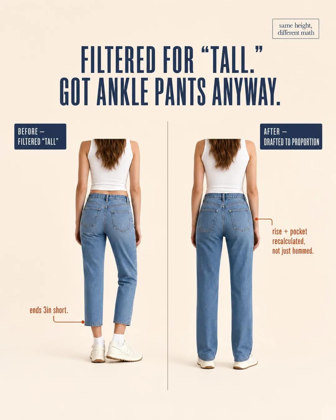
Jeans drafted by height, not hemmed longer
Sized for 5'10" and up
Fit failure is chronic in apparel, and chronic problems stop generating complaints — a tall woman has not been angry about trouser length for years, she has been resigned to it. Friction / Annoyance works on resignation where a benefit claim would not, because it names the ritual rather than the product: filtered for “tall”, got ankle pants anyway. That sentence is a lived Tuesday for exactly the person the ad is for and gibberish to everyone else, which is the targeting doing its work inside the creative.
The split earns its keep because everything is held constant except the claim. Same height, same top, same wash — the only variables are where the hem ends and the annotation explaining why (“rise + pocket recalculated, not just hemmed”). The ad's argument is that “tall” sizing is usually a longer hem on the same pattern, and the frame makes that checkable in one glance. Note also what the run's alternate headline did — “Same height. Different math.” became the corner badge of the image itself, which is the concept and the copy agreeing on what the ad is about.
Other headlines from the same run
- Rise recalculated. Pockets repositioned.
- Same height. Different math.
- Tall isn't a filter. It's a fit block.
- 34"–38" inseam, drafted to proportion
Call to action
The ad has already qualified the clicker — nobody taps a tall-sizing ad out of idle curiosity — and the objective is Sales, so send them to the product. The one reason to prefer Learn more is if your actual conversion argument is a fit guide or size chart the product page buries; the click this ad produces is a person who has been burned by exactly that page before.
The 17.5-Micron Fiber
Traffic17.5 microns is why it doesn't smell like day two.
- Audience
- Carry-on-only travelers — Fly a few times a month, pack for three days no matter how long the trip, and have done sink laundry in a hotel bathroom recently enough to remember it.
- Angle
- Ingredient / Material (Product & Mechanism) — Spotlights a specific ingredient, component, material, or input.
17.5 microns. That's the fiber diameter that keeps this shirt from smelling like a redeye. Fine-gauge merino naturally manages the bacteria that cause odor, so you wear it Monday through Friday without a wash. No sprays, no hoping. Just the physics of a fiber most brands don't bother measuring.
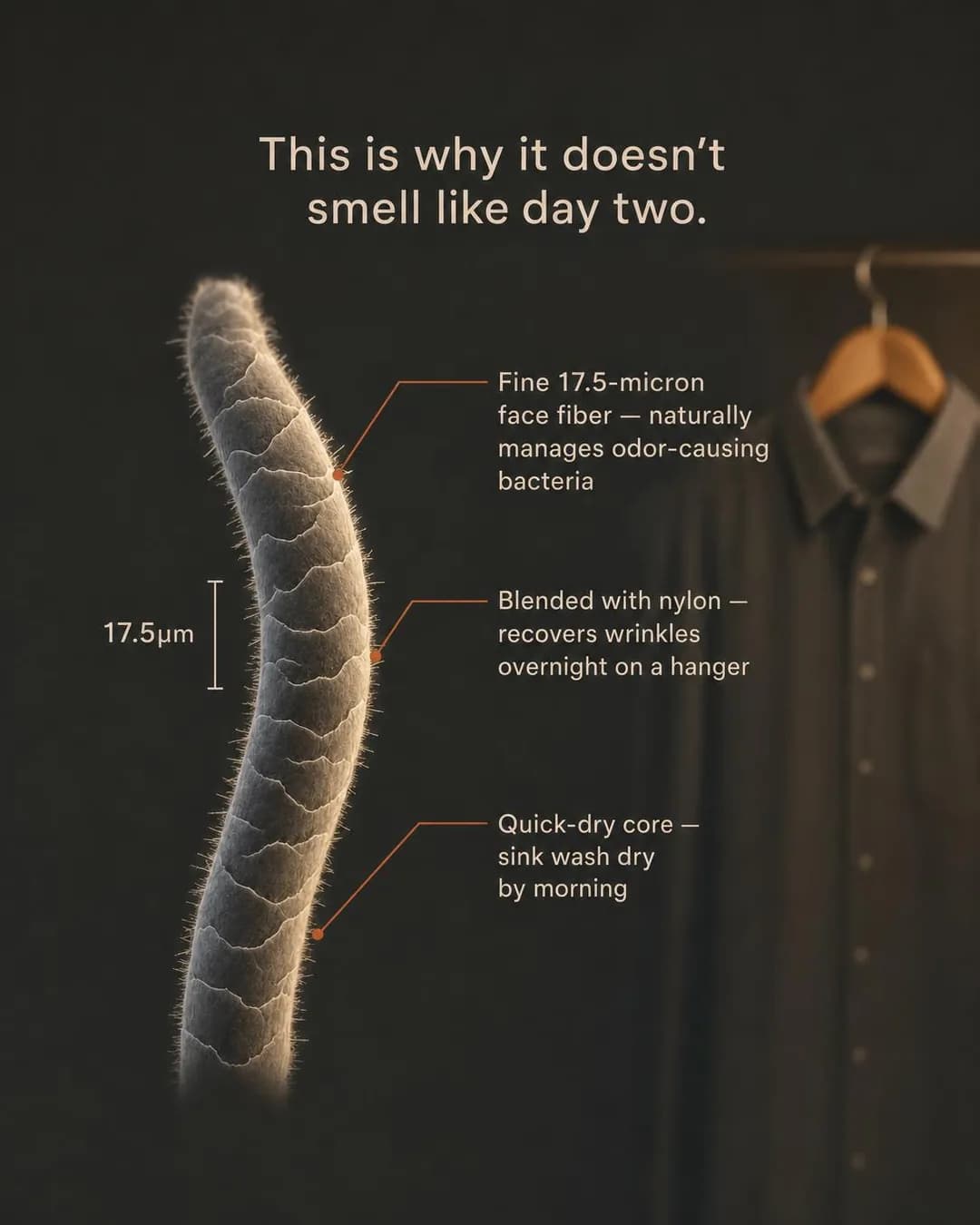
17.5 microns. 7 days. No laundry.
Shop merino travel shirts
Premium basics have a pricing problem: a $90 shirt next to a $12 shirt needs a mechanism, not an adjective. Ingredient / Material is the angle that supplies one, and the execution understands that the mechanism must be a number — 17.5 microns is the entire ad, repeated in the headline, the callouts and the scale bar. “Fine merino” is a claim; a fiber diameter with a unit is a fact, and facts are what someone pays the difference for.
The render does something a fabric ad almost never does: it shows the fabric at the scale where the argument lives. A magnified fiber with labelled callouts, the actual shirt hanging soft-focus behind it — spec sheet as image, which survives Instagram because it is a strange, specific picture rather than a paragraph. One caution transfers to any ad built this way: the number inside the render has to match the number in the copy, and numerals inside generated images are still where image models are least reliable. Here they agree — 17.5 in the image, 17.5 in the headline — and that check is one you run every single time, because a mismatch is not a blemish, it is the ad contradicting itself.
Other headlines from the same run
- The fiber diameter that stops odor
- Why it doesn't smell like day two
- One shirt. Seven days. Zero washes.
- Engineered at the micron level
Call to action
The ad opens a mechanism claim and a Traffic objective means the landing page finishes it — the fabric story, the week-of-wear test, the care instructions. Shop now is the version to run once the audience is warm; Get offer only if a first-order discount actually exists, because the word is a promise the landing page has to keep.
The Knee Graveyard
SalesFour blown-out knees a year isn't bad luck, it's the business model.
- Audience
- Men replacing jeans yearly — Keep three or four cheap pairs in rotation, watch each one blow out at the knee or crotch inside a year, and buy the replacement with no expectation it will last longer.
- Angle
- Hidden Cost of Cheap (Comparison & Positioning) — Shows the downstream costs, replacements, waste, or frustration created by cheaper alternatives.
Four pairs in twelve months. Not because you're hard on jeans — because they're built to fail at the knee so you buy again. Same $45 × 4. Same blowout. Same landfill. Or: one pair, cut and sewn in the same mill since 1987, backed by free repairs for as long as you own it. Blown knee gets mended, not replaced. The math isn't close.
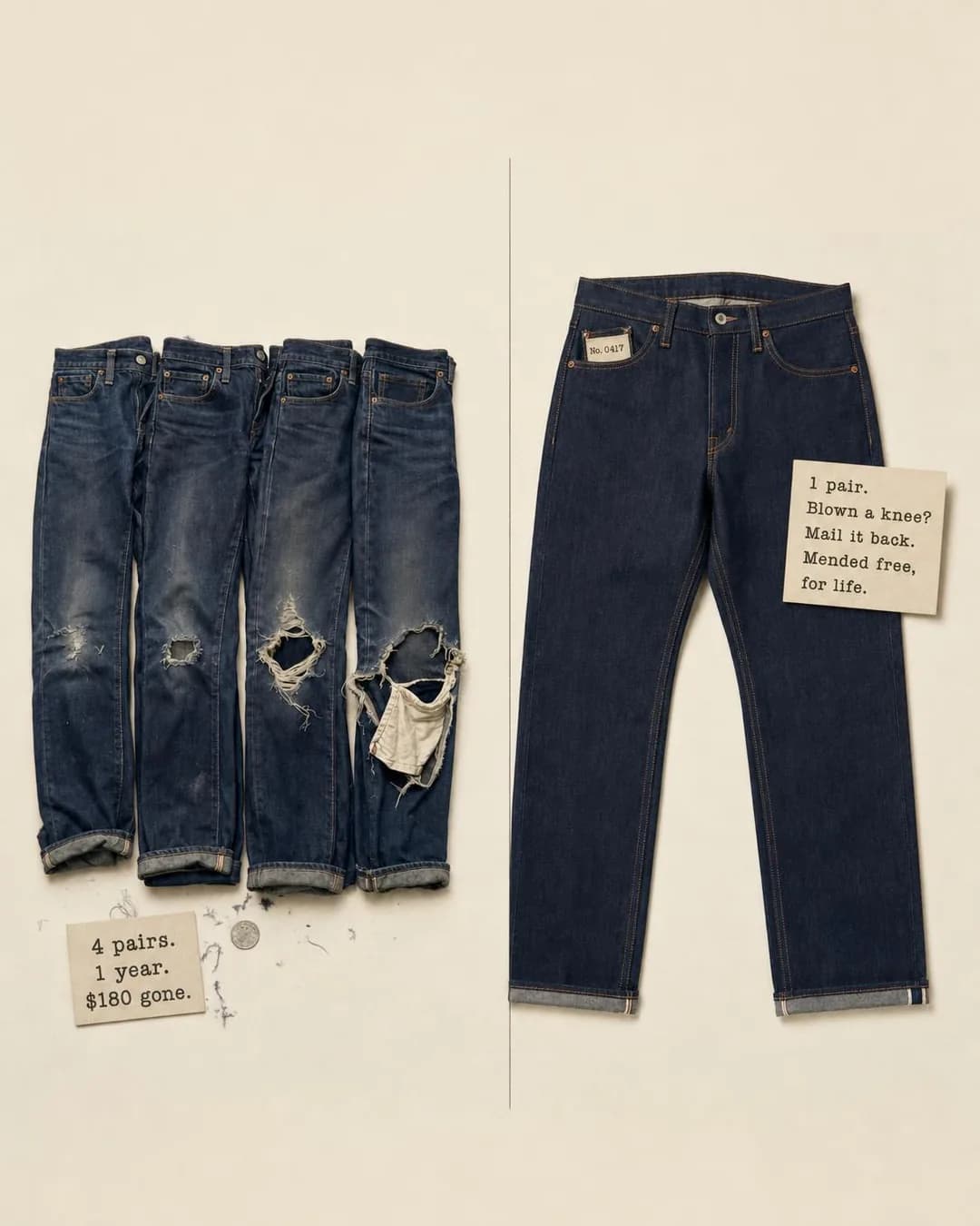
One pair. Free repairs. For life.
Selvedge jeans. Lifetime repairs.
Hidden Cost of Cheap is the correct attack for a category where the cheap option is the incumbent. The buyer's alternative to $180 jeans is not another premium brand, it is four more $45 pairs — so the ad does the arithmetic the buyer never does: four dead pairs laid flat, “4 pairs. 1 year. $180 gone.” against one pair and a repair promise. Same total, opposite outcomes, and the reader's own purchase history is the data set the left half is drawn from.
The execution is a Side-by-side scene rather than a comparison chart, and in apparel that is the right call: the evidence is physical. Blown knees photograph; a table row saying “durability: low” does not. Worth noticing that the copy in the frame lives on typewritten cards propped inside the scene — the image carries its own argument text without becoming a graphic, which keeps it reading as a photograph in a feed full of graphics.
Other headlines from the same run
- Stop replacing. Start repairing.
- Built to mend, not replace.
- Four blowouts or one lifetime pair?
- Same mill since '87. Free mending.
Call to action
The arithmetic is complete inside the frame, so the click is a buying click — but the landing page must restate the free-repairs-for-life promise above the fold. That promise is the entire right-hand column of the ad; a product page that leads with fabric weight and fit notes instead makes the click feel baited, and this is the rare case where the guarantee, not the garment, is what was sold.
The Countdown Card
LeadsBatch 15 leather runs out before the raffle would end.
- Audience
- Drop-calendar sneaker buyers — Follow release accounts, have lost enough raffles to distrust hype brands, and know the resale price of the last three shoes they failed to get.
- Angle
- Launch / Drop (Scarcity, FOMO & Timing) — Uses novelty and release timing to create excitement.
Batch 15. 300 pairs. No raffle, no waitlist, no restock. The hide lot determines the number, and the number determines when it's gone. 114 pairs already finished. Every pair is numbered, every batch sells out, and the leather doesn't come back. First-come stays first-come.
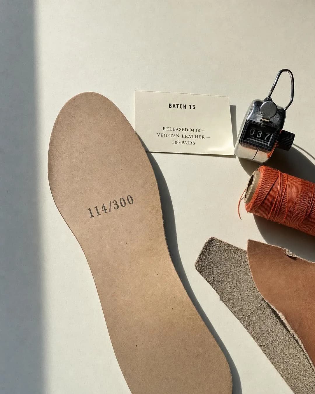
Batch 15. 300 pairs. No raffle.
Numbered. Resoleable. Gone when sold.
Launch / Drop barely needs introducing to this audience — batch numbers, no-restock, numbered pairs are the native grammar of sneaker buying. What the run got right is the register: a raw phone pic of an insole stamped 114/300 next to a batch card and a tally counter reads as a leak from the workshop floor, not a campaign asset. For an audience burned by raffle culture — which the copy names and disowns, “no raffle, no waitlist” — anti-hype presentation is the credible version of hype. Every number in the frame agrees with the copy: batch 15, 300 pairs, 114 finished.
One thing on this page has to be said plainly, because it is the honest cost of pinning the objective before generating: this concept was pinned as a Leads ad — build the list before the drop — and the copy came back explicitly foreclosing that, “no waitlist, just a countdown.” The objective is recorded metadata, never fed to the model, so the model argued the angle to its natural conclusion instead: first-come, first-served, live now. That is not a broken ad, it is a fork the brief left open — but you cannot run this copy against a signup form, because the ad just promised there is no list to sign up for.
Other headlines from the same run
- The leather runs out before the draw ends.
- No waitlist. Just a countdown.
- Fixed count. First-come. No restock.
- Batch 15 closes when the hide lot does.
Call to action
If the drop is live, Shop now — the copy has already committed to first-come. Sign up is the button for the campaign this was pinned to be, a list for the next batch, and choosing it means changing the copy that says no waitlist exists. Pick the campaign, then make the button and the copy tell the same story; an ad that promises no list over a button that asks people to join one is the mismatch readers punish.
The Shoulder Seam Test
TrafficIf the seam sits on your arm, the pattern was wrong.
- Audience
- Petite professional women — Buy blazers that fit in the shoulders and nowhere else, budget for alterations on everything they own, and read size guides like contracts because returns have taught them to.
- Angle
- Fit / Compatibility (Objection & Risk Reversal) — Resolves sizing, integration, device compatibility, workflow fit, or other practical blockers.
If the shoulder seam sits on your arm instead of your shoulder, the pattern was wrong — not your size. Standard petite blazers just cut the hem shorter. We redraft the whole thing: raised armhole, narrowed shoulder point, sleeve pitch recalibrated for a shorter frame. The seam sits where it should, and the sleeve stops at your wrist. No tailor before first wear. One free proportion exchange per order if you need to adjust your band.
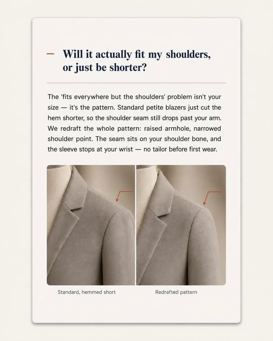
The seam sits on your shoulder, not your arm
Blazers $228–$268, fit-guaranteed
For clothing bought online, Fit / Compatibility is not one objection among many — it is the conversion objection, and for petite sizing it has a specific, sophisticated form: everything “petite” is just shortened. The FAQ card format works because the question is in the reader's own words (“Will it actually fit my shoulders, or just be shorter?”) and because the answer is a mechanism rather than a reassurance — redrafted pattern, raised armhole, narrowed shoulder point, “no tailor before first wear.” An answer that had said “designed with petite frames in mind” would have confirmed the fear it quoted.
The flaw worth learning from is in the photo insets. “Standard, hemmed short” and “Redrafted pattern” are genuinely different — the seam sits differently — but at feed size the difference is millimetres, and the labels end up carrying more of the argument than the pixels do. That is the recurring failure mode of before/after in tailoring, where honest differences are small: if you build one, crop to the seam until the difference is unmissable, or accept that the annotation is the evidence and design it accordingly. Shipped as generated here, flaw included, because the flaw is instructive.
Other headlines from the same run
- Petite patterns redrafted, not just hemmed
- Blazers cut for your frame, not shortened
- No tailor needed before first wear
- This is what correct proportion looks like
Call to action
The card answers one objection; a Traffic objective means the landing page answers the rest — and for this buyer that page is the size guide, the measurements table, the returns policy. Send the click there, not to a category grid. Shop now becomes the right button on the retargeting pass, once the fit case has been made once already.
The Closet Math Confession
SalesYour $30 jacket costs more per wear than this coat.
- Audience
- Women pruning their wardrobes — Own a full closet and wear a fifth of it, have read the capsule-wardrobe articles, and are suspicious of a $150 jacket and a $30 jacket for opposite reasons.
- Angle
- Cost Per Day / Use (Offer & Economics) — Breaks a large price into a smaller daily, monthly, or per-use amount.
Your $30 jacket costs more per wear than this coat. That's not a guess — it's the math you're not doing when you hit checkout. A cheap jacket worn four times = $7.50/wear. This coat, worn 200 times over two years = under $2.00/wear, guaranteed. Most wardrobes are priced to be bought, not worn. This one is priced by the number that actually matters: what it costs you each time you put it on.
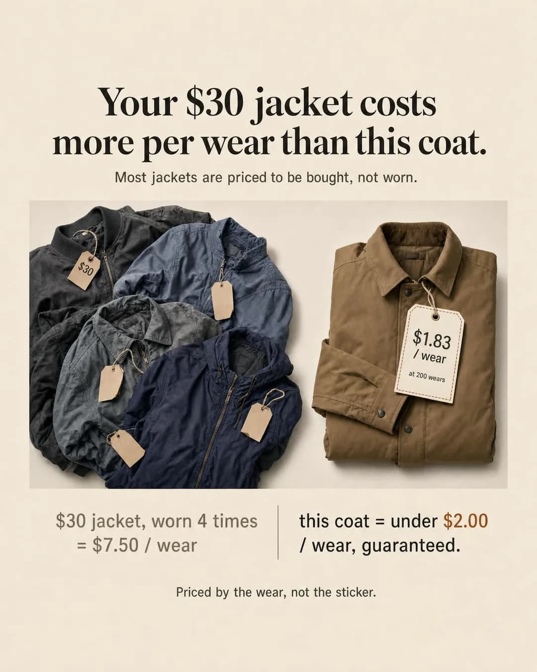
Under $2/wear, guaranteed in 24 months
Cost-per-wear, guaranteed
Cost Per Day / Use is everywhere in mattresses and software and almost nowhere in fashion, which is exactly why it works here: it is the strongest counter to fast-fashion price anchoring that does not involve a discount. The ad changes the unit — $30 worn four times is $7.50 a wear; this coat at 200 wears is under $2 — and the whole calculation is inside the frame, auditable by the reader. An offer-economics ad with no offer in it, in the discount-saturated category, is a differentiated ad by construction.
The sharpest object in the render is the hang tag: “$1.83 / wear” hanging where the price goes. That one prop is the brand's entire positioning made physical — the claim that the number on the tag has been the wrong number all along. And the run's alternate headline, “Priced by the wear, not the sticker”, is arguably stronger than the one it shipped with, which is what the alternates column is for: the same argument, five castings, choose after seeing them together.
Other headlines from the same run
- Priced by the wear, not the sticker
- Cheap jackets cost more. Here's the math.
- A wardrobe priced to be worn, not bought
- 12 pieces. 200 wears each. Real math.
Call to action
The math closes inside the ad, so the click is a purchase-intent click. Resist Get offer: “guaranteed” in the headline is a durability policy, not a discount, and Get offer promises the discount — the reader who taps it looking for a code and finds a warranty page converts worse than one sent honestly. Learn more fits if the guarantee's mechanics are the thing your landing page does best.
The Corner Rack Veteran
SalesYou've shopped the back corner since you were fourteen.
- Audience
- Big & tall men — 6'3", or past 250 pounds, or both; shop in the one corner of the store that stocks their size and have spent years wearing whatever fits rather than whatever they like.
- Angle
- Identity Callout (Identity & Emotion) — Directly identifies a profession, role, life stage, behavior, or type of person.
You've shopped the back corner since you were fourteen. The one rack with your size. The three shirts they bothered to stock. You learned early to buy what fit, not what you actually wanted. Oxford shirts built on a chest-and-height grid — 44 to 62 chest, Short through Long-Tall — so you can stop settling for whatever was left. Sized by actual measurement, not vague letters.
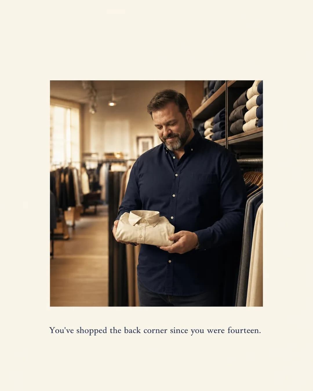
Sized by chest and height, not hope
Engineered fit, $98
Identity Callout is a risky angle in apparel because it usually flatters, and flattery from a stranger is an ad announcing itself. This one recognises instead: “You've shopped the back corner since you were fourteen” names a two-decade history, not a body type, and the number the ad never says out loud — no chest measurement, no size — is what keeps recognition from tipping into diagnosis. The buyer it lands on has years of evidence that clothing brands do not mean him; being seen accurately is the scarce thing, and it is the entire ad.
The portrait carries the same restraint. A man in a menswear store, considering a folded shirt — the exact moment the caption describes — composed like a photo essay rather than a catalogue: the caption sits under the image like a gallery label, the palette is quiet, nothing is being celebrated. An aspirational treatment here, the standard fashion-ad move, would have broken the ad; the format works because it treats the subject the way the brand claims to.
Other headlines from the same run
- Oxfords cut for your actual build
- The corner rack ends here
- 44–62 chest. Short to Long-Tall.
- Built for big & tall from the start
Call to action
The callout has done the qualifying, the objective is Sales — send the click to the product. The one requirement is that the destination proves the promise instantly: the size grid, chest-by-height, visible without scrolling. This buyer has clicked hopeful ads before; the product page has one screen to be different from every store that taught him the back corner.
The 3XL Review Wall
Sales847 reviews. Every size. Same five stars.
- Audience
- Women lifting in commercial gyms — Train three to five times a week, have checked the mirror mid-set for the reason every woman who lifts has, and rebuy one trusted pair in black rather than risk a new brand.
- Angle
- Reviews / Ratings (Proof & Trust) — Uses star ratings, review excerpts, review counts, or screenshots.
847 reviews. 4.9★ average across XS–4XL. Every size tested identically, every colorway filmed at full squat depth before it ships. The rating doesn't change because the fabric doesn't change. Leggings engineered by former garment techs who got tired of "squat-proof" meaning "squat-proof in the sample size." $88–$98. Bottoms only. No tops, no distractions, no reduced size runs.
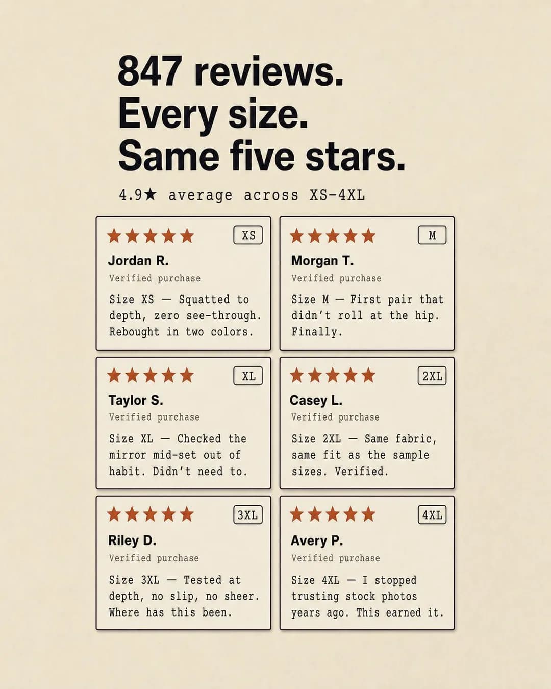
4.9★ across every size we carry
Leggings tested in every size
Reviews / Ratings ads usually just assert volume — four stars, thousands of reviews — and volume is wallpaper. This one makes the structure of the reviews do the arguing: six cards, one per size, XS to 4XL, same five stars, under a headline that names the pattern. That structure answers the actual anxiety in activewear, which is not “is it good” but “is it good in my size” — every lifter has seen a product reviewed to death by sample-size bodies and arrived opaque at 2XL. “Checked the mirror mid-set out of habit. Didn't need to” is review language written from inside the audience, which is what makes a fabricated grid feel real —
— and that is exactly why this is the one ad on the page you must not run as generated. Jordan R., Morgan T. and the rest do not exist; their “verified purchases” never happened. A review-grid format works because readers assume real customers behind it, and shipping it with invented ones is fabricated social proof — a policy violation on Meta and a legal problem in most markets, same as the invented testimonial on our SaaS page. The honest takeaway is the format itself: size-labelled reviews arguing size consistency. Fill the grid with quotes from customers who exist and agreed to appear, and the ad keeps everything that makes it work.
Other headlines from the same run
- Tested at depth. In your size.
- 847 reviews. Same five stars.
- Squat-tested means all sizes
- The rating holds across XS–4XL
Call to action
Social proof is bottom-funnel; the reader convinced by a review wall is ready for the product page, and the objective is Sales. Subscribe is worth testing only if replenishment is real for you — leggings are a rebuy category and the copy's “rebought in two colors” is already telling that story. Learn more wastes the intent this format generates.
Skip the Dry Cleaner Forever
SalesWash it Sunday night, wear it Monday morning.
- Audience
- Teachers and nurses — On their feet from seven to four with a phone, keys, and someone else's problems to carry, and long past pretending a dress with no pockets is workwear.
- Angle
- Convenience (Benefit & Outcome) — Makes an existing task, routine, or purchase easier to complete.
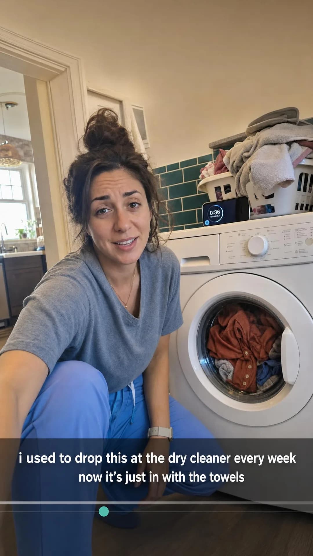
I used to make a separate dry-cleaner run every single week. Now my work dresses go in with the towels, and I get Sunday night back. Machine-washable ponte and jersey that actually survives a hot wash — tested through 100+ cycles before we sell it. Real pockets sized for a phone and pen light. Built for nurses, teachers, and anyone who spends a shift upright.
Wash it Sunday. Wear it Monday.
From $88. Real pockets included.
Convenience is a weak angle stated and a strong one shown, and this ad shows it as an absence: the dry-cleaner run that no longer happens. The claim is a Sunday-night fact — work dresses in with the towels — made checkable by the scene itself: laundry room, timer running on the phone, the dress visible mid-cycle in the drum. That last detail is quietly the product shot, and it is deliberately the least glamorous product shot on the page, which on Instagram is a feature: in Stories, between things people chose to watch, it reads as a person's post for the beat that matters.
One honest note about pinning: the brief for this ad named two benefits — machine-washable and real pockets — and the run built the entire ad on the first, never mentioning the second. Pinning fixes the angle, not which benefit inside the angle the model finds strongest; the one-line description is the whole steering wheel. If the pockets are the hill your brand dies on, the description has to say so — a lesson that costs nothing here and a re-run in production.
Other headlines from the same run
- Work dresses that survive laundry day
- Skip the dry cleaner. For good.
- Machine-wash your work dress. Really.
- One less errand. Every single week.
Call to action
A Stories tap is cheap and half-accidental, which argues for a soft landing — but the destination here is a product page either way, and the objective is Sales, so send the click to the dress itself, not a collection grid that makes the half-interested tap do more work. Learn more is the safer pairing if your product page opens on price before it re-earns the claim.
The Fiber Isn't the Markup
TrafficOrganic cotton costs $2. The rest is myth.
- Audience
- Shoppers who distrust the word sustainable — Have watched every fast-fashion giant launch a 'conscious' line, assume greenwashing by default, and want a number or a name before they believe anything.
- Angle
- Myth Busting (Comparison & Positioning) — Challenges and disproves a common belief in the category.
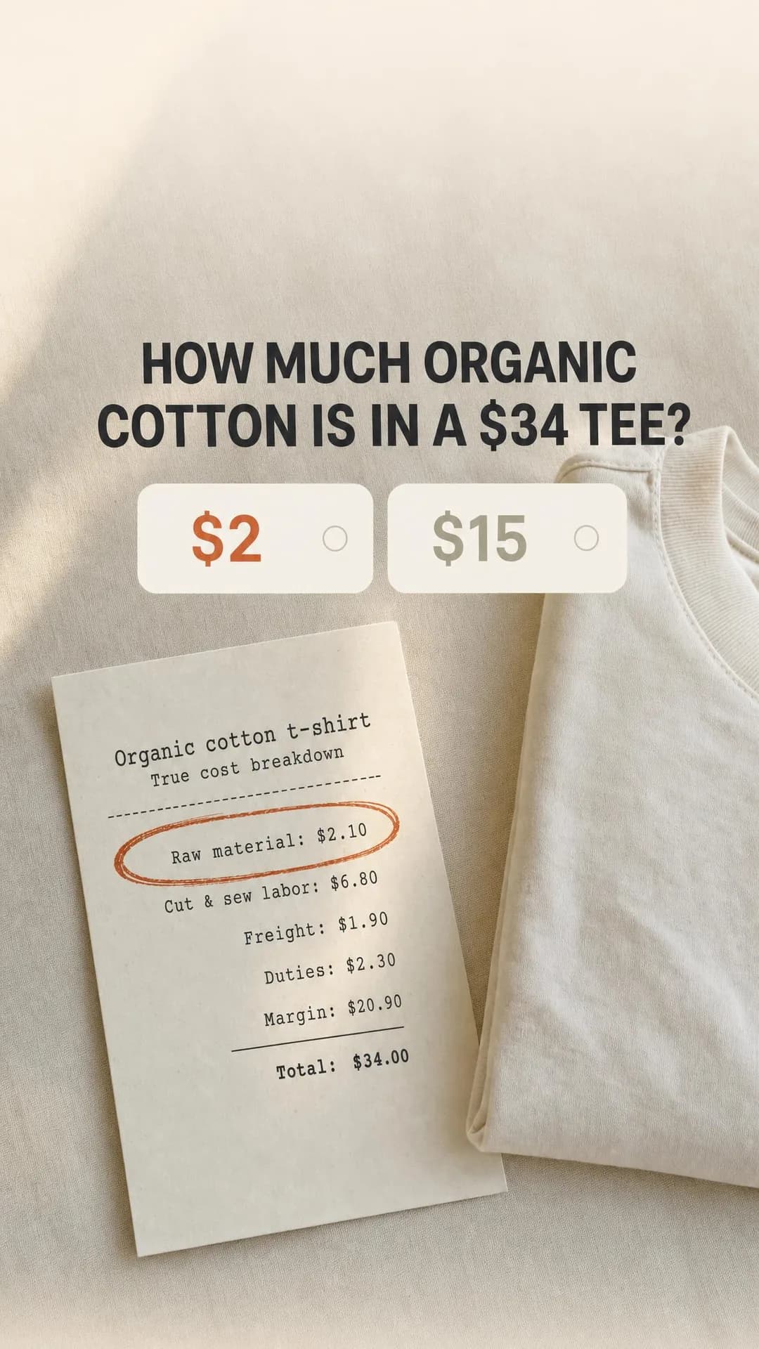
Organic cotton costs $2.10. Not $15. Not $20. Two dollars and ten cents. The rest of what you pay for a 'sustainable' tee? That's markup, not materials. We print the full cost breakdown on every product page — raw material, labor, freight, duties, and yes, our margin — because the fiber was never the expensive part. It was always the story you were sold about the fiber.
Organic cotton costs $2. The rest is markup.
Cost breakdown on every product
Myth Busting for an audience that already assumes greenwashing cannot open with a virtue claim — the reader's defences are the whole targeting premise. So the ad opens with a question instead, and the poll format is secretly a quiz with a right answer: how much organic cotton is in a $34 tee, $2 or $15? The reader who picks $2 gets told their cynicism is correct — $2.10, circled on a receipt — which recruits the scepticism instead of fighting it. That inversion is the only way this audience is reachable, and the two-option poll is Stories' native grammar for it.
The receipt is the ad's real argument, and its bravest line is not the cotton — it is “Margin: $20.90”, printed and summing correctly to the $34 total. A transparency brand indicting its own margin buys credibility for every other number it will ever publish; the same receipt with the margin omitted would read as exactly the greenwash it claims to oppose. If you copy this format, copy that: the number that costs you something is the one doing the persuading.
Other headlines from the same run
- The fiber isn't the premium. The story is.
- Raw material: $2.10. Margin: $20.90. See the difference?
- $34 tee. $2 cotton. Full breakdown published.
- We show the math. Most brands don't.
Call to action
The ad has proven one number; a Traffic objective and this audience demand the landing page prove the rest — the factory list, the full breakdowns. Learn more is the button that promises receipts and a page of receipts keeps it. Shop now belongs on the retarget, once the transparency case has been seen; asked for cold, it converts the poll's participation into a sales pitch one beat too early.
Questions
- Do Instagram ads work for small clothing brands?
- They work when the ad argues something a big brand's ad cannot. A famous label can run a wordless product shot because the logo carries the argument; a small one competing with that shot loses on production value every time. What a small brand can do is be specific — about who the garment is for (women 5'10" and up, men who shop the corner rack), what it fixes (the shoulder seam, the blown knee), or what it costs honestly (per wear, with the margin printed). Every ad on this page is built on one of those, which is a consequence of pinning the audience and angle before generating rather than a house style.
- What size should a fashion Instagram ad be?
- Portrait, not square. Meta's ads guide recommends 4:5 for feed image ads and full-screen 9:16 for Stories and Reels; best-in-slot exports those as 1080 × 1350 and 1080 × 1920. For apparel there is a second reason beyond screen space: fit claims need the garment on a full figure to be checkable, and a square crop is where the hem, the break or the drape falls out of frame. Render each shape separately rather than letting Meta crop one image into both — which is what happened here.
- Should the ad show the product on a model?
- Only three of these ten lead with a person, and that ratio is the lesson. A model shot is the default fashion ad, which means it is also the wallpaper an Instagram user scrolls through — and it is the one asset every competitor has an equally good version of. The ads here reach for a person when the person is the argument (an identity callout, a fit comparison, a Stories selfie) and for evidence when the argument is a number or a promise: a receipt, a hang tag, a review grid, four dead jeans. Ask what the ad is claiming, then show the thing that proves the claim.
- How do I advertise clothes without discounting?
- Reframe the price instead of cutting it. The cost-per-wear ad below is an offer-economics ad with no discount in it — it changes the unit from price-per-garment to price-per-wear and lets arithmetic do what a sale would have done, without training buyers to wait for markdowns. The drop ad does the same with supply: scarcity stated as a production fact, batch size and no restock, rather than a countdown timer bolted onto an unlimited product. Discounting is one family in the angle library, not the default setting for the category.
- Can I use these ads?
- Take the approach, not the pixels — and for two of them, that rule has teeth. The reviewers in the leggings ad and their “verified purchases” are invented, and running fabricated reviews or endorsements as if real violates Meta's policies and worse; the honest use is the format — size-labelled reviews arguing size consistency — filled with quotes from customers who exist and consented. The companies are invented and the images were generated for this page, so there is nothing to lift anyway: the value is the pairing of an audience with a specific argument, and every angle used below is documented in full in our ad angle library, linked from each ad.
Seen enough? Make your own.
Paste your store. It reads your products, your customers and your look, then writes the concepts, renders the images and drafts the copy — for the one feed already full of clothes.
No credit card · 50 free credits (about 5 ads or Instagram posts)
Every angle used above is documented in the best-in-slot ad angle library. More industries and placements are at all ad examples.