
Ad Angle Library #6 · 12 angles
Objection & Risk Reversal ad angles
Remove reasons not to buy.
This is the first family in the library with no cold angle in it. Not one of the twelve will do anything for a stranger, and that is a fact about objections rather than an accident of how the taxonomy was cut. An objection is something only a person who is already half-buying can have. Nobody doubts a product they have never considered, and there is no risk to reverse on a purchase that was never being contemplated. Every other family opens a conversation; this one is what you say at the end of it.
Which makes the family’s job subtractive. The angles before this one add something — a problem, a benefit, a mechanism, proof, a comparison — and the reader gets more interested as a result. These twelve remove. The reader already wants the outcome and has already decided you can probably deliver it, and is now sitting on one specific reason not to move: it costs too much, it will take a week to set up, the last three didn’t work, it probably doesn’t handle their situation. Nothing you add fixes any of that. You have to go and take the reason away.
There are exactly two ways to do that, and the split organises the whole family. You can answer the objection — argue it away with a fact, a demonstration, a boundary. Objection Handling, FAQ, Price Objection, “Will It Work for Me?”, “I’ve Tried Everything”, Complexity Objection and Fit / Compatibility all work this way. Or you can absorb it — take the risk off the reader’s balance sheet and onto your own. Guarantee, Free Trial, Try Before You Buy, Easy Returns and No Commitment all work this way. Answering costs words and requires you to be right. Absorbing costs money and requires you to mean it.
Most teams reach for answering, because it is free, and it is the weaker of the two. An argument can be doubted by anyone who has been oversold before, which is everyone. A refund policy cannot be doubted; it can only be used. That is the uncomfortable thing about this family: it is the one place in the library where the copywriter has the least leverage and the founder has the most. The best guarantee ad in the world is capped by the guarantee. If the angles below feel thin when you write them, the honest read is usually that the offer behind them is thin, and the fix is on the pricing page rather than in the ad.
One failure mode runs through all twelve, and the taxonomy flags it twice: saying the objection can install it. A reader who had not yet worried about price will happily accept the invitation to start. The resolution is not softer writing, it is stage discipline — every angle here belongs to an audience that has already met the pricing page, opened the trial, abandoned the cart or replied “this looks great, but”. And the objections themselves have to be collected rather than invented. Lost-deal notes, cancelled carts, churn surveys, the question that arrives at minute twelve of every sales call. An objection list written in a meeting is a list of the doubts you find flattering, and those are never the ones costing you money.
Which one, when
- Mid“I’ve Tried Everything”
- The only angle here that reaches somebody who isn’t shopping yet, because its audience gave up on the category rather than on you. They have to be re-recruited before anything else in this family means a thing.
- Mid–HotObjection Handling · “Will It Work for Me?” · Complexity Objection · FAQ · Free Trial / Sample
- Interested, unconvinced, still gathering. The doubts at this stage are about fit and effort rather than money — will it work for me, how much of my week does it cost, what actually happens after I click. Answer one per ad, and let the trial carry the ones that are easier to show than to argue.
- HotGuarantee · Try Before You Buy · No Commitment · Easy Returns · Price Objection · Fit / Compatibility
- They were going to buy and something stopped them. Four of these six absorb the risk instead of arguing with it, which is why they close: the reader doesn’t have to believe you, only to notice that being wrong about you is now cheap. Retargeting, cart abandoners, pricing-page bouncers — never cold, because several of them make an objection salient that a stranger hadn’t raised.
About the examples. Every ad below was generated by best-in-slot for best-in-slot — one product, one underlying problem, 12 different arguments about it. That repetition is the point: hold the product and the pain still, and the angle is the only thing left changing. Each is shown exactly as it came out.
Objection Handling
Mid–HotStarts with a purchase objection and directly resolves it.
The family’s umbrella angle and the most direct thing in it: state the reason somebody isn’t buying, then remove it. Two beats, both inside the same ad. An ad that raises a doubt and defers the answer to the landing page has made the doubt vivid, attached it to your brand, and then asked for a click — you have paid Meta to worsen your own conversion rate.
Everything depends on where the objection came from. The good ones are ugly, specific, and already exist in writing: the reply that opens “this looks great, but”, the reason people give when they cancel, the question every sales call eventually arrives at. Steal the phrasing exactly, including the part that stings. If your list of objections runs to four items and all four are flattering — is it too advanced for a small team, is it too fast — you have written excuses in the shape of objections, and the reader notices that none of them is the thing they were actually worried about.
Then answer with a fact rather than reassurance. “Don’t worry, it’s easy” restates the objection in a friendly voice; “setup is one photo and a URL, and the first ad is done before the coffee goes cold” answers it. One objection per ad, always — an ad that clears three doubts has introduced two of them to a reader who only held one. And keep it away from cold audiences, which is the taxonomy’s warning made operational: at the top of the funnel you are not resolving a blocker, you are supplying one.
- Works because
- Attacks conversion blockers head-on.
- Fails when
- Mentioning an objection can sometimes reinforce it.
Write one like this
- “It’s probably just another template generator.” Here’s the thirty seconds that settles it.
- You’re not worried about the price. You’re worried it’ll eat a weekend.
- The objection we hear most: “my product photos aren’t good enough.” They are.
- “What if the ads look AI-generated?” Then don’t run them — you see them before you pay.
Don’t raise an objection your audience hasn’t got yet. A doubt you introduce is a doubt you now own, and cold traffic takes the doubt and leaves the answer behind.
"I don't have time to learn another ad tool." Good — you won't. best-in-slot reads your website, learns your business, and spits out a finished Meta ad in about a minute. No setup forms. No brand questionnaire. No uploading guidelines. Paste your link, wait 60 seconds, get an ad ready to publish. Nothing goes live until you say so. Try it free — no card required.
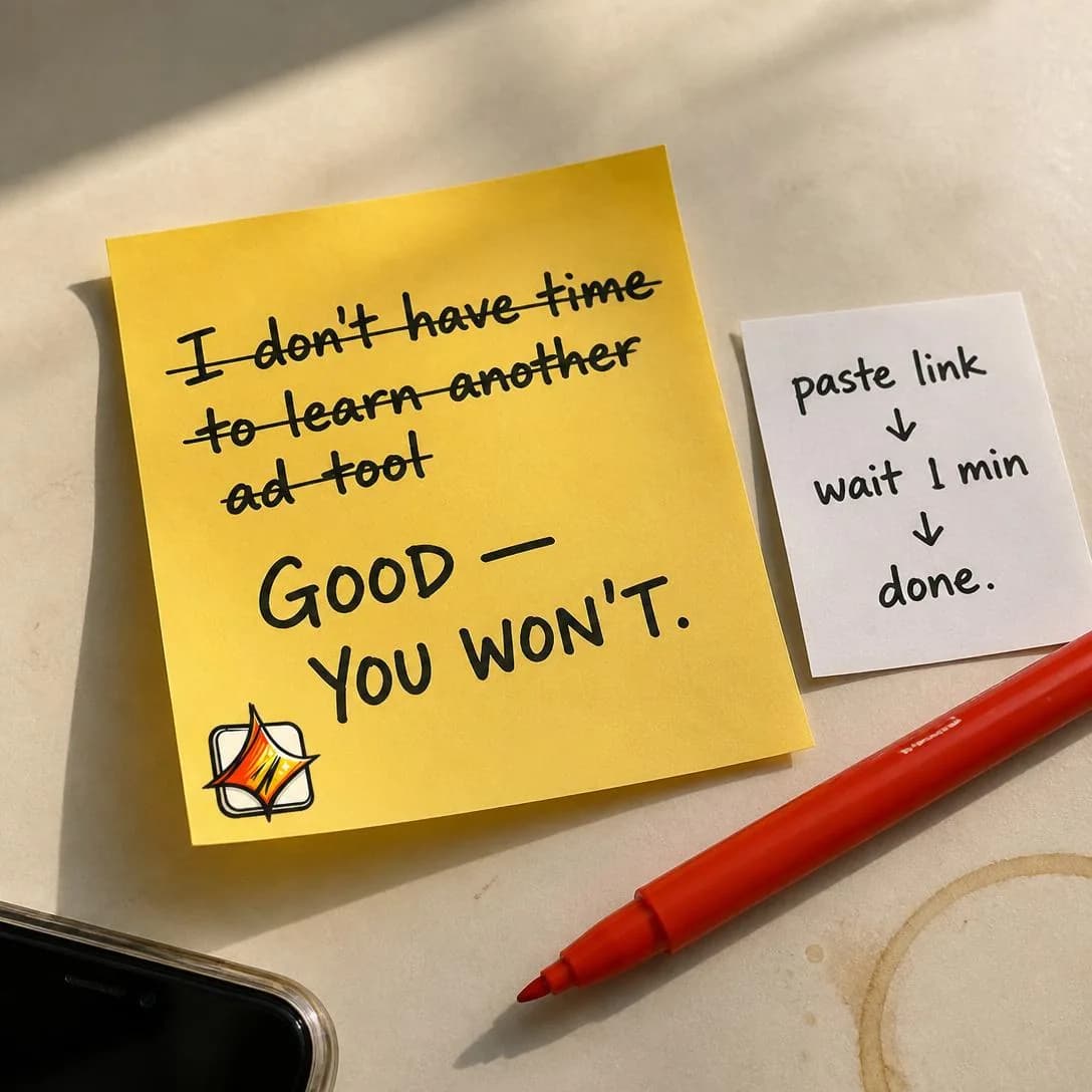
Paste link. Wait 1 min. Done.
Start free — no card required
FAQ
Mid–HotAnswers common questions that prevent the buyer from moving forward.
Not the page — the ad. Take the three or four questions standing between interest and checkout and answer them at ad length. Its virtue is that nobody has to be persuaded of anything: information is the cheapest thing you can hand someone who is nearly convinced, and it arrives without the pressure a closing ad carries.
The taxonomy is right that it goes dry without a concept, and the concept is usually the format rather than an idea. A card per question in a carousel, a question per beat in video, one question at full size in a static. Real questions typeset as questions is device enough, provided they are real — this angle dies the moment it becomes a feature list wearing question marks. Every line should be one you have literally received, in the phrasing you received it, ordered by how often it turns up rather than by how well you answer it.
The under-used part is that an FAQ ad is also an instrument. Each card earns its own engagement, so a carousel tells you which doubt the market actually holds, and the one that gets the taps is your next Objection Handling ad — a research pass and a conversion ad bought with the same money. It is also the most reusable asset in the family: the same four answers become the retargeting set, the sales follow-up, and the section of the landing page the click arrives on.
- Works because
- Useful, practical, and low-friction.
- Fails when
- Can feel dry if there is no strong creative concept.
Write one like this
- Four questions we get every week, in the order we get them.
- “Do I need a designer for this?” No. Next question.
- Q: what if my photos are bad? A: they’re probably fine — here’s the test.
- Everything people ask before signing up, answered in ten seconds each.
Don’t answer questions nobody asked. An FAQ assembled from your feature list is a brochure with question marks, and a reader spots the difference in one line.
Every reason you haven't tried an AI ad tool yet? We wrote them all down, then crossed them out. Free to start. Zero design skill required. Nothing goes live without your approval. You get 50 credits just for signing up — enough to build 3 full ads and see if this actually works. No card, no risk, no excuses left.
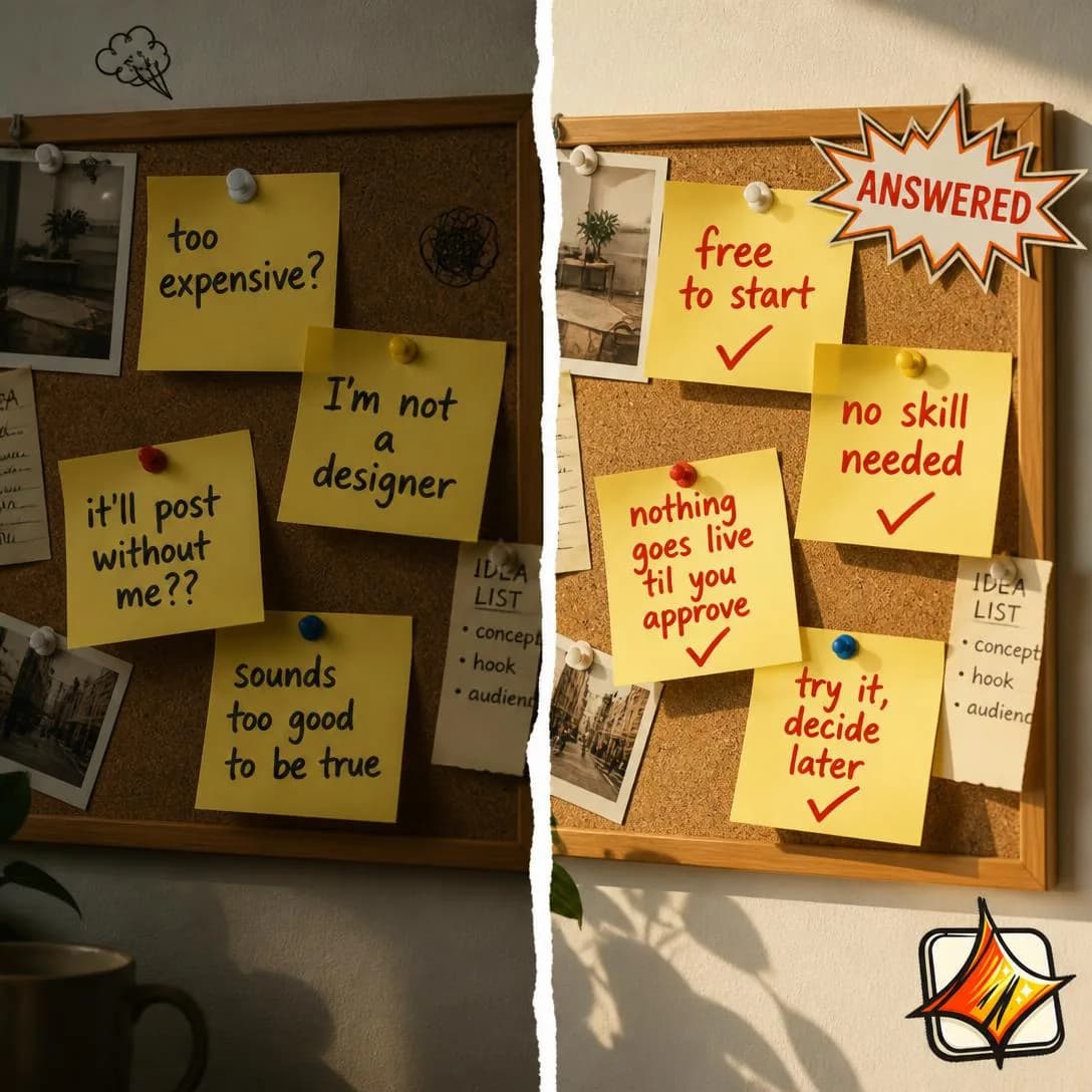
Every doubt, answered in one glance
Start free. 50 credits waiting.
Guarantee
HotEmphasizes a money-back, satisfaction, quality, or performance guarantee.
The moment you stop arguing and start absorbing. A guarantee does not persuade anybody that you are good — it makes being wrong about you cheap, which is a different and stronger mechanism. A reader who privately suspects you are overselling can still act, because the cost of your overselling has moved to your side of the table. Belief is no longer required, and belief was the expensive part.
Simplicity is the entire product here. Every condition you attach subtracts more confidence than the guarantee adds, because a condition tells the reader you have thought carefully about how not to pay. “30 days, no questions” beats “60 days subject to completing onboarding and submitting evidence of use”, even though the second is nominally twice as generous. If your guarantee needs a paragraph it is not a guarantee, it is a policy, and policies reassure nobody. The taxonomy calls this a weakness; treat it as a design brief with one line in it.
Then put it in the headline. Most brands who own a real guarantee mention it in eleven-point grey under the button, which is where risk reversal goes to die — the doubt happens before the scroll, not after it. Two honest cautions. A guarantee amplifies whatever the product already is: it does not fix disappointment, it makes disappointment refundable and faster. And redemption is usually low but has to be budgeted as though it isn’t, because the day you get reluctant about honouring it, the guarantee stops being an asset and becomes the thing people write reviews about.
- Works because
- Transfers risk from buyer to seller.
- Fails when
- Weak if the guarantee is complicated or full of exceptions.
Write one like this
- If the first batch isn’t better than what you’re running now, we refund it. No form.
- 30 days, no questions. We’d rather have the feedback than the money.
- You don’t have to believe us. That’s what the guarantee is for.
- Refunded if it doesn’t work. Keep the ads either way.
Don’t attach conditions. One exception clause can cost more trust than the whole guarantee buys, because it tells the reader you have already rehearsed saying no.
If the AI screws up, you get your credits back. Automatically. No ticket, no waiting, no "we'll look into it." Failed ad generation? Refunded before you even notice. That's how best-in-slot works: paste your website link, get a finished Meta ad in ~60 seconds, and if something breaks, we eat the cost. Not you. Start with 50 free credits — no card required.
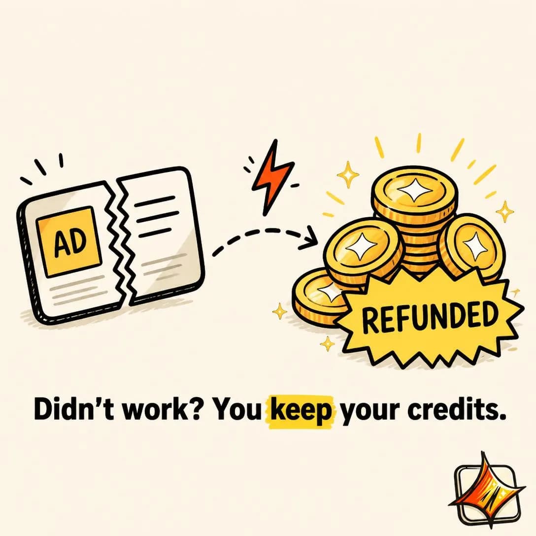
AI fails? Credits refunded. Instantly.
Try free — no card required
Free Trial / Sample
Mid–HotLets the prospect experience the product before fully committing.
The most reliable conversion device in software, and the ad version has one job: make the trial sound like an experience rather than a form. “Start your free trial” is not an offer, it is a button. “Upload one product photo and see what a week of ads for it looks like, before you decide anything” is an offer — it names what happens in the first two minutes, which is the only part of the trial the reader is actually evaluating.
So show the thing rather than describing the access. The strongest free-trial ads are barely about the trial at all: a demonstration of output with a low-friction door at the end, because the reader is not asking whether free is a good price, they are asking whether the first session is worth twenty minutes. That framing also softens the taxonomy’s warning about low intent — an ad that shows real output filters better than a credit-card gate does, and it filters on interest rather than on willingness to be charged.
Decide honestly which job the trial is doing before writing it, because volume and proof pull in opposite directions. If it is proof, name the specific thing the reader will be holding at the end, and make sure onboarding delivers exactly that in the first session, or the ad has written a cheque the product then bounces. For physical goods the same logic runs with the sample as the whole ad: a sample is not a marketing asset, it is the product arriving early, so everything in the creative should be about what shows up.
- Works because
- Dramatically lowers the trial barrier.
- Fails when
- Can attract low-intent users.
Write one like this
- Upload one product photo. See the ads before you decide anything.
- Free credits, no card. Enough to find out whether this is for you.
- Try it on your worst product photo. That’s the honest test.
- The trial isn’t a demo. It’s three ads you could actually run.
Don’t sell the access. “Free trial” describes a pricing mechanic — show what the reader will be holding twenty minutes in, or free is the only claim in the ad.
Most ad tools ask for your credit card before you see anything. We do the opposite. Paste your link, get 50 free credits, and generate real Meta ads — image, copy, all four sizes — before you ever decide to pay. No forms. No card. No risk. See your actual ad first, then choose.
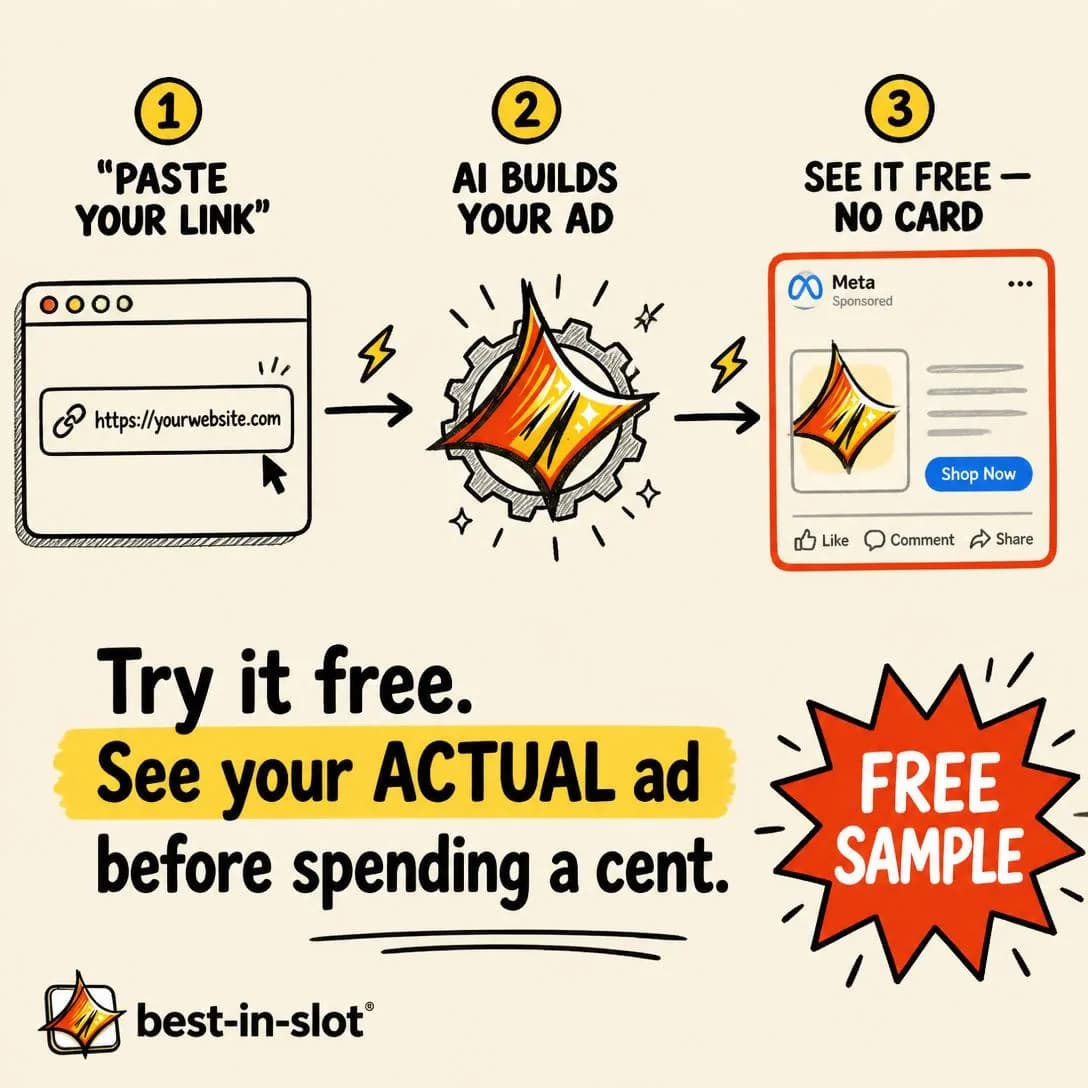
Try it free. No card needed.
No card. No risk. Real ads.
Try Before You Buy
HotDelays payment or commitment until the buyer has experienced the product.
Stronger than a trial, and routinely confused with one. A trial is a limited version of the product for a limited time, and the reader still does the setup on faith. Try Before You Buy delays the payment on the real thing: the item ships and the card is charged after they keep it, or the campaign runs and they pay once it has produced something. The burden of proof inverts completely, and the ad gets to say the sentence that does all the work — you pay after it works.
Everything after that sentence is bonus, which is why this angle needs very little copywriting and a great deal of clarity. The taxonomy’s warning about operational complexity shows up in the creative as ambiguity, and ambiguity in a risk-reversal offer reads as a trap. Say when the card is charged, what happens if the reader does nothing, and how they stop. Three lines: what you get now, when the money moves, how to end it. A reader who has to guess at any of the three assumes the least generous version of the sentence you didn’t finish.
Be clear-eyed about who it suits. It works where the product proves itself fast and where you can afford to be wrong about a proportion of people, and it produces a customer who experienced the thing before paying for it — the best retention cohort you will ever buy. Where value takes months to show up, the delay is just a longer window in which nothing happened, and the offer converts people who never come back.
- Works because
- Strong form of risk reversal.
- Fails when
- Can be operationally complex.
Write one like this
- Try three. Keep one. Pay for that one.
- Your card isn’t touched until you’ve got an ad you’d actually run.
- It ships tomorrow. You pay after you’ve seen it.
- No payment for 30 days — and here’s the exact sequence, so nothing surprises you.
Don’t be vague about when the money moves. A risk-reversal offer with unclear mechanics reads as a catch, and the reader fills the gap with the worst version.
Most ad tools make you pay first, then cross your fingers. We flipped it. Paste your link, get a finished Meta ad — concept, image, copy, all four sizes — then decide if it's worth a single credit. Zero risk. Zero regret. That's the order it should've always been.
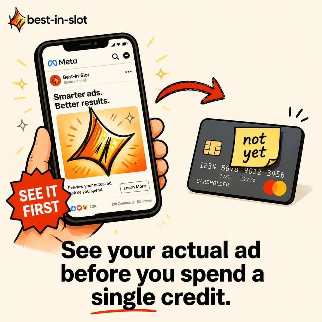
See Your Ad Before You Pay Anything
Try before you spend a credit.
Easy Returns
HotEmphasizes a painless return or exchange experience.
Every physical purchase contains a hidden second decision: what happens if this is wrong. The reader is not weighing the item, they are weighing the item plus a chore they can already picture — the printer with no ink, the queue at the post office, the chat widget demanding an order number they can’t find. Easy Returns removes the second decision, and it is often the only thing standing between a considered cart and a closed tab.
So replace the picture instead of asserting an adjective. “Free returns” is a claim, and they have heard it from companies that made returning miserable anyway. “Prepaid label already in the box, drop it at any post office, refunded the day it’s scanned” is a picture, and it is shorter than the one they were imagining. Mechanics are the whole craft of this angle: how many steps, whether anyone has to be spoken to, how long the money takes to come back.
The taxonomy’s weakness — it increases returns — is real, and it belongs to whoever owns the P&L rather than to the copywriter. Two things blunt it. Pair the returns message with fit information so fewer of the orders it wins are wrong in the first place; a size guide in the same campaign changes the mix of what comes back. And aim it where the fear is specific and physical: size, colour, whether the thing looks like its photograph. Vague reassurance in a category with no specific fear buys the returns without buying the orders that justify them.
- Works because
- Reduces ecommerce purchase anxiety.
- Fails when
- Can increase return behavior.
Write one like this
- Wrong size? The prepaid label is already in the box.
- Order both sizes. Send one back. That’s what free returns are for.
- Returns take thirty seconds and involve nobody.
- If it doesn’t fit you’re not stuck with it — refunded the day it’s scanned.
Don’t stop at “easy returns”. The reader’s fear is a specific chore, and only the mechanics — label, drop-off, refund timing — actually remove it.
Didn't love it? Print a label. That's it. No back-and-forth emails, no restocking fees, no 'original packaging required.' Just one click, one printed label, and the thing's gone. We built the return process everyone wishes they had — because the fear of getting stuck with the wrong thing shouldn't stop you from trying the right one.
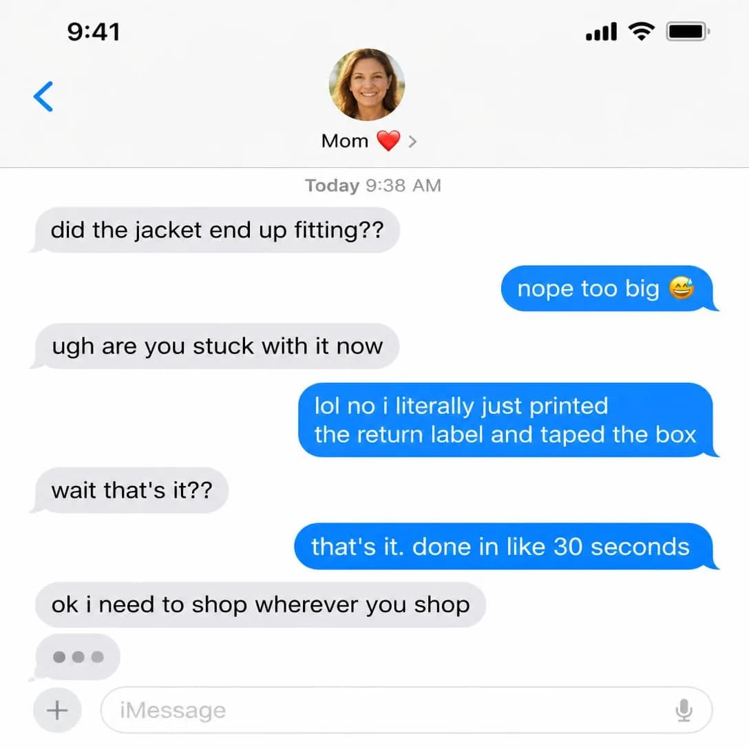
Returns in 30 seconds. Seriously.
Print, ship, done. No drama.
No Commitment
HotEmphasizes cancel-anytime, no contract, or no long-term obligation.
For subscriptions the thing being resisted is rarely the price. It is the fourth month of paying for something they stopped using and can’t work out how to leave. Cancel-anytime addresses that directly, which is why it converts on a category of doubt no benefit claim can touch: the reader isn’t asking whether this is worth the monthly figure, they are asking what it takes to stop.
So the ad is about the exit, and it has to prove it rather than promise it. Show the cancel button. Say how many clicks. Say there is no call, no retention email, no “tell us why” maze. Nearly every subscription business claims cancel-anytime and a striking number hide the button behind a chat widget, so the claim by itself now carries almost no weight — the proof is the message. This is also the most checkable promise in the library, and the people who check are the ones who were going to pay.
The taxonomy warns it encourages churn, and the honest version of that is narrower than it sounds. Annual lock-in doesn’t create loyalty, it postpones a decision; what cancel-anytime really does is move the burden onto the product to earn its place every month, which is a fair burden if the product does. Run it when your monthly value is obvious and your onboarding reaches it fast. If retention only survives because leaving is annoying, this angle will find that out, at scale, with your money.
- Works because
- Strong for subscriptions and SaaS.
- Fails when
- May encourage churn or low-commitment customers.
Write one like this
- Cancel in two clicks. No email, no call, no “are you sure” chain.
- No contract, no annual, no “talk to sales”.
- Month one is exactly the same commitment as month twelve: none.
- Leave whenever you like. The credits you already bought stay yours.
Don’t promise cancel-anytime and bury the button. This is the one claim a sceptic can verify in ninety seconds, and the sceptics are the segment you were trying to convert.
Most software feels like a trap the second you sign up. Annual contracts. Cancellation hoops. Retention teams trying to guilt you into staying. We don't do that. With best-in-slot, you're never locked in. Cancel anytime, keep your ads, and leave on your terms — no hoops, no hard feelings. Try it risk-free, and if it's not for you, walk away. Simple as that.
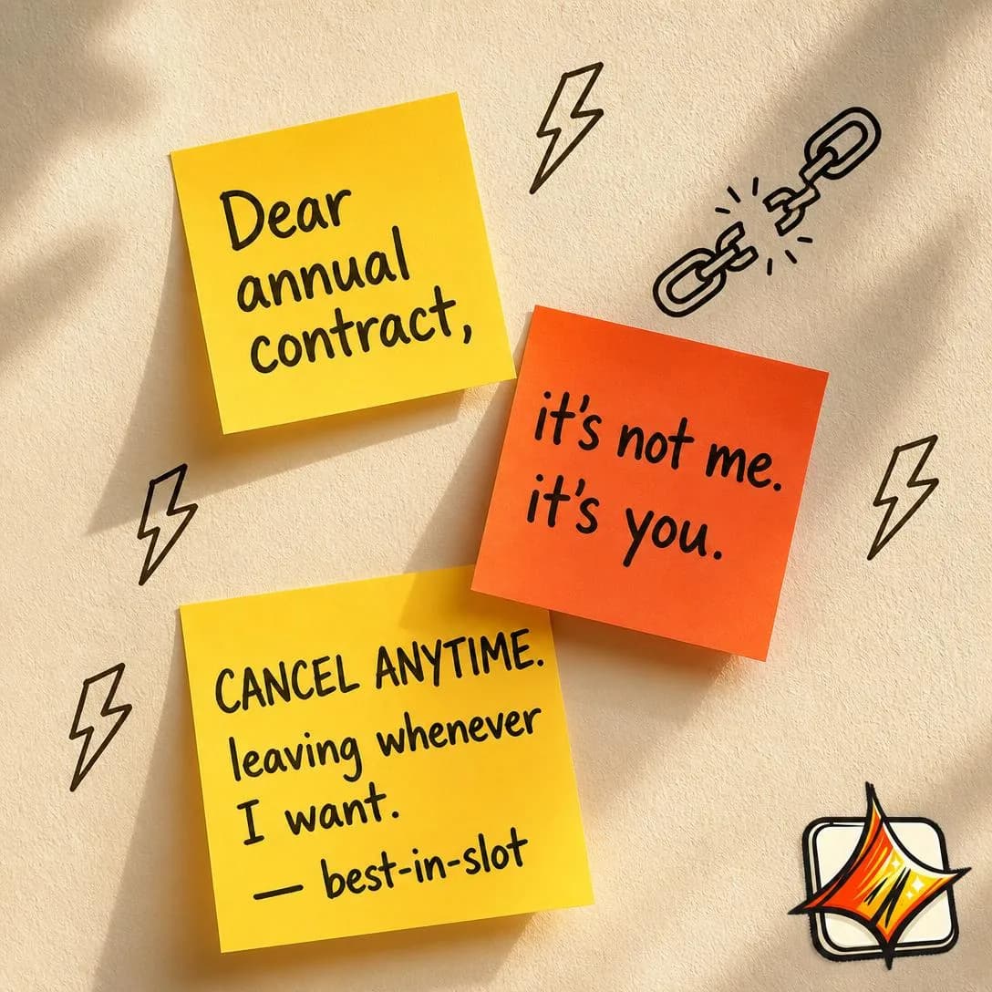
No contract. Cancel anytime.
Start free. Leave anytime.
Price Objection
HotExplains why the product’s price is justified.
The reader has seen the number and flinched. This angle answers the flinch, and it is worth separating from Price vs. Value in the comparison family, because the two get written as the same ad and only one of them is this one. Price vs. Value changes the denominator — the same figure divided by twelve ads, or by a month of use. Price Objection is defensive and compositional: it explains what the number is made of, and what would have to be missing for it to be smaller.
So justify by composition. The question underneath “that’s expensive” is nearly always “why does this cost more than the thing that looks the same”, and the answer is a specific thing you do that costs specific money — the work that happens before the output, the part the cheap version skips, the step you refuse to automate. Name it. A price defence made of adjectives — premium, crafted, best-in-class — confirms the objection, because those are the words of somebody who cannot point at the difference.
Two rules of discipline. Never discount in the same ad: cutting the number in the breath after defending it concedes the objection you spent four lines refuting, and teaches the reader to wait for the next cut. And obey the stage, because the taxonomy is right that this makes price salient — run it at people who have already met the number, on the pricing page or in the checkout, never at the top of the funnel where you would be raising the objection yourself. Used properly this is not a discount argument at all. It is the thing that lets you charge more.
- Works because
- Useful for premium and high-AOV products.
- Fails when
- Makes the price objection more salient.
Write one like this
- Yes, it costs more than the free one. Here’s exactly what the difference buys.
- You’re not paying for images. You’re paying for the argument each one makes.
- Priced for someone who runs ads every week. One a month? Genuinely, don’t buy it.
- The expensive part of an ad was never the ad. It’s the spend behind the wrong one.
Don’t answer a price objection with a discount. Cutting the number in the same ad that defends it concedes the point and trains the reader to wait for the next sale.
A freelance designer charges $300 for one ad concept. We charge $1 for a finished ad — image, all four Meta sizes, and copy — ready to publish in about a minute. Same result. Different math. Paste your website link, and best-in-slot builds the ad for you. Nothing goes live until you say so. Start free at bestinslot.ai
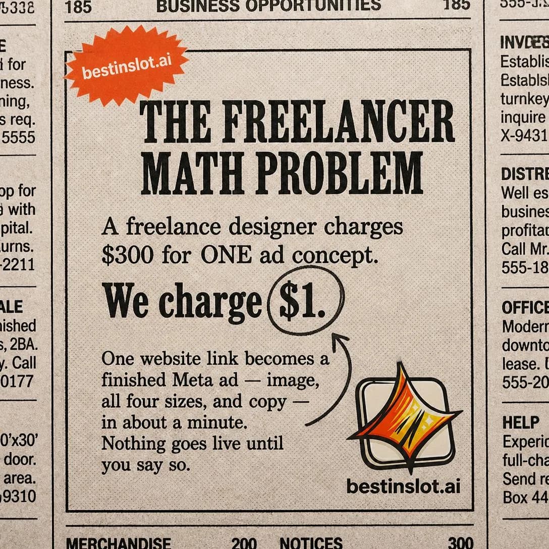
$300/ad vs. $1/ad. Same result.
Paste link. Get ad. One minute.
“Will It Work for Me?”
Mid–HotProves fit across personas, use cases, circumstances, or customer types.
The last objection, and the most personal one. They believe it works — for other people. Every proof point you have shown is evidence about somebody else, and the gap between “this works” and “this works for me” is where a startling amount of considered demand quietly dies.
Closing it takes specificity about the reader rather than about the product. “Great for small businesses” is a segment and answers nobody, because nobody experiences themselves as a segment. “You’ve got forty product photos, no designer, and you post more often than you advertise” is a situation, and the person living in it stops arguing mid-sentence. Build the ad out of circumstances — inventory size, team shape, category, what they tried last — and you are describing the reader’s week back to them, which is the move Problem & Pain opens with, arriving here as reassurance instead of recognition.
The taxonomy’s warning about universality is the one to take seriously, because “works for any business” is the answer that cannot be true and every reader knows it. The strongest version names who it is not for, out loud, and the precision of the exclusion is what makes the inclusion credible. It also has a natural format: one ad per situation, never one ad claiming all of them. That is a creative structure and a targeting structure at once — the situation you can name is usually the audience you can also select in the ad set.
- Works because
- Directly addresses personal skepticism.
- Fails when
- Must avoid implying unrealistic universality.
Write one like this
- You sell one product in fifty variants. Yes, especially you.
- Works if you’ve got photos and no designer. Doesn’t if you’ve got no product yet.
- “But my category is boring.” Boring categories are the easiest to argue about.
- Six businesses that look nothing like each other. Same eleven angles.
Don’t answer “will it work for me” with “it works for everyone”. Naming who it doesn’t suit is the only thing that makes the yes believable.
"But will it work for a business like mine?" That's the real reason you haven't tried an AI ad tool yet. Here's your answer: best-in-slot learns from YOUR website — whether you sell cupcakes, legal services, or software. Paste your link, get a finished Meta ad in 60 seconds. No forms, no guessing, no 'close enough.' It reads your site, matches your brand, and builds ads that actually fit what you do. Bakery owners and SaaS founders use the same tool. Because it adapts to you, not the other way around.
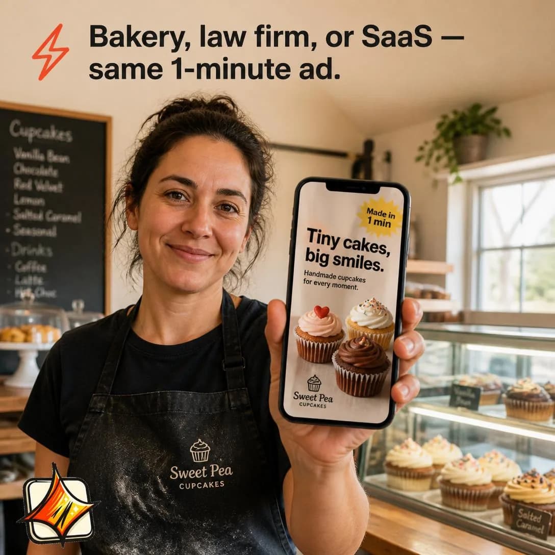
One tool. Every type of business.
Paste your link. Get your ad.
“I’ve Tried Everything”
MidSpeaks to people who have already tried competing solutions and failed.
The most defeated audience in the library, and the reason this angle sits at Mid while everything around it is Hot. These people are not comparing options; they have stopped believing the category can solve the problem at all. That is a different starting position from doubt — they are not asking whether you are the right one, they are quietly certain that none of you is.
Which makes “we’re different” the worst possible opening, because it is verbatim what the last three said. The only thing that moves this audience is an explanation of why the previous attempts failed, and it has to be structural — not a slur on the competition and not a failure of theirs. Keep it clearly distinct from the Misdiagnosis Reframe in Problem & Pain: that angle relocates the cause of the problem, this one accounts for the wreckage of the attempted solutions. Something in how those tools were built made them fail for someone in this reader’s position, and naming it hands them an explanation for their own history, which is worth more to them than any feature.
Then lower the ask. This audience will not commit, they will test, sceptically, with about ten minutes of patience. Pair the angle with the smallest possible next step and write it flat — enthusiasm reads as the same pitch that already failed them three times, and understatement converts here in a way it does nowhere else in the library. Accept a worse cost per acquisition on the segment and judge it on retention instead: somebody who has tried four things and stayed with the fifth is the least likely customer you will ever have to churn.
- Works because
- Strong for mature categories and skeptical buyers.
- Fails when
- The audience is inherently harder to convince.
Write one like this
- You’ve tried three of these. Here’s why they didn’t stick — and it wasn’t you.
- If you’ve already got a graveyard of ad tools, this is the boring pitch.
- Everything you tried solved the making. None of them solved the deciding.
- Fourth attempt at fixing this? Ten minutes, one photo, then judge it.
Don’t open by promising this one is different. That is the exact sentence the last three used — explain why they failed, and let “different” be the reader’s own conclusion.
You've tried Canva. Hired someone on Fiverr. Maybe even paid an agency $2k/month for three ads. You didn't fail. The tools failed you. best-in-slot removes the part that kills every other ad tool: the setup form, the back-and-forth, the 40-minute onboarding call. Paste your website link. One minute later, you've got a finished Meta ad sitting paused in your Ads Manager — image, all four sizes, copy, everything. No brief. No revisions. No wondering if it's done yet. Turns out you were never the problem.
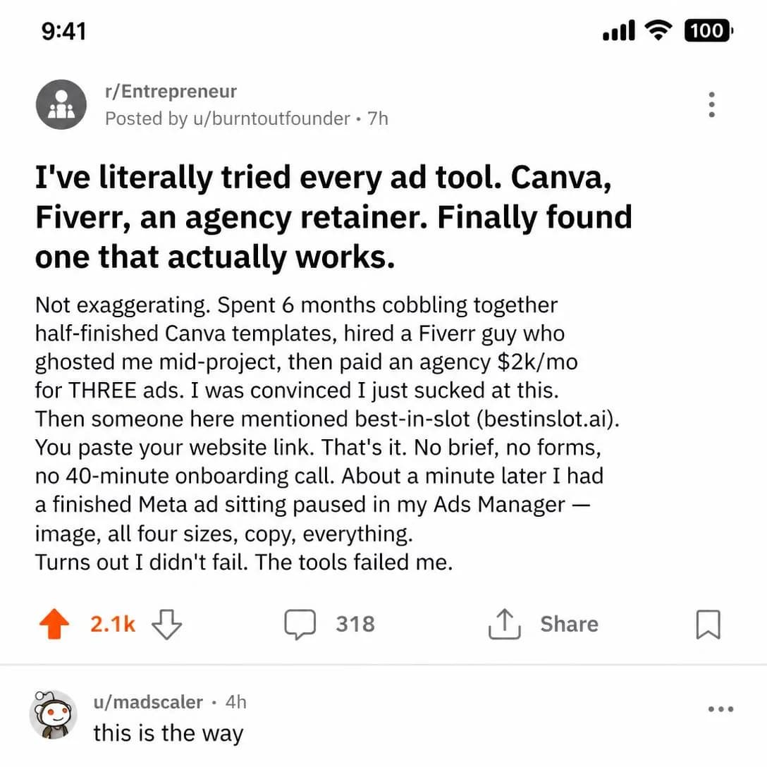
You didn't fail. The tools did.
Done in 60 seconds. No forms.
Complexity Objection
Mid–HotShows how easy setup, onboarding, learning, or use actually is.
The objection is almost never “is this hard”. It is “how much of my week does this cost before it’s worth anything” — and for anyone burned by a tool that needed a fortnight of setup, that fear outranks price by a distance. Time-to-value is what is being doubted, so time-to-value is what the ad has to put a number on.
Demonstration beats assertion so completely that the assertion is worth deleting. “Easy to use” is the most ignored phrase in software advertising, because every product that ruined a Saturday said it too. Show the path with the clock running: an unedited screen recording, real time, steps counted out loud, one continuous take with a timestamp in the corner. The taxonomy says this angle requires a convincing demonstration, and the operative word is convincing — a cut between two steps is exactly where the reader assumes the fifteen minutes you removed was hiding.
Include the boring part. Whatever setup you genuinely can’t remove — connecting the account, uploading the logo, waiting on the first render — say how long it takes, because an ad claiming zero effort makes the first tedious step feel like a lie and loses the reader at precisely the moment you had them. One honest “this bit takes four minutes” buys credibility for everything else in the ad. And if the demonstration turns out to be hard to film, that is the finding: this angle tells you the truth about your onboarding whether or not you wanted it.
- Works because
- Excellent for SaaS, technical products, and services.
- Fails when
- Requires a convincing demonstration.
Write one like this
- Photo in, ads out. That’s the whole workflow, unedited, in real time.
- Setup is a logo and a URL. Four minutes, timed.
- No onboarding call, because there’s nothing to onboard.
- If it takes longer than one coffee, we’ve failed at the only thing we promised.
Don’t claim it’s effortless. A demonstrated four minutes is believable; “effortless” is what every tool that ate their Saturday also said.
We killed the setup form. Every ad tool starts with the same soul-crushing questionnaire: name your brand voice, describe your audience personas, define your goals, rate your tone 1-10. I've abandoned three of these mid-flow. So we just... deleted it. Paste your website link. best-in-slot reads the whole thing — what you sell, who buys it, your colors, your logo. One minute later there's a finished Meta ad sitting paused in your account. No brief. No forms. No zip files.
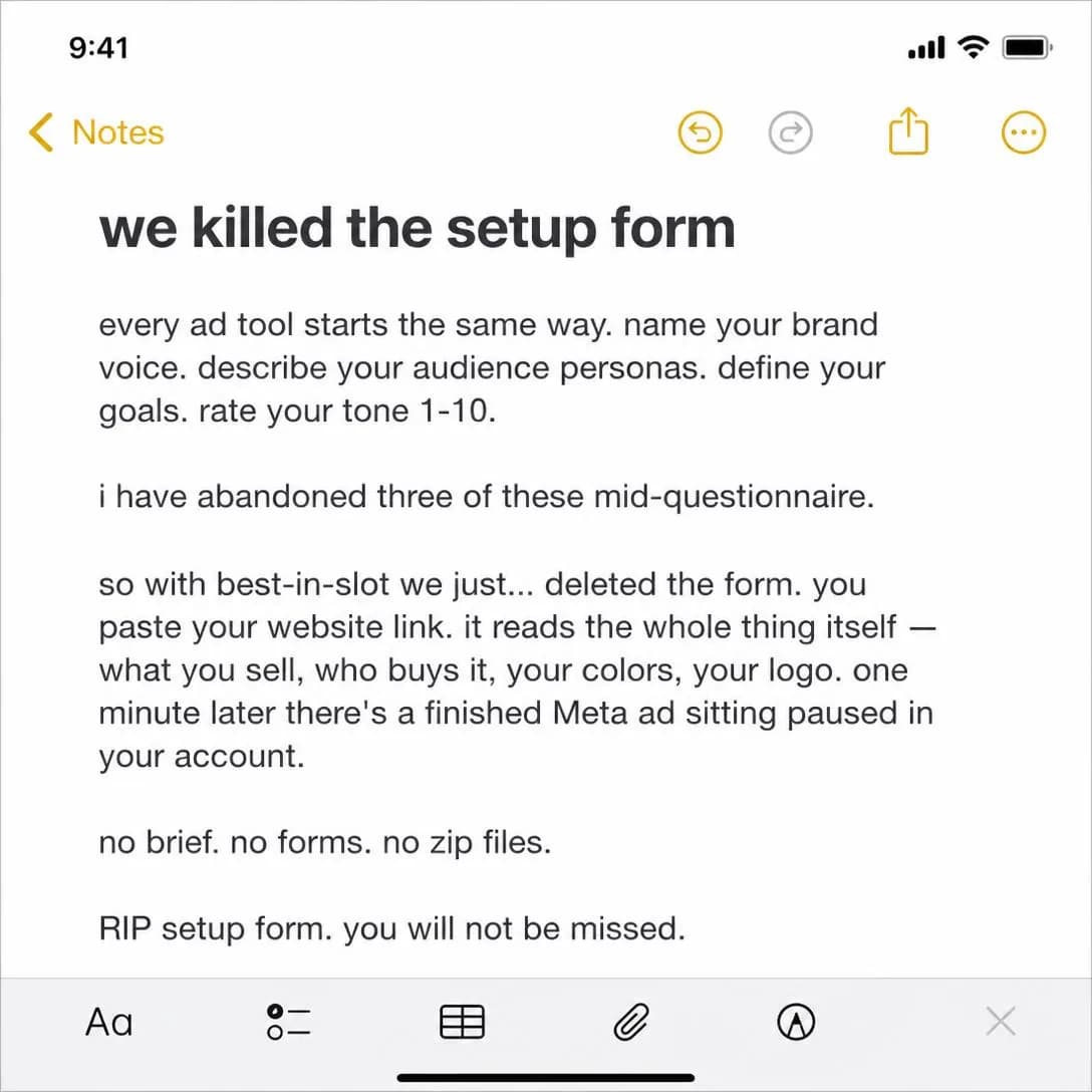
We deleted the setup form
In ~60 seconds. Zero forms.
Fit / Compatibility
HotResolves sizing, integration, device compatibility, workflow fit, or other practical blockers.
The least glamorous angle in the library and one of the highest-converting, because what it removes is factual rather than emotional. Somebody who wants the product but doesn’t know whether it works with their stack, their size, their phone or their workflow is not undecided — they are blocked, and a blocked buyer converts the instant the answer arrives. There is no persuasion in this ad at all. There is a question and a yes.
These objections are knowable and finite, which makes the angle unusually cheap to run. Your support inbox, presales chat and return reasons already contain the complete list, and each item is one ad with an audience you can select precisely. The taxonomy calls narrow relevance a weakness; read it as a targeting instruction. Relevance is narrow and conversion is high, so the right shape is a set of small specific ads rather than one broad ad claiming everything — and the small ones keep working long after the broad one has fatigued, because each has its own small audience.
Be exact and keep it current. “Integrates with everything” is worth nothing; a list is worth money, and a list is also a promise you have to maintain. A wrong compatibility claim doesn’t merely lose the sale, it produces a refund, a support ticket and a review, which is a considerably more expensive outcome than the silence you were trying to avoid. Diary a check on anything naming a third party: their roadmap changes without telling you, and a stale claim is a false one you are paying to distribute.
- Works because
- Removes concrete reasons not to buy.
- Fails when
- Narrower relevance than broad emotional angles.
Write one like this
- Yes, it works with the photos you already have. Phone shots included.
- All four Meta sizes, exported. You don’t have to know which is which.
- Between sizes? Here’s the one to order, by measurement.
- Works with a folder of JPEGs. That’s the whole integration requirement.
Don’t write “works with everything”. A specific list converts and a blanket claim doesn’t — and when the blanket claim turns out to be false you’ve bought a refund and a review.
Most ad tools force you to rebuild your entire campaign structure just to test one new creative. best-in-slot doesn't. It drops finished ads directly into your existing ad sets — no new campaigns, no orphaned assets, no mess. Your page, IG account, CTA, and URL are inherited automatically. It's designed to fit your workflow, not replace it. Paste your site, pick an ad set, done.
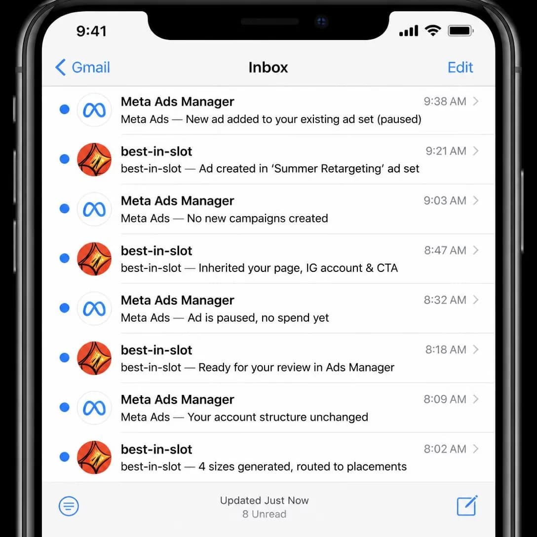
Fits your ad account, not the other way
Publishes into existing ad sets
Testing them against each other
Test this family against itself the usual way, but read the result as a diagnosis rather than a scoreboard. What varies across these twelve is which reason people had for not buying, so the winner names the objection that was actually costing you money — and that finding belongs to the product team as much as to the ad account. If Complexity Objection wins, onboarding is your bottleneck and no amount of creative will out-run it. If Price Objection wins, the number isn’t explained anywhere the buyer looks. If “I’ve Tried Everything” wins, your market is later and more cynical than your funnel assumes, and the top of it needs rebuilding.
Then remember what this family cannot do. Every angle here removes a reason not to buy, and removing the last objection from somebody who never wanted the thing produces nothing at all — which is why these belong downstream of the families that create wanting, and why running them broad is the most common way to waste money on them. The natural pairing is the one Problem & Pain’s Cost of Inaction sets up: establish that waiting has a price, then close with a guarantee, a trial or a cancel-anytime line, and both halves of the decision are answered inside a single ad. Get the sequence right and this family converts the demand the rest of the library built. Get it backwards and you are answering questions nobody has asked yet.
Pick an angle. Get the ad.
No credit card · 50 free credits (about 5 ads or Instagram posts)