
Ad Angle Library #9 · 14 angles
Identity & Emotion ad angles
Connect the product to identity, aspiration, emotion, or belonging.
Everything in the library so far has been a claim about something outside the reader: a problem that exists, a benefit that arrives, a mechanism that works, a price that is fair, a deadline that is real. This family changes the subject of the sentence. These fourteen angles make a claim about the reader — who they are, who they would like to be, what they are afraid of losing, what they find funny — and the product appears only as evidence for it.
That swap changes what a failure costs you. A wrong claim about a product gets ignored; the reader shrugs and scrolls. A wrong claim about a person gets rejected, and rejected faster, because “that’s not me” needs no evaluation at all. It is the only family where the ad can insult the audience by being merely inaccurate, and the only one where the reader’s verdict arrives before they have thought about what you sell.
It is also, by the taxonomy’s own reckoning, the coldest family in the library. Not one of the fourteen rows is marked Hot, or Mid–Hot, or Warm–Hot — the only family of the ten where that is true, and the exact inverse of Offer & Economics (issue #7), where all eleven were Hot and nothing worked on a stranger. Here six rows are Cold outright, three more Cold–Mid, and the two marked All begin there too. Eleven of fourteen work on somebody who has never heard of you, for one reason: an identity claim doesn’t require the product to be understood. And the same reason explains the missing half of the column. Nobody has ever bought anything because of who they are. They buy afterwards, for reasons that live in other families.
Then there is the weakness column, where the taxonomy uses the word vague twice outright and says a version of it three more times — cliché, performative, and a humor row warning that the joke can swallow the product. It has one cause, and it is worth naming before you write anything here. Every other family contains something checkable: a number, a mechanism, a date, a testimonial with a name on it. An identity claim contains nothing that can be verified, so nothing in the drafting process forces you to be specific, and the writer who is not forced to be specific never is. “For ambitious marketers” took ten seconds to write and says nothing about anybody. The discipline this family needs is entirely self-imposed: attach every claim about the reader to one concrete detail from their actual week.
The last problem is the one that makes this issue harder to write than the eight before it. Fourteen angles that all appeal to self-image sit much closer together than eleven angles about deadlines do, and it is genuinely easy to write something that is four of these at once and therefore none of them — which teaches you nothing when it wins and less when it loses. So the rows below group by the one thing that actually separates them: what the ad claims about the reader. It reflects them, it upgrades them, it guards something of theirs, it makes them like you, or — in the single case that sits alone at the bottom — it isn’t about them at all.
Which one, when
- The mirrorIdentity Callout · Self-Expression · Belonging / Community
- Three ads that reflect the reader back instead of proposing a change. Identity Callout names the person, Self-Expression says the product will carry their taste rather than replace it, and Belonging says people like them are already here. Nothing is offered as an improvement, which is why they read as relevance rather than as advertising and why they self-select an audience faster than anything else in the library. Choose by what you genuinely know about the reader: a situation you can describe, a taste they are protective of, or a group they would want to be counted in.
- The upgradeAspirational Identity · Future Self · Status / Prestige · Confidence / Empowerment
- Four ways to propose a better version of the reader, differing on what exactly gets upgraded. Aspirational Identity offers a type to belong to; Future Self shows the ordinary day that comes afterwards; Status / Prestige raises their standing in front of other people; Confidence / Empowerment leaves their circumstances alone and upgrades their sense of their own competence. All four fail identically — an adjective where a behaviour should be — so whichever you take, finish the sentence with something a person could be seen doing.
- The guardRelief / Peace of Mind · Fear / Loss Aversion · Security / Protection
- The family’s only three Mid rows, and it is no accident that they are the three about loss: a reader has to believe a product works before they will believe it protects them. Relief lifts a weight they are already carrying, Fear dramatises a loss that hasn’t happened yet, Security shows the guard rather than the burglar. Fear is the most powerful and the only angle in the family that can make an enemy of the person reading it, so reach for the other two first and save it for a loss your product genuinely prevents.
- The moodHumor · Nostalgia · Rebellion / Anti-Establishment
- Three Cold angles that persuade by tone before they argue anything, and the family’s odd ones out: what they buy is being liked. Humor pays the reader at the moment of reading, Nostalgia arrives with the warmth already attached, Rebellion offers the pleasure of being on the right side of something. All three are angles rather than decoration only when the tone is about your subject — a joke, a memory or an enemy that would work just as well for any brand in any category is a mood you rented, not an argument you made.
- Somebody elseCare / Love
- The only angle in the family that is not about the reader. Care / Love moves the subject to a person they are responsible for — a colleague, a client, a team — and makes the purchase something done on that person’s behalf. It sits alone because it is also the family’s one structural escape from vagueness: an ad about somebody else’s Tuesday is very hard to write in adjectives. Reach for it when the reader would be faintly embarrassed to want the thing for themselves.
About the examples. Every ad below was generated by best-in-slot for best-in-slot — one product, one underlying problem, 14 different arguments about it. That repetition is the point: hold the product and the pain still, and the angle is the only thing left changing. Each is shown exactly as it came out.
Identity Callout
ColdDirectly identifies a profession, role, life stage, behavior, or type of person.
Names the reader. A profession, a role, a life stage, a situation — “if you run ads for six brands and you’re the only one who knows how any of them sound”. As an argument it is barely an argument, and that is the point: attention on a feed is allocated by relevance detection long before anything is evaluated, and a name is the cheapest relevance signal in existence. The reader doesn’t decide to be interested. They respond to being addressed, and the deciding happens afterwards.
The craft is entirely in what you name. A demographic is a label anyone can wear and everyone reads past — “founders”, “marketers”, “business owners” — while a situation belongs to a specific subset and cannot be shrugged off by the people it describes. “Agency owners” is a job title. “You’ve rewritten the same headline four times this week and it’s Tuesday” picks out one person, precisely, and the recognition is involuntary in a way a job title never manages. If the sentence would still be true of half the platform, you have written a greeting rather than a callout.
Its weakness is narrowing scale too aggressively, and on Meta specifically that is a warning about doing the narrowing twice. A tight audience and a tight callout compound, and the second filter is the one you didn’t budget for — you end up paying to reach a pool the creative then cuts in half again. The structure that works is the opposite: let the targeting stay broad and let the ad do the qualifying, which is what this angle is for and what it is better at than any audience setting. Reach for it cold, when you need strangers to sort themselves.
- Works because
- Strong self-selection and relevance.
- Fails when
- Can narrow scale too aggressively.
Write one like this
- If you’ve rewritten the same headline four times this week, this one’s for you.
- You run ads for six brands and you’re the only person who knows how any of them sound.
- For the founder who is also, somehow, the entire marketing department.
- Anyone who has ever exported the same ad in four sizes at 11pm: we built this for you.
Don’t call out a demographic when you could call out a situation. “Attention, business owners” is a word everybody reads past — the version that stops someone describes a thing they did this week, and the people it isn’t about scroll on without ever feeling addressed.
You're the founder, the marketer, the designer, the support team, and somehow also the ad guy. 🎩 No wonder you're exhausted. Let us take one hat off your head: best-in-slot turns your website into a finished Meta ad in about a minute. No brief, no forms, no creative paralysis. Just paste your link and get concept + image + copy, ready to publish. You've got enough jobs already.
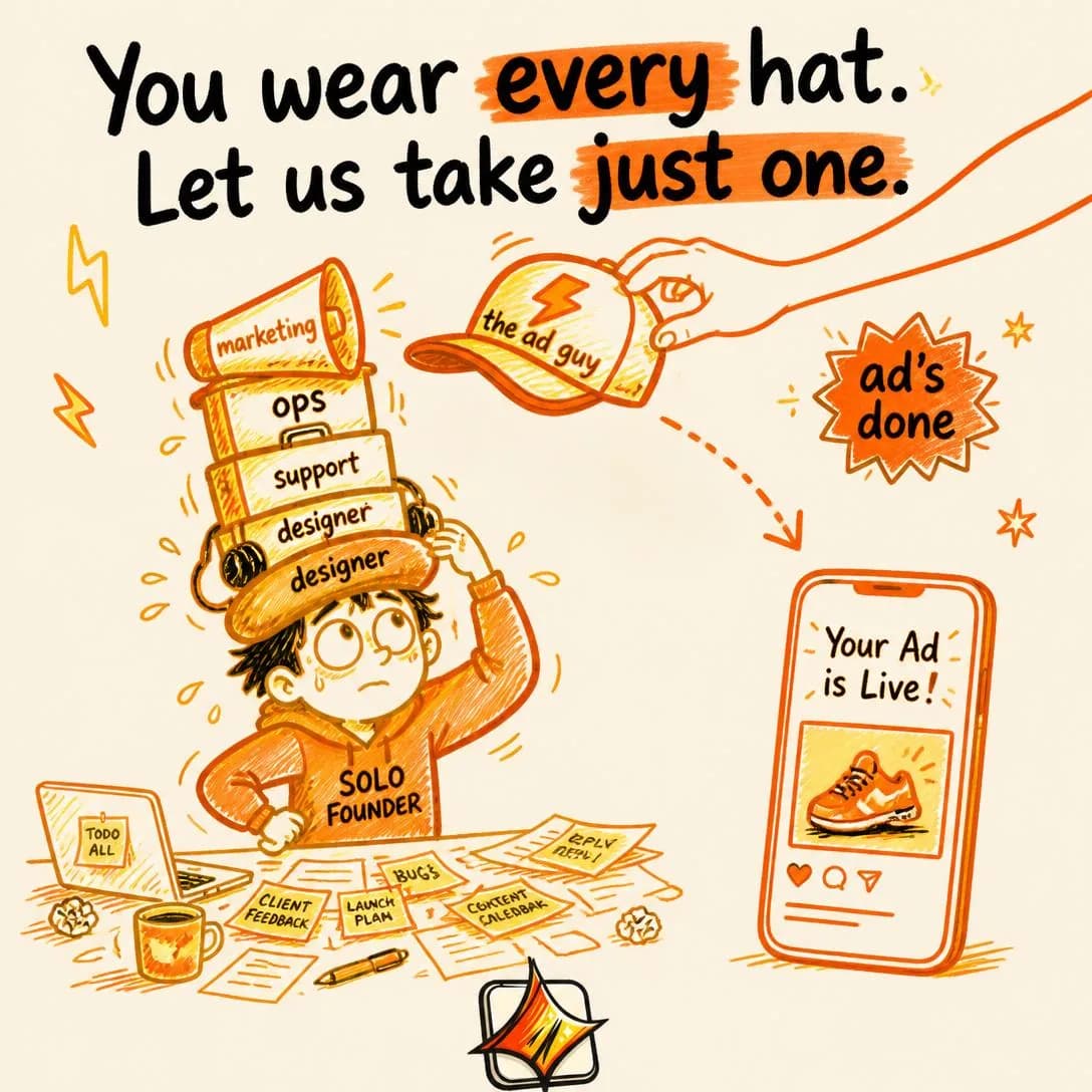
One fewer hat to wear
Paste site → get Meta ad. Done.
Aspirational Identity
ColdSells the type of person the buyer wants to become.
Sells the kind of person the buyer would like to be, and offers the purchase as a step into that category. Not what you get — who you would be counted as. It works cold because it needs no product comprehension at all: the reader can want to be that person before they have any idea what you sell, and the wanting is what makes them read the second line.
The mechanism is the gap between how someone sees themselves and how they would like to. Advertising cannot install an ambition in three seconds, and every ad that tries reads as a lecture. What it can do is name an ambition the reader is already carrying privately and quietly confirm they are nearly there — which is why the flattering version outperforms the challenging one, and why the identity you name has to be one that exists in your market already rather than one you would like to exist.
Vague lifestyle advertising, says the taxonomy, and the cause is grammatical. The failed version states the identity as an adjective — ambitious, creative, modern, data-driven — and adjectives are unfalsifiable, which is exactly why they are so easy to write and so weightless to read. The working version states it as a behaviour: the kind of team that ships eleven ads a week, the kind of marketer who tests the angle before arguing about the headline. Then check the behaviour against your own product, because if the purchase doesn’t actually produce that person, you have described somebody the reader cannot become by buying.
- Works because
- Powerful emotional motivation.
- Fails when
- Can become vague lifestyle advertising.
Write one like this
- Be the kind of marketer who tests eleven angles instead of defending one.
- Some brands have a house style. Yours can have one by Thursday.
- The teams that own Q4 aren’t more creative than you. They just publish more than you do.
- You used to be the person with the ideas. Then you became the person with the backlog.
Don’t sell an adjective. “For ambitious brands” names nobody and asks the reader to picture nothing — finish the sentence “the kind of person who ______” with a behaviour, and make sure it’s one your product actually produces.
I had the idea over coffee. Wrote it on a napkin. That was it. No brief, no forms, no waiting on a designer. Pasted my website link into best-in-slot, hit one button. Finished Meta ad in about a minute — image, all four sizes, copy done. It's live before dinner. Funny thing I realized: the people I admire don't PLAN to launch. They just launch. Turns out that's a choice you can make today.
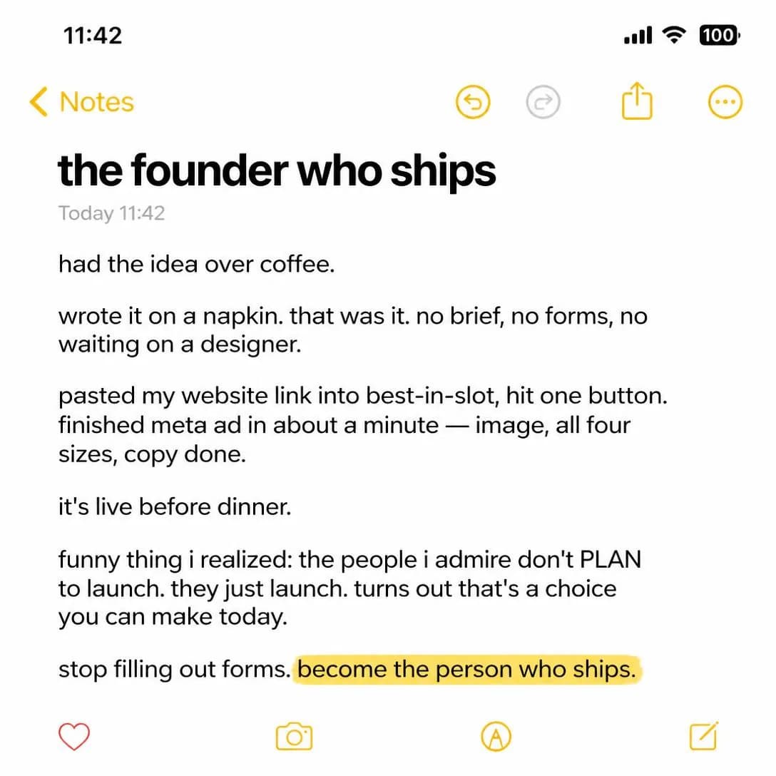
Become the founder who ships
Idea → ad → live. One click.
Future Self
Cold–MidShows what life could look like after adopting the product.
Shows the reader’s life after the purchase — a scene rather than a claim. No mechanism, no before-and-after arrows, just the ordinary day on the other side, rendered specifically enough to be believed and attractively enough to be wanted. It is the most visual angle in the family and the one where the picture does most of the persuading.
Two neighbours are worth separating carefully, because this is exactly where the family blurs. Transformation, over in Benefit & Outcome (issue #2), argues the change: here is state A, here is state B, here is the product that moves you between them. Future Self drops the argument and shows only B, from inside it. And Aspirational Identity sells the label — the kind of person you would be — while this one sells the Tuesday. Same destination, different evidence: one hands the reader a category to join, the other hands them a day to picture themselves in.
It is Cold–Mid rather than Cold because a depicted future has to be believed, and belief decays with distance. A future the reader can reach by next month needs almost no proof; a future a year out is a daydream, and daydreams are pleasant to look at and impossible to act on. So keep it near and keep it mundane. The convincing version of this ad is not a rooftop and a raised glass — it is a Monday where the ad set already has eight variants in it and nobody spent the weekend making them.
- Works because
- Makes the desired outcome vivid.
- Fails when
- Needs strong creative and believable transformation.
Write one like this
- Next month’s ads already exist. That’s the entire difference between then and now.
- A Monday where the ad set has eight variants in it and you made none of them by hand.
- Same budget, same team, same product. The only thing that changed is that you stopped running one ad.
- Picture the quarter where creative was never the thing holding the campaign up.
Don’t set the picture too far away. A future the reader can’t reach by next month asks to be believed rather than bought — and the further out you put it, the more proof it needs and the less of it you have.
I used to be up until 1am fighting Canva. Now I close the laptop by 9. For two years my whole evening was ad creation. Resize this, rewrite that, export the zip, upload it, redo it. I genuinely thought that was just the cost of running a small shop. Last month I started pasting my website link into best-in-slot and letting it spit out the whole ad — image, all the Meta sizes, copy — in about a minute, paused and waiting for me in Ads Manager. First night I actually shut the laptop at 8:45 and made tea. Nothing went live without me clicking it. I know it sounds dramatic but I feel like a different person. My future self was apparently just... someone who sleeps.
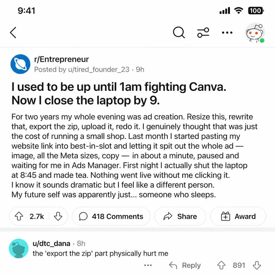
Close the laptop by 9pm
Paste your link. Get your ad.
Belonging / Community
Cold–MidFrames the product as a signal of membership in a group or movement.
Frames choosing the product as joining a group. The argument isn’t that the thing is good, it’s that the people already using it are people the reader would like to be counted among — and unlike most claims in advertising, that one gets stronger every time somebody acts on it.
It gets confused with two angles elsewhere in the library and loses to both when the confusion goes unnoticed. Social Proof, in Proof & Trust (issue #4), says many people chose this so it is probably good: evidence, aimed at doubt. Belonging says these particular people are like you: an identity claim, aimed at affiliation, and useless to a reader whose actual objection is whether the product works. Exclusive / VIP, in Scarcity (issue #8), borrows from this row and inverts it — there the value is that other people are outside, and it is vertical and gated. Belonging is horizontal and open. Put a gate on it and you have written the other angle.
Weak in categories that are not identity-driven, says the taxonomy, and there is a blunt test for whether yours is: would anybody mention using this out loud, unprompted, to a peer? If not, there is no membership to signal and the ad is describing a customer list. The group also has to be describable — not “our community” but the actual specific set of people, four hundred solo marketers or thirty agencies who all have the same Thursday problem — and it has to exist, because this is the one claim in the family a curious reader can check in about nine seconds.
- Works because
- Strong loyalty and community effects.
- Fails when
- Weak in categories that are not identity-driven.
Write one like this
- Four hundred people running ads alone, in one channel, comparing first drafts.
- You’re not the only person who is both the strategy and the production department.
- Every brand in here started the same way: one link, one Tuesday, no brief.
- The agencies who stopped charging for resizing found each other. This is where.
Don’t claim a community you haven’t got. “Join thousands of marketers” describes a customer list, not a group — and the reader who goes looking for the door and finds there isn’t one has learned something about you that no later ad can unteach.
Every founder who skipped the brief is already in. The fastest operators stopped filling out creative briefs and started shipping ads instead. No forms. No questionnaires. Just paste your website link into best-in-slot and get a finished Meta ad in about a minute — concept, image, copy, all four sizes, published straight into Ads Manager, paused until you say go. Join the club. bestinslot.ai
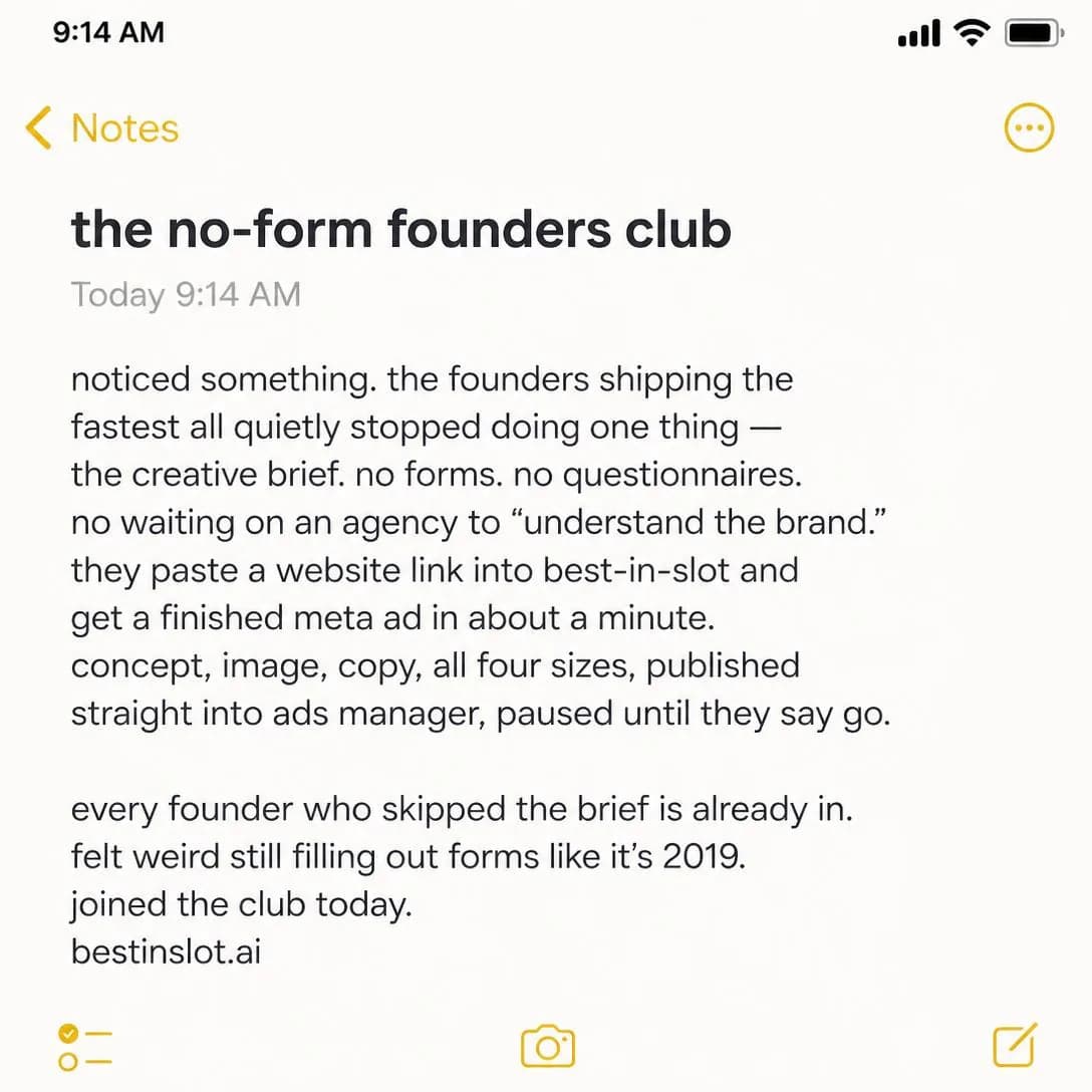
Skip the brief. Ship the ad.
Website → Meta ad in 1 min
Status / Prestige
Cold–MidUses taste, exclusivity, quality, success, or distinction as the appeal.
Uses standing as the appeal: taste, quality, success, distinction. It is the vertical relative of Belonging — not “with people like you” but “visibly above where you were” — and it is the angle that most reliably justifies a premium price without ever mentioning one.
Software has an obvious problem here, and it is worth stating plainly rather than writing around: status requires an audience, and nobody can see your stack. A tool used privately confers nothing. What rescues the angle is the output — if what the product makes is public, the status available to you is the status of the work, which is visible to precisely the people whose opinion the buyer cares about. Ads are about as public as a company’s work gets. “Your creative should look like there’s a design team behind it” is a status claim that survives the fact that the tool itself is invisible.
The execution rule is that status is demonstrated, never asserted. An ad that says premium is doing the thing no premium brand’s ad has ever needed to do, and readers decode that instantly. Restraint, craft and a confident amount of white space make the claim; the copy shouldn’t have to. Then mind the weakness — it alienates value-oriented buyers — as a scheduling instruction rather than a flaw: run it where price is not the axis of the decision, and never in the same creative as a discount. A prestige argument with a coupon stapled to it is two ads cancelling each other out, and the reader believes the coupon.
- Works because
- Excellent for luxury and premium products.
- Fails when
- Can alienate value-oriented buyers.
Write one like this
- Nobody can see your stack. Everybody can see your creative.
- Your ads are the only part of the company most people will ever look at.
- It should be obvious from the feed that somebody here has taste.
- Ads that don’t look like they were made in an afternoon. Made in an afternoon.
Don’t assert the status — demonstrate it. “For serious brands” is a sentence a serious brand’s ad never has to contain, and the reader draws exactly the conclusion you were hoping to avoid.
Your ads just started looking like you hired a studio. Paste your website link into best-in-slot and get back a finished, studio-quality Meta ad in about a minute — polished visuals, tight copy, zero DIY tells. The kind of work that makes people assume you've got a bigger budget than you do. Nobody has to know you didn't.
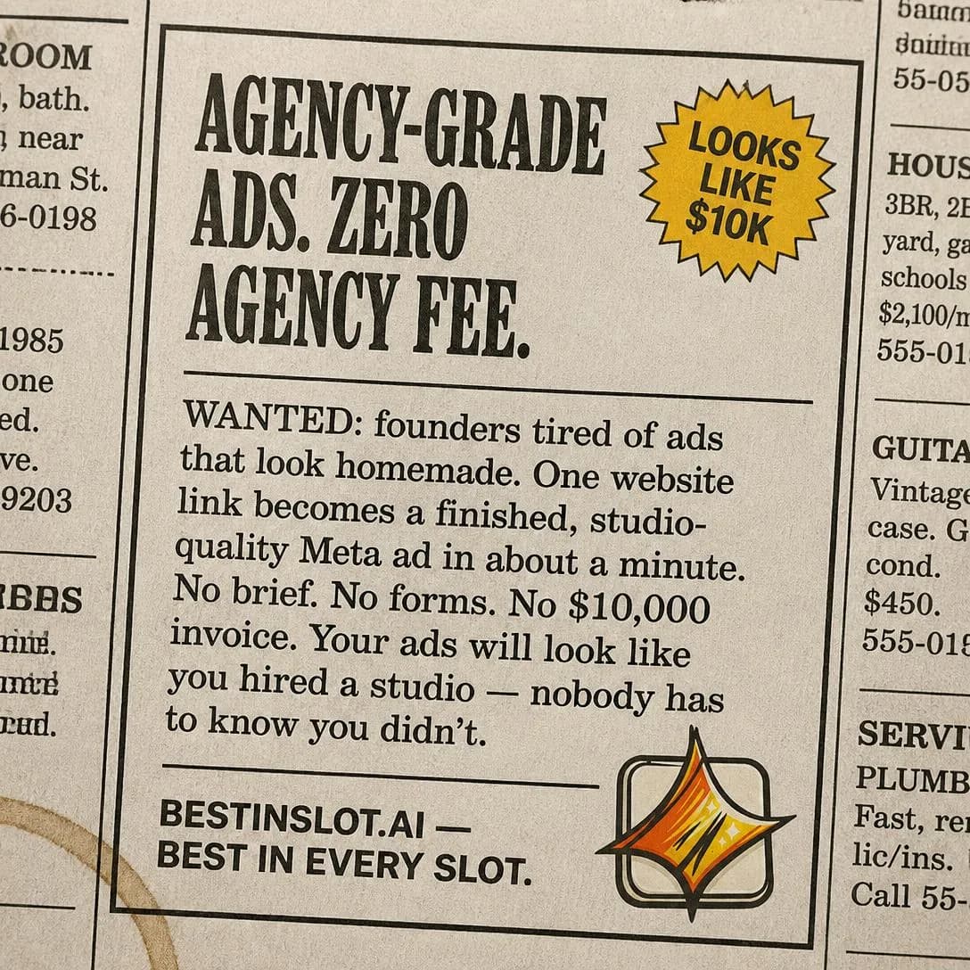
Ads that look like you hired a studio
Start free at bestinslot.ai
Self-Expression
ColdPositions the product as a way to express personality, taste, or individuality.
Positions the product as a way for the buyer to say something about themselves. The voice in the output is theirs, not yours; what they are buying is a wider range of ways to sound like themselves. Strong in fashion, design and creator categories for the obvious reason that the artefact is worn in public.
The taxonomy warns it is harder to use for purely utilitarian products, and the way through is the artefact rather than the tool. A utility becomes self-expressive the moment what comes out of it carries the customer’s name — and for anything that generates creative, that is the entire live objection in the category. The fear that generated work all looks the same is a self-expression fear, not a quality fear, and this is the only row in the library that answers it directly. Control, range and voice are the vocabulary: does the output sound like you, or like everybody else who bought the same subscription?
Which makes it the most demanding angle here to prove, because the claim is about range and range cannot be stated. It has to be shown — two brands, side by side, that plainly did not come out of the same template. A single beautiful example proves nothing about range, and the reader knows that even if they can’t articulate why the ad feels thin. Don’t mistake it for Versatility over in Product & Mechanism (issue #3), either: versatility is the product doing many things, and this is the customer still sounding like themselves while it does them. Reach for it when your category’s output has visibly homogenised and you can put the counter-evidence in the frame.
- Works because
- Strong for fashion, design, lifestyle, and creator categories.
- Fails when
- Harder to use for purely utilitarian products.
Write one like this
- Same tool, two brands, and you’d never guess they came from one place.
- It learns your brand, not a template. The tell is that your ads still sound like you wrote them.
- Your voice, at the volume you actually have time to publish at.
- None of this has the just-generated look. Avoiding that was most of the work.
Don’t claim range and then show one house style. This is the one angle in the family your own creative can refute on sight — if every ad you’ve published looks identical, the ad arguing otherwise is the evidence against it.
You didn't build your brand to look like everyone else's. Yet scroll through Facebook and half the ads could swap logos without anyone noticing — same templates, same stock photos, same forgettable vibe. best-in-slot reads your actual website and builds ads from your colors, your logo, your voice. One click. No templates. Just an ad that looks like yours, because it is.
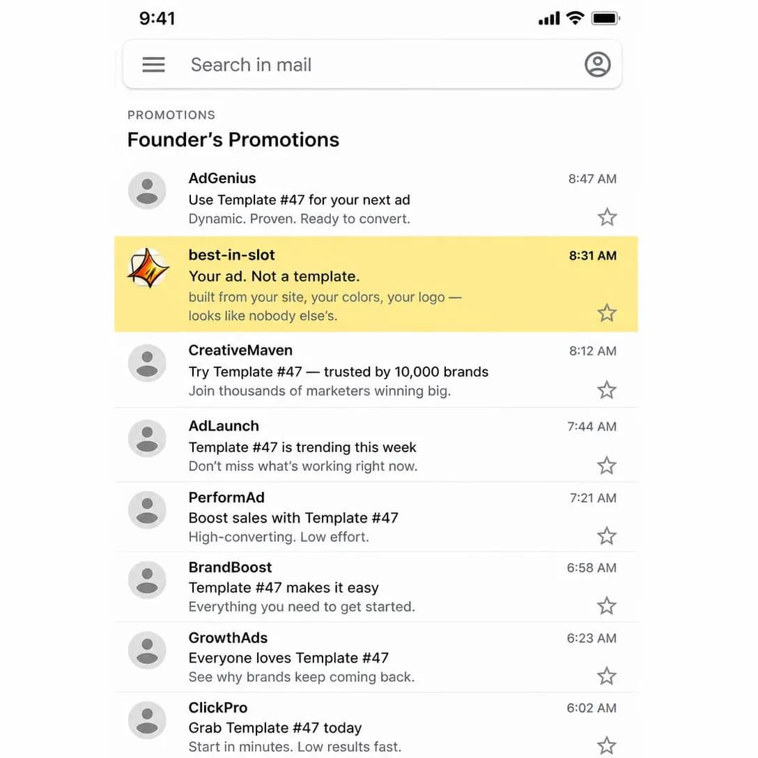
Your ad. Not a template.
One click. Your colors. Your ad.
Confidence / Empowerment
AllSells the feeling of being more capable, prepared, attractive, or in control.
Sells the feeling of being capable — prepared, in control, equal to the thing. The subject is the reader’s competence rather than the task’s difficulty, and that distinction is the whole angle. Ease, in Benefit & Outcome (issue #2), says the job is simple. This says you are good enough for it. Those are different sentences aimed at different people: one at the reader who thinks the work is hard, the other at the reader who suspects they personally aren’t up to it.
The second reader is more common than most teams assume in any category with a skill barrier, and advertising is a category with a skill barrier the size of a building. A very large share of the people running ads believe — often wrongly — that they are not creative, and that belief is doing more to block the purchase than any feature gap. An ad that quietly disagrees with them about themselves is doing something no benefit claim can do.
It is one of only two angles in the family rated for every stage, and the reason is also the risk: it attaches to anything. Vague unless tied to a concrete benefit, says the taxonomy, and “feel confident about your ads” is the wallpaper version — a mood with nothing underneath it. The fix is always one specific thing the reader would be able to do that they currently can’t: walk into Monday’s meeting with eleven angles and a reason for each. Name the capability and let the feeling arrive as its consequence, never the other way round.
- Works because
- Emotionally resonant across many categories.
- Fails when
- Can be vague unless tied to a concrete benefit.
Write one like this
- You don’t have to be a creative to walk in Monday with eleven ads and a reason for each.
- The part of the job you’ve been avoiding is the part this does.
- Nobody needs to know the marketing department is one person and a laptop.
- Turn up to the review with options instead of apologies.
Don’t sell the feeling on its own. Confidence with no cause attached is a mood board — name the specific thing the reader would be able to do on Monday, and let feeling capable be the result of that rather than the claim.
You know that feeling when someone asks about your launch ads and you can just… smile? Because they're already done. Already sitting in Ads Manager. Already paused and waiting for you to hit go. That's the vibe. Paste your site link, one click, finished ad in about a minute. No brief. No back-and-forth. No staring at a blank screen wondering what to say. Just handled.
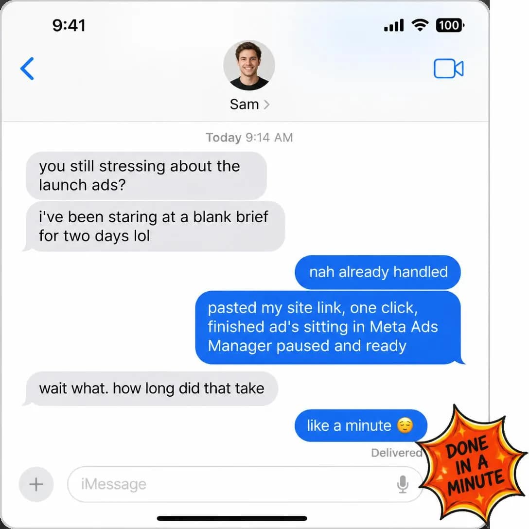
Your ads. Done in a minute.
Site link → finished ad
Relief / Peace of Mind
MidSells the removal of stress, uncertainty, worry, or mental load.
Sells subtraction. Not a thing the reader gains but a weight they put down — the low, constant hum of an unfinished job that follows them into the evening. Strong in insurance, security, finance and services for the same reason it is strong in software: what those categories actually remove is not work, it is worrying about work.
Mental load is chronically under-served in advertising because it is invisible and because the person carrying it often hasn’t named it. That is the opportunity. Friction / Annoyance, back in Problem & Pain (issue #1), zooms in on one irritating moment; this one is about the ambient weight of a thing that is never finished, which is bigger, quieter and much harder for the reader to argue with once you have described it accurately. It is also worth separating from Save Time in Benefit & Outcome (issue #2), which is the same product benefit measured with the wrong instrument: hours returned are a number, and what the reader actually wants back is the attention those hours were occupying while they weren’t being worked. The line that lands is rarely about the task. It is about the Sunday.
Its listed weakness is that it is less visually dramatic than transformation angles, which is true and has a known answer: don’t try to picture calm, picture the absence. An empty evening, a closed laptop, a list with nothing on it where the thing used to be. And respect the honest constraint — relief is only believable from a product that takes the whole task, not most of it. Half a job removed is still a job the reader is carrying, and they will work that out before the first invoice.
- Works because
- Strong for insurance, security, finance, services, and convenience.
- Fails when
- Less visually dramatic than transformation angles.
Write one like this
- Next week’s ads are already made. You can have your Sunday back.
- Nothing on the list that says “make new creative”. That’s the whole pitch.
- You’ll stop thinking about it at 11pm, which nobody ever puts on a feature list.
- One thing gone from the list permanently, rather than one thing made slightly faster.
Don’t promise relief from something you only partly remove. A task that still wants half an hour of the reader’s Sunday still owns their Sunday — and this is the angle where a small exaggeration is felt personally.
You know that Sunday night feeling when you remember you still need to create that ad? The dread. The mental tab that won't close. The weekend that ends early because Monday's looming task already owns your brain. We built best-in-slot so you can actually exhale. One website link becomes a finished Meta ad in about a minute — concept, image, copy, all sizes, paused in your Ads Manager. Nothing goes live until you say so. Just… done.
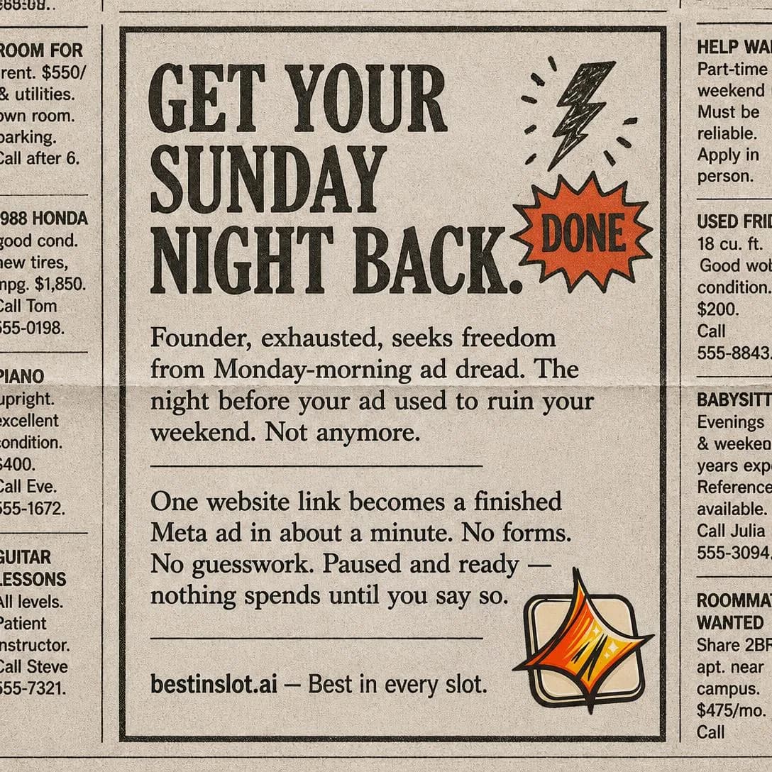
Get your Sunday night back
Website to ad in 60 seconds
Fear / Loss Aversion
MidFocuses on avoiding a negative outcome or protecting something valuable.
Points at something the reader could lose and brings it close. The taxonomy calls it a strong motivational force and undersells it: the asymmetry between losing and gaining is the most consistently reproduced finding in the whole persuasion literature. It is also the angle most often run badly, and the badness is not a matter of taste — it has a specific, diagnosable shape.
Fear about a consequence the reader controls is motivating. Fear about a consequence they don’t control is just distress, and distress gets hidden, resented, or remembered as your brand’s personality. So the loss you name must be one this purchase actually prevents, and the ad has to hand back more agency than it took. Cost of Inaction, over in Problem & Pain (issue #1), is the calmer relative and often the better ad: it quantifies a drift that is already happening, which is checkable, where fear dramatises an event that hasn’t happened, which isn’t. Same direction, different temperature — reach for the quantified one unless the loss is genuinely sudden.
Then the discipline the taxonomy asks for. Easy to overdo or cross into fearmongering is a line, not a caution, and on a social feed the reader has a button for ads that make them feel bad — the one interaction that has no upside for you at all. Name the risk once, at its real size. A creative that is running unwatched into fatigue is a real risk with a real fix; the end of your reader’s career is not, and reaching for the second one costs you the first.
- Works because
- Strong motivational force.
- Fails when
- Easy to overdo or cross into fearmongering.
Write one like this
- Your best ad is three weeks old and you already know how this ends.
- Creative fatigue never announces itself. It just quietly takes the quarter.
- The account isn’t broken. It’s running one ad, and one ad has a shelf life.
- Q4 is a bad quarter to discover your only creative stopped working in October.
Don’t name a loss the reader can’t prevent by buying. Fear with no matching action is a bad feeling attached to your logo, and the only lever you’ve handed them is the one that hides the ad.
Your competitor just posted their third ad this week. You posted… when was it again? Every silent day is a day someone else becomes the brand people remember. best-in-slot turns your website into a finished Meta ad in under a minute — concept, image, copy, all four sizes, published straight into Ads Manager. No forms. No design time. Just stay visible.
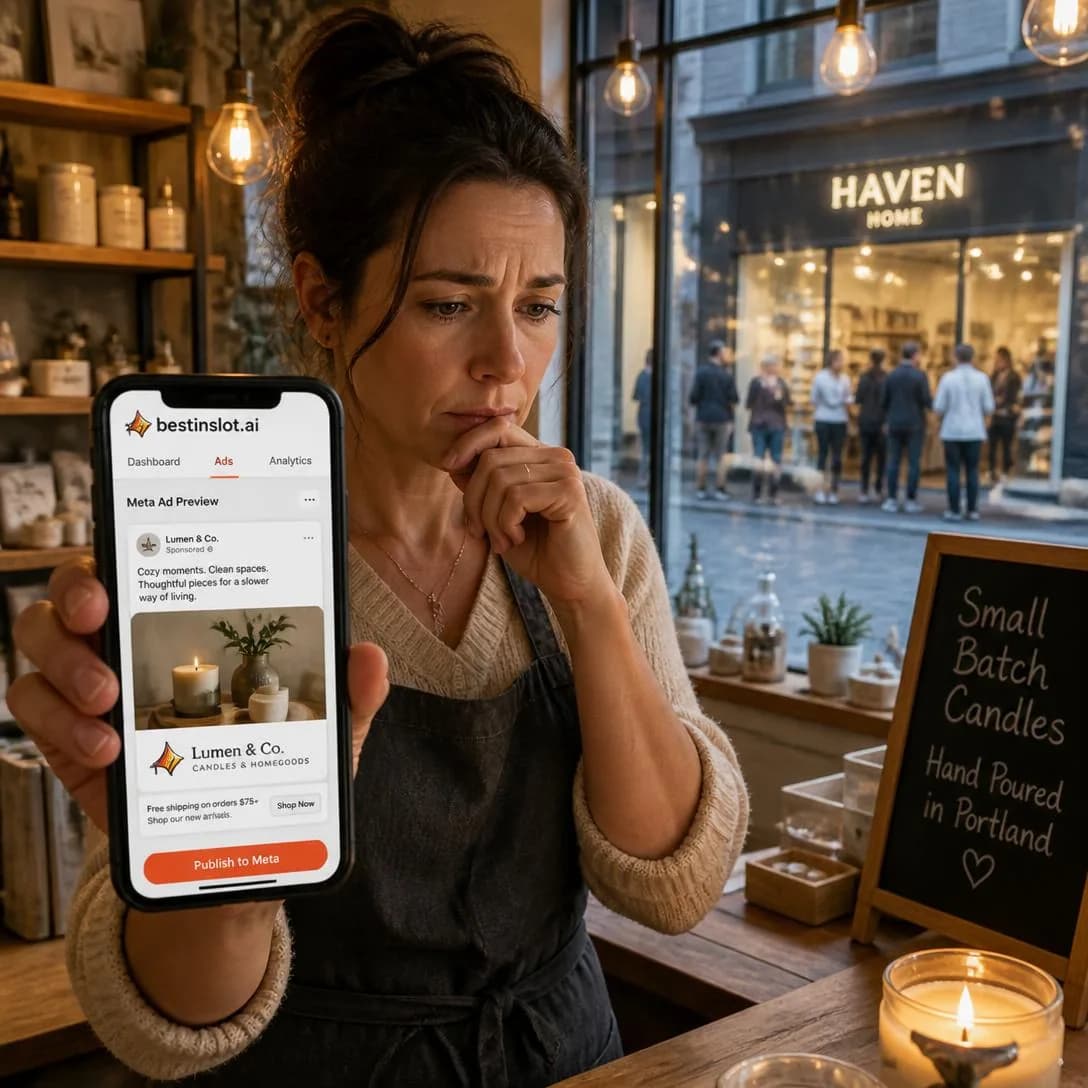
Stay visible or get forgotten
Website → finished ad in 60s
Humor
ColdUses comedy, absurdity, irony, or relatable frustration as the persuasion vehicle.
Uses comedy as the persuasion vehicle. The source document is emphatic that angles are not formats, and this is the row where holding that line is hardest, because humour looks exactly like a tone of voice. It becomes an angle at the point where the joke is the argument — where the funny thing is a true observation about the reader’s situation that also happens to be the case for the product.
It has one property nothing else in the library has: it pays immediately and unconditionally. Every other ad asks for attention now against a benefit later, which is a trade the reader has learned to decline. A joke settles up at the moment of reading, which is why it earns the attention it takes rather than borrowing it, and why it gets forwarded. The trade is that it decays fastest — a second viewing of a joke is worse than the first, where a second viewing of a proof point is not — so humour buys reach cheaply and burns through creative quickly. Budget for more of it, not for longer runs of it.
Overshadowing the product is the listed weakness and it has a one-question diagnosis: would this ad still be funny with a competitor’s logo on it? If yes, you have made an ad for comedy in general and paid to introduce your reader to nothing. The safest flavour by a distance is relatable frustration, because the frustration is your problem statement — it is Problem & Pain (issue #1) delivered as a joke, the audience does the recognising and the laughing in the same beat, and there is nothing left over for the product to compete with.
- Works because
- Memorable, shareable, and native to social feeds.
- Fails when
- Humor is subjective and can overshadow the product.
Write one like this
- Congratulations on your promotion to creative director. Your other four jobs are unaffected.
- Your ad account currently contains one ad. It is called FINAL_v3_USE_THIS.
- The brief was “like the last one, but different”. Thank you. Very clear. Extremely actionable.
- Nine finished drafts and nobody once said “can we make it pop”.
Don’t tell a joke that would survive a competitor’s logo. If the punchline isn’t about the problem you fix, you’ve rented the reader’s attention and spent it introducing them to comedy rather than to you.
Remember being stuck doing the entire group project while everyone else 'contributed'? That's every ad tool's onboarding form. Define your brand voice. Upload 12 assets. Write 3 audience personas. Suddenly you're that kid again, doing all the work while the software coasts. best-in-slot skips the group project entirely: paste your website link, get a finished ad. No forms. No homework. Just done.
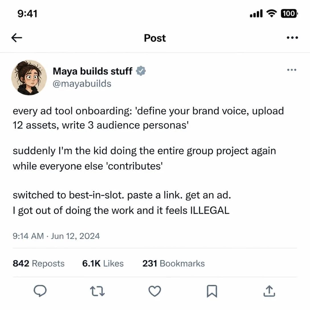
No more group project onboarding
No setup form. Just ads.
Nostalgia
ColdConnects the product or brand to a remembered era, experience, or cultural reference.
Connects the brand to a remembered time and borrows its warmth. The persuasion happens before the argument starts: the reader arrives in a good mood, and on a feed that is treating them as a target all day, a good mood is a genuine asset rather than a soft one.
The version almost everyone makes is decoration — a retro treatment over a product with no relationship to the era. The warmth turns up, finds nothing to attach itself to, and the reader keeps the feeling and forgets the brand. The version that works makes the memory about the category: the time when the thing was better, or the part of the work the reader misses. For anyone who has been running ads for a decade there is a real and precise one available — when a campaign was four good ideas made properly, before the volume appetite of a feed turned creative into a quota. That memory argues for the product without a word of product copy in it.
Audience-dependent and hard to scale, says the taxonomy, and that is an audience-sizing fact rather than a craft fault: a memory only works on people who have it, and no amount of rewriting widens the pool. So verify whose memory you are using. The most common failure in this row is a founder advertising to their own adolescence — a reference that is vivid to exactly one person in the building and invisible to the buyer, who was doing something else entirely that year.
- Works because
- Creates emotional warmth and strong attention.
- Fails when
- Audience-dependent and sometimes hard to scale.
Write one like this
- Remember when a campaign was four ideas instead of forty deliverables?
- Advertising used to be a craft with a deadline. Now it’s a feed with an appetite.
- You didn’t get into this to resize the same JPEG eleven times.
- The part of this job you actually liked was never the exporting.
Don’t dress the ad in an era it has nothing to do with. A retro filter over an unrelated product is a costume — and check the memory belongs to your buyer rather than to you, because a reference only one person in the building recognises is not nostalgia, it’s a private joke.
Remember gluing magazine letters at midnight for a class project? That panic-meets-pride feeling when it finally came together? We kept the pride. Ditched the all-nighter. best-in-slot turns your website into a finished Facebook ad — concept, image, copy, all four sizes — in about a minute. Same scrappy DIY satisfaction, zero suffering. Nothing goes live until you say so.
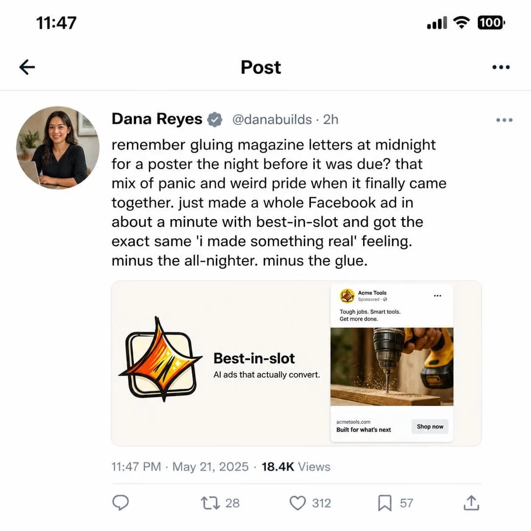
The all-nighter, minus the all-nighter
Finished ads in one minute
Rebellion / Anti-Establishment
ColdPositions the brand against industry norms, conventions, or mainstream behavior.
Sets the brand against how the category normally behaves, and offers the reader the identity of somebody who has opted out of it. Strong, memorable, and the fastest way in the family to make a market feel like it has sides.
It is one row away from Category Enemy in Comparison & Positioning (issue #5) and they are constantly written as each other. Category Enemy is a positioning move: it names an enemy so the product’s difference becomes legible, and the beneficiary is your product. Rebellion is an identity move: the subject is the reader, and what they get is membership among the people who saw through it. Same target, different beneficiary — run the wrong one and you have published something true about the industry that says nothing about anybody reading it.
Polarizing or performative, warns the taxonomy, and there is a plain test for the second half: are you actually doing the thing you say the industry shouldn’t? This angle has the highest cost of insincerity anywhere in the library, because the people who respond to it are responding to a claim about your character, and they are constitutionally inclined to check. Then one rule of aim, which is not squeamishness but arithmetic: keep the enemy a practice, never a group of people. A rebellion against retainers and four-week turnarounds is positioning. A rebellion against agencies insults a room that contains a good number of your future customers. And put the alternative in the same ad as the objection, because an ad that only refuses things is a complaint — the reader has to leave knowing what you do instead, or the identity on offer is simply being annoyed.
- Works because
- Strong identity and differentiation mechanism.
- Fails when
- Can be polarizing or become performative.
Write one like this
- No brief. No kickoff call. No two-week turnaround. It’s an ad, not a merger.
- The industry standard is a mood board and an invoice. We skipped both.
- Nobody needs a six-week creative process to test a headline.
- You shouldn’t need anyone’s permission to try eleven angles this month.
Don’t rebel against people. Aim at a practice — retainers, kickoff decks, month-long turnarounds — because the moment the enemy is a group rather than a habit, half the audience is being insulted and a few of them were about to buy.
We made the ad brief obsolete. You're welcome. 🔥 Every ad tool starts with a 47-question form, a kickoff call, and three rounds of "just one more tweak." We threw all of it out. Paste your website link, get a finished Meta ad — concept, image, copy, all four sizes — in about a minute. No brief. No back-and-forth. No performance art disguised as productivity. bestinslot.ai

No brief. No meetings. Just ads.
Paste link → get Meta ad
Care / Love
AllFrames the purchase as an act of care for another person, pet, family member, or community.
Frames the purchase as an act of care for somebody else. It is the only angle in this family whose subject is not the reader, and that single structural difference is why it is rated for every stage: care isn’t an awareness stage, it is a standing condition, and it is just as available on the first impression as on the last.
In gifting, family and pet categories the recipient is obvious. In business categories the recipient exists too and is routinely ignored, which is a waste, because a great many purchases are made by somebody whose real motive is that another person is drowning. The designer who didn’t sign up to resize things. The client who deserves better than a third rewrite of the same idea. The one colleague still online at nine because the launch needs creative by morning. This is the angle for the buyer who would feel self-indulgent asking for the thing for themselves and entirely justified asking for it on someone else’s behalf.
Sentimental cliché is the failure, and it comes from generality: care written about nobody in particular has no choice but to reach for strings and soft focus. Be specific about who and about what stops happening to them. And there is a line inside the angle worth marking, because crossing it is easy and expensive — the manipulative version implies the reader is currently failing the person they love. Guilt converts once, and is remembered as the ad that made somebody feel like a bad manager.
- Works because
- Powerful in gifting, family, pet, and caregiving categories.
- Fails when
- Can become sentimental cliché.
Write one like this
- Your designer didn’t take the job to resize things. Give them back the part they’re good at.
- Somebody on your team is doing this at nine at night. It doesn’t have to be anybody.
- The client asked for options. Your team asked for a weekend. Both of those are possible now.
- You can stop sending the Friday-afternoon “tiny favour, won’t take long” message.
Don’t imply the reader is letting somebody down. Care that arrives as an accusation converts once and is resented afterwards — say what stops happening to the other person, not what the reader has been putting them through.
Your kids remember the nights you actually came home. Every hour wrestling Ads Manager is an hour stolen from dinner, bath time, and bedtime stories. best-in-slot turns a full ad — concept, hero image, all four Meta sizes, copy — into about 60 seconds of work. Paste your website link. Get a finished ad. Be home for dinner. Nothing publishes until you say so. Try it free at bestinslot.ai
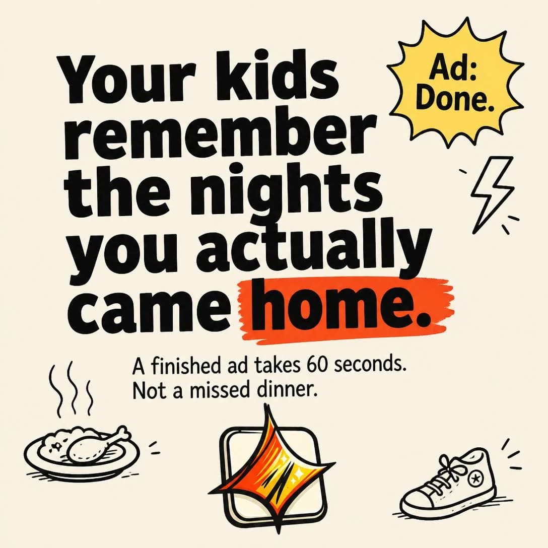
Ads in 60 seconds. Dinner on time.
Try free. No credit card.
Security / Protection
MidEmphasizes protecting family, money, property, data, health, time, or peace of mind.
Argues that something the reader already has is worth guarding. It shares its subject matter with Fear / Loss Aversion and takes the opposite posture: fear makes you feel the loss, security shows you the lock. One ad is about the burglar, the other is about the door — and the door is calmer, more repeatable, and far harder to run badly.
For a business buyer the things worth protecting are spend, the account, the data and, above all, the brand. Anywhere near AI-generated creative there is a sharper and very current version of that: the reader has a real, specific worry about what a generator is going to attach their logo to. Protection here means naming the controls — the brand kit as a ceiling rather than a suggestion, nothing publishing that a person hasn’t looked at, no claim in an ad that the business never made. That is not a feature list, it is the answer to “can I trust this with the thing I have spent ten years building”, and it is a question nobody puts in a support ticket.
The listed weakness is drift into fear-heavy messaging, and the fix is a drafting rule you can check with a ruler: most of the ad should be the guard, not the threat. Name what is at stake once, in a sentence, then spend the rest on the mechanism. Worth separating from Objection & Risk Reversal (issue #6) too, since buyers conflate them constantly — a guarantee removes the risk of buying, and this removes the risk of using. A reader worried about wasting money wants the first. A reader worried about what ends up on their brand’s page wants this one, and a refund policy does not answer them.
- Works because
- Clear high-stakes motivation.
- Fails when
- Can drift into fear-heavy messaging.
Write one like this
- Nothing goes live until you’ve looked at it. That isn’t a setting, it’s the flow.
- It can’t invent a claim you never made. Your brand kit is the ceiling, not a suggestion.
- Ten years of brand, one afternoon of ads. The first one is the thing being protected.
- You approve every ad before Meta ever sees it.
Don’t spend the ad on the threat. Security is the one angle where the reader should finish calmer than they started — one sentence on what’s at stake, and the rest on the specific mechanism standing in front of it.
Guard the money you bled for like it's family. Every dollar in your ad budget used to be groceries, rent, or your kid's tuition. best-in-slot builds your Meta ads automatically — concept, image, copy, all four sizes — but nothing goes live or spends a cent until you personally hit publish. You stay in control. You protect what you built.

Not a dollar moves until you say go
All ads created paused.
Testing them against each other
Testing inside this family answers a question the other nine can’t: which claim about themselves your buyer accepts. But it only answers it if the test is built out of angles that are actually far apart, and this is the family where that goes wrong most often — fourteen appeals to self-image produce neighbours so close that a three-way test can easily be three versions of the same ad. Take one from separate rows above. An Identity Callout against a Humor ad against a Security / Protection ad is a real test; Aspirational Identity against Future Self is a headline preference wearing a test’s clothes. And judge the winner on the job this family actually does. Eleven of these fourteen rows work on strangers and not one of them is marked Hot, so the honest measure is whether people who had never heard of you stopped and identified themselves — not whether they bought, which was always going to be decided somewhere else.
Read a loss differently here, too. An Offer & Economics ad that fails usually got the arithmetic wrong; an identity ad that fails usually got the reader wrong, and that is a more valuable failure than it looks — it is audience research delivered by the auction, and it is telling you that a group you believed existed doesn’t see itself the way your brief said it did. Then pair rather than close. This family gives somebody a reason to want to be a certain kind of person; Proof & Trust (issue #4) gives them a reason to believe you can help with that, and Objection & Risk Reversal (issue #6) removes the thing still stopping them. The debt runs both directions — Exclusive / VIP over in Scarcity (issue #8) is built out of Status and Belonging from this page, and works precisely because it is. Identity is what makes a stranger care. It has never once been what makes them checkout.
Pick an angle. Get the ad.
No credit card · 50 free credits (about 5 ads or Instagram posts)