
Ad Examples · Fashion & Apparel × Facebook · 10 ads
Fashion Facebook ad examples
Ten finished Facebook ads for apparel, every one of them arguing about a garment rather than about the person reading — with the brief behind each, because we generated them rather than collected them.
Fashion advertising on Meta is written as though there were one customer: someone in their twenties, discovering a brand, on Instagram, at night. That customer is real and the other app is the right place to reach them. This page is about the one the industry keeps forgetting, and Facebook is the only place they are.
Pew's November 2025 survey puts Facebook at 74% of 50- to 64-year-olds and 57% of over-65s, against Instagram's 40% and 19%. That is a clothing buyer with money, a body the industry has quietly stopped cutting for, and a shopping mode nothing in the fashion playbook describes: they are not discovering, they are replacing. They know their size and cannot find it. They have a jacket they will own for fifteen years. They are buying for somebody else and guessing at the size. Every one of the ten ads below is written for that mode.
There is a rule underneath all ten and it is the reason this page exists rather than a fifth restatement of the drop calendar. The vernacular that comes naturally when you sell clothes to this buyer — "at our age", "since the menopause", "if your waist has changed", "for wide feet" — asserts age, a medical condition or a disability about the person reading the ad, and Meta's personal attributes policy covers all three. So the one app that reaches this customer is the one where you may not name them. The way out is to qualify on the garment instead: "E to 6E" reaches everybody with wide feet and says nothing about any of them. Same selection, no assertion, and the guide alongside this page works the rule out in full.
The ads were not collected. Each was generated with the audience, the angle and the objective pinned before the run, so the brief printed beside an ad is the brief that produced it rather than a caption written afterwards about somebody else's work. All ten angle families appear once each — which fills the Founder POV row the Instagram batch left empty — and the split is five Sales, three Traffic, one Leads and one Awareness, almost exactly the Instagram batch's six/three/one/nought. Unlike SaaS, apparel does not change business model when you change app, so the objective mix does not move; the inversion is elsewhere. The brands are invented and unnamed, nothing was edited afterwards, and all ten came back in a single pass.
The rule held, and something else did not. Not one of the ten mentions an age, a body or a condition — the discipline worked because it was applied to the brief rather than caught at review. But five of the ten carry invented evidence, which nothing in the brief guards against: a laboratory wash log with shrinkage figures nobody measured, two first-person accounts from customers who do not exist, a private text conversation between two named people about their mother, and a street address in the Los Angeles garment district stamped on a parcel in the one ad whose entire argument is that the address is real. Each note below says which and what the fix is.
Every price is invented too. £215 for a cardigan, $88 for a linen shirt, £395 for a jacket, $255–$345 for shoes, $148 for a five-piece set — these belong to brands that do not exist. Read them as placeholders marking where a real number goes, and note how much work the specific ones do: an ad that names a price can be checked, which is most of why this buyer trusts it.
What changes because it is Facebook
The buyer changes, and in apparel that is not a nuance — it is a different shopping trip. Pew's November 2025 figures put Facebook thirty-four points ahead of Instagram among 50- to 64-year-olds (74% against 40%) and thirty-eight ahead among over-65s (57% against 19%). Instagram's fashion audience is discovering: a brand they have not seen, a drop they might miss, a look they are trying on in their head. This one already knows what they want and cannot get it — the trouser that fits, the shoe in a 4E, the cardigan in their size, the shirt that has been discontinued. Eight of the ten ads below are about getting the same thing again, and none of them is about a trend.
Then the constraint that follows the buyer around, and it is the one nobody writing about fashion ads mentions. Meta's personal attributes policy prohibits ads that assert or imply things about the person seeing them, and it names age, disability and physical or mental health. Selling clothes to a sixty-year-old means describing a body that has changed, and every sentence that does it lands inside that list. Housing loses its targeting to a special ad category and keeps its copy; apparel keeps every targeting lever — it is not a special ad category, so age is fully selectable in the ad set — and loses the sentence. The resolution is the batch's design rule: put the qualifying in a garment specification, where a width fitting or an inseam or a finished waist measurement selects the same people and asserts nothing about them.
The shape budget is wider here than on the twin and the run uses it: five of the ten are 4:5, two are 1:1, two are 1.91:1 and one is 9:16. Two of the nine re-framed exports came back with the square draft inset rather than re-composed — the mill ad is a 1200 × 628 with a 56-pixel white bar above the picture and a 46-pixel bar below, and the swatch-card ad is a 1080 × 1350 with the photograph sitting between hard horizontal edges at rows 319 and 1034. Both read as deliberate white space at a glance and as padding when you measure them. Look at the re-framed file, not the square draft.
And the copy lengths, which are the sharpest Facebook result this cluster has produced. Meta's ads guide recommends a 27-character headline and 50–150 characters of primary text for a Facebook Feed image ad, against Instagram Feed's 40 and 125 — both re-read from the spec pages on 7 September 2026. The ten ads produced fifty headlines. Two of them fit 27. Forty-eight fit 40. All ten lead headlines overrun Facebook's recommendation and only one overruns Instagram's, which makes this the fifth consecutive Facebook batch to land on the same finding and by far the worst of them — the previous four ran eight or nine lead headlines over, not ten. Every one of the fifty primary texts overruns 150, at 225 to 513 characters. Five of the ten descriptions fit Marketplace's 30, in a field Facebook Feed does not show at all.
The two headlines that do fit are worth a second look, because they are not the ones you would guess. They are "The tag names the frame" (23) and "Knit where we spin the yarn" (27), both from the same ad, and both name a single object rather than make a single argument. Every specification headline in the batch — "E to 6E. Cut once. Still available." at 35, "0.4% shrinkage after 40 washes." at 31 — overruns. Twenty-seven characters is not enough room for a claim. It is enough room for a noun.
Source: Meta ads guide — image ad specifications, Facebook Feed (4:5 at 1440 × 1800; primary text 50–150, headline 27; aspect-ratio tolerance 3%) · Meta ads guide — image ad specifications, Instagram Feed (headline 40, primary text 125; aspect-ratio tolerance 1%) · Meta Advertising Standards — privacy violations and personal attributes · Meta Marketing API — special ad categories (apparel is not one; NONE must still be declared) · Pew Research Center — Americans' social media use, November 2025
Want the campaign, not just the creative? Facebook ads for clothing brands → is the playbook these ads came out of: which objective to buy, the offers worth running, the targeting levers this trade keeps, and the policy that decides what the copy may say.
Generate Facebook ads for your own label
Paste your site and best-in-slot reads it the way these invented labels were read — products, customers, positioning — then writes the concepts, renders the images and drafts the copy. Free to start, no card.
Four Sizes, One Waist
TrafficYour waist didn't change four times. Four labels did.
- Audience
- Women who own four sizes of the same trouser — Have watched a size 12 become a 14 in one brand and an 8 in another over twenty years, keep three sizes in the wardrobe because none of the labels agree, and have quietly concluded the problem is them.
- Angle
- Misdiagnosis / Reframe (Problem & Pain) — Reframes the cause of the problem: “It isn’t X causing this. It’s Y.”
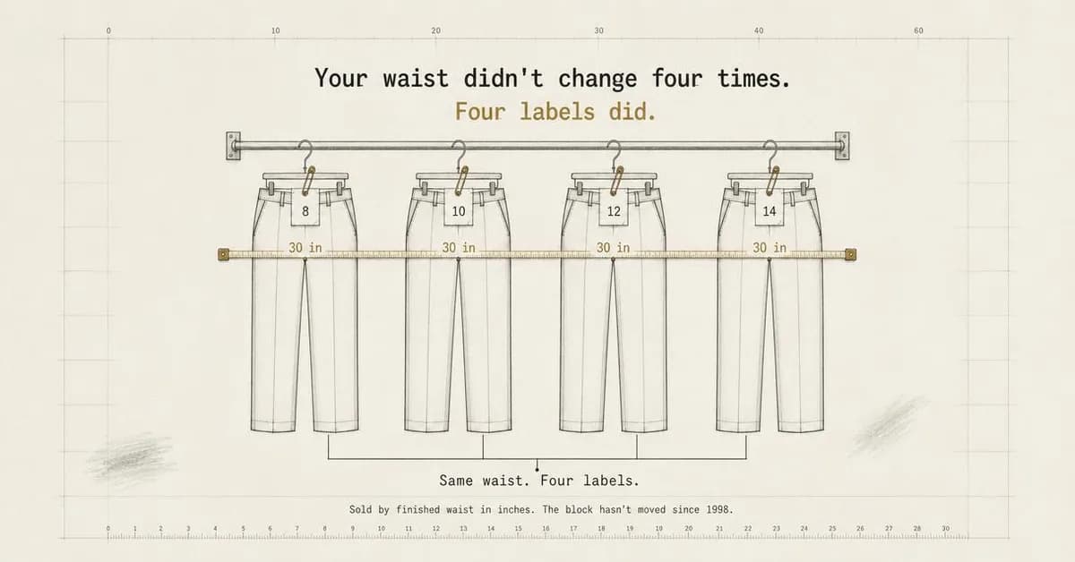
Your waist didn't change four times. Four labels did. If you keep three sizes of the same trouser because none of the numbers agree anymore, the problem isn't you. It's vanity sizing that drifts every season. These trousers are sold by finished waist measurement in inches — the number on the tape, not the tag. Same block since 1998.
Sold by waist in inches, not labels
Finished measurements in inches
Misdiagnosis / Reframe is the right family for the single most-felt and least-advertised problem in womenswear, and the reframe is what makes it publishable. The reader owns a size 8, a 10, a 12 and a 14 of the same trouser and has quietly concluded the problem is her. The ad moves the blame onto grading that drifts every season, which is both true and — importantly — a claim about the industry rather than about her body. That distinction is the whole design rule of this page: the same insight written as "if your waist has changed" would be an assertion about the reader and inside Meta's personal attributes policy.
The picture is the argument, which is rare and worth stealing. Four identical trousers on a rail tagged 8, 10, 12 and 14, one tape measure running across all four waistbands reading 30 in at every stop, and a caption that just says "Same waist. Four labels." There is no model, no styling and nothing to interpret. It is also the only ad in the batch whose 1.91:1 export fills the frame properly — a diagram survives a wide crop because it has nothing in the top and bottom margins to lose, which is exactly why the two padded exports elsewhere on this page are photographs.
Two things before it runs. The rulers rendered along the top and bottom edges do not count correctly — the top scale reads 0, 10, 20, 30, 40, 60, and the bottom repeats a number mid-sequence — which is decoration on a diagram whose entire credibility is measurement. And one of the five primary texts calls vanity sizing "gaslighting"; in a category where the audience has spent thirty years being told their body is the variable, borrowing clinical vocabulary to make the point is a bad trade for a sentence you do not need.
Other headlines from the same run
- Same block since 1998. Same fit.
- The size that doesn't change
- Trousers sold by actual measurement
- One waist. Four sizes. End this.
Call to action
This ad has changed a belief and not yet shown a product, and the honest next click is the size chart it is arguing for — which is why it is the one Traffic buy of the three that leads the page. Shop now is worth testing only if that page opens on the measurement table rather than a grid.
The Empty Shelf
SalesYour shirt gets discontinued. Your fit doesn't.
- Audience
- Men who wear the same shirt to work every day — Found one shirt that fits about nine years ago, buy it in the same two colours until it is discontinued, and dread the afternoon they have to start the search over.
- Angle
- Ease (Benefit & Outcome) — Emphasizes getting the result with less effort, complexity, or skill.
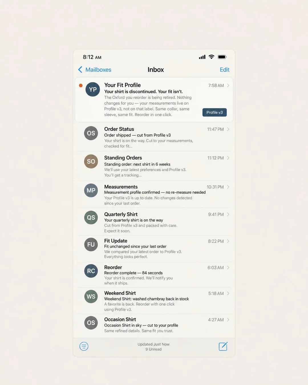
Your shirt gets discontinued. Your fit doesn't. Your measurements live on a profile, not a label. When the oxford you've worn for years gets retired, you reorder the same collar, sleeve, and fit in one click. No search, no sizing chart, no starting over.
Your fit doesn't get discontinued
Made to your stored profile
Ease is the family, and the specific fear it answers is one nobody in apparel advertises to: the day the shirt you have worn for nine years is discontinued. On Instagram that is not a fear at all, because that reader is looking for the next thing. Here it is the reason somebody buys — the fit lives on a profile rather than on a label, so the retirement of a product becomes a non-event. Read the headline set for how consistently the run found that idea: "Your fit doesn't get discontinued", "Your measurements outlive the label", "The shirt changes. Your fit doesn't."
The direction is an email-inbox screenshot and it demonstrates both what that format buys and what it costs. What it buys is a whole relationship in one frame: a standing order, a fit-unchanged confirmation, a reorder that took 84 seconds, a discontinuation notice that is reassuring rather than bad news. What it costs is that a rendered interface has internal rules the model does not follow. The timestamps run 7:58 AM, then 11:47 PM, 11:12 PM, 10:31 PM, 9:41 PM, 8:22 PM, then 6:03 AM and 5:18 AM — an inbox that is not in any order — and the footer claims 9 Unread above a list with one unread dot.
That is a new failure shape worth carrying to the next batch. Three batches established that this pipeline gets rendered sums right and rendered quantities and percentages wrong. This adds ordering and state: any mocked-up interface — an inbox, a chat, an order history, a dashboard — has consistency rules a reader has spent twenty years internalising, and breaking one is the kind of thing nobody can name but everybody notices. Check the screenshot the way you would check a number.
Other headlines from the same run
- Measure once. Reorder for years.
- Same fit. New shirt. One click.
- The shirt changes. Your fit doesn't.
- Your measurements outlive the label
Call to action
The offer is literally an account — the measurements have to live somewhere — so Sign up describes the actual next step rather than dressing up a purchase. Subscribe is the variant to test if the standing order in the mock-up is a real product; do not run it if it is not.
The 40-Wash Logbook
TrafficWe washed this trouser 40 times before you ever could.
- Audience
- Owners of wool they never wear — Have good wool in the wardrobe that comes out twice a year because everything else about it means a trip to the dry cleaner, and buy synthetics they like less because those can be washed on a Sunday.
- Angle
- Durability / Reliability (Product & Mechanism) — Demonstrates robustness, consistency, lifespan, or dependability.
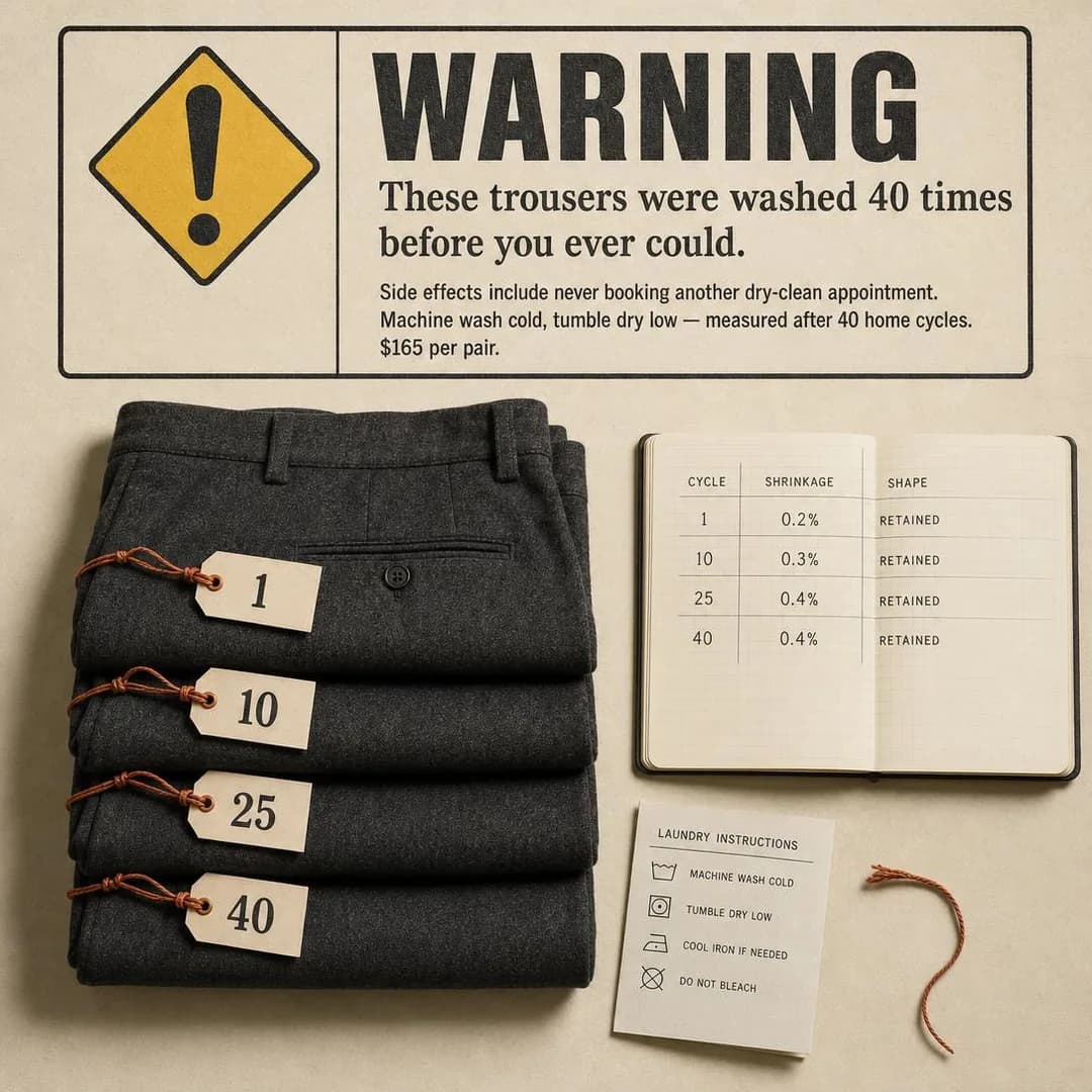
We washed this trouser 40 times before you ever could. Machine wash cold, tumble dry low — measured after every cycle. 0.4% shrinkage at cycle 40. Shape retained. Because wool that survives your Sunday laundry pile is wool you'll actually wear. $165, ships with a laundry card instead of a dry-clean-only tag.
Tested 40 times. Still looks pressed.
From $165. Machine wash cold.
Durability / Reliability is the family, and this is the argument that converts a wardrobe full of good wool nobody wears. The obstacle to buying wool is never the wool — it is the dry cleaner, which turns a garment into an errand. "Machine wash cold, tumble dry low" is a specification about the cloth, not a claim about the reader's life, and it does the same qualifying that a sentence about being too busy to visit a dry cleaner would do, without asserting anything about anybody. It is the clearest small illustration on the page of the rule the whole batch is built on.
Warning-label parody is a good pairing and the execution is better than the brief asked for: the parody structure carries a real care label at the bottom of the frame with correct symbols, so the joke and the specification are the same object. Note also that the four numbered tags — 1, 10, 25, 40 — match the four rows of the logbook beside them. That is the rendered-quantity check that the gym batch's whiteboard failed, and it passes here.
It cannot run as it stands, and it is the cleanest example this cluster has produced of the SaaS Facebook finding that where a direction offers a place to put proof the model fills it. The logbook renders a four-row test series — 0.2%, 0.3%, 0.4%, 0.4% shrinkage, shape RETAINED at every stage — and "0.4% shrinkage after 40 washes" is also one of the five headlines and a sentence in the body. Nobody ran that test. A rendered laboratory result is a stronger claim than a rendered testimonial and a harder one to walk back, because it looks like data. Either run forty wash cycles and publish what happens, or take the logbook out of the frame and keep the joke.
Other headlines from the same run
- Wool trousers. Zero dry-clean bills.
- 0.4% shrinkage after 40 washes.
- Machine-washable tailoring, proven.
- We logged every wash. You reap it.
Call to action
Pinned Traffic, and rightly: a durability claim this specific invites verification, so the click should land on the test method and the care instructions rather than on a checkout. Shop now becomes the right button the moment that page exists and the ad can point at it.
The Card That Never Changes
SalesReorder by number. No fitting room required.
- Audience
- People with wide feet — Have been told to size up, wear the sides out of every shoe they own, and gave up on the high street years ago because the widest fitting in the shop is still too narrow.
- Angle
- Repeat Customer (Proof & Trust) — Emphasizes repurchase, renewal, retention, or long-term loyalty.
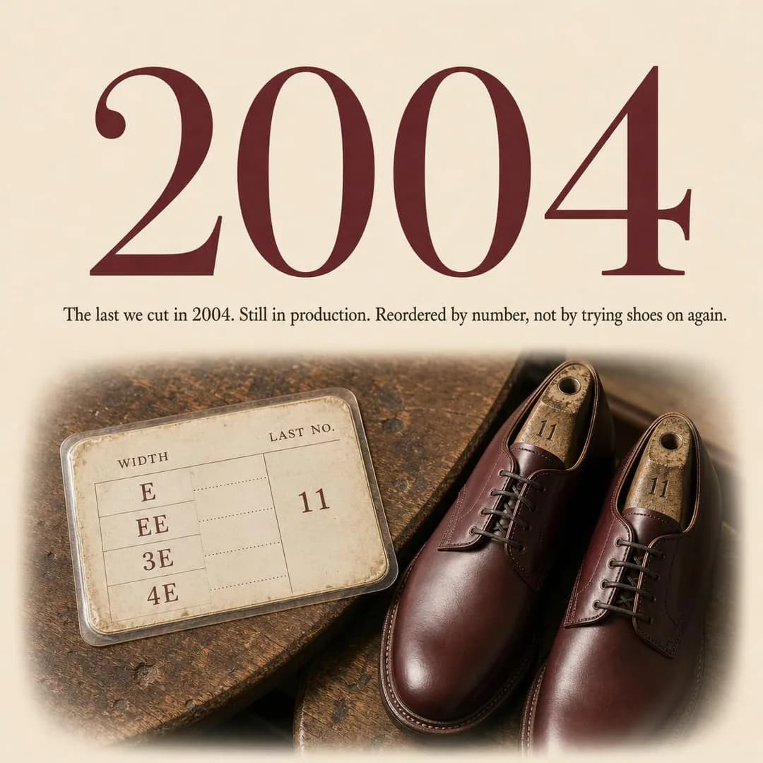
I've been ordering the same last number since 2009. Haven't set foot in a fitting room since. Every pair I own ships with a laminated reference card — width, last number, size. When the soles wear through, I send them back for a rebuild on the same last. When I need another pair, I call in the numbers. The lasts were cut in 2004 from hand-measured foot scans. They haven't been narrowed, modernized, or discontinued since. If your foot hasn't changed, your size won't stop existing.
Same last since 2004. Reorder by number.
Widths E–6E, resoleable, $255–$345
Repeat Customer is the family and wide fittings are the perfect subject for it, because a shoe last that has not been re-cut in twenty years turns a repurchase into a phone call with three numbers in it. "E to 6E" is also the batch's model sentence: it reaches every person who has worn the sides out of every shoe they own, and it says nothing whatsoever about their feet. Compare it with the alternate headline "Built for feet that don't fit trends", which is doing the same job by describing the reader — a small drift, and the direction the whole category drifts in.
The style was pinned as a stat-hero graphic and what came back has no statistic in it at all. The number filling the top half of the frame is a year, 2004, and the proof underneath is a laminated width card and a pair of derbies on Last No. 11. That is a genuinely interesting substitution: asked for evidence, the model reached for a fact about the company rather than a fact about customers, which is the safest thing it could have done. The reference card is the transferable object here — a physical artefact that makes reordering trivial is worth more to this buyer than any review count.
The copy did not stay that safe. The primary text is a first-person customer account — "I've been ordering the same last number since 2009. Haven't set foot in a fitting room since." — from a customer who does not exist, on an ad whose family is proof. That is the same fabrication the Instagram twin's review wall carries, in a quieter costume, and the fix is the same: attribute it to somebody real or write it in the brand's own voice. Two smaller things: the width card shows E, EE, 3E and 4E where the brief and the headline both say E to 6E, and "$255–$345" is an invented range.
Other headlines from the same run
- Your size won't stop existing.
- Built for feet that don't fit trends.
- E to 6E. Cut once. Still available.
- The width chart hasn't moved in 20 years.
Call to action
The reader in this ad already knows their number, so Shop now matches the actual intent — the whole promise is that no fitting is required. Learn more is for the version of the page that leads with the width chart, which is a reasonable A/B here rather than a fallback.
The Return Address Test
TrafficIf the ad won't show you the box, don't order.
- Audience
- People burned by a linen dress advert — Ordered something beautiful from a photograph, waited six weeks for a parcel with no return address, and now assume every clothing advert in the feed is the same operation with a different font.
- Angle
- Us vs. Them (Comparison & Positioning) — Contrasts your brand with the typical competitor or category solution.
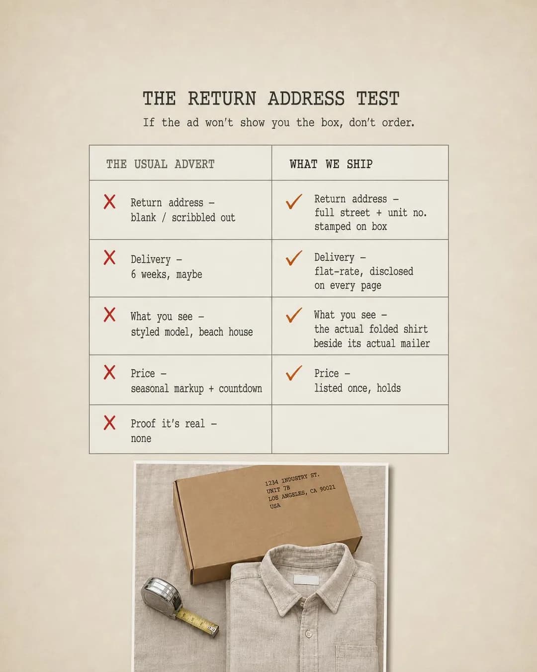
If the ad won't show you the box, don't order. That's the test. Most linen brands show you a model on a beach and ship from an address they won't print. We photograph the brown mailer next to the folded shirt, warehouse address stamped in the corner, unit number included. The Warehouse Shirt is $88, stonewashed twice, mid-weight European flax. What you see is what arrives.
If they hide the box, don't order
Linen from a real address
Us vs. Them is the family, and the competitor is not another brand — it is the category of advertisement this ad is sitting inside. Facebook has spent a decade training this buyer that a beautifully photographed linen dress is a parcel that arrives in six weeks from an address nobody will print. So the differentiated claim on this app is not about the garment at all: it is that the shop is real. "If the ad won't show you the box, don't order" is a test the reader can apply to every other ad in the feed, including the ones running against you, which is what makes it a positioning ad rather than a defensive one.
The execution is a checklist against a photograph and it is the strongest structural idea in the batch — a comparison chart whose rows are all logistics (return address, delivery, what you see, price) rather than features. One rendering fault: the left column has five rows and the right column has four, so "Proof it's real — none" is answered by an empty cell in the one place the ad most needs an answer. That is a two-minute fix and it is currently the weakest point in the strongest ad here.
And it must not run, for a reason that is exactly the ad's own subject. The parcel in the photograph is stamped 1234 INDUSTRY ST., UNIT 7B, LOS ANGELES, CA 90021 — a real ZIP code in the Los Angeles garment district, on a street name that exists, in an ad arguing that this address is genuine. The SaaS Facebook batch found the same class of fault as a rendered URL on a real top-level domain; this is the physical version, and it is worse, because somebody occupies that unit. Put your actual warehouse address in the frame, which is the only version of this ad that means anything anyway.
Other headlines from the same run
- We print the warehouse address on it
- $88 linen shirt, actual return address
- The box test: ours shows the address
- No return address? Not a real warehouse
Call to action
The ad has argued that you are a real business and has not yet sold a shirt, so the click should land somewhere that finishes the argument — the warehouse, the returns terms, the address. Shop now works only if the product page carries that proof above the fold; on a bare product page it wastes the whole setup.
The Card Before the Coat
LeadsFeel the cloth before you spend a penny of £395.
- Audience
- Buyers of one good jacket — Are buying for a wedding, a funeral or a job they have just been promoted into, will own the result for fifteen years, and will not spend that money on a colour they have only seen on a screen.
- Angle
- Free Trial / Sample (Objection & Risk Reversal) — Lets the prospect experience the product before fully committing.
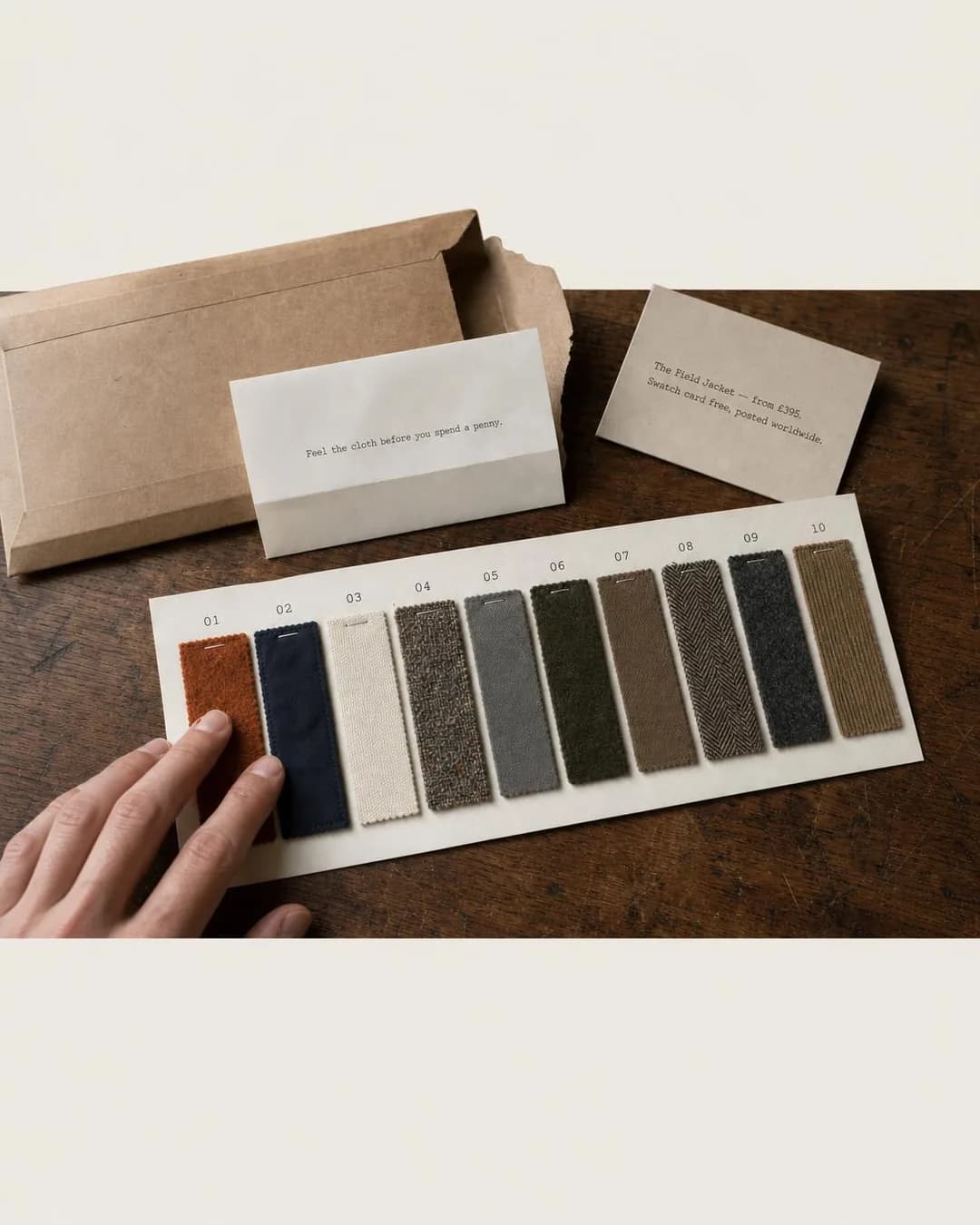
Feel the cloth before you spend a penny. A jacket you'll wear for fifteen years shouldn't be chosen from a screen. We post a swatch card — ten current cloths, cut and numbered — free, worldwide, no purchase required. You handle each one, rule out what doesn't feel right, and only then choose a fabric and size. The jacket is cut to order after that. Payment is taken once you've decided, not before.
Feel the cloth before you pay
Swatch card posted free worldwide
Free Trial / Sample is a family apparel almost never uses and this is the case where it is obviously right: a jacket somebody will own for fifteen years, chosen from ten cloths, none of which can be judged on a screen. Posting a swatch card is a real lead mechanic — it needs a name and a postal address, which is a form worth filling in — and it is the reason this is the one Leads ad on a page that is otherwise Sales and Traffic. It is also a mechanic this buyer recognises and the Instagram audience would find absurd, which is a useful test of whether an offer belongs on this app.
Look at how the ad handles price. "£395" appears on a card in the frame and in two of the five headlines, on an ad that is asking for an address rather than a payment. That is the right way round: naming the price before the form filters out everybody for whom the answer is no, so the addresses you collect are worth posting a card to. An offer that hides the price collects a longer list of worse leads.
The defect here is mechanical rather than editorial, and it is the second occurrence of something the SaaS Facebook batch found once. The 4:5 export is not re-composed — the photograph sits between hard horizontal edges at rows 319 and 1034 of a 1350-pixel frame, with flat cream above and below that happens to match the ad's own background, so it reads as generous white space until you measure it. The mill ad further down has the same fault in a more obvious form. Open the re-framed file at full size before you upload it.
Other headlines from the same run
- Free swatch card. Choose by touch.
- The card comes first. Payment last.
- One jacket, ten cloths, zero risk
- £395 decided by hand, not screen
Call to action
The swatch card is a free thing being given away, which is precisely what Get offer describes, and it sets the expectation that something arrives in the post rather than in an inbox. Sign up is the wrong shape here — nobody is creating an account — and Learn more under-sells a genuinely concrete offer.
The Five-Piece Math
SalesFive pieces, one price, no separate math to do.
- Audience
- Men who hate shopping — Would rather do almost anything than spend a Saturday in a changing room, replace clothes only when they fail, and want the whole decision made once and then left alone.
- Angle
- Bundle (Offer & Economics) — Packages multiple products, services, or units together for stronger perceived value.
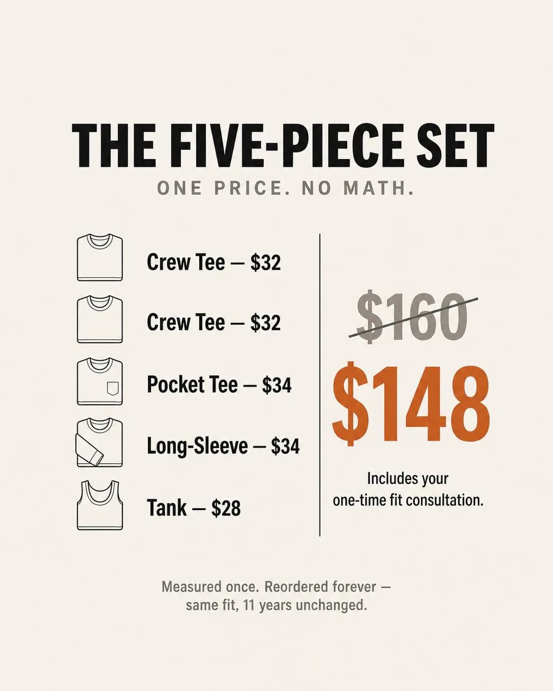
Five pieces. One price. Done. Two crew tees, one pocket tee, one long-sleeve, one tank — all cut from the same 7.5oz cotton block. Bought separately, you'd pay $160. As a set, $148. Includes the fit consultation. Measured once, then you're finished shopping for the next decade.
Five pieces. One price. No math.
Measured once. Reordered forever.
Bundle is the family and the audience is the argument: somebody who would rather do almost anything than spend a Saturday in a changing room. A five-piece set is not a discount play for that reader, it is a way to make the decision once. "Measured once. Reordered forever." does more work than the twelve dollars saved, and the ad is right to put the arithmetic on the right-hand side and the promise underneath rather than the other way round.
The numbers check out, which after four batches of rendered-evidence failures is worth stating plainly. $32 plus $32 plus $34 plus $34 plus $28 is $160, which is the struck-through anchor; the set is $148; five garments are drawn against a headline reading five. Sum, anchor and quantity all agree, on an offer-stack graphic — the exact composition that produced the SaaS batch's invented struck-through price. The lesson is not that the pipeline has improved but that a stack built from a list you supplied adds up and a stack built from a discount it invented does not.
One caution and one omission. The struck-through $160 is only honest if the five pieces genuinely sell at those prices individually — a crossed-out anchor is a factual claim about your own pricing, and it is the sort of claim that gets an account restricted rather than an ad rejected. And "Includes your one-time fit consultation" is rendered into the image, which commits you to a service that has to actually exist and be staffed.
Other headlines from the same run
- $148 for the set. $160 if bought solo.
- Bundle saves $12. Fit lasts 11 years.
- The set costs less than the pieces.
- Five basics. One decision. Finished.
Call to action
A priced bundle with a visible total is a checkout, and Shop now is the button that says so. Get offer is the alternate to test if the fit consultation is the thing you want people to book first, in which case it is a different ad with a different landing page.
The Ledger of Empty Rows
SalesBracken sold through in eleven days last time.
- Audience
- People who missed it last time — Went to buy the thing they had been thinking about for a month, found their size gone, joined a list, and heard nothing until it was gone again.
- Angle
- Restock (Scarcity, FOMO & Timing) — Announces that a sold-out or unavailable product is back.
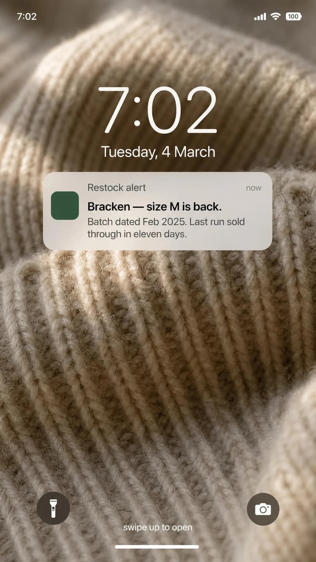
Bracken sold through in eleven days last time. This batch is dated February 2025. Same seven-ply lambswool, same horn buttons, same four colourways that haven't changed in eight years. No new colours planned. No markdowns. When your size sells out, the alert goes quiet until the next knitting run.
Bracken restocked. Eleven days last time.
£215. All sizes currently available.
Restock is the exact inverse of the Instagram twin's Launch Drop, and putting the two pages side by side is the clearest illustration of the platform axis in this cluster. The drop ad sells a thing that has never existed to somebody who wants to be first. This one sells a thing that already existed to somebody who missed it, and the scarcity is not manufactured at all — a knitting run has a number of garments in it and a sell-through history. "Bracken sold through in eleven days last time" is a fact if you have a ledger, which is why the concept was built around one.
The per-size alert is the part worth stealing. A general mailing list tells everybody that something is back and disappoints most of them; an alert per size tells one person that the thing they wanted is available in the only variant that matters to them. It is also the only mechanic on this page that would justify buying Leads instead of Sales — and the ad does not, because by the time the notification fires the reader is a purchase rather than a lead.
The rendered detail is unusually clean. The lock screen reads "Tuesday, 4 March" and the copy dates the batch February 2025 — and 4 March 2025 was a Tuesday, so the weekday and the date agree with each other and with the story. That is a rendered consistency check passing in a place nobody would have looked. Two things to change before running: "Bracken" is a colourway the model invented and reads close enough to a brand name to be worth renaming, and £215 with "all sizes currently available" is a stock claim that has to be true on the day the ad serves.
Other headlines from the same run
- Feb 2025 batch available now
- Same cardigan. Four colours. In stock.
- The alert you set just went live
- Logged, dated, and shipping today
Call to action
Somebody who set a restock alert and saw it fire is as far down the funnel as this page gets, and any button that adds a step loses the sale. Subscribe is the honest alternate for the version of this ad aimed at people who missed it and want the next run rather than this one.
The Drawer It Never Left
SalesLove shouldn't end up folded in a drawer, unworn.
- Audience
- People buying clothes for someone else — Are buying for a partner or a grown-up child, know the person and not the size, and have watched a present be politely admired and never worn.
- Angle
- Care / Love (Identity & Emotion) — Frames the purchase as an act of care for another person, pet, family member, or community.
You know that sweater you gave them last year? The one they smiled at, said they loved, then never wore? It's probably still folded in a drawer somewhere, tags on, size wrong. Every knitwear gift we ship comes with a discreet prepaid exchange card tucked inside — so they can swap sizes by mail, privately, without you ever knowing. You get to look thoughtful. They get something that actually fits. No awkward conversation required.
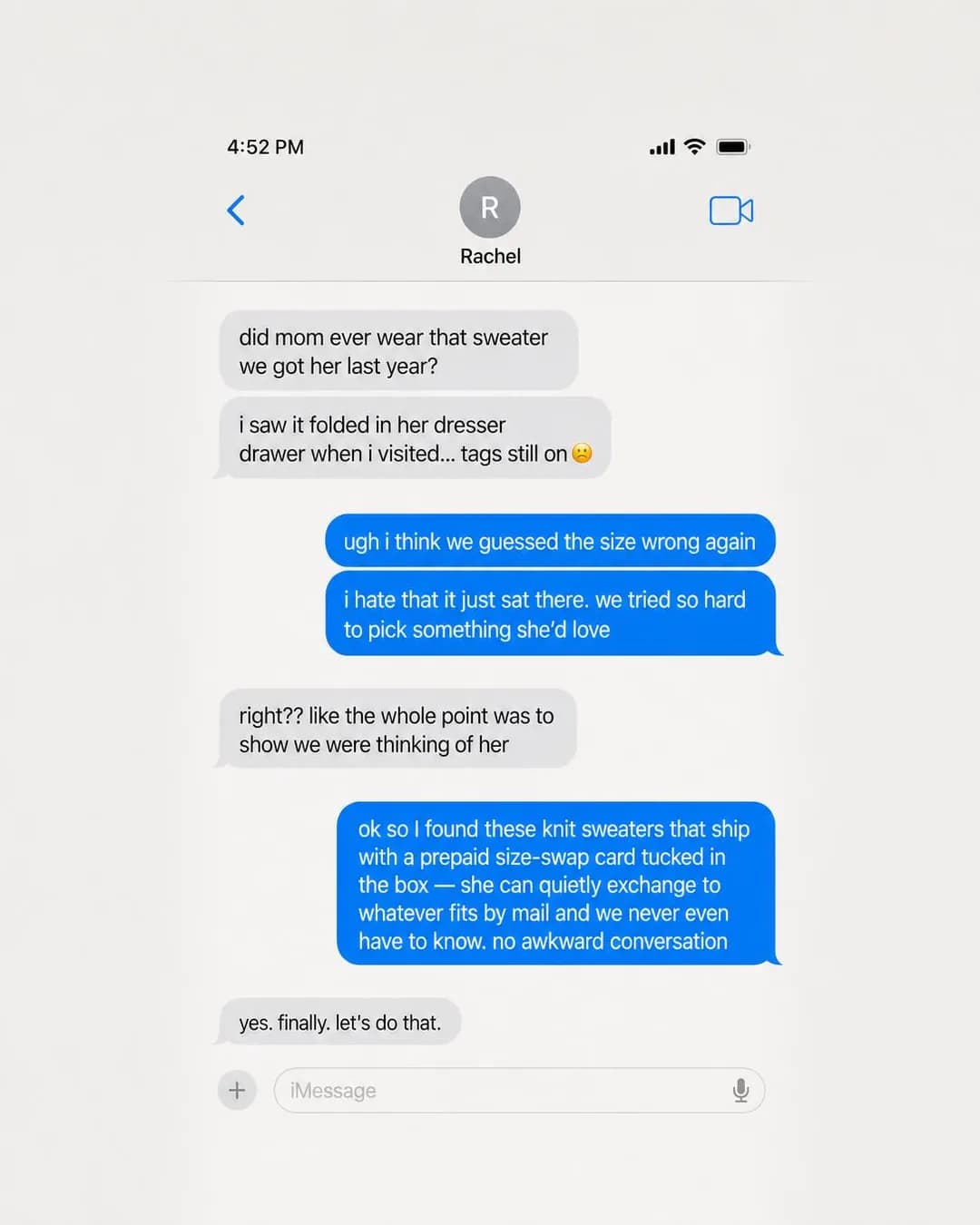
Knitwear gifts that actually get worn
Prepaid exchanges included
Care / Love is the family and gifting is the mode Facebook has and Instagram does not. The insight is sharper than most gift advertising: the failure is not that the present was wrong, it is that nobody could say so. A prepaid exchange card in the box lets the recipient fix the size by post without a conversation, which sells the garment by removing an emotional risk rather than a financial one. Note too that this is the one ad on the page whose copy is about a person — and the person is a third party, not the reader, which is precisely why it stays clear of the policy the rest of the batch is designed around.
The direction is an iMessage screenshot and it is a genuinely effective piece of writing: the tags still on, the drawer, "we tried so hard to pick something she'd love". It is also the batch's most quietly deceptive object. It is a fabricated private conversation between two named siblings about their mother, presented as a real screenshot, and the fact that it is well written is what makes it work and what makes it a fabricated testimonial. The format is not the problem — you can shoot this with two people who agree to it, or write it as an obvious illustration rather than a screenshot — but it cannot ship as a document of something that happened.
Second, smaller, and the same for every screenshot direction in this catalogue: the frame reproduces Apple's iMessage interface closely enough to be recognisable, down to the compose bar and the mic icon. Fine on an article page that labels it a specimen, and a decision worth making deliberately before you spend money running it.
Other headlines from the same run
- No more guessing sizes, ever
- The sweater that won't sit in a drawer
- Gifting without the size anxiety
- They swap sizes. You never know.
Call to action
The exchange card is the reason to buy and not a separate offer, so the button should go to the knitwear with the card described on the page. Get offer is worth testing during a gifting peak, when the card is the promotion rather than a feature.
The Machine Number Tiebreaker
AwarenessTwo jumpers, two tabs, one of them tells you which machine made it.
- Audience
- Someone choosing between two identical jumpers — Has two lambswool jumpers open in two tabs at nearly the same price, cannot tell them apart from the photographs, and is looking for one fact that makes the decision for them.
- Angle
- Behind the Brand (Story & Founder POV) — Shows the people, processes, culture, or operations behind the company.
Two lambswool sweaters open in two tabs. Same price. Same weight. Same photo angle. One of them has a tag with a machine number and a week. That's the one I bought. Not because I needed proof, but because when forty people run the same frames their parents ran, and the tag tells you which one made yours, you're not buying from a spec sheet. You're buying from a building. Five-gauge wool crewnecks knit in one piece, $245, made in the mill we part-own.
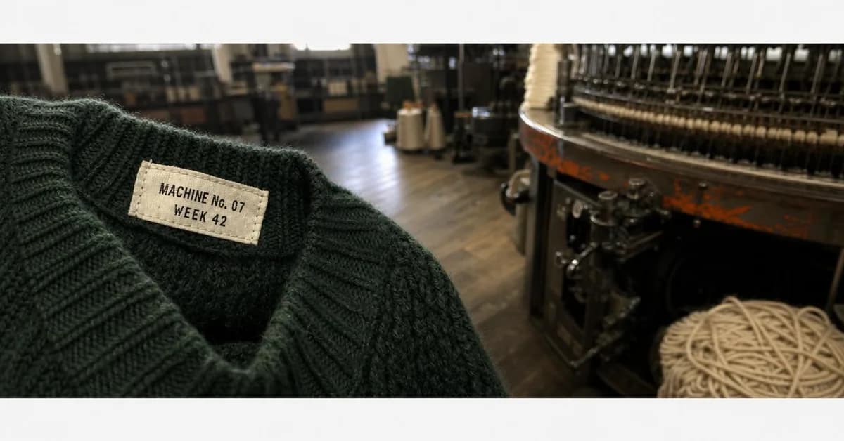
Machine No. 07 made this one
Wool sweaters, $245–$340
Behind the Brand fills the Founder POV row the Instagram twin left empty, and it answers the objection that page raised: a founder story only works when it ends in a design choice a competitor did not make. This one ends in an object. Two lambswool jumpers, two tabs, the same price and the same photograph — and one of them has a woven tag naming the machine that knitted it and the week it was made. That is not a feeling about fashion, it is a tiebreaker, and it is the one argument on this page that is genuinely aimed at somebody who has not decided to buy anything yet, which is why it is the single Awareness buy.
The photograph is the best in the batch and the crop is the worst. A tag against the cast-iron frame it names, the mill floor soft behind it — and the 1.91:1 export is the square draft inset, with a 56-pixel white bar above the picture and a 46-pixel bar below, not even symmetrical. This is the second padded re-frame on this page and the third this cluster has found. It matters most on 1.91:1, because that shape routes to the right-hand column and search results, which render small: losing a sixth of the height to white bars on the smallest surface on the app is the whole asset.
It also cannot run as written. The primary text is in the first person — "That's the one I bought" — from a customer who does not exist, which makes this the second fabricated testimonial in the batch and the second on an ad whose family is not testimonial. The machine number, the week number, the forty people and the three generations are all invented too, and unlike a price they are not placeholders a reader would recognise as such. The structure is worth keeping exactly as it is: name the frame, name the week, put it on the tag. Then it has to be your frame and your week.
Other headlines from the same run
- The tag names the frame
- One mill. Forty people. Your sweater.
- Knit where we spin the yarn
- Same crew. Same frames. Since '60s.
Call to action
An Awareness ad that has just given somebody a reason to choose between two tabs should land on the mill rather than on a checkout — the page that shows the frames is the ad's second half. Shop now is the alternate for retargeting the people who read it.
Questions
- Do Facebook ads still work for clothing brands?
- They work for a customer Instagram does not reach. Pew puts Facebook at 74% of 50- to 64-year-olds and 57% of over-65s, against Instagram's 40% and 19% — a clothing buyer with money whose size the industry has stopped cutting for. What does not work is running your Instagram creative here: that audience is discovering a brand, and this one is trying to replace something they already own and cannot find. Eight of the ten ads below are about getting the same thing again.
- Why does none of these ads mention the customer's age or body?
- Because Meta's personal attributes policy prohibits ads that assert or imply things about the person seeing them, and it names age, disability and physical or mental health. "Trousers for women over 50" and "Struggling with wide feet?" are both inside that list even though they read as ordinary retail copy. The way through is to put the qualifying in the garment: widths E to 6E, a finished waist in inches, a 34-inch inseam. It selects exactly the same people and asserts nothing about any of them.
- What size should a fashion Facebook ad be?
- 4:5 at 1440 × 1800 for the feed, and compose so a square crop out of the middle survives, because Advantage+ placements will take your portrait to Marketplace, which recommends 1:1. Five of the ten below are 4:5, two 1:1, two 1.91:1 and one 9:16. Check the re-framed export rather than the square draft: two of the nine here came back with the square picture inset inside the new frame, with white bars top and bottom, which is a defect you only see if you look at the file you are actually uploading.
- How long should a Facebook headline be?
- Twenty-seven characters, which is shorter than Instagram's 40 and much shorter than most people expect. It is measurable on this page: the ten ads produced fifty headlines and two of them fit. Every specification headline overran — "E to 6E. Cut once. Still available." is 35 — and the two that fit both name a single object rather than making an argument. Nothing is rejected for being longer, Meta truncates, but truncation lands first on the smallest surfaces, so the first three words have to carry the ad.
- Which of these ads could not be run as they are?
- Five, and all five for the same reason: they invent evidence. The wool ad renders a wash log with shrinkage percentages nobody measured. The shoe ad and the mill ad both speak in the first person as customers who do not exist. The gift ad is a fabricated private text conversation between two named people about their mother. And the linen ad stamps a specific Los Angeles garment-district address on a parcel in the one ad whose whole argument is that the address is real. Each note says what the fix is, and the fix is always the same shape: keep the structure, put a true thing in it.
- Can I use these ads?
- Take the approach, not the pixels. Every brand here is invented, every price is a placeholder, and five of the ten are flagged below as must-not-run for reasons that would apply to your version too. What transfers is the pairing of this buyer with an argument about a garment — the block that has not moved since 1998, the last cut in 2004, the exchange card in the box — and the discipline of never making the argument about them. Every angle used is documented in full in our ad angle library, linked from each ad.
Seen enough? Make your own.
Paste your store. It reads your products, your customers and your look, then writes the concepts, renders the images and drafts the copy — for the one feed already full of clothes.
No credit card · 50 free credits (about 5 ads or Instagram posts)
Every angle used above is documented in the best-in-slot ad angle library. More industries and placements are at all ad examples.