
Ad Guides · Gyms & Fitness Studios × Facebook
Facebook ads for gyms and fitness studios
You choose the export. Facebook chooses the frame. Here is how to advertise a gym on an app that will render your ad in nine places you did not pick.
Almost every gym ad running on Facebook was made for Instagram. Same portrait export, same thirty-five-character headline, posted to both because Meta makes that one checkbox — and then cropped, truncated and re-rendered on arrival by a system that was never asked. That is not a small inefficiency. Meta's own ads guide recommends a 27-character headline for a Facebook Feed image ad and 40 for Instagram Feed, so the headline that fits comfortably on one app is a third too long on the other, from the same file, on the same day.
This page is the playbook for the app rather than the export: which of the six objectives a membership deserves and which a class pack does, the offers a 24/7 access gym has that a boutique studio does not, what to do about Marketplace asking for a square when the feed asked for a portrait, whether the click should land on an Instant Form, a landing page or an actual phone call, and how to budget for a business whose real cost is not the join but the month the member stops coming. Every platform claim is footnoted and dated at the bottom.
The structural fact underneath all of it is that Facebook is not one surface. Meta's placement picker for an image ad lists the feed, in-stream video, video feeds, Marketplace, Stories, ads on Reels, search results, Business Explore and the right-hand column. Leave Advantage+ placements on, which nearly everybody does, and one image and one headline are rendered into all of them. The recommendations for those surfaces disagree: 4:5 and 27 characters in the feed, 1:1 and 40 characters with a 30-character description in Marketplace. So the discipline this app asks for is not a policy discipline, it is a compositional one — write to the shortest budget and design the portrait so it survives being cropped square, because the placement you did not think about is the one holding your reader.
The second thing to know is who is here. Pew's November 2025 survey puts Facebook at 68% of adults aged 18 to 29, 80% of 30- to 49-year-olds and 74% of 50- to 64-year-olds, against Instagram's 80%, 62% and 40%. That is not a small skew and it decides the whole page: the boutique studio's core member is on the other app, and the person weighing whether a monthly charge is worth keeping is on this one. So this guide leans 24/7 access gym — six of the twelve offer rows below are its, three are the studio's and three fit either, which is the exact mirror of the Instagram twin — and the arguments it recommends are about fees, notice periods, pauses, off-peak hours and what happens on the day attendance drops.
The ads are real output, not mock-ups. Seven come from the ten on the gym and studio Facebook examples page, published exactly as generated for gyms that do not exist. Four of those ten must not be run as they stand, and the reason is worth carrying into every brief you write here: not one of them is about a body, which was the Instagram page's whole hazard. They fail by claiming to know things — three invented operating statistics rendered into an email preview, a whiteboard that draws close to a hundred tally marks under a label reading thirty and then cites an adherence rate against an industry average nobody has, a QR code that resolves to nothing, and a competitor's payroll stated as fact. On Instagram this trade's risk is what the ad says about the reader. Here it is what the ad claims to have measured. No benchmark numbers anywhere; the budget section gives you arithmetic to run on your own figures instead.
Generate Facebook ads for your gym or studio
Paste your site and best-in-slot reads it the way these invented gyms were read — rates, hours, contract terms, coaches — then writes the concepts, renders the images and drafts the copy. Free to start, no card.
You choose the export. Facebook chooses the frame.
Nine image surfaces on this app against Instagram's four, and they do not agree with each other about what an ad should look like. Meta recommends 4:5 at 1440 × 1800 for Facebook Feed, with primary text of 50 to 150 characters and a headline of 27 — and it lists no description line at all. For Facebook Marketplace it recommends a 1:1 image at a minimum of 1080 × 1080, primary text of 125, a headline of 40 and a description of 30. Both are filled from the same ad the moment Advantage+ placements are on. There is no export that satisfies both, which means the choice is which one to lose, and the answer is to write the headline to 27 and compose the 4:5 so that the square crop out of its middle is still the ad.
It is worth knowing how badly a normal run misses that, because it is not close. The ten ads on the Browse page produced fifty headlines between them. Five are inside Facebook Feed's 27 characters; forty-five are inside Instagram's 40. Of the ten headlines the ads actually lead with, exactly one clears 27 — a 22-character line on the win-back ad, which is also the best headline in the batch and almost certainly not a coincidence. Every primary text overruns 150, running from 218 to 542 characters. Nothing is rejected for length; Meta truncates. But truncation happens first on the smallest surface, so the first clause is the ad and everything after it is for the reader who already stopped.
The third difference is shape, and here Facebook is the generous one. It allows 3% aspect-ratio tolerance where Instagram allows 1%, so a crop a few pixels out of true passes here and fails there from an identical file. It also has the surfaces that want a wide asset — the right-hand column and search results — which Instagram does not. Note carefully what that does and does not mean, because this cluster had it wrong until 7 September 2026: Instagram Feed's technical requirements accept aspect ratios from a minimum of 4:5 up to a maximum of 1.91:1, so the wide image is not refused there. What is missing on that app is a placement built to reward it. On Facebook there is, which is why the Browse page carries two 1.91:1 ads, one 1:1 and one 9:16 alongside its six portraits, and its Instagram twin carries only two shapes.
Fourth, the demographic, which is why this page argues about contracts. Facebook reaches 80% of 30- to 49-year-olds against Instagram's 62%, and 74% of 50- to 64-year-olds against 40%. In those bands a gym membership is a recurring household charge that has been signed before, cancelled before, and in a good many cases forgotten about for eight months. That reader is not deciding whether to train. They are deciding whether this particular line on the statement earns its place — which is why the annual fee, the notice period, the pause policy and the off-peak rate are the offers with the most range on this app, and why the one Sales-objective ad in the Instagram batch has no counterpart here. The class pack is the only thing this trade sells that completes at a checkout, and it belongs to the studio.
Finally, the thing that does not change with the app. Fitness is not a special ad category — Meta's Marketing API accepts four, and health and fitness is not among them — so age, radius, lookalikes and exclusions all survive, and every campaign must still declare a value even when that value is NONE. The Health and Wellness standards' 18+ floor attaches to what an ad markets rather than to the trade, exempting fitness services and health clubs marketed for general wellbeing, and the prohibition on statements of inferiority about physical appearance applies everywhere. The Instagram guide is where that argument is made at length, and none of it is weaker here. It is simply not what goes wrong on this app.
Which objective to buy
Six objectives, and on this app the answer is narrower than on Instagram, for a reason that is really about which half of the trade is here. A boutique studio sells a class pack, which is a fixed-price thing genuinely bought in a browser. A 24/7 access gym sells a membership, which is signed rather than bought — and the access gym is who Facebook reaches. So the distribution tightens toward Leads and away from Sales, and the Browse batch reflects it: seven Leads, two Traffic, one Awareness, and no Sales at all, where the Instagram batch carried one.
That seven-two-one split is the same one the dentist and real estate Facebook batches landed on. Objective is pinned metadata here rather than something the run discovers, so three identical splits are three briefs agreeing rather than an emergent finding — but the agreement is telling anyway. The Facebook cell of every local trade in this cluster is a first-appointment machine, and the appointment is the product. For a gym that appointment is a tour, a trial session or a re-start consultation, and everything below is downstream of getting one booked.
The place to be careful is the second row. Traffic looks like the safe answer on an app full of arguments, and this trade has more arguments than most: the pause policy, the off-peak window, the fee list, the reviews you publish. But Traffic optimises for the click and stops caring, and a gym's whole problem is what happens after the click. Buy it for the two or three claims that genuinely cannot be believed inside an ad, retarget the readers with a Leads campaign, and resist the temptation to make it the default because the landing page looks good in a report.
- LeadsDefault
Most of the budget, and more of it here than on Instagram. A tour, a trial session, a re-start consultation, a rate lock — anything whose next step is somebody physically arriving. Seven of the ten Browse ads are pinned to it. Choose the conversion location deliberately: Instant Form on Higher intent, or a call, which on this app is a real option and often the better one. See the destination section.
- TrafficSometimes
For the two or three claims a reader will not take on trust from an ad — a pause policy with real terms, a published complaints log, a contrarian argument about training frequency. Two of the ten Browse ads sit here. Cap it: Traffic buys attention and then loses interest, and the same reader is worth far more inside a Leads campaign a week later.
- AwarenessSometimes
Buyable, because the radius and age levers survive, and genuinely useful for the owner-voice ad that explains a price rather than offering one — the single Awareness ad in the Browse batch is a letter from the person who owns the studio. Give it the feed rather than Stories: it is 200 words, and a 9:16 full-screen placement will bury it, which is exactly what happened to the one on the Browse page.
- SalesRarely
The inverse of the Instagram twin's advice, and for a structural reason rather than a preference. Sales needs a purchase event at a checkout, and the only thing this trade sells that way is a class pack or an intro offer — the studio's products, on the studio's app. An access-gym membership that needs a tour or a signature is a lead however much the pricing page wants it to be a sale. Buy Sales here only if your join flow genuinely completes online, and then read the section on the learning phase before you set the budget.
- EngagementRarely
It optimises for the cheapest available reaction, and this app has a specific failure mode the other one does not: inside a two-mile radius the cheapest reaction is a current member commenting on your ad, in public, about the thing they are unhappy with — under a post that links to a Page carrying their recommendation. If conversations are how you actually book, buy Leads with a messaging conversion location and pay for the conversation instead.
- App promotionNo
The door-unlock app is installed after somebody joins. Paying a stranger's install cost to deliver a keycard screen for a building they have no membership to is the most expensive lead in the account, and on this app's demographics it is also the least likely to be installed.
What to advertise: the access gym's offers first, then the studio's
The order is reversed from the Instagram twin on purpose. That page leads with the studio because its reader is there; this one leads with the 24/7 access gym for the same reason, and the difference is not cosmetic. A studio sells a coach, a capped room and a schedule, and its arguments are proof and story. An access gym sells a building and a contract — price, hours, notice, what happens when you stop coming — and its arguments are objection-handling, mechanism and economics. The six rows below are the access gym's, the next three are the studio's, and the last three fit either. The 'who it is for' line on every row says which.
Each row pins four decisions: who buys it, the angle family that argues it (each one a page in the angle library), the objective to buy it under, and the finished ad on the Browse page that shows it working. Ten rows have an example and two do not. One of the two is the intro offer, which the batch has now skipped twice because it is worthless without a real published price and a real end date. The other is the partner or household membership, which is the offer this app's demographics most obviously support and which nothing in the batch was briefed for — write it first, from your own rate card.
One thing runs across all twelve and it is the same rule the Instagram page ends on: none of them sells a result. The reason on this app is slightly different, though. It is not only that the standards restrict the weight-loss claim; it is that the reader in the 30-to-64 bands has been sold that result before, by a gym they subsequently cancelled, and the argument that survives contact with that memory is an argument about terms.
A membership that pauses
Leads- Who it is for.
- Access gym — members in their forties and fifties whose year is interrupted by surgery, a work posting or a parent who needs looking after, and who have twice cancelled because no pause was offered.
- Angle.
- Objection & Risk Reversal — The best-targeted offer on this page and the least advertised. The reason this reader cancels is almost never motivation, and a gym that lets them stop paying for eight weeks keeps a member it would otherwise have to reacquire at full cost. Advertise the mechanism, not the sentiment — how long, how often, what happens to the rate, and whether anyone has to be asked. Do not require a doctor's note: it is a worse offer and it walks you into collecting health information.
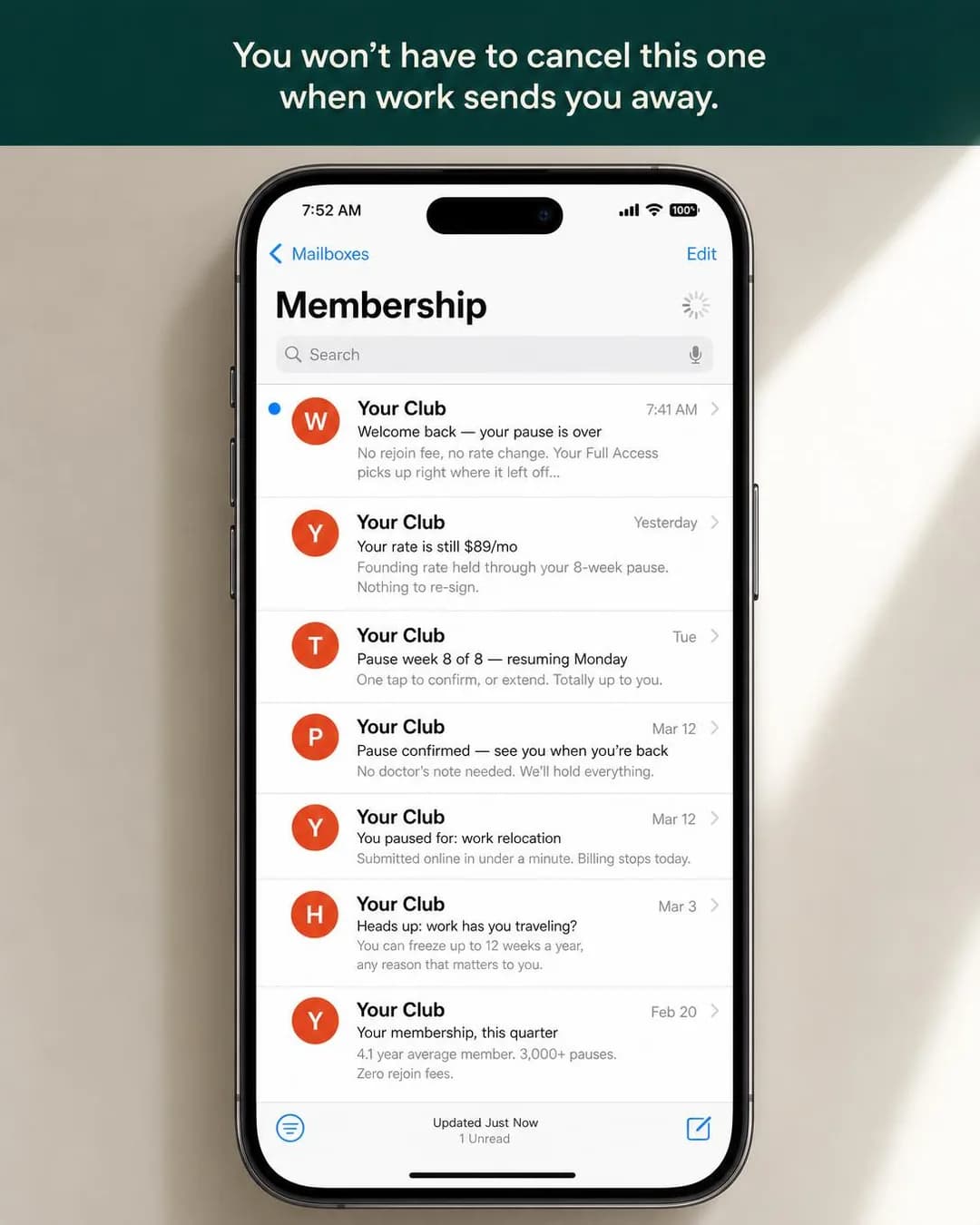 Example adPause up to 12 weeks a year. No fee.See the brief →
A timed tour and a printed price list
Leads- Who it is for.
- Access gym — people who will not walk in because of what happens after the tour, having once been kept forty minutes while somebody fetched a manager to approve a discount expiring that day.
- Angle.
- Product & Mechanism — Product Demo of a process rather than a product, which is the move to take from this page. The dread is the sales room, so put the sales process itself on display: a fixed number of minutes, a printed sheet, the same prices for everyone who walks in that day. Beware the hollow guarantee — 'fifteen minutes or the visit is free' costs nothing when the visit was already free.
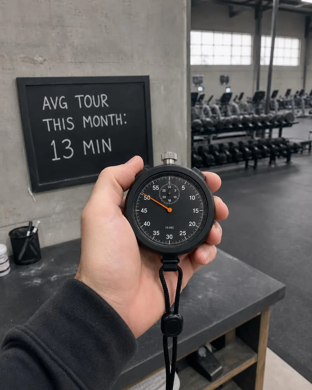 Example adFifteen minutes or the visit is freeSee the brief →
The off-peak rate
Leads- Who it is for.
- Access gym — shift workers, home workers, the retired and the between-jobs, who can train at eleven in the morning and are paying a full rate to use a building at the one hour it is full.
- Angle.
- Offer & Economics — The row the Instagram guide could not illustrate, because it needs a real published price — and the one this app's demographics support best. Price Anchoring works here because both prices are real products rather than a fake 'was' figure. Point the hook at the actual trade: what the reader gives up is the evening and the weekend, not the hours they are asleep, and a reader who learns that on the first Saturday cancels.
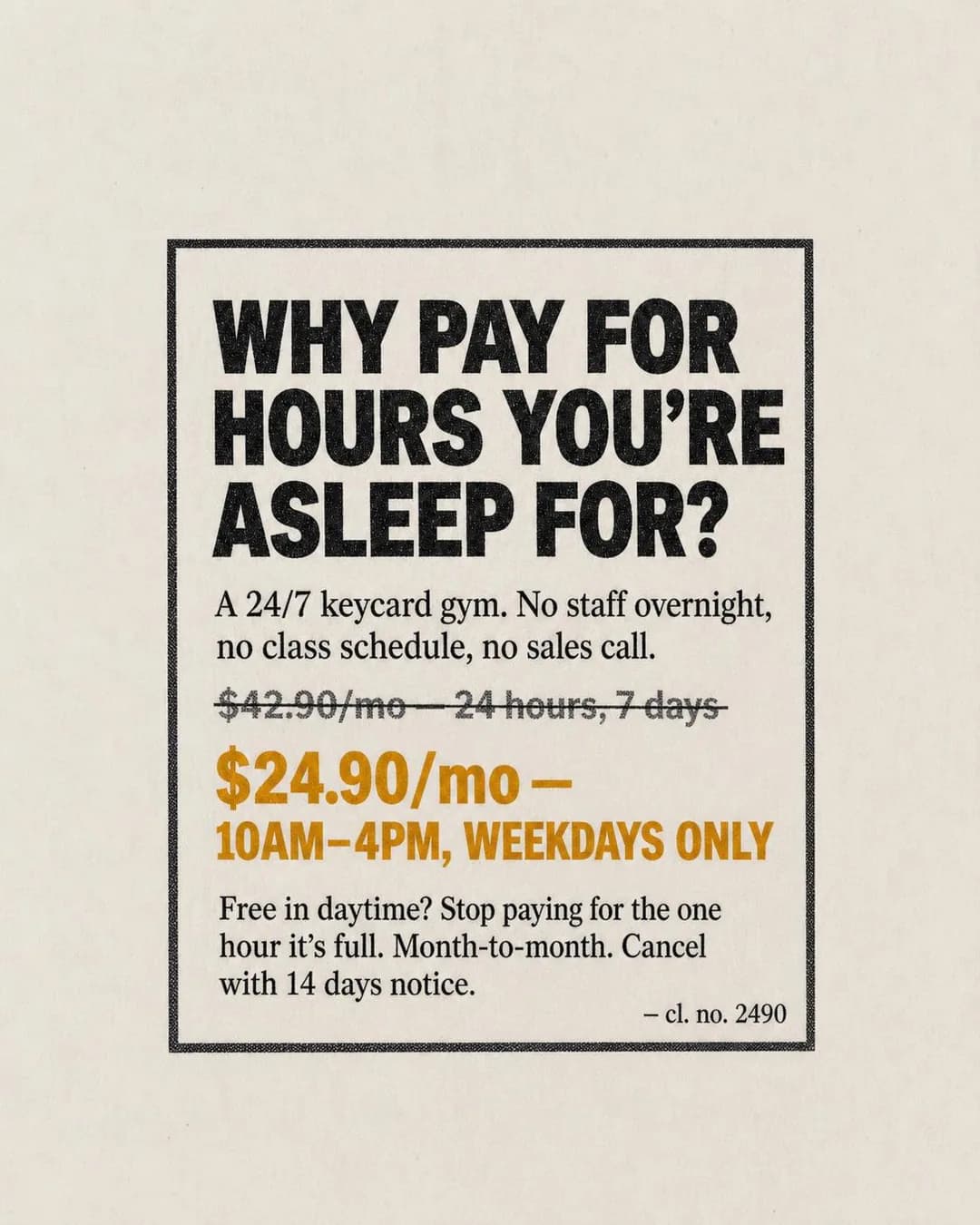 Example adPay for the hours you actually useSee the brief →
The rate held for whoever left
Leads- Who it is for.
- Access gym — former members who trained for years, stopped for a reason that has since passed, and are held back mainly because going back feels like admitting they stopped.
- Angle.
- Identity & Emotion — The cheapest acquisition in the building, and Facebook is where these people are. Nostalgia is nearly always executed as a sepia barbell; produce the specific object instead — a training log, a locker number, a rate that has not moved. This is also the row where creative and ad set are one decision: shown to a stranger it is a sentence about somebody else's life, and shown to a current member it is a rate they are not getting.
 Example adYour file's still hereSee the brief →
Instructions on every machine
Leads- Who it is for.
- Access gym — adults who walk past half the equipment because nobody ever showed them, and would rather pay for a gym they use a third of than ask.
- Angle.
- Benefit & Outcome — Ease is a weak family in most trades because everybody claims it. Here the obstacle is precise, silent and expensive: the reader is already paying for equipment they will not touch. A card at eye level on every machine is a cheap, physical, photographable answer, and it is a better first-visit argument than any discount for a reader whose real objection is embarrassment.
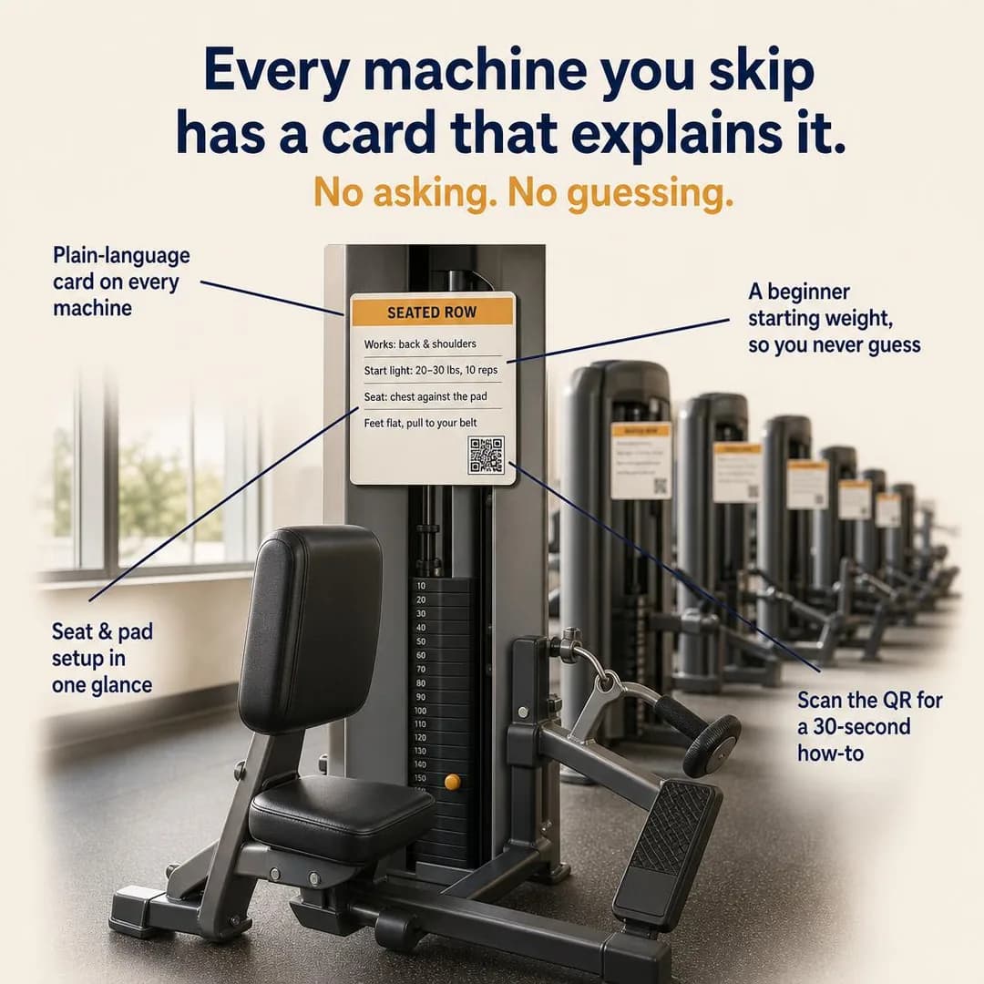 Example adEvery machine explains itselfSee the brief →
Your own bad reviews, answered
Traffic- Who it is for.
- Studio — people who read the one-star reviews first and judge a business on whether anybody replied and whether anything changed.
- Angle.
- Proof & Trust — Native to this app in a way nothing on the Instagram twin is: the ad and the Page carrying your recommendations are one tap apart, so the reader will find the complaints whether you show them or not. Going first is a claim about judgement that no five-star wall can make — especially the review you declined to act on, with the reason. Choose the set so the average is representative; a grid of interesting complaints reads as a warning before it reads as honesty.
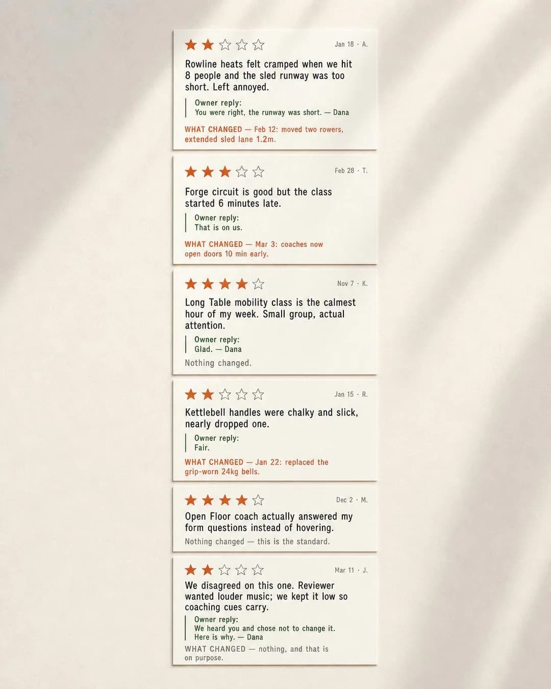 Example adWe post our one-star reviews on purposeSee the brief →
The waiting list, published
Leads- Who it is for.
- Studio — people comparing studios who once bought a pack on the strength of a timetable and found the only class that fitted their week was full every time.
- Angle.
- Scarcity, FOMO & Timing — The one honest form of scarcity a studio has, because it is a fact with a mechanism rather than a countdown. Publishing the queue also does the qualifying the ad set cannot: a reader who can see that Thursday morning has space self-selects into the class you actually want to fill. Keep every number a statement about the studio, never about the reader — a cold ad cannot know where anybody stands in a queue.
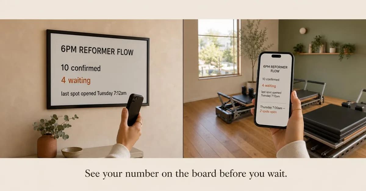 Example adSee your place in line before you waitSee the brief →
Why the class costs what it costs
Awareness- Who it is for.
- Studio — people holding a chain's monthly figure in their head as the price of training, who can see the studio is better without being able to say why.
- Angle.
- Story & Founder POV — The hardest sub-angle in the library to write without whining, and the right one for an owner who is genuinely more expensive. Concede the comparison in the first line, then itemise: people in the room, how the coaches are paid, what the contract does not do. Hedge any claim about how a competitor pays its staff — you have not audited them, and the whole letter's credibility rests on sounding like the one person in the category who only says what they can back.
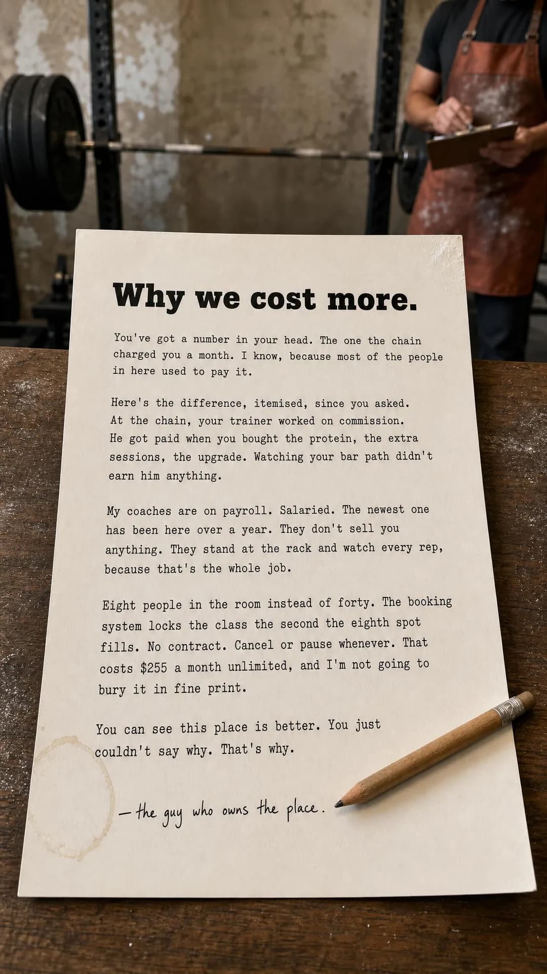 Example adCoaches on payroll, not commissionSee the brief →
Twice a week, kept up
Traffic- Who it is for.
- Either — people who have started five times a week three times, stopped by February each time, and concluded the problem is them.
- Angle.
- Comparison & Positioning — Myth Busting earns its place when the myth is one the reader is punishing themselves with, and 'four times a week or it doesn't count' is exactly that. The arithmetic does the arguing — thirty sessions against a hundred — and it needs no help from a retention statistic you cannot produce. If you draw the comparison, count what you have drawn: the Browse page's version got both sums right in the caption and then drew both heaps the same size.
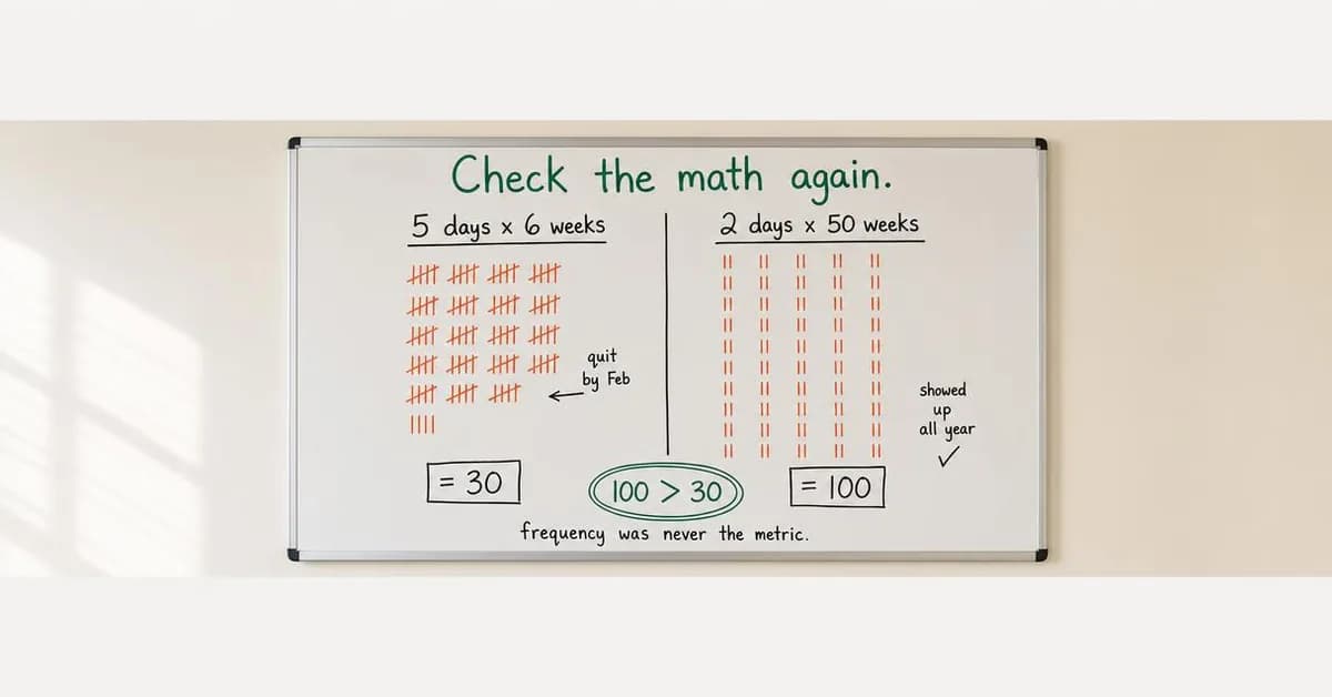 Example ad100 sessions beats 30 every timeSee the brief →
The second person on the same account
Leads- Who it is for.
- Either — a household in the 35-to-60 band where one person is already a member and the other has been meaning to for a year.
- Angle.
- Offer & Economics — The offer this app's demographics most obviously support and the one nothing in the batch was briefed for, so it has no example here and is the first thing to write yourself. It is also the only acquisition in this trade where somebody else does the persuading — price the second membership, name the shared direct debit, and let the existing member forward the ad. Needs a real rate and a real rule about what happens when one of the two leaves.
No example ad for this offer on the examples page yet.
The intro offer
Leads- Who it is for.
- Either — the reader who has three tabs open and will join whichever of you makes the first visit cost the least to walk away from.
- Angle.
- Offer & Economics — The most-run ad in the category and the row both batches have now deliberately skipped, because it is worth nothing without a real published price and a real end date. Two weeks unlimited for a fixed figure, a first session free, a day pass at the posted rate. Write it from your price list rather than a template, and put the terms on the page the button goes to, because this reader will look for them.
No example ad for this offer on the examples page yet.
Every lever survives — and the one that decides this app is the one nobody touches
Start with the declaration, because it is compulsory and it is where an inherited habit costs you the whole account's precision. Meta's Marketing API accepts four special ad categories — housing, employment, financial products and services, and social issues, elections and politics — and fitness is not among them. But every campaign must specify something: pass NONE or an empty array. If you or your agency also runs a housing or a lending account, check the category on the first campaign you build here, because a carried-over HOUSING selection is enforced with a hard error on the audience side and silently costs you custom age, saved audiences, lookalikes and any radius under fifteen miles. A gym giving those away is giving away everything.
The lever that actually decides this app, though, is the one most accounts leave on automatic: placements. Advantage+ placements will render your ad into the feed, Marketplace, search results, the right-hand column, Business Explore, Stories, Reels, in-stream video and video feeds, from one image and one headline, and the recommendations for those surfaces disagree — 4:5 and a 27-character headline in the feed, 1:1 and 40 characters in Marketplace. That is usually the right trade, because restricting placements restricts delivery and a single-site gym has little enough evidence as it is. But it is a trade you should make knowingly: either write and compose to the strictest surface, or turn off the placements you have not designed for and accept the smaller pool. What you should not do is discover in a report that most of your impressions were served somewhere your headline was cut in half.
Then the levers themselves, all of which survive. The thing worth saying about age on this app is that it does real work here in a way it barely does on Instagram: the 30-to-64 bands are where Facebook's advantage is, and they are also where the difference between a 6am lifter, a midday off-peak member and a lapsed member of four years is largest. Band the age to the offer, and set the bottom to your own membership terms rather than to eighteen out of habit. Geography for an access gym is a route rather than a circle — the shift worker trains between work and home, so a pin on the building and a pin on the industrial estate two miles out are both your catchment, and one wide radius is the lazy version of both.
Two cautions carry over from the Instagram guide unchanged, because they are about data rather than about the app. A member list is a usable seed and a usable exclusion, unlike a patient list — but Meta's Business Tools terms prohibit data based on health information including the names given to events, conversions and custom audiences, so name events for the action rather than the goal. 'Trial Booked' is the same event as 'Weight Loss Consult' and only one of them gets flagged. And exclude current members from every acquisition ad set: inside a two-mile radius, an ad offering a held rate to whoever left will reach somebody paying more than that rate on day one, and what arrives is not a lead but a conversation at the front desk.
- Special ad categoryDeclare NONE
- Fitness is not one of the four, but the field is required on every campaign. Check it explicitly if the same business manager runs a housing or lending account — an inherited category is enforced as a hard error and takes custom age, lookalikes, saved audiences and your radius with it.
- PlacementsThe one to think about
- Advantage+ fills nine image surfaces from one ad, and their recommendations disagree — 4:5 with a 27-character headline in the feed, 1:1 with 40 in Marketplace. Leave it on and design for the strictest surface, or restrict it and accept a smaller pool. Deciding by default is the only wrong answer.
- AgeBand it to the offer
- This is where Facebook's advantage lives — 80% of 30- to 49-year-olds and 74% of 50- to 64-year-olds — and the offers differ sharply across it. Set the floor to your membership terms, not to 18 by habit. Exempt from the Health and Wellness 18+ rule while the ad sells fitness and access; mandatory 18+ the moment it markets weight loss.
- RadiusUse it, as a route
- The API's custom-location floor is 0.63 miles or one kilometre. An access gym's catchment is the journey between work and home rather than a circle around the door, so add a second pin instead of widening the first, and let delivery tell you when it is too tight.
- Detailed targeting (interests)Rarely
- Inside a two-mile radius the geography is already the targeting, and a fitness interest is mostly people who have a gym. Layering it on a small radius usually leaves an audience too thin to leave the learning phase, which costs more in delivery than the precision was worth.
- LookalikesUse it
- Seed from members who are still attending after six months rather than from everyone who ever joined — this trade's whole economics are in the difference, and a lookalike of your churn is an expensive thing to buy.
- Custom audiencesUse it
- The pages that cost something to read are the good signal here — the fee list, the pause terms, the complaints log — over the timetable, which anybody browses. And then the audience this app has more of than the other: people who used to be members.
- ExclusionsUse it
- Current members out of every acquisition ad set, and out of the win-back ad first. A held-rate offer shown to someone paying more than the held rate is a complaint, and inside a small radius it happens on day one.
- Event and audience namesCareful
- The label is the data as far as Meta's Business Tools terms are concerned, so a conversion named for what the member wanted is a health-data flag and one named for what they did is not. Tour Booked, Trial Attended, Pack Purchased.
Instant Form, landing page — or a phone call?
This app has a destination the other one effectively does not, and for an access gym it is often the right one. Call ads are mobile-only, deliver on Facebook Feed, Marketplace, Reels and Video feed as well as Instagram Feed and Stories, and — this is the part that matters — Ads Manager reports calls placed, 20-second calls and 60-second calls as separate metrics. That last column is the thing no form gives you. A submitted Instant Form tells you somebody tapped; a 60-second call tells you somebody described their week to your front desk, which for a business selling a tour is most of the qualification done before anyone has driven anywhere. If your desk is staffed during the hours you advertise, buy the call and optimise on the 60-second column rather than on volume.
When you buy the form instead, buy the Higher-intent type. Meta's two Instant Form types differ by one step: More volume submits in a thumb movement from pre-filled profile data, Higher intent adds a review screen. That screen is a filter you are paying for on purpose, and this app is where it earns most — a cheap lead from a 55-year-old who half-remembers tapping something is the most expensive kind of lead a gym can buy, because the no-show costs a tour slot and the follow-up call costs the front desk twenty minutes. Add one qualifying question that changes what happens next: which hours you would use, or whether you have trained before.
The landing page is the answer for anything that has to be believed before it can be acted on, and this trade has more of those than most. A pause policy with real terms, a fee list with nothing under it, a published complaints log, an argument about training frequency — none of them survives compression into a form. Send the click, let them read, and retarget with the Leads ad a week later. Class packs and intro offers, where you have them, go to the checkout.
Never the homepage, and on this app there is a second never: not the Facebook Page either. It is tempting, because the Page is where the reviews and the photos and the opening hours already are, and because the ad is already on the same app. But a Page has no offer on it, no form, and a feed of your own posts competing with the one thing you just paid to say. Use the Page as the thing your ad is checked against, which it will be, and send the click somewhere that can convert it.
The recommendation: Access gym with a staffed desk: buy the call and optimise on 60-second calls, not volume. No staffed desk: an Instant Form on Higher intent with one qualifying question. Anything that has to be believed first — the pause terms, the fee list, the complaints log — gets a landing page and a retargeting ad. Packs and intro offers go to a checkout. Never the homepage, and never your own Page.
Creative direction
The first rule is the one this app enforces without telling you: write the headline to 27 characters and compose the portrait so that a square crop out of its middle is still the ad. Meta recommends 27 for Facebook Feed and 40 for Instagram Feed, and 1:1 for Marketplace against 4:5 for the feed, and Advantage+ placements will take one file into both. Of the fifty headlines the Browse batch produced, five fit the Facebook recommendation and forty-five fit the Instagram one — which is what happens when creative made for the other app is posted here, and it is happening in most gym accounts right now.
The second rule is where this batch went wrong, and it is a different failure from the Instagram twin's. Every one of that page's hazards was about the reader's body. Not one of these is. Instead, four of the ten: a membership ad with three invented operating statistics rendered into an email preview, where no alternate headline can reach them; a whiteboard whose caption arithmetic is perfect, whose tally field draws close to a hundred marks under a label reading thirty, and whose body copy quotes an adherence rate against an industry average that does not exist; an equipment ad instructing the reader to scan a QR code drawn by a model that cannot encode one; and an owner's letter describing a competitor's payroll as certainty. The diagnosis is common to all four — the ad reached for proof and invented it. On this app, where the reader is older and comparing terms, the pull toward proof is strong and the cost of faking it is a Page full of recommendations sitting one tap away.
The third is the practical version of the same thing, and it is the rule the previous batch handed over: if a number, a clock, a calendar or a screen carries your claim, composite it from something real. That rule held here in the places it predicted — a fee list whose twelve times $42 is genuinely $504, a training log whose lifts progress consistently across two pages, a review grid where every fix postdates the complaint it answers, and a waiting list that reads identically on a wall board and on a phone in the same frame. It needs one extension. Checking a rendered sum and checking a rendered quantity are two different checks, and the whiteboard passed the first and failed the second in the same image.
- Write the headline to 27 characters. Meta recommends 27 for Facebook Feed and 40 for Instagram Feed, and one of the ten Browse headlines clears 27 while all ten clear 40. The shortest surface decides.
- Compose the 4:5 so a square crop out of its middle is still the ad — Marketplace recommends 1:1, and Advantage+ will take your portrait there without asking.
- The first clause is the ad. Every primary text in this batch overruns Meta's 50–150 recommendation, at 218 to 542 characters, and truncation lands first on the surfaces that convert cheapest.
- Never invent a number about yourself. Three rendered operating statistics, an adherence rate and an industry average sank four of these ten, and on this app the reader can check you against your own Page in one tap.
- Never state as fact how a competitor charges, pays or contracts. Hedge it — 'most big-box trainers are paid on what they sell' costs one word and loses nothing.
- Check rendered quantities, not just rendered sums. The whiteboard got 5 × 6 = 30 and 2 × 50 = 100 right in the caption and then drew both heaps the same size.
- Check every rendered date against today's. Four times in three batches this pipeline has built a coherent set of documents and anchored them to its own sense of now — an inbox in March, a training log dated to a Tuesday that only existed in 2024.
- Do not draw a QR code, and do not tell anyone to scan one. A generated code encodes nothing, and the reader is already holding the phone that would have to read it.
- Match the shape to the argument. A 200-word letter at 9:16 is unread, and a whiteboard of handwriting at 1.91:1 routes to surfaces that render it small.
- Every specific is a promise the building has to keep — fifteen minutes, twelve weeks, ten to four, no rejoin fee, two taps. On this app the reader checks, and the place they check is the Page under your ad.
- Decide which of your two businesses the ad is for before you write the first line, and let the six-to-three weighting on this app decide the ratio across the account.
- Real people only, and if you cannot photograph them yet, do what the best ad in this batch did: sign it 'the guy who owns the place' and crop the frame at the neck.
Funnel structure
Three stages, and on this app the third is bigger than it is on Instagram. Facebook reaches 80% of 30- to 49-year-olds and 74% of 50- to 64-year-olds, which is where the people who used to be members of something are — and the lapsed member is the cheapest acquisition this trade has. They know where the machines are, they left for a reason that may no longer apply, and the objection is embarrassment rather than price. So the shares below shift about ten points out of cold and into the list you already own, which is the opposite of what most single-site gyms do.
Keep the structure this simple deliberately. A single-site budget is small against the evidence Meta's delivery system wants, and every extra ad set divides the same evidence into thinner piles. Variation belongs at the ad level — the access-gym ad and the studio ad live in the same ad set if you run both — not at the ad-set level. And do not build a separate ad set per placement to solve the shape problem; solve it in the creative, which is what the section above is for.
Cold
≈50% of budgetAudience. Two pins rather than one circle — the building, and wherever the commute starts — with the age band set from the offer, interests off, and everyone who already pays you removed.
Running. Four ads at most, weighted toward the access gym. The call is the conversion location wherever the desk is staffed; the fee list and the pause terms are the only two things worth buying Traffic for.
Warm
≈20% of budgetAudience. Anyone who read a page that costs something to read — the fee list, the pause terms, the complaints log — plus abandoned form opens, over the last 30 to 90 days.
Running. The offer they were reading toward, and nothing else: the timed tour after the price list, the off-peak rate after the timetable, the held rate after the terms page. Leads throughout.
Lapsed and current members
≈30% of budgetAudience. The two halves of your own database, and they behave nothing alike: people who stopped, who are the largest untapped audience most gyms own; and people who have not, who belong nowhere else on this list.
Running. For the lapsed, the held rate and the waived rejoin fee — the strongest single ad in the Browse batch. For the current, the second membership on the same account and the referral month. Run in bursts, not always-on.
Budget and testing, when the real cost arrives three months after the join
Do the learning-phase arithmetic first, because it tells you how much of Meta's optimisation you are actually buying. An ad set needs roughly 50 optimisation events a week to leave the learning phase; below that it sits in 'learning limited', which is not a penalty so much as the system saying it cannot optimise on what it has. Take your own cost per booked tour, whatever it genuinely is, and multiply by 50: that is the weekly spend at which one ad set has full information. For a single-site gym the honest answer is usually a fraction of it, which is exactly why the funnel above has three ad sets and not nine. Then leave it alone — pausing an ad set, or changing its optimisation event, audience or creative, is a significant edit and restarts learning, and in a trade where the owner is also on the floor, the daily adjustment is the most expensive habit available.
Now the part specific to this app, and it is not the January auction — that argument belongs to the Instagram page, and it is about a studio's peak. The access-gym version of the calendar is a retention problem wearing a seasonal costume. A member acquired in January has a notice period, and if yours is thirty days after a twelve-month term or fourteen days on a rolling contract, the first honest read on that cohort is not available until March or April. Which means a January account that looks superb on cost per join in week three is an account you cannot yet evaluate, and the temptation is to scale it exactly then. Hold the budget flat through the peak, spend the month before it while the auction is quieter and the reader is already deciding, and make the scaling decision when the first cancellation window has closed.
That reframes what to optimise. Cost per join is the number the platform will show you and the one that misleads hardest here, because the cheapest join in this trade is reliably the one that cancels first. The number that decides whether the ads worked is months retained per join, by ad — how many billing cycles the people from each creative actually completed. It takes a spreadsheet and a quarter to see, and it will usually tell you that the ad about the contract outperformed the ad about the discount by a distance that no in-platform metric ever suggested.
One last cost this app has and the other does not. Your ad sits one tap from a Page carrying recommendations, and a business can turn Recommendations off. Turning them off is itself visible, and it is the wrong fix. If you are about to spend meaningfully on Facebook, budget a fortnight of somebody's time to reply to the recommendations you already have before the first ad runs — it is cheaper than the impressions it saves, and the ad on the Browse page built entirely out of answered complaints is the argument for why.
- Test the offer, not the headline — but test the headline length once, deliberately, because 27 characters against 35 is the single cheapest experiment available on this app.
- Give every test a full week before you read it, and do not start a second one inside it — two changes in five days is one result you cannot attribute.
- Read cost per attended tour, not cost per lead, and then months retained per join by ad. The second one takes a quarter and is the only number that has ever settled this argument.
- Check the placement breakdown before you blame the creative. If most impressions landed somewhere your headline was truncated, you tested a different ad from the one you wrote.
- Watch the disapproval column as a signal about claims rather than about compliance. In this category on this app, a rejection is usually a number you could not substantiate.
- Check the ad set left the learning phase before you draw any conclusion from it at all — a verdict on creative that was really a verdict on sample size is the most durable wrong idea in this category.
Seven of these ads, in full
Every ad below was generated by best-in-slot for a gym or studio that does not exist, with its audience, angle and objective pinned before the run — and published exactly as it came back. They are seven of the Facebook examples for a gym or studio; the rest, with the full brief and the alternate headlines behind each one, are on that page.
Identity & Emotion · 4:5 · Leads
Your file's still here
Written for: Former members who left and have not been back.
The full brief and why it works →
Offer & Economics · 4:5 · Leads
Pay for the hours you actually use
Written for: People whose hours are free in the middle of the day.
The full brief and why it works →
Product & Mechanism · 4:5 · Leads
Fifteen minutes or the visit is free
Written for: People who will not walk into a gym because of what happens after the tour.
The full brief and why it works →
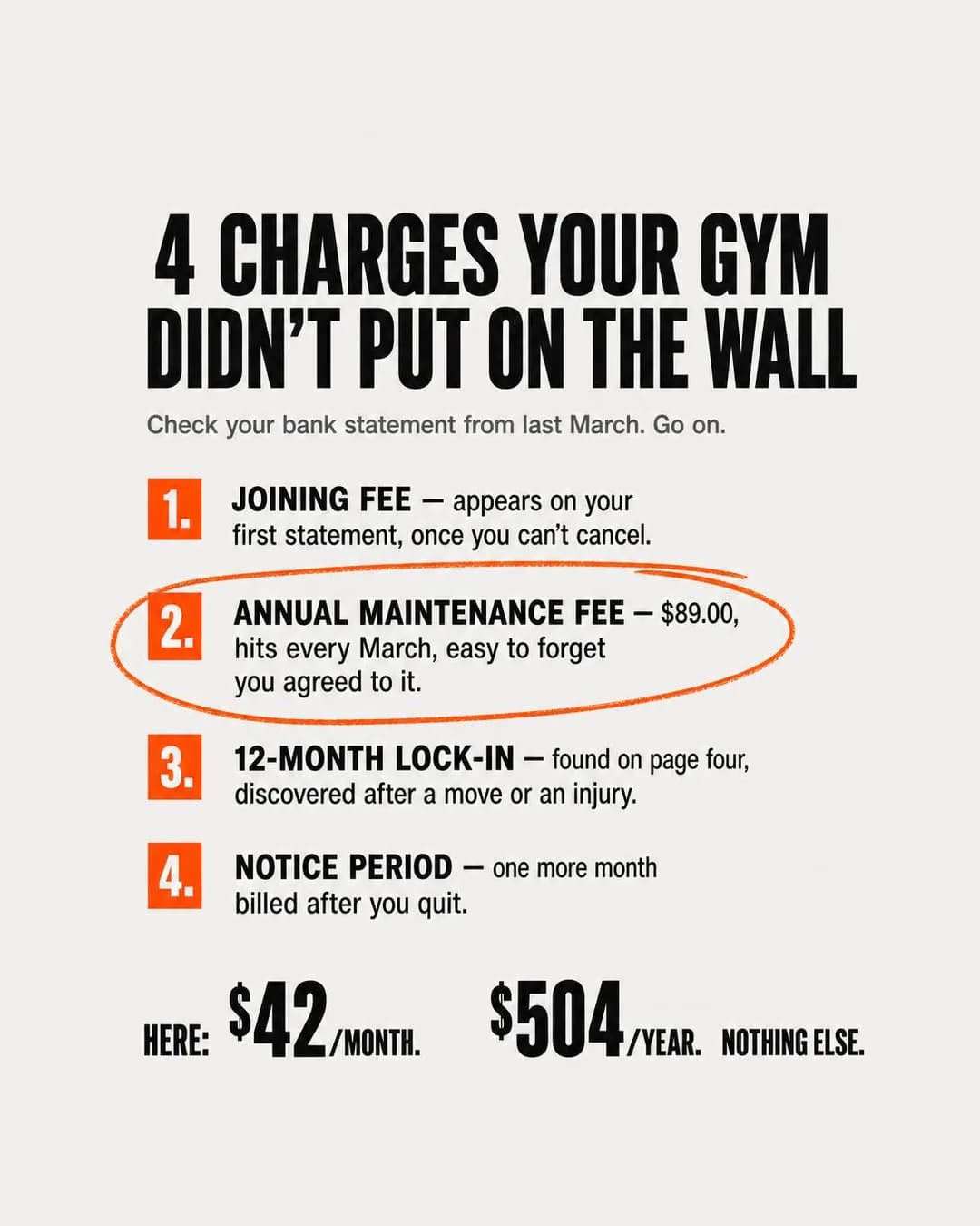
Problem & Pain · 4:5 · Leads
$42/month. $504/year. Nothing else.
Written for: People who joined on a headline monthly price and got a charge they had not budgeted for.
The full brief and why it works →
Proof & Trust · 4:5 · Traffic
We post our one-star reviews on purpose
Written for: People who read the one-star reviews first.
The full brief and why it works →
Scarcity, FOMO & Timing · 1.91:1 · Leads
See your place in line before you wait
Written for: People deciding between studios who have been burned by a timetable they could never actually book.
The full brief and why it works →
Benefit & Outcome · 1:1 · Leads
Every machine explains itself
Written for: Adults who will not use half the equipment because they do not know how.
The full brief and why it works →
Mistakes specific to this trade on this app
The first two are the ones that cost the most and are almost never noticed, because both fail silently: an ad designed for the wrong frame, and an ad that invented the proof it needed.
Posting the Instagram ad here and calling it a Facebook campaign
Meta recommends a 27-character headline for Facebook Feed and 40 for Instagram Feed, and Marketplace wants a square where the feed wants a portrait. Of the fifty headlines the Browse batch wrote, forty-five fit Instagram and five fit Facebook. Nothing is rejected — it is truncated and cropped, on the surfaces that convert cheapest, and the report never says so.
Leaving placements on automatic without designing for them
Advantage+ renders one ad into nine surfaces whose recommendations disagree. Leaving it on is usually right, because restricting delivery starves a single-site budget of evidence. Leaving it on without composing for the strictest surface is how most of your impressions end up somewhere your ad does not work.
Inventing the number that makes the argument
Four of the ten Browse ads fail this way: three operating statistics rendered into an inbox, an adherence rate against an industry average that does not exist, a competitor's payroll asserted as fact, and a QR code that encodes nothing. Everything else on those ads is good. On this app the reader can check you against your own Page in one tap, which is why the pull toward proof is strong here and the cost of faking it is highest.
Describing a competitor's contract as though you had read it
'Four charges your gym didn't put on the wall' and 'at the chain, your trainer worked on commission' are both very likely true and neither is something you know. Describe your own price list and your own payroll; the comparison the reader draws is stronger than the one you assert, and it is one you can defend.
Offering a guarantee that refunds nothing
'Fifteen minutes or the visit is free' is a promise with no forfeit inside it, because the tour was already free. A reader notices a beat later, and what they conclude is that the rest of the ad is written the same way. Make the forfeit real — a free month, a free session — or drop the conditional and keep the promise.
Writing a hook for a product you are not selling
'Why pay for hours you're asleep for?' sells an off-peak membership that actually takes away the evening and the weekend. Anyone who agrees with the headline and buys finds out on the first Saturday, and that discovery is a cancellation and a review. Point the hook at the trade the reader is really making.
Writing copy for a screen the reader is not signed in to
'You're 4th in line' is a fine sentence inside a booking app and an impossible one in a cold ad, because the reader has no place in your queue. Any number you show has to be a fact about the business — 'four people are waiting for the 6pm' — not a fact about the person reading.
Sending the click to your Facebook Page
It is the same app, the reviews are there and the photos are there, and it has no offer, no form and a feed of your own posts competing with the thing you just paid to say. The Page is what your ad gets checked against. Send the click to something that can convert it.
Showing the win-back rate to people who never left
Without an exclusion, a two-mile radius guarantees a held-rate offer reaches somebody currently paying more than the held rate. That is not a lead, it is a conversation at the front desk, and on an app where they can reply in public under the ad it is worse than one.
Scaling the January cohort before its notice period has run
A member acquired in January cannot be evaluated until the first cancellation window closes, which on a rolling contract is weeks and on an annual one is months. Cost per join in week three is the most flattering and least informative number the platform will ever show you. Hold budget flat through the peak and decide in April.
Optimising for the cheapest join
The cheapest join in this trade is reliably the first cancellation. Read months retained per join, by ad, over a quarter — and expect the contract ad to beat the discount ad by a distance nothing in Ads Manager predicted.
Advertising over a Page nobody has replied to
Your ad is one tap from your recommendations, and a business can turn them off — visibly, which is its own signal. Spend a fortnight replying before the first ad runs. The best-performing format in this batch is literally a grid of complaints with the owner's answers attached.
Questions
- How long should a Facebook ad headline be for a gym?
- Twenty-seven characters, which is what Meta's ads guide recommends for a Facebook Feed image ad — against 40 for Instagram Feed and 40 for Facebook Marketplace. That gap is the single most useful number on this page, because almost every gym ad on Facebook was written to the Instagram budget. Of the fifty headlines our own Browse batch produced, five fit the Facebook recommendation and forty-five fit the Instagram one. Nothing is rejected for length; it is truncated, and truncation lands first on the smallest surfaces.
- What image size should a gym use for Facebook ads?
- Export 4:5 at 1440 × 1800, which is what Meta recommends for Facebook Feed and identical to Instagram Feed — but compose it so a square crop out of the middle still works, because Marketplace recommends 1:1 at a minimum of 1080 × 1080 and Advantage+ placements will send your portrait there from the same ad. Facebook allows 3% aspect-ratio tolerance where Instagram allows 1%, so a crop a few pixels out passes here and fails there. A 1.91:1 asset is worth having for the right-hand column and search results, which have no Instagram equivalent.
- Facebook or Instagram for a gym?
- Both, for different halves of the business. Pew's November 2025 survey puts Facebook at 68% of adults aged 18 to 29, 80% of 30- to 49-year-olds and 74% of 50- to 64-year-olds, against Instagram's 80%, 62% and 40%. A boutique studio selling class packs on a coach and a schedule leans Instagram; a 24/7 access gym selling a membership on price, hours and contract terms leans here, and so does the lapsed member you most want back. This page is weighted six offers to three toward the access gym, and its Instagram twin is weighted the other way.
- Which objective should a gym buy on Facebook?
- Leads for most of it — a tour, a trial session, a re-start consultation. Traffic for the two or three claims that cannot be believed inside an ad, such as a pause policy with real terms. Awareness for the owner-voice ad that explains a price rather than offering one, and give it the feed rather than Stories. Sales rarely, which reverses the Instagram advice: a checkout event needs something bought in a browser, and the only thing this trade sells that way is a class pack, which belongs to the studio. Our Browse batch is pinned 7 Leads, 2 Traffic and 1 Awareness, the same split the dentist and real estate Facebook batches landed on.
- Should gym ads go to a form, a landing page or a phone call?
- The call is the answer this app has and Instagram effectively does not. Call ads are mobile-only, deliver on Facebook Feed, Marketplace, Reels and Video feed plus Instagram Feed and Stories, and Ads Manager reports calls placed, 20-second calls and 60-second calls separately — so you can optimise on the duration column rather than on volume, which is most of the qualification for a business selling a tour. If the desk is not staffed, use an Instant Form on the Higher-intent type with one qualifying question. Anything that has to be believed first gets a landing page. Never the homepage, and never your own Facebook Page.
- Are gym and fitness ads restricted on Facebook?
- Not as a special ad category — Meta accepts four and fitness is not among them, so age, radius, lookalikes and exclusions all survive. Every campaign still has to declare a value, so pass NONE, and check it if the same business manager runs a housing or lending account, because an inherited category silently removes custom age, lookalikes and any radius under fifteen miles. The content rule is conditional: ads marketing weight loss must be targeted to adults 18 and over, while fitness services and health clubs marketed for general wellbeing are exempt, and statements of inferiority about physical appearance are prohibited throughout.
- How much should a gym spend on Facebook ads?
- Multiply your own cost per booked tour by 50 for the weekly spend at which one ad set is fully out of Meta's learning phase, and be honest about the fraction of it you can afford — that is why the funnel here is three ad sets rather than nine. Then be careful about when. A member acquired in January cannot be evaluated until their first notice period has run, so cost per join in week three is the most flattering number the platform will show you. Hold budget flat through the peak, spend the month before it, and judge the account on months retained per join by ad.
Sources
Every platform claim on this page was read against these on . Meta’s policies move; if one of these disagrees with this page, it is right and we are stale.
- Meta ads guide — image ad specifications, Facebook Feed (4:5 at 1440 × 1800; primary text 50–150, headline 27; minimum width 600px; 3% aspect-ratio tolerance)
- Meta ads guide — image ad specifications, Facebook Marketplace (1:1 at 1080 × 1080; primary text 125, headline 40, description 30)
- Meta ads guide — image ad specifications, Instagram Feed (headline 40; minimum ratio 4:5, maximum 1.91:1; 1% tolerance)
- Meta Marketing API — special ad categories (four categories; fitness is not one; every campaign must declare a value)
- Meta Marketing API — basic targeting reference (custom location radius: 0.63–50 miles, 1–80 km)
- Meta Advertising Standards — Health and Wellness (18+ targeting for weight-loss services; fitness services and health clubs marketed for general wellbeing exempt)
- Meta Advertising Standards — Privacy Violations and Personal Attributes
- Meta Business Help Centre — supported objectives and placements for call ads
- Meta Business Help Centre — call ad metrics in Ads Manager (calls placed, 20-second and 60-second calls)
- Meta Business Help Centre — about Instant Form types
- Meta Business Help Centre — about the learning phase
- Meta Business Help Centre — significant edits and the learning phase
- Meta Business Help Centre — about sensitive health information (event and audience names)
- Meta Business Help Centre — turn Recommendations on or off for your business Page
- Pew Research Center — Americans' social media use, November 2025
That is the playbook. Now make the ads.
Paste your site. It reads your timetable, your memberships and your coaches, then writes the concepts, renders the images and drafts the copy — for a category where the image can break a rule the copy never mentions.
No credit card · 50 free credits (about 5 ads or Instagram posts)
Every angle recommended above is documented in the best-in-slot ad angle library, and the ads are from gym and fitness studio facebook ad examples. More industries are at all ad guides.