
Ad Examples · Gyms & Fitness Studios × Facebook · 10 ads
Gym and fitness studio Facebook ad examples
Ten finished Facebook ads in four different shapes, mostly for the 24/7 access gym — with the brief behind each one, because we generated them rather than collected them.
The gym ads you have seen on Facebook are mostly the ones that were made for Instagram. Same portrait crop, same transformation grammar, same headline running to thirty-five characters — posted to both apps from one export because Meta lets you, and cropped, truncated and re-shaped on arrival in ways nobody checked. That is the assumption this page was built to test, and the test is unusually easy to run, because Meta publishes the numbers and almost nobody reads them.
Meta's own ads guide recommends a 27-character headline for a Facebook Feed image ad. For Instagram Feed it recommends 40. Of the fifty headlines the ten ads below produced in a single run, forty-five fit the Instagram recommendation and five fit the Facebook one. The same fifty strings, two verdicts, decided entirely by which surface they land in. And Facebook Feed is only the first surface: Marketplace, search results, the right-hand column, Business Explore, in-stream video and video feeds are all placements this app has and Instagram does not, and Marketplace asks for a square image, a 40-character headline and a 30-character description that Facebook Feed does not list at all.
So this page leans where the platform leans. Pew's November 2025 survey puts Facebook at 68% of adults aged 18 to 29, 80% of 30- to 49-year-olds and 74% of 50- to 64-year-olds, against Instagram's 80%, 62% and 40%. The boutique studio's core member is on the other app; the 24/7 access gym's membership is here, and so is the person deciding whether a monthly line item is worth keeping. Six of the ten briefs below are for an access gym, three for a studio and one fits either — the exact mirror of the Instagram twin, which is five studio, four access gym, one either.
What they sell is what a gym has that a creator posting a transformation does not: the annual fee it does not charge, a membership that pauses for twelve weeks, a tour with a stopwatch on it, its own one-star reviews with the owner's replies attached, a cheaper rate for the hours the building is empty, a training log with your handwriting still in it, a card on every machine, a waiting list you can actually see, and a letter from an owner explaining why the class costs nine times a chain membership. None of them sells a body. That was the Instagram page's discovery and it carries over intact.
They were not collected. Each was generated with the audience, the angle and the objective pinned before the run, so the brief printed beside an ad is what produced it rather than a caption written afterwards about somebody else's work. The gyms are invented — a keycard gym with a printed rate card, a Pilates studio that publishes its waiting list, a strength room capped at eight — so no operator's creative is borrowed and no member's face is used. Nothing was edited afterwards. One of the ten crashed mid-run on malformed JSON and was regenerated from the same brief, which is the second time this industry has produced that specific failure and is a crash rather than a re-roll: the tenth ad is a second attempt after a fault, not a second attempt after a first one we did not like.
Four of the ten must not run as they stand, and they fail in a way the Instagram batch did not. On that page the hazard was what an ad said about the reader's body. Here nothing does. Instead: a membership ad renders three invented operating statistics into an email preview; a whiteboard ad draws close to a hundred tally marks under a label reading thirty and then quotes an adherence rate against an industry average that does not exist; a machine-instructions ad tells you to scan a QR code an image model drew; and an owner's letter states as fact how a competitor pays its trainers. Every one is the ad claiming to know something. The notes say which, and what the fix is.
What changes because it is Facebook
Start with the shelf, because it is the thing Instagram does not have. Meta's placement picker for an image ad lists Facebook Feed, in-stream video, video feeds, Marketplace, Stories, ads on Facebook Reels, search results, Business Explore and the right-hand column — nine surfaces on this app, against Instagram's feed, Stories, Reels and the Explore home. Leave Advantage+ placements on, which almost everybody does, and one ad is rendered into all of them from a single image and a single headline. You choose the export; you do not choose the frame.
That would be an academic point if the recommendations agreed across surfaces, and they do not. Meta's ads guide recommends 4:5 at 1440 × 1800 for Facebook Feed, with primary text of 50–150 characters and a headline of 27 — and no description line at all. For Marketplace it recommends a 1:1 image at a minimum of 1080 × 1080, primary text of 125, a headline of 40 and a description of 30. Two placements, one ad, a portrait against a square and 27 characters against 40. The practical rule falls straight out: write the headline to the shorter budget and compose the portrait so it survives being cropped square, because the placement you did not think about is the one holding your reader.
Measured against that, this run is a useful failure. One of the ten lead headlines below is inside Facebook Feed's 27 characters — the 22-character 'Your file's still here' on the win-back ad, which is also the best headline in the batch. All ten are inside Instagram's 40. Across all fifty headlines the run wrote, five fit Facebook and forty-five fit Instagram. Every primary text overruns 150; they run from 218 to 542 characters. Six of the ten descriptions fit Marketplace's 30 and four do not, in a slot Facebook Feed will not show anyway. Nothing here is rejected for length — Meta truncates rather than refuses — but truncation on the shortest surface is where the argument goes, so the first clause has to carry the ad.
Third, shape, and a correction this page owes its own cluster. Six pages here previously said that a 1.91:1 image has no Instagram placement. Instagram Feed's technical requirements accept aspect ratios from a minimum of 4:5 to a maximum of 1.91:1, so the wide asset is not refused there; what Instagram lacks is the surfaces built to want one. Those are Facebook's — the right-hand column and search results — which is why this page can show you shapes the Instagram twin cannot. Six of the ten below are 4:5, two are 1.91:1, one is 1:1 for Marketplace and one is 9:16. Facebook also allows 3% aspect-ratio tolerance where Instagram allows 1%, so a crop a few pixels out of true passes here and fails there from the same file — the one direction in which this app is the forgiving one.
Fourth, the audience, which is the reason for the lean. Pew's November 2025 numbers put Facebook ahead of Instagram in both bands where a gym membership is a household budget line rather than an aspiration: 80% of 30- to 49-year-olds against 62%, and 74% of 50- to 64-year-olds against 40%. That reader is not deciding whether to train. They are deciding whether this particular monthly charge is worth keeping, which is why the six access-gym ads below argue about fees, pauses, notice periods, off-peak hours and what happens on the day you stop coming — and why the one Sales objective the Instagram batch carried is absent here. The class pack is the only thing in this trade that genuinely completes at a checkout, and the class pack belongs to the studio, and the studio's reader is on the other app.
Finally, the thing that is not a spec. None of this is a special ad category: Meta's Marketing API accepts exactly four — housing, employment, financial products and services, and social issues, elections and politics — and fitness is not among them, so age, radius, lookalikes and exclusions all survive. But every campaign must still declare something, even if that something is NONE, and the content rule that does apply here is conditional rather than categorical. Ads marketing weight loss must be targeted to adults 18 and over; fitness services and health clubs marketed for general wellbeing are exempt. Not one of the ten ads below goes near that line, which is the Instagram page's lesson and does not change with the app.
Source: Meta ads guide — image ad specifications, Facebook Feed (4:5 at 1440 × 1800; primary text 50–150, headline 27; 3% aspect-ratio tolerance) · Meta ads guide — image ad specifications, Facebook Marketplace (1:1 at 1080 × 1080; primary text 125, headline 40, description 30) · Meta ads guide — image ad specifications, Instagram Feed (headline 40; minimum ratio 4:5, maximum 1.91:1; 1% tolerance) · Meta Marketing API — special ad categories (fitness is not one; every campaign must still declare a value) · Meta Advertising Standards — Health and Wellness (18+ targeting for weight-loss services; fitness services and health clubs marketed for general wellbeing exempt) · Pew Research Center — Americans' social media use, November 2025
Want the campaign, not just the creative? Facebook ads for gyms and fitness studios → is the playbook these ads came out of: which objective to buy, the offers worth running, the targeting levers this trade keeps, and the policy that decides what the copy may say.
Generate ads for your own gym or studio
Paste your site and best-in-slot reads it the way these invented gyms were read — rates, hours, contract terms, coaches — then writes the concepts, renders the images and drafts the copy. Free to start, no card.
The March Charge
LeadsCheck your bank statement from last March. Go on.
- Audience
- People who joined on a headline monthly price and got a charge they had not budgeted for — Signed up at a low advertised rate, then found a joining fee on the first statement and an annual maintenance charge in March, and now assume every gym price they read is missing something.
- Angle
- Hidden Problem (Problem & Pain) — Reveals a problem the customer may not realize they have.
Check your bank statement from last March. That $89 charge you barely noticed? That's your gym's annual maintenance fee. It hits every year, whether you remember signing for it or not. Here: $42/month. $504/year. No joining fee. No annual charge. No 12-month lock-in. The price on the wall is the price you pay.
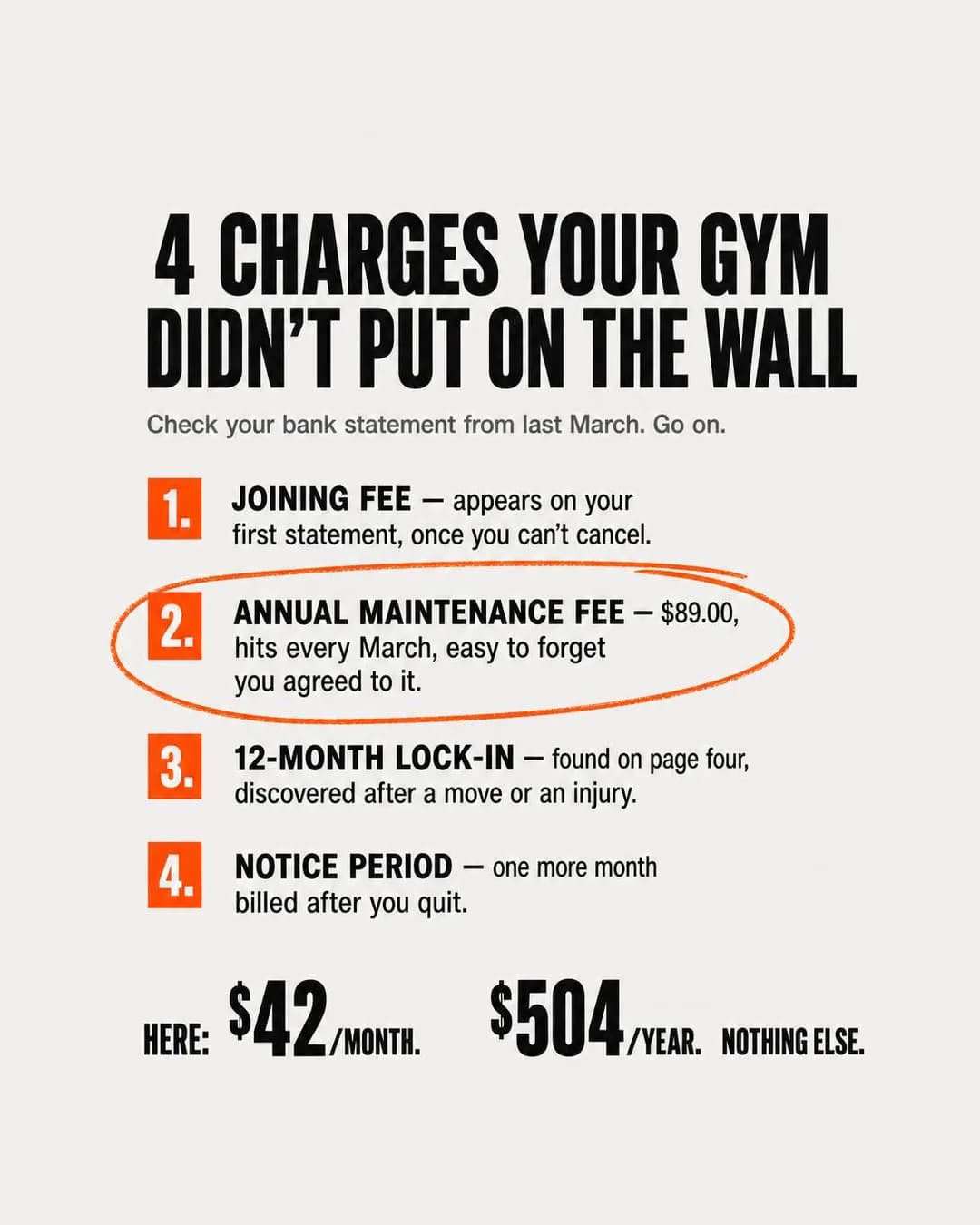
$42/month. $504/year. Nothing else.
Cancel anytime. No annual fee.
Access gym. Hidden Problem is the right family when the reader's grievance is real but unnamed, and this ad names four of them in the order they arrive: the joining fee that appears on the first statement 'once you can't cancel', the $89 annual maintenance charge that 'hits every March', the twelve-month lock-in 'found on page four', and the notice period that bills you one more month after you quit. That is the access-gym contract described by somebody who has read one, and it is a far better argument than a discount because the reader can check every line against their own bank app while the ad is still on screen. The construction to steal is the ending: after four charges the page resolves into one line of arithmetic — $42 a month, $504 a year, nothing else — and the strike-through of the whole category is that the ad simply finishes the sum.
The sum is correct, which matters more than it sounds. Forty-two times twelve is five hundred and four, and the batch that ran before this one established the rule: rendered arithmetic holds on short documents and collapses on long ones. This document is four lines and a total, and it foots. Two things to change before you run it. The headline is a claim about a business you have never seen — 'four charges your gym didn't put on the wall' asserts what a competitor's contract contains, and while it is true of a great many gyms it is not knowledge you have; the fix is to describe your own price list rather than theirs, which is the stronger half of the ad anyway. And the $89, the $42 and the $504 are invented and are yours to replace, including the month: 'every March' is a specific enough detail that a reader whose fee lands in September will decide the ad is not about them.
Other headlines from the same run
- No joining fee. No annual charge.
- The price on the wall is what you pay.
- One rate. No hidden March charge.
- $504/year. That's the full cost.
Call to action
The whole ad is an argument that the price list is the product, so send them to the price list. Sign up is the swap once the rate has been seen and believed — a better retargeting audience than a cold one. Avoid Get offer: there is no offer here, only the absence of four charges, and a reader tapping for a discount lands on a normal page and leaves.
The Cancel-Proof Membership
LeadsYou won't have to cancel this one when work sends you away.
- Audience
- Members in their forties and fifties whose year is interrupted by something that is not a lack of motivation — Have had a shoulder operation, a parent to look after or eight weeks away for work, and have twice cancelled a membership because a pause was not offered, then paid a joining fee again to come back.
- Angle
- Objection Handling (Objection & Risk Reversal) — Starts with a purchase objection and directly resolves it.
You've cancelled twice because your old gym wouldn't let you pause. Surgery. A work posting. A parent who needed you. Each time you came back, you paid a rejoin fee and lost your rate. This membership was built for people whose training gets interrupted by life, not by motivation. Pause up to 12 weeks a year, any reason, no paperwork, no fee to return. Your rate stays locked. Join once, stay as long as you want.
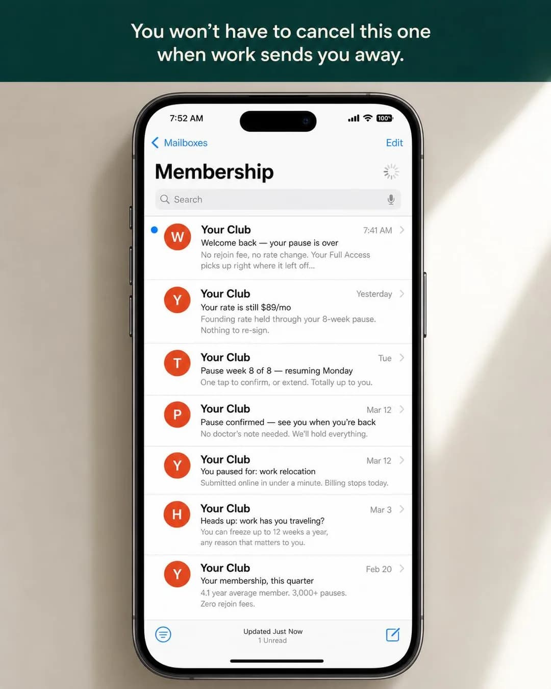
Pause up to 12 weeks a year. No fee.
Hold your rate through pauses
Access gym, and the sharpest audience insight in the batch. The reason a forty-five-year-old cancels a membership is rarely motivation; it is a shoulder operation, a work posting or a parent who needs looking after, and every one of those is a reason a gym could survive if it let the member stop paying for eight weeks instead of leaving. Objection Handling works here because the objection is specific and has never been answered: the ad's own inbox includes 'You paused for: work relocation — submitted online in under a minute. Billing stops today' and 'Pause confirmed — no doctor's note needed. We'll hold everything.' That last clause is doing quiet, excellent work. Not asking for a doctor's note is a kindness, and it is also the only version of this offer that keeps the gym out of collecting health information, which Meta's own Business Tools terms treat as a live hazard right down to the names you give events and audiences.
This is one of the four on the page that must not run as generated, and the reason is the bottom row of the inbox: '4.1 year average member. 3,000+ pauses. Zero rejoin fees.' Three operating statistics for a gym that does not exist, rendered into the image where no alternate headline can reach them — the same failure the real-estate batch found in a rendered price table, arriving here in an email preview. Delete that row and the ad is intact. Two more things to check while you are in there. The rendered rate is $89 a month and one of the four alternate headlines offers the membership 'from $59/mo', which is the kind of mismatch that ships because nobody reads the image and the alternates side by side. And the dates place the whole inbox in a February-to-March window — a pause confirmed on 12 March, a quarterly summary on 20 February — in a batch that ran in September. That is the fourth time in three batches this pipeline has built an internally coherent set of documents and anchored it to its own sense of now rather than to the run date. Check every rendered date against today's, every time.
Other headlines from the same run
- A gym built for interrupted years
- Your rate holds. So does your spot.
- No rejoin fee. Ever.
- Cancel-proof membership from $59/mo
Call to action
The pause terms are the product and they need a page: how long, how often, what happens to the rate, what counts as a reason. Sign up belongs on the version shown to people who have already read them. Contact us suits a gym whose pause policy is genuinely discretionary, which is honest but is a weaker ad — the whole appeal here is that nobody has to ask.
The Stopwatch at the Door
LeadsFifteen minutes, timed, or the visit is free.
- Audience
- People who will not walk into a gym because of what happens after the tour — Want to see the floor and the changing rooms and then leave with a price, and have been kept for forty minutes by someone fetching a manager to approve a discount that expires today.
- Angle
- Product Demo (Product & Mechanism) — Shows the product actively solving the problem.
Fifteen minutes. Timed. If the tour runs long, the visit is free. No back office. No manager to fetch. You get the floor, the locker rooms, the equipment list, and a printed price sheet before anyone asks if you want to join. Month-to-month is $49. Off-peak is $39. Annual is $470. Day pass is $12. Same prices for everyone who walks in that day.
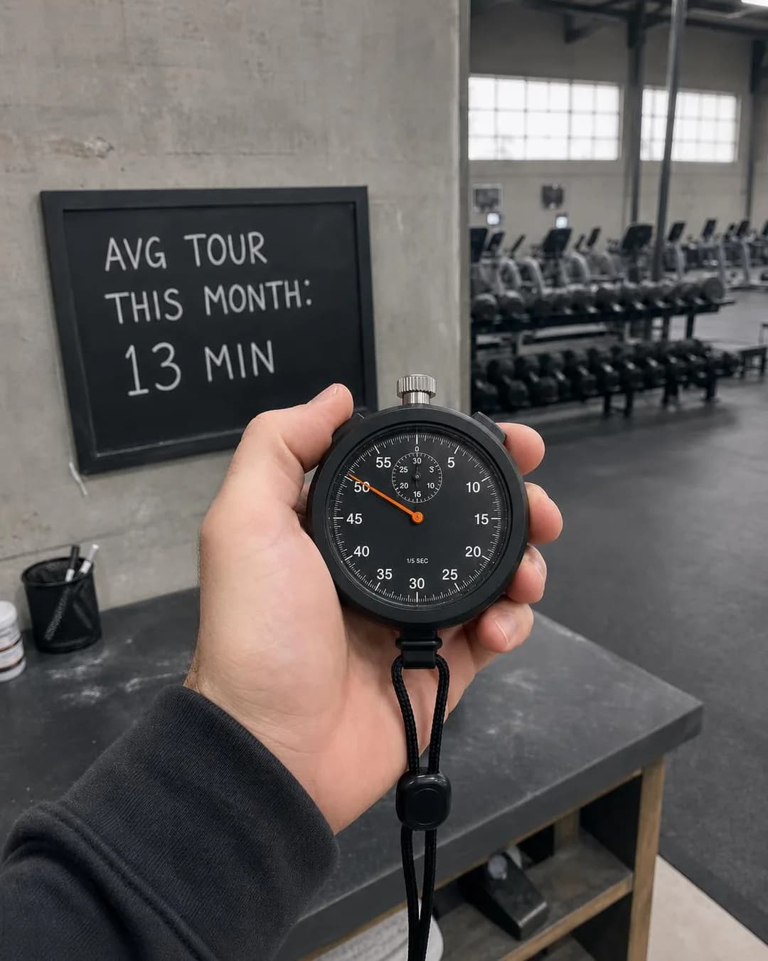
Fifteen minutes or the visit is free
$49/month. No back office
Access gym, and a Product Demo of a process rather than a product, which is the move worth taking. The thing this reader dreads is not the gym, it is the forty minutes after the tour with somebody fetching a manager to approve a discount that expires today. So the ad makes the sales process itself the mechanism on display: fifteen minutes, timed, a printed price sheet handed over at the door, and four prices on it that anybody who walks in that day is offered. The photograph is the best in the batch — a staffer's own hand holding a mechanical stopwatch, shot at a tilt, with a chalkboard behind reading 'AVG TOUR THIS MONTH: 13 MIN'. That thirteen is the detail that makes it credible: a gym confident enough to publish an average that is under its own promise rather than equal to it.
Then look at the stopwatch, because the ad put it in the centre of the frame and invited you to. The sweep hand sits around fifty seconds and the small dial's hand sits at or a shade past its fifteen — which, read literally, is a tour that has just run past the guarantee the ad is making. It is the third instance in this cluster of a rendered object contradicting the claim it was drawn to support, and the fix is the same one every time: composite the prop from a real photograph rather than asking for it in the prompt. The other thing to fix is the guarantee itself, and it is a copy problem rather than an image one. 'Fifteen minutes or the visit is free' is a promise that costs nothing, because the visit was already free — there is no refund inside it. Either make it a real forfeit, which for a gym means a free month or a free personal session, or drop the conditional and keep the promise, which is strong on its own: the tour takes fifteen minutes and the price list is printed.
Other headlines from the same run
- Timed tours. Printed prices. No office
- The stopwatch is the sales process
- See the floor and the price in 15 min
- Tour is timed. Price list is printed
Call to action
The entire ad is an argument that walking in is safe, so let them book the walk-in. Learn more works for a gym whose price list is genuinely on the site, which this ad implies it is. Contact us is the wrong end of the funnel here — the ad's whole promise is that nobody has to talk to anyone first.
The One-Star Screenshot
TrafficYou already scrolled to the one-star review. Good.
- Audience
- People who read the one-star reviews first — Scroll straight past the five-star ratings to find the complaints, and judge a business on whether anybody replied to them and whether anything was done.
- Angle
- Reviews / Ratings (Proof & Trust) — Uses star ratings, review excerpts, review counts, or screenshots.
You already read the one-star reviews. So did we. Then we posted them on every class page, replied to each one, and logged what we actually changed. Because if a studio won't show you its worst feedback, you can't trust the rest. Small-group strength, rowing, and mobility classes capped at 16. First class $10.
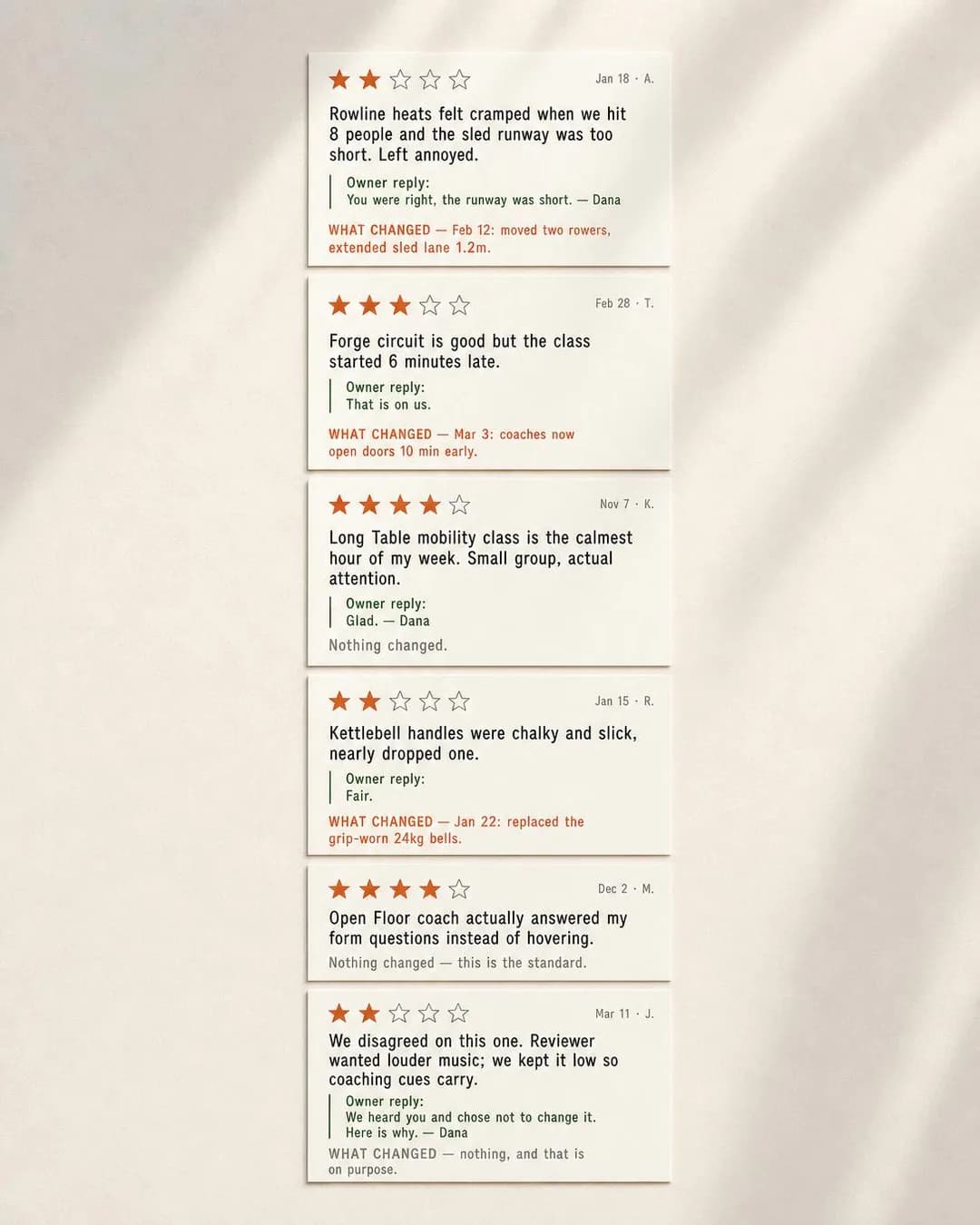
We post our one-star reviews on purpose
First class $10. See the log.
Studio, and the format is native to this app in a way nothing on the Instagram twin is: the ad and the Page carrying the business's recommendations sit one tap apart, so a Facebook reader who wants the complaints will find them whether or not you show them. This ad decides to go first. Six review cards, dated, initialled rather than named — A., T., K., R., M., J. — each with the owner's reply and a coloured 'WHAT CHANGED' line underneath. 'Rowline heats felt cramped when we hit 8 people' is answered with 'You were right, the runway was short' and 'Feb 12: moved two rowers, extended sled lane 1.2m'. Every change date falls after the review it answers; on a page of six dated exchanges the pipeline got the chronology right in all three cases where there was a change date to get right. The best card is the last, a two-star complaint about the music with the reply 'We heard you and chose not to change it. Here is why', over a change line reading 'nothing, and that is on purpose'. A business that publishes a disagreement it lost nothing by having is making a claim about its judgement that no five-star wall can make.
Two things before you copy it, and the first is the one nobody notices until it is running. Add the stars up: two, three, four, two, four, two. The grid this ad built to prove its honesty carries an average under three, which is a rating a studio would not choose to publish and which the reader absorbs in a glance before reading a single word. Choose the cards so the set is representative rather than only interesting — the argument survives with two critical reviews among six, and it does not survive an average that looks like a warning. Second, the initials are a genuine improvement on the invented full names this cluster's apparel page shipped, but these are still six reviews nobody wrote about a studio that does not exist, and the format's whole value is that it is real. Rebuild it from your actual Page, with the actual replies, and get permission to reproduce them. One last mismatch to reconcile: the copy says classes are capped at sixteen while the top review says eight people already felt cramped, which reads as an argument against the cap the ad is selling.
Other headlines from the same run
- The bad reviews are on the class page
- See the complaints before you book
- Studios that hide feedback hide truth
- Every review published. Every one replied.
Call to action
Pinned to Traffic, and rightly — the promise is that the complaints and the replies are all published, and that is a thing you have to go and look at before it means anything. Send them to the page that carries them. Book now belongs on the retargeting version, once somebody has read the bad ones and come back anyway, which is as qualified as a studio lead gets.
The Printed Rate Card
LeadsWhy pay $42.90 for hours you're asleep for?
- Audience
- People whose hours are free in the middle of the day — Work shifts, work from home, are retired or are between jobs, can train at eleven in the morning, and are currently paying a full rate to use a building at the one hour it is full.
- Angle
- Price Anchoring (Offer & Economics) — Compares the current price with a higher reference value.
Why pay $42.90 for hours you're asleep for? If you train between 10 a.m. and 4 p.m. on weekdays, you're subsidizing the 6 p.m. crowd. We print two prices. You pick the one that matches your actual hours. Month-to-month, no contract, cancel with 14 days' notice.
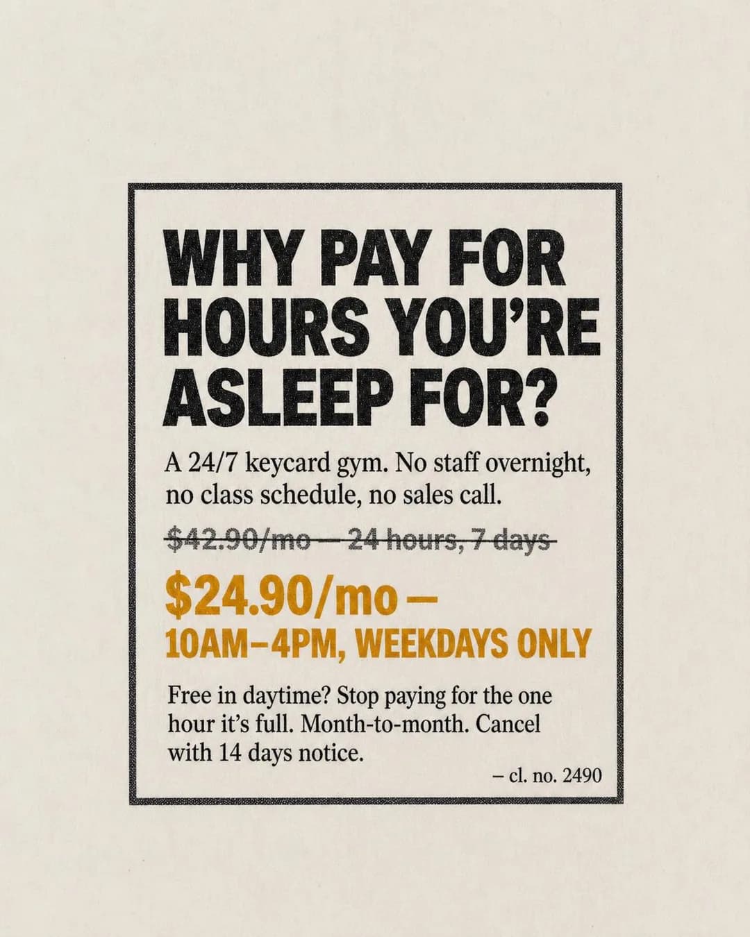
Pay for the hours you actually use
Month-to-month. Cancel anytime.
Access gym, and the row the Instagram guide flagged as one it could not illustrate — the off-peak membership, skipped by that batch because it needs a real published price. Here it is, priced. Price Anchoring is usually the family where a fake 'was' price sits above a real one; this ad earns it because both prices are real products: $42.90 for twenty-four hours a day struck through, $24.90 for ten to four on weekdays in orange underneath, and a line explaining that the cheaper one exists because you are otherwise subsidising the six o'clock crowd. Setting it as a newspaper classified is the right register for this app and this reader — dense, unglamorous, priced, with 'A 24/7 keycard gym. No staff overnight, no class schedule, no sales call' as the description and a classified number at the foot that echoes the price. It is the only ad in the batch with no photograph and no rendered evidence to get wrong, and it is correspondingly the only one with nothing to fix in the image.
The thing to fix is the argument, and it is a good lesson in how a strong hook can describe a different product from the one being sold. 'Why pay for hours you're asleep for?' is an excellent line and it is not what this offer takes away. Off-peak is ten to four on weekdays; what the reader gives up by buying it is not three in the morning, it is six in the evening and all weekend. Anyone who reads the headline, agrees with it and buys will discover the actual restriction on the first Saturday, and that discovery is a cancellation and a review. Point the hook at the real trade — you are free at eleven on a Tuesday, so stop paying for the hour the building is full, which is the line the body copy already found. And check the window against your own floor before you print it: the whole offer only works if the building genuinely is empty between those hours.
Other headlines from the same run
- $24.90 for midday. $42.90 for 24/7.
- Two prices. You pick your window.
- Stop paying for the 6 p.m. crowd
- Midday access: $24.90/month
Call to action
A named price on a month-to-month contract with fourteen days' notice is about as low-commitment as this trade gets, so let them take it in one step. Get offer is defensible and slightly worse — this is a cheaper product, not a discount, and a reader expecting money off the full rate is disappointed on arrival. Learn more if the off-peak hours need to be seen against a timetable before anyone believes they can use them.
The Handwritten Page
LeadsYour handwriting's still on page 47.
- Audience
- Former members who left and have not been back — Trained here for years, stopped for a reason that has since passed, and have been putting off returning mostly because starting again feels like admitting they stopped.
- Angle
- Nostalgia (Identity & Emotion) — Connects the product or brand to a remembered era, experience, or cultural reference.
Your handwriting's still on page 47. We kept your training log — every set, every session, even the ones from before you stopped. Most gyms treat lapsed members like strangers. We kept your file. Rejoin fee waived, your old rate held for 30 days.

Your file's still here
Rejoin fee waived, old rate held
Access gym, and the best ad on the page. The lapsed member is the cheapest acquisition in the building — they know where the machines are, they left for a reason that may have passed, and the only real obstacle is that going back feels like admitting you stopped. Nostalgia is exactly the right family for that and it is almost always executed badly, as a sepia photograph of a barbell. This one produces the specific object instead: an open spiral training log on a chalk-dusted platform with an orange note stuck to it reading 'Your handwriting's still on page 47. Same numbers. Same platform. Rejoin fee waived, your old rate held 30 days.' The pencil lines underneath are legible and they progress — squat 245 then 255, deadlift 275 then 285, across dates a few days apart, with 'felt heavy' and 'RPE 8' in the margin. A model that can hold a lifting progression consistent across two facing pages is doing the thing this whole format depends on.
This is also the ad that turns the batch's running defect into a joke at its own expense. The log's first entry reads '3/19 Tues' — and 19 March was a Tuesday in 2024, not in 2026, when this ran. That is the same anchoring failure that put the previous ad's inbox in March and put the dentist batch's lock screen in the wrong year: the model builds a coherent document and dates it to its own sense of now. Here, uniquely, it is right, because the whole premise is that these are your marks from before you stopped. Do not mistake that for control — the next brief that needs today's date will get 2024 just as readily. The real caution is elsewhere: run this to a lapsed-member custom audience and nothing else. 'Your handwriting's still on page 47' shown to a stranger is a sentence about somebody else's life, and shown to a current member it is an offer of a rate they are not getting. The creative and the ad set are one decision here, not two. And note what a 4:5 re-frame did to the composition — roughly a fifth of the slot is empty cream border, which is free space in a feed that charges by the impression.
Other headlines from the same run
- We kept your training log
- Same platform, same numbers
- Your spot didn't go anywhere
- Nothing got erased when you left
Call to action
The offer is a waived rejoin fee and a held rate for thirty days, and this reader has already made the decision once. Let them act on it. Get offer is a fair swap because there genuinely is one, with a deadline attached. Learn more is the weakest of the three — somebody who trained here for years does not need the facilities page.
The Hundred vs Thirty Myth
TrafficThirty sessions beats one hundred? Check the math again.
- Audience
- People who have started five times a week three times and stopped by February each time — Believe that training only counts if it is done properly and often, have proved to themselves three times that they cannot sustain it, and have concluded the problem is them.
- Angle
- Myth Busting (Comparison & Positioning) — Challenges and disproves a common belief in the category.
Five days a week for six weeks is thirty workouts. Two days a week for fifty weeks is one hundred. You already know which one you'll actually finish. Our twice-weekly program is built around the frequency you can sustain, not the frequency that looks good in January. Members who train on a fixed two-day rhythm maintain adherence through month eleven at rates that make the industry average look like a February joke.
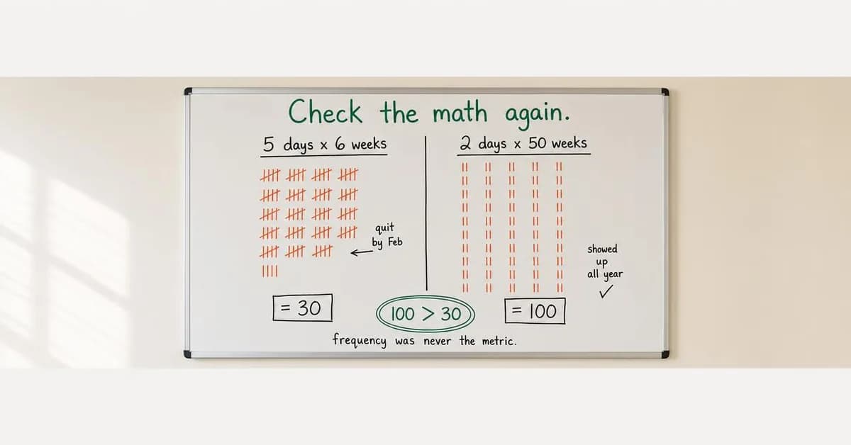
100 sessions beats 30 every time
Twice-weekly strength coaching
Either model, and the argument is honest and worth making: five days a week for six weeks is thirty sessions, two days a week for fifty weeks is a hundred, and the reader who has quit by February three times has been measuring the wrong number. Myth Busting earns its place when the myth is one the reader is punishing themselves with, and 'you have to go four times a week or it doesn't count' is exactly that. The whiteboard is the right object, the tally metaphor is the right way to show it, and the closing line — 'frequency was never the metric' — is the sentence a lot of gym marketing needs and never says.
And it is the ad on this page that must not run, for two separate reasons, one of which is new to this cluster. Count the tally marks. The left column is labelled '= 30' and carries something like nineteen five-bar gates plus a few loose strokes — close to a hundred, which is to say it has drawn about the same quantity as the right column labelled '= 100'. The whiteboard's entire visual argument is that one heap is much bigger than the other, and the two heaps are the same size. The previous batch established that rendered arithmetic holds on short documents and fails on long ones; this extends it in a direction worth writing down, because the arithmetic here is perfect — 5 × 6 = 30 and 2 × 50 = 100 are both correct in the caption — and what collapsed is the count of things drawn. Checking a rendered sum and checking a rendered quantity are two different checks. The second reason is in the primary text: 'members who train on a fixed two-day rhythm maintain adherence through month eleven at rates that make the industry average look like a February joke' is a performance claim, about an industry average that does not exist, for a gym that does not exist. Delete the sentence; the arithmetic argument in front of it needs no help. And weigh the shape while you are there — this is the 1.91:1 asset, which routes to surfaces that render small, and every word of its argument is in handwriting.
Other headlines from the same run
- Two days a week, fifty weeks a year
- Twice weekly. All year. Do the math.
- Consistency wins. The data proves it.
- Built for the frequency you'll keep
Call to action
Traffic, correctly — this is an argument the reader has not heard, and asking for a booking off the back of a whiteboard is asking before the case has been made. Send them to the page explaining how a twice-weekly programme is structured. Book now belongs on the retargeting ad. Rewrite the creative first either way.
The Machines You Skip
LeadsEvery machine you walk past has a card that explains it.
- Audience
- Adults who will not use half the equipment because they do not know how — Walk past the machines they cannot work out rather than ask, have never been shown, and would rather pay for a gym they use a third of than have the conversation.
- Angle
- Ease (Benefit & Outcome) — Emphasizes getting the result with less effort, complexity, or skill.
You walk past half the machines because you don't know how they work. Every machine here has a plain-language card at eye level: what it does, where to start, how to adjust it. No asking. No guessing. Just read and go.
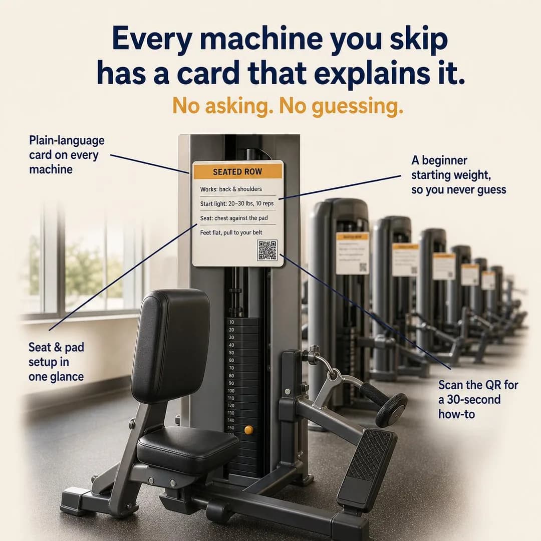
Every machine explains itself
Plain-language cards on everything
Access gym, and the only 1:1 ad on the page, which makes it the one you can judge against Marketplace's own recommendation — a square at 1080 × 1080 — rather than against the feed's portrait. It reads well square, which is the point: the callouts fan out from a single machine to the row behind it, and nothing important is near an edge. The insight underneath is better than the format usually gets. Ease is a weak family in most trades because ease is what everybody claims; here the obstacle is precise and silent, which is that adults walk past equipment they were never shown rather than ask, and pay for a gym they use a third of instead of having the conversation. The card the ad invents answers it in four lines — 'SEATED ROW. Works: back & shoulders. Start light: 20–30 lbs, 10 reps. Seat: chest against the pad. Feet flat, pull to your belt' — and those are correct instructions, next to a stack numbered in tens that starts at 10, so the beginner weight the card recommends is actually on the machine.
It must not run as generated, and the reason is in the bottom right of that card. There is a QR code rendered into the image, and a callout beside it reading 'Scan the QR for a 30-second how-to'. An image model draws something QR-shaped; it does not encode a URL, so the ad instructs the reader to do a thing that cannot work, and does it in the one place where being caught is guaranteed because the reader has to try. Composite a real code in, or delete both the code and the callout — the ad is unharmed without them, and a QR code in a Facebook ad is a strange ask anyway, since the reader is holding the phone that would have to scan it. One smaller note: the machine in the frame is a plausible composite rather than any real model, with a back pad, a footplate and a handle that do not quite belong to the same piece of equipment. Nobody buys a gym on that, but if you are photographing the idea, photograph your actual row machine — the entire promise is that the card matches the thing it is stuck to.
Other headlines from the same run
- No more skipping equipment you don't know
- Instructions on every machine. Finally.
- Use the whole gym, not just the treadmill
- A gym that assumes you've never been shown
Call to action
Someone who recognised themselves in 'you walk past half the machines' is close, and what they want is the smallest possible first visit. Learn more suits a gym whose induction is the real offer and needs explaining. Sign up only if joining genuinely is the next step, which for this reader it usually is not — they are still deciding whether they will be able to use the place.
Your Number on the Board
LeadsSee exactly how many people are ahead of you before you wait for nothing.
- Audience
- People deciding between studios who have been burned by a timetable they could never actually book — Bought a pack somewhere on the strength of a class schedule, then found the only session that fitted their week was full every time they opened the app.
- Angle
- Waitlist (Scarcity, FOMO & Timing) — Uses restricted pre-launch access or a queue to build anticipation.
You're 4th in line. The last spot opened Tuesday at 7:12am. That's not a guess — it's on the board at the entrance, and on your phone before you book. Every class shows you exactly how many people are confirmed, how many are waiting, and when the last opening happened. No invisible queue. No wasting a credit on a slot that never opens. First class is $18.
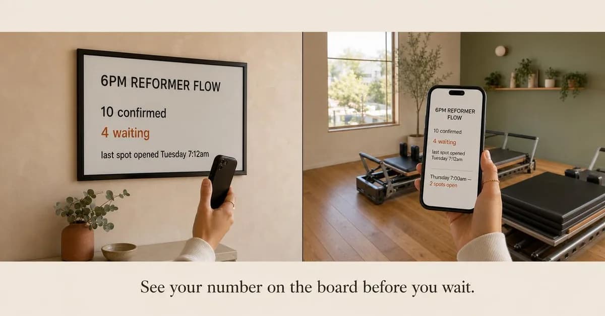
See your place in line before you wait
First class $18
Studio, and the cleanest rendered evidence in the batch. The brief asked for a published waiting list; the run made it a 6pm Reformer Flow and built the proof twice — a framed board on the studio wall reading '10 confirmed / 4 waiting / last spot opened Tuesday 7:12am', and a phone in the reader's hand showing the identical four lines plus 'Thursday 7:00am — 2 spots open'. The two surfaces agree exactly, which is worth dwelling on, because the Instagram twin's occupancy ad rendered a wall display reading full in an ad about open racks. Same trade, same category of prop, opposite outcome. The argument is good too, and rarer than it should be: a studio that shows you the queue before you buy is a studio betting that an honest 'four ahead of you' converts better than a timetable you discover is unbookable after you have paid for a pack.
The defect is in the copy and it is the most instructive one on the page. The primary text opens 'You're 4th in line. The last spot opened Tuesday at 7:12am.' The board says four people are waiting; the copy turns that into a statement about where you stand — and this is a cold ad, shown to somebody who has never booked a class here and has no place in any queue. It is an ad written for a logged-in screen and bought on a placement that reaches strangers, which is a mistake worth learning in one reading because it will happen to you the first time you adapt product UI into creative. The fix keeps everything: 'four people are waiting for the 6pm; two spots are open Thursday' makes the same argument, is true of the studio rather than of the reader, and would survive being shown to anybody. Note also that the slug this ad was briefed under says six in the morning and the ad it produced is about six in the evening — pinning an audience and an angle steers the concept, it does not dictate the timetable, and the brief printed beside an ad is the brief, not a description written afterwards to match.
Other headlines from the same run
- No invisible queues. Just real numbers.
- The waitlist you can actually see
- Know if it's full before you book
- Your number. On the board. Before you join.
Call to action
The ad ends on a specific class with two open spots, which is a booking rather than a purchase. Send them to the timetable. Learn more works for a studio whose booking rules need explaining before anyone trusts them, and Sign up only if the waiting list genuinely requires an account first — which, if it does, is worth saying in the ad rather than discovering after the tap.
The Payroll Math
AwarenessYour old coach worked for tips. Mine works for a paycheck.
- Audience
- People comparing a studio's price against a chain's and finding it hard to justify — Have the chain's monthly figure in their head as the price of training, can see the studio is better without being able to say why, and need the difference itemised before they will pay it.
- Angle
- Why We’re More Expensive (Story & Founder POV) — Founder explains the quality, sourcing, labor, service, or economics behind a premium price.
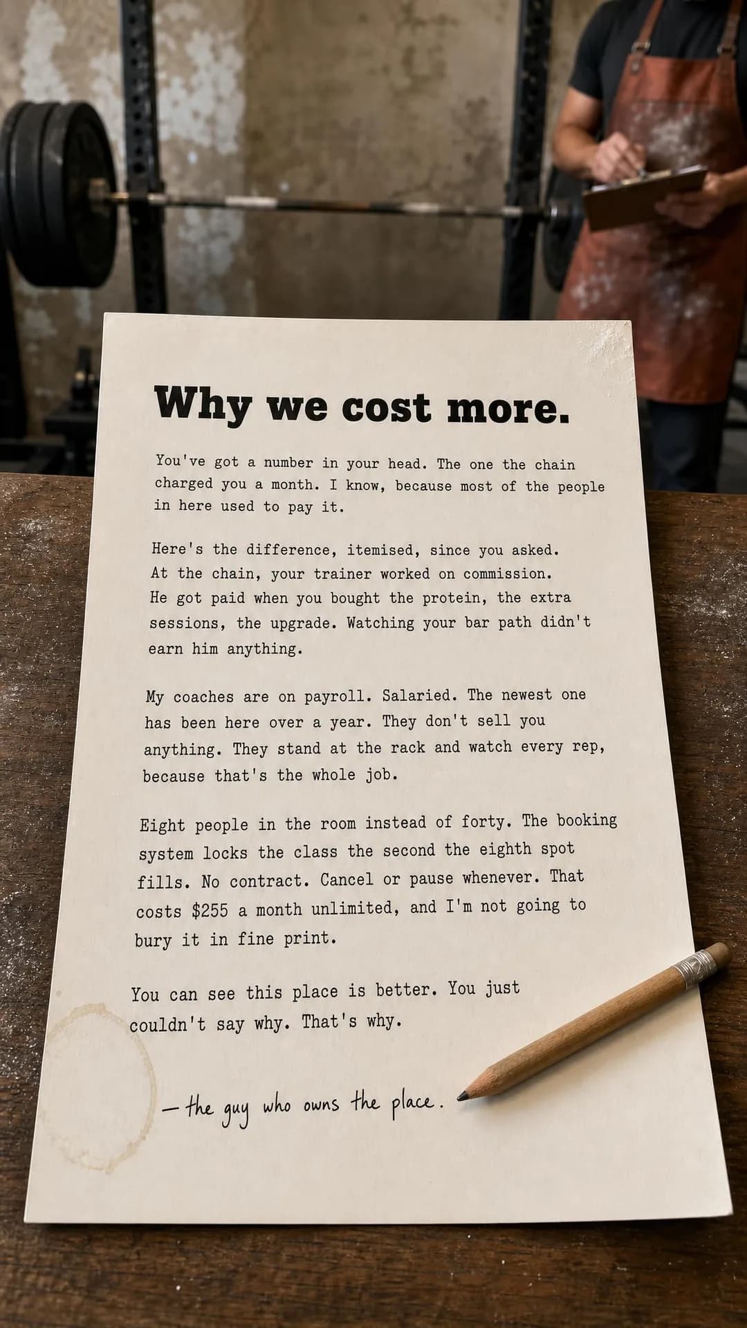
Your last coach made money when you bought the protein shake, not when he fixed your squat. Mine's on payroll. Salaried. He's been here over a year and the only thing he sells is attention to your bar path. That's the difference between $29 a month and $255. Eight people in the room instead of forty. A coach who watches every rep because that's the entire job. No contract, no upsells, no commission structure that rewards anything except keeping you safe and stronger. You already know this place is better. Now you know why it costs more.
Coaches on payroll, not commission
8 people. Real coaching. No contract.
Studio, and the one ad here pinned to Awareness. Why We're More Expensive is the hardest sub-angle in the library to do without whining, and this letter mostly gets it: 'You've got a number in your head. The one the chain charged you a month. I know, because most of the people in here used to pay it' opens by conceding the comparison rather than dodging it, and the itemisation that follows is concrete — eight people in the room instead of forty, the booking system locking the class when the eighth spot fills, coaches salaried rather than on commission, no contract, $255 a month, 'and I'm not going to bury it in fine print'. The closing line does the real work: 'You can see this place is better. You just couldn't say why. That's why.' Note also what the image does not do. It is signed 'the guy who owns the place' rather than with an invented name, and the person in frame is cropped at the neck — an apron, a clipboard, chalk, no face. That is precisely the fix the Instagram twin's coach portrait needed, arrived at here without being asked for, and it is the pattern to copy for any owner-voice ad you cannot yet photograph.
It is the fourth on the page that must not run as generated, and the offending clause is two lines long. The second paragraph states as fact how a competitor pays its staff — 'at the chain, your trainer worked on commission. He got paid when you bought the protein, the extra sessions, the upgrade' — about a business you have not named, cannot have audited, and are describing to a reader who may work there. It is very likely true of some chains and it is not something you know, and the whole letter's credibility rests on sounding like the one person in the category who only says what they can back. 'Most big-box trainers are paid on what they sell' costs one hedge and loses nothing. The other change is structural: this is a 200-word typewritten letter rendered at 9:16, which is the full-screen Stories and Reels shape, where it will be swiped past long before the second paragraph. A letter is a feed asset. If you want it vertical, pull three lines out and let the tap open the rest.
Other headlines from the same run
- Your bar path doesn't pay his rent
- Salaried coaches. No upsells. 8 people.
- What $255 buys that $29 never did
- They watch reps, not sales targets
Call to action
An Awareness ad whose whole job is to justify a price has one honest destination, which is the page carrying that price and what is in it. Contact us suits a studio that would rather have the conversation than let a number sit on a screen unattended. Book now is too early — nobody books an eight-person class off a letter about payroll.
Questions
- Do Facebook and Instagram ads need different creative for a gym?
- Different headlines, certainly. Meta's ads guide recommends a 27-character headline for a Facebook Feed image ad and 40 for Instagram Feed, and of the fifty headlines this run produced, five fit the Facebook recommendation and forty-five fit the Instagram one. Shape matters too: Facebook Marketplace recommends a square image where Facebook Feed recommends 4:5, and Advantage+ placements will fill both from the same ad. Write the headline to the shorter budget and compose the portrait so it survives a square crop.
- Should a gym advertise on Facebook or Instagram?
- Both, for different halves of the business. Pew's November 2025 survey puts Facebook at 68% of adults aged 18 to 29, 80% of 30- to 49-year-olds and 74% of 50- to 64-year-olds, against Instagram's 80%, 62% and 40%. A boutique studio's core member sits in the youngest band, so the studio leans Instagram; a 24/7 access gym's membership spreads across the older two and its price-led, cancel-anytime half is squarely here. Six of the ten ads on this page are for an access gym; the Instagram twin is weighted the other way.
- Are gym and fitness ads restricted by Meta?
- Not as a special ad category — Meta accepts four, and fitness is not one, so age, radius, lookalikes and exclusions all stay available. The restriction is on the creative and it is conditional: ads marketing dietary, health or weight-loss services must be targeted to adults 18 and over, while fitness services and health clubs marketed for general wellbeing are exempt, so the floor attaches to what the ad says rather than to the trade. Meta also prohibits statements of inferiority about physical appearance outright. None of the ten ads here goes near any of it, which is the point.
- Why does none of these ads have a Sales objective?
- Because the one thing this trade sells that genuinely completes at a checkout is the class pack, and the class pack belongs to the boutique studio, whose reader is on Instagram. The Instagram twin of this page carries that ad. What is on this page is a membership decision, which is a lead however much the pricing page wants it to be a sale, so these ten were pinned 7 Leads, 2 Traffic and 1 Awareness — the same split the dentist and real estate Facebook batches landed on.
- Can I copy these ads?
- Take the approach, not the pixels. The gyms are invented and the images were generated for this page, so there is no operator's creative here to lift — and four of the ten carry something that must be removed before they could run at all, each named in its note. What transfers is the pairing of an audience with a specific argument, and in this trade on this app, the choice to argue about the contract rather than the body. Every angle used below is documented in full in our ad angle library, linked from each ad.
Seen enough? Make your own.
Paste your site. It reads your timetable, your memberships and your coaches, then writes the concepts, renders the images and drafts the copy — for a category where the image can break a rule the copy never mentions.
No credit card · 50 free credits (about 5 ads or Instagram posts)
Every angle used above is documented in the best-in-slot ad angle library. More industries and placements are at all ad examples.