
Ad Examples · SaaS × Facebook · 10 ads
SaaS Facebook ad examples
Ten finished Facebook ads for vertical software — the trades, the clinics, the yards — with the brief behind each one, because we generated them rather than collected them.
Software marketing has a story about Meta that stops one step too early: B2B does not work here, the budget belongs on LinkedIn, and if you must run Meta ads then run them on Instagram where the practitioner is. The first two are arguable. The third quietly assumes there is one kind of software company.
There are two, and this app reaches the other one. Pew's November 2025 survey puts Facebook at 80% of adults aged 30 to 49 and 74% of 50- to 64-year-olds, against Instagram's 62% and 40%. Those two bands are where the owner-operator lives — the person running three trucks, two childcare rooms, four service bays, one restaurant floor. They are not evaluating a category. They are not going to put a card into a phone at eleven at night. And they are the entire buyer for vertical software, which is the half of this industry that nobody writes Meta guides about.
So the ten ads below are ten different trades' back-office software, aimed at the person who signs rather than the person who uses. Pest control and lawn routing, restaurant POS, fleet compliance, trade estimating, childcare billing, self-storage, physical therapy claims, veterinary practice management, wholesale distribution, auto repair. The objective mix moves with them: six Leads, two Traffic, one Sales, one Awareness — where the Instagram batch was five Traffic, three Leads, two Sales and no Awareness. That flip is the whole argument of this page, and it is the only industry in this cluster where the platform axis changes the mix.
They were not collected. Each was generated with the audience, the angle and the objective pinned before the run, so the brief printed beside an ad is the brief that produced it and not a caption written afterwards about somebody else's work. All ten angle families appear once each, which closes the four the Instagram batch skipped — Offer & Economics, Product & Mechanism, Scarcity and Founder POV — and those four turn out to be the honest ones for vertical software, where there is a published price, a real migration and a contract with a renewal date on it. The companies are invented and unnamed. Nothing was edited afterwards. One of the ten crashed mid-run on malformed JSON and was regenerated from the same brief — a crash, not a re-roll.
Four of the ten must not run as they stand, and they fail in a place the earlier batches did not reach. The gym Facebook page found that this app pulls an ad toward proof and that proof is where it invents. This one shows what that looks like inside a vertical: an ad for veterinary software renders three real competing products by name — AVimark, ezyVet and IDEXX Neo — on sticky notes in a drawer, under a tombstone, each next to a password. A fleet ad names its own modules after one. A distribution ad stamps "ACTUAL CUSTOMER RESULT" into the image above numbers nobody measured. A founder ad puts an invented biography in the first person under a photograph of a man who does not exist. The notes below say which, and what the fix is for each.
Everything with a currency sign in it is invented too. $47 per truck, $79 per terminal, $149 a month, $895 for a migration, fourteen backorders falling to two — these belong to companies that do not exist. Read them as placeholders marking where a real number goes and how specific it has to be to carry an ad. In your version, that slot needs a figure you can defend to somebody who runs the business it describes.
What changes because it is Facebook
The reader changes, and for software that is not a nuance — it is a different company. Pew's November 2025 numbers put Facebook ahead of Instagram by eighteen points among 30- to 49-year-olds (80% against 62%) and by thirty-four points among 50- to 64-year-olds (74% against 40%). Horizontal, product-led software is bought by the person who will use it, and that person skews to the other app. Vertical software is bought by the person who owns the business, and that person is here. Every one of the ten audience briefs below is an owner: three-to-fifteen trucks, two-to-four centres, three-to-eight bays, one-to-three clinics. None of them is a job title you could have selected in an ad set, which is the Instagram page's problem too — but the answer changes, because an owner recognises their own P&L faster than they recognise their own Tuesday.
Then the shelf, which Instagram does not have. Meta's placement picker for an image ad lists Facebook Feed, in-stream video, video feeds, Marketplace, Stories, ads on Reels, search results, Business Explore and the right-hand column — nine surfaces against Instagram's four — and Advantage+ placements fill all of them from one image and one headline. The recommendations disagree: Meta's ads guide gives Facebook Feed 4:5 at 1440 × 1800 with primary text of 50–150 and a headline of 27, and no description line at all; Marketplace gets a 1:1 image at 1080 × 1080 with primary text of 125, a headline of 40 and a 30-character description. You choose the export. You do not choose the frame.
Measured against that, this run repeats the gym batch's result almost exactly, which is what makes it a platform fact rather than a category one. The ten ads produced fifty headlines. Five fit Facebook Feed's 27 characters. All fifty fit Instagram's 40 — the same 5-of-50 split the gym Facebook batch produced, and the third Facebook batch in a row to land there. Nine of the ten lead headlines clear 27 and not one clears 40. Six of the ten descriptions fit Marketplace's 30, in a field Facebook Feed will not show. Every primary text overruns 150, and this batch overruns it further than any before it: 322 to 708 characters, against the gym batch's 218 to 542. B2B copy is the wordiest copy this pipeline writes, and truncation lands first on the smallest surface.
Shape is where this page can show you things the Instagram twin cannot, and it uses the room. Six of the ten are 4:5, two are 1.91:1, one is 1:1 for Marketplace and one is 9:16. Instagram Feed's technical requirements do accept up to 1.91:1 — that was corrected across this cluster on 7 September 2026 — so the wide asset is not refused there; what Instagram lacks is the surfaces built to want one, and those are Facebook's right-hand column and search results. Worth looking at the two wide ads with that in mind. The compliance ad fills its 1.91:1 with a paragraph of body text, and the right-hand column renders a wide asset small. A wide shape routes to the surfaces least able to carry words.
Finally, the category question, which for software has a two-part answer that no competing guide gives. Meta's Marketing API accepts four special ad categories — housing, employment, financial products and services, and social issues, elections and politics — and software is not one of them, so every targeting lever survives. But since 31 March 2020 every campaign must declare something, and businesses that offer none of those things must specify NONE. And the category attaches to what an ad offers, not to what a company sells: a product whose creative offers financing, a payment advance or a lending feature is a financial-products ad regardless of the industry label, and Meta reads the creative either way. None of the ten below crosses that line. The billing ad for physical therapy clinics gets close to a different one, and its note explains why.
Source: Meta ads guide — image ad specifications, Facebook Feed (4:5 at 1440 × 1800; primary text 50–150, headline 27) · Meta ads guide — image ad specifications, Facebook Marketplace (1:1 at 1080 × 1080; primary text 125, headline 40, description 30) · Meta ads guide — image ad specifications, Instagram Feed (headline 40; minimum ratio 4:5, maximum 1.91:1) · Meta Marketing API — special ad categories (four categories; software is not one; NONE must still be declared since 31 March 2020) · Meta Business Tools terms — restrictions on health-related event and audience names · Pew Research Center — Americans' social media use, November 2025
Want the campaign, not just the creative? Facebook ads for SaaS companies → is the playbook these ads came out of: which objective to buy, the offers worth running, the targeting levers this trade keeps, and the policy that decides what the copy may say.
Generate Facebook ads for your own software
Paste your site and best-in-slot reads it the way these invented software companies were read — product, audience, positioning — then writes the concepts, renders the images and drafts the copy. Free to start, no card.
Two Dollars an Hour
SalesLess than two bucks an hour to stop doing paperwork at 9pm.
- Audience
- Owner-operators, three to fifteen trucks — Bought the second truck to grow the business and got a second job doing paperwork at nine at night. Price everything themselves, sign everything themselves, and have been burned by a contract before.
- Angle
- Cost Per Day / Use (Offer & Economics) — Breaks a large price into a smaller daily, monthly, or per-use amount.
$1.57 an hour. That's what it costs to stop doing paperwork at 9pm every night. Scheduling, routing, invoicing — all in one screen you can run from your phone. Your techs see their route, log the job, capture a signature. Invoice sends the second they mark it done. No annual contract, no sales call to start. 21-day free trial, then $47/truck/month if it saves you the evening shift.
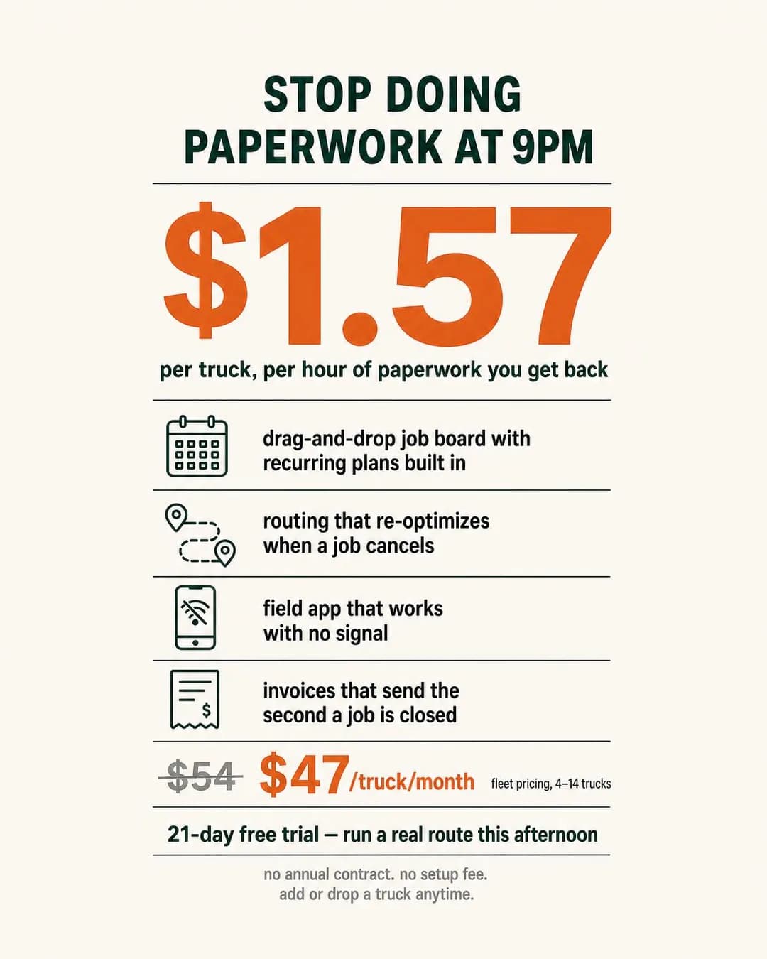
$1.57/hour to stop working at 9pm
21-day free trial. No contract.
Cost Per Day / Use is one of the four angle families the Instagram batch skipped, and this is why it was worth coming back for: it only works when there is a real published price, and vertical software has one. The move is a division, not a discount — $47 per truck per month becomes $1.57 an hour against the hour of evening paperwork it replaces. An owner who prices jobs for a living can check that in about two seconds, which is the point. "Affordable" is an adjective; $1.57 is an invitation to do arithmetic that lands in your favour.
Worth noting that the arithmetic actually holds. $47 divided across roughly thirty evenings is $1.57, and the sub-line names the unit precisely — per truck, per hour of paperwork you get back — rather than leaving "an hour" ambiguous. Three batches of rendered-evidence failures have made this the first thing to check on any offer-stack graphic, and this one passes.
One thing in the frame was not asked for and should not ship: the struck-through "$54" beside the $47. There is no former price here, because there is no company. A crossed-out anchor is a factual claim about your own past pricing, and it is the sort of claim that gets an account restricted rather than an ad rejected. Delete it or make it true. It is also instructive about where these things originate — the anchor was written into the image prompt at the prompt stage, not invented by the image model, so this is a copy problem wearing a picture.
Other headlines from the same run
- Paperwork ends at 5. Not 9pm.
- Less than $2/hour per truck
- Stop doing admin after dinner
- Get your evenings back for $47/mo
Call to action
The only ad on this page where Sign up is right, and for the same reason it is the only one pinned to Sales: the price is published, the signup is online and there is no contract to negotiate. Everywhere else on this page the next step is a person. Get offer would need the trial to be an actual offer rather than a standard 21 days.
The Cable Between Two Systems
LeadsYour old POS talks to your new one. That's the trick.
- Audience
- Independent restaurant owners — One or two rooms, on a POS contract they resent, and certain that switching means a closed Saturday and a week of staff not knowing where the buttons are.
- Angle
- How It Works (Product & Mechanism) — Explains the process from input to mechanism to result.
Your old POS talks to your new one. That's the trick. We plug into your current system, pull your full menu tree, modifiers, table map, and two years of sales, and drop it into the new terminal. Under six hours, typically. No re-entry. No lost history. You verify it before go-live. Counter plan starts at $79/month per terminal.
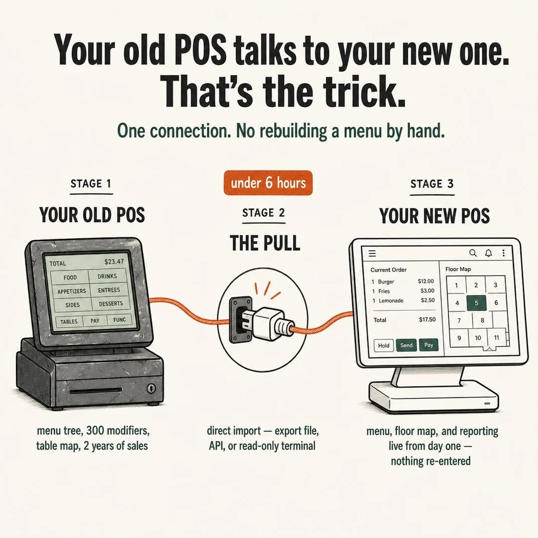
No re-entry. Just a direct pull.
POS software built for switching.
How It Works is the second family the Instagram batch skipped, and it skipped it for a stated reason — mechanism arguments need a mechanism a reader can picture. Vertical software has one that nobody has to be taught: the migration. Every restaurant owner on a POS contract they resent has already decided that switching costs a closed Saturday and a week of staff hunting for buttons, and no feature list touches that. The ad answers it with a diagram of three stages and a cable, and the whole argument is the middle box.
This is also the only 1:1 ad on the page, and it is here on purpose. Marketplace recommends a square at 1080 × 1080 and Facebook Feed recommends a 4:5 portrait, and Advantage+ placements will fill both from whatever you exported. A three-stage horizontal diagram is one of the few compositions that survives that trip: it reads left to right, it has nothing in the top or bottom margin to lose, and its 33-character headline is inside Instagram's budget if not Facebook's. Compare it with the two 1.91:1 ads further down, which do not travel nearly as well.
Two cautions, one small and one that would kill the ad. The small one is that the order total is right — $12.00 plus $3.00 plus $2.50 is the $17.50 the screen shows — which is now the fourth batch in a row where short rendered arithmetic held. The other is the middle caption: "direct import — export file, API, or read-only terminal". That is a specific integration claim about somebody else's product, made by a model that has no idea whether the incumbent POS exposes any of the three. Under six hours is a promise attached to it. If you cannot name the systems you can actually pull from, this ad is a lie with a diagram on it.
Other headlines from the same run
- Your menu moves with you.
- Migration in under six hours.
- Keep your data. Switch anyway.
- One cable. Zero manual re-builds.
Call to action
A mechanism diagram raises exactly one question — does it work with mine — and Learn more is the button that answers it, on a page that lists the systems you migrate from. Book now is the version worth testing rather than a fallback: an owner with two rooms and a contract may well prefer fifteen minutes on the phone to reading a compatibility table.
The Renewal Clock
LeadsYour three-year contract renews itself before the ball drops.
- Audience
- Owners of eight to forty truck fleets — Signed a three-year compliance contract in a hurry after an audit, and will not find out it renewed itself until the invoice lands.
- Angle
- Seasonal Deadline (Scarcity, FOMO & Timing) — Uses a holiday, season, event, or calendar moment as a natural deadline.
That three-year compliance contract you signed after your last audit? Check the fine print. Most require written cancellation 60–90 days before the anniversary date. Miss the New Year deadline and you're locked in for another 36 months — at whatever rate they decide to charge. Hours-of-service tracking, pre-trip checklists, and audit-ready files shouldn't require a contract you can't leave. $39 per truck, per month. Cancel anytime.
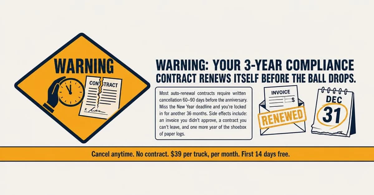
Your contract renews before January 1
Month-to-month compliance tools
Scarcity is the third family the Instagram batch skipped, and the reason it gave was sound: manufactured urgency in a category with a free tier reads as a lie. What this ad demonstrates is the exception. Software has exactly one honest deadline and it belongs to the buyer rather than the seller — the notice window on the contract they are already in. Nobody invented it, nobody can extend it, and the reader either has one in front of them or does not. That is Seasonal Deadline used properly, and it is the only shape of urgency this industry can run without embarrassment.
The wide format is worth studying as a warning rather than a model. This is 1.91:1, the shape our publisher routes to Facebook's right-hand column and search results — which are the smallest image surfaces on the app — and the composition fills the middle third with a six-line paragraph in body type. On the feed it reads. In the right column it is a yellow smear with a warning sign on it. If you are exporting a wide asset, put one line in it.
Two things must change before this runs. The body copy asserts as fact that "most auto-renewal contracts require written cancellation 60–90 days before the anniversary" — a claim about how other vendors' paperwork works, which nobody here checked and which the reader can disprove by opening their own file. Hedge it or cite it. And then the finding that made this ad worth the run: the invented business's own modules came back named RoadLog, GateCheck and AuditTrail, and VDO RoadLog was a real Continental electronic logging device, discontinued in 2020, in precisely this category. The pipeline's unbranded rule suppresses the company name and says nothing about product names inside the invented brand profile, so the model reached into the vertical's actual vendor list for a plausible one. Check the names, not just the claims.
Other headlines from the same run
- Cancel by Dec 31 or you're locked in
- Three more years. Same invoice.
- The auto-renewal clause you forgot
- No contract. $39/truck. Cancel anytime.
Call to action
The ad's job is to make somebody go and read their own contract, and the honest next step is a page that tells them where the notice window usually sits and what to send. Contact us is the higher-intent variant for a fleet that has found the date and now needs somebody to move fast. Sign up is wrong here: the reader is not free to buy yet.
The Kitchen Table Mistake
AwarenessHe built this after eating a $4,000 mistake at a customer's kitchen table.
- Audience
- Trade business owners, four to twenty on the tools — Have bought software written by people who have never quoted a job, and can tell within a minute of opening it.
- Angle
- Why We Built This (Story & Founder POV) — Explains the customer problem or frustration that motivated the product’s creation.

I ate a $4,000 mistake at a customer's kitchen table. Missed labor hours, forgot a material markup, added wrong. The homeowner was right to push back — my numbers didn't add up. I ran electrical crews for over a decade, and that night I started building the estimating tool I wish I'd had. Now contractors using it cut bid turnaround from days to hours and stop leaving money on the table. Built by someone who's been in the trench, not a conference room. 30-day trial, no contract.
Built after a $4K bidding mistake
30-day trial. No contract.
Founder POV is the fourth and last family the Instagram batch skipped, and it is the one this app most rewards. Why We Built This is an argument about who is behind the software, and every trade business owner has bought a tool written by people who have never quoted a job and could tell within a minute of opening it. On a leisure surface that story is a scroll-past. Here, in front of somebody who has decided this purchase is about trust rather than features, it is the strongest thing you can say — which is why this is the one Awareness ad on the page.
Look at what the direction did with 9:16. There is no text in the frame at all: no headline burned in, no caption bar, nothing but a photograph of a man at a kitchen table at night with a calculator and a stack of bids. That is a defensible choice for Stories and a bad one for the feed, and it puts the entire argument in a 469-character primary text on the placement that truncates hardest. If you run a founder ad, either put the sentence in the picture or buy the feed.
It cannot run as it stands, and this is the batch's counterpart to the Instagram page's fabricated testimonial. There the invented person was a customer; here it is the founder, speaking in the first person about a decade running electrical crews and a $4,000 mistake at a homeowner's kitchen table, under a photorealistic face that belongs to nobody. The gym Facebook batch found the fix without being asked — sign it "the guy who owns the place" and crop at the neck — and it applies exactly. Or photograph your actual founder, which is cheaper than it sounds and is the whole point of the angle.
Other headlines from the same run
- Estimating software by a contractor
- Stop eating bad bids
- From the trench, not a boardroom
- Catch the revenue you're missing
Call to action
An origin story has not made an offer, so the button should promise the rest of it rather than a transaction — a page with the founder on it and the product underneath. This is the one ad on the page where Sign up would be a mismatch with the argument rather than merely early.
Two Days Down to Two Hours
LeadsWhat used to eat a whole weekend now takes one coffee.
- Audience
- Owner-directors of two to four childcare centres — Run the rooms all day and do the billing and the subsidy claims after close, from three systems and a folder.
- Angle
- Save Time (Benefit & Outcome) — Quantifies hours, minutes, or steps saved.
Two full days every month, gone. That's what most centre directors spend on invoicing, subsidy claims, and enrolment paperwork — three separate systems, three logins, and a Friday night that bleeds into Saturday morning. One platform cuts it to two hours. Enrolment intake, parent billing, and subsidy filing in a single dashboard built only for childcare. No spreadsheets. No reconciling at midnight. From $149/month for centres up to 60 kids, with 45 days of free setup while we migrate your data.
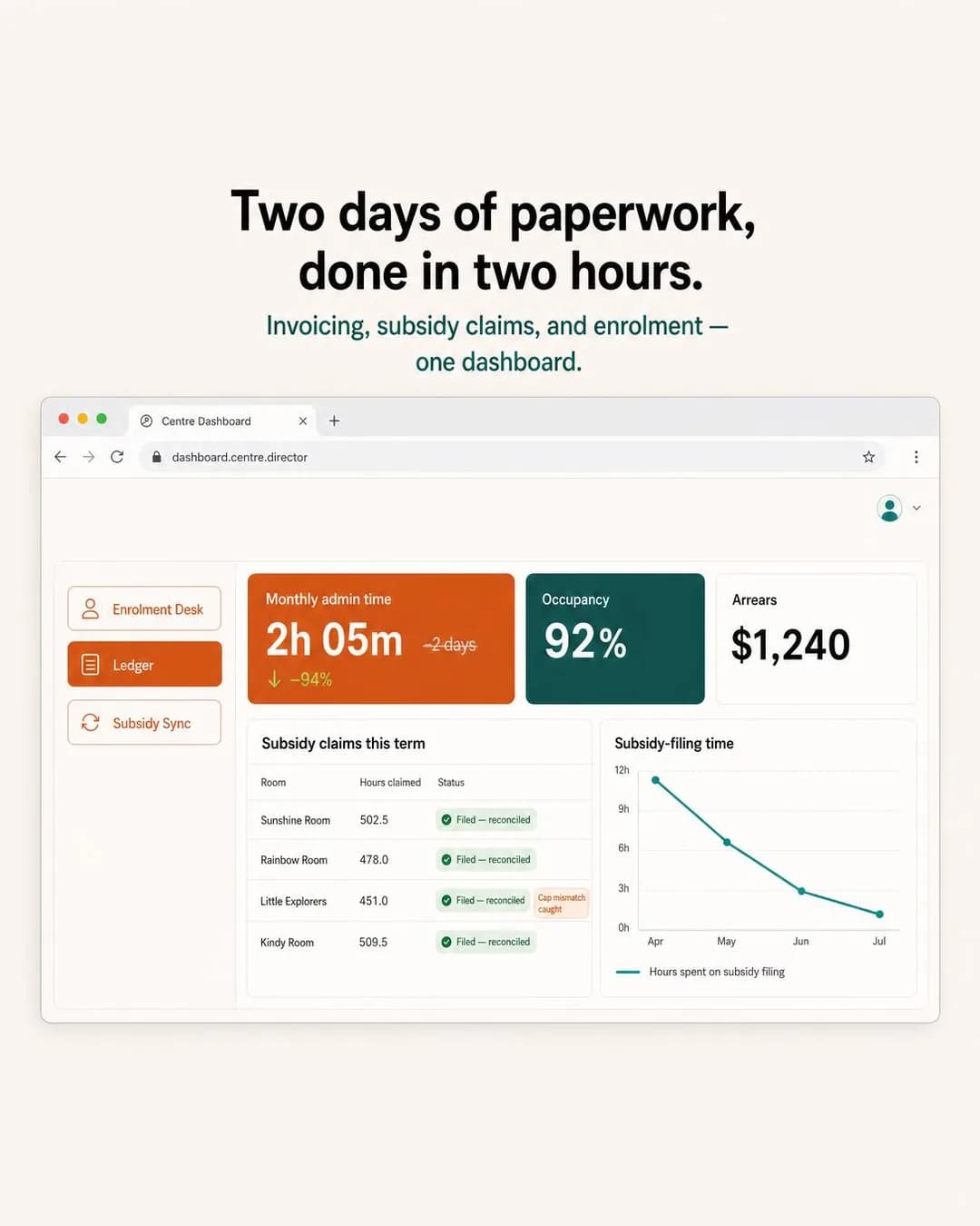
Two days of admin, done in two hours
From $149/month
Save Time is the most-used argument in software and usually the emptiest, because it is nearly always stated as a percentage nobody can check. What rescues it here is that the unit is a thing the buyer already counts: an owner-director of two childcare centres knows precisely how many evenings a month go to subsidy claims, because they are the person sitting there. Two days to two hours is not a benchmark, it is a claim about the reader's own calendar, and they will either recognise it or not within a second.
This is the one ad on the page that leads with a product screenshot, and it is the exception that proves the Instagram page's rule. That rule — never make the UI the hero, because a dashboard at feed size is a grey rectangle — holds on this app too, and the reason this render escapes it is that it is not showing the product. It is showing one tile, at poster size, with everything else arranged as context. Look at how much of the frame the 2h 05m occupies. That is a stat-hero wearing a browser window.
And it contains the batch's arithmetic failure, which is worth more than a clean pass would have been. The tile reads "2h 05m", struck through "2 days", and "↓ −94%" — and −94% does not follow from two days on any normal reading of a working day. Sixteen hours to two hours is −87%. The same wrong figure is in one of the five headlines. Three batches have now established that this pipeline gets rendered sums right and rendered quantities wrong; this is the first time it has got a rendered percentage wrong, and the arithmetic was in the copy stage rather than the image. Check the derived number, not just the two it came from. Second, smaller: the browser chrome carries a URL, dashboard.centre.director, and .director is a real top-level domain. A rendered address in a fake screenshot is a domain somebody can go and register.
Other headlines from the same run
- Cut monthly paperwork by 94%
- One system. Two hours. Done.
- Invoicing & subsidy claims in one login
- Stop spending weekends on admin
Call to action
A director looking at a dashboard has one question — does it do my state's subsidy paperwork — and only a page can answer it. Book now is the strong alternate here rather than the polite one: subsidy handling is regulatory, varies by jurisdiction, and is the kind of thing people want confirmed by a person before they move a centre's billing.
The Four-Vendor Desk
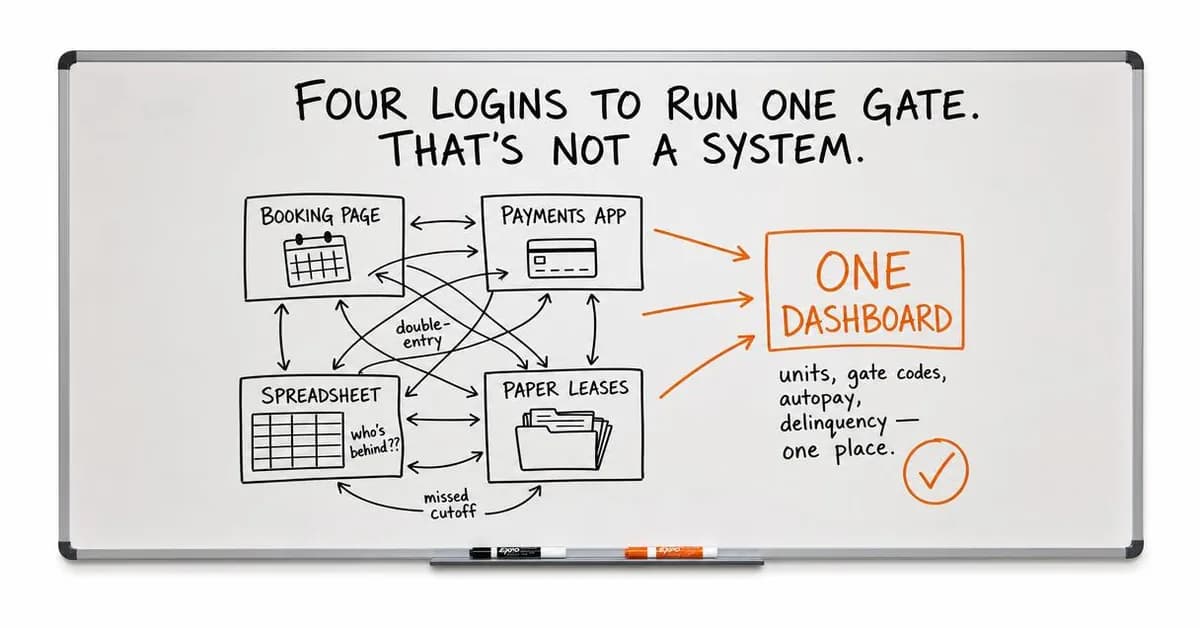
TrafficFour logins to run one gate. That's not a system.
- Audience
- Independent self-storage operators, one to three facilities — Run a booking page, a payments app, a spreadsheet of who is behind and a paper folder of leases, none of which knows about the others.
- Angle
- Alternative / Substitute (Comparison & Positioning) — Compares your solution with a completely different way of achieving the same goal.
Four logins to run one gate. That's not a system. Most operators think spreadsheets, gate boxes, and payment processors are the affordable option. But stitching four tools together costs more in double-entry and missed cutoffs than one dashboard ever would. Units, gate codes, autopay, delinquency — one place, $129/month.
Four logins is three too many
Starting at $129/month
Alternative / Substitute is the comparison shape to use when your real competitor is not a company. A self-storage operator running one to three facilities is not choosing between vendors; they are running a booking page, a payments app, a spreadsheet and a folder of paper leases, and each of those was a reasonable decision on the day it was made. The ad never names anybody. It draws the four boxes and the tangle of arrows between them, and lets the reader count their own logins.
The quantity is right, which is the specific thing to check on this direction. The gym Facebook batch's whiteboard got its caption arithmetic perfect and then drew close to a hundred tally marks under a label reading thirty, and the rule that came out of it was that a rendered sum and a rendered quantity are two different checks. Here the headline says four and the board draws four, labelled and legible. Small enough to count is the condition under which this passes.
The direction, though, was overruled. The image prompt asked for a smartphone photo of a real office whiteboard — handheld tilt, ghosting from old marker, fluorescent glare in the top corner, markers in the tray — and what came back is a clean, straight-on, evenly lit board with no tilt and no ghosting. The same thing happened to the auto-repair ad further down, where a "raw phone pic" brief produced a lit three-person scene. Twice in one batch, the model quietly declined to make the picture worse. If the lo-fi look is load-bearing for you, that is not a prompt you can win by asking more firmly; shoot it.
Other headlines from the same run
- One dashboard for the whole facility
- Stop stitching vendors together
- Your gate should know who paid
- Units, codes, billing — one place
Call to action
The ad has named a problem in the reader's own back office and has not said what replacing it costs or involves, which is a landing page's job. Traffic is the right objective for the same reason. Sign up would be asking somebody to migrate four systems on the strength of a whiteboard.
The Sunday Night Tax
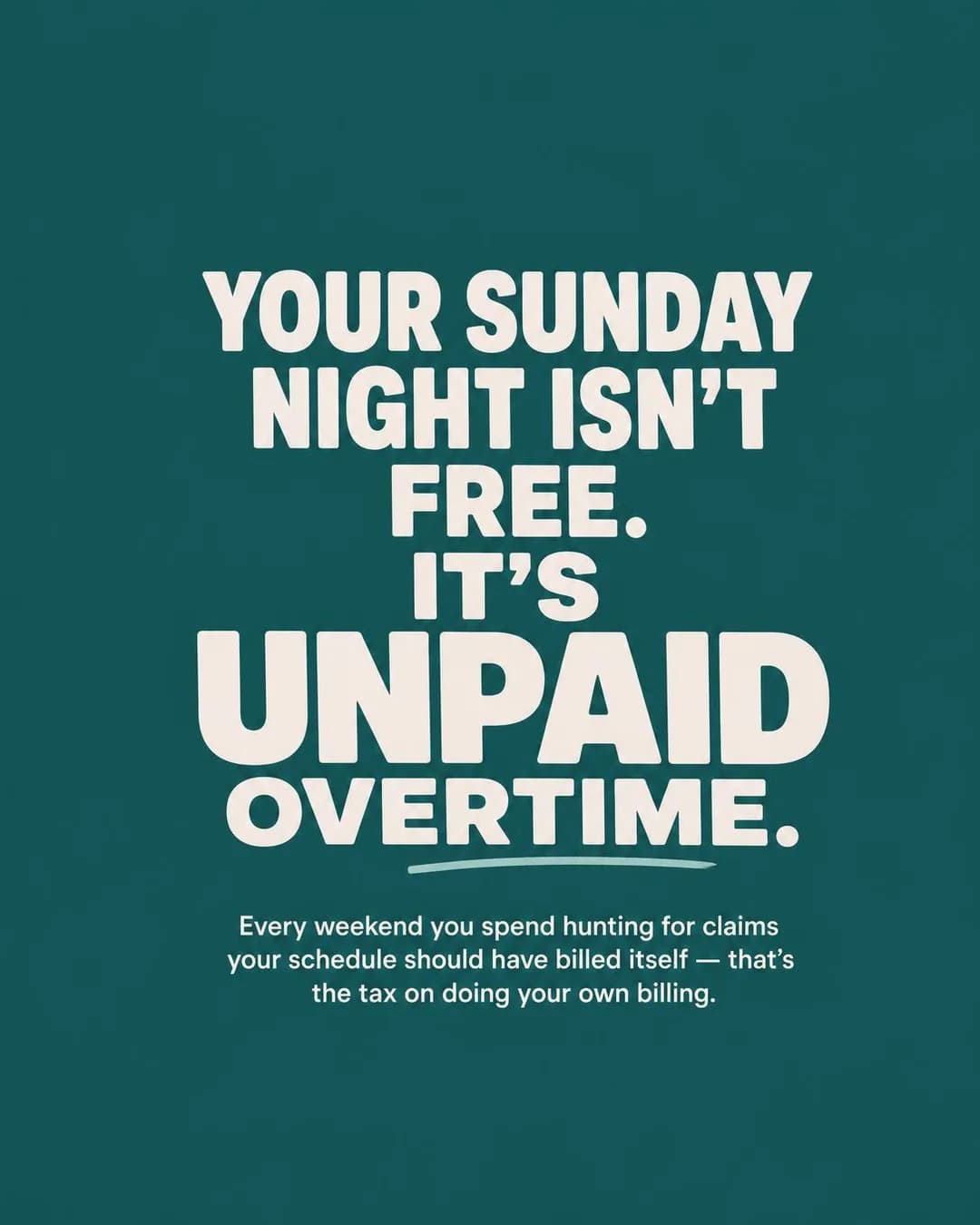
LeadsEvery Sunday you spend hunting for missing claims is unpaid overtime.
- Audience
- Owner-clinicians at one to three site practices — See patients all day and reconcile the schedule against the billing at the weekend, knowing some of it falls through and not which.
- Angle
- Cost of the Problem (Problem & Pain) — Quantifies the money, time, effort, missed revenue, or lost results caused by the problem.
You're working unpaid overtime every Sunday night. Cross-referencing schedules, hunting for missing claims, wondering what slipped through this week. That's not billing—that's a second job you didn't sign up for. A layer that sits on top of your EMR catches treated visits that never got invoiced, automatically, before the weekend even starts. First month typically surfaces a few thousand dollars already sitting in the gap. Thirty-day trial to see your own number.
Stop working Sundays for free
Billing integrity for PT clinics
Cost of the Problem is Problem & Pain's most disciplined sub-angle: it refuses to describe the product at all and simply prices the status quo. For an owner-clinician that price has two components, which is why the argument works twice — the claims that were never submitted, and the Sunday evening spent looking for them. The ad leads with the second, because unpaid overtime is the one a person feels, and puts the money underneath.
This is the control in the batch, and it produced the batch's cleanest result. A solid-colour quote card has no evidence slot: no chart, no screenshot, no receipt, no face, no logo, nothing for a model to invent a number into. Four of the other nine ads have a fabrication in them and this one has none, and the reason is structural rather than lucky. Where the direction offers a place to put proof, the model fills it. That is the most useful single sentence this run produced about steering a generator.
The one thing to handle before it runs is not in the image. The copy says the product "sits on top of your EMR", which makes the advertiser health-adjacent, and Meta's Business Tools terms prohibit sending data derived from health information — explicitly including the names given to events, conversions and custom audiences. An advertiser who names a pixel event "PT_claim_recovered" or builds an audience called "physio clinics" has put health information into Meta's systems in the one place nobody thinks to look. The ad is fine. The account it runs from is where this goes wrong.
Other headlines from the same run
- Your weekend isn't a billing shift
- Treated visits should bill themselves
- Catch the gap before the weekend
- Missing claims cost you twice
Call to action
"A few thousand dollars already sitting in the gap" is a claim about the reader's own practice, and the only honest next step is a page that shows how the number is found. Contact us fits the multi-site version of this buyer. Get offer would be wrong: the thirty-day trial in the copy is a trial, not an offer.
The Login Graveyard
LeadsThree systems later, your front desk still uses sticky notes.
- Audience
- Practice managers at two to four site veterinary groups — Already bought a system that the front desk quietly stopped using, and will not be the person who does that twice.
- Angle
- “I’ve Tried Everything” (Objection & Risk Reversal) — Speaks to people who have already tried competing solutions and failed.
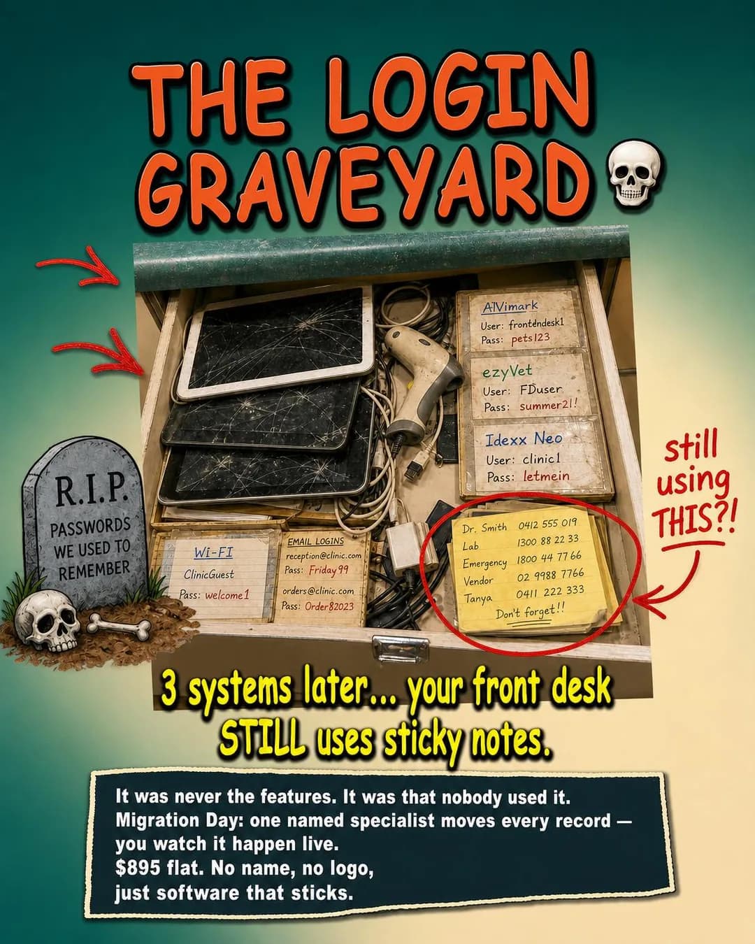
Three systems later, your front desk still uses sticky notes. It was never the features. It was that nobody used it. You bought scheduling software, integrated billing, even paid for training — and six months later, the team quietly went back to the whiteboard and the phone tree taped to the monitor. Migration Day is one named specialist who moves every record while you watch it happen live. $895 flat, credited back as three months of software. No logo, no sales pitch — just software your team actually opens on Monday morning.
Software your team actually opens
From $129/mo per doctor
"I've Tried Everything" is the objection nobody writes ads against, and in vertical software it is the objection. A practice manager at a two-to-four site veterinary group has already bought a system that the front desk quietly stopped using, and they are not going to be the person who does that twice. Notice what the ad refuses to argue: it never claims better features. It says the last one failed on adoption, and then answers with a named specialist, a flat $895 and a migration you watch happen. That is the correct shape — the objection is about risk, so the answer has to be a procedure rather than a promise.
It is also the funniest artefact in the run and worth reading closely. "No name, no logo" appears in the ad's own body copy and again in the image, which is the pipeline's unbranded instruction escaping into the creative as though it were a product feature. The Lo-fi Ugly Ad direction is the one most likely to do that, because its whole grammar is a thing that looks unmade.
And then the reason this is the page's must-not-run. The drawer contains three sticky notes reading AVimark, ezyVet and Idexx Neo — the three most-compared veterinary practice management products, all real, all currently sold — each beside a username and a password, under a tombstone reading "R.I.P. PASSWORDS WE USED TO REMEMBER" and an arrow captioned "still using THIS?!". Nobody asked for a competitor. The brand is unbranded, the prompt names no vendor, and the model reached into the vertical's actual product list because that is the shortest path to "a system you have outgrown". There is also a stack of plausible Australian phone numbers in the frame. Naming a competitor in your creative is a legitimate decision; having one arrive by itself, under a gravestone, next to a password, is not a decision at all. Check every rendered word in the frame — especially in a vertical, where the model knows the vendor list better than your marketing team does.
Other headlines from the same run
- The system they'll use on day two
- Migration you can watch happen live
- Built for adoption, not demos
- One specialist moves every record
Call to action
The whole ad is an argument that this purchase fails on adoption rather than features, and the page it earns is the one about the migration — the named person, the flat fee, the day it happens. Contact us is the better alternate than Sign up for a buyer whose last two decisions went wrong: they want to talk to somebody before they move records.
Three Warehouses, Zero Short-Ships
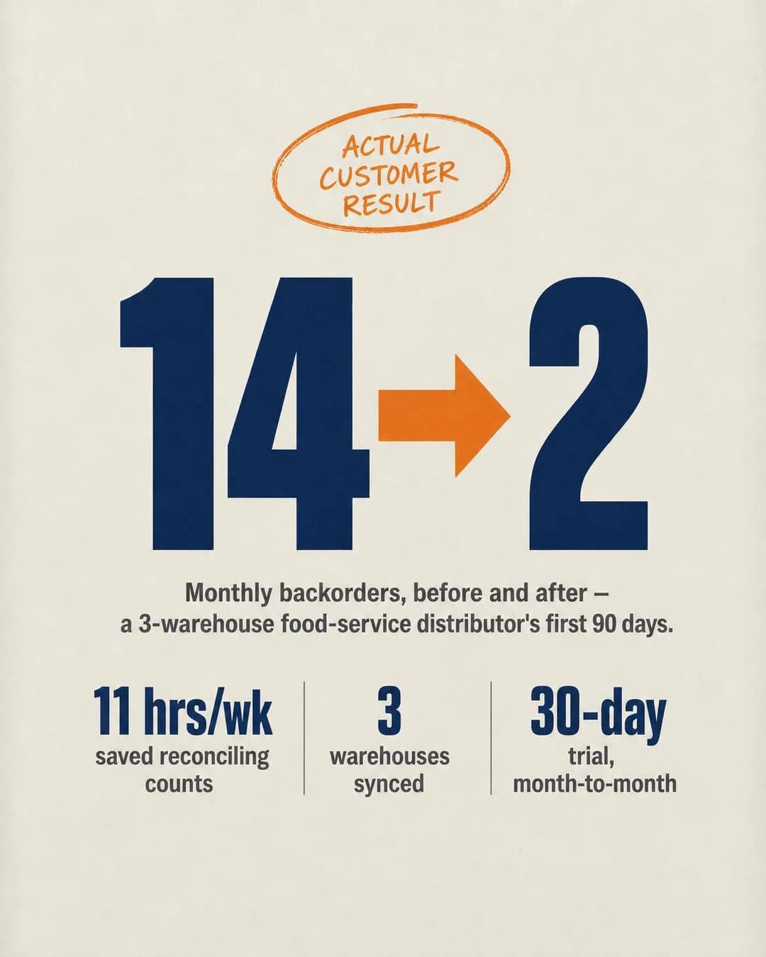
LeadsA food-service distributor cut monthly backorders from 14 to 2.
- Audience
- Operations owners at ten to sixty person distributors — Count stock twice a year, sell what the spreadsheet says is there, and eat the short-ships.
- Angle
- Case Study (Proof & Trust) — Gives a detailed example of one customer or client achieving a result.
A food-service distributor with three warehouses dropped monthly backorders from 14 to 2 in their first 90 days. They also saved 11 hours a week on manual stock reconciliation. Real numbers. Real customer. They moved off spreadsheets, synced all three locations in real time, and stopped overselling what they didn't have. Try it free for 30 days — no contract, month-to-month billing.
14 backorders to 2 in 90 days
Try free for 30 days
Case Study is Proof & Trust's highest-ceiling shape and the reason is arithmetic: a before-and-after from a business shaped like the reader's beats every adjective in the category. Fourteen backorders to two, in ninety days, at a three-warehouse food-service distributor, with eleven hours a week of reconciliation attached. The 86% in the alternate headline is correct against 14 and 2, which is a fourth clean rendered-arithmetic pass in this run. The specificity is what does the persuading, and it is also what makes the fabricated version indefensible rather than merely puffed.
The brief predicted this failure and the run went one better than predicted. A case-study angle on a business that does not exist was always going to produce an invented case study — that much was written into the plan. What was not predicted is that it would certify it. "ACTUAL CUSTOMER RESULT" is drawn into the image, in a hand-lettered circle at the top of the frame, where no alternate headline can reach it; "Real numbers. Real customer." is the second headline and the fourth sentence of the primary text. The gym Facebook batch's finding was that on this app an ad reaches for proof and invents it. This is the next step down that road: it invents the proof and then stamps it as verified.
The fix keeps everything except the certification. The shape — one named business type, two numbers ninety days apart, one operational metric underneath — is exactly right and is what the format is for. Fill it with a customer who agreed to be in it, and note that in this trade you often can: a distributor will let you publish backorder counts under an unnamed description far sooner than they will let you publish their logo. What must not survive is the circle at the top of the frame.
Other headlines from the same run
- Real customer. Real numbers.
- 3 warehouses, zero guesswork
- 86% fewer backorders in 3 months
- Stop short-shipping what you have
Call to action
A specific result invites one question — what happened in those ninety days — and Learn more sends it to the write-up. Contact us is the version for a distributor who wants to know whether it works across their own three sites. Neither button fixes the ad; the ad has to be true first.
The Only One Who Reads The Board
TrafficIf you're the only one who can read the board, that's not job security.
- Audience
- Owners of three to eight bay independent shops — Schedule on a whiteboard in the bay, quote from a parts catalogue and a calculator, and cannot leave for a week because only they can read the board.
- Angle
- Identity Callout (Identity & Emotion) — Directly identifies a profession, role, life stage, behavior, or type of person.
If you're the only one who can read the board, that's not job security — it's a system nobody built. Your techs are waiting on you to decode scribbles. Your phone's blowing up with 'where's my car' texts. You can't leave for an afternoon without the whole shop grinding to a halt. A drag-and-drop bay schedule, digital write-ups customers approve by text, and a shared screen anyone can read. One board, one system, no more being the bottleneck. Try it free for 30 days.
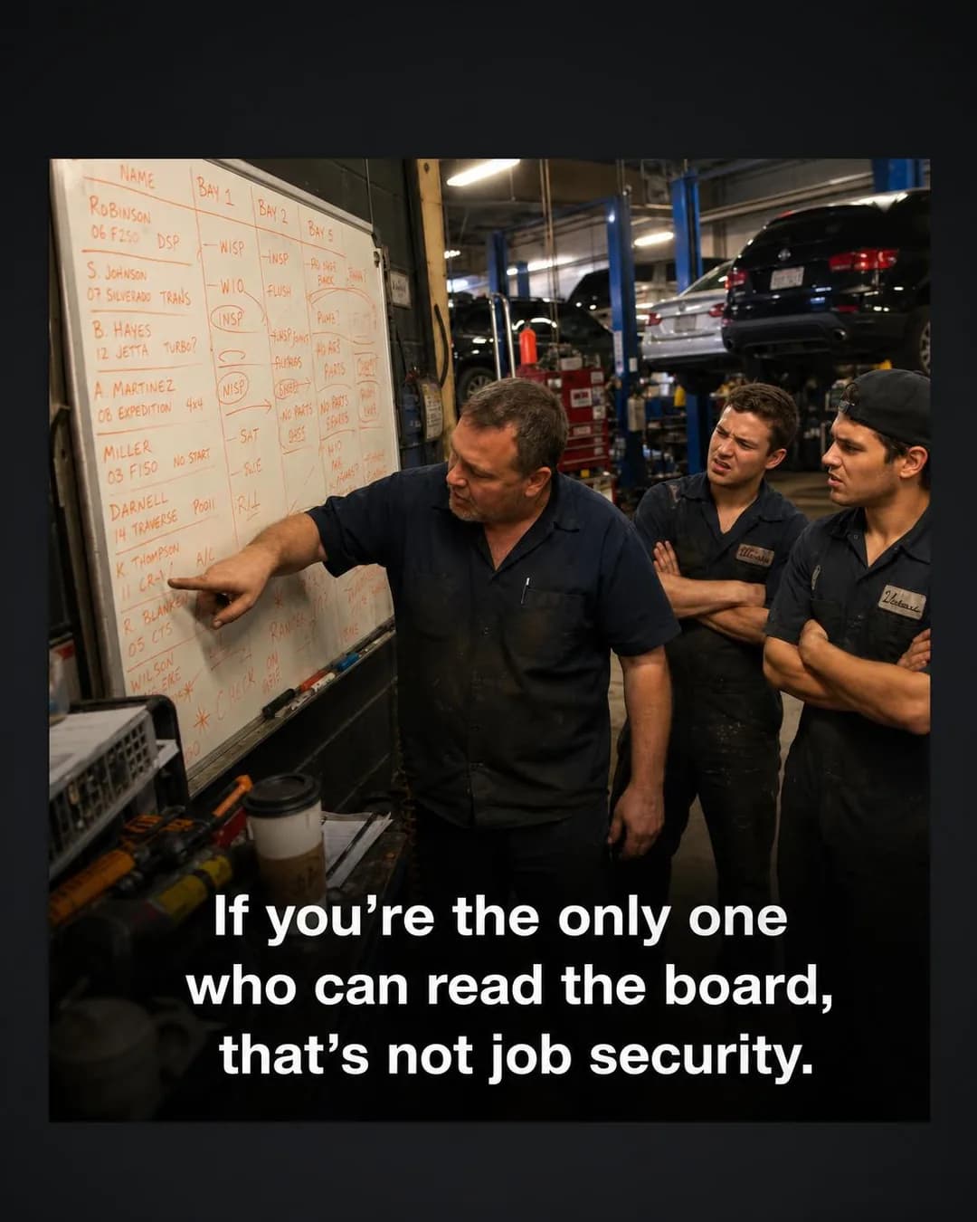
The board only you can read
Try it free for 30 days
Identity Callout does the qualifying that the ad set cannot, which is the argument the Instagram twin makes at length and which does not change here. "If you're the only one who can read the board" excludes everybody who has never run a shop, and it does it in ten words. What is different on this app is the content of the identity: on Instagram the reader recognises a moment in their week, and here they recognise a fact about their business. Being the single point of failure is a structural complaint, not a Tuesday, and it is the kind of thing a person notices about themselves at forty-five and not at twenty-five.
The frame is doing something the copy could not. Three faces, one pointing at a board only he can read, two mechanics with their arms folded waiting to be told — the ad's whole thesis is in the body language before a word is read. The whiteboard itself is dense with real vehicle models, which for an auto-repair advertiser is ordinary nominative use and reads as authenticity rather than as a claim.
Two things to fix. The 4:5 export is letterboxed: the square draft was re-framed to portrait by padding it with black bars rather than re-composing, so the ad arrives in a 4:5 slot with a 1:1 picture inside it and dead space top and bottom. Check the re-framed export, not just the square. And the three faces are generated people presented as your shop and your staff — the same problem as the founder ad, minus the first person. Photograph your own bay. In this trade that is a fifteen-minute job and it is better creative than anything a model will draw for you.
Other headlines from the same run
- Stop being the bottleneck
- Your crew can't read your system
- One screen the whole shop understands
- Job security or single point of failure?
Call to action
The ad has described the reader and not the product, so the page has to introduce it — which is why this one is pinned to Traffic rather than Leads. Book now is the alternate worth testing on the same creative: an owner who has just been told he is the bottleneck may want a demo more than a brochure.
Questions
- Do Facebook ads work for B2B software?
- They work when your buyer owns the business rather than works in it. Facebook reaches 80% of 30- to 49-year-olds and 74% of 50- to 64-year-olds, against Instagram's 62% and 40%, and that is exactly where the owner of a five-truck pest control company or a three-bay repair shop sits. For horizontal, product-led software bought by a practitioner, the other app is usually the better buy. For vertical software sold to an owner-operator, this is the cheapest place to reach them and nobody else is bidding for that impression as hard as they bid on LinkedIn.
- Why do these ads use Leads when the SaaS Instagram page uses Traffic?
- Because the buyer changed. A self-serve subscription completes in the ad's own session, which is why the Instagram batch is Traffic-led and carries two Sales ads. An owner-operator buying software for a business with staff and a contract does not do that at nine in the evening on a phone — they ask a question, take a call, or watch somebody move their data. So this batch is six Leads, two Traffic, one Sales and one Awareness. The one Sales ad is the one with a published per-truck price and an online signup behind it.
- What size should a SaaS Facebook ad be?
- 4:5 at 1440 × 1800 for the feed, and compose it so a square crop out of the middle still works, because Marketplace recommends 1:1 and Advantage+ placements will take your portrait there without asking. Six of the ten ads below are 4:5, one is 1:1, two are 1.91:1 for the right-hand column and search results, and one is 9:16. The wide shapes are worth using deliberately rather than by default: they route to the smallest surfaces on the app, so a wide ad full of body copy is a wide ad nobody reads.
- How long should the headline be?
- Twenty-seven characters, which is shorter than most people expect and shorter than Instagram's 40. It is measurable on this page: the ten ads below produced fifty headlines, five of which fit Facebook Feed's recommendation and all fifty of which fit Instagram's. Nothing is rejected for being longer — Meta truncates — but truncation happens first on the smallest surfaces, so the first clause has to be the ad.
- Can I name a competitor in a software ad?
- You can, and it is normal practice in this category — but it should be a decision rather than something that happens to you. One ad on this page names three real veterinary products in the image, under a tombstone, next to passwords, and we did not ask it to. That is the specific risk of running a generator inside a vertical: the shortest way to say "the system you have outgrown" is the name of the system, and the model knows the names. Check every rendered word in a frame before it runs, and if a competitor is going to appear, put them there on purpose.
- Can I use these ads?
- Take the approach, not the pixels. Every company here is invented and every number in them is a placeholder, and four of the ten are flagged below as must-not-run for reasons that would apply to your version too. What transfers is the pairing of an owner with a specific argument — the contract that renews itself, the migration nobody wants to do, the four logins that run one gate. Every angle used is documented in full in our ad angle library, linked from each ad.
Seen enough? Make your own.
Paste your product site. It reads what you do, who it is for and how you sound, then writes the concepts, renders the images and drafts the copy — for the one audience you cannot target by job title.
No credit card · 50 free credits (about 5 ads or Instagram posts)
Every angle used above is documented in the best-in-slot ad angle library. More industries and placements are at all ad examples.