
Ad Examples · Dentists × Instagram · 10 ads
Dentist Instagram ad examples
Ten finished Instagram ads for dental practices — with the audience, angle and objective behind each one, because we generated them rather than collected them.
Search for dental ad examples on Instagram and you find three genres, none of them an ad you could learn from. There is the whitening influencer with a discount code, which is a sponsorship and tells you nothing about how a practice would run the same offer. There are the mail-order aligner ads themselves, which is the category's biggest spender telling you what your competition looks like. And there is the screenshot grid of before-and-after smiles lifted off practice pages by marketing accounts that did not ask — collected images again, with no audience, no angle and no objective attached, because whoever collected them could not have known those things.
So these were not collected. Every ad below was generated with the audience, the angle and the objective chosen up front, which means the brief printed beside each one is the brief that actually produced it. The practices are invented — an enamel-check clinic, a preview-first orthodontic studio, a conversation-first practice, a cosmetic studio that prices by the month, none of them real — so no practice's creative is borrowed and no patient's face is used. The skew is deliberate: this is the cosmetic and aligner half of dentistry, sold to the ages where Instagram actually has the reach, which makes it the structural inverse of the Facebook page in this cluster rather than a second version of it.
Nothing was edited afterwards. The image, the body text, the headline and the alternates under each ad all came out of one run and are printed exactly as they arrived. That is the point: a page arguing a machine can make a usable ad is worth nothing if a person quietly fixed the ads first. And no sample failed this time: the Facebook and gym pages each carry one ad that came back as an entirely new concept after a crash, and the fashion page carries two, but this run came back ten of ten in a single pass, so nothing below is a second attempt at anything.
The prices are invented, and in this batch that warning covers more than fees. Monthly financing figures, a published three-item cosmetic menu, a founding date, a count of sessions delivered — all of it belongs to practices that do not exist, and a fee or a credit term published in an ad is one you have to honour: the ADA's Code of Professional Conduct requires that fees not be represented in a false or misleading manner, state boards enforce their own advertising rules on top of it, and a financing claim is a contract claim — the terms in the ad have to be the terms in the agreement. Read every number here as a placeholder showing where a real one goes.
One thing you can read off the briefs before looking at a single image: not one of the ten was written for a Sales objective. Seven are Leads, two are Traffic and one is Awareness — the identical distribution to the Facebook batch, and that is not a lack of imagination. Nothing in dentistry completes in a checkout, on either platform; the objective is decided by the trade, and the platform decides who you can reach. What is different here is everything above the objective: which offers, which moments, which first sentence.
And it is worth knowing what the honesty costs before you scroll. Three ads on this page should not run as they stand. One opens by telling the reader what they see in their own mirror, quotes a patient who does not exist, and carries a founding date nobody lived through. One is a before-and-after of a smile nobody in the photograph owns. One carries a gallery of cases that never happened. A fourth is signed by a dentist who does not exist — the letter is the fixable one, and the signature is the whole repair. Steering the brief is not the same as controlling the output — the sentence the gym page in this cluster earned, earned again here, and in a category whose entire vernacular sits one word from a policy line, that gap is the lesson the page exists to teach.
What changes because it is Instagram
The first question is why a dental practice would run this on Instagram rather than Facebook, and for this half of the trade the answer runs the opposite way to the Facebook page's. Pew's November 2025 survey puts Instagram at 80% of US adults aged 18 to 29 and 62% of those 30 to 49 — against Facebook's 68% and 80% for the same groups. Cleanings are spread evenly across ages; the offers that make money from a young audience are not. Aligners, composite bonding, whitening before an event, a first practice of your own — those concentrate exactly where Instagram reaches and Facebook does not. The two pages of this cluster split dentistry by procedure: the Facebook one gets implants, dentures and emergency work, and this one gets everything a twenty-something books. An orthodontic or cosmetic practice has a real argument for this app; an implant clinic does not, and the Facebook page says so itself.
The second difference has no number attached, and most dental marketing never mentions it: Instagram has no search surface to capture demand from. In our own publisher, the 1.91:1 ratio routes to Facebook's right-hand column and search results — the place a six-in-the-morning toothache search lands — and Instagram has no equivalent at all, so that shape is absent from this batch on purpose. Nobody types 'dentist near me' into Instagram. Every reader here is mid-scroll, which is why all ten briefs open on a moment — a row of seltzer cans, a lock screen, a photograph someone kept for ten years — and none opens on a service name. On Facebook, an emergency ad catches demand; on Instagram, every ad has to interrupt, and the first sentence is the whole mechanism for doing it.
Third, the policy cage is the same one the Facebook page describes — health is not a special ad category, so every targeting lever survives, and Meta's personal-attributes policy is what actually rejects dental ads — but it bites hardest on this half of the trade. The cosmetic vernacular is worse than the restorative one, because a line like 'Embarrassed to smile?' asserts something about the reader's health and their appearance at once, and the appearance half carries its own prohibition: statements of inferiority about physical appearance are banned outright, and imagery that works by making the viewer feel bad about how they look never stopped being banned. The one rule that moved is the one a cosmetic practice most wanted: on 22 July 2026 Meta permitted before-and-after transformation imagery for cosmetic procedures again, at 18 plus. The image is no longer the violation; the caption still is.
Fourth, the specs, and the received wisdom is backwards here too. Meta's ads guide recommends a headline of about 40 characters for an Instagram Feed image ad — against Facebook's 27 — so the platform everyone treats as wordier actually gives you thirteen more characters to work with. The primary text recommendation is about 125 characters, and the same first-sentence rule as Facebook applies: measure this batch and all ten primary texts run over, at 271 to 548 characters, while only one of the ten headlines the ads lead with crosses 40 — six more of the fifty alternates do. The argument has to survive inside the first sentence either way. The image is 4:5 at 1440 × 1800, identical to Facebook Feed so one export serves both — but the aspect-ratio tolerance is 1% here against Facebook's 3%, so a crop a few pixels out of true passes there and fails here. Two ads below are 9:16 for Stories and Reels, and none is 1.91:1 — a choice rather than a rule, corrected 7 September 2026. Instagram Feed's technical requirements accept a minimum aspect ratio of 4:5 and a maximum of 1.91:1, so the wide asset is not rejected here; the surfaces built to want one are Facebook's right-hand column and search results.
Finally, the audience you already own is here too, and it is younger. A practice's Instagram profile has engagers, story replies and saved posts attached to it — the warm pool the middle of the funnel runs on, and the same most-skipped asset as on Facebook. The patient list itself is a HIPAA question the ad platform cannot answer, and Meta's Business Tools terms prohibit health-based names on events and audiences, exactly as the Facebook page describes. The destination is where the two apps genuinely diverge, and it is the one thing a page of examples cannot show you: lead ads here can click to a conversation on Messenger, Instagram or WhatsApp, so a practice's reply thread is part of the ad set — staffed, or better bought as a form.
Source: Meta Advertising Standards — Health and Wellness (policy updated 22 July 2026) · Meta Advertising Standards — Privacy Violations and Personal Attributes · Meta Marketing API — special ad categories (health is not one) · Meta ads guide — image ad specifications, Instagram Feed · American Dental Association — advertising, marketing and the Code of Professional Conduct · Pew Research Center — Americans' social media use, November 2025
Want the campaign, not just the creative? Instagram ads for dentists → is the playbook these ads came out of: which objective to buy, the offers worth running, the targeting levers this trade keeps, and the policy that decides what the copy may say.
Generate ads for your own practice
Paste your site and best-in-slot reads it the way these invented practices were read — services, patients, positioning — then writes the concepts, renders the images and drafts the copy. Free to start, no card.
The Innocent Can Count
TrafficFour seltzers a day isn't hydration, it's a habit with a bill.
- Audience
- Sparkling-water devotees in their twenties and thirties — Gave up soda years ago and replaced it with sparkling water and citrus water, chose it precisely because it seemed like the healthy option, and have never connected the new sensitivity behind the front teeth with anything in the glass.
- Angle
- Bad Habit (Problem & Pain) — Frames repeated behavior as the source of poor results.
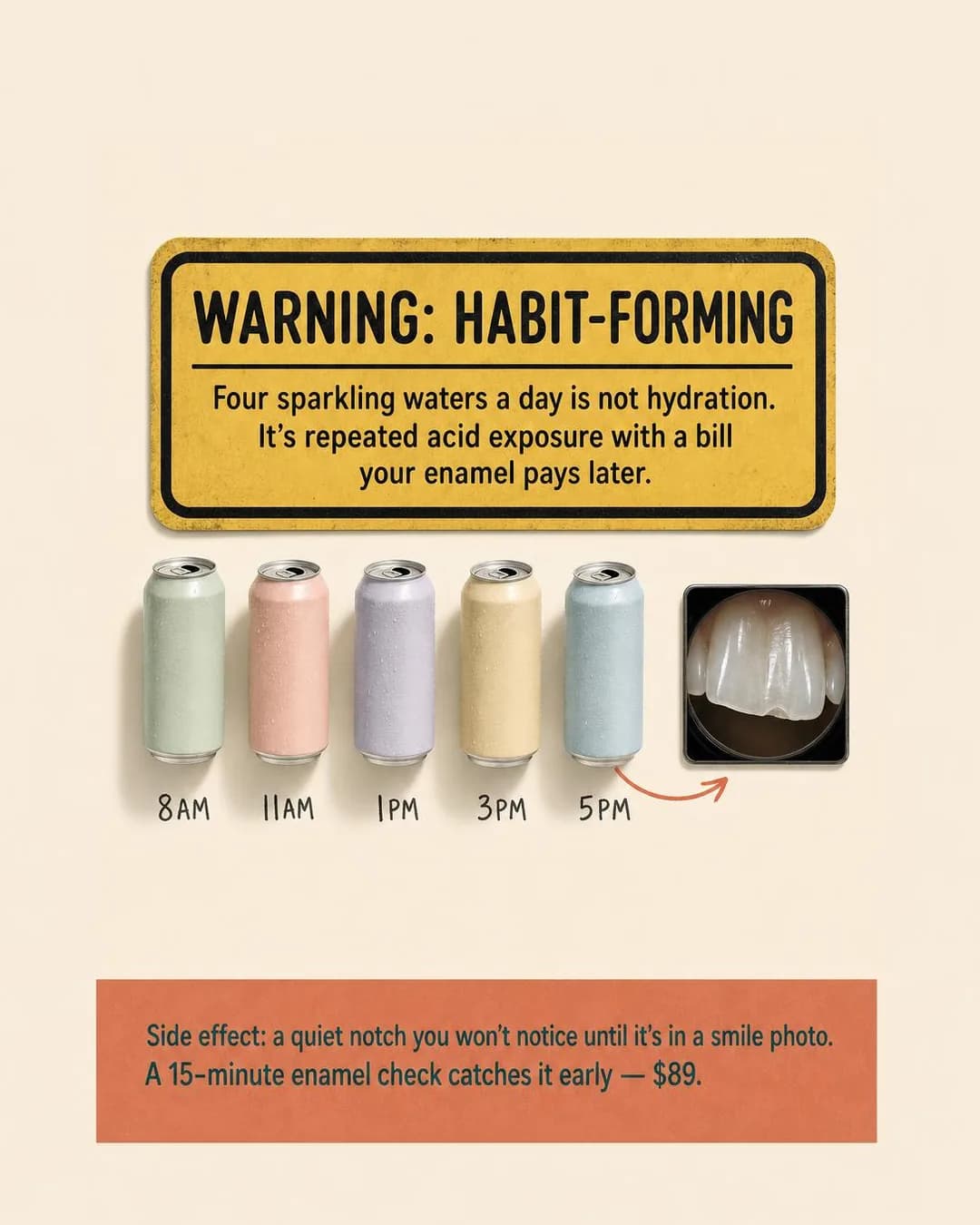
You swapped soda for sparkling water and thought you'd made the healthy choice. But four cans a day means your front teeth are sitting in acid from breakfast to dinner — and enamel doesn't grow back. Our 15-minute Enamel Check catches the groove before it shows up in photos. $89, same-visit fluoride treatment included.
Four cans a day has a price
15-min check + treatment, $89
This reader chose the healthy option, which is the whole design of the brief: the ad is welcome news rather than an accusation, and the warning-label parody is the right genre for it — it borrows the authority of a label without diagnosing anyone. The five cans with their handwritten times (8AM to 5PM, in order, for once) are the audience brief rendered as objects: the tally the primary texts talk about, drawn instead of said. And the calibration in the brief held where it mattered: the image says 'acid wear', not 'dissolving', and the model did not reach for the exaggerated claim the Health and Wellness standards prohibit.
Then read the copy against the image, because that is where it slips. The image's banner — 'a quiet notch you won't notice until it's in a smile photo' — is second person, aimed at the reader's mouth, the exact shape the personal-attributes policy rejects; the compliant version is already in the same run as a headline ('Catch the groove before the photo does'). The five primary texts describe four different examination mechanisms between them — magnified imaging, backlit imaging, a 'five-minute fluoride shield', a fluoride varnish — and one ad cannot mean all of them; pick the one the practice actually owns and delete the rest. And the last primary text promises the wear is 'still reversible', while the run's own headline says enamel doesn't grow back. Enamel lost is lost; fluoride manages what remains. A clinical claim that contradicts itself inside one ad is the kind of thing a reader who almost came in will notice.
Other headlines from the same run
- Sparkling water isn't neutral
- Your healthy swap is wearing you down
- Enamel doesn't grow back
- Catch the groove before the photo does
Call to action
Written for Traffic, and correctly: this reader has a habit, not a symptom, and has not accepted the premise that their teeth are involved. Send them to the page that shows the wear and what the $89 check does, with the calendar at the bottom of it. Book now on the ad itself is worth testing only against a warm audience that already knows the practice.
The 45-Minute Deadline
LeadsInterview's in 12 days. Your teeth need 45 minutes, not 12.
- Audience
- People with an event on the calendar and no spare evening — Have a big interview, a reunion or a first date inside a month, whiten once with strips every couple of years and always stop halfway through the box, and assume professional whitening means taking a half day off.
- Angle
- Speed (Benefit & Outcome) — Emphasizes achieving the desired result faster.
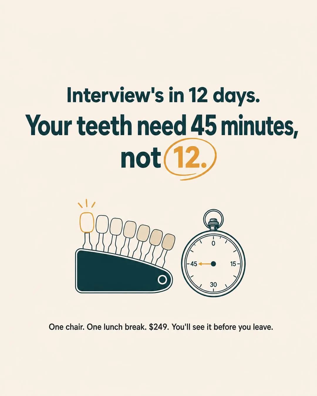
Interview's in 12 days. Your teeth need 45 minutes, not 12. Book a single in-chair whitening session during lunch, walk out with a shade-card comparison in hand, and stop pretending you'll finish that take-home kit in time. One chair. One hour on the calendar. $249 flat.
45 minutes. Visible result. Done.
Book your Midday Session—$249
Speed ads fail when the speed is generic — 'fast whitening!' — and this one works because the speed is priced against a specific countdown: twelve days to the interview, forty-five minutes to the result, the arithmetic visible on the poster. The stopwatch is the concept's object, and for once the dial is right: 0, 15, 30, 45 around the face with the hand at 45, so the rendered number and the claimed number agree — the emergency ad on the Facebook page could not manage that with a wall clock. The shade-card fan beside it is the proof object, and 'you'll see it before you leave' is the claim that genuinely separates in-chair whitening from the half-finished strip box in the drawer.
One wobble worth catching before anyone books: the primary text says 'One chair. One hour on the calendar' two sentences after promising forty-five minutes, and the poster's own footer says 'One lunch break', which is the honest version. Pick one duration — the reader who books an 11:30 slot is going to find out which. Otherwise this is the compliant shape of a dental ad: the copy is second-person throughout but never asserts a condition about anyone's health, because the calendar does all the talking. It is also the only ad on the page whose whole argument survives with the dentistry unnamed, which is what makes it Instagram-native rather than a Facebook ad with the platform swapped.
Other headlines from the same run
- Whiter teeth by end of lunch break
- One session. See it before you leave.
- Interview-ready teeth in under an hour
- Skip the kit. Book the 45-minute fix.
Call to action
A time-boxed offer with a flat published price is a calendar ad — the slots are the scarcity and they are real. Learn more is the right swap if $249 needs the 'what's included and will it make my teeth sensitive' page first, which for a first-time in-chair patient is a reasonable bet.
Ten Minutes, One Wand
TrafficOne scan replaces the tray you've been dreading for years.
- Audience
- Adults who want straight teeth but not the guess — Have thought about aligners for years, dread the impression tray more than the price, and do not believe a result they cannot first see on their own face.
- Angle
- How It Works (Product & Mechanism) — Explains the process from input to mechanism to result.
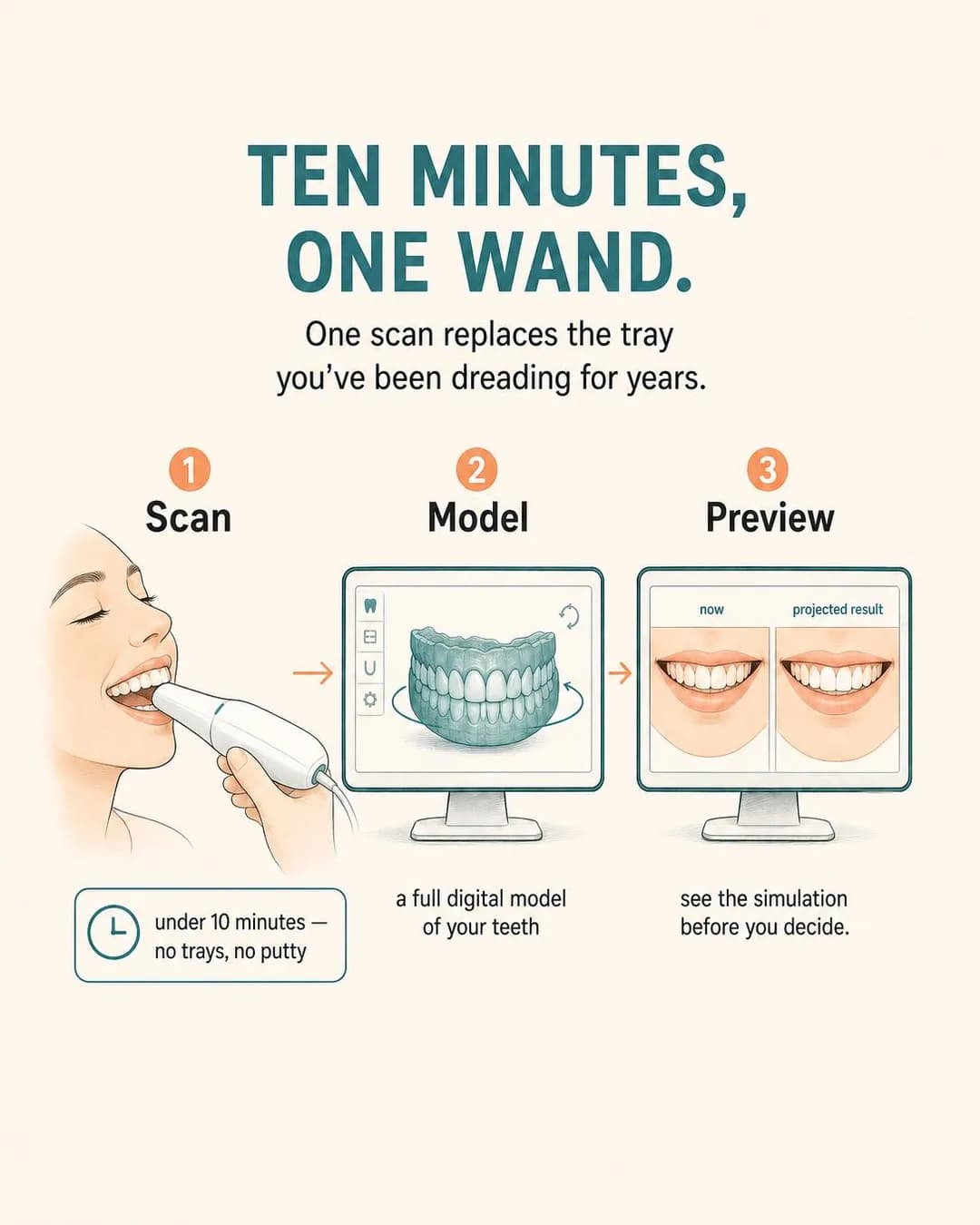
The tray. That's the part you've been putting off, isn't it? One handheld scanner replaces it entirely. Ten minutes, no gag reflex, no redos. Your teeth get captured as a full 3D model, turned into a simulation you watch on-screen before you agree to anything. See the projected result at the first visit — then decide if you want it.
See your result before you commit
Preview Visit starts at $95
The audience brief said the dread of the impression tray outweighs the price, so the diagram sells the wand, not the aligners — the same mechanism-ad logic as the Facebook page's same-day crown: the reader cannot book a procedure they don't believe in, and the preview is what makes aligners buyable for someone who has thought about them for years. Three panels, Scan to Model to Preview, each carrying one claim, and the third panel's caption — 'see the simulation before you decide.' — is the whole offer: the risk-reversal and the mechanism are the same feature.
Two things to weigh. 'TEN MINUTES' in the headline and 'under 10 minutes' in the callout are not the same promise — pick one, because a reader who is told both will assume the one you didn't mean. And the monitors show a generic arch and a generic now-versus-projected pair that belong to nobody, while the copy promises 'your own smile' — a diagram is allowed to be generic, but the promise belongs to the consult, not the ad, and the landing page is where the real scan's simulation should be sitting. The best line in the run is the fifth primary text's third-person open: 'Most people don't avoid aligners because of the cost. They avoid them because of the tray.' That is the compliant construction and the sharpest sentence in the batch, in the same run that produced the emoji-first alternates.
Other headlines from the same run
- One scan. No trays. Your call.
- The tray-free way to straight teeth
- Ten minutes replaces the mold
- Preview your smile, then decide
Call to action
Traffic, for the same reason as every mechanism ad in this cluster: the premise — that the tray is optional now — has to be accepted before a booking button makes sense. Send the click to the page that shows the scan, and put the $95 preview visit (credited if treatment starts within 60 days, per the copy) at the bottom of that page as the second step.
The Fifteen-Year Photo Habit
LeadsOne corner changed. Twenty years of half-smiles didn't.
- Audience
- Adults who broke a front tooth years ago and smile around it — Chipped a tooth at fifteen on a pool edge or a trampoline, have arranged their smile ever since, and assume the fix means a crown and grinding the tooth down to a stub.
- Angle
- Before / After (Proof & Trust) — Contrasts the state before adoption with the state after adoption.
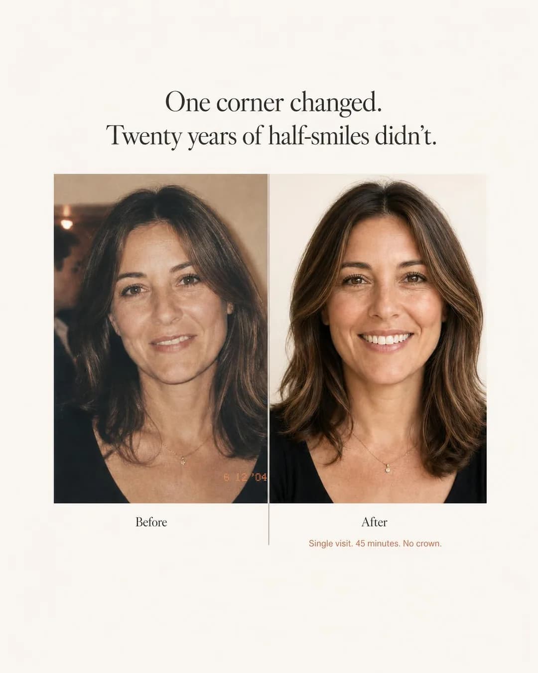
She spent 20 years smiling with her lips pressed together. Not because she didn't have things to smile about — because she chipped a front tooth at seventeen and thought fixing it meant grinding it down for a crown. One 45-minute appointment. One corner rebuilt with composite resin, shade-matched to the tooth beside it. No drilling. No temporary. No second visit. Corner Restore starts at $450.
One corner fixed. Two decades ended.
Single-tooth composite bonding
This is the second before/after specimen in the cluster, and it was briefed as the deliberate counterpart to the Facebook page's one. That run failed because nothing was held constant: a ninth-grade yearbook photo against a portrait decades later, different eras and cameras, and the gap the ad was about wasn't visible in either panel. This brief pinned 'the same smile photographed the same way', and the model got two things the last run missed: it is the same woman in both panels — the necklace is constant, the face is hers — and the before panel carries a 2004 date stamp that the copy independently agrees with ('The tooth chipped in 2004'). Image and copy landing on the same year without coordination is the rarest thing these renders do.
And it still fails the standard, in the instructive place. The before is a dim candid with the smile restrained; the after is a bright studio portrait, mouth open — different light, different framing, different expression, which is precisely what the 'comparable presentation' requirement in professional advertising rules exists to prevent, and it recreates the emotional before/after (self-conscious then, confident now) rather than the clinical one the July 2026 rewrite permits. The chip itself is not verifiable in the before panel, so the image still does not contain its own claim — the Facebook specimen's failure, one run closer. Then the copy, which is the teaching pair in miniature: the first, third and fourth primary texts put the story in a patient's mouth — 'She spent 20 years smiling with her lips pressed together' — the compliant construction; the second and fifth turn on the reader: 'You've been arranging your smile in photos since high school' and 'You've been self-conscious about this for how long?' — the second-person appearance assertion the policy prohibits. One brief, one run, both sides. Do not run this ad as it stands: the patient does not exist, and a before/after asserts an outcome. Run the format — your own case, written consent, identical framing and lighting, a representative result, and the ad set at 18 plus.
Other headlines from the same run
- 45 minutes. No crown. Same-day repair.
- The chip you've hidden for 20 years.
- Fix the corner. Keep the tooth.
- Same visit. No drilling. $450.
Call to action
$450 for a single tooth is a small, concrete ask, and this reader has been ready for twenty years — give them the calendar, with the exclusions (which cases are one visit, which need a crown instead) on the booking page. Deliberately not Get offer: beside a transformation image an offer button reads as a guaranteed result, which is the one claim nobody can make about bonding.
The X-Ray They Skip
LeadsA selfie can't see what's under your gums. An X-ray can.
- Audience
- People who keep seeing mail-order aligner ads — Have done the quiz on a direct-to-consumer aligner site twice, liked the price, and stopped at the part where no dentist ever examines the teeth or takes an x-ray.
- Angle
- Alternative / Substitute (Comparison & Positioning) — Compares your solution with a completely different way of achieving the same goal.
A selfie can't see what's under your gums. An X-ray can. Mail-order aligner kits skip the X-ray, skip the exam, and skip the part where a dentist actually looks in your mouth. Our clear aligner treatment starts with a real diagnostic visit — X-rays, bite assessment, gum health check — and includes in-office progress visits every 6 weeks so a dentist can course-correct if needed. Same discreet trays. Actual clinical oversight. From $2,400 with interest-free payments.
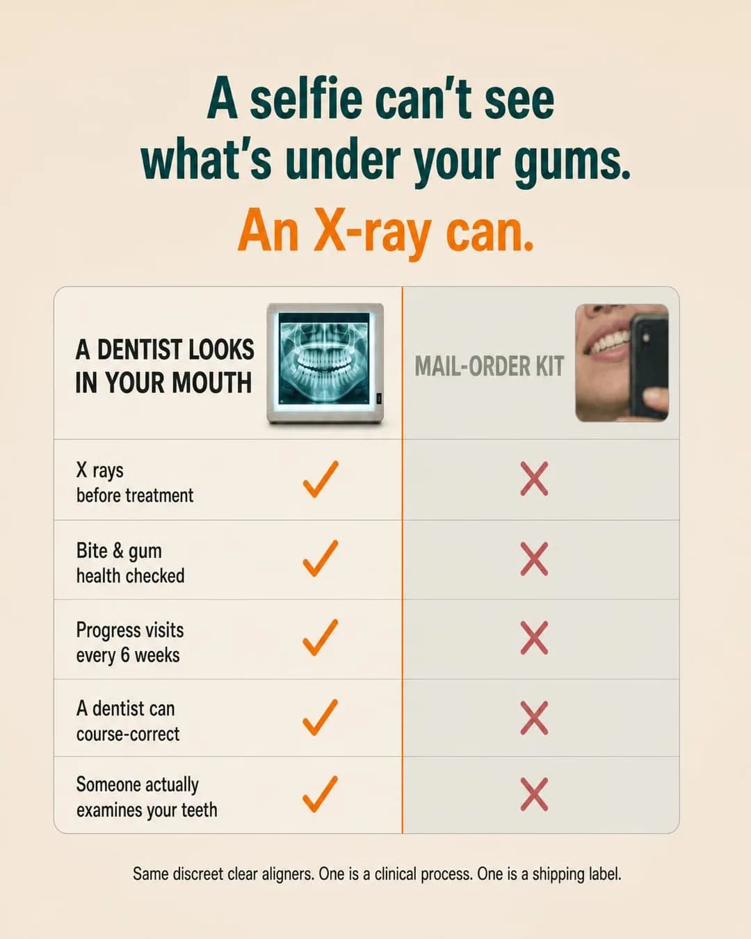
Clear aligners. Actual dentist visits.
Book your $95 diagnostic exam
The comparison this reader is actually running is the mail-order quiz they have done twice, so the chart's argument is exactly right: not 'our trays are better' but 'one is a clinical process, one is a shipping label', with every row a thing a kit structurally cannot do — an X-ray, an exam, a course-correct every six weeks. Alternative-Substitute is the family that splits a category and hands the reader the safer version, and the split here is honest: the kits genuinely take a selfie and ship, and the rows say so. The image carries the argument without a price on it, and the phone in the selfie panel rendered with no brand on it — this style of ad is one third-party logo away from a problem, and the draw stayed clean.
What to read before running it. The footer — 'One is a clinical process. One is a shipping label.' — is a comparative claim about competitors published under your own name, and so is the fourth primary text's 'whether the plan is even safe for your teeth': the row facts are defensible (a kit cannot X-ray anyone), the safety inference needs either your own comfort or softer wording, and 'no one examines your teeth' is the fact that carries the argument without it. The chart renders 'X rays' without a hyphen while the headline hyphenates it — a typo-class flaw, the only one on an otherwise disciplined image. And the ask is the best offer-shape on the page: a $95 diagnostic exam credited toward treatment, which converts curiosity into a clinical relationship instead of a shopping cart.
Other headlines from the same run
- A dentist should look in your mouth
- The X-ray mail-order kits skip
- Supervised aligner treatment from $2,400
- Not a kit. A clinical process.
Call to action
The ask in the copy is a $95 exam, not a $2,400 treatment plan, and a small credited exam is a calendar ask — send the click to the exam booking, not to a general aligners page that doesn't carry it. Learn more is the right swap if the practice wants the comparison substantiated on a page before anyone books anything.
The Wall of Every Mouth
LeadsCrowded teeth, gapped teeth, worn-down teeth—there's a mock-up proving it works for each.
- Audience
- People who want veneers and are afraid of the fake ones — Have seen the bad cosmetic work on a relative or a reality show, want their own teeth but better, and fear committing to something irreversible with no preview.
- Angle
- “Will It Work for Me?” (Objection & Risk Reversal) — Proves fit across personas, use cases, circumstances, or customer types.
"Will this even work for my teeth?" That's the question we hear most. So we keep a wall of every starting point we've seen — crowded, gapped, chipped, worn-down, discolored. Each one paired with its wax mock-up and final result, side by side. You see the range, then we build yours. You hold it, photograph it, and decide whether to move forward. Nothing is touched until you say so.
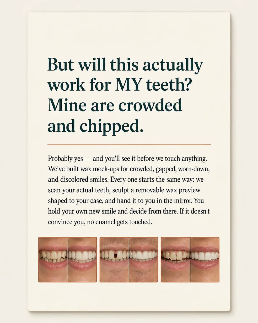
See your new smile before we touch anything
Preview appointment: $185, fully credited
The audience brief named the objection precisely — wants veneers, afraid of the fake ones — and this is the only ad on the page that answers an objection with a mechanism rather than reassurance: a wax mock-up held in the patient's own hands before any enamel is touched. The question rendered on the card is the compliant construction the Facebook page's sedation ad used: the doubt in a patient's mouth — 'But will this actually work for MY teeth? Mine are crowded and chipped.' — rather than aimed at the reader, and the copy's first primary text carries the same line in its plainer form, 'Will this even work for my teeth?' Will-It-Work-For-Me is only ever answerable proof-per-case, which is why the concept reaches for the gallery, and why the gallery is where the problem is.
The wall is invented. The copy claims paired cases for 'every type of starting smile we've reshaped' — crowded, gapped, chipped, worn-down, discolored — and the image renders three unlabelled before/after mouth pairs: patients who do not exist, with outcomes nobody produced. A fabricated case gallery is the same class of hazard as the SaaS page's invented testimonial, and heavier in a trade where the gallery is the proof; this is the ad on the page that must not run as-is, and the fix is not a different prompt — it is the practice's own cases, consented, plus one photograph of the actual wax mock-up, which is the object no competitor's ad shows. Note also that the concept drifted: the mock-up, the mechanism the whole offer rests on, is in the copy and not in the picture.
Other headlines from the same run
- Crowded, gapped, chipped — proven for each
- Hold the preview. Approve it. Then proceed.
- Your exact smile, sculpted in wax first
- No surprises. No regrets. Just proof.
Call to action
The offer carries a mechanism and a price with conditions (the $185 preview, credited), so it needs a page — the copy itself says 'Nothing is touched until you say so', and the click should land somewhere that proves it. Book now is right only once that page exists and the consult books online.
The Bill Stack Comparison
LeadsRent, car, phone, smile. Same stack, one more line.
- Audience
- Under-40s who can afford a monthly number but not a five-figure quote — Already run their life on a rent, a car payment and a phone plan, buy most large things on installments, and have put cosmetic work off for three years because it was quoted as one total.
- Angle
- Financing / Installments (Offer & Economics) — Focuses on affordability through payment structure rather than absolute price.
You already budget in monthly lines. Rent. Car. Phone. Why should your smile be different? Clear aligners: $99/month for 12 months. Porcelain veneers: $149–$219/month for 12 months. In-house financed. No interest line. No third-party lender. The number you see at your consult is the number on every statement. Book a free design consult. Walk out with your one-page plan — treatment, total price, and the exact monthly number that doesn't change.
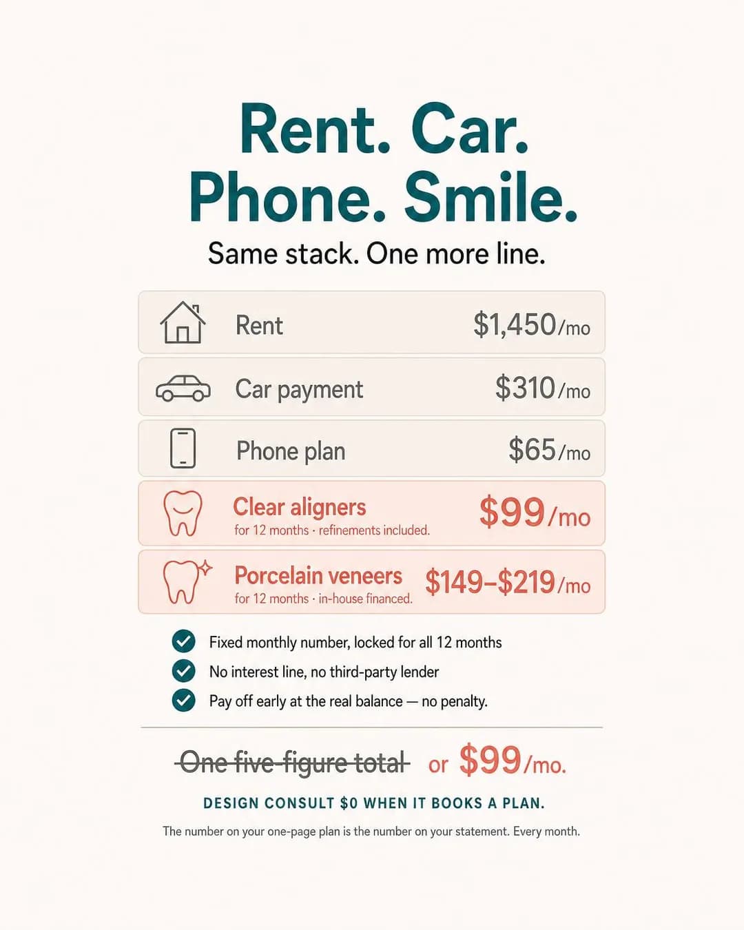
One more line on the bill stack
Free consult. Fixed monthly.
Financing-Installments is the honest economics family for this half of the trade, and this is its honest use: not a discount, a re-denomination — the five-figure total becomes a line on a bill stack the reader already manages every month. The image is the concept built as an object, and for once every number in the render foots against the copy: $99 and $149–$219 over twelve months, the struck-through 'one five-figure total' as the anchor, no total contradicting anything. The rendered-number discipline that failed the gym page's calendars held across this whole graphic.
The line to read before running is the third primary text's 'If you can afford a car payment, you can afford the smile you've been putting off' — it asserts what the reader can afford, which is one sentence from the vulnerable-financial-status clause, and the compliant version is already in the same run ('Most people put off veneers because they see one big scary number' — people in general). Then the terms: 'In-house financed. No interest line. No third-party lender.' is a set of credit claims, and the terms in the ad have to be the terms in the contract — the graphic's checklist promises 'pay off early at the real balance — no penalty', and that has to be in the actual agreement before it is in a render. And the footer's 'DESIGN CONSULT $0 WHEN IT BOOKS A PLAN' is a condition pretending to be a freebie: free-when-it-converts is not free, and the second primary text admits the condition out loud. Say the condition or drop the word.
Other headlines from the same run
- $99–$219/mo. In-house financed.
- Veneers quoted like a car payment
- Same monthly budget. Better smile.
- The number we quote never changes
Call to action
Financing is terms, exclusions and a credit question — a page, never a form, for the same reason the Facebook page sends its membership plan to a page. Book now is right only if the design consult genuinely books online in one sitting and the printed one-page plan the copy promises is real.
The Booking Calendar Is Filling In
LeadsJune weekends are disappearing off the calendar right now.
- Audience
- People in a wedding this year — Are in a wedding this summer — their own or a best friend's — know exactly which weekend the photographs are, and have not thought about their teeth since the last one they were in.
- Angle
- Seasonal Deadline (Scarcity, FOMO & Timing) — Uses a holiday, season, event, or calendar moment as a natural deadline.
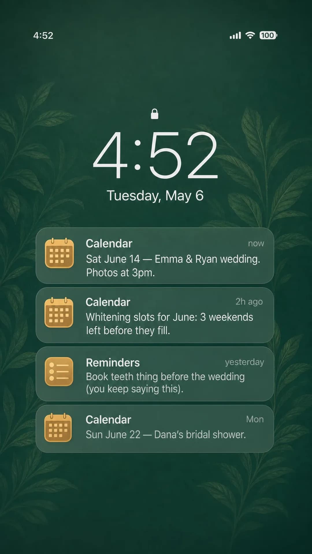
June weekends are disappearing off the calendar right now. If you're in a wedding this summer and you haven't booked whitening yet, you're watching your ideal timing close. We hold slots backward from ceremony dates — once June fills, you're looking at rushed appointments or none at all. Book your session while your weekend is still open.
June wedding slots filling fast
Reserve your wedding whitening
Seasonal Deadline is the one scarcity family with a clock the practice did not invent, and here the clock is the reader's own calendar: the wedding date is not manufactured urgency, which is what makes the family legitimate in dentistry almost nowhere else. The format is the insight too — a lock screen is the object this audience actually stares at in spring, and the notification stack turns the deadline into the ad's own chrome instead of a caption about it. The rendered dates are the most disciplined in the batch: June 14 marked SAT and June 22 marked SUN, on a phone dated Tuesday, May 6 — every weekday pair agrees with the others. They agree on the year 2025, which is the tell: the only year in which all three align is 2025 — the phone is internally consistent and a year out of date for a batch that ran in September 2026. A rendered-object flaw in a new shape, worth seeing before you trust a model with a calendar.
Three more, in order of cost. The phone is an Apple-style lock screen with Calendar and Reminders icons — the platform-native-format hazard this pipeline documents: imitating a third party's interface is the format, and their marks ride along; this draw came back generic enough, but the check belongs on every render of this style. The reminder — 'Book teeth thing before the wedding (you keep saying this)' — reads like a placeholder and is also the best sentence on the page, the only one the reader has said to themselves; keep it and fix 'teeth thing'. And the statistics are invented twice over: 'Most couples reserve whitening 6–8 weeks out' in the second primary text and 'Most people book 6–10 weeks out' in the fourth disagree with each other and with any real practice's data — cut them or make them yours. One scheduling note, the same as the Facebook page's benefits-expire ad: this is a spring creative, dated September because that is when the batch ran. Run it from March, not now.
Other headlines from the same run
- Book before your weekend is gone
- 3 June weekends left to reserve
- Your date won't wait — book now
- Wedding-timed whitening, while it lasts
Call to action
The deadline is real and the ask is a session, so the button belongs on a calendar. Contact us is the honest swap for a practice whose front desk builds the timeline backwards from the ceremony date — which the copy claims is the actual service, and which no booking form does by itself.
The Next Decade's Photo
LeadsThat one photo you like? Take a new one today.
- Audience
- Chronic closed-mouth smilers — Have deleted, untagged or cropped themselves out of photos for years, keep one photo from a decade ago because it is the only one they like, and treat the problem as a fact about their face rather than a thing a dentist fixes.
- Angle
- Future Self (Identity & Emotion) — Shows what life could look like after adopting the product.
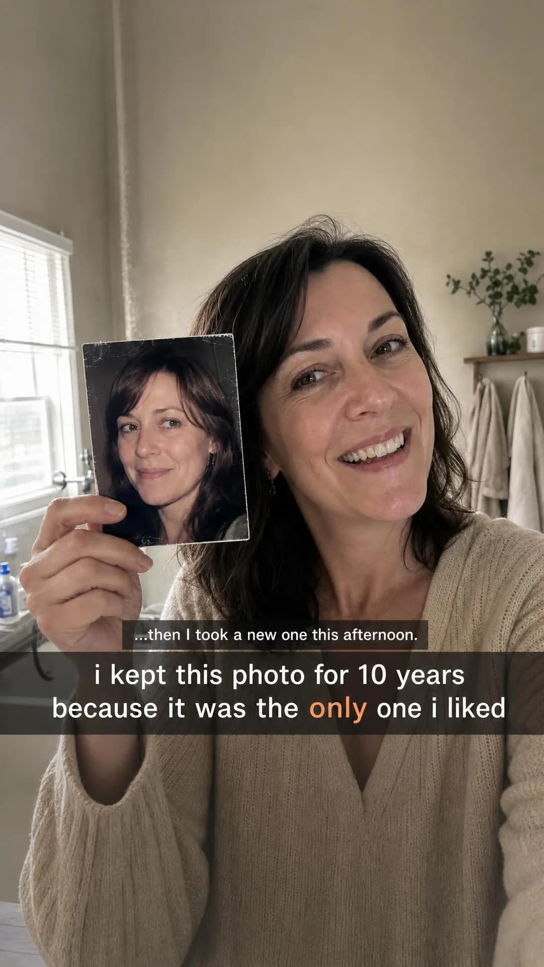
You have one photo you actually like from the last ten years. That's the problem. Most people keep fixing this with angles, lighting, cropping — everything but the actual thing they see in the mirror. Edge reshaping, bonding, and same-day whitening can be done in a single 2.5-hour visit. You leave with new photos that afternoon. Pricing posted, no multi-visit plan, no temporary anything.
One visit. New photos this afternoon.
Edge reshaping, bonding & whitening
This is the page's designated policy-line ad, briefed to the line on purpose, and the run did exactly what the Facebook page's evidence said runs happen. The image is the format's best trick and its trap at once: a selfie-style still of a person holding the one photograph she kept, smiling open-mouthed now, the entire concept in one frame — '...then I took a new one this afternoon' — with no dentistry visible anywhere. That is why it reads as a real person's testimonial. She is not. The caption's lower-case, ellipsis-opened first person is doing the authenticity work, and authenticity is precisely what an invented person cannot supply.
The full hazard list, in one ad. The first primary text opens on the reader: 'You have one photo you actually like from the last ten years. That's the problem.' — a second-person assertion about the reader's appearance and self-image, the exact shape the personal-attributes policy rejects, and the second and fourth repeat it ('You've been rationing it for years', 'you already know why you're reading this'). The third is a first-person patient testimonial from a person who does not exist, down to 'Walked in at 2pm, had new photos by 5.' The fifth carries 'Thousands of single-visit sessions since 2014' — a fabricated track record and a founding date the practice does not have, the invented-statistic hazard the fashion page carries with its review wall. The second invents a published price menu, including a 'Full Reveal session' the practice never quoted. Every one of these becomes a real practice's ad only if every one becomes true: real menu, real history, a real patient with consent — and the first person swapped for the third, which the image's caption already is ('i kept this photo for 10 years because it was the only one i liked'). Do not run this ad. Run the frame: the held photograph is the argument, and it works with nobody diagnosed in the process.
Other headlines from the same run
- Same-day cosmetic dentistry, posted pricing
- The next decade starts with one appointment
- Done in 2.5 hours. No second visit.
- Replace that one photo you've kept for years
Call to action
The ad's own promise is 'pricing posted' — so the click should land on the page that carries the posted prices, and nothing here can be booked until that menu exists. Once it does, Book now is worth testing against the warm audience; the offer (one 2.5-hour visit, three procedures) is small enough to be a calendar ask.
The Meeting That Ended It
AwarenessShe quit the day the agenda read: 'Upsell script, page 4.'
- Audience
- People who switched dentists after the headphones-and-upsell visit — Have sat through a cleaning that turned into a sales pitch for a night guard or a subscription plan, changed practices twice in five years, and assume every dentist is the same business with a different name.
- Angle
- Why We Built This (Story & Founder POV) — Explains the customer problem or frustration that motivated the product’s creation.
I quit the day they handed me an upsell script for night guards. Ten people around a table, agenda item four: how to sell more to people who came in for a cleaning. That was the day I stopped pretending it was normal to leave a dentist feeling sold instead of cared for. So I built a practice with one rule: the first visit is a conversation, not a pitch. You get a look, a chat, a written summary. No treatment plan on day one. If you've switched dentists twice looking for someone who talks to you like an adult, this is the one I wish I'd found.
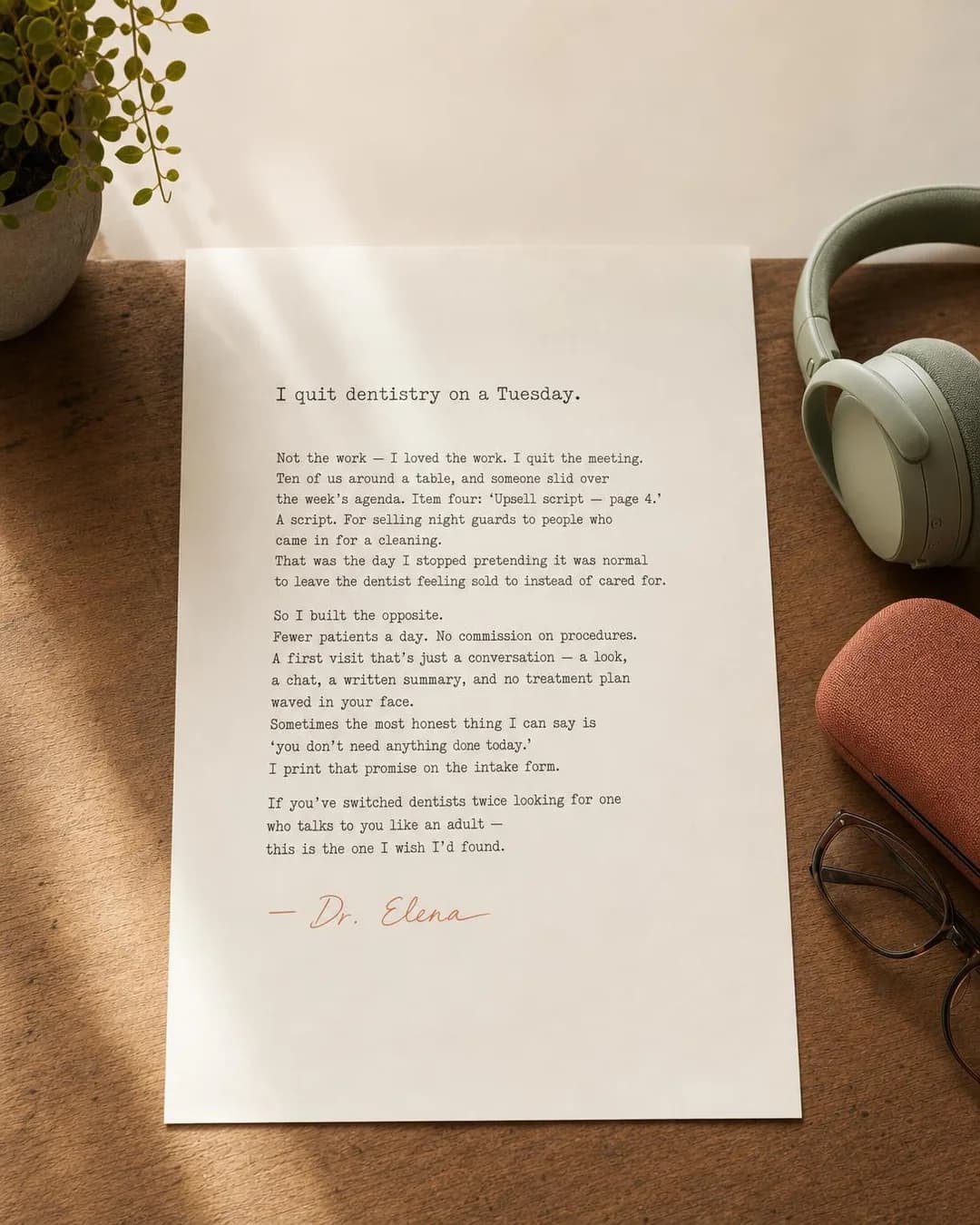
No upsell script. Just honest care.
First visit $65. Just talk.
The founder slot, and the letter is the right genre for it: one story — the meeting, the agenda item, the walkout — and every claim is about the writer, which is the compliant side of the first person. The printed letter adds details the primary texts don't carry — 'I print that promise on the intake form', 'No commission on procedures', 'Fewer patients a day' — and each is the kind a real practice can verify and a model cannot. The desk still-life (headphones, glasses, a plant) sells a person rather than a clinic, and the whole ad is the argument the Facebook page's same-hygienist ad made in a different register — continuity and honesty against the corporate chain — reached here through why-we-built-this rather than the operator's point of view.
Two swaps before it runs. The letter is signed '— Dr. Elena', and Dr. Elena does not exist: an invented named professional is the SaaS page's invented-customer hazard with a licence number on it — sign it with the real dentist or with nobody. And read the third primary text's 'If you've avoided the dentist because it always feels like a sales pitch in a white coat' against the letter, which never addresses the reader's history at all: the conditional second person ('if you've avoided…') is the same shape the Facebook page's night-guard ad graded — closer to the line than a direct question, not the compliant construction the letter itself manages. The fourth primary text's 'If you've been burned by a dentist who treated you like a quota' sits in the same place. The letter is the version to publish; the alternates are the version to learn from. Note the offer, too: a $65 conversation-first visit is the same offer as the Facebook page's sedation ad's free first appointment, for a different audience — the upsold rather than the phobic — which is why it earns two slots in the trade rather than one.
Other headlines from the same run
- The dentist I wish I'd found.
- First visit: conversation, not pitch.
- Built the day I walked out.
- What dentistry looks like off-quota.
Call to action
Awareness creative with the smallest ask on the page ($65) — send the click to the page that introduces the practice and explains what the first visit is, which is the claim the letter makes. Book now belongs on the second ad this person sees, not this one; an Awareness ad that asks for the appointment in the same breath as 'nobody gets a treatment plan on visit one' contradicts itself.
Questions
- Should a dental practice advertise on Instagram or Facebook?
- Follow the procedure, not the platform's reputation. Pew's November 2025 numbers put Instagram at 80% of US adults aged 18 to 29 and 62% of 30- to 49-year-olds, against Facebook's 68% and 80% for the same groups — flipped at 50-plus. Aligners, bonding, event whitening and a first practice of your own are this page; implants, dentures, emergency and crown work are the Facebook page in this cluster. Most general practices should run both and let the offer decide which app each ad set sits on.
- Can dentists use before-and-after photos in Instagram ads?
- Yes, since 22 July 2026, provided the ad is targeted to 18 and over. That is when Meta moved its Health and Wellness standards from product-based to claims-based enforcement, and before-and-after transformation imagery for cosmetic procedures became permitted rather than auto-rejected. Three cautions from our own two runs of the format: the panels have to be comparable or the pair is worthless as proof; the caption is what gets you rejected now, not the image — statements of inferiority about appearance and second-person lines about the reader's smile are still prohibited; and the patients have to be yours, with written consent. Both specimens on this site are of invented practices and neither should run as-is — run the format, not the specimen.
- Why was my ad rejected for a line like “Do you hide your smile in photos?”
- Because it asserts something about the person reading. Meta's personal-attributes policy prohibits an ad that asserts or implies a person's physical or mental health, and cosmetic copy carries a second exposure: statements of inferiority about physical appearance are prohibited on their own, regardless of health. The second-person question form fails both at once. The fix is grammatical, not strategic: put the hesitation in a patient's mouth in quotation marks ('She spent 20 years smiling with her lips pressed together') or state the service in the third person ('Edge reshaping, bonding and whitening in one 2.5-hour visit'). The compliant version of every ad on this page is already in its own alternates, which is why we publish all five rather than one.
- Do dental ads need a special ad category on Instagram?
- No. Meta's Marketing API accepts exactly four special ad categories — housing, employment, financial products and services, and social issues, elections or politics — and health is not among them, on either app. A dental practice keeps age targeting, lookalikes and any radius it likes. The one age rule that matters in this category is different: if the creative carries before-and-after transformation imagery for a cosmetic procedure, the ad must be targeted to adults 18 and over. That is a condition attached to the imagery, not a category you tick.
- What call to action should a dental Instagram ad use?
- Learn more, for most of them — six of the ten on this page — and the difference from the Facebook page is the honest finding, not a weakness. The offers on this half of the trade carry a mechanism, terms or a price a cold reader has to believe first: the scan that replaces the tray, the mock-up consult, the financing plan, the enamel check. Book now is right the moment the offer needs no explaining — the whitening session, the wedding timeline, the bonding on a twenty-year chip — and that is the other four. The trade's rule survives either way: nobody checks out of an appointment, so every button ends at a calendar, a form or a thread, and the only question is whether a page has to come first.
- Can I boost a before-and-after Reel that already worked organically?
- This is the trap in this category. An organic post runs under Meta's content policies, which are looser; the moment you put money behind the same post, it becomes an ad and the advertising standards apply in full — the 18-plus targeting for transformation imagery, the personal-attributes rules on the caption, the inferiority rules on the framing. A Reel that performed fine on the practice's own feed can come back rejected the day it is boosted, and the rejection is correct. Repost it as an ad set with the caption rewritten in the third person and the age floor set, and the same creative runs.
Seen enough? Make your own.
Paste your practice website. It reads your services, your patients and your brand, then writes the concepts, renders the images and drafts the copy.
No credit card · 50 free credits (about 5 ads or Instagram posts)
Every angle used above is documented in the best-in-slot ad angle library. More industries and placements are at all ad examples.