
Ad Examples · Dentists × Facebook · 10 ads
Dentist Facebook ad examples
Ten finished ads for dental practices — with the audience, angle and objective behind each one, because we generated them rather than collected them.
Search for dental ad examples and you get a wall of the same three things, none of which is an ad you could learn from. There is the stock photograph of a model with teeth no dentist produced, captioned with a practice name. There is the “$99 new patient special” graphic, which is a coupon and tells you nothing about who it was meant to stop. And there is the before/after grid, screenshotted off somebody's practice page by someone who did not ask. All three are collected images, and a collected image cannot tell you the only things that transfer — who the ad was written for, what it argued, and what it was supposed to make happen.
So these were not collected. Every ad below was generated with the audience, the angle and the objective chosen up front, which means the brief printed beside each one is the brief that actually produced it, not a guess written afterwards about someone else's work. The practices are invented — ten of them, an implant clinic, a sedation practice, a membership plan, a two-chair office with one hygienist, none of them real — so no dentist's creative is being borrowed and no patient's face is being used.
Nothing was edited afterwards. The image, the body text, the headline and the alternate headlines under each ad all came out of one run and are printed exactly as they arrived. That is the point: a page arguing that a machine can make a usable ad is worth nothing if a person quietly fixed the ads first.
One ad on this page was produced twice, and the distinction matters enough to state plainly. The batch of ten ran in one pass and nine came back; the tenth failed outright when the model returned malformed JSON, and a second run regenerated it. That regeneration produced a whole new ad — a new concept and a new image, not a retouch of a broken one — because this pipeline resumes at the level of a sample rather than a step. So one of the ten below is a second attempt after a crash. None of the ten is a second attempt after a first one we did not like, which is the distinction that keeps the rest of this page honest.
The prices are invented too, and in this category that warning is worth more than usual. Annual membership fees, implant quotes, aligner pricing, the percentage off a filling — all of it belongs to practices that do not exist and none of it is research about what dentistry costs in your market. Read those figures as placeholders showing where a real number goes and how specific it has to be to carry an ad. A fee published in an ad is a fee you have to honour at the desk: the ADA's Code of Professional Conduct requires that dentists not represent their fees in a false or misleading manner, and state dental boards enforce their own advertising rules on top of it.
One thing you can read off the briefs before looking at a single image: not one of the ten was written for a Sales objective. Seven are Leads, two are Traffic and one is Awareness. Nobody buys a crown in a checkout, so the most an ad here can cause is a booked appointment or a phone call. The Awareness ad is the interesting one, and it is only buyable because of a rule this industry escapes — see below.
What changes because it is Facebook
The first question is why a dental practice would run this on Facebook rather than Instagram, and for once the answer is not taste. It is where the expensive patients are. Pew's November 2025 survey of US adults puts Facebook at 74% of 50- to 64-year-olds and 57% of those 65 and over; Instagram reaches 40% and 19% of the same two groups. Dentistry's revenue is not evenly spread across ages — cleanings are, but cleanings do not pay for advertising. Implants, dentures, full-arch and crown-and-bridge work concentrate in exactly the cohort where Instagram loses more than half its reach. An orthodontic practice selling aligners to twenty-somethings has a real argument for the other cell. An implant clinic does not.
The second difference is a regulatory one, and it runs the opposite way to the real estate page in this cluster. Housing advertisers are forced into a special ad category that strips their targeting down to the studs. Dentists are not: Meta's Marketing API accepts exactly four special ad categories — HOUSING, EMPLOYMENT, FINANCIAL_PRODUCTS_SERVICES and ISSUES_ELECTIONS_POLITICS — and health is not among them. So a dental practice keeps every lever a housing advertiser loses. You can target 55-plus. You can draw a three-mile radius around the office instead of the fifteen-mile floor housing ads are held to. Lookalikes are available. This is why the Awareness buy on this page is rational rather than vain: a practice's entire addressable market is the few thousand households that would plausibly drive to it, and you can actually buy that shape.
Which moves the binding constraint somewhere most dental marketing never looks. Because the ad set can qualify the audience, the creative does not have to — and the thing that will actually get your ads rejected is the words on them. Meta's personal attributes policy prohibits an ad that asserts or implies a person's “race, ethnicity, religion, beliefs, age, sexual orientation or practices, gender identity, disability, physical or mental health (including medical conditions), vulnerable financial status” and more. Meta's own worked example is a pair: “Do you have diabetes?” is non-compliant, “New diabetes treatment available” is compliant. Now translate that into the vernacular every dental agency writes in. “Missing teeth?” “Embarrassed to smile?” “Afraid of the dentist?” “No insurance?” That last one is not even about teeth — it implies vulnerable financial status, a separate clause of the same policy. Every one of those is the second-person question form, and the second person is what breaks it. State the service, describe the person in the third person, and the same ad passes.
That constraint is why the briefs on this page describe the patient at length and the ad copy is not allowed to. The audience paragraph beside each ad — “adults who have not sat in a dental chair in a decade”, “self-employed patients paying cash at the desk” — is a targeting and writing instrument, not ad copy, and reading them next to the finished headline is the most useful thing on this page. Watch where the generated copy holds the line and where it slips into asking the reader a diagnostic question. It does both, and the notes say which is which rather than quietly regenerating the ones that slipped.
The fourth thing changed a month ago, and almost every dental marketing guide online is still wrong about it. On 22 July 2026 Meta rewrote its Health and Wellness advertising standards from product-based enforcement to claims-based enforcement, and before-and-after transformation imagery for cosmetic products, procedures and surgeries is now permitted rather than auto-rejected, provided the ad is targeted to adults 18 and over. The before/after was the single most-wanted and most-refused format in cosmetic dentistry for years. It is allowed again. What is still prohibited is the thing that usually travelled with it: statements of inferiority about physical appearance, imagery that works by making the viewer feel bad about how they look, sensational or exaggerated claims, and claims to cure or eliminate a disease. So the image is no longer the violation — the caption is. There is a before/after ad on this page for exactly this reason.
Finally, the shape, where the received wisdom is also stale. Facebook is not the landscape platform any more: Meta's ads guide now recommends 4:5 at 1440 × 1800 for Facebook Feed, the same portrait shape it recommends for Instagram feed, and seven of the ten ads below are 4:5 for that reason. But two are 1.91:1, and those are genuinely Facebook-only assets. In our own publisher, 1.91:1 routes to Facebook's right-hand column and search results — surfaces with no Instagram equivalent at all — while 4:5 routes to both feeds and 9:16 to stories and reels across both apps. An emergency-dentistry ad in Facebook search results is a placement the Instagram cell of this cluster cannot show you, so this page renders two ads at a shape the other pages have no use for.
And with the shape comes a copy budget, which is the Facebook spec nobody writes about. Meta's ads guide recommends a 27-character headline and 50–150 characters of primary text for a Facebook Feed image ad, against Instagram Feed's 40 and 125, and Facebook Feed shows no description line at all — while Marketplace, one of the eight other image surfaces this app has, asks for a square image, 125 characters of primary text, a 40-character headline and a 30-character description. Leave Advantage+ placements on, which almost everyone does, and one ad fills all of them from a single export and a single headline. Measured against that, this run is a useful failure. The ten ads wrote fifty headlines: three fit 27 and forty-eight fit 40. Two of the ten lead headlines fit Facebook's recommendation — the 27-character 'Scan to seated in one visit' on the same-day crown ad, and the 24-character 'It was never the pillow.' on the night-guard ad, which is also the best line in the batch — and all ten fit Instagram's. Not one of the fifty primary texts fits 150; they run from 255 to 527 characters. Six of the ten descriptions fit Marketplace's 30, in a field Facebook Feed will not show anyway. Nothing here is rejected for length — Meta truncates rather than refuses — but truncation lands on the smallest surface, so the first clause has to carry the ad.
That result is not a fact about dentistry. Five Facebook batches in this cluster have now been measured the same way — this one, real estate, gyms, SaaS and fashion — and across all 250 headlines, 19 fit 27 and 238 fit 40. Across all 250 primary texts, none fits 150 and the shortest written is 200 characters. Two independent things follow. Forty characters is roughly the length this pipeline, and most people, naturally write a headline; twenty-seven is not, so it is a budget you spend deliberately rather than a target copy drifts into. And look at what the short ones have in common here and on every other page in the cluster: 'It was never the pillow.' names one object and makes you supply the argument. Twenty-seven characters is not enough room for a claim. It is enough room for a noun.
Source: Meta Advertising Standards — Health and Wellness (policy updated 22 July 2026) · Meta Advertising Standards — Privacy Violations and Personal Attributes · Meta Marketing API — special ad categories (health is not one) · Meta ads guide — image ad specifications, Facebook Feed (4:5 at 1440 × 1800; primary text 50–150, headline 27, no description line; 3% aspect-ratio tolerance) · Meta ads guide — image ad specifications, Facebook Marketplace (1:1 at 1080 × 1080; primary text 125, headline 40, description 30) · Meta ads guide — image ad specifications, Instagram Feed (headline 40, primary text 125; 1% aspect-ratio tolerance) · American Dental Association — advertising, marketing and the Code of Professional Conduct · Pew Research Center — Americans' social media use, November 2025
Want the campaign, not just the creative? Facebook ads for dentists → is the playbook these ads came out of: which objective to buy, the offers worth running, the targeting levers this trade keeps, and the policy that decides what the copy may say.
Generate ads for your own practice
Paste your site and best-in-slot reads it the way these invented practices were read — services, patients, positioning — then writes the concepts, renders the images and drafts the copy. Free to start, no card.
Two Calendars, Side by Side
LeadsOne clinic wanted five months. This takes a Tuesday.
- Audience
- Lower denture wearers who have stopped eating in public — Have had the lower plate five or six years, carry the adhesive in a coat pocket, order the soft thing on the menu when other people are at the table, and have been quoted a full-arch number by one clinic that ended the conversation.
- Angle
- Old Way vs. New Way (Comparison & Positioning) — Contrasts the traditional method with your newer approach.
Five months of appointments. A new denture you have to get used to. A price that stopped the conversation. Or: one Tuesday morning. The denture you already like. Two implants. $4,200 flat. We don't replace your lower denture — we anchor it so it stops moving. Same bite. Same smile. One visit.
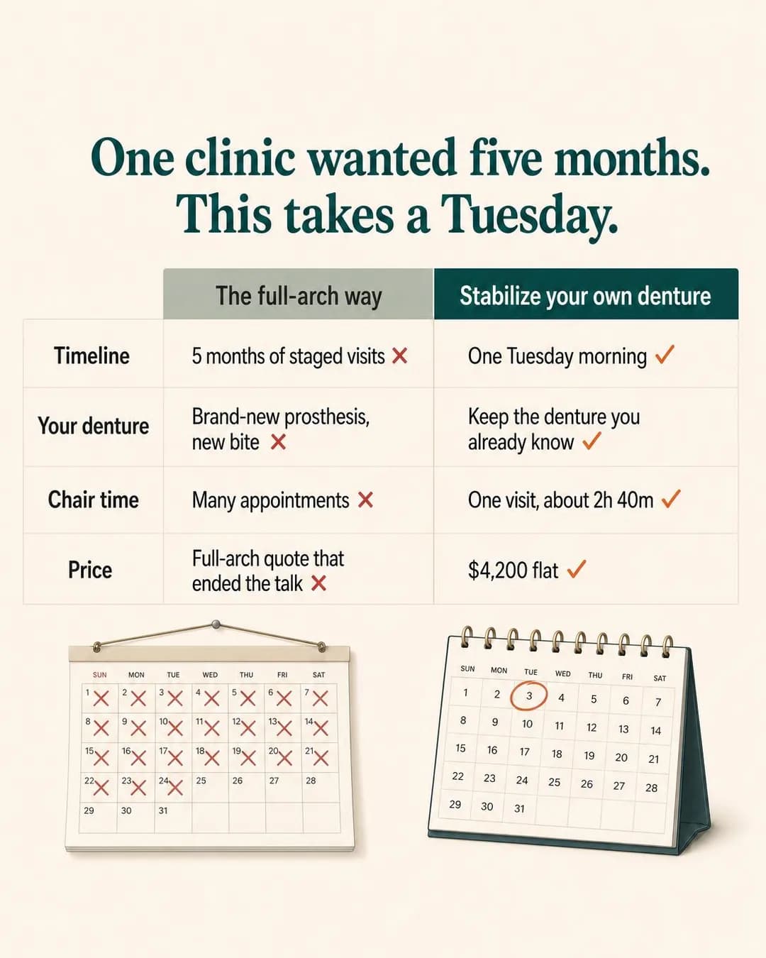
One visit. Your denture. $4,200.
Same-day lower denture stabilization
This reader has already been sold implants once and walked away, so the ad's job is not to argue that implants work. It is to narrow the category. Old Way vs. New Way is the only family in the library that can do that in one frame, because it does not defend the product — it splits the product into two versions and hands the reader the smaller one. The objection was never the implant, it was starting over: a new prosthesis, a new bite to learn, five months of staged visits. An ad that says keep the denture you already own removes the thing they actually refused, and it reopens a conversation that a price cut would not have.
The table renders cleanly across all four rows, which is not a given at this size, and the two calendars underneath repay a close look: the right-hand one circles the 3rd, and the 3rd sits under TUE, matching a headline that promises a Tuesday. Coordinating a rendered object with a sentence is where these images usually fall apart, and this one held. The left calendar is where it slips — it is a single month with twenty-odd days crossed off, which argues volume, while the copy beside it argues duration. The picture and the sentence are not making the same claim. Handle the numbers with more care than the layout: $4,200 flat and "over 1,900 people" are invented, and "one clinic wanted five months" is a comparative claim about a competitor you would be publishing under your own name. One more thing worth seeing, because it recurs down the page — the image sells the service and the copy addresses the reader's mouth. "Keep the denture you've already broken in" tells a stranger you know what is in it.
Other headlines from the same run
- Stop replacing it. Start anchoring it.
- Five months, or one Tuesday morning?
- Keep your denture. Lose the slip.
- Your plate. Two implants. One day.
Call to action
The warmest audience on the page: they own the problem, they have already priced the alternative, and the ad names a specific procedure at a specific fee. Send that to a calendar. Learn more is the right swap if $4,200 needs a page to stand on first, which for someone who walked away from a bigger quote is a reasonable bet. Not Get offer — a flat fee is not a discount, and a reader who taps expecting one lands on a price list.
The Two-Cancellation Patient
LeadsYou've booked and cancelled twice. This visit was built for exactly that.
- Audience
- Adults who have not sat in a dental chair in a decade — Know exactly how long it has been, have booked and cancelled twice, and are held back less by the treatment than by the part where someone reads the chart aloud and asks why they waited.
- Angle
- “Will It Work for Me?” (Objection & Risk Reversal) — Proves fit across personas, use cases, circumstances, or customer types.
You've booked and cancelled twice already. That's not a problem — it's the exact pattern this first visit was designed for. The appointment is a 30-minute conversation. No chair, no instruments, no cleaning, and no one asking why you waited. It costs $0 and you're under no obligation to book anything after. Come, talk, and decide nothing today.
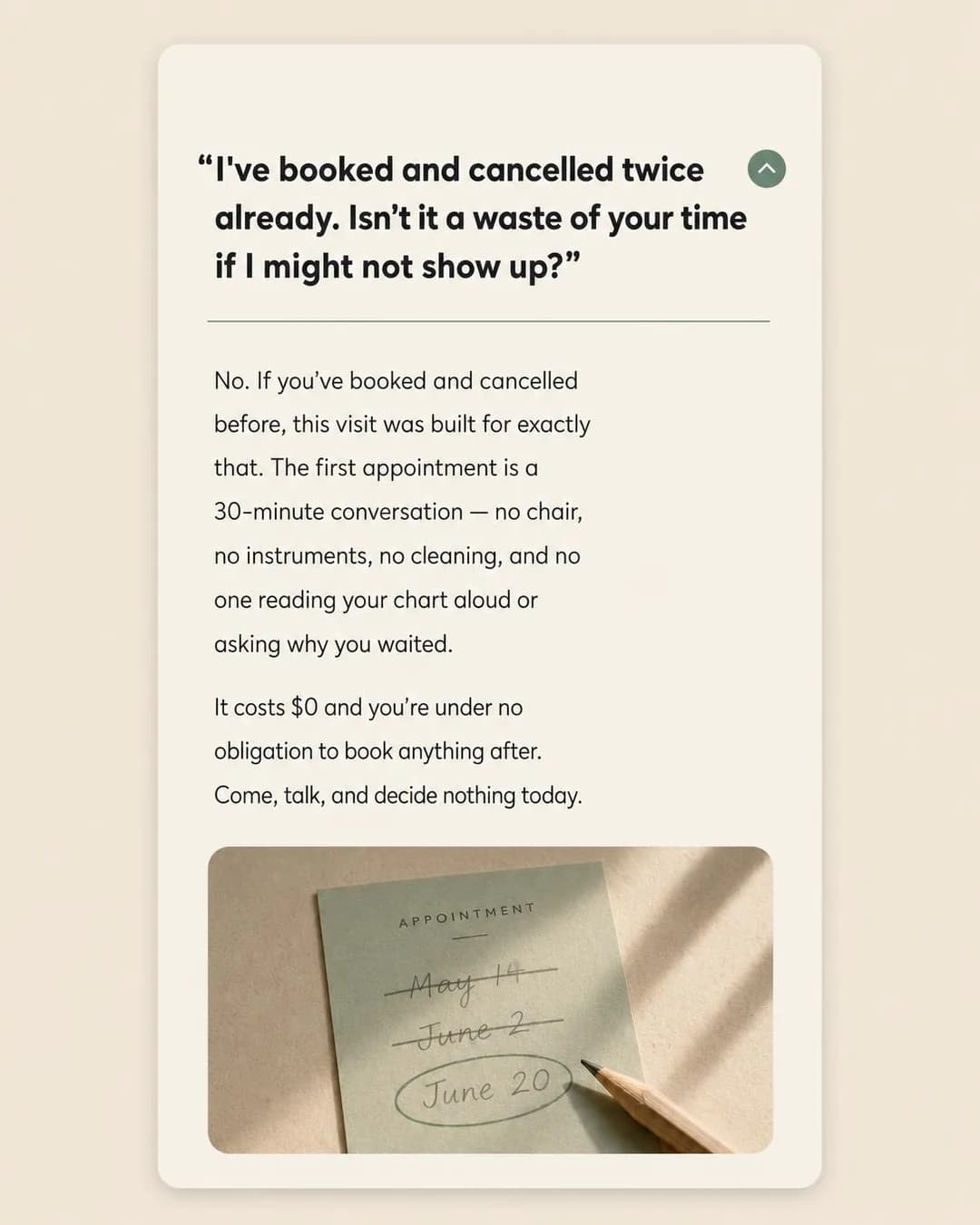
Built for the patient who cancels twice
First appointment: $0, no obligation
The objection this ad handles is not the treatment. It is the reception desk. That is why "Will It Work for Me?" is the right family and why the ad spends its whole frame on the first fifteen feet of the visit rather than on sedation, which is nominally what the practice sells. A reader who has cancelled twice is not weighing clinical options; they are anticipating a specific social moment, and the ad answers that moment by removing it — no chart read aloud, no question about why you waited.
Two things to take from the execution. The headline is a patient's question in quotation marks rather than a question aimed at the reader, and that is both the warmer construction and the safer one: it lets the ad name the hesitation without asserting that the person scrolling has it. Notice the image never uses the words fear or anxiety, while two of the alternate primary texts do — "the fear isn't about the cleaning" is the same ad standing on the wrong side of a policy line about implied mental health. Same run, same brief, both versions. The appointment card is the other detail worth pointing at: two dates struck through and a third circled, which is exactly the audience brief rendered as an object rather than described in a sentence. One caution that is not Meta's — a $0 first visit is an offer several state dental boards regulate, so check what your own board requires you to disclose alongside "free".
Other headlines from the same run
- The first visit is just a conversation
- No chair. No tools. No judgment.
- For people who know how long it's been
- You don't have to decide anything today
Call to action
Everything in this ad is engineered to make the booking itself feel small — thirty minutes, no instruments, no obligation — so sending the click anywhere other than a calendar throws away the work. Contact us is the honest alternative for a practice that would rather this person talk to a human before they see a booking form, which for this audience specifically is a defensible choice.
One Fee Beats a Premium
Leads$329 a year. Less than most premiums. Way more useful.
- Audience
- Self-employed patients paying cash at the desk — Left a job with benefits, have priced individual dental cover and found it costs more per year than the two cleanings it pays for, and now decide about a filling by looking at the number rather than the tooth.
- Angle
- Subscription Savings (Offer & Economics) — Shows the economic advantage of recurring purchase or subscription.
Most individual dental premiums cost more than $329 a year. And for that, you get… two cleanings. Maybe. If you read the fine print. Our membership plan is $329. You get two cleanings, two exams, annual x-rays, and 20% off everything else. No deductibles. No claim forms. Just one number that actually makes sense.
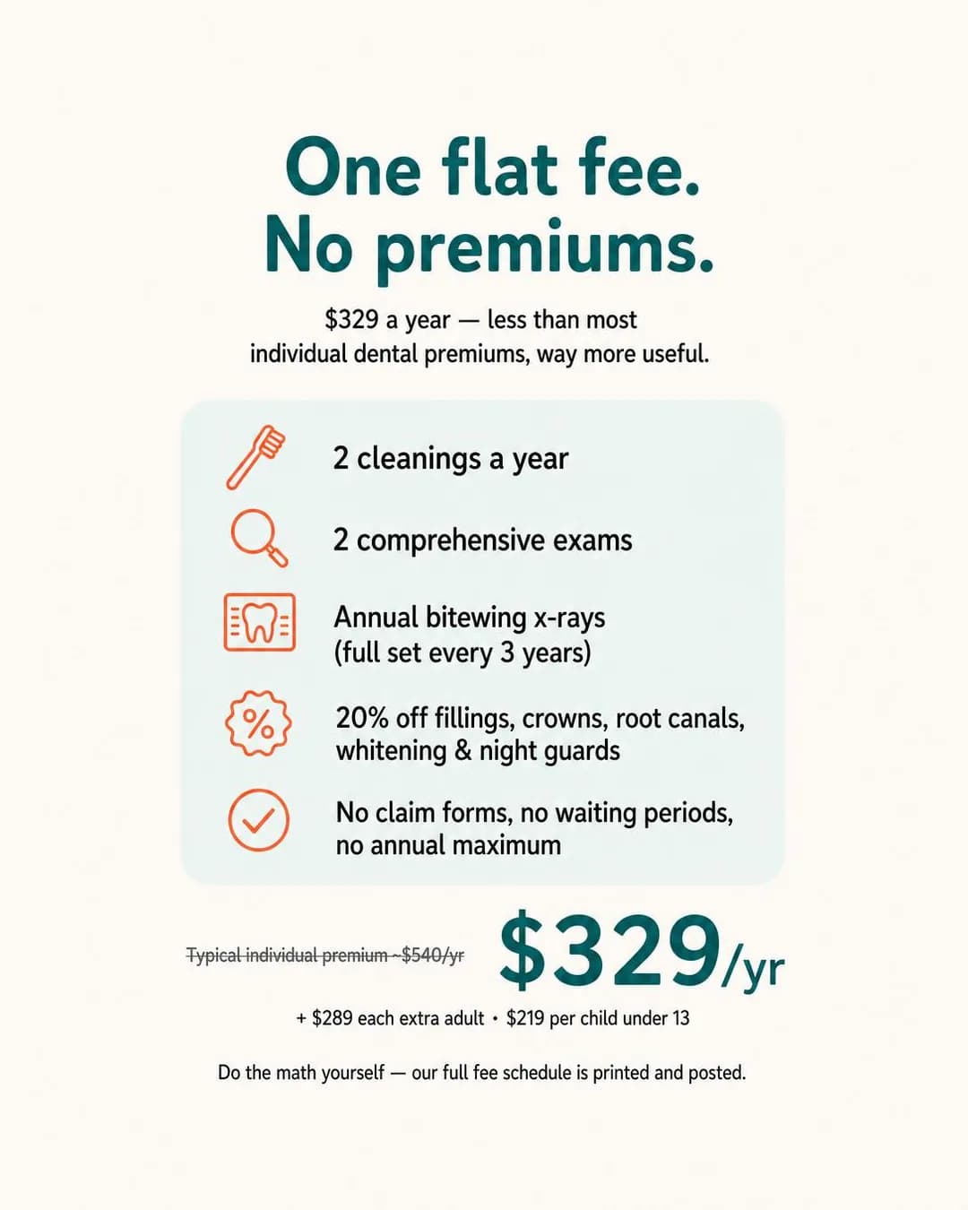
$329/year. Less than most premiums.
See what's included
Dental membership plans are one of the few products in this industry with real subscription economics, and Subscription Savings is the family that prices them against the alternative instead of describing them. The move that makes this ad work is choosing the right enemy: it compares the plan to buying individual dental insurance, not to another dentist. That is the comparison the reader is actually running, and it is the one where the practice wins on arithmetic rather than on sentiment.
This is the cleanest render on the page — five benefit rows, correct icons, legible fine print, a struck-through anchor price. It is also the ad with the most to fix before anyone runs it. The "typical individual premium ~$540/yr" struck through beside $329 is a factual claim about third-party insurance pricing, and here it is invented; a comparative price claim is precisely the sort an advertiser is expected to substantiate. Worse, one of the five primary texts is written in the first person as a patient — "I left my job last year and lost my dental coverage" — which is a fabricated testimonial for a practice that does not exist. That is the must-not-run line of this ad, and the same defect the SaaS page in this cluster carries. The policy contrast is instructive too: the image says "One flat fee. No premiums," which states the service, while a primary text says "You're paying $40–$60/month for dental coverage," which asserts the reader's financial position — the vulnerable-financial-status clause of the same personal attributes policy that catches "Missing teeth?"
Other headlines from the same run
- One fee. Two cleanings. 20% off the rest.
- No premiums. No paperwork. Just $329.
- Dental care without the insurance math.
- Flat $329. Beats any premium we've seen.
Call to action
A membership is a contract with terms, exclusions and a renewal date, and none of that fits in an ad. Send the click to the full schedule. Sign up is right if the plan can genuinely be bought online in one sitting. Avoid Subscribe — Meta's Subscribe button is built for content subscriptions and sets the wrong expectation for a care plan.
Scan to Seated, One Sitting
TrafficYour tooth is scanned, designed, and milled before lunch.
- Audience
- Patients scheduling around a second appointment they resent — Have worn a temporary crown before, remember it coming loose in something chewy, and count the cost of a crown in half-days taken off work as much as in dollars.
- Angle
- How It Works (Product & Mechanism) — Explains the process from input to mechanism to result.
Most crowns mean two appointments, a temporary that might come loose in your coffee, and two weeks of hoping nothing goes wrong. Here's what happens instead: we scan your tooth, design the crown on-screen, mill it from solid ceramic in our in-house suite, and seat it before you leave. 96 minutes, start to finish. Over 11,000 same-day crowns milled on-site since we opened. No lab. No second visit. No temporary to worry about.
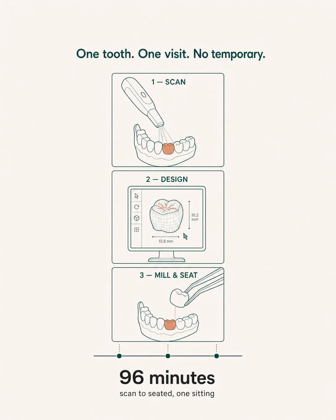
Scan to seated in one visit
Book your single-visit crown
How It Works earns its place when the mechanism is the differentiator and the reader has no idea it exists. Chairside milling is invisible from the patient's side of the chair — the practice looks like any other until you are told there is a mill in the building — so the ad's real task is to make "one visit" believable, and the only way to do that is to show the machinery of it. Note what the ad is actually selling, which is not a crown. It is the second appointment you do not take, priced in half-days off work.
This is the most technically accurate render in the batch. Three panels in the right order, line-art anatomy that holds up, and crown dimensions of 10.8 mm by 10.2 mm, which is a genuinely plausible occlusal footprint for a lower molar rather than a number invented to fill a callout. The 96 minutes in the image matches the 96 minutes in the headline. What is missing is the interesting part: there is no preparation step. Between the scan and the design sits the drilling and the anaesthetic — the part of the appointment the patient is actually anxious about — and a three-step mechanism that quietly omits it is describing a smoother procedure than the one you perform. That is a normal thing for an ad to do and a bad thing for a reader to discover in the chair. The "over 11,000 same-day crowns" is invented, as usual.
Other headlines from the same run
- No temporary. No second trip.
- One morning. One permanent crown.
- 96 minutes. Crown done.
- Same-day crowns, milled on-site
Call to action
Written for Traffic, and correctly: this reader does not yet know chairside milling exists, and asking them to book a procedure they cannot name is asking too early. Give them the page that explains the mechanism, and put Book now at the bottom of it. Book now on the ad itself is worth testing against a warm retargeting audience who have already read that page.
Beat The ER Clock
LeadsSee a dentist before the ER even calls your name.
- Audience
- People deciding at 6am whether to go to the ER — Were woken by it for the second night, have taken everything in the cabinet, and know the emergency room will give them antibiotics and a referral rather than fix the tooth.
- Angle
- Speed (Benefit & Outcome) — Emphasizes achieving the desired result faster.
You know the ER won't fix your tooth. They'll hand you antibiotics and a referral slip, then you'll wait three weeks for an opening. We hold two emergency slots open every single weekday. Call before 9am, sit in the chair before noon. Exam, X-ray, and same-day treatment if you need it. $95 flat, applied to whatever we do. The tooth gets fixed today, not next month.
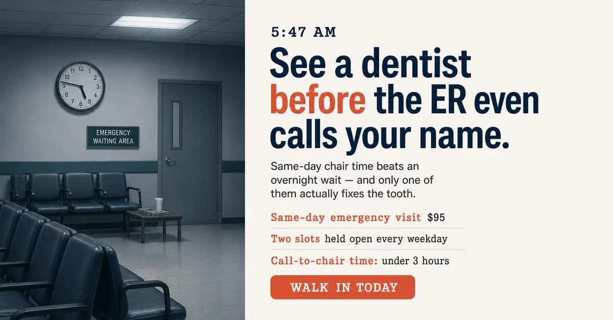
Same-day emergency dental. $95.
Two emergency slots every day.
Speed is not a benefit in emergency dentistry, it is the entire product, and this is the one ad on the page whose reader is not browsing. It is also the page's clearest demonstration of why the platform half of the title matters: this is a 1.91:1 asset, and while Instagram Feed will accept that ratio — it is the exact maximum in Meta's spec — the surfaces built to want a wide asset are Facebook-only. Our publisher routes it to Facebook's right-hand column and search results — someone who has just typed a question about a tooth at six in the morning is exactly who is on the other side of that surface, and the Instagram cell of this cluster cannot show you an ad for it.
It is also the ad with the most wrong with it, and the first problem is clinical rather than creative. "See a dentist before the ER even calls your name" and "only one of them actually fixes the tooth" tell a person in pain at dawn to skip the emergency department. Most dental pain does not belong in an ER, which is what makes the line persuasive — but facial swelling, fever, or any difficulty swallowing or breathing absolutely does, and those are the readers this ad reaches most reliably. A practice can advertise same-day slots without advising anyone away from emergency care, and it should. After that the flaws are ordinary: the clock on the ER wall reads about twenty past seven under a label that says 5:47 AM, because image models still cannot set an analog clock; the rendered WALK IN TODAY button contradicts a body text that says call before 9am, and competes with the real call-to-action button Facebook draws underneath. And read two of the five headlines side by side — "Tooth pain? Treated today. $95." against "Same-day emergency dental. $95." The first is the second-person diagnostic question Meta's personal attributes policy prohibits; the second is the same offer, compliant. One run produced both. That pair is the most useful thing on this page.
Other headlines from the same run
- In the chair in under 3 hours.
- Skip the ER. Fix the tooth today.
- Call now. Seen today. $95 flat.
- Tooth pain? Treated today. $95.
Call to action
The only ad here where a booking form is an obstacle rather than a convenience. This person wants a human on the phone in the next four minutes, and Contact us is the button that gets them there. Book now is right only if same-day emergency slots are genuinely bookable online and the calendar reflects real availability — an empty slot list at 6am does more damage than no ad at all.
The Decades-Long Pause, Ended
LeadsSame gap since ninth grade. Different decision now.
- Audience
- Adults who were told braces were for children — Turned down orthodontics at fourteen because of how it would look at school, have thought about it every few years since, and assume the answer at forty is metal brackets or nothing.
- Angle
- Before / After (Proof & Trust) — Contrasts the state before adoption with the state after adoption.
You were told braces were for kids. So you waited. Twenty-five years later, same gap, same self-conscious smile in photos. Clear aligners for one front-tooth gap: $1,895 flat, dentist-reviewed before they ship, refinements and retainer already included. No add-ons. No surprises. Just a straight answer for something you've thought about long enough.
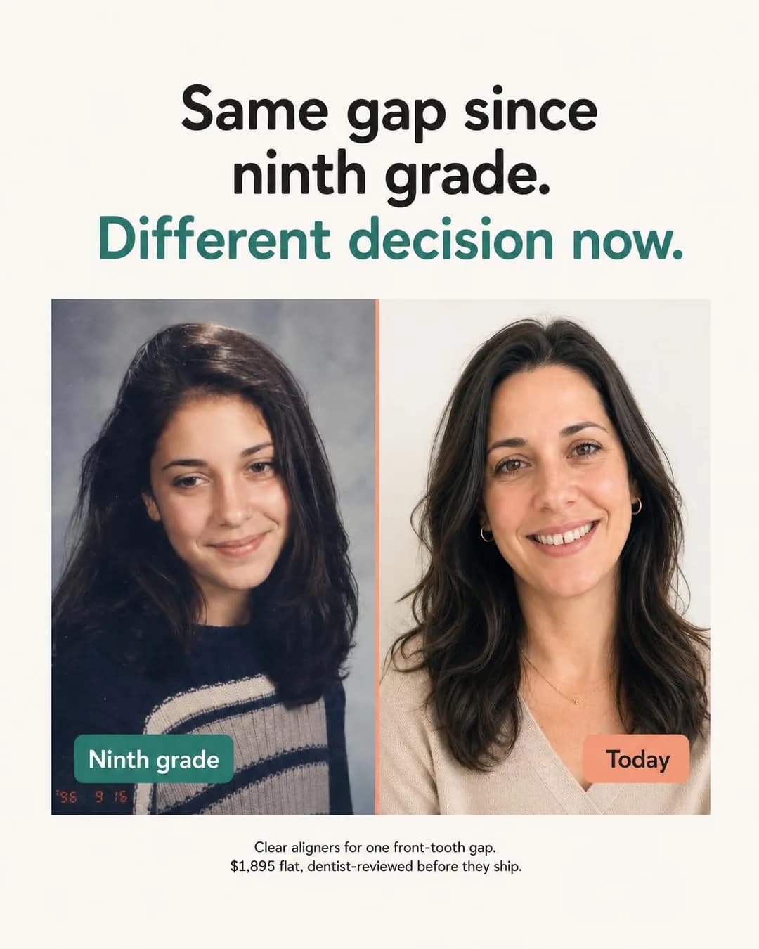
One gap. One price. Dentist-reviewed.
Aligners for one thing, done right
The before/after is the most wanted and, for years, most refused format in cosmetic dentistry, and it changed status a month before this page was published: on 22 July 2026 Meta rewrote its Health and Wellness standards from product-based to claims-based enforcement, and before-and-after imagery for cosmetic procedures is now permitted at 18-plus rather than auto-rejected. So this ad was pinned deliberately — one slot in the batch spent on a format that had just become legal, to see what the model would do with it.
What it did is the most instructive failure in this cluster, and it is worth going through carefully because every part of it is a trap a real practice can fall into. Start with the evidence: this is not a treatment before/after. It is a ninth-grade yearbook photograph beside a portrait taken decades later, and the front-tooth gap the entire ad is about is not visible in either panel. The image does not contain the claim. Nothing is held constant either — different age, camera, film, lighting, hair, wardrobe, era — which is exactly what the "comparable presentation" requirement in professional advertising rules exists to prevent, and it makes the pair worthless as proof even before anyone asks whether it is honest. The internal arithmetic disagrees with itself: the date stamp burnt into the corner of the left panel reads '96, which is thirty years, while the copy says twenty-five. And structurally the ad works by setting a muted, self-conscious "before" against a warm, confident "after" — the negative-self-perception construction, which is the thing the July rewrite specifically did not legalise. What Meta now permits is the clinical before/after. This is the emotional one. Underneath all of that sits the plainest problem: a before/after asserts a real patient outcome, and this patient does not exist. Do not run this ad. Run the format — your own cases, written consent, identical framing and lighting, and a result that is typical rather than the best one you have ever had.
Other headlines from the same run
- $1,895 flat. Refinements included.
- Close the gap you've had since school
- Same concern, 25 years. Real answer now.
- Front-tooth gap plan, no hidden fees
Call to action
At $1,895 this is a considered purchase with real exclusions — "one front-tooth gap" is doing a lot of work, and a reader with crowding or a bite problem is not a candidate. Send them to a page that says who this is for before they book. Deliberately not Get offer: an offer button beside a transformation image reads as a guaranteed result, which is the one claim you cannot make about orthodontics.
Why I Cap My List
AwarenessI keep a waitlist so I never have to rush you.
- Audience
- Patients cycling through a corporate practice — Have been to the same address four times and met four different hygienists, repeat the same history from scratch each visit, and noticed the practice changed its name after it was bought.
- Angle
- Employee / Operator POV (Story & Founder POV) — A team member, specialist, operator, or insider explains how the company thinks or works.
I keep a waitlist so I never have to rush you. Most practices pack schedules tight and rotate hygienists to fill every chair. I don't. I cap my list at 320 patients so you always get me — the same person who cleaned your teeth last time, who remembers your sensitivity on the lower left, who keeps your notes visit after visit. It's the only way I can guarantee continuity. If you're tired of repeating your history to strangers every six months, this is how care is supposed to feel.
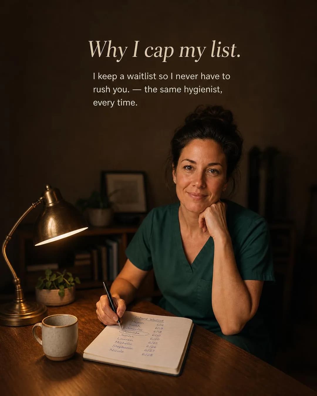
The same hygienist, every time
No rotating. No repeating.
This is the ad that was generated twice — the one whose first attempt died on a malformed response and came back as an entirely new concept and image. Worth knowing before you read it, because it is also the best-looking photograph in the batch, and it would be easy to assume it was the one we fussed over. It is the one the machine happened to produce on the second draw.
The argument is an operator's, not an owner's, and that is the whole reason it lands. A practice owner saying "we value continuity" is marketing; a hygienist saying "I cap my list at 320 so you always get me" is a person describing a constraint she has accepted, and the constraint is the proof. Notice it is the only ad on the page written for Awareness, which is a rational buy here in a way it would not be for a housing advertiser — a dental practice's entire market is the few thousand households that would plausibly drive to it, and Meta will let a dentist buy a three-mile radius. A familiar face, seen repeatedly by the same small circle, is what that budget is for.
Then look at the notebook, because it is the reason this ad cannot run as it stands. The page under her pen is headed "Patient Waitlist" and lists legible first names against dates — Megan, Sarah, Jennifer, Lauren, Michelle, Stephanie, Nicole. These are invented people at an invented practice, so nothing was disclosed here. But the ad depicts a dental professional displaying a patient roster to a camera, and a practice that recreated this shot with its own notebook would be publishing protected health information: the fact that a named person is your patient is itself protected, before anyone reads a diagnosis. It is the single most category-specific error on this page, and the one an image model is least equipped to avoid, because a notebook that says "waitlist" plausibly has names on it. Shoot the same portrait with a blank page, or with the notebook closed. Two smaller things while you are in there: the subhead renders as two fragments welded by a stray em-dash — "I keep a waitlist so I never have to rush you. — the same hygienist, every time" — and the dates in the list do not run in order, with 6/10 sitting below 6/18. And a note on the brief: this was pinned as an operator's point of view about continuity, and the concept drifted to the capped list, which is the same argument the real estate page in this cluster reached for independently. A scarce-by-choice roster is evidently a strong attractor across service industries; it is not what was asked for here.
Other headlines from the same run
- I keep a waitlist so I never rush
- Why I cap my patient list at 320
- You get me — not whoever's free
- Continuity over volume, always
Call to action
Awareness creative with no offer in it, so the click is curiosity rather than intent — send it to the page that introduces the team and explains how patients are assigned, which is the claim the ad makes. Book now is worth testing only once the same person has seen this face two or three times; it is the second ad in the sequence that should ask for the appointment, not this one.
The Pillow Wasn't It
TrafficThird pillow. Same headache. Maybe it was never the pillow.
- Audience
- People who wake with a tight jaw and blame their pillow — Have a headache most mornings that clears by eleven, have changed pillows twice, and have never connected any of it to their teeth because nothing hurts in the mouth.
- Angle
- Hidden Problem (Problem & Pain) — Reveals a problem the customer may not realize they have.
Third pillow. Same headache. If you wake with a dull ache that fades by lunch, blame your jaw before you blame your sleep setup. A 90-second scan shows the wear pattern on your own molars — flattened cusps, chip lines, the places you've been grinding without feeling it. Most people leave with a custom guard built from that exact scan. Some just leave knowing. $65 for the scan, credited if you order same-day.
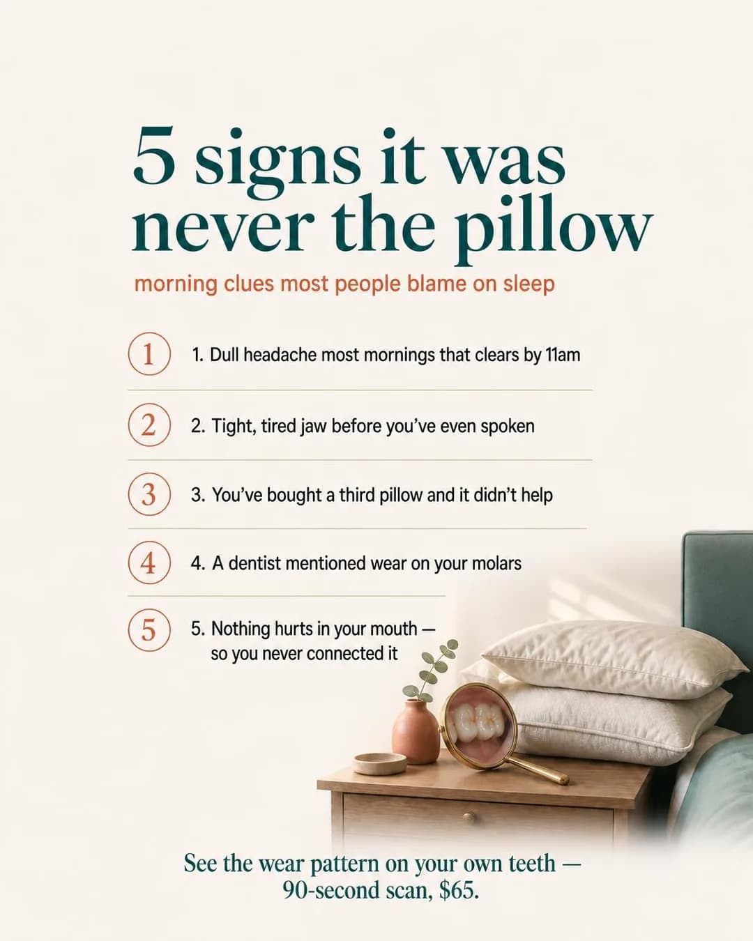
It was never the pillow.
Custom guards from your scan.
Hidden Problem is the right family here and the hardest one to run legally in a health category, which is why it is on the page. The reader has a symptom and a confident wrong explanation for it, and the ad's job is to supply a different culprit without diagnosing a stranger. Watch the framing do that work: the subhead says "morning clues most people blame on sleep" — third person, about people in general — which is the compliant shape of a problem ad. The primary text then narrows to "if you wake with a dull ache that fades by lunch, blame your jaw," a conditional aimed at the reader. That is closer to the line than the image, though still short of the "do you grind your teeth?" construction that would cross it outright.
The visible defect is that every row is numbered twice — a circled numeral and then the digit again in the text, five times down the list. It survived because it reads as design rather than as an error, which is how this class of flaw usually survives. Credit where it is due on the other axis: the headline promises five signs and the image delivers exactly five, and counting is where these renders normally fail. The problem worth more of your attention is clinical. Morning headache plus a tight, tired jaw is also the textbook presentation of obstructive sleep apnoea, which is associated with bruxism rather than distinct from it, and this ad rules out the pillow without ever mentioning the airway. A night guard sold to someone whose real problem is apnoea protects the enamel and leaves the disease. The creative is fine; the practice running it needs to be screening, and the landing page is where that belongs.
Other headlines from the same run
- See the wear pattern. $65 scan.
- Your jaw. Not your sleep setup.
- Third pillow won't fix clenching.
- 90-second scan. Real answer.
Call to action
Traffic, and it should be: this reader has not yet accepted the premise that their teeth have anything to do with their headache, and a booking button asks them to act on a conclusion they have not reached. The $65 scan is a well-built second step and a poor first click. Download is worth testing if the five signs exist as a one-page checklist — it converts the same curiosity and gives you an email to follow up.
Break the Chain
LeadsYou don't have to hand down your own dentist fear.
- Audience
- Parents who dread the dentist and are hiding it — Had a bad time in the chair as a child themselves, are careful never to say so in front of their four-year-old, and want the first appointment to go well more than they want it to be thorough.
- Angle
- Care / Love (Identity & Emotion) — Frames the purchase as an act of care for another person, pet, family member, or community.
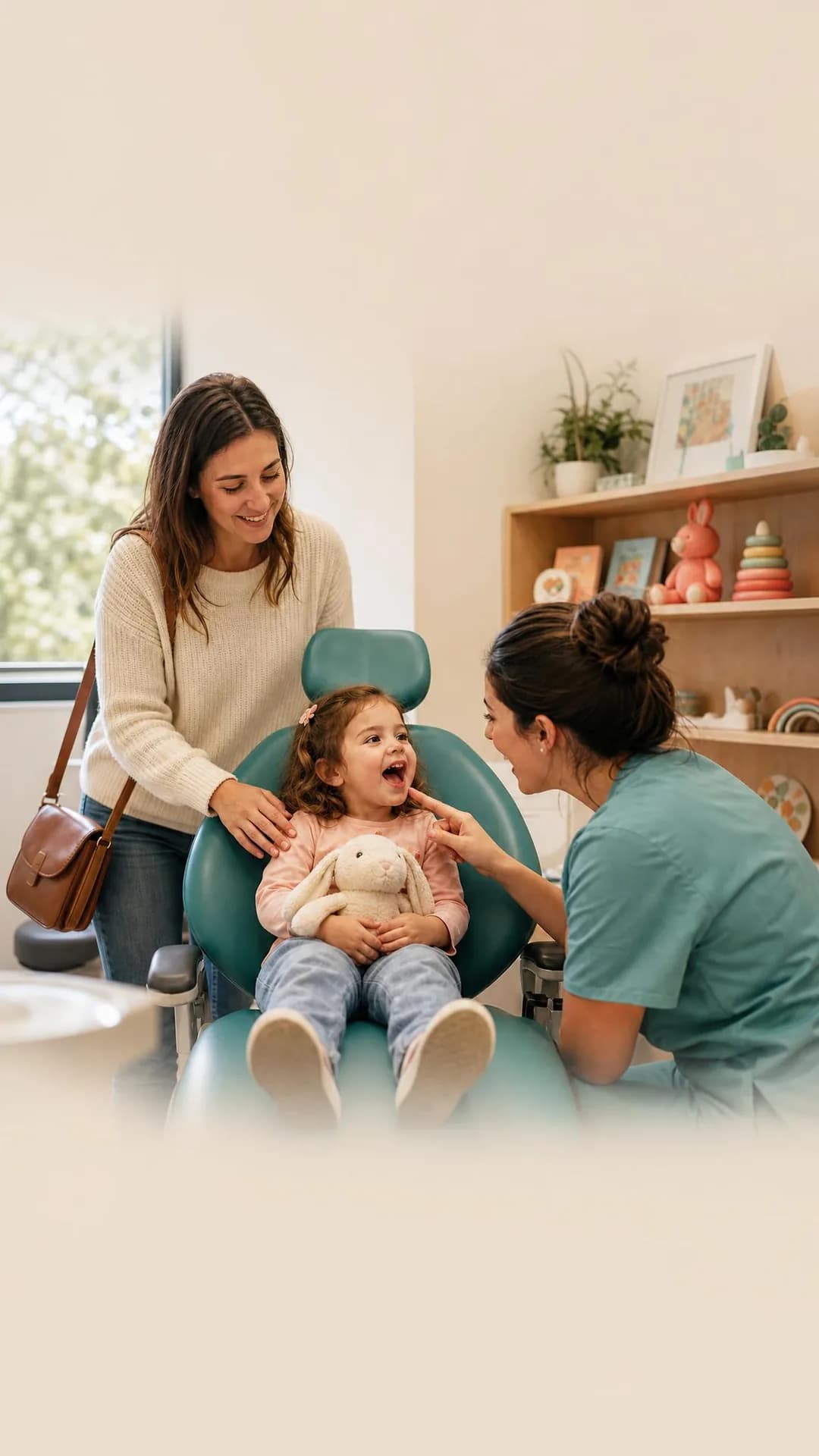
You remember the drill sound. The bright lights. The way your stomach dropped when they said "open wide." Your kid doesn't have to. Our First Look Visit is 15 minutes, $55, and built for one thing: a good memory. No cleaning, no x-rays, no treatment. Just a friendly chair, a hygienist who counts teeth out loud, and a take-home sticker passport. Most kids are ready for a real cleaning by visit two — because they've already decided this place is safe.
They don't have to inherit your fear
First visit, zero treatment
The ad is not addressed to the child's teeth. It is addressed to the parent's memory, which is why Care / Love is the family and why the audience brief describes the adult's own history in the chair rather than anything about the four-year-old. The product only makes sense read that way: fifteen minutes, no cleaning, no x-rays, nothing attempted. As dentistry that is almost nothing. As an answer to a parent who is quietly braced for their child to have the experience they had, it is the whole offer.
This is the cleanest photographic render on the page, and it passed the check this pipeline exists to run. A dentist sample generated for this site once came back with a recognisable children's cartoon playing on the waiting-room television — the image model puts a plausible object where the scene wants one, and a plausible thing on a television is a real show — so paediatric scenes get examined shelf by shelf. Nothing in this frame is anyone's property. Two things to weigh. The 9:16 re-frame padded rather than re-composed: the subjects sit in the middle third with empty wall above and floor below. In Stories and Reels that is roughly where the interface sits so it survives the placement, but it is not a vertical composition and you should not mistake it for one. And the copy carries the page's second policy risk — "You don't have to hand down your own dentist fear" asserts that the reader has a fear, and Meta's own non-compliant example is this same shape aimed at a family member. The fix is already in the headline set: "A first visit built for good memories" makes the identical promise and asserts nothing about the person reading it.
Other headlines from the same run
- A first visit built for good memories
- Break the cycle. $55, 15 minutes.
- No drill. No fear. Just a gentle start.
- Their story doesn't have to be yours
Call to action
A $55, fifteen-minute appointment is the smallest concrete ask on this page, and the parent who has read this far is not weighing alternatives — they are deciding whether to do it now. Give them the calendar. Learn more suits a practice whose first visit format needs explaining before a parent will believe nothing will be attempted.
The Ball Drop Refund
LeadsYour benefits expire at the same second the ball drops.
- Audience
- Insured patients who used none of it this year — Have had dental cover through work for years, went once in March, and do not know that the annual maximum is use-it-or-lose-it or that theirs resets in a few weeks.
- Angle
- Seasonal Deadline (Scarcity, FOMO & Timing) — Uses a holiday, season, event, or calendar moment as a natural deadline.
$687. That's the average amount sitting unused in dental benefits right now — and it disappears January 1st, no rollover, no refund. Most people don't realize their annual maximum resets with the calendar, not when they're ready to use it. We offer a free 10-minute benefit checkup: we pull your plan, show you what's left in dollars, and help you book what you've already paid for before the clock runs out. Book by December 10th for priority year-end scheduling.
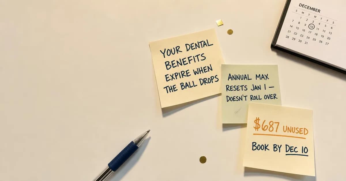
Your benefits expire December 31st
Free benefit checkup. Book by Dec 10.
Seasonal Deadline is usually the weakest family in the library because the clock is nearly always the advertiser's invention, and dentistry is the honourable exception. Unused annual maximums genuinely do not roll over, the reset is genuinely on a fixed date, and the money at stake is the patient's own, already paid in premiums. This is the rare scarcity ad where the urgency is real and the practice is pointing at it rather than manufacturing it — which is also why the December recall is the most reliably profitable campaign most practices run.
Which makes the two errors more costly, because a true premise is what a reader will trust the false details on. "$687 unused" is described in the copy as an average and written on a post-it in the image as though it were this reader's own balance; it is an invented figure doing the work of a statistic, and a benefits claim like that is exactly the sort an advertiser is expected to be able to support. The second error is flatter: benefits do not expire on 31 December for everyone. A large share of dental plans run on a plan year keyed to the enrolment date, not the calendar, and an ad that states the deadline as a universal fact is simply wrong for those readers. Both problems have the same fix, and to the ad's credit it is already the offer — stop asserting a number and a date, and point at the free ten-minute check that pulls the reader's actual plan. One scheduling note: this is a November and early-December creative. It is dated August here because that is when the batch ran, not because you should run it now.
Other headlines from the same run
- $687 unused. Gone at midnight.
- Use it by Jan 1st or lose it forever
- Annual max resets — no rollover
- Claim what's left before the clock runs out
Call to action
The deadline is real and the ask is a ten-minute check, so the button belongs on a calendar — every day of hesitation is inventory you cannot sell after the 31st. Contact us works for practices whose front desk would rather pull the benefits and call back. Not Get offer: nothing here is discounted, and the reader is being told to spend money they have already spent.
Questions
- Do Facebook ads work for dental practices?
- They work when the ad sells a specific first appointment rather than a discount. The default dental ad is a “$99 new patient special”, and it selects for the one patient who will move practices for $99 and then never return. Every ad on this page sells a method or a first visit instead: a lower denture stabilised in one surgical visit, a first appointment with no instruments in the room, a crown fitted the same day, a membership fee that replaces insurance. The other thing that makes them work is geography — a practice's whole market is the households that would plausibly drive to it, and unlike a housing advertiser you are allowed to buy exactly that radius.
- Should a dentist advertise on Facebook or Instagram?
- Follow the procedure, not the platform's reputation. Pew's November 2025 numbers put Facebook at 74% of US adults aged 50 to 64 and 57% of those 65 and older, against 40% and 19% for Instagram. Implants, dentures, full-arch and crown work concentrate in those ages, so for those services Facebook reaches roughly twice the people per dollar of the same audience. Clear aligners sold to twenty-somethings are the honest exception and belong on Instagram. Cleanings are everywhere, and do not generate enough margin to be the thing you advertise.
- Why was my dental ad rejected for “Missing teeth?” or “No insurance?”
- Because Meta's personal attributes policy prohibits ads that assert or imply a person's physical or mental health, including medical conditions, or their vulnerable financial status — and the second-person question form implies you know something about the reader. Meta publishes the fix as a pair of examples: “Do you have diabetes?” is non-compliant, “New diabetes treatment available” is compliant. The dental translation is the same move. “Missing teeth?” becomes “Implant-supported dentures, fitted in one visit.” “No insurance?” becomes “Membership plan: two cleanings, exams and x-rays for a flat annual fee.” You keep the audience — the ad set is still targeting them — and you stop diagnosing them in the headline.
- Can dentists use before-and-after photos in Facebook ads?
- Yes, as of 22 July 2026, and most guidance online has not caught up. Meta rewrote its Health and Wellness advertising standards that day from product-based to claims-based enforcement, and before-and-after transformation imagery for cosmetic products, procedures and surgeries is now permitted rather than auto-rejected, provided the ad targets adults 18 and over. What is still prohibited is what used to accompany it: statements of inferiority about physical appearance, creative that works by making the viewer feel bad about how they look, sensational claims, and cure claims. In practice the photograph is no longer the problem and the caption is. Meta's permission is not the only one you need, though, and the other two are stricter. The images must be of your own patients and you need their written consent to publish them. And professional advertising rules still apply underneath: the FTC and state dental boards require that the claim not be misleading, which in practice means the before and after have to be comparable — same framing, same lighting, no filtering or retouching that flatters the result — and that the outcome be representative rather than the best one you have ever had. Those rules vary by state, so the binding version is your own board's, not Meta's.
- Are dental ads a special ad category on Facebook?
- No. Meta's Marketing API recognises four — housing, employment, financial products and services, and social issues, elections or politics — and health is not one of them. That matters more than it sounds. A real estate advertiser loses age targeting, gender, lookalikes and any radius under fifteen miles; a dental practice keeps all of it and can target 55-plus inside three miles of the office. The trade is that dentistry's restrictions sit in the content policies instead, where they apply to the words on the creative rather than to the ad set, and where nothing stops you at setup time — the ad simply gets rejected, or worse, runs and gets your account flagged.
- What call to action should a dental ad use?
- Book now, for most of them, and that concentration is itself the industry insight. A dental practice's conversion is an appointment on a calendar, so the seven Leads ads on this page nearly all point at booking. The exceptions are worth copying though: the ads carrying an unfamiliar mechanism or a price that needs explaining — the same-day crown, the membership plan, the night guard — are paired with Learn more, because a cold reader asked to book before they understand what they are booking simply does not. Contact us is the right button on the emergency ad, where the person needs a human on the phone now and a booking form is an obstacle.
Seen enough? Make your own.
Paste your practice website. It reads your services, your patients and your brand, then writes the concepts, renders the images and drafts the copy.
No credit card · 50 free credits (about 5 ads or Instagram posts)
Every angle used above is documented in the best-in-slot ad angle library. More industries and placements are at all ad examples.