
Ad Guides · SaaS × Instagram
Instagram ads for SaaS companies
You are advertising work to someone who is not at work, and you cannot buy their job title. Both problems are solved in the creative — here is how.
The advice a software company gets about Meta is that B2B does not work here and the budget belongs on LinkedIn. It is half true in a way that costs real money: LinkedIn will sell you the job title, and it will charge you a multiple of Meta's CPM for the privilege, and for a self-serve product with a €29 plan that arithmetic almost never closes. What is actually true is narrower. You cannot reliably buy a job title on Meta — so if your plan begins with targeting one, the plan does not survive contact with the ad set.
This page is what to do instead. What follows is the playbook for a software company buying Instagram ads: which objectives are worth anything here (the answer is genuinely different from every other industry on this site), which standard event to optimise for and the point at which you must change it, how to make a specific job role recognise itself when the targeting cannot help you, what to put in the frame instead of a product screenshot, and the budget arithmetic — which for once works in your favour.
Two structural facts drive everything below. The first is that the reader is perfectly reachable and not usefully identifiable: there is no special ad category here and no content policy wall, every lever is available, and none of them asks the question you want to ask. The second is that they are not at work. Instagram is a leisure surface, so an ad for a rota tool is arriving while somebody is on the sofa, and "recognise yourself as a restaurant GM" has to happen before "consider our scheduling software" is even a sentence they will read.
The ads below are real output, not mockups drawn for the argument. Six come from the ten on the SaaS Instagram examples page, published exactly as generated, for software companies that do not exist. The metrics inside them are invented and should be read as placeholders marking where a real figure goes — and one of those ten is a fabricated customer testimonial, complete with a name and a face, which the examples page flags as the one ad on it that must not be run as-is. That is a live hazard in this category rather than a curiosity; see the mistakes section.
One thing this page is not: a benchmark report. There are no CAC or CPL figures here, because a number from somebody else's funnel is worth less than the arithmetic you can run on your own — and unusually for this site, the numbers that matter in this industry (events per week, payback in months) are ones you can count yourself by the end of the first month.
Generate Instagram ads for your product
Paste your site and best-in-slot reads it the way these invented software companies were read — product, audience, positioning — then writes the concepts, renders the images and drafts the copy. Free to start, no card.
You are advertising work to someone who is not at work
Start with what the Browse page shows rather than with a claim. Every one of the ten SaaS ads opens on a moment and not a feature: a Sunday night rota that takes three hours, a phone turned face-down because the pager is somebody else's problem tonight, an empty notepad after a client call, a spreadsheet quietly winning an argument it should have lost. That is not a stylistic preference, it is the platform. Instagram is where people are between things, and a person between things will recognise a Sunday night before they will recognise a product category. On the Facebook twin of this page — feed, right column, search — you have surfaces where somebody is arguably looking for something. Here you have surfaces where they are not, and the first line of the ad has to do the work that intent would otherwise have done.
The second Instagram-specific difference is who is on it. Pew's November 2025 survey puts Instagram at 80% of adults aged 18 to 29 and half of all US adults, while Facebook reaches 80% of 30- to 49-year-olds. In software that maps onto a distinction worth planning around: the practitioner who will use the tool daily skews to the first group, and the manager who approves the invoice skews to the second. That is a heuristic rather than a fact about your funnel, but it is a useful one — if you sell product-led, where the user and the buyer are the same person, Instagram is where that person is and the split collapses in your favour. If you sell to a committee, expect this app to fill the top of the funnel and the other one to close it.
Third, shape, and this is the biggest practical gap between the two cells of this cluster. Instagram gives you 4:5 for feed and full-screen 9:16 for Stories and Reels — eight of the ten ads on the Browse page are 4:5 and two are 9:16 — and it gives a 1.91:1 asset nowhere useful to go, because our publisher routes that ratio to Facebook's right-hand column and search results and to no Instagram position. (Instagram Feed's own technical requirements do accept up to 1.91:1 — corrected 7 September 2026, this paragraph previously said the ratio did not exist here. It exists; the surfaces built for it are Facebook's.) For most industries that costs you a placement. For software it costs you the comparison ad: "X vs Y" is where a large share of SaaS budget goes, and it works best against somebody who has just typed a competitor's name. There is no search placement here, so a comparison has to win in-feed against a reader who was not asking — which is why the contrarian ad on the Browse page argues a position ("47 charts or one answer") rather than naming a rival.
Finally, the screenshot problem, which is specific to this industry and worse on this app than anywhere else. The instinct is to show the product. A dashboard rendered at 1080 × 1350 and viewed on a phone at arm's length is an illegible grey rectangle, and a 9:16 story is worse. Six of the ten ads on the Browse page render a situation instead of a UI — a checklist, a notepad, a whiteboard being retired — and the two that do show product detail show one number from it rather than the screen it lives on.
Which objective to buy
This is the one section of this cluster where the recommendation inverts. Every other industry on this site is Leads-dominated because nothing they sell can complete inside the ad's own session — nobody books an implant or buys a house from a feed. Software can. A free trial starts in a browser tab and a self-serve subscription is a card form away, which puts two objectives on the table that a dental practice cannot use and takes the pressure off the one it depends on.
The evidence is in the batch. The ten ads on the Browse page were pinned as 5 Traffic, 3 Leads, 2 Sales and no Awareness — the only page on this site where Traffic leads, and the only one where Sales appears at all. The reason Traffic leads is not timidity: an ad cannot explain software. What it can do is make one person recognise one problem and then get out of the way, and the page you send them to does the selling. Buying Leads for a product that is trying to be self-serve is how you end up with an email address belonging to somebody who has never seen the thing.
Sales is the right objective once the funnel can actually feed it — meaning the pixel or Conversions API is firing a real Subscribe or StartTrial event and doing so often enough to optimise on. Below that volume it is a worse Traffic campaign. The budget section has the arithmetic for deciding which side of that line you are on.
- TrafficDefault
Half the Browse page, and correctly. An ad has room for one recognition, not for an explanation — send the recognition to a page that can finish the job. Also the right objective while your conversion volume is too thin to optimise on.
- SalesSometimes
Real here and nowhere else in this cluster, because a self-serve subscription completes in-session. Worth switching to once a Subscribe or StartTrial event is firing at volume, and not a day before — see the budget section.
- LeadsSometimes
For a sales-led motion where a booked demo genuinely is the conversion, and for enterprise tiers with no self-serve path. For a product-led company it is usually the objective that buys email addresses attached to people who never opened the product.
- App promotionSometimes
The only industry on this site where this is a serious answer. If the product is mobile-first and the install is the activation, buy it. If the app is a companion to a web product, you are paying install costs to reach people who would have signed up in a browser.
- EngagementRarely
It optimises for the cheapest reaction available, which in software is a like from somebody who will never evaluate anything. Its one defensible use is assembling a video-viewer pool to retarget, and Traffic usually assembles a better one.
- AwarenessRarely
Zero of the ten Browse ads were written for it. A category-defining brand with a budget to match can justify it; a company still working out which role to talk to is buying reach it cannot yet aim, and the same money spent on Traffic at least tells it who was interested.
What to advertise, and the argument that wins it
Software has no offer list in the sense a dentist does — there is one product. What varies is the argument, and the unit of planning here is a role plus a moment: which person, in which recurring situation, recognises themselves. Every row below is one of those pairs, taken from the audience briefs that actually produced the Browse page's ads.
Each pins four decisions: who it is for, the angle family that argues it (each is a page in the angle library), the objective to buy it under, and the finished ad that shows it assembled. Two rows have no example ad, and the reason is worth knowing rather than hiding: the SaaS batch used only six of the ten angle families, and the four it skipped — Offer & Economics, Product & Mechanism, Scarcity and Founder POV — are the four that are hardest to do honestly for software. Pricing arguments need a real price, mechanism arguments need a mechanism a reader can picture, and manufactured urgency in a category with a free tier reads as a lie. They are still worth running; they are just the rows you have to write yourself.
One structural note that holds across all of them. The first line names the role, because the ad set cannot. "Independent restaurant GMs" is a superb targeting instrument and it is not available in the picker, so it has to be inside the picture.
The recurring time sink
Traffic- Who it is for.
- Someone who loses the same three hours every week to the same task and has stopped noticing it is optional.
- Angle.
- Problem & Pain — Stacking the symptoms is what makes an invisible cost visible — the reader is not looking for software, they are enduring a routine. Name the routine precisely enough that they recognise their own week, and the product introduces itself.
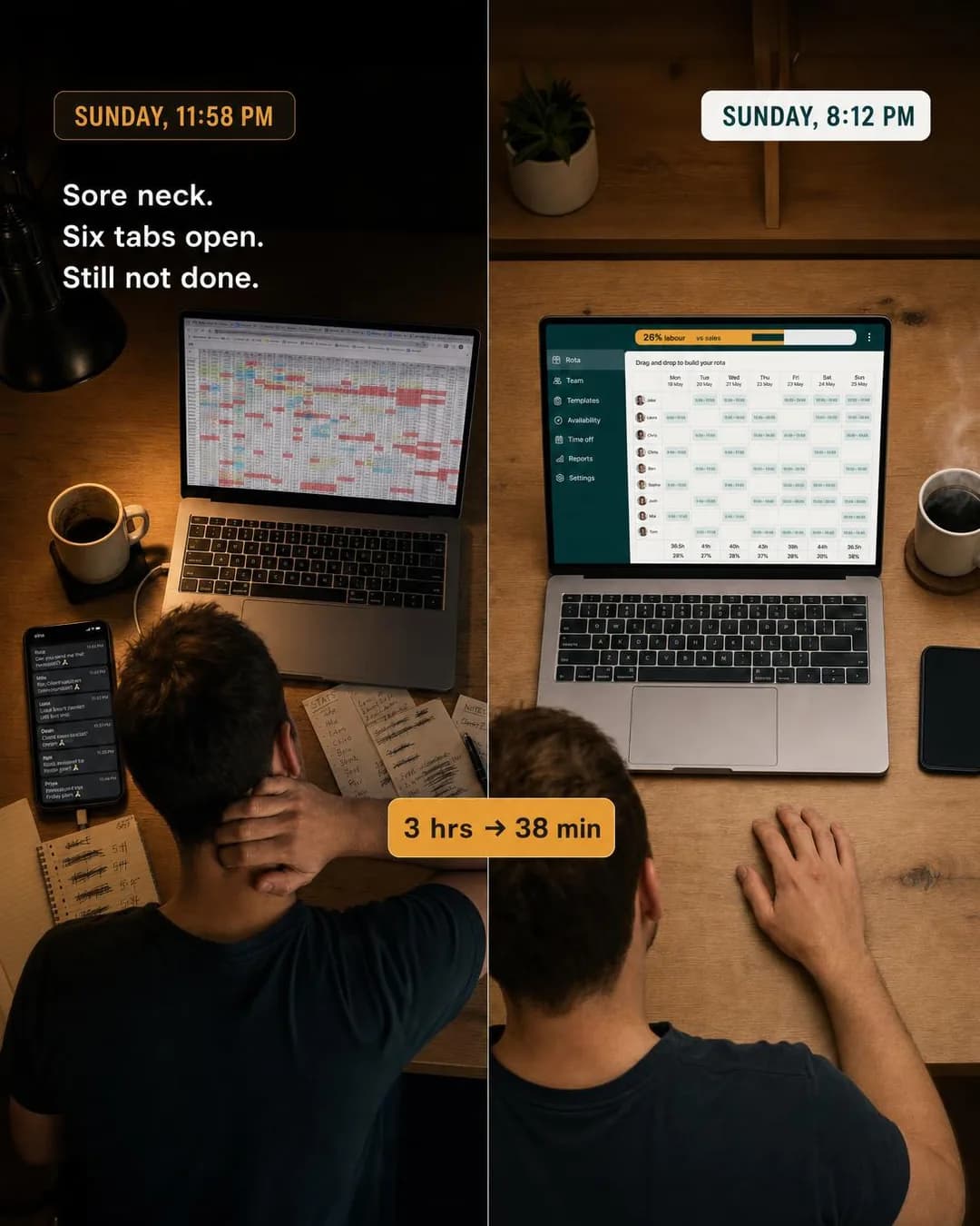 Example ad3 hours to 38 minutes. Same rota.See the brief →
Time saved per unit of work
Sales- Who it is for.
- A solo operator whose output is billable and whose admin is not.
- Angle.
- Benefit & Outcome — The strongest arithmetic available to a small-ticket product: a per-invoice or per-ticket saving multiplies by a number the reader already knows about their own month. Keep it per-unit rather than per-year — the annualised version sounds like marketing, the per-unit version sounds like measurement.
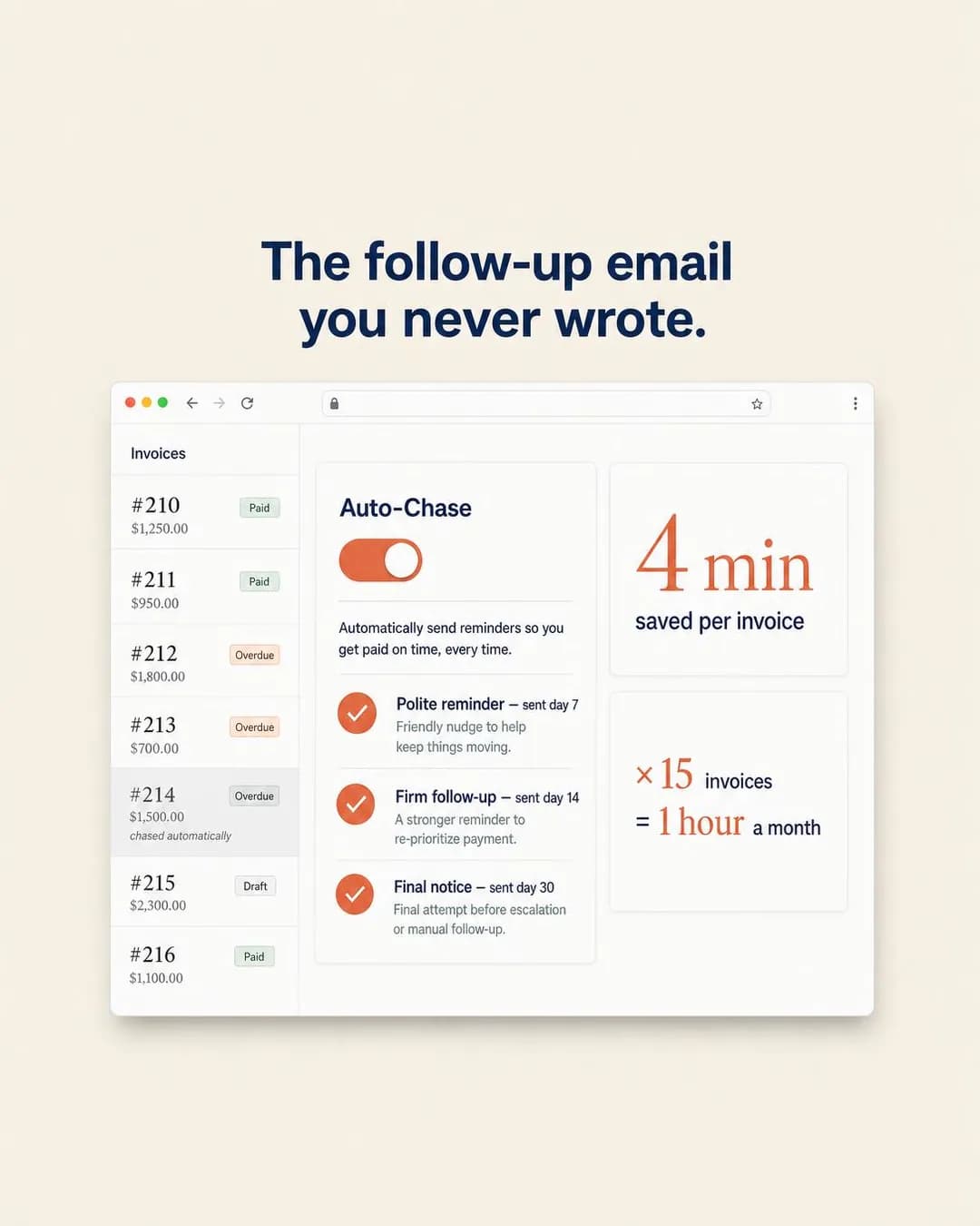 Example ad4 min saved per invoice. Every invoice.See the brief →
Replacing a process, not a tool
Traffic- Who it is for.
- A team lead whose problem is a chain of chasing messages rather than a missing feature.
- Angle.
- Comparison & Positioning — Old Way vs New Way wins when the incumbent is a habit rather than a competitor. Nobody is evaluating your category; they are tolerating a process, and the ad's job is to show the same week with the process removed.
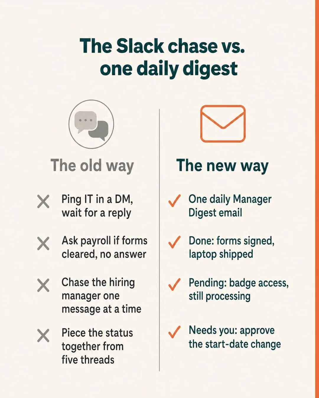 Example adOne digest. Zero Slack chases.See the brief →
The anti-feature position
Traffic- Who it is for.
- A buyer who has already been sold a heavier tool and did not use most of it.
- Angle.
- Comparison & Positioning — The one comparison shape that works on a platform with no search placement: rather than naming a rival to somebody who was not looking for one, argue a position they can agree with in one line. It also does the qualifying for you — the reader who nods is the reader who churned off the heavy tool.
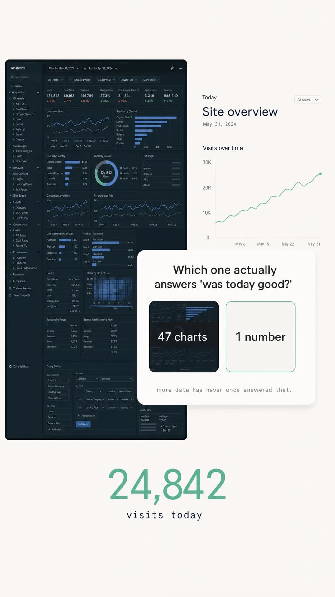 Example ad47 charts or one answer — pick oneSee the brief →
The switching cost
Leads- Who it is for.
- Someone who believes you, wants it, and has quietly decided the migration is not worth a fortnight.
- Angle.
- Objection & Risk Reversal — In software the last objection is almost never price, it is the changeover. Answer the complexity objection concretely — what happens to the existing data, on the first day — because a vague reassurance confirms the fear rather than removing it.
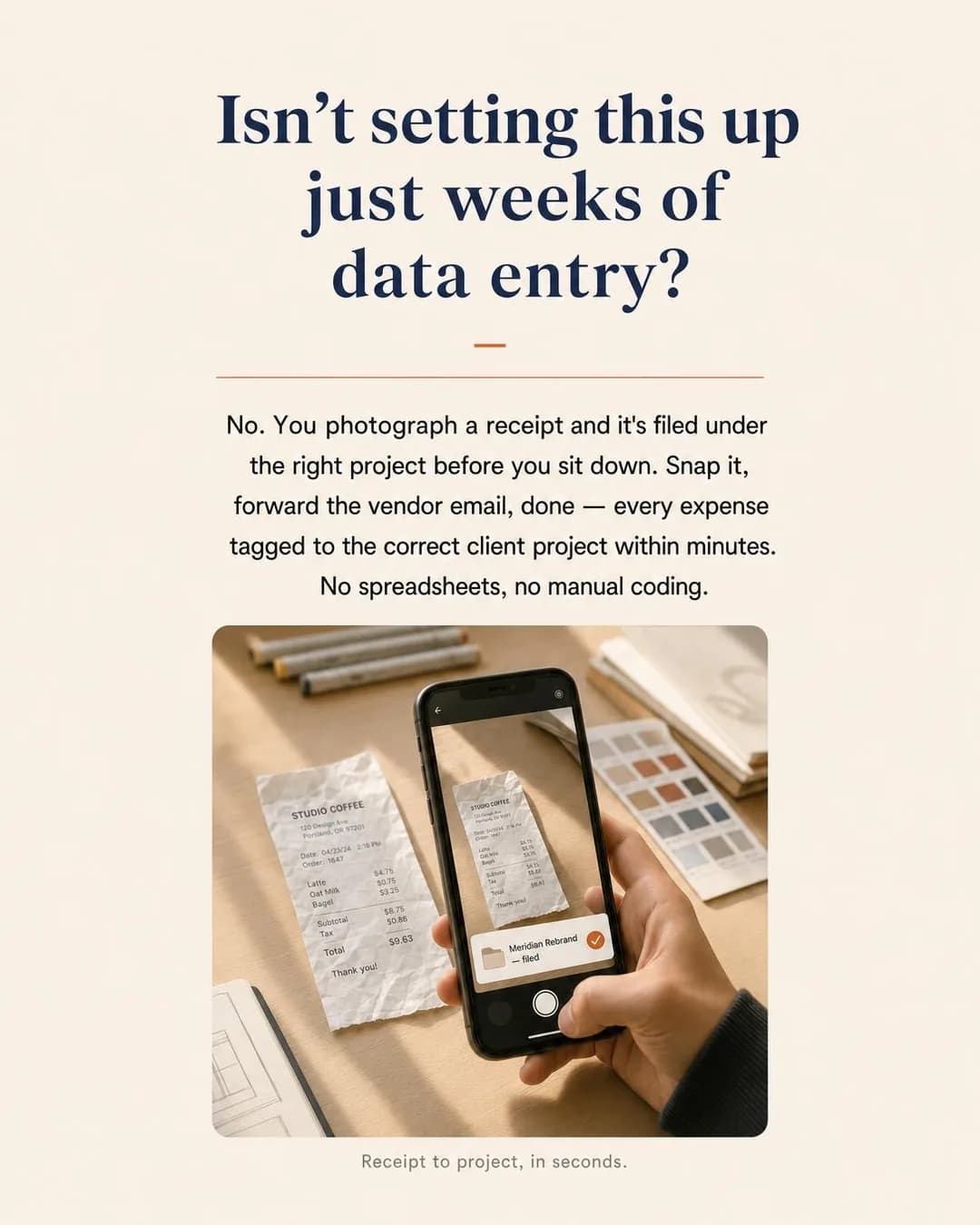 Example adReceipt to project in secondsSee the brief →
The measured claim
Traffic- Who it is for.
- An operationally-minded buyer who has been promised accuracy before.
- Angle.
- Proof & Trust — Statistical proof works here precisely because the category is full of adjectives. A number with a measurement window attached — by week two, measured — is checkable in a way "powerful AI" is not, and checkable is the whole point.
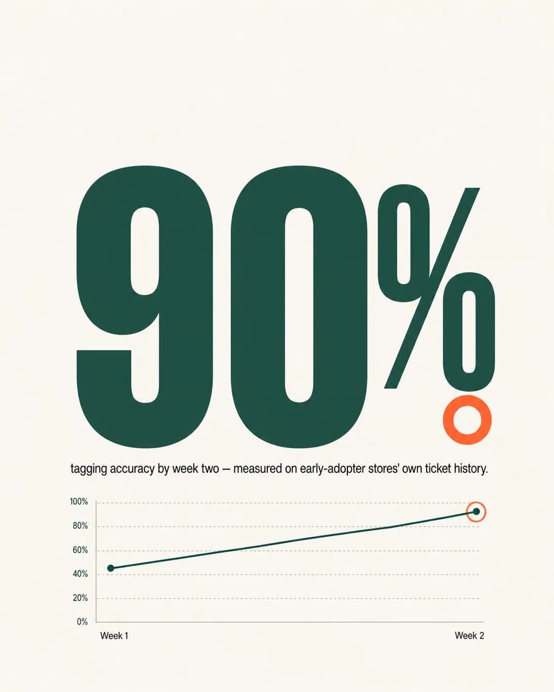 Example ad90% accuracy by week two. Measured.See the brief →
The named customer result
Leads- Who it is for.
- A buyer who wants to see the product working in a business shaped like theirs.
- Angle.
- Proof & Trust — The most persuasive shape in the category and the most dangerous to fake. Specificity is what carries it — fourteen trucks, an hour per tech, callbacks halved — and specificity is exactly what makes an invented version fraud rather than puffery. See the mistakes section; the Browse page's version of this ad is its one must-not-run.
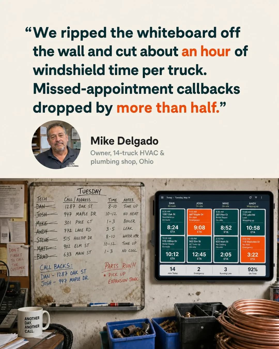 Example adCut an hour per truck, half the callbacksSee the brief →
The life the software gives back
Sales- Who it is for.
- Someone whose job follows them home — on-call rotations, month-end, the notifications that do not respect an evening.
- Angle.
- Identity & Emotion — The only row here that does not argue about work at all, and on a leisure surface it is the one with the least translation to do. Relief is legible at nine in the evening in a way a feature is not, and it is the argument most likely to be forwarded to a colleague.
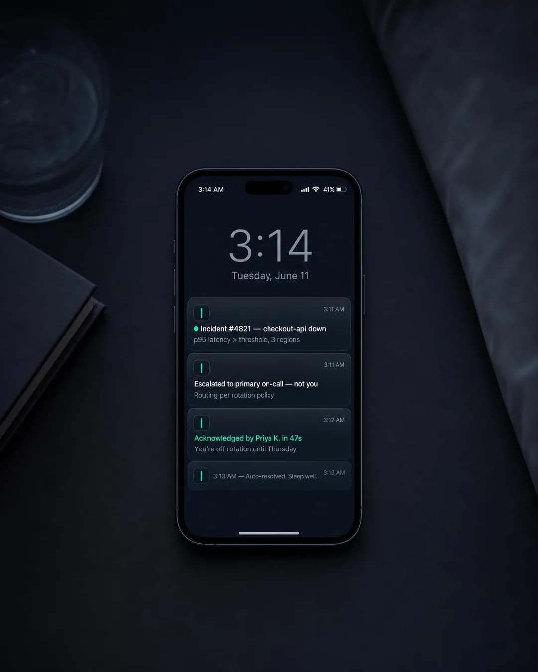 Example adOff rotation? Stay off rotation.See the brief →
The task that disappears
Traffic- Who it is for.
- Someone who does a small, dull, unavoidable thing after every meeting, call or shift.
- Angle.
- Benefit & Outcome — Ease is the argument when the task is too small to be worth solving deliberately — nobody goes shopping for note-taking. Show the absence rather than the automation: the notepad that stayed empty, the field that filled itself in.
 Example adYour CRM, updated. Your pen, untouched.See the brief →
How it actually works
Traffic- Who it is for.
- A technical evaluator who will not believe an outcome claim until they can picture the mechanism.
- Angle.
- Product & Mechanism — The row the batch skipped, and worth writing yourself for any product whose method is genuinely unusual. The test is whether you can draw the mechanism in three steps a non-user would follow; if you cannot, this is a landing page section rather than an ad.
No example ad for this offer on the examples page yet.
Pricing, the free tier and its ceiling
Sales- Who it is for.
- A prospect who is already using a free plan somewhere and does not know what they would be buying.
- Angle.
- Offer & Economics — The second row the batch skipped, and the one most likely to work for a self-serve product. It only holds up with a real published price and a real ceiling — this is the argument where an invented number stops being a placeholder and starts being a promise you cannot keep at checkout.
No example ad for this offer on the examples page yet.
Targeting a job title you cannot buy
First, the good news, and it is worth stating because two of the three guides in this cluster open with the opposite. Software is not a special ad category — Meta accepts exactly four, for housing, employment, financial products and services, and social issues, elections and politics — so nothing here is taken away from you. Age is yours, geography is yours, lookalikes are yours, exclusions are yours. There is no policy wall around the copy either.
The bad news is that none of those levers asks the question you actually have. You want people who run a restaurant, or who carry a pager, or who own a small agency. Meta's detailed targeting has been narrowed repeatedly over the last few years and the work-related categories are the ones most often affected, so the honest instruction is the same one the real-estate guide gives about custom audiences: open the picker in your own account, see what is genuinely in it today, and build the plan from that rather than from any guide's description of it, this one included. It costs you nothing to check and it is the only way to be right about it in six months.
In practice the recommendation does not change either way, which is why the uncertainty above is tolerable: go broad and let the creative filter. A first line that says "independent restaurant GMs" — or renders a Sunday night rota that only a restaurant GM has ever stared at — excludes everybody else more reliably than an interest category built from what people clicked three years ago, and it does it without shrinking the audience below the size the delivery system needs. Every audience brief on the Browse page is a job description and none of them was ever selectable.
Where the ad set does earn its keep is the second stage. Website custom audiences, video viewers and engagement audiences are all available here, and lookalikes are too — which is a real advantage over the housing cluster and worth using properly. Seed lookalikes from paying customers, not from trial signups: a free-trial list in a product-led company is largely people who were curious, and modelling an audience on curiosity is how a campaign scales the wrong half of the funnel. Geography deserves one deliberate decision rather than a default: for a global product the temptation is worldwide, and the cost is a stream of cheap impressions in markets you cannot support, price for, or invoice.
- Special ad categoryNot required
- Software is not one of the four. Leave it off — and if a habit from another account has it switched on, you are giving away age, lookalikes and exclusions for nothing.
- Detailed targetingCheck first
- Meta has narrowed this repeatedly and work-related categories have been the most affected. Open the picker in your own account before planning around any description of it. The recommendation below does not depend on the answer.
- Broad + creative filterUse it
- The actual answer to the job-title problem. The first line names the role; everyone else scrolls past for free. It also keeps the audience large enough for delivery to optimise, which a stacked interest sandwich does not.
- AgeUse it lightly
- Available, unlike in housing, and worth a wide band rather than a narrow one. The practitioner and the approver for the same product can be twenty years apart, and the platform split is doing more of that work than the age slider is.
- LookalikesUse it — mind the seed
- Available here. Seed from paying customers, not from trial signups: modelling on people who were merely curious scales the top of the funnel and nothing else.
- Custom audiencesUse it
- Site visitors, video viewers, engagement. This is where a software funnel actually converts, because it is the one stage where the ad set knows something the creative had to guess.
- GeographyDecide it
- The first industry on this site where the answer is not "near the building". Worldwide is a default, not a decision — restrict to the markets you can price, support and invoice in, and revisit when you can.
- ExclusionsUse it
- Exclude existing customers and current trialists from acquisition ad sets. Available to you, unlike in housing, and skipping it means paying to sell the product to people who already opened it this morning.
Landing page or lead form?
A landing page, almost always — which is the exact opposite of the dentist guide's recommendation, and the reason is the product rather than the platform. Software has to be seen before anyone can want it. An Instant Form is superb at converting a person who has already decided and needs only to hand over a phone number; it is useless when the thing you are asking them to decide about is a screen they have never looked at. Collect an email from somebody who has never seen the product and you have bought a name and a sequence of emails to send it.
So send the click to a page that lets them start. Not the homepage, which answers a different question than the ad asked, and — this one is common — not the pricing page. Pricing is where a person goes once they want the thing; putting it in front of a reader who is still deciding whether the Sunday-night rota problem is solvable asks them to evaluate cost before value. Match the page to the argument the ad made, and let the primary action on it be the trial, the sandbox, or whatever the smallest real use of the product is.
The exception is a genuine sales-led motion. If the product has no self-serve path, if the tier being advertised is quoted rather than priced, or if implementation requires a conversation before anyone can use anything, then a booked demo is the conversion and an Instant Form on its higher-intent type — which adds a review step — with two or three qualifying questions is the right instrument. That is a different business from the one most of this page is written for, and running its playbook on a product-led product is the most common way a SaaS Meta account underperforms.
Whichever you pick, instrument it before you spend. The destination decision and the optimisation-event decision are the same decision made twice, and the budget section below is about the second half of it.
The recommendation: A landing page that lets them start — not the homepage and not the pricing page. Instant Forms only for a genuinely sales-led motion, on the higher-intent type with qualifying questions.
Creative direction
The single most useful rule in this industry is: do not put the product in the ad. Not because the product is uninteresting, but because a dashboard rendered at 1080 × 1350 and looked at on a phone, at arm's length, in a feed, is a grey rectangle with unreadable text in it. Six of the ten ads on the Browse page render a situation rather than a screen — a checklist, a whiteboard, an empty notepad, a phone face-down — and the ones that do use product detail lift one number out of the interface rather than photographing the interface.
The second rule is that the first line is your targeting, and it has a harder job here than on the other two pages in this cluster. A dentist's reader has a toothache; a seller's listing has expired. Your reader is having an ordinary evening and has not thought about their rota since Friday. So open on the recurring moment rather than the problem category, and be specific enough to be exclusionary — three hours every Sunday is recognisable, "streamline your scheduling" is not.
Third, one number, and one you actually measured. This category is saturated with unfalsifiable adjectives, which is exactly why a figure with a window attached — 90% accuracy by week two, four minutes per invoice — reads as a different kind of claim. It is also the reason the invented metrics on the Browse page are labelled as placeholders rather than quietly left to look real: the format only works while the number is true.
- Render the situation, not the screen. A UI screenshot at feed size is illegible, and at 9:16 it is worse.
- Name the role or the moment in the first line — the ad set cannot do it, so this is your targeting.
- One metric per ad, with the window it was measured over. Without a window it is an adjective wearing a number.
- Export 4:5 for feed and 9:16 for Stories and Reels. Skip 1.91:1 — Instagram Feed accepts it as its maximum ratio, but the right-column and search surfaces that comparison ad is built for are Facebook's, so it has no home here. Meta's spec is 1440 × 1800, the same as Facebook Feed, so one export serves both — but the aspect-ratio tolerance here is 1% against Facebook's 3%, so a crop that is a few pixels out passes there and not here.
- Write to 40 characters of headline and 125 of primary text — Meta's recommendations for an Instagram Feed image ad. Worth knowing that the run on the Browse page does not: one headline of ten is over, and all ten primary texts are, at 266 to 489 characters. Longer is not forbidden, it is truncated, so the argument has to survive inside the first sentence and the rest is for whoever taps “more”.
- Argue a position rather than naming a rival. With no search placement, a reader has not asked about your competitor and does not know why you are talking about them.
- Never invent a customer. A testimonial works because readers assume a real person is behind it, which is precisely what makes a fabricated one a lie rather than a mock-up.
- Show the outcome in a domestic frame where it fits. Relief, evenings and empty notepads translate better on a leisure surface than throughput does.
- Write for the practitioner on this app. The approver is on the other one, and one ad rarely does both.
Funnel structure
Three stages, and unlike the other two clusters the third one is a revenue stage rather than a courtesy. Software has expansion and churn, so the audience you already own is worth advertising to on its own terms — not with the acquisition ad, which they will find irritating, but with the feature they are not using and the plan they have outgrown.
The split is deliberately less cold-heavy than a local business needs, because the second stage is where a software funnel actually converts: cold buys recognition, warm buys the trial, and the ad set only becomes precise once there is behaviour to target.
Cold
≈50% of budgetAudience. Broad, geography decided deliberately, existing customers and current trialists excluded. Whatever the detailed-targeting picker actually offers, used lightly.
Running. Two or three role-and-moment ads. Traffic, sent to a page that lets them start.
Warm
≈35% of budgetAudience. Site visitors, video viewers, engagement audiences; lookalikes seeded from paying customers rather than trial signups.
Running. Proof, mechanism and the switching-cost answer. Sales once the event fires at volume, Traffic until then.
Customers
≈15% of budgetAudience. Your own list — trialists mid-trial, and paying accounts, as separate audiences.
Running. Activation nudges during a trial, the unused feature, the plan they have outgrown. The cheapest revenue in the account.
Budget and testing
Here is the one place on this site where the learning-phase arithmetic works in your favour, and it is worth doing before anything else. Meta's delivery system needs roughly 50 optimisation events per ad set per week to leave the learning phase; below that an ad set sits in "learning limited", which is an admission that it cannot optimise with what it has been given. For a dental practice, 50 booked implant consultations a week is not a real number. For a self-serve software product, 50 trial starts a week is entirely achievable — which means you can actually buy the optimisation everyone else on this site is priced out of.
The trap is right behind it. Meta's standard events include StartTrial ("when a person starts a free trial"), Subscribe ("when a person applies to start a paid subscription"), CompleteRegistration and Lead, and the easy choice is to optimise for the cheapest of them. Optimise for StartTrial and the system will faithfully find you the people most likely to start a trial, which is not the same population as the people most likely to pay — and after a month you will have a beautiful cost per trial and a conversion rate that has quietly halved. So: use StartTrial while you are below the volume threshold, and move to Subscribe, or to a qualified-activation event you define, as soon as that event clears roughly 50 a week. Sending the deeper event server-side through the Conversions API is usually what makes that possible, because the moment that matters often happens after the browser has gone.
Then leave it alone. Pausing an ad set, or changing its optimisation event, audience or creative, is a significant edit and restarts the learning phase; budget and bid changes can too, depending on size. Changing the optimisation event is the biggest one available to you here, so make that switch deliberately and once, not as a weekly experiment.
Judge on payback rather than on cost per acquisition. It is the number this industry has that the others do not: a signup is worth a monthly figure over a lifetime rather than a one-off, so the honest question is how many months of subscription it takes to repay the ad that produced it, and whether your company can wait that long. Seasonality is mild compared with the other clusters — the real calendar effects are the ones inside your own business, like a pricing change or a launch, and those are the moments worth concentrating spend on.
- Test the role and the moment, not the headline. Which person recognises themselves is the variable with the largest range in this category.
- One change at a time, with seven days to read it — the learning phase is measured over a week, so anything shorter is noise.
- Change the optimisation event once, on purpose, when the deeper event clears about 50 a week. It is the most disruptive edit available and the most valuable.
- Track trial-to-paid by ad, not just trials by ad. The best-performing ad on cost per trial is very often the worst on revenue.
- Read cohorts, not weeks. A trial started today is a paying customer in three weeks or never, and a weekly dashboard hides which.
Six of these ads, in full
Every ad below was generated by best-in-slot for a SaaS company that does not exist, with its audience, angle and objective pinned before the run — and published exactly as it came back. They are six of the Instagram examples for a SaaS company; the rest, with the full brief and the alternate headlines behind each one, are on that page.
Problem & Pain · 4:5 · Traffic
3 hours to 38 minutes. Same rota.
Written for: Independent restaurant GMs.
The full brief and why it works →
Identity & Emotion · 4:5 · Sales
Off rotation? Stay off rotation.
Written for: On-call backend engineers.
The full brief and why it works →
Comparison & Positioning · 9:16 · Traffic
47 charts or one answer — pick one
Written for: Indie founders and small marketing teams.
The full brief and why it works →
Benefit & Outcome · 9:16 · Traffic
Your CRM, updated. Your pen, untouched.
Written for: Account executives.
The full brief and why it works →
Objection & Risk Reversal · 4:5 · Leads
Receipt to project in seconds
Written for: Agency founders.
The full brief and why it works →
Proof & Trust · 4:5 · Traffic
90% accuracy by week two. Measured.
Written for: Ecommerce support managers.
The full brief and why it works →
Mistakes specific to this trade
The first two are the reason most SaaS Meta accounts underperform, and they are the same mistake at two different layers: treating the ad as a place to explain the product.
Using a product screenshot as the hero image
It is the reflex and it is illegible. A dashboard at feed size on a phone is a grey rectangle, and in a 9:16 story it is a smaller one. Render the situation the product removes, and if you must use the interface, lift one number out of it rather than photographing the screen.
Opening on the feature instead of the moment
"AI-powered scheduling with real-time conflict detection" describes the product accurately and identifies nobody. The reader is on a sofa. Three hours every Sunday night is a sentence a restaurant GM recognises about their own life, and recognition is the only qualifying step this platform gives you.
Optimising for StartTrial and never changing it
The system will find people likely to start a trial, and being likely to start a trial is not the same as being likely to pay. Cost per trial improves, trial-to-paid falls, and the two metrics live on different dashboards so nobody notices for a quarter. Move to Subscribe or a qualified-activation event once it clears roughly 50 a week.
Building a lookalike from your trial list
In a product-led company that list is mostly curiosity. Modelling an audience on it scales the top of the funnel and nothing underneath it. Seed from paying customers, even when the list is small — a lookalike from 500 payers beats one from 50,000 trialists.
Moving the budget to LinkedIn without pricing the difference
LinkedIn will sell you the job title; it will also charge you a CPM that a self-serve product with a small monthly price frequently cannot repay. That is a calculation, not a principle, and it is worth actually doing for your own price point rather than inheriting somebody's rule of thumb.
Sending the click to the homepage or the pricing page
The homepage answers a different question than the ad asked. The pricing page asks a reader to evaluate cost before they have seen value. Send them to a page about the thing the ad promised, whose primary action is the smallest real use of the product.
Running Instant Forms for a self-serve product
A form collects an email from somebody who has never seen the software, which is a name and a nurture sequence rather than a prospect. Forms belong to sales-led motions where the demo genuinely is the conversion.
Inventing a customer
The Browse page carries a worked example of why this is the category's live hazard: its field-service ad has a face, a name, a shop and two numbers, and the page states plainly that Mike Delgado does not exist and that this is the one ad on it you must not run. The format works because readers assume a real customer is behind it. Use the shape — quote, face, role, scale, two numbers — and fill it with someone who said it and agreed to appear.
Leaving geography set to worldwide
The cheapest impressions on the platform are in markets you cannot price for, support in, or invoice. It looks like efficiency in the CPM column and shows up as a trial list nobody can convert.
Running one ad at the user and the approver
The practitioner cares about their Sunday night; the manager cares about a number in a board pack. Pew's split puts the first on Instagram and the second more on Facebook, so this is a platform decision as much as a creative one — and an ad written to satisfy both usually persuades neither.
Judging the account on cost per acquisition
Subscription revenue arrives monthly, so the meaningful question is how many months it takes to repay the ad and whether the business can wait. A CAC that looks alarming at twelve months' payback and fine at four is the same CAC; only the second one is affordable.
Questions
- Does B2B software advertising actually work on Instagram?
- It works when the buyer is a person rather than a committee, which for product-led software is most of the time. What does not work is the plan that starts by targeting a job title — that is what LinkedIn sells and what Meta cannot reliably give you. The workable version is broad targeting with the role named in the ad's first line, and it is cheaper per impression by a margin that matters at a small monthly price.
- Which objective should a SaaS company buy?
- Traffic by default, which is the reverse of every other industry on this site. An ad cannot explain software; it can make one person recognise one problem, and the page does the rest. Move to Sales once a Subscribe or StartTrial event is firing often enough to optimise on — roughly 50 a week — and keep Leads for genuinely sales-led motions where a booked demo is the conversion.
- Should I optimise for trial signups or for paid conversions?
- Trials while you are below the volume threshold, paid as soon as you clear it. Meta's standard events include StartTrial and Subscribe, and optimising for the cheaper one indefinitely is the most common way a SaaS account degrades quietly: delivery finds people likely to start trials, which is a different population from people likely to pay. The deeper event usually needs the Conversions API, because the moment that matters happens after the browser has closed.
- Can I target people by job title on Meta?
- Not reliably, and Meta has narrowed detailed targeting repeatedly with work-related categories among the most affected — so check what is actually in the picker in your own account rather than trusting any guide's list, including this one. It matters less than it sounds: the recommendation is the same either way. Go broad and let the first line of the ad name the role, which excludes everyone else for free and keeps the audience large enough for delivery to optimise.
- Instagram or Facebook for a software product?
- Instagram reaches 80% of adults aged 18–29 and half of all US adults; Facebook reaches 80% of 30- to 49-year-olds. As a planning heuristic that puts the practitioner who will use the tool here and the manager who approves the invoice more on the other app. If you sell product-led, where the user is the buyer, that collapses in Instagram's favour. There is also a concrete gap, and it is about surfaces rather than shapes: Instagram Feed accepts a 1.91:1 image, but the right-hand column and search results the comparison ad is built for are Facebook-only, so the format a lot of SaaS budget goes into has nowhere to land on this app.
- Should I put a screenshot of the product in the ad?
- No, or not as the hero. A dashboard rendered at 1080 × 1350 and viewed on a phone is an illegible grey rectangle, and a 9:16 story is worse. Six of the ten ads on our SaaS examples page render a situation instead — a checklist, an empty notepad, a whiteboard being retired — and the ones that use the interface lift a single number out of it.
- How much should a software company spend?
- Do the arithmetic. Meta needs roughly 50 optimisation events per ad set per week for delivery to leave the learning phase, so multiply your own cost per trial by 50 for the weekly spend at which one ad set is fully optimised. This is the one industry on this site that can realistically hit that, because a free trial is cheap enough to generate at volume. Then judge the result on payback months rather than on cost per acquisition.
Sources
Every platform claim on this page was read against these on . Meta’s policies move; if one of these disagrees with this page, it is right and we are stale.
- Meta Pixel — standard events reference (StartTrial, Subscribe, CompleteRegistration, Lead)
- Meta Marketing API — special ad categories (software is not one)
- Meta Business Help Centre — updates to detailed targeting
- Meta Business Help Centre — choosing Ads Manager advertising objectives
- Meta Business Help Centre — about the learning phase
- Meta Business Help Centre — significant edits and the learning phase
- Meta Business Help Centre — about Instant Form types
- Meta ads guide — image ad specifications, Instagram feed
- Pew Research Center — Americans' social media use, November 2025
That is the playbook. Now make the ads.
Paste your product site. It reads what you do, who it is for and how you sound, then writes the concepts, renders the images and drafts the copy — for the one audience you cannot target by job title.
No credit card · 50 free credits (about 5 ads or Instagram posts)
Every angle recommended above is documented in the best-in-slot ad angle library, and the ads are from saas instagram ad examples. More industries are at all ad guides.