
Ad Examples · SaaS × Instagram · 10 ads
SaaS Instagram ad examples
Ten finished ads for software companies — with the audience, angle and objective behind each one, because we generated them rather than collected them.
Every other page of SaaS ad examples is a gallery of other companies' creative with a caption underneath saying it is eye-catching. That tells you nothing you can use. You cannot see who the ad was aimed at, what argument it was making, what it was optimising for, or what the team tried before they landed on that headline — and those are the only parts that transfer to your product.
So these were not collected. Every ad below was generated with the audience, the angle and the objective chosen up front, which means the brief printed beside each one is the brief that actually produced it, not a guess written afterwards about someone else's work. The companies are invented — ten different software businesses, none of them real, so no customer's creative is being borrowed and no vendor is being flattered.
Nothing was edited afterwards. The image, the body text, the headline and the four alternate headlines under each ad all came out of one run and are printed exactly as they arrived. That is the point: a page arguing that a machine can make a usable ad is worth nothing if a person quietly fixed the ads first.
One of the ten was generated twice — its first draw misrendered a number inside the image, and its note explains what that tells you about the format. Every other ad here is a first attempt, and none was chosen from a set.
Which means the numbers in them are invented too. “34% fewer stockout-days” and “median acknowledgement: 47 seconds” belong to companies that do not exist and are not research about anything. Read them as placeholders showing where a real figure goes and how specific it has to be to carry an ad — in your version, that slot needs a number you can actually defend.
What changes because it is Instagram
Two things, and only one of them is a spec. Meta's ads guide recommends 4:5 for feed image ads — a portrait frame that takes roughly twice the vertical space of a square one on the same phone — and full-screen 9:16 for Stories and Reels. Eight of the ads below are 4:5 and two are 9:16, exported at the sizes best-in-slot ships (1080 × 1350 and 1080 × 1920). Each was rendered at its own shape rather than cropped into it, which is why the compositions actually use the room.
The other difference is not a number. On Instagram your ad appears between photographs and videos posted by people someone chose to follow, and it is being seen by a person who is not at work. That is the whole problem with running SaaS ads here, and it is also the opportunity: an ad that looks like designed B2B marketing collateral announces itself as an interruption and gets flicked past, while an ad that looks like something a person would post gets read before it gets categorised.
You can see the consequence in what the generator drew. A phone on a bedside table at 3:14 a.m. A dining table at 11:58 p.m. A workshop whiteboard covered in marker. A two-option poll. Exactly one ad opens on a polished product screenshot, and its job there is arithmetic rather than a feature tour; where interfaces turn up elsewhere they are props inside a scene — a tablet bolted to a workshop wall, a wall of charts cast as the villain. That ratio is not an accident of this run, it is what the placement rewards.
Source: Meta ads guide — image ad specifications by placement
Want the campaign, not just the creative? Instagram ads for SaaS companies → is the playbook these ads came out of: which objective to buy, the offers worth running, the targeting levers this trade keeps, and the policy that decides what the copy may say.
Generate ads for your own software
Paste your site and best-in-slot reads it the way these invented companies were read — product, audience, positioning — then writes the concepts, renders the images and drafts the copy. Free to start, no card.
The Sunday Night Checklist
TrafficSore neck, six tabs open, still not done at midnight.
- Audience
- Independent restaurant GMs — Run one to five locations, still build the rota in a spreadsheet on Sunday night, and spend the week fielding swap requests by text.
- Angle
- Symptom Stack (Problem & Pain) — Lists several manifestations of one underlying problem so prospects recognize themselves.
Sunday night. Six tabs open. Sore neck. Cold coffee. Still not done at midnight. If this is your weekly rota ritual, it doesn't have to be. Drag-and-drop shift planning that auto-flags understaffed sections, handles swap requests inside the app, and shows you labour cost before you publish — not after payroll runs. Managers on the Line plan cut scheduling from three hours to under forty minutes. 30-day free trial, no card required.
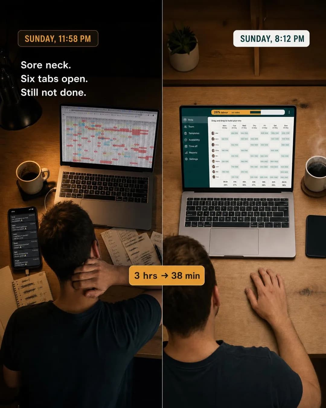
3 hours to 38 minutes. Same rota.
30-day free trial. No card.
Scheduling software has a marketing problem: the buyer already knows scheduling software exists and has already decided their spreadsheet is fine. Arguing features against that produces a comparison they never asked for. Symptom Stack sidesteps it by never mentioning the category — it lists the sore neck, the six tabs, the midnight finish, and lets the reader join those to a cause on their own. Recognition does the persuading, which is the only thing that works on someone who is not shopping.
The split-frame execution earns its keep here because the payoff is a time, not a feature. Both halves are the same table, the same person, the same Sunday; the only variables are the clock and what is on the screen. That is a claim a restaurant manager can check against their own evening in about a second.
Other headlines from the same run
- Sunday nights don't have to hurt.
- Built for rotas, not spreadsheets.
- See labour cost before you publish.
- Scheduling that takes under an hour.
Call to action
Cold traffic that has just been shown its own Sunday night is not ready to create an account — it is ready to see whether the 38 minutes is real. Learn more matches that. Sign up belongs on the retargeting pass, once the landing page has made the case.
The Follow-Up Email You Never Wrote
LeadsThat's four minutes back. Times fifteen invoices.
- Audience
- Solo design freelancers — Bill five to fifteen clients a month, hate writing the 'just following up on invoice #214' email, and are usually owed money they have stopped chasing.
- Angle
- Save Time (Benefit & Outcome) — Quantifies hours, minutes, or steps saved.
You spend four minutes writing each follow-up email. That's an hour a month you're giving away for free. Auto-Chase sends polite, firm, and final reminders on the schedule you set once — then never think about it again. Built for designers who'd rather be designing.
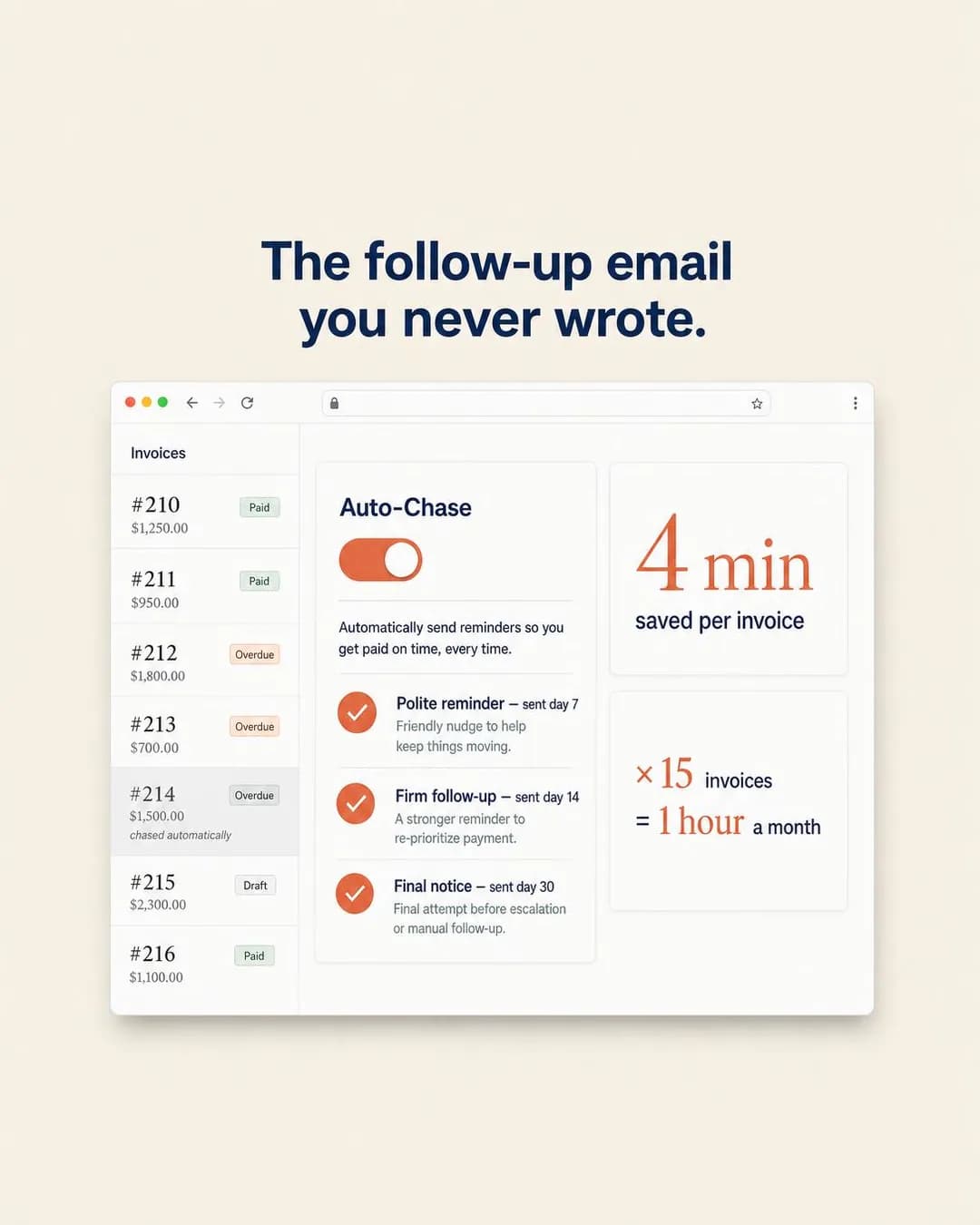
4 min saved per invoice. Every invoice.
Set it once. Forget it forever.
A freelancer's alternative to invoicing software is not a competitor, it is doing it themselves for free. Feature arguments lose to free every time, which is why Save Time only works once someone has put a number on what free actually costs — four minutes, fifteen times a month, an hour gone. That arithmetic is the entire ad, and it is the reason this angle is worth reaching for in a category where the buyer is also the accounts department.
The screenshot is doing something narrower than a product tour. The invoice list is context for a number rather than a feature to admire, there is no pricing, no integration logos and no second screen — it exists so the four minutes has somewhere to be true. A dashboard shot that tries to show the whole product instead of one claim is the most common way this direction fails.
Other headlines from the same run
- An hour a month back. Automatically.
- Never write that follow-up again
- Auto-Chase handles the awkward part
- 1 hour saved. 15 invoices chased.
Call to action
The product is cheap, self-serve and needs no demo, and the ad has already made its case with a number. Sending that person to a landing page to read the case again adds a step for nothing. Learn more is the safer pick if your signup asks for a card.
The Slack Chase vs. The Digest
TrafficStop chasing IT one Slack message at a time.
- Audience
- People ops leads, 50-500 employees — Onboard three to ten people a month with a checklist doc, chasing IT, payroll and the hiring manager one Slack message at a time.
- Angle
- Old Way vs. New Way (Comparison & Positioning) — Contrasts the traditional method with your newer approach.
Stop chasing IT one Slack message at a time. Most onboarding delay isn't the paperwork — it's the handoffs between HR, IT, and the hiring manager, tracked in spreadsheets and side channels. One shared workflow replaces that chain. Managers get a daily digest: done, pending, needs you. First-week schedules publish four days earlier on average.
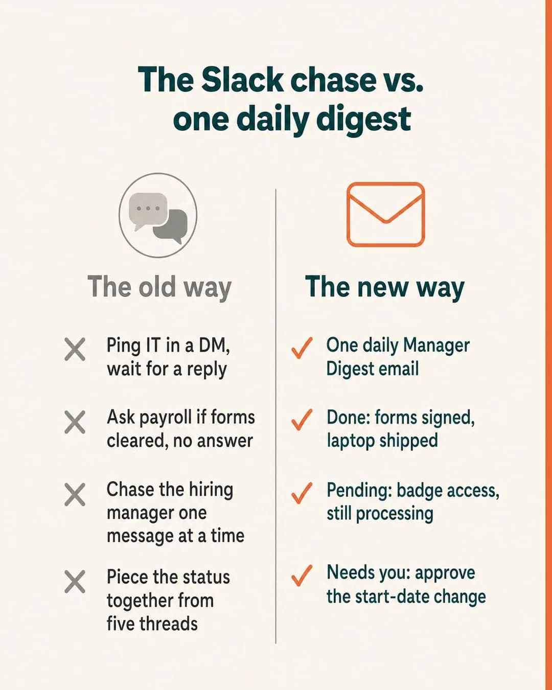
One digest. Zero Slack chases.
See how the workflow changes
Old Way vs. New Way is the safest comparison angle in software, because the thing being beaten is a process rather than a company. Nobody has to be named, nobody can file a complaint about the chart, and the reader recognises the left-hand column from their own week. For onboarding in particular the old way is unusually legible — everyone who has done it has chased three departments for one start date.
The whole angle collapses if the left column is a strawman. "Ping IT in a DM, wait for a reply" is a real Tuesday; had it said "use nothing at all" the reader would discount the right column along with it. That is the thing to copy here, and it is harder than it looks: the temptation in a comparison chart is always to make the old way slightly worse than it is.
Worth noting what the generator chose on its own: it named a specific tool in the headline rather than saying "chat messages". That is how a working advertiser would write the line, and it is a decision to make deliberately rather than inherit — naming another company's product in your creative is normal practice, but it is still their name on your ad.
Other headlines from the same run
- Stop hunting for onboarding status
- Onboarding without the handoff chaos
- The Slack chase ends here
- Done, pending, needs you — daily
Call to action
A comparison chart is a promise that there is a fuller version of the argument somewhere, and Learn more is the button that keeps that promise. Book now fits the same ad higher up the price ladder, where the buying committee expects a call rather than a trial.
Phone Face-Down, Finally
SalesSleep like the pager isn't yours anymore.
- Audience
- On-call backend engineers — Small platform teams at startups where the same three people carry the pager and find out about outages from a customer email.
- Angle
- Relief / Peace of Mind (Identity & Emotion) — Sells the removal of stress, uncertainty, worry, or mental load.
You're off rotation until Thursday. That notification at 3am? It found the right person — not you. Escalation policies route incidents to whoever's actually on-call, so you stop flinching every time your phone lights up. Median acknowledgement: 47 seconds. Duplicate alerts down 60%. On-call schedules your team actually agreed on, with automatic escalation if someone misses it. Sleep like the pager isn't yours anymore.
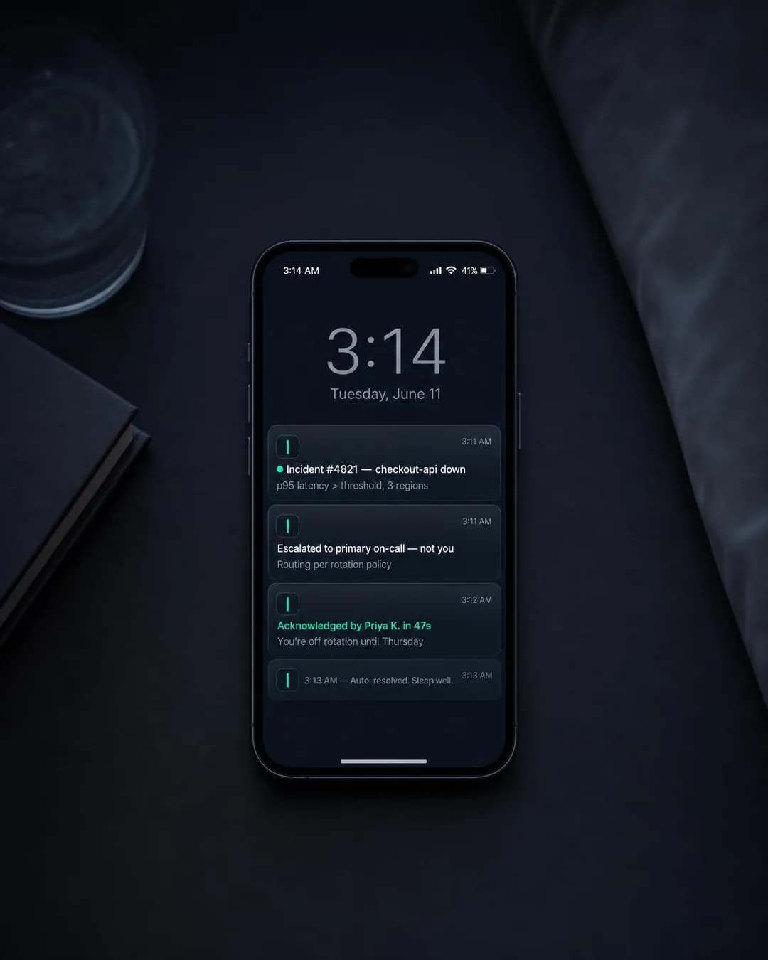
Off rotation? Stay off rotation.
Uptime monitoring + on-call logic
Identity & Emotion is the family software advertisers skip, because the reflex in B2B is to argue capability. On-call is the rare enterprise purchase with a real emotional cost, and the person paying it is the person you are advertising to — so Relief / Peace of Mind is not a soft angle here, it is the accurate one. The payoff being sold is a night's sleep, and the numbers are underneath it rather than instead of it.
The execution matters as much as the angle. This is a photograph of a bedside table at 3:14 a.m., which on Instagram reads as something a person posted rather than something a company made — and the ad is aimed at engineers, who are unusually quick to categorise and dismiss marketing. The alert copy on the screen carries the entire product explanation, so the ad never has to describe itself.
Other headlines from the same run
- The right alert, the right person.
- Sleep when it's not your shift.
- On-call that respects the calendar.
- Finally: humane escalation rotation.
Call to action
Developer tools are bought by being tried, usually by one engineer before anyone approves anything, and that person will not book a call. Get offer only if there is a genuine trial extension or credit behind it — the word promises something specific and an empty promise gets punished at the landing page.
The Monday Number
Traffic90% tagging accuracy by week two. We measured it.
- Audience
- Ecommerce support managers — Two to eight agents handling a few thousand tickets a month, where first-response time is the number they get asked about every Monday.
- Angle
- Data / Statistical Proof (Proof & Trust) — Uses research, usage data, performance metrics, or quantified results.
90% tagging accuracy by week two. We measured it across early-adopter stores using their own ticket history — no generic models, no guessing. Your inbox learns what "order issue" vs "return request" actually means for your SKUs, your policies, your seasonal spikes. The number climbs fast because the training data is yours. Support managers who track first-response time and backlog velocity: this is the metric that makes both move. Starts at $149/month, no contract.
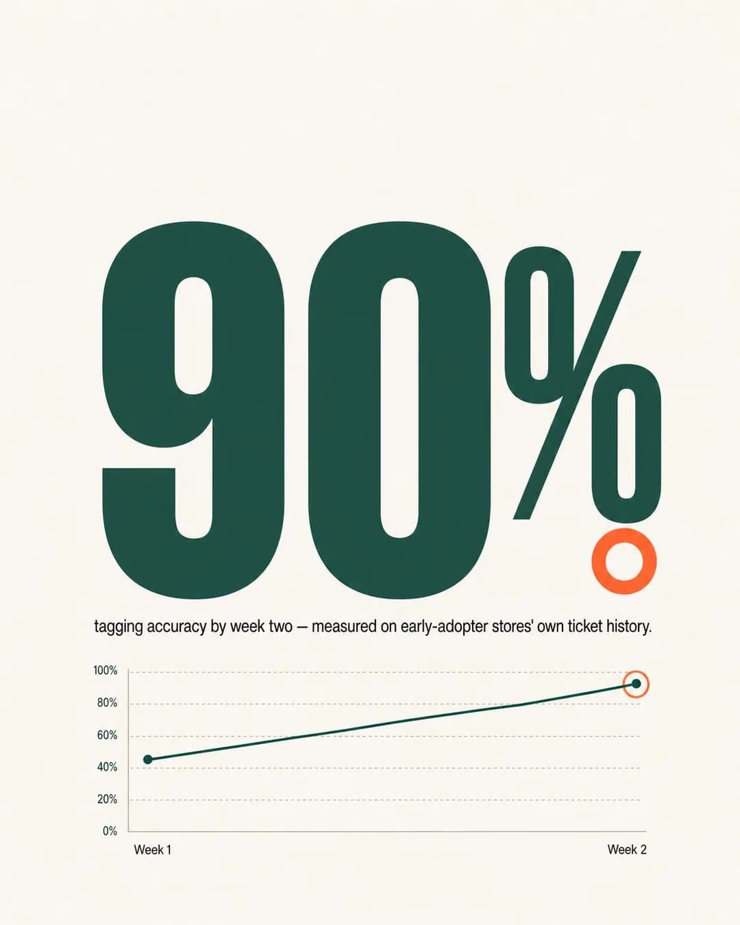
90% accuracy by week two. Measured.
See the dashboard yourself
Statistical Proof is the highest-risk angle in software, because a vague number is worse than no number: “faster responses” reads as an ad, “90% tagging accuracy by week two” reads as a fact. What makes it survivable is the qualifier, and the qualifier is in the ad rather than in a footnote — measured on early-adopter stores’ own ticket history. That is an unusually modest thing to volunteer, and it is what stops a reader deciding for themselves how the number was cooked. On a claim like this the scope is not a caveat, it is the claim.
The composition is doing the second half of the work. The number is the frame and the line chart underneath is small, which is the right order: the chart exists to say the figure moved rather than to be read. Reverse the two — a normal-sized chart with a caption — and you have a slide, which is a thing people scroll past on a phone.
This is also the only ad on the page that was generated twice, and it is worth knowing why. The first draw was fine as a layout and wrong as an artefact: the copy said fourteen hours, and the seven-segment digits rendered 74:00:00. Numerals inside a generated image are still where these models are least reliable, so a stat-hero is the one direction where you check the render against the copy every single time — and when they disagree, you re-roll the ad rather than retouch the number, because the number is the only thing the ad is saying.
Other headlines from the same run
- The Monday number, automated.
- Your inbox learns. Fast.
- Stop tagging. Start clearing.
- Trained on your tickets, not ours.
Call to action
A number this specific invites one question — how — and Learn more is the button that answers it. This is the default pairing for cold traffic across the whole page, and defaults are not a failure of imagination: a stranger who has read one statistic is not further along than that.
Receipt to Project in Seconds
LeadsPhotograph a receipt. It's filed under the right project before you sit down.
- Audience
- Agency founders — Ten to forty staff, profitable on paper, no idea which projects actually made money until the accountant says so in March.
- Angle
- Complexity Objection (Objection & Risk Reversal) — Shows how easy setup, onboarding, learning, or use actually is.
"Isn't setting this up just weeks of data entry?" No. You photograph a receipt and it's filed under the right project before you sit down. Snap it, forward the vendor email, done — every expense tagged to the correct client project within minutes. No spreadsheets, no manual coding. Built for agencies that bill by project, not for retailers. Try it free for 30 days, no card required.
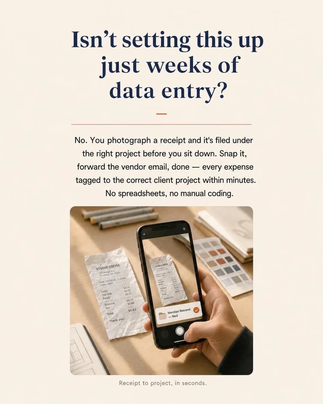
Receipt to project in seconds
Try free for 30 days
More B2B software deals die on the buyer's estimate of the switching cost than on price. The Complexity Objection angle takes that head-on by quoting the objection in the reader's own words, which is a format that only works if the answer is a picture rather than a reassurance. "No. You photograph a receipt and it's filed under the right project before you sit down" is one motion someone can see themselves doing.
Had the answer been "our onboarding team will guide you through setup", the ad would have been worse than saying nothing: it names a fear and then confirms there is a process attached to it. That is the trap with objection-handling creative generally — asking the question is cheap, and everything depends on whether the next line closes it.
Other headlines from the same run
- No setup, no spreadsheets, no manual coding
- Snap it. It's filed. Move on.
- Agency bookkeeping that takes minutes, not weeks
- From coffee receipt to project ledger instantly
Call to action
The ad's own offer is a free trial, so the button should match the sentence the reader just finished. A call-to-action that contradicts the offer in the copy is a small thing that reliably costs conversions — the reader has already agreed to one thing and is being asked for another.
The Spreadsheet Keeps Winning
SalesSame spreadsheet, same stockout, six months from now.
- Audience
- DTC operations leads — Brands doing one to ten million a year, forecasting in a spreadsheet, alternating between stockouts on the hero SKU and a warehouse full of the wrong colour.
- Angle
- Cost of Inaction (Problem & Pain) — Shows what happens if the buyer does nothing and the current situation continues.
Same spreadsheet, same stockout, six months from now. Reorder by gut feel and nothing changes but the date. The hero SKU sells out. The wrong colour piles up. Every cycle, again. DTC brands using inventory forecasting software cut stockout-days 34% in six months. Or you can keep circling dates.
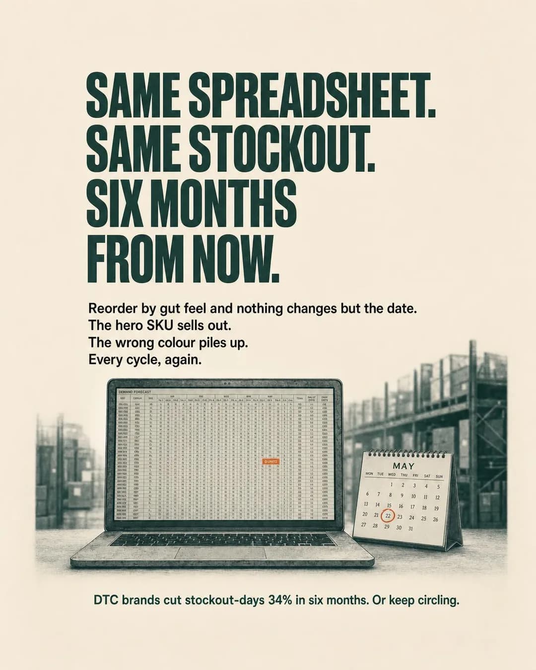
Stop reordering by gut feel
Inventory forecasting for DTC
Cost of Inaction is the angle for a buyer whose status quo is bad but survivable, which describes almost every spreadsheet in commerce. It works by refusing to argue: the ad never says what the product does, only what another six months of the current method costs. That is a deliberate trade — it buys clicks from people who recognise the cycle and wastes impressions on everyone else, which in a category this specific is the right way round.
The typographic poster is the correct format here for a boring reason: there is nothing to photograph. The subject is a repeating outcome, not an object or an interface, and a stock photo of a warehouse would have added nothing the words do not already do. When the concept is an argument rather than a thing, type is usually the honest format.
Other headlines from the same run
- End the stockout-overstock cycle
- Forecast from your actual sales history
- 34% fewer stockout-days in 6 months
- Replace the spreadsheet with a system
Call to action
Nobody creates an account off a poster that has not told them what the product is — the ad is deliberately withholding that, so the landing page has to supply it before any signup is reasonable. Pairing this creative with Sign up is the most common way a good cost-of-inaction ad gets written off as a bad one.
The Whiteboard Retirement
LeadsThe whiteboard got replaced. So did the guesswork.
- Audience
- HVAC company owners — Five to thirty technicians, dispatching from a whiteboard and a phone, losing an hour of billable time per tech per day to drive-time and paperwork.
- Angle
- Customer Result Story (Proof & Trust) — Tells a customer journey from problem to product to outcome.
Mike runs 14 trucks in Ohio. Used to lose an hour per tech every day to bad routing and missed-appointment callbacks. Ripped the whiteboard off the wall, put up a live dispatch board instead. Windshield time dropped. Callbacks dropped by more than half. Same crew, same market — just better sequencing and real-time visibility. If you're still erasing names and rewriting routes three times a day, try the 21-day trial. Month-to-month after that, $69–$79 per truck depending on fleet size.
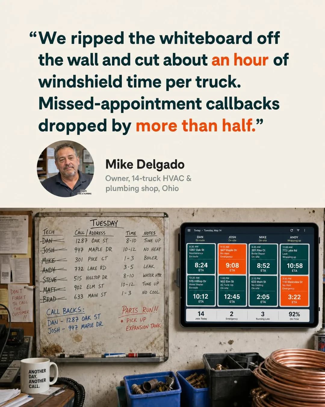
Cut an hour per truck, half the callbacks
21-day trial, no contract required
A Customer Result Story beats a feature list because the reader can check it against their own shop, and the checking is what makes it persuasive. Everything load-bearing here is specific: fourteen trucks, Ohio, an hour per tech per day, callbacks halved. “Great product, saved us loads of time” is the same testimonial with the evidence removed, and it could be about any software ever sold.
The photograph underneath is doing the arguing, not decorating. The whiteboard and the live board are on the same wall in the same workshop, so the before and the after are one scene rather than a claim about two. For field-service software in particular that matters, because the buyer’s objection is never “does it work” — it is “does it work in a place like mine”.
This is also the one ad on the page you must not run as-is, and it is worth saying plainly: Mike Delgado does not exist. The face, the name, the shop and the numbers were all generated. A testimonial format works precisely because readers assume a real customer is behind it, so the honest use of this output is the shape — quote, face, name, role, scale, two numbers — filled in with a customer who actually said it and agreed to appear.
Other headlines from the same run
- The whiteboard vs. the live board
- One hour saved per truck, every day
- 14 trucks, one screen, fewer missed calls
- From whiteboard chaos to real-time routing
Call to action
The copy ends on a 21-day trial, so the button should agree with it. Book now is the version worth testing against it rather than a fallback: an owner with fourteen trucks may well prefer fifteen minutes on the phone to setting the thing up himself, and which of those two wins is a real question about your buyer rather than a matter of taste.
The Empty Notepad
TrafficYour last CRM update, brought to you by zero effort.
- Audience
- Account executives — Six to ten calls a day, updating the CRM at 7pm from memory, or not at all.
- Angle
- Ease (Benefit & Outcome) — Emphasizes getting the result with less effort, complexity, or skill.
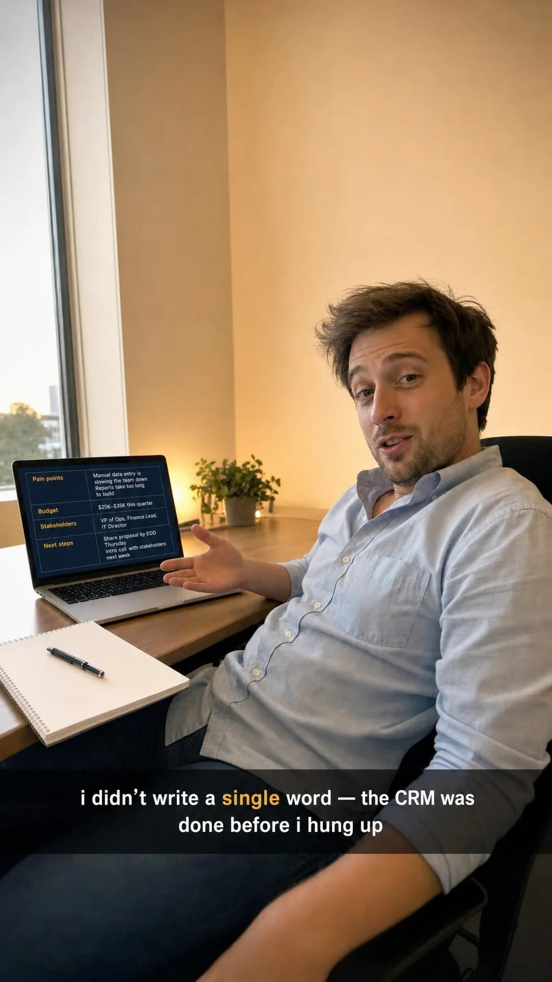
Your CRM is filled out. You didn't touch a keyboard. That pen? Still capped. The notepad? Still blank. Every call you take gets logged the same thorough way — pain points, budget signals, next steps, all of it — whether you remember to or not. 94% of our customers' calls are documented within the hour. Try it free for 14 days.
Your CRM, updated. Your pen, untouched.
Try free for 14 days
Ease is usually a dead angle — every product claims to be easy, so the word carries nothing. It works here because the proof is an absence rather than an assertion. A capped pen and a blank notepad are visual evidence of work that did not happen, and a picture can make that argument in a way a sentence cannot; “the notepad is still blank” is checkable, “incredibly easy to use” is not.
The format is the Instagram-specific half. This was rendered at 9:16 for Stories and Reels, where the ad arrives full screen, usually muted, between things a person chose to watch — so the claim is burnt into the caption bar in lowercase, exactly as a creator would post it. The identical image cropped to 4:5 in the feed would read as a stock photo with a caption on it, which is the failure this format is designed around.
Other headlines from the same run
- The call ended. The notes were done.
- Zero effort. Fully documented deals.
- No notes taken. CRM still perfect.
- Stop writing. Start closing.
Call to action
The copy offers a 14-day trial, which normally argues for Sign up — but a Stories tap is cheap and often half-accidental, and that traffic converts worse against a signup form than against a page. This is the one place on the page where the placement, not the offer, should pick the button.
The Depth Trap
TrafficMore data has never once answered 'was today good?'
- Audience
- Indie founders and small marketing teams — Opened Google Analytics to answer one question, left twenty minutes later without the answer.
- Angle
- Contrarian (Comparison & Positioning) — Makes a position that runs against conventional wisdom.
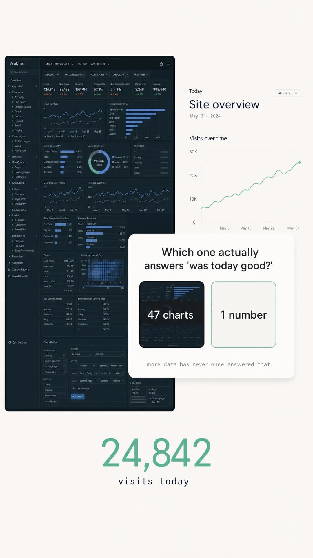
More data has never once answered 'was today good?' Analytics platforms compete on depth because depth sells seats, not because you need it. You wanted a number. They gave you 47 charts, a query builder, and a compliance policy. One dashboard. One scroll. One answer. $9/month, no banner required.
47 charts or one answer — pick one
From $9/mo • 21-day trial
A Contrarian ad only works when it contradicts something the reader already half-suspects, and “more data has never once told me whether today was good” is a thought most people running a small site have had at 9am. Note what it does not do: it never names a competitor. It draws the category as a wall of charts and lets every reader supply their own villain, which is the safer and usually the stronger version — attack a norm and nobody has a complaint to file.
The poll is the Stories-native part. A two-option choice is the grammar of that placement, so the ad reads as something to participate in for a beat before it reads as advertising, which is the entire budget a full-screen ad gets. It is also the angle with the narrowest ceiling on this page: it only reaches people already irritated by their current tool. At nine dollars a month, self-serve, that is the right trade. At enterprise prices it would be a way to disqualify most of your market.
Other headlines from the same run
- Analytics that fit on one screen
- No depth. No banner. Just the number.
- One page. One scroll. Done.
- The opposite of your last tool
Call to action
The ad has argued that everything else is too much and has not yet said what this is — that is the angle working as intended, and it means the landing page still has a job to do before anyone creates an account. Get offer would need a real trial or discount behind it; the $9 price in the copy is not one.
Questions
- Do Instagram ads actually work for B2B SaaS?
- They work when the ad survives being seen by someone who is not thinking about work. The buyer for a scheduling tool is a restaurant manager who also has an Instagram account, and they are on it in the evening, not at their desk. That rules out the ad that opens with a category name and a feature list, and it strongly favours ads built on a recognisable moment — the Sunday night rota, the 3 a.m. page, the invoice you never chased. Every ad on this page is built that way, which is a consequence of the angle each was pinned to rather than a house style.
- What size should a SaaS Instagram ad be?
- Portrait, not square. Meta's ads guide recommends 4:5 for feed image ads and full-screen 9:16 for Stories and Reels; best-in-slot exports those as 1080 × 1350 and 1080 × 1920. The mistake worth avoiding is designing one square image and letting Meta crop it into both — a composition that works at 1:1 usually loses its subject or its text at 9:16. Render each shape separately, which is what happened here.
- How many versions of one ad should I run?
- More than one and fewer than you think. Each ad below shipped with five headlines from a single run — the one on the creative and four alternates listed under it — because headline is the cheapest thing to vary while holding the image and the argument still. Change one variable at a time and you learn something; change the image, the headline and the audience together and you learn that one of nine things worked.
- Should a SaaS ad show the product?
- Only when the interface is the argument. One ad in ten here leads with a dashboard, and it is the one whose whole claim is a number you can read off the screen. The rest show the problem instead, because a screenshot of software is legible to someone who already knows what the software does and is wallpaper to everyone else — and on Instagram, almost everyone else is who you are reaching.
- Can I use these ads?
- Take the approach, not the pixels. The companies are invented and the images were generated for this page, so there is no customer creative here to lift and nothing worth lifting anyway — the value is in the pairing of an audience with a specific argument, which is the part that transfers. Every angle used below is documented in full in our ad angle library, linked from each ad.
Seen enough? Make your own.
Paste your product site. It reads what you do, who it is for and how you sound, then writes the concepts, renders the images and drafts the copy — for the one audience you cannot target by job title.
No credit card · 50 free credits (about 5 ads or Instagram posts)
Every angle used above is documented in the best-in-slot ad angle library. More industries and placements are at all ad examples.